Leaderboard
Popular Content
Showing content with the highest reputation on 10/05/2024 in all areas
-
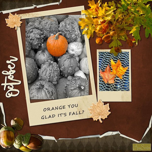
ORANGE YOU GLAD IT'S FALL? Folded paper, Polaroid frames and glitter leaves and word art from Merisa Lerin. Corel fall overlays are freebies this week. Font used is Segoe Script. I got most everything on Digitalscrapbooking.com as daily freebies today. The photos are by Chuck Calio on the Hudson Valley in Pictures Gallery.3 points
-
Thank you Julie. Her stuff is awesome. I have the email saved and will download the goodies tomorrow when my main computer is finished it's back up. I'm looking forward to watching the videos. I see she is associated with OSCRAPS. I love their site, amazing stuff. I have this huge "winter" indoor list of stuff I want to do when it's cold outside and am stuck inside. I'll need winter to last for 4 yrs if I want to get to everything I want to do. I keep saying, "I'll get to the that when winter comes...and I have more time", then I laugh, knowing I wont have any more time than I do now.3 points
-
I'm the same. It's a bit overwhelming there's so much! I've watched a few of her videos on YouTube and her website to see ways to use them. This is gonna be fun!3 points
-
I just have to share this. Quite by accident I came across a designer on FB who offers a rather large number (40!) of FREE zipped files. Her style is very artsy and mixed media-ish which I enjoy emulating. She's much like Katie Pertiet in that way. https://annaaspnesdesigns.com/products Her name is Anna Aspnes. Her site offers the download link at the bottom of the home page. All you need is to sign up for her newsletters, confirm in your email, and then follow the links they send for the downloads. Three videos (quite basic) are also free. Just putting it out there for my fellow PSPers who might enjoy some of her materials. Share with friends is what Mama taught me! 😁2 points
-
2 points
-
I'm much obliged, for those meaningful words. I was thinking the same, as the window of opportunity to take the best shots was closing.2 points
-
2 points
-
Thank you Julie and I have downloaded the whole bunch. It will take all my free time this whole weekend to look what is in it! I only opened a couple of the zipfiles and it looks already very promising to say the least. You do your mama proud!😄2 points
-
2 points
-
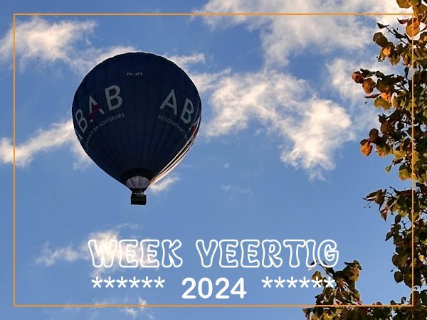
Sometimes, depending on the wind and weather conditions we have hot air balloons coming over our house. When we hear the sound of the burner we will have a look where the balloon is. Today was such a day and I went to look at the back on the patio if I could see the balloon which was quite low and just right over our house but already to far to take a photo, so I quickly went to the frontdoor, which was still locked.... I was on time to take a couple of shots, but I had backlight. Luckily there is a little tree and by standing a bit in the shade I could take the photos.2 points
-
2 points
-
2 points
-
I'll post my projects for the BSC here. Not sure how fast I'll work through them. Doing the Bootcamp as well currently. This is Project 1 from Module 1:1 point
-
Susan me too! In the mean time I have taken a quick look at all the goodies and I like a lot what I have seen thus far. Although I have to figure out how to use some.1 point
-
1 point
-
1 point
-
Trying again to post this, as the last three times were unsuccessful. 😞 Thank you, Julie. 🙂 This is really a Mega Pack! I only recently learned the name Anna Aspnes. A designer from the Lilypad site mentioned her in a newsletter, saying she had attended an Artsy Design Course by Anna Aspnes. I am not an artsy scrapbooker, but I have been trying to do things a bit differently for the last year or so —whenever the theme allows, not when Halloween. 😄1 point
-
Love the interlocking circles. That was way beyond me when i first did the Basic Scrap Course. they look great. the ones that are more on an angle, did you squish them or did you make them as ovals so they would look like that? Nice shadow on the balloons!1 point
-
1 point
-
I love your layouts Daniel. I also title the vector layer with the font name, it's faster than clicking on the object in the layer because my Text tool takes forever to activate. This way I just look at the layer. Good idea to put the font size.1 point
-
1 point
-
1 point
-
I had a ride in a hot air balloon, approximately 10 years ago as a gift for my 65th birthday. It was great to see the area where I live from the air and I even saw some deer grazing on a grass spot in a small forest. It was a fantastic experience and I would love to do so again, but alas it is rather pricy.1 point
-
I had the opportunity, to go up in a hot air balloon, many years ago. It was a wonderful experience. A whole different view of South Glamorgan, and it's diverse coastline. A lovely capture. It always pays to sieze the moment.1 point
-
I encourage you to do so! There is a masterclass, 'Adjust What!' I can see this technique being used in your exquisite layouts, with impressive results.1 point
-
1 point
-
A good reminder that I should use the adjustment layers more often; the last time is maybe 2 month ago. I love how you have made the frames and that nice bird is just looking into the camera!1 point
-
1 point
-
1 point
-
1 point
-
1 point
-
Fabulous Mary! What a happy layout and great Olaf you have created.1 point
-
I too love the gnome in the corner, a nice touch. Between the punches and the mitred corner, there are endless possibilities. Even, with the punches on their own.1 point
-
1 point
-
Bringing October in with a bang (although the birthday was yesterday; I didn't wrap it up until this morning). Module 5 Project 5. Shadows were challenging but I "think" I got most of them done OK. Several of the papers came from the cpjess-crafty eve mini kit. Background was cass-Random Brush Print-Summer. A couple of things off internet then highly modified by myself. Alpha is original.......base font is Incised 901 Nd BT @400 dpi. The ribbon was generated with the sinebot plugin, then turned into a pattern flooded into a narrow 3600 wide selection. Stitching was the original stitch tube from Corel but I've made 3 or 4 more in different colors.1 point
-
Module 4 Project 4. Almost all supplies from Cassel's Fire and Ice with a couple of modifications. Used a green paper from Jessica Dunn. The doily was done by me following along one of the tutorials. I pretty much turned the layout 90 degrees since my photo was NOT in landscape format. PS...you have to look close to see Rambo.1 point
-
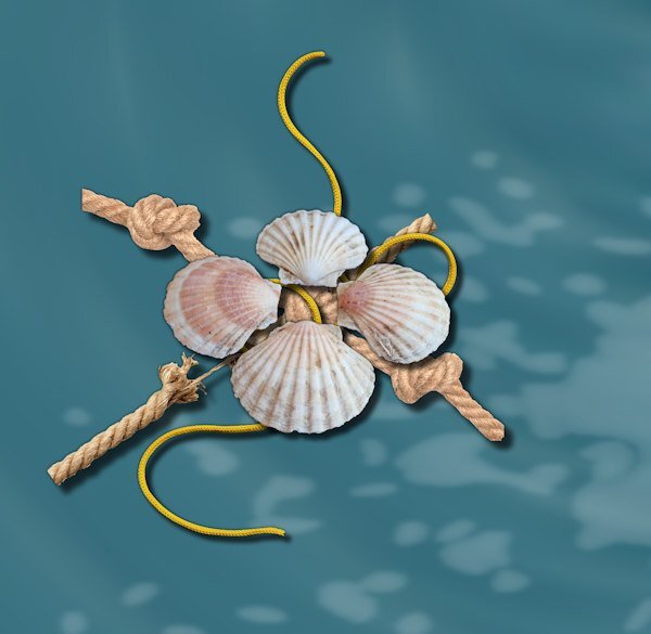
@Cassel I'm curious. I saw you mentioned to one of the other participants in the boot camp, something about using a rope and making sure it was on top. In Project 3, I did a cluster that is different from many, in that I had a couple of ropes, a string, and a group of shells. The shells seemed to me to "work" placing them on top over the center knot on one of the ropes which was on top of a rope that was coming apart. I really enjoyed finding that sweet spot with the layering where the string appeared to intertwine amidst the layers. Did I really achieve the effect I was hoping for placing the shells on top?1 point
-
Module 3 Project 3. A couple of papers from cpjess, one modified from Flolinette-PBS and a rope from Marisa Lerin. The photo is two originals taken from aboard ship, blended together with another layer that was a gradient fill. Background, plaid paper and paint splash original. Elements from the internet. I keep forgetting to write down the font names when I have more than one and always "lose" the first one LOL. Needless to say it was as Carole calls them...a thick one and in this case a 3D font. The second is obviously Ariel. PS. I'm going to start renaming the font raster layers with the font name and size. Might keep me straight in the future that way. The OpenAsLayer does a good job with the papers and elements in that way.1 point
-
And that is another great idea! I saved that path I finally got, but not as a preset shape! I'll do so tomorrow, now it is almost bedtime after 2 exhausting days. 🥱💤1 point
-
That is a great solution. I find that more than the drawing, the difficulty is the "visualization" of the path. Without the visualization, it is even harder to draw it. I had the same problem. I had to do it and redo it several times, so don't despair! Once you have a path, you have to adjust it to the thickness of the rope itself, but you can always keep that path. In fact, maybe even save it as a preset shape! So you won't have to redo anything from scratch!1 point
-
Donna if it is of some consolation to you. my first attempt wasn't looking anything better! Drawing by hand is not for me and your solution to use a nice knot and trace the parts with the pen tool is a good idea. Something to follow because it really looks nice1 point
-
1 point





Resized.thumb.jpg.d25811db03a63358cedab1e79f527635.jpg)

.jpg.842103ccb6f9f02de4e83e844a8dc3b4.jpg)
