Leaderboard
Popular Content
Showing content with the highest reputation on 09/30/2024 in all areas
-
Did anyone work on those projects in the background and didn't post them? Remember that there are nice prizes to be won if you post 4 out of the 5.4 points
-
3 points
-
3 points
-
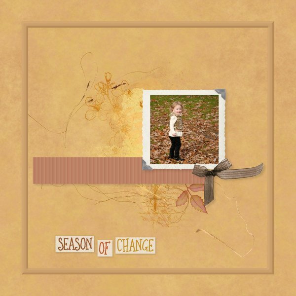
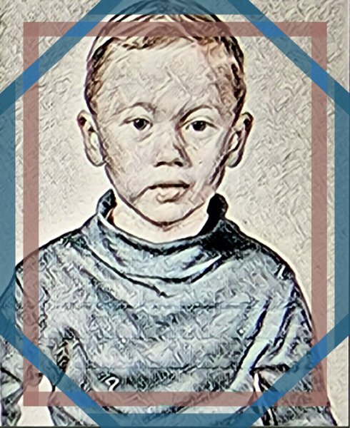
Likely the last layout for September. And another month passes by! Our fall days don't look like the photo yet. That will be later in October. Lately it's been damp, cloudy, but still very humid which keeps the temperatures in the 20s C. Old picture of my niece's daughter who is a lot more grown up now. Only things I made/did were background (blending papers), the ribbon, and outer frame with bevel. All other elements & brushwork from Janet Kemp (DS) or Erika Designs. I am simply too lazy or time-constrained to make many of my own elements. Especially when so much good stuff is available for free often.3 points
-
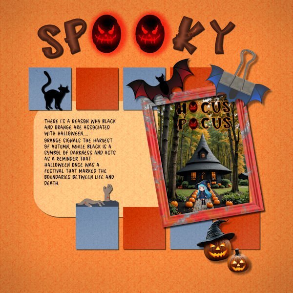
I changed the photo. Except for the "hocus pocus," it was made in My Edit program. It took a while for My Edit to get what I wanted. My Edit is a Cyberlink program which is a yearly subscription. I just downloaded the full program called PhotoDirector 365 to my computer since it was on sale for $39.3 points
-
3 points
-
2 points
-
2 points
-
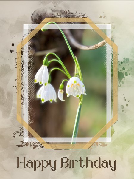
I needed a new card to send to a friend of us and I know he likes flowers too, but I didn't want the card to be too girlie. I used one of my photos taken of summer bells (Leucojum Gravetye Giant) with a mask by Jessica Dunn and of course the freebie frames. I had to change the colors of the frames for something that goes with the photo but I kept the transparency of them. The background is made of the same photo with a lot of blur and an overlay of paint streaks that I did for another project with reduced opacity. To let the frames stand out a bit they got a very light shadow with an offset of 1 and no blur. The font is Belinda. The card has to go in the mail so it is a double card with my logo on the back and I'm going to print it later today.2 points
-
I have watched Band of Brothers when it was broadcasted over here and it comes on again sometimes. I think my husband has seen it at least 4 times now.2 points
-
Assuming the elements are all the same shape and size, you could even flip, rotate, or even mirror them once the texture had been applied.2 points
-
2 points
-
Lovely that your background has the photo too, I just noticed that.1 point
-
Making my own frames is on my ever growing list of ideas that I want to follow and create. There are just not enough hours in a day to do everything that I want or must do. I'm not really a "house wife", if my windows are dirty well it will be going to rain again, but there are things that have to be done. 😉 Maybe I'll have more free time in the winter months. October is a busy month with birthdays that we have to attent, I'm making and printing the cards now because 2 of those are for dear friends that will be 80! For the more common numbers I can choose cards from my stock. But these are the first 2 that reach 80, so for the next one I already have a card.😀1 point
-
I was going to go with a mask, but saw that you had already created a gorgeous birthday card using a mask. Creating these frames are ever so easy. Saying that the more corners, and overlaps you have the more work it involves. Yet worth it in my opinion.1 point
-
Nice frames and a bit wider then the freebies. I love the simplicity of the layout and the colors.1 point
-
Hello Ann, this is an embellishment from Jessica Dunn's kit1 point
-
I thought of doing that, but I was too tired to do anything more. lol 😴1 point
-
This is so pretty and delicate. Your backgrounds are so fabulous. You are very good at the blended background. I will have to try the outer bevel. I havent used it before.1 point
-
There is nothing wrong with using "stuff" that is available so widely and you used it in a great way too. It is not always easy qua time or inspiration to do everything from scratch!1 point
-
I really liked Kalinda. Great character to offset the "good wife".1 point
-
I happen to be watching Band of Brothers right now and he's in it. That was a long time ago. I don't normally watch war movies/mini-series, but this one is exceptional.1 point
-
I did use the texture command. If Corel added an angle option, that would be great, but it doesn't sound promising. Adding the texture was a last-minute decision and I was tired so I left it as is. I like your idea of rotating the file and saving it as a new one. I'll keep that in mind (if my mind works lol).1 point
-
Yes, it seems to be. I'm really into it but I started back on Season One. The first I realized who the actor was is when they announced the start of Season 4, so I have a lot of viewing pleasure to look forward to...1 point
-
1 point
-
Marc is a renowned British actor, I remember him as a child in Grange Hill. Van Der Valk, is an excellent program.1 point
-
I watch most PBS dramas, but this is one that comes on late and is very dark. I usually turn it off, but I'm sure I'm missing something really good. I do not recall this guy from The Good Wife.1 point
-
Doska very nice layout and I can sympathize with you, we had very much the same summer as was the case in many parts of southwestern Europe.1 point
-
@Doska St. This is a very nice layout! I only have one question: what is that on the left side that seems to have some text?1 point
-
I use your painted frames all the time to showcase what I'm watching today on tv. I got a new 36" monitor for Christmas with lots of space for displays! For example, here's what I had for Friday 9/27 - @Corrie Kinkel This is set in Amsterdam. The actor's name is Marc Warren and I first saw him on The Good Wife so I thought I'd try this show, also.1 point
-
1 point
-
I got this far and then couldn't find a frame saved in any folders and after trying to find and save and use a brand new frames (and still no luck finding them in a folder) I gave up. Not only did I not conquer finding/using a new frame, I lost all the layers I had up to this point so I couldn't do the shadows. I know it's time to give up when my bums gets sore and my legs start to fall asleep. I have enjoyed getting reacquainted with the program and relearning how to use layers. I don't do scrapbook pages, but I do do a lot of editing the many photos I take. It was really nice to see many of the familiar and beautiful faces that grace the pages of the forum. That just feels good!!! Thank you Carole for doing such a marvelous job teaching us how to use PSP. You are a delight to have for a teacher. 🙂1 point


.jpg.28ad1d4ff4781c56fcc0f07c467f01f7.jpg)
