Leaderboard
Popular Content
Showing content with the highest reputation on 09/18/2024 in all areas
-
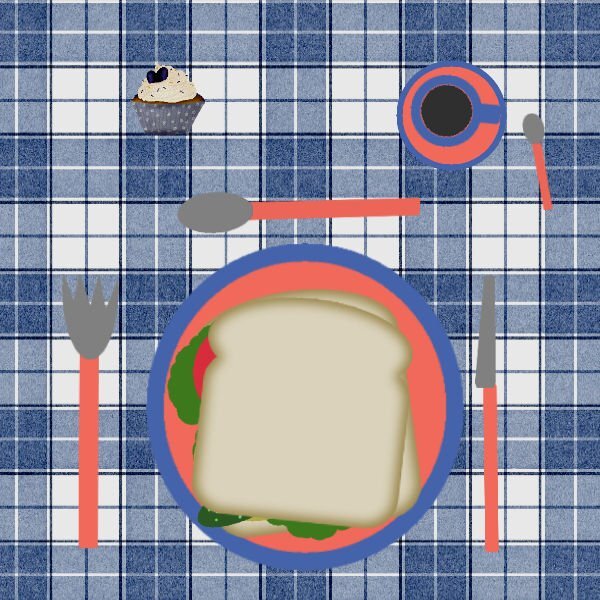
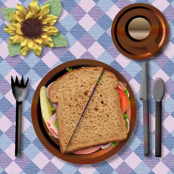
Gotta use only the "finest" wedding reception ready "Great Value" brand decorative paper plates, saucers and cutlery. And the sandwich would be a "Dagwood" version of Carole's club sandwich.8 points
-
7 points
-
7 points
-
Here it comes @Mary Solaas LOL. (2nd upload...I deleted the first one and subsequent post...wanted to lighten the background a bit). Now that I'm in the groove being registered in the class, this one is "Project 1".6 points
-
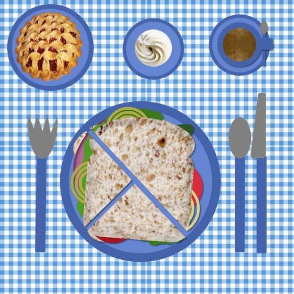
Well my first 'play' with 2023 did not go well - I think I overworked my pick tool as it refused to work after a couple of resizes - all it would give me was a red circle with a diagonal line through the middle. I checked and closed all open images, I ran uninstall and did a repair, reboot psp and pc ... still nothing. But now works as normal on other images just not my day 1 project. I am sharing lunch with a friend who prefers her sandwich in quarters, we have a pie and cream for dessert.6 points
-
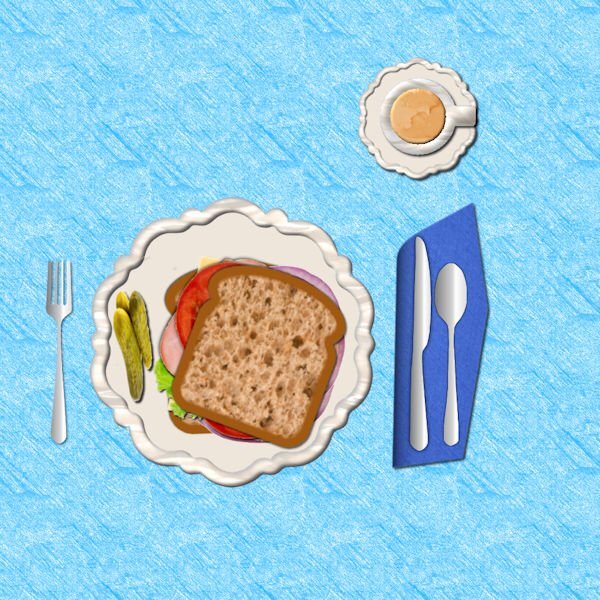
I now only eat whole grain bread, Arnie's" that is made in Michigan. There is only one place near me where you can purchase it. It is the best bread that I have ever eaten and fits right in with my diet. I made the bread with a texture from Canva. The pickles, ham, cheese, onion and lettuce are also from Canva. The silverware is from some that I made with vectors. The plate is from a previous Bootcamp. The coffee texture is from CF.6 points
-
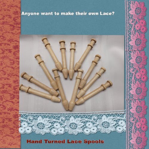
Hi everyone, I seem to have missed the email for Monday (Day 2) but since I am a returning student I'm sure I'll make out OK. I just got a new laptop and am still getting things set up, but here is my attempt at Day 1 project 1. I am a woodturner so the picture is of some Lace Spools I was asked to make this summer.5 points
-
You did GREAT. I wish I had thought to put a stirring spoon on mine for the coffee. Your background reminds me of MANY picnic tablecloths that my mother would use over my growing up years. Keep it up !5 points
-
4 points
-
The only person's work you should be comparing yours to is your own. It's not a contest, it's about learning and improving your skills. ❤️4 points
-
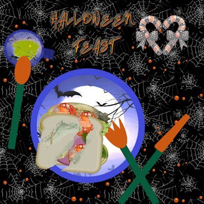
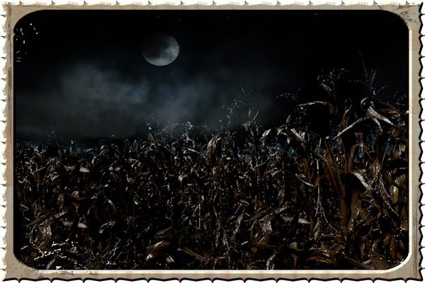
Great to see even more people joining in the fun! @Michele Yes, it is very important to identify what version you save your workspace from because PSP won't tell you if you use a different version, and problems will come in later. @Donna SilliaKeyboard shortcuts or shortcuts on the workspace will just be the way to go based on your needs! Those plates for your lunch are fancy!!! @Carolyn Herrmann Welcome to the Bootcamp and the Campus. As Ann mentioned, you have to resize images to 600 pixels and save it in jpg format to attach them to your posts. @Ann Seeber Having done this bootcamp a few times, you must have quite a collection of sandwiches by now! @Corrie KinkelIt looks like you are on a picnic table with that wooden background. @Anne Lamp I think this is the first time we have had a Halloween sandwich! @Jeni Simpson I have considered using more realistic elements in the sandwich exercise but it is so much fun to see what everyone finds when they are searching for replacement components! Where did you find all your ingredients? @Daniel Hess Quite nice dishes too! And matching cutlery! @Euka It is a strange behavior for the Pick tool. @Carolyn Don't ever start comparing yourself to others. Some have done the same exercise half a dozen times. People are just having fun and so should you. It does not matter if you don't have flowers on your table or whole wheat bread. You did the exercise perfectly as instructed. That is all you needed to do. Keep an eye out for the first "real" project tomorrow. So far, it was a warm-up! And if you are not scrapbooker, try the projects anyways. Afterall, it uses the same tools in PSP than you would use for a variety of other projects.4 points
-
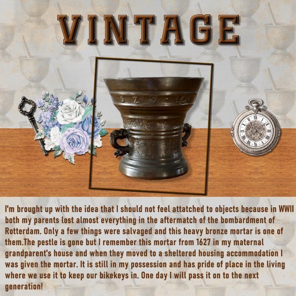
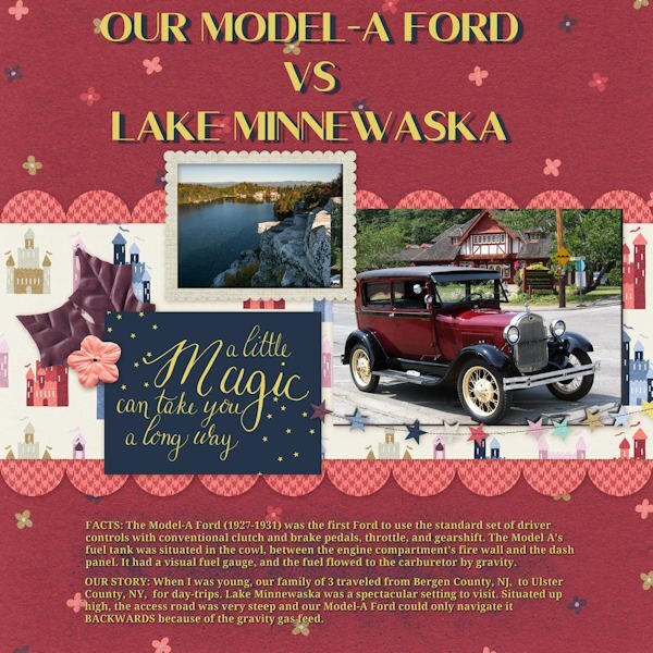
I have already mentioned that I grew up in Rotterdam in the years just after WWII. In the bombardment of the city and the fires that erupted my father and his mother and sisters lost everything and were staying with my dad's brother and his young family until they got an appartement in a undestroyed part of the city. They got furniture and titbits from people that had something to spare. They had only the clothes they were wearing, so they had to buy or make new ones too. Later in the war next to the house where my mother, her parents and sister were living was a school that was confiscated by the Germans. One day there was a air raid by the allied forces and that school was a target. In those days there wasn't something as a precise bombardment and the house of my mom's family was hit too. The front part of the house was in ruins but the backpart remained standing and the rescue teams found my granny hiding under the stairs. When the building was made more or less secure my granddad was allowed in to see if he could get some stuff out. Amongst it was this mortar that I later always have seen in my grandparent's house. My parents married after the war but it was extremely difficult to buy household goods, most things were still rationed and you could only buy with coupons that the gouvernement distributed. Because of all this my parents always emphasized that I should not become attached to things; in an emergency you could always loose them. I'm indeed not a person that accumulate "things" very easy and I have nothing personal from my childhood. Anyways I wasn't very fond of teddies and puppets etc. For this layout a made a tight diagonal background from a pestle and mortar that I had in my stash, the font is Classic Vintage and the elements are from Jessica Dunn's kit Vintage Blooms4 points
-
4 points
-
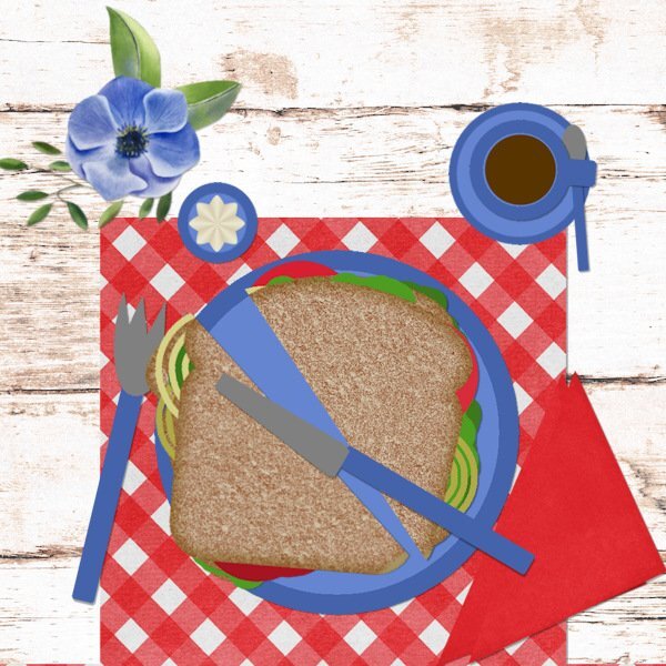
Lesson 2 - Sandwich It is a nice day and I'm eating my sandwich outside, so I use simple plastic crockery, a place mat and a paper napkin. I have a cup of coffee and a small bowl with mayonaise to go with my sandwich. I don't like pickles, so no pickles and no meat as well but extra lettuce, unions and tomato's. Even if I'm eating alone I like to have a flower and greenery for decoration.4 points
-
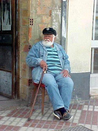
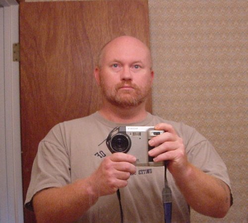
At some time during the bootcamp, I'll probably try to incorporate this photo I took in Santa Maria, Spain of this gentleman. Of course at the time I was using a 0.3 Megapixel Sony Mavica camera that used a 3.5 inch floppy disk as film. I have a ton of photos taken with that camera during my navy days. I've tried amping up some of those photos to 300 dpi (turning them into huge photos) but even hard for PSP's AI resizing capability to overcome some of the resolution difficulties. It doesn't do enough to let some of the other photo fixes to truly do a good job. See the other photo LOL for a look at the camera (and the photographer).4 points
-
4 points
-
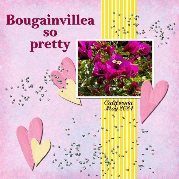
Here is project 1 and I used the photo I showed on my screenshot. I have done this bootcamp a couple of times now and I found it difficult to keep my layout simple as I nowadays use more complicated techniques. So really a good exercise to keep things more basic which I seem to have forgotten. But I found some papers to make my background, hearts and scatters in my stash.3 points
-
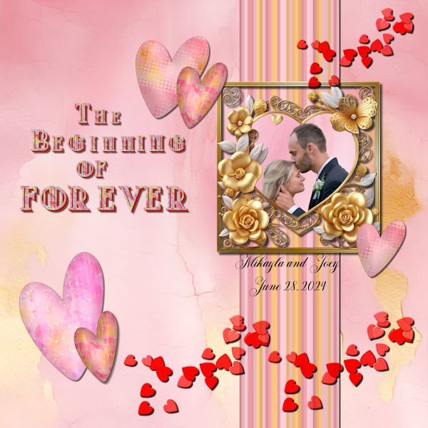
My beautiful niece married the love of her life. The background and the gold heart is from CF. I made the frame and the stripes (cass stripe2 script with colors from the background). the hearts were made with the dingbat font "Heart Valentine" from CF. I filled each heart with a variation of the background using FF to make different patterns. I used layer styles on the hearts to make the darker outline. The scattered hearts are from my build a kit with a blend mode added. The title font is called "Modecque" from CF. I added a pattern and extrusion to the font. The lower case for the font was the same as the upper case but smaller. I made some of the text smaller using the pick tool and snap to guide. I used the following cass scripts for the title: alpha sheet separator; alpha file stacker; and text creator. Carole, the alpha scripts worked perfectly in . The title was done piecemeal in the text creator because I didn't want to have to keep resizing.☺️3 points
-
That is such a great photo! Very classic seaman kind of image. Nice layout as well.3 points
-
@Daniel Hess I love the picture of "The Old Salt". Can't wait to see how you will use it. Love what you have been doing on the Campus.3 points
-
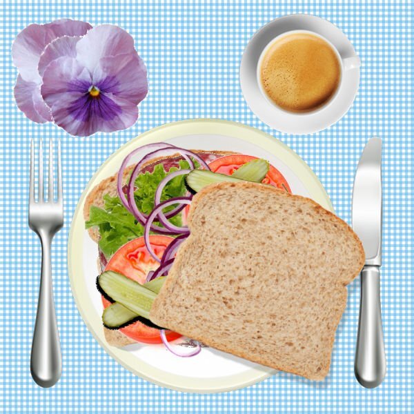
Carolyn, welcome to this Workshop! We were all beginners at some point here. The most important thing is to understand the technique, and you did great, even adding a cupcake to the table!3 points
-
3 points
-
Carolyn, I join the others who are reminding you that you don't ever need to compare yourself or your projects with others! We all learn slowly, then get better, and develop our own ways of doing things and find our personal styles. It can take a long time, but it's so much fun along the way. I like to remind myself: learning something new is HARD until it gets easy!2 points
-
My main hobby back in the 1980's was doing needle work projects like counted cross stitch or using plastic canvas and yarn. I did mostly counted cross stitch. I did a lot of birth samplers for the births of cousins' children or wedding samplers for friends. I got a magazine with patterns every month and they were usually quick and simple projects in series that were released over the span of several months. One of those series was for the 50 states. I made 3 of the Ohio (one for Mom, one for me, one for Grandpa). I made a Florida for Grandpa. Other states I made for gifts included Texas, Pennsylvania, Illinois and Michigan. Then I got the bright idea to make each state and have a quilt made from them. My step-grandmother had done quilting and was willing to do it. So I started making the states in 1990 and got 13 of them done. Then I left the job I had (it was a 2nd shift secretarial job in a hospital and during slow times the tech and I would cross-stitch). Then I went back to school and got a different job. No more time for this hobby. Then my step-grandmother passed away. So I left the idea of the quilt behind. A couple weeks ago a scrapbooking designer friend kept posting about a cross stitch project she was doing and it got me interested in it again. So I dug my stuff out and found a sampler that was about half completed so I started working on it again. I also found that I had actually started my 14th state for the quilt and will work on it next. I do want to finish all 50 states and will have to figure out how to display them since I don't know anyone local that quilts. I was thinking of a wall hanging but I saw an idea yesterday in a cross stitch sub-reddit that really intrigues me. That person showcases projects they don't frame in a portfolio. So now I'm thinking of using a scrapbook for this project! As for DIY stuff like your project, I don't do things like that!!!2 points
-
Mary you are on a roll! Nice to see you are continuing this workshop after your trip. You did a great job so far and the lessons can be used in all kinds of projects.2 points
-
Hi! I am using PSP 22. My workspace is standard settings with the dark background. I have 80,000 photos on my computer so picking an image won't be difficult. I might use the one below. It depends on the tutorials. I was a member of the now defunct Artistry In Paintshop Pro group so I am a bit rusty. Looking forward to getting started. Ok...so I just tried to attach the image and the file is too big. I screenshotted the photo. Too big. I cropped the photo. Too big. So might not be sharing my finished Scrapbooking. UGGGGGGGG2 points
-
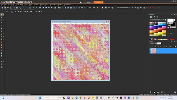
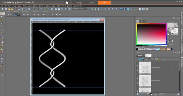
I like to keep my workspace dark. I have a 27 inch screen so I like to have my shortcuts in the middle, along with my scripts palette. Due to my incoordination and eyesight prefer clicking a short cut rather than using keyboard shortcuts except for the "f" to bring up the fill bucket. I learned the hard way to always save my workspace. I have my favorite scripts--directional tubes, open as a layer, clip to it --bound to the task bar. I plan to use the picture sometime during the Bootcamp. It was originally created in kaleidoscope and then treated with a FF effect called "spatter painting."2 points
-
Over the years, I've changed up my workspace. This is my latest. I have a bunch of shortcuts on the top toolbar for things I use often, including scripts. I have a few on the layers palette, too. I use Auto Hide on palettes I want access to without having to take up space. I haven't decided which pics I'll use, but here's one I might.2 points
-
2 points
-
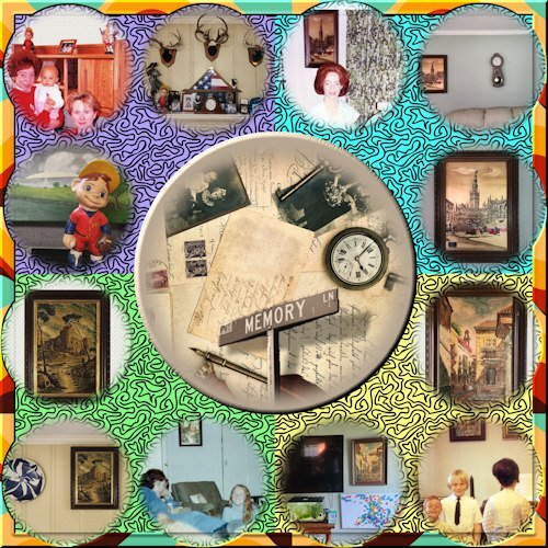
It sort of tells the story itself but there is some additional "back-story". When my siblings and I were VERY young, my mom's sister, Aunt Molly was into ceramics and made each of the three (at that time) kids a figurine. She painted them and made sure the hair color was correct for each kid. Mine was the baseball kid. (PS, my brother Rick's is in one of the pictures, the blond astronaut). After my Mom passed away in 2005, I came back into possession of "my" figurine". Also, I had always loved the three gold leaf paintings they picked up in Spain and I now have them displayed in my home. One item each inner corner with two additional photos, showing the item displayed in my parent's home back in the day, and one showing the item displayed currently in my home. Additional note...with the figurine, when I joined the Navy, my Mom incorporated it into the home decor whereas previously it had always been in my bedroom. Also, my grandmother made each kid a ceramic lamp with the same hair color thing (I think Molly and she were attending a ceramics class/workshop together at the time). Mine was unfortunately broken at some point in the past.2 points
-
First of all, come and say HI once you register for this Bootcamp. We want to know who else will be there, on our side to cheer everyone up. Everyone started as a beginner, so don't ever compare yourself to others. You will learn one tool at a time, one concept at a time and you will create one project at a time. Everyone will have different photos and possibly different supplies so every project will be different. Once the Bootcamp is started, on September 16th, 2024, you can post your projects in here. Remember to resize your images to about 600 pixels AND save them in jpg format, before uploading them to the gallery (check this tutorial to upload to the gallery) so it won't slow down the site when we have lots of your masterpieces. Try to follow the tutorials at least enough so that we can recognize what lesson you completed. Now, let's get ready! If you missed the registration link or if you found this thread before I announced it (some people are very observant), HERE it is. Share it around if you want. Although this Bootcamp is mostly meant to help beginners, we won't exclude anyone for "excess experience". Some participants are back for a second (or third) round. You are always welcome. Remember that it will be the exact same tutorials so don't be surprised. I am sure you will now do something slightly different than the previous time. Since anyone can follow the whole Bootcamp using the trial version of PaintShop Pro, this is a perfect opportunity for anyone to give it a try and see how they like the program, so share with your friends who MIGHT consider using PaintShop Pro. The 7 tutorials will be spaced out over almost 2 weeks. This should make it easier for participants to follow without feeling stressed (it should never be stressful!).1 point
-
1 point
-
1 point
-
1 point
-
I always save my workspace after I make any changes. Keep in mind that the workspaces only work in the version of PSP they were created for. When I save mine, I always add the version # and date I saved. I learned the hard way.1 point
-
1 point
-
1 point
-
1 point
-
I also use a laptop and it means a lot of scrolling. I like this idea of floating the materials palette! Thanks.1 point
-
1 point
-
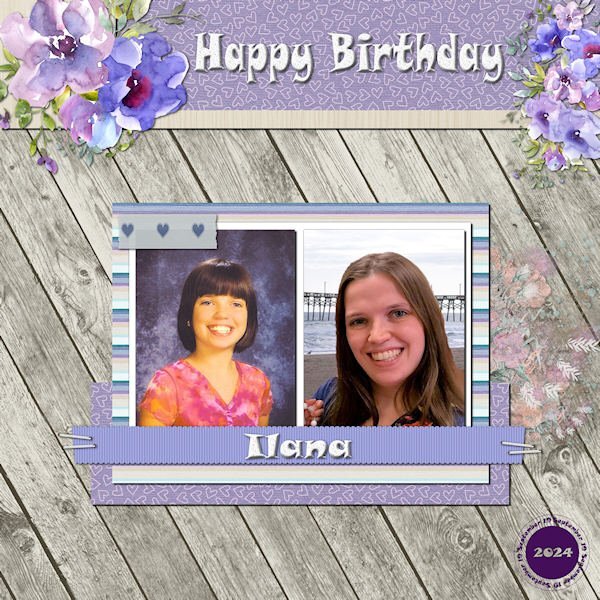
My granddaughter has a birthday Thurs Sept 19 so I made this layout as a birthday card. She's 10 in the photo on the left and 26 this year in the current photo on the right which I treated with PSP's background replacer ai. I used a Marisa Lerin template (ps_marisa-lerin_32814_layout-template-470_pu) and a mini kit called Winter. The font is Snap ITC. The watercolor flowers are from my stash, and I used cass-Datestamp4 script. The splash is ap-cherish-mini-el-paint-transfer.1 point
-
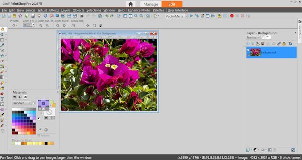
Lesson #1 This is the setup for my workspace and I have the Materials Palette floating. I work on a laptop and although it has a relatively big screen I have to scroll much and by having the Materials floating I can move it out of the way and still have the Layers Palette in full view. Further more I have a couple of shortcuts on my toolbar for the functions I use most, which probably will be different for everybody and the same goes for the Layers palette. This screenshot shows one of the photos that I'm planning to use. I intend to use more flower photos from my last visit to California.1 point
-
1 point
-
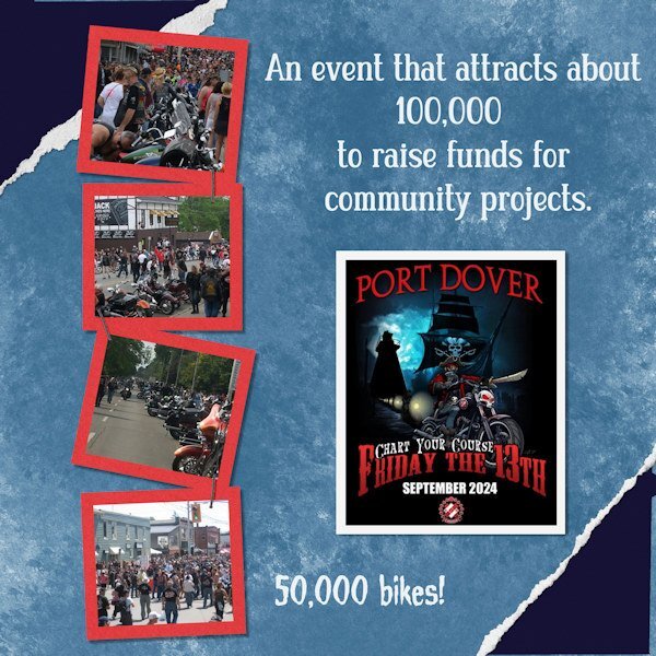
When I saw Anne Lamp's Friday the 13th layout, it reminded me of the huge event that takes place every Friday the 13th, no matter the month or the weather. Port Dover is a town on the north shore of Lake Erie which has hosted a motorcycle rally since the 1980s. The place is literally taken over for the festival with large numbers coming for many different places. It's a peaceful get-together, but not quiet! This one, held last Friday, enjoyed beautiful summer-like weather. Photos from online, since I wasn't there. 😔1 point
-
And here I thought I was weird b/c walking into office supply places always gets me ready to buy! I think it's a holdover from all the years of teaching when late summer meant a trip for new goodies!1 point
-
Sharla if you have the time to watch the class, it was really a fun class and the 4 projects that were shown are relatively easy to make!1 point
-
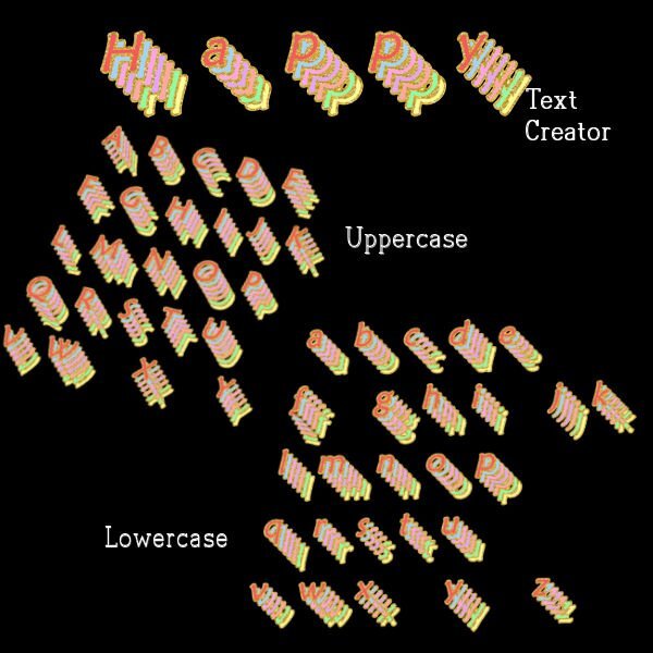
I am still fascinated by various fonts. The font I used is a called maiandra is my computer fonts. The font pages were originally created in Photoshop from an editable text effect called "soft" that I downloaded from deeezy.com. Once I made the letters in Photoshop, I saved them as pngs and opened them in Paintshop. I used the script alphasheetseparator from cass, then the Alpha stacker script and finally the Text creator script. All the scripts worked perfectly in PSP Ultimate 2023.1 point
-
1 point
-
Hi, Ann you beat me to the line-up! I have taken this bootcamp a couple of times before and always try to do so once a year. It is a great rehearsal of the basic techniques! I started my scrapbooking journey in 2020 with a bootcamp and I have no regrets whatsoever doing so. A warm welcome to the newcomers and don't be intimidated by us regulars because we vividly remember our first steps into scrapbooking. Who knows maybe you inspire us with your input and it is always nice to welcome new scrapbook enthousiasts! See you soon.1 point
-
That is so nice. Is that black walnut on the edges? that's going to be a very unique brand on her boards, a little extra art for the recipient..1 point


