Leaderboard


Popular Content
Showing content with the highest reputation on 09/13/2024 in all areas
-
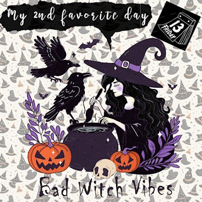
My Friday 13th page. of course her most favorite day is Halloween.
 5 points
 -
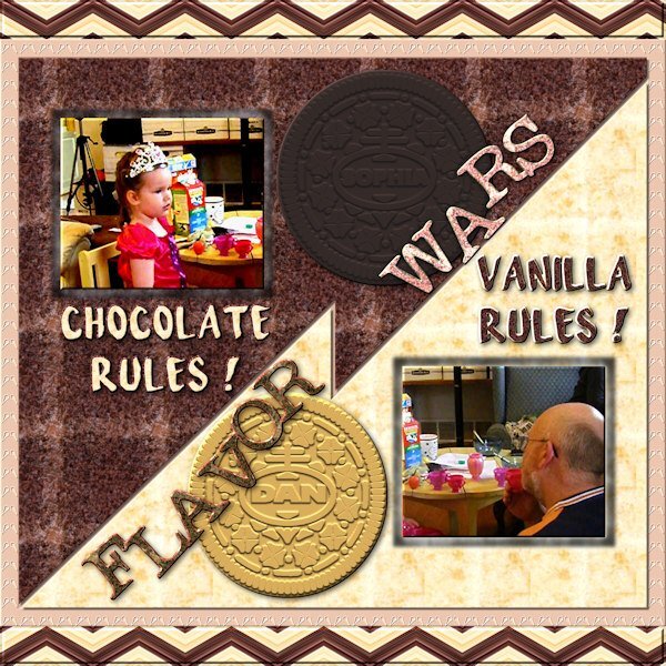
Another project been working on and finally finished. Granddaughter is 16 now and we haven't been having that exchange for a few years but when she was small for several years, I got her going during visits and on the phone (they live in Austin TX) by telling her Vanilla RULZ !
5 points
-
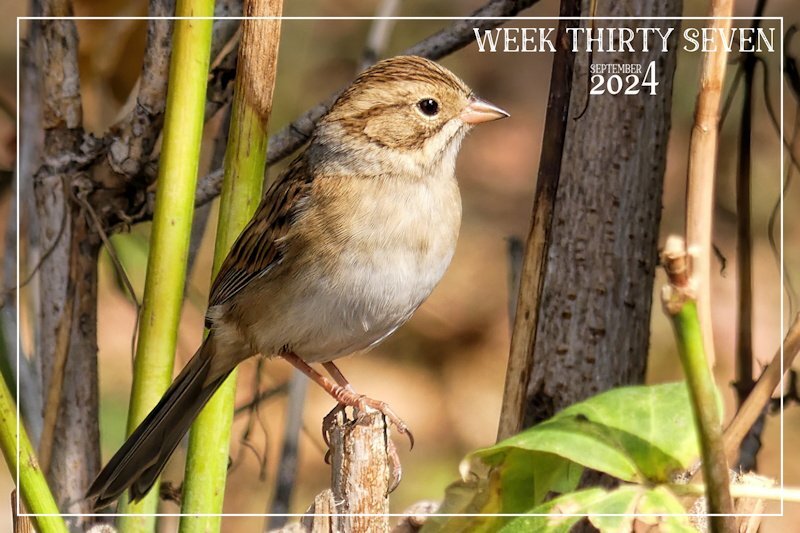
Week thirty seven. The migratory birds are arriving on mass. They must know something that we don't, when it come to the weather. The leaves are turning and falling quickly. A most delightful small native Clay coloured song sparrow. I am currently in my element.
4 points
-
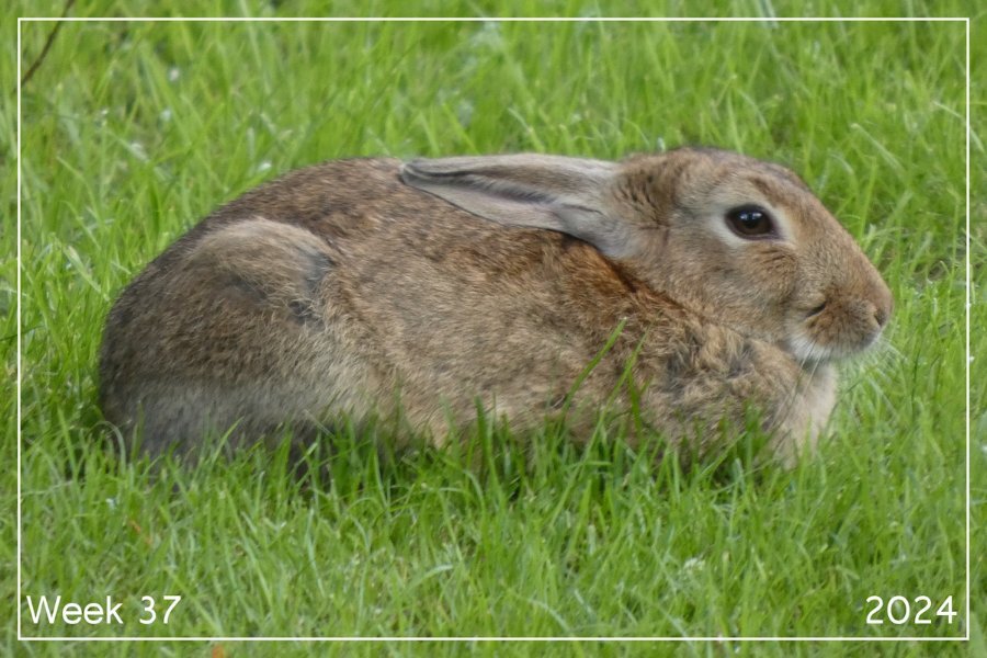
Week 37 I was fortunate to meet this delightful rabbit whilst on a walk. He was having a quite moment so I kept my distance and let him be.
2 points
-
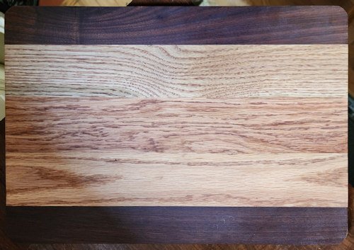
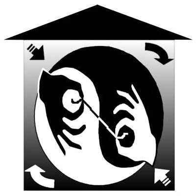
Actually I modified the "brand"...when you look at this...the black will be raised i.e. burned into the wood and the white will be blank. Got it ordered...will be "small", essentially about 1.8" x 2.0".
2 points
-
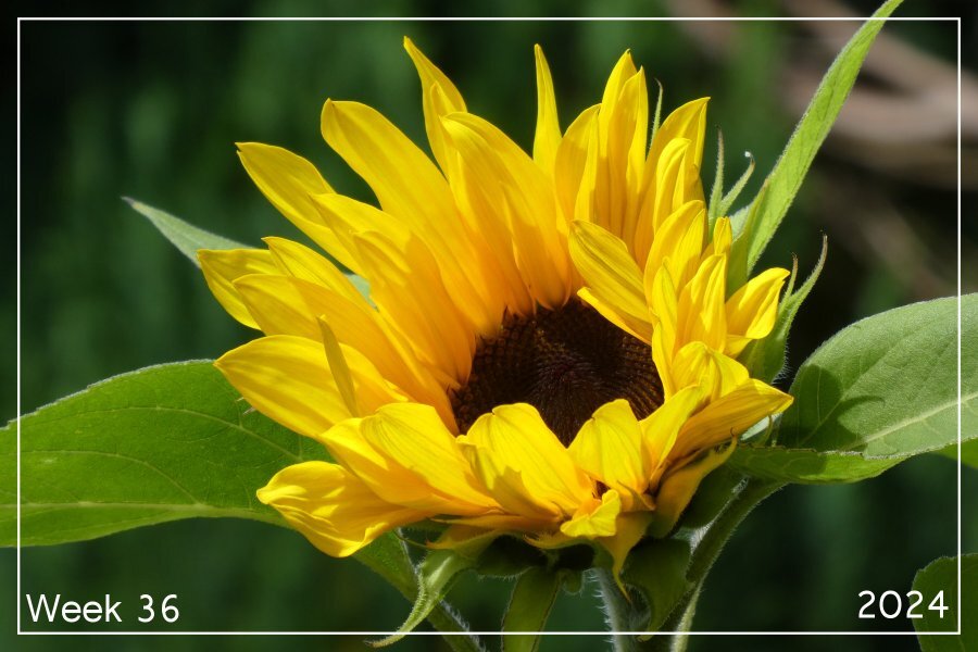
Week 36 I managed to grow some really tall sunflowers this year. This is one of them.
2 points
-
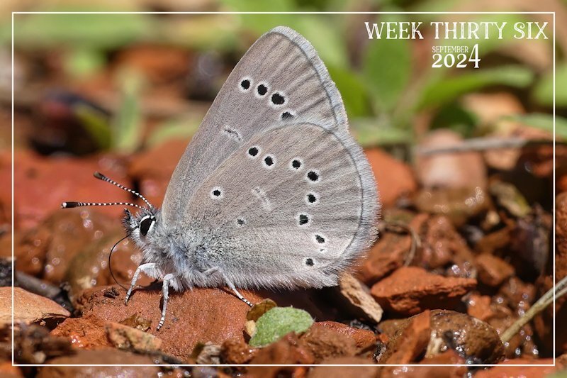
I was to early posting week 36, which meant I posted it in the month of August. Week 36 of 2024, is from 2 Sept to the 8th Sept. Earlier weeks should be posted in the month of August. I like to adhere to the right weeks in the right months. I have deleted this photo in August. Teeny tiny Silvery Blue Butterfly ( male) Photo taken this week. Macro photography.
2 points
-
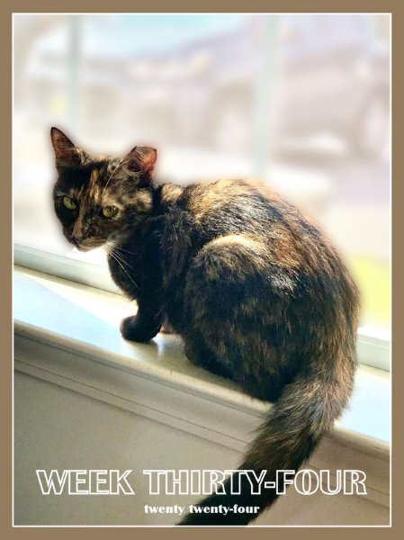
My Week 34 - Sept 1, 2024, TNR rescue cat Brandy, the tortoiseshell teen! It seems she won't stay in the house, so she has resumed outdoor meals. My 2 senior indoor cats are vastly relieved! 😅 UPDATE: She's back inside, quarantined to the bed/bath again. She ran because the seniors were bullying her. We have to work on that.
2 points
-
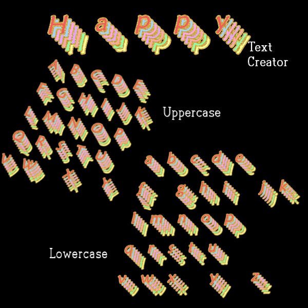
I am still fascinated by various fonts. The font I used is a called maiandra is my computer fonts. The font pages were originally created in Photoshop from an editable text effect called "soft" that I downloaded from deeezy.com. Once I made the letters in Photoshop, I saved them as pngs and opened them in Paintshop. I used the script alphasheetseparator from cass, then the Alpha stacker script and finally the Text creator script. All the scripts worked perfectly in PSP Ultimate 2023.
1 point
-
Sue I hope that the period of the migratory birds will take some time before all are gone. You enjoy this immensely and we get the benefits with all those lovely photos too!1 point
-
Yes Julie it is the same plant and it is mostly white but over here some can have a pink touch!1 point
-
1 point
-
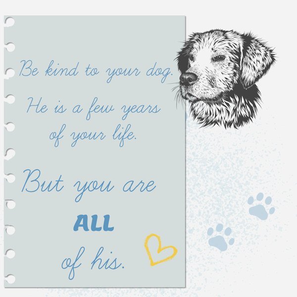
Just a few words on notepaper using the font (not my notepaper b/c I don't have the ripped edge script yet!). I saw these words online and they rang true for me.
1 point
-
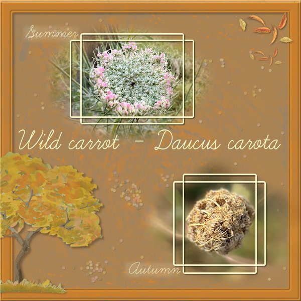
I didn't go for a school theme as well. This font is so easy to read that I probably am going to use it often. Besides the frame by Carole I made the rest from scratch with a lot of different blend modes and reduced opacities. Both my photos are from the same wild carrot in the small meadow where I often pass by. When the plant dies down it makes a tight ball over the seeds in the flowerhead which give it its nickname "vogelnestje" (in Dutch) and that translates to birdnest.
1 point
-
Here is the cutting board and the finished preset shape (to send in to be made into a "branding iron"). This is her first one and she is sending it to a friend in Florida.
1 point
-
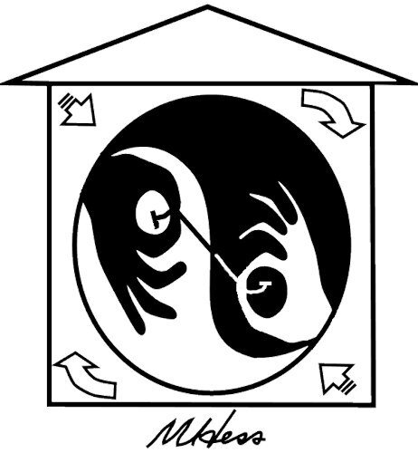
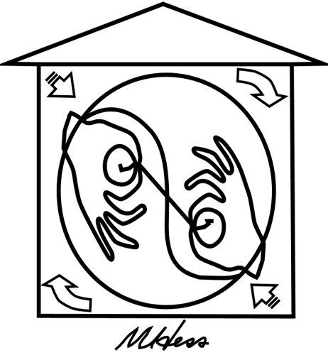
Most current project. My wife is a Feng Shui Master (studied with Joseph Yu in Toronto) and at some point about 25 years ago, she commissioned an artist to design a logo for her. The artist came up with two and she chose and mostly has used one of them over the years. She is now into woodworking and is making kitchen cutting boards. She wanted to turn her logo into a branding iron (type "branding iron for wood" into amazon.c o m). I am turning her logo into a preset shape outline that can be used to make the branding iron. Obviously it won't have the yin/yang COLOR scheme but I can make the outline so it is definitely HER logo and can be turned into a "one-dimensional" (?) tool to "sign" her woodwork. Here is the logo I'm starting with.
1 point
-
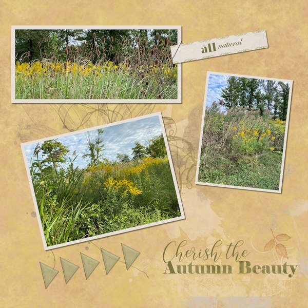
These pix are from a small natural area near where I live where I sometimes walk the dogs. We did today and I was impressed with the fall vibes there and actually had my phone with me (a rare occurrence on a walk). I should carry it with me more often, I suppose. I love autumn, and I wait patiently (?) all through our stifling, humid summers for the cooler, drier days which have made an appearance lately. Feels like coming alive again!
1 point
-
Shot taken by Jacek.
1 point
-
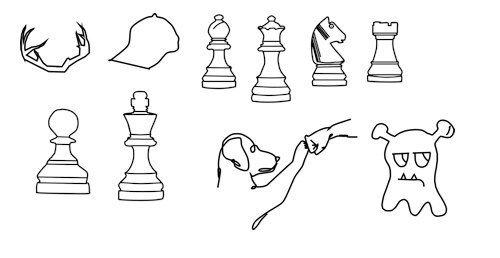
Among other things, been playing around with creating pre-set shapes (vectors) a little bit. The last one was one that I converted from some I found that were listed as vectors (I think psd format?...for photoshop?) but really weren't so had to work on it in PSP. I'm hoping I saved the chess pieces as pspimage because I did something wrong...the shapes in the preset shape drop down do not match up to the shape that gets drawn . When I do the shape, the names are correct in the vector objects so not sure where I went awry on that.
1 point
-
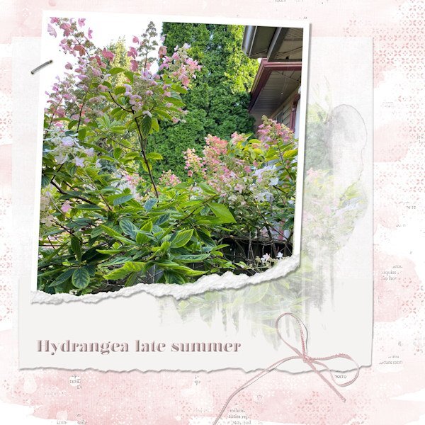
Finally got something together. I've had some pix I took of the hydrangea near my deck. I love observing how the colours shift from creamy white to light pink to dark pink. Mother Nature and her palette at work. I used the photo in a mask on the white layer, and then put the pic into a ripped frame. Got the idea from elsewhere and wanted to try it.
1 point
-
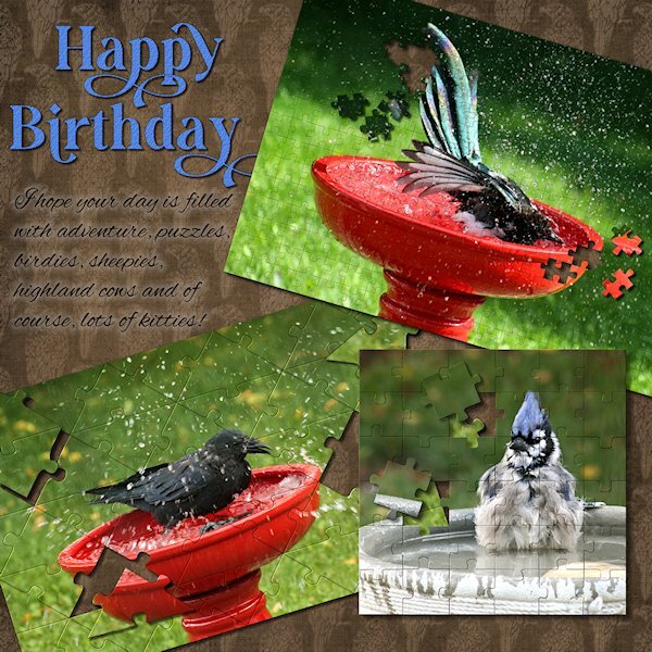
This was a quickie for one of my best friends (since we were 12 yrs old!). She recently moved to Scotland (7 hours ahead of me), and I left it until the last moment - life happens, right? She loves birds and puzzles and all the silly stuff I wrote about. I used 3 different puzzles and a HUGE THANK YOU to Carole for helping with an issue. They are really fun to play with. And good if you need to do a layout quickly (although no layout is ever quick for me). Fonts are Gravity Wanders (CF) and Alex Brush (from a freebie sight). And I re-used the tight diagonal paper from the Lab 14-9.
1 point
-
My friend, Maryann, is a self taught cookie decorator. I think her work is amazing. I gave her the car cookie cutter, thinking she might use it for weddings. She created a completely different design and turned it into a pickleball car! She also made this cookie when a new pickleball venue opened here. She used the company colors and changed the wording, etc. Needless to say, they loved it! Heart cookie cutter by Brooke Gazarek at Digital Scrapbooking. Turner and rolling pin by Jessica Dunn, Baking Days at Digital Scrapbooking.1 point
-
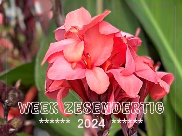
Where I live we have a small station with 2 platforms and of course there is a pedestrian crossing which everybody can use to cross the tracks. This year there are big containers with nice greenery and flowers in the square and as I have to use that crossing almost daily I enjoyed the flowers. The planting in the containers is changed as soon as it begins to wilt or dies down. Now there are Canna's in them with an underplanting of Pelargoniums. It was impossible to get a good photo without people in it and most people aren't happy when they think you are taking photos of them unasked. I didn't want those people in my photos anyway so no photo of the containers but a detail of the Canna in them.
1 point
-
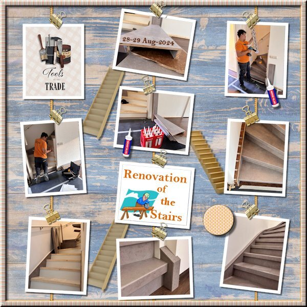
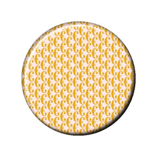
I had a lot of pictures from our recent stairs renovation and wanted to do something with them. I tried different templates and in the end decided on cass-Hanging Photos 2 template because it had the number of photos that I wanted. The background is made from 2 "wood" papers from 2 different kits by Jessica Dunn and blended together just as the journal card. The stairs and the carpenter sticker I found on kisspng; the glue bottle is from a DIY-kit by Chantahlia Design. I like the Lab 14-09 tutorials and made a tight diagonal with the € sign instead of the $ sign, not all fonts have that €! I think that are probably older fonts and the euro currency is only since 1999 in existence. Our new stairs didn't came cheap and therefore I wanted that € for this layout. But in the end it was way to overpowering and I made a flairbutton out of it. Last I made a striped ribbon, also Lab 14-09 with a very faint blinds texture and used it for a frame. It has become a whole list.....
1 point
-
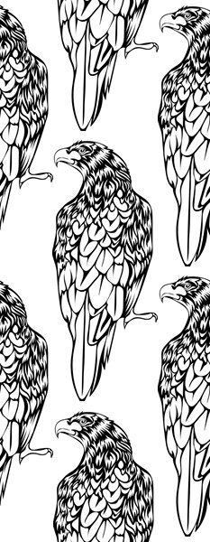
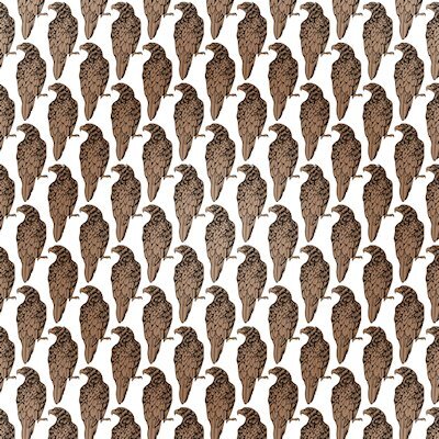
Here's what the tile looks like and I colored just the hawks by selecting (magic wand -opacity) the transparent parts and inverting the selection, then flood filled on separate layer with a gradient.
1 point
-
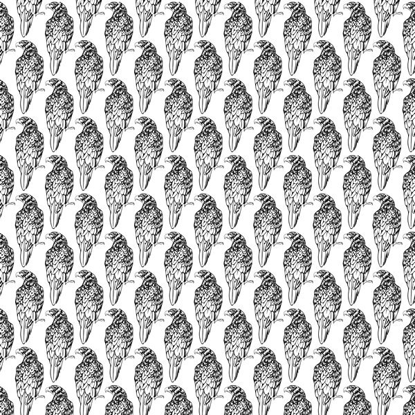
here is the outline version of the what the Tight Diagonal looks like. I would be a very busy paper at that size.
1 point
-
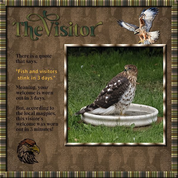
Lab 14-9 or Sketch 13, you decide. I started out doing something for the sketch challenge and ended up watching the tutorials for the most recent Lab (14-9). the items are: Striped Ribbon (2) Tight Diagonal The Striped Ribbon turned into the frame around the outer edge. I added a texture (blinds) and some noise and then duplicated and made a frame that I beveled. This is a quick and very easy to do tutorial. I kept my layers separate so I could decide on the background color (dark green looked better than white - it looks like black lines in the frame, but it's actually a dark green). The Tight Diagonal is really cool and easier than I expected. I did graphic of a hawk line drawing I found at Creative Fabrica. Then I used a blend mode and lowered the opacity as it was really busy and dark. Remember this tutorial when you do the Build A Kit next year, it will make for great papers. The hawk flying in and the hawk head are from Creative Fabrica and I changed the color of the feather on the head, used a blend mode, lowered the opacity and used the eraser tool to grunge it up a bit. Fonts are from Creative Fabrica; Gravity Wanders (Title and the journaling) and Gudea (yellow quote), Gudea might not be from CF. Background paper is Brook Gazarek (Digital Scrapbook). The birdbath I had took off the pedestal for a crow that had a bad leg a month ago. It turned out to be the favorite of the birds and squirrel this yr. This hawk flew in and stayed in the bath (it was hot out) for more than 20 minutes. The magpies gathered and watched very intently and then a lone little blue jay flew in to a branch 3 feet above the hawk and gave it a good talking too. All the birds were well behaved as this was big bird. When the Merlin flies in, the magpies endlessly taunt it and nip at the tail feathers. It's a much smaller bird. It was very exciting. I don't know what kind of hawk it is.
1 point
-
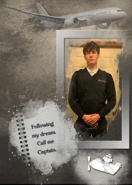
I was fortunate to receive a recent photo of my great-nephew who is about to start his Aviation School training (his long-term dream) at Sault College in Northern Ontario. As always, more challenging to make a "male" layout, but I can live with this version. He has worked so hard and done so much preparation for this venture.
1 point


Resized.thumb.jpg.d25811db03a63358cedab1e79f527635.jpg)