Leaderboard
Popular Content
Showing content with the highest reputation on 09/07/2024 in all areas
-
I have posted 7 projects in the Gallery under the Workshops/Masks Workshop after I got motivated and did the workshop a couple of weeks ago.5 points
-
It took me forever to eat the car cookie...I did finally give in and enjoy it!4 points
-
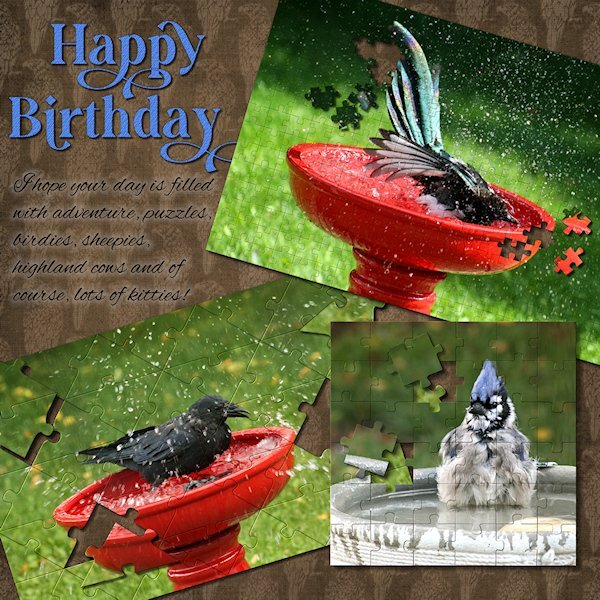
This was a quickie for one of my best friends (since we were 12 yrs old!). She recently moved to Scotland (7 hours ahead of me), and I left it until the last moment - life happens, right? She loves birds and puzzles and all the silly stuff I wrote about. I used 3 different puzzles and a HUGE THANK YOU to Carole for helping with an issue. They are really fun to play with. And good if you need to do a layout quickly (although no layout is ever quick for me). Fonts are Gravity Wanders (CF) and Alex Brush (from a freebie sight). And I re-used the tight diagonal paper from the Lab 14-9.4 points
-
3 points
-
I'll eat almost ANY cookie, pretty or not. But such lovely edibles must taste more delish.2 points
-
Susan, I love the birthday card and how you used the Puzzle Script. What a great idea to use it on a card.2 points
-
My friend, Maryann, is a self taught cookie decorator. I think her work is amazing. I gave her the car cookie cutter, thinking she might use it for weddings. She created a completely different design and turned it into a pickleball car! She also made this cookie when a new pickleball venue opened here. She used the company colors and changed the wording, etc. Needless to say, they loved it! Heart cookie cutter by Brooke Gazarek at Digital Scrapbooking. Turner and rolling pin by Jessica Dunn, Baking Days at Digital Scrapbooking.2 points
-
1 point
-
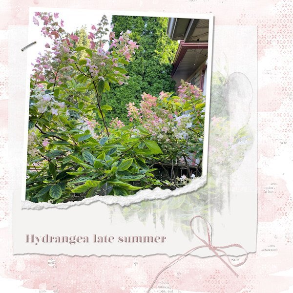
Finally got something together. I've had some pix I took of the hydrangea near my deck. I love observing how the colours shift from creamy white to light pink to dark pink. Mother Nature and her palette at work. I used the photo in a mask on the white layer, and then put the pic into a ripped frame. Got the idea from elsewhere and wanted to try it.1 point
-
I ALWAYS think of things I should have done to a layout after I've put it away! And you're both 59? The next decade is approaching....!1 point
-
Brilliant layout Susan. No wonder your BFF enjoyed it. Making personalized greetings is so much more meaningful than a Hallmark card sometimes.1 point
-
Thank you Corrie. the little 6x6 puzzle is really fabulous because each puzzle piece is on it's own layer and it asks if you want to group them (I did) so you can take the whole group into the layout as is. then I could choose which pieces to pull out. I wish I had moved the smaller ones to the background so it would look like pieces on a puzzle mat, I thought of that later. I did duplicate the layers of pieces I took out (then hid the layer) so I could rotate the pieces. If in the future I wanted to put them back I would just hide the rotated one and unhide the orig. The other two puzzles you choose, with the brush tool, which ones you want to separate. They are fun scripts to use. My friend really liked the layout...she did not like that we both are now 59! How did that happen?1 point
-
1 point
-
1 point
-
T = Turkish Taffy When I was a kid, it was a special day when I ate Turkish Taffy1 point
-
1 point
-
1 point
-
1 point
-
1 point
-
1 point
-
1 point
-
I just downloaded the cass-Puzzle6x6 and tried it on a square image (2527 x 2527 px) and I am getting an error saying the preset shape is not there (in the preset shapes folder), but it is. I tried putting the pspshape in again and same error. I got the error the 3-4 times I tried. Closed PSP then got it to work but the puzzle pieces are odd, missing the puzzle lines in some parts so the pieces are twice as long. Not sure what's happening or what I did wrong. Here is some screen shots. The error is line 147. this is what the red error says: ---------Command Execution Failed--------- Command Name: PresetShapes Error Text: Specified Preset Shape not found. Traceback (most recent call last): File "<string.", line147, in Do RuntimeError: Specified Preset Shape not found.1 point
-
thank you Sue, I didn't notice that at first, and now I'm under the gun for time to get it to my friend and before I leave for work. I have I think all of them with lines at the eyes. I should know better. Being in a hurry is not a good recipe for a good layout or an excuse for not paying attention (that's when I should be paying even more attention!).1 point
-
Thank you so much for your quick action with my troublum (yes, this is a word in my vocabulary....cross between problem and trouble 😁). It works like a charm and I got my layout done for my besties birthday tomorrow....which is coming soon as she is now 7 hours ahead of me (in Scotland). I appreciate the swift action. I will download the new ZIP so I have a copy of the new files. My image was fairly large so I understand also why sometimes it would make a double selection in a different area.1 point
-
Those cookies are a joy to see and look yummy too but it is almost a shame to eat them 🍪1 point
-
I think i have the explanation and the solution. The preset shape was not 100% accurate for the nodes, and on a very large image, the Magic Wand will find a "tiny gap" so it will select more than one section. Check your email for a replacement shape. If it fixes the issue, I'll change it in the zip file too.1 point
-
Aha! Here's the layers palette. I highlight one of the double pces. One layer is blank the other is a double size. Weird gremlins at work? I presume the other layers are like that. I could see the correct amount of layers I just didnt look close enough to see some of them were blank. Turns out my cache was already at zero, but I still did a clean up and my browser cache too. You never know, right?1 point
-
I closed PSP and then wanted to get a screen shot of the actual error to show you. So I opened it again and it ran this time and it seemed more like it was having a seizure, weirdly blinking and jerky movements. I ended up with the odd double sized pieces. I have emailed you a test run I did on PSP 2021 (as my 2022 hasnt been pointed to the new path yet). I have used two other puzzle scripts yesterday with no problems at all (the rectangle 20x15 puzzle, cass-JigsawPuzzle & the triangle one, cass-JigsawPuzzle2). And I chose to have some pieces out of the puzzle. That is very cool BTW. I needed to have a square format puzzle so I bought the one in the store. I did try the rectangle puzzle on it and the pieces were squishy as expected.1 point
-
Susan, and anyone else, may I make a suggestion. When I use a puzzle, or create photo block, I always make sure that the face, in particular the eyes are not obscured in any way. You can use many ways to rectify that, after running the script for the first time, to see what is where. Awesome photo of the Blue Jay.1 point
-
1 point
-
One little oddity of older scripts using other resources is that PSP does not always "know" you added those resources: it was not added to the cache. In more recent scripts, I have a code in it to clear the cache, but not in older ones. One solution can be to use the shape on a blank image. Another solution is to restart PSP. Now, I am a little "puzzled" (no pun intended): how do you get a puzzle done if you get that error?1 point
-
I think PSPs Background Eraser was the first tool I got really handy with in the early days...1 point
-
1 point
-
I agree a bow/knot will look great. a technique that fast to do, to make an element, can really personalize the layout. What I really like too, is that you can make so many elements with both the striped ribbon (2) and the tight diagonal and then add different textures and techniques to it. I think I'll start a list of tutorials to remember for when Build A Kit comes around again.1 point
-
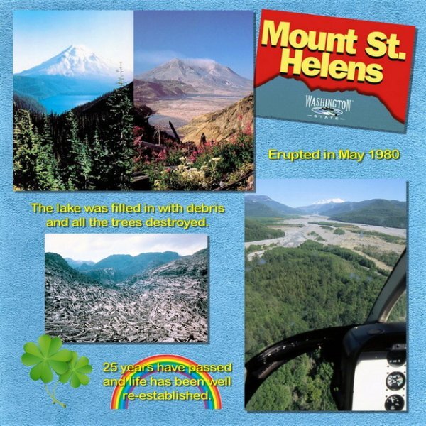
With all this talk about flights in helicopters, how about a sharing some of the photos you took during those flights, if any. Here is one of mine. Our most memorable flight was over Mt Saint Helens in 2005. This was 25 years after its major eruption. I found some images online to show what it looked like before and after. Then I added my photo from the helicopter flight over the valley. It was wonderful to see how much had been restored by Mother Nature. We even saw some deer wandering near the river. Life goes on.1 point
-
Thanks and those stairs reminded me of that game too. I even considered placing more of them in that manner, but in the end decided against it because it became way to much. I think as it is so easy to make a striped paper and use it as a ribbon I will probably make more of those with the colors of the layout I'm working on. A bow or knot will also look nice.1 point
-
Fabulous Corrie! Lab 14-9 is good one isn't it? Like Ann said, the flair button looks great. The striped paper (2) is going to be really good for frames, I also used the blinds texture, it makes it look like a thick ribbon. I like the colors you used in the striped paper. And, your placement of the stairs is neat, it reminds me a bit of the game, snakes and ladders. Your new stairs look great.1 point
-
Thank you, Cristina. She's a little manipulor and I fall for it everytime!1 point
-
How fortunate the timing of your last Scrapbook email. It arrived just a day before the episode with the Miramichi zip-line was aired here. We watched it last night and it sure looks like a beautiful location. Now I have another thing to put on my bucket list; to go zip-lining and visit more of New Brunswick. I was in New Brunswick as a teenager. I was an Air Cadet and learned to fly at Saint John Airport. Then for my solo cross-country flight I was sent to fly from Saint John to Moncton to Frederickton and back to Saint John. I saw a lot of trees from the air but I didn't really see much else. So a future trip to see it from the ground is in order.1 point
-
I love heights, but l[ving in the Netherlands which is flat there wasn't much of an opportunity to do anything that adventurous. But whenever visiting in Switzerland I loved to take the cable cars or chairlifts that are crossing a deep valley below. I have never come across the chance to do ziplining, but I think I will love it. A helicopter ride and hot air balloon are the most adventurous I did. Some steep mountain trails in my younger years as well and that is it!1 point
-
I have always wanted to do the zip line adventure. Any time we were somewhere I could do that I didn't because of my Hubby. He has a real problem withe heighths and would have been a nervous wreck by the time I got back down. On one of our jobs there were lights to be changed way up high. There was a old but safe wooden ladder we had to use (it shook a little). I would go up to change the lights and it was his job to hold the ladder and sweat for me. Other than some of the crazy things I did with my horse over the years, I have never done anything particularly adventurous.1 point
-
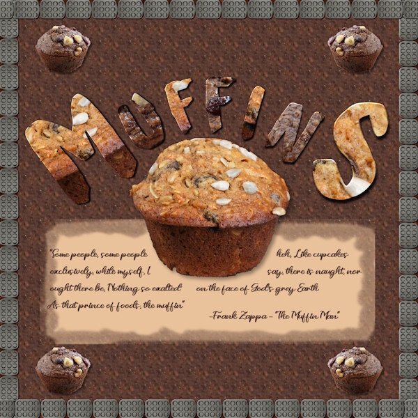
This one was pretty much a Dan original layout with Dan original Alpha characters. I didn't do the whole alphabet; I just created the characters I needed for this. I made a small script that will create the character after you size it and place it with black border and white fill on top of your chosen background and then put it in a layer on the project. I used two different muffins (the ones in the layout) for the backgrounds alternating and running the script for each individual letter. I used the Cloud Craft Font for the letters. The "caption" is a portion of the lyrics from the song: The Muffin Man done by Frank Zappa. He is sort of an "acquired taste" musically and some of my fellow hippies from the 60's and 70's will remember him LOL. I bordered it with a muffin pan turned into a tube. I think I could have done something different with the corners...I was unable to figure out a size and step to prevent the overlaps. Used the vector tube script to create each edge then the move tool to line everything up. Getting better but still learning (constantly).1 point


Resized.thumb.jpg.d25811db03a63358cedab1e79f527635.jpg)
