Leaderboard
Popular Content
Showing content with the highest reputation on 07/11/2024 in all areas
-
Ralph and I played in a pickleball tournament with no skill levels and no age groups, meaning we played all players regardless of their skill level or age. Ralph is almost 20 years my junior and we played a 20 year old and a 16 year old. I was by far the oldest player. We won the bronze medal. Template: MFish, You Did It 04.10 points
-
Nathan's Dairy Bar...a favorite and much visited place. CD digital scrapbooking template 339 (Chantahlia Design).9 points
-
This plant volunteered in my yard. Blue is my favorite color so you know I love this one. I learned so much making this layout. Bees have pouches on their legs to store pollen. The pollen of the Chicory plant is white. This flower is actually is many flowes...each petal is a flower.Chicory opens with the sunrise and closes around noon. Template 239 by Lady 22.9 points
-
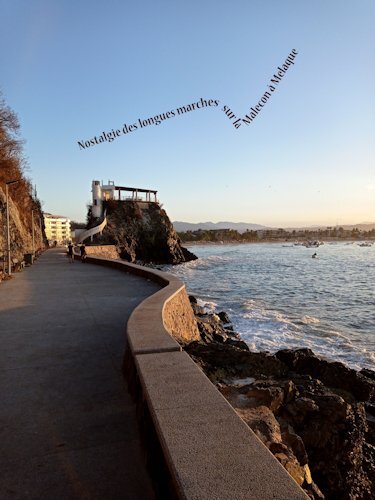
A little late but here it is. I was really surprised to look up and find this girl so close and willing to come closer! Fonts: Arial, Alphebet Soup Tilt BT (Curiousity), Sloppy Hand (wild and wonderful)6 points
-
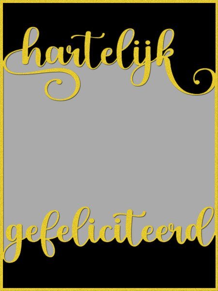
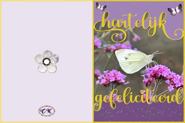
What about old-fashioned handy work after all the talk on Copilot, Spark, AI etc...... I wanted to make something were the text touches the frame and creates a kind of bounding box were you can put a photo, a paper. first I made a template with the Dutch text of happy birthday and the spaces in between are mask layers, so I can use it again with different photos and colors for a totally different result. Then I made a card out of it for my cousin who adores butterflies. I'm going to experiment a bit more with this technique, I like it6 points
-
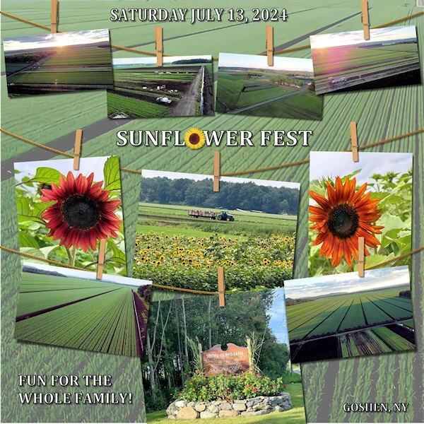
I found these photos on Facebook that were posted by Social Island Farm. I do love the black dirt fields of Pine Island/Goshen, NY. This is announcing a festival for this weekend. I used Carole's Hanging Photos script. The font is Cambria with a stroke. The background is part of one of the photos enlarged to full size and with 57% reduced opacity.3 points
-
I love this. I have been creating these to. I want to create more with generic sentiments (happy birthday, Merry Christmas, Happy New Year etc). It's fun to decide which "counter"(the enclosed space in a letter such as; p, a, b, e, q etc) space to add or subtract when you select the top and bottom portions with the magic wand. That butterfly and the flowers works so well with your template/mask.3 points
-
This is beautiful, Corrie! Great idea to use the Vector Spiral Script. I am slowly catching up with the comments and all the work posted... They are so inspiring!2 points
-
Bonnie, what an amazing experience! So close to this beauty... really a special moment.2 points
-
2 points
-
What a beautiful girl and an equally special and beautiful moment you got to have with her. I love the layout and the border is perfect for this layout.2 points
-
I've also used NightCafe; you can get free credits daily. https://creator.nightcafe.studio/ Some of the creations there are amazing. There are many style choices that, for me, are very confusing. Some of the creators share their prompts which is very helpful.2 points
-
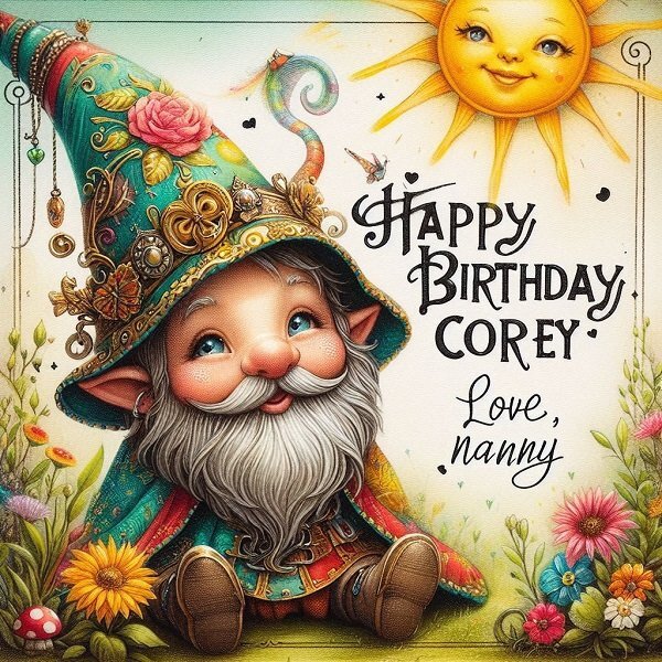
Trying out Bing Copilot's Designer mode, I created a birthday card for my grandson-in-law, Corey, who is married to Jackie, my zookeeper granddaughter. Corey is into horticulture in a big way. His gift to the attendees at their wedding was a small succulent in a pot to take home. Sticking with Anja's gnome theme, my efforts created this. Prompt -- A steampunk gnome in cheerful colors, his eyes hidden under his pointed cap, wishes Corey, 'HAPPY BIRTHDAY', the sun shines and there is an abundance of plants and flowers, signed Love, Nanny.2 points
-
2 points
-
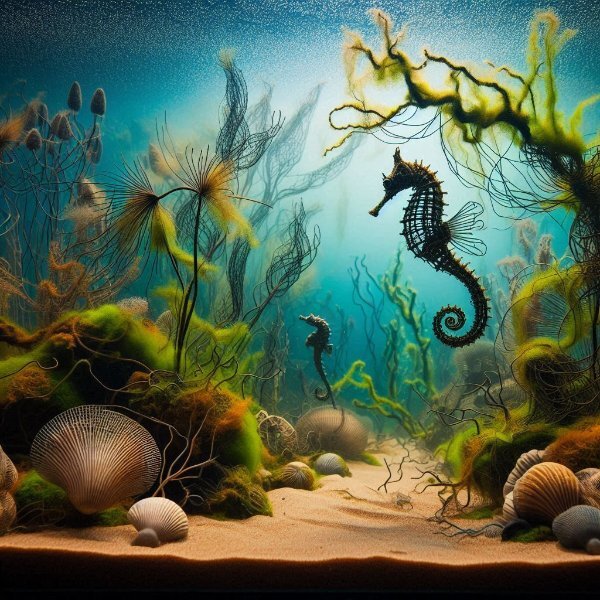
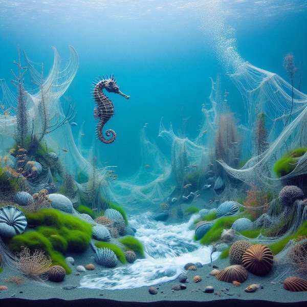
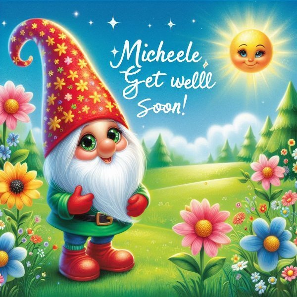
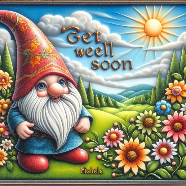
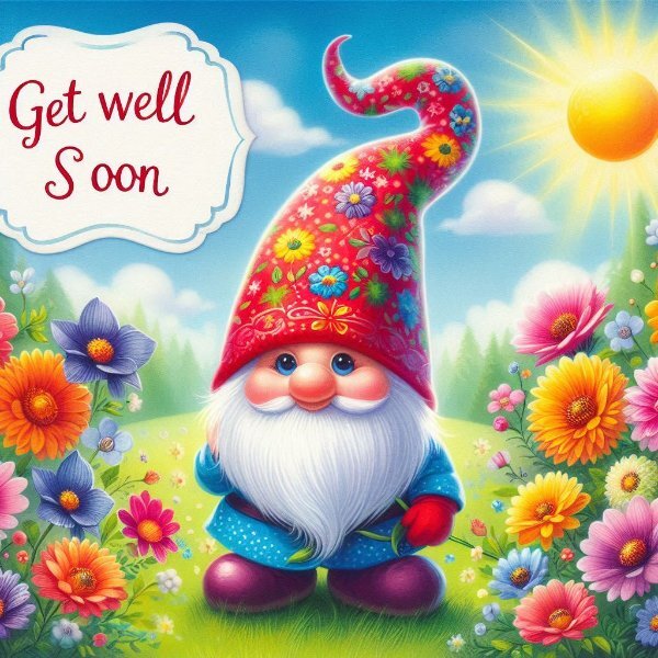
I played a bit with this prompt on Copilot Designer A gnome in cheerful colors, his eyes hidden under his pointed cap, wishes Michele, 'GET WELL SOON', beautiful flowers on a green meadow enliven the background, the sun shines in the cloudless sky , I used the german prompt, I added for the second one - Traumlandschaft in Stein - Pietra Dura Technik at the beginning of the prompt,2 points
-
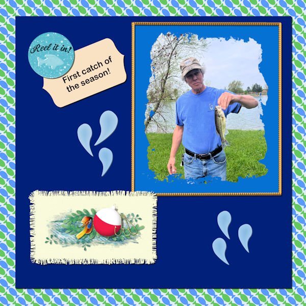
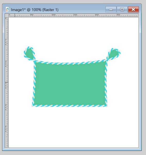
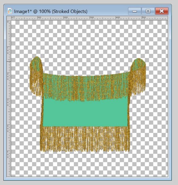
Time to get back to the labs - also I have the final layout to do for the Alphabet Challenge from 2022. Those blue water drops are there only because it is required for this lab module. But I guess they are ok. The fish going in opposite directions on the background paper are also required. I made 2 fringe mats and used this one cause I like it better. The other one I'm not showing because the fringe is large - kind of reminds me of the fleece pieces that were fringed - something the fabric shops were promoting several years ago. I might put a baby blanket pattern on it and use it for a baby layout sometime in the future. I used some elements from Pixel Scrapper and my own elements created in a previous lab for the cluster on the mat. Used one of the labels made in the vector workshop from last year for the title tag. The brad is from Pixel Scrapper also and probably Jessica Dunn.2 points
-
I have always used MS Office One Note for snippets or screenshots or whatever. It generates png's and it's got such a loose filing system I can just close it up and whatever I'm doing is still there tomorrow.1 point
-
Cristina, great that you have competed the vector workshop more or less on your own with this results.1 point
-
Nope. All the clicks can be done with the pen/tablet. I have a mouse on my laptop (I use the tablet on my desktop), so I can easily switch from one to the other. Not really. I still used a mouse at work as I never had a tablet there. I also use a mouse on my laptop. I'll try to see what I can set up so you can see both my screen AND tablet at the same time for the Q&A. Not sure how, but I'll try to find something.1 point
-
1 point
-
1 point
-
I'm getting a little better every day, but I'm exhausted and the heat is kicking my butt. Thank you for asking, sweet Susan. ❤️1 point
-
1 point
-
Hi , here is my work with the sketch, I used a collab kit from PickleberryPop named Wildbouquets1 point
-
1 point
-
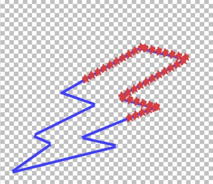
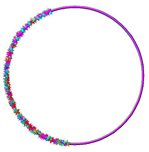
Lesson 7: A bit finicky working with those "star nodes" but I finally got it! I think after I participate in the Vector Workshop maybe a dozen more times, I might get good at this! In case it isn't obvious (ahem), that's a lightning bolt. I traced the shape from a clipart to make the vector/path. I have a very limited number of picture tubes so the bolt got stars.1 point
-
Donna I see you have or found the VectorSpiral script! I like that script very much because it gives a unique effect if you use it with text or picture tubes even if you only use a part of it!1 point
-
Julie very nice! Maybe you can ask Carole for a demonstration of the PaintSplashMask script in the next Q&A. I think if you have some problems with it, there probably will be others too that like to see it in use. Those demos help so much in understanding the way a script works.1 point
-
me too. Echo is a grey tabby and Zeppelin (older now and does really wander anymore) is a black fuzzy long hair dude. My black cat (Sumi) is in love with Echo, so you can imagine her surprise at him attacking the window screen (he's actually a chicken and make all these noises if a different cat comes into the 'hood). we usually head out the door to stop the meeting. They have a Chow named Jasper, barely ever hear him bark.1 point
-
Hi Daniel - Carole explained that the Lock keeps the transparency and lets the "paint" focus on the object alone. Be sure to undo the lock. It can make problems further along... hth1 point
-
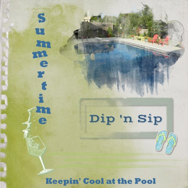
Before the month ends, I wanted to get something done for the Sketch Challenge. Only the pic is mine. Background paper is from ET Designs; mask is called "watery" from Katie Pertiet. I wanted to use the CassPaintSplash mask, but I had too much trouble adjusting it for the photo. Other elements and things from my stash or online clipart. We have dubbed out get-togethers at our friends' pool as Dip 'n Sip days.1 point
-
I like what you do with the layer styles. You have good control. I find I'm usually having to put it so low in the settings, wish there was more fine control on them.1 point
-
1 point
-
1 point
-
So beautiful Corrie. I love those soft tinty colors. At long last summer has arrived for you. I think we had our two days of summer and now it's fall, with constant rain.1 point
-
1 point
-
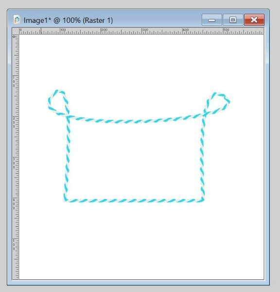
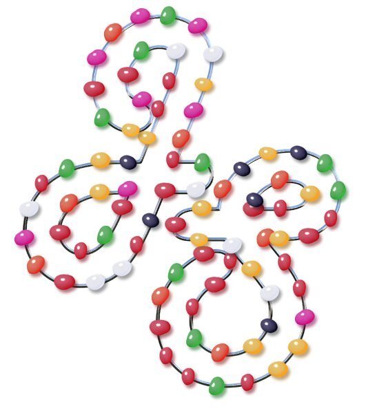
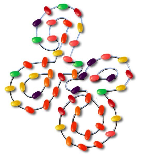
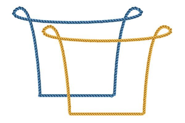
I have been otherwise occupied for a few days. Most of my deadlines come toward the end of the month which leaves me not much time (or energy) to work on much else. All clear now. These shapes (with Vector Tubes) are from Lesson 6. They worked well for me, could even call them fun this time. I don't expect to be a Vector Expert in this lifetime, but it feels good to just be able to manage those #@*&# nodes better. (The green shape with the weird fringe is just for fun b/c I had a fringe tube in there.)1 point
-
1 point
-
1 point
-
1 point
-
1 point
-
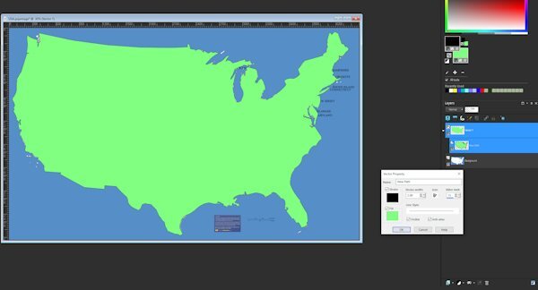
Totally enjoyed this workshop. Gonna do a diamond membership for a few months and try to pick up some of the classes and information available for PSP. My next project already started is to do a preset shape of a USA map. I guess to do state borders internal to the closed vector path, you just select the lines (vs edit) with pen tool and put them in seperate. I'll find out if that is just a folly in my mind LOL.1 point
-
Carole, Thank you so much for your lessons on Vector. I like what I have learned so far and expect to review to get a better handle on what I have not "mastered" yet. Everyone else, Thank you for sharing your work. Thank you for helpful input. Thank you for encouragement by showing what can be done, and encouraging words to push ahead. This is great! And having something that I have learned that I can use in the future is really the best part.1 point
-
Doska, I hope you are feeling better soon. We will all be here when you feeling up to returning. Take care of yourself first.1 point
-
1 point
-
Susan, I think it is a matter of doing the tutorials regularly to pick up these tools. Vectors have scared me, they appear so difficult, yet I am sure, going over what we have learned would help. I hope to remember the tutorials as best I can and try to redo them soon, while they are still in my mind. A few gems have come from members all throughout, and they helped me.1 point
-
I think I will redo the lessons in a month or so. If I dont I will surely lose it.1 point
-
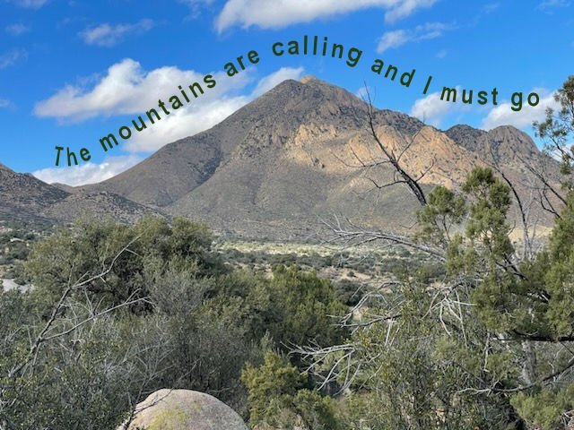
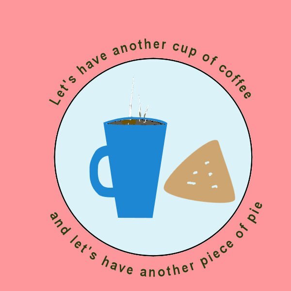
Lesson 5. I can't believe the trouble I've been having with the text tool and the path. Anyway, I managed to get the text to go along the path on the mountain and the circles paths for the cup of coffee and piece of pie. I know - the piece of pie doesn't look like much, but that's all I've got this afternoon for it. It is what it is!!!!!1 point
-
You are all such creative people here, and your work motivates me to improve my vector skills. Thank you, Carole, and everyone. Next Vector Workshop, maybe? Jeni1 point
-
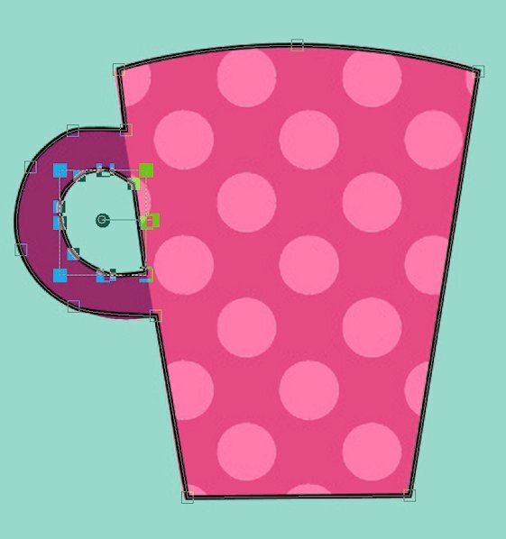
I honestly don't know what I'm doing wrong at this point. I've deleted everything and gone back the drawing board and followed along step by step with Lesson 4, pausing the video with each step. It "cuts" the cutout vector and I can paste it into the "cup" vector and reposition it but the cutout is filled when I check it. The only thing different is that I'm working on the original canvas of many cups and started with the upper left one. The vectors are in the layers palette and show up on the canvas and when I switch to fill AND stroke its all there except the cutout is NOT cut out. GRRRR !!! To the best of my knowledge I'm set up exactly as Caroline was in the video for the pen tool. The image below is what I have right after I paste the cutout into the main cup vector and reposition it. The "test" fails (so far) every time.1 point

Resized.thumb.jpg.d25811db03a63358cedab1e79f527635.jpg)


