Leaderboard


Popular Content
Showing content with the highest reputation on 07/10/2024 in Posts
-
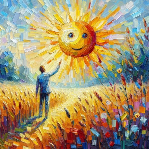
This took me hours to do (with lots of breaks and blank stares). I tried a bunch of things including masks, but I just didn't have it in me. Being sick has given me brain fog in addition to exhaustion, and the oppressive heat isn't helping. The little girl and the sunflower are from CF. The fonts are akaDylan Plain and Alegreya SC Black. It's weird how the orange rectangles look uneven when sized down to 600. Neil Diamond wrote the song, Sunflower. Glen Campbell released it in 1977, but Neil didn't release it until 2018.7 points
-
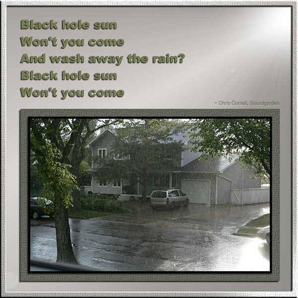
Song Challenge July 2024 Black Hole Sun by Soundgarden. Fonts are arial(s). I used a texture(woven basket) on the desaturated green photo mat and around the whole layout (with an inner bevel). A gradient on the background and then sunburst effect (whew, that was a hard one to figure out) which added a brighter "sun spot" and some rays a bokeh or two, and also desaturated. The rays might not show up in the small image. I'll post on FB later. This is not a great shot. It was not long after we moved here and it was downpouring with rain and sunny at the same time. It's always bizarre to see that. That is my neighbours house, I was shooting out a window. Oh, and I wanted all the shadows to mimic the gradient sun and the sun in the photo, that was a real headscratcher for me. So please let me know where I might've gone wrong with the shadows on the frames, text etc.
 7 points
 -
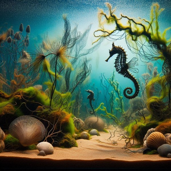
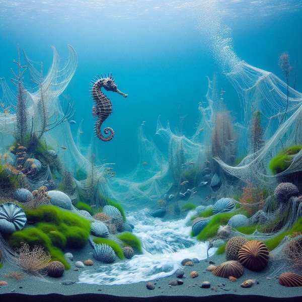
I have also made some Seahorses with copilot, you all can copy the prompts and try yourselve, everytime another picture , Prompt -- a dream landscape made of wire in the aquarium. Algae zone, mussel bank, mud bottom. Seahorse, wire art, --
7 points
-
I checked the file and still don't know how/what I did, but definitely not correct. So, I redid the lesson with the same graphic, and here is the new one.
6 points
-
I tried out Copilot/Dal-E for my song: "I can see clearly now..." by Johnny Nash. I did one in the manner of Van Gogh and another in Impasto style. This is lots of fun but be careful of eyeballs and text. They can get weird!
6 points
-
This is the one from Anja's description (You are my sunshine)
6 points
-
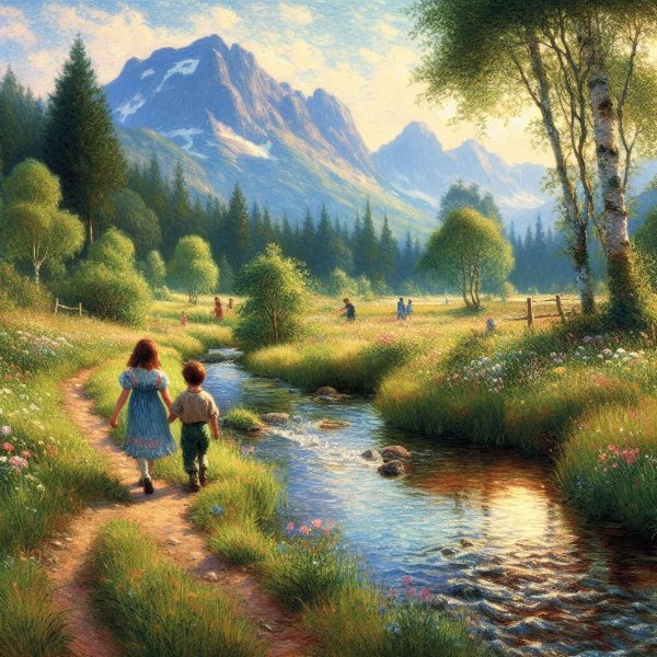
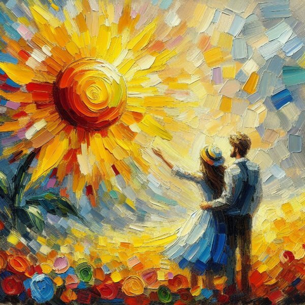
@Anja Pelzer Wow! I played around with that Bing Copilot. I started with your take and ended up with just typing boy and girl walking in a meadow beside a bubbling stream with mountains in he distance.
6 points
-
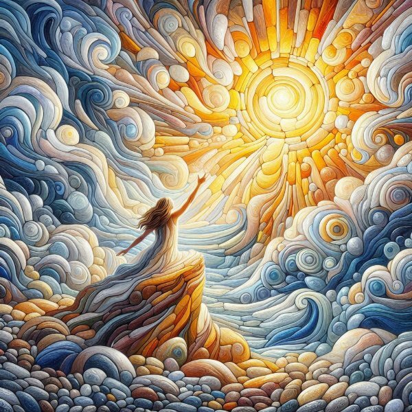
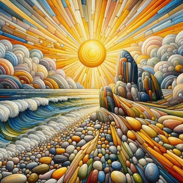
try this one - Optic Illusione in stone, Pietra Dura Technique,You are my sunshine, my only sunshine You make me happy when skies are gray You'll never know dear, how much I love you Please don't take my sunshine away neo-impressionism expressionist style oil painting, smooth post-impressionist impasto acrylic painted stones, thick layers of colourful textured stones and rocks-
6 points
-
I have worked with the lessons separately, but I will post here just one file that includes all the 3 other techniques (Text on a Path - Vector Tube Script - Cut a Vector Object) Text on a Path - I also added the "Text on a Circle" technique. I used Instant Effect Pen & Ink for the photo and Layer Styles Outer Glow. Vector Tube Script - I used cass-Pearls Tube. Cut a Vector Object—I drew a rectangle frame and cut it into 3 parts. I wanted to try something different so that I could choose a different color for every section of the frame. I cut the vector object in the original layer and duplicated it three times, deleting the unnecessary vector parts in each layer. Then, just ran the script as shown in the video. As always, this is a great workshop!
5 points
-
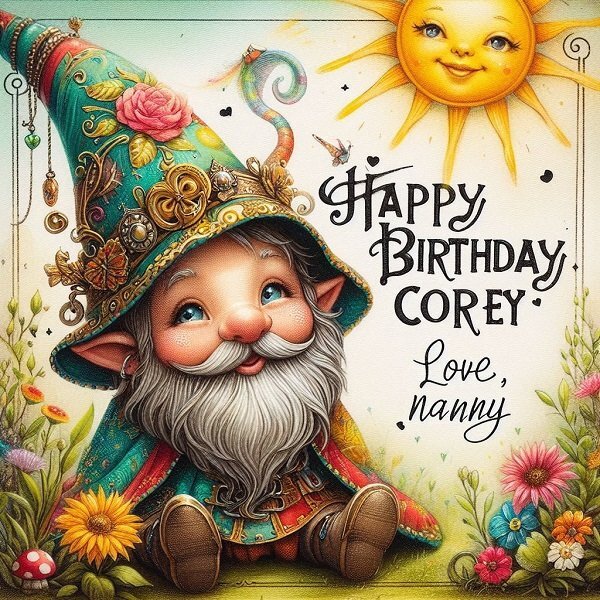
Trying out Bing Copilot's Designer mode, I created a birthday card for my grandson-in-law, Corey, who is married to Jackie, my zookeeper granddaughter. Corey is into horticulture in a big way. His gift to the attendees at their wedding was a small succulent in a pot to take home. Sticking with Anja's gnome theme, my efforts created this. Prompt -- A steampunk gnome in cheerful colors, his eyes hidden under his pointed cap, wishes Corey, 'HAPPY BIRTHDAY', the sun shines and there is an abundance of plants and flowers, signed Love, Nanny.
5 points
-
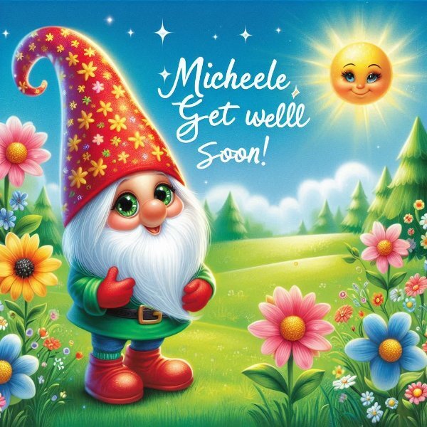
I played a bit with this prompt on Copilot Designer A gnome in cheerful colors, his eyes hidden under his pointed cap, wishes Michele, 'GET WELL SOON', beautiful flowers on a green meadow enliven the background, the sun shines in the cloudless sky , I used the german prompt, I added for the second one - Traumlandschaft in Stein - Pietra Dura Technik at the beginning of the prompt,
5 points
-
Thank you all of you for your encouragement. I have been concerned that I wouldn't be able to apply myself timewise but like a lot of things, where there's a will, there's a way! I get into a project and it consumes my time. My brother visited recently and he berated me for not using my DSLR camera like I used to. It's so easy to snap away with a mobile phone. Maybe I can add the camera use to my objectives for this project. Thanks again for the tips. I did start collecting images for this project last month but didn't keep up the momentum due to commitments but maybe, rather than being put off, it can be the best endeavour to take one picture a week. Thanks again all. By way of contribution, here's one of my first ones then. Happy Year.
4 points
-
Anja, I tried it using your prompt and chose this one -- weee! This is fun!
4 points
-
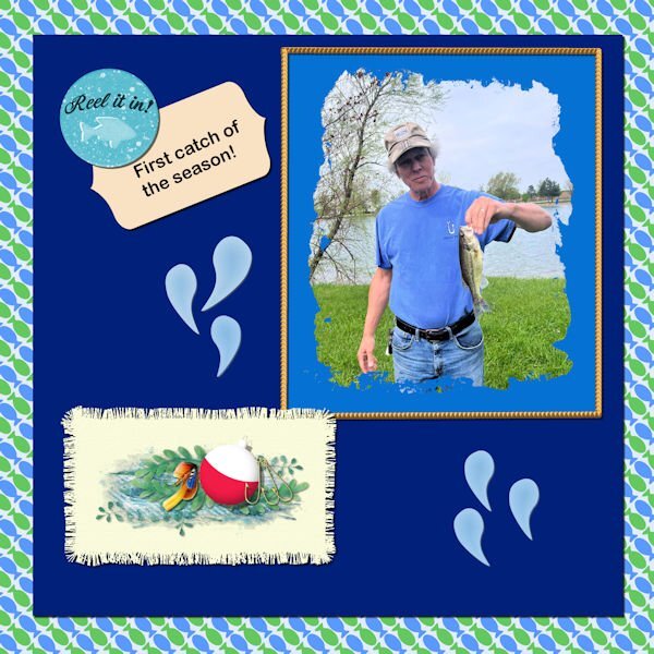
Time to get back to the labs - also I have the final layout to do for the Alphabet Challenge from 2022. Those blue water drops are there only because it is required for this lab module. But I guess they are ok. The fish going in opposite directions on the background paper are also required. I made 2 fringe mats and used this one cause I like it better. The other one I'm not showing because the fringe is large - kind of reminds me of the fleece pieces that were fringed - something the fabric shops were promoting several years ago. I might put a baby blanket pattern on it and use it for a baby layout sometime in the future. I used some elements from Pixel Scrapper and my own elements created in a previous lab for the cluster on the mat. Used one of the labels made in the vector workshop from last year for the title tag. The brad is from Pixel Scrapper also and probably Jessica Dunn.
4 points
-
Oh, Michele, I'm so sorry to hear that. At the same time, I'm happy you're already at home recovering from it! The layout is lovely, as is all your work. Best wishes and a speedy recovery! 💟3 points
-
wow it is so funny to play around with other words, things and elements, try illusion in stone , or wire art,3 points
-
I can't thank you enough, Anja. It was so thoughtful of you and I love him! ❤️3 points
-
The light blue one looks like it could be a directional tube. If you want, I can make a demonstration during the Q&A this Sunday about how to create those.3 points
-
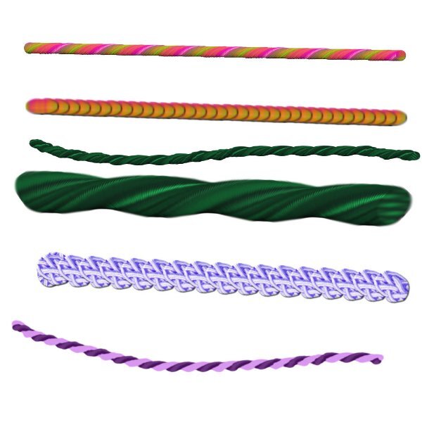
Playing with make ropes and strings
3 points
-
yes I did, here is the prompt - - You are my sunshine, my only sunshine You make me happy when skies are gray You'll never know dear, how much I love you Please don't take my sunshine away neo-impressionism expressionist style oil painting, smooth post-impressionist impasto acrylic painting, thick layers of colourful textured paint -- there are 4 pictures , this is one of them.
3 points
-
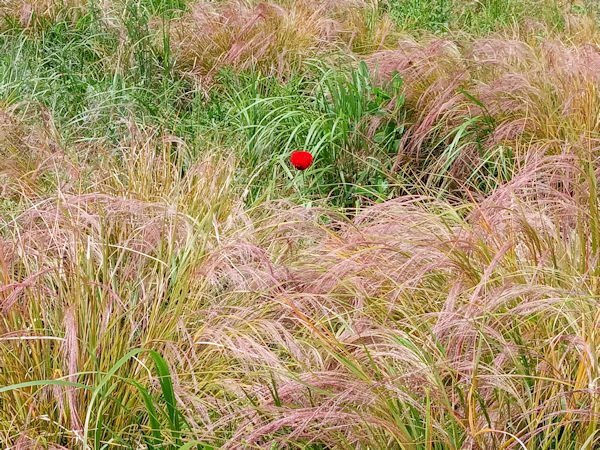
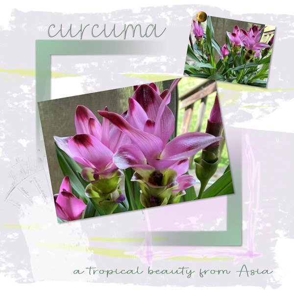
My passion for perennials in the garden has faded (just going with what I already have), but I am finding tropical plants to be something fun. We have a garden centre not far from here that has been around for many years and specializes in cacti, succulents, and tropicals. Picked up this one (photo) which is just so eye-catching. It's a member of the turmeric/ginger family and therefore very tender in our climate. It will have to come indoors. I also have two orchids which require very little of me. I tried (and tried) to work some picture tube around part of the frame, but I just don't have the hang of drawing the lines yet, and have a limited choice of tubes. The pen tool lines look too irregular and jerky, even when I try to adjust the nodes. I CAN, however, do the interlacing part. More practice is necessary. Sigh, it's always something....
3 points
-
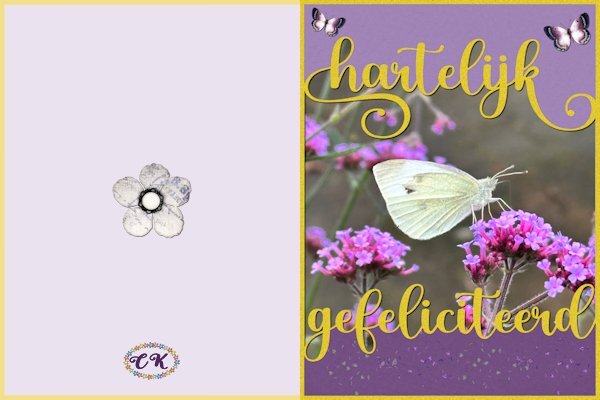
What about old-fashioned handy work after all the talk on Copilot, Spark, AI etc...... I wanted to make something were the text touches the frame and creates a kind of bounding box were you can put a photo, a paper. first I made a template with the Dutch text of happy birthday and the spaces in between are mask layers, so I can use it again with different photos and colors for a totally different result. Then I made a card out of it for my cousin who adores butterflies. I'm going to experiment a bit more with this technique, I like it
2 points
-
Now I see it's all in the words (I am not good with words), and why spark didn't spark much creativity in me. hahaha might have to give it a second chance.2 points
-
hahaha, love that...."neverending"2 points
-
Now I know where some of the Creative Fabrica designers get their stuff.2 points
-
Sometimes I feel like I'm in a candy store! Definitely can over-indulge! Gluttony?????2 points
-
I hope you can make it possible to give a demo on the Q&A. I have it on my "neverending" wishlist as well.2 points
-
I didn't need additional features, so I chose a model that was closest to what I had. The new one has Bluetooth, which might be useful in some contexts, but my desktop does not have Bluetooth so it is not something I NEED. It also has more sensitivity for pressure than older models, but again, that is something I don't need because I don't paint.2 points
-
I am happy you posted it, Dawn! The flowers look amazing. Great work!2 points
-
Mine are a take-off from Anja, she seems to have a flair for them. Also, I don't think I have an MS account though I do use the Edge browser. And my OS is Win10. Mostly I use Google for gmail and stuff and MS Edge, Firefox and Duck Duck Go for browsing. I'm pleased with that birthday graphic for Corey. 🙂2 points
-
This is cool. I like reading the prompts, they are more interesting than the results. You need to be good with words I can see. I did find the Copilot Designer but see I need a MS account.2 points
-
Nope. All the clicks can be done with the pen/tablet. I have a mouse on my laptop (I use the tablet on my desktop), so I can easily switch from one to the other. Not really. I still used a mouse at work as I never had a tablet there. I also use a mouse on my laptop. I'll try to see what I can set up so you can see both my screen AND tablet at the same time for the Q&A. Not sure how, but I'll try to find something.2 points
-
My color group and a fitness person I follow is there and my friend who moved to Scotland posts there, so if I want to see these things I have to go there. I have to log in from my computer as I don't have data on my phone and wifi doesn't work - the phone is old. Neither FB nor instagram appeal to me but I do go on for those few people I follow. I'm trying to be better about posting to FB...after all, my data seems to be the worlds A.I.'s data for learning...let's train them to only love Digital Scrapbooking! 😅2 points
-
@Anja Pelzer So how did you figure out a prompt for something this elaborate??? It is gorgeous!!2 points
-
I created this Gnome for @Michele with Bing Copilot Designer
2 points
-
Julie very nice and as always it is in your style!2 points
-
Still playing with stuff from Vector workshop - Mickey at the Beach
2 points
-
J:ust playing around. Had fun.
2 points
-
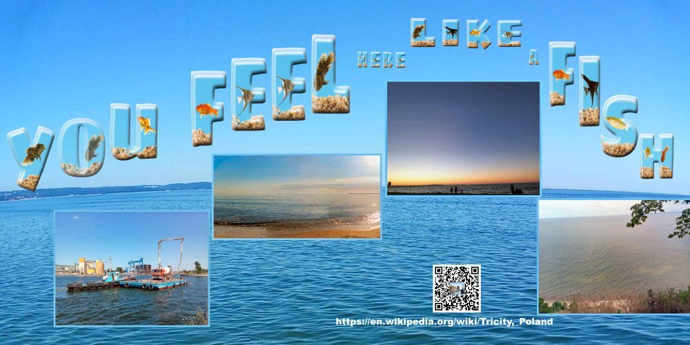
Recent Jacek's trip to Baltic Sea or to Tricity in Poland. You peobably remember his trip to Sopot /it's one part of Tricity/. Shots taken by Jacek, letters created by Carole.
2 points
-
i have been having a go at Digital Art painting in a free software called Krita and the Daisy/gerbra kind of flower is my first attempt. i am hoping i will improve enough to do some more artwork this way for my card making. .. wasn't sure whether i should post this one, however my hubby thought it was good enough and encouraged me to post. the frame is another parchment one purchased years ago and have bevelled it and used luminance legacy mode on the layer. sprigs and leaves are from a brush set used in previous cards. blue flowers are from another purchased kit i also got a few years ago .... Best wishes to everyone... Dawn.
2 points
-
Michele all the best and take good care of yourself; double pneumonia is not something to take lightly! We are here and love to see your work when you are up to it again.2 points
-
I just realized I spelled the state wrong! Good grief!
2 points
-
Playing around and having fun with my PSP is what I do most of the time. What a cutie.1 point
-
And I bet you had looked at the layout (as you were doing it) lots of times and read it, but your eyes just fixed the spelling before it told the brain. I've done that when it took someone else's eyes to see my mistake. funny how you keep reading it the same over and over, even when it's wrong.1 point
-
I'm still stuck on vectors which I find fascinating. My latest little creature is an owl. The patterns are from FF, the feathers around the face are a'dozi feather brushes. Feathers on body, chest and wings are from feathers from CF made into patterns. Eyes and feet are from Canva.
1 point
-
Hi , you all made great work in this workshop, it was fun to view all the lessons again here is my day 7 and the old one1 point
-
Lesson 6 part 2 I wanted to see what happens on letters like "i" and "j" to see if the script will do the dot on the I. It sure does, I guess because the character is both of those elements. This script is really fun and addictive. The second thing I wanted to know. How thick or thin can the stroke be? I tested 5 px and 20 px and makes no visual difference to me. The reason for this test is so I can duplicate the vector and have a layer that has a stroke and no fill. And the bottom Vector layer has a fill and a very small 1-5 px stroke. That gave me the opportunity to to be able to reduce the opacity of the vector layer with the fill, and be able to manipulate the stroke layer on it's own. One issue that came up with the font (is the pipe cleaner can't make such a bend as shown, so the stroke showed through). It was an easy fix as I had the stroked object layer to use, I just hid the Vector outline layer and it was gone. I really like this lesson.
1 point
-
A follow up to Lesson 5. I decided to try something different with my pointed border. I wondered what would happen if I started with a Vector instead of a Raster. So I created a triangle with the pen tool. Then I created a script to rotate so that I had 8 triangles. Then I merged visible to a new layer, duplicated, rotated, then merged visible to a new layer and rotated again. This came out exactly as I wanted it. I may change the script to make it more flexible but for now, using a vector, I have what I wanted. And I have somewhat of what I want a glow by duplicating a layer, changing the colour and using Gausian Blur (multiple times).
1 point
-
Haven't had much time to play as a major house project started much earlier than I expected .... but I am following along. Love seeing what everyone has been doing! I am looking forward to July 4th ... a traditional day of BBQ around this family!
1 point
-
I tried that "sculpture" effect a couple of times but it never seems to give me what I want. It is great for some things (especially grungy stuff) but not for delicate brocade or lace effects. So, when in doubt, buy or borrow from people who are far better than I am at this stuff.1 point