Leaderboard
Popular Content
Showing content with the highest reputation on 06/30/2024 in all areas
-
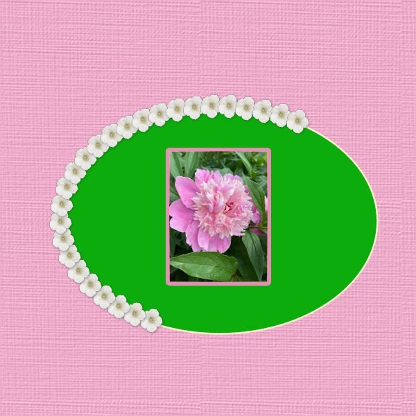
Hi , here is my work with the sketch, I used a collab kit from PickleberryPop named Wildbouquets6 points
-
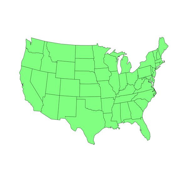
Pssttttttt..... I have a template for Canada with the individual provinces on it. It is still available at The Lily Pad. The designer also did one for the US and I used it for a layout I did in April documenting every state I have visited in the first 68 years of my life. Since I can now start working on my travel dreams, I will continue to fill it in the next few years.4 points
-
3 points
-
Ann, I love the way you look after these cats - it is such a great kindness.3 points
-
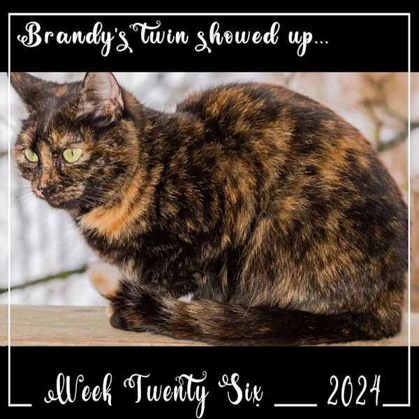
Week 26 - I had a surprise visitor. On June 25th, the rescue came, and we managed to trap 4 of my outside cats so they could be vet checked, neutered and vaccinated. Among them was the young, female tortoiseshell I call Brandy. I had hoped to get her as she is too thin and young to be out on her own. When the rescue evaluated her, they decided to put her in foster care as she seems to be a good candidate to become a house-pet. The other 3 (all males) were returned to me on June 27th and when released scattered to the far winds! Hopefully, I opened the door early the following morning, to see if any of the returned crew would show up for breakfast. And there was the big black male I called Batman and also little female tortoiseshell Brandy! Say, what?? Did she escape? Turns out, Brandy has a doppelganger... Truly identical twin... I may have been feeding both all along and not realized there were two!! Actually, I am really pleased as I was fond of Brandy and don't feel like I've lost her to foster. Her sister is a very good replacement. We won't be trapping again for a while based on 1) not triggering the cats so soon after the last go round and 2) the vet is at the local Animal Rights Alliance (T.A.R.A.) and will only take 6 at a time and we have to get in line for appointments. My feature this week is Brandy - Number 2.3 points
-
I think we would all love that, it must've taken some time and a lot of patience to make it so precise. Daniel, you did a superb job on it. There is only one question left to ask.... Where's Canada? ...we NEED that too!😁3 points
-
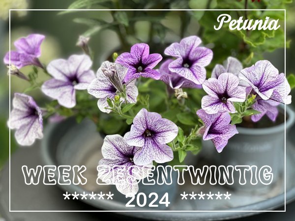
Thank you! For a while petunias were considered old fashioned but they are back in full swing. I always liked them and have them almost every year, but they are prone to lice.2 points
-
2 points
-
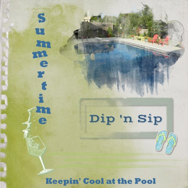
Before the month ends, I wanted to get something done for the Sketch Challenge. Only the pic is mine. Background paper is from ET Designs; mask is called "watery" from Katie Pertiet. I wanted to use the CassPaintSplash mask, but I had too much trouble adjusting it for the photo. Other elements and things from my stash or online clipart. We have dubbed out get-togethers at our friends' pool as Dip 'n Sip days.2 points
-
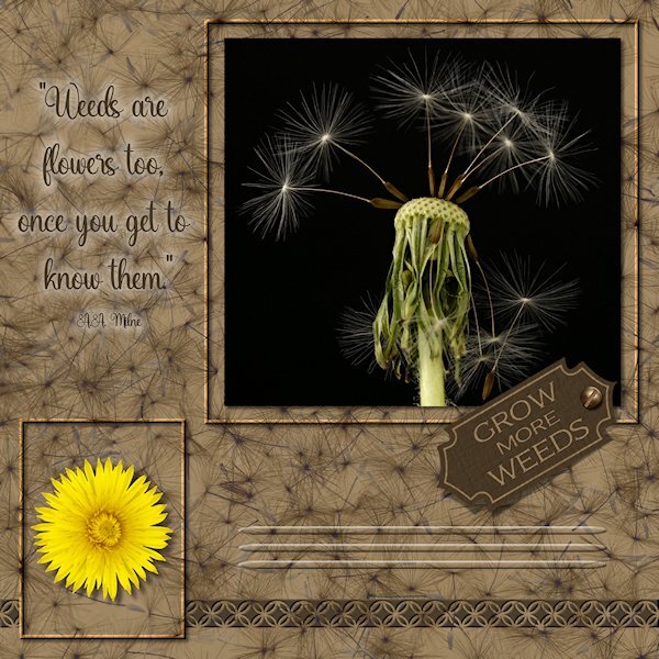
Here the sketch I did. Pretty much followed the sketch. The three photos are mine (one was extracted- yellow dandelion). The little tag was a vector shape I made in the first Vector Workshop. I made frame by promoting the background layer and gave them a bevel. the lines below the tag are the effect>cutout and i used a vector ellipse shape to have tapered ends. It's the first time I made something I could use "Selection from Vector Object". The background paper is a photo I did of dandelion seeds on a black background. I first did negative image, then used a blend mode, then I think I used HSL and reduced the opacity or something like that. the bottom tiling is a CASS punch (cass-Edge12), then a small inner bevel and small shadow which made it stand out more. Fonts used are Adorn Copperplate on the tag and Amanda Sunshine for the quote. Both from Creative Fabrica. My text tool was acting very strangely today. I couldnt move it or resize it, it would just jump back to where it was. Also I used cass-screwheads picture tube for the screw on the tag. I'm not sure about the quote. I couldnt find any color that showed up well against the busy background. I tried the paint behind technique but I did a dismal job at it so I used a layer style so the quote would at least be readable.2 points
-
1 point
-
1 point
-
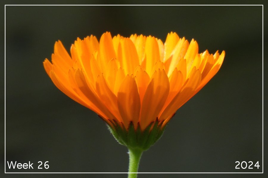
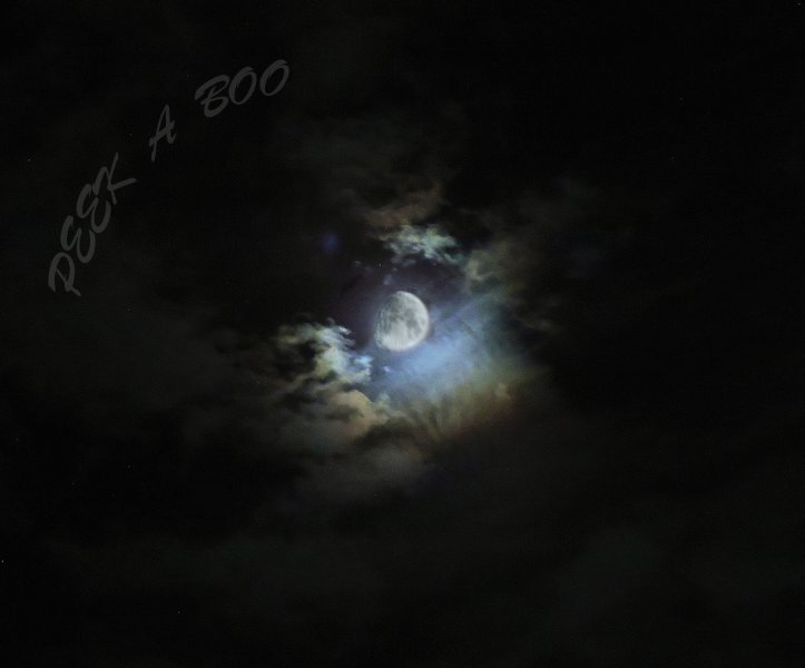
Sharla a fantastic photo, I can even see the little hairs on its stem and it look great against that dark backdrop.1 point
-
Stunning Sharla. My kind of photo! Dont you just love the side lit and back lit flowers? Mother Nature is the earths first artist. We are artists capturing an artist in action.1 point
-
Sometimes it takes several attempts at drawing around the image to get the effect I am looking for. Also I will edit the mask after I have run the script.1 point
-
That's fabulous Corrie. There is so much variations in the color and the veining looks so cool. Petunias remind me of my mom, she always had them.1 point
-
Week-26, we are already half way through 2024. Where is the time gone, or do I sound a bit old now....... After all the rain of the last weeks this week the sun did its utmost best to let us forget that and not only we but the plants enjoyed it too. I have taken the opportunity to shoot a lot of photos from the plants on my small patio. The gardencenter we usually visit often has a rack with small free plants that are no longer good enough to sell but if you take care of them they most of the time perform later on. This petunia was looking dreary and didn't like all the rain but, look what a couple of warm, sunny days did to it.1 point
-
1 point
-
1 point
-
Thanks Sue. I don't know why that one mask gave me trouble. Usually using masks is easy for me. But I was also rushing and that doesn't help.1 point
-
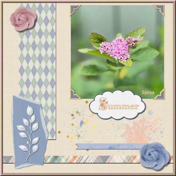
After finishing with the Vector Workshop I took a pause because we had such nice weather for a change. This was the first time this year we could sit outside in the evening, much welcome after all that terrible rain. But after a few days I wanted to see what the Argyle-2 script which I won is doing. I love it, it gives so many options qua colors that can be matched to a project. Of course I wanted to use it in a project and I took the Sketch and incorporated not only the argyle tiles but the photo corners freebie by Carole too. Those use the blogtrain color palette for this month and I have the freebie kits from Jessica Dunn and Marissa Lerin where all the elements are from. I don't know if it is clear in this reseized version but the background has a texture. The fonts are Crocus Monogram and Georgia and the photo is by me as usual.1 point
-
1 point
-
1 point
-
1 point
-
1 point
-
1 point
-
1 point
-
1 point
-
1 point
-
1 point
-
Completed lesson 7 A little confused using vector lays duplicated each looked the same. Decided to rename the layers from the start which made things much better. Then rearranged the order in which was done first, slicing the path then applying tubes seemed to work ok for me. Anyway got the idea after a few attempts, practice, practice. Quiz, I got 8 / 10 Can I ask regarding #1 how many different icons are there to identify the different types of vector objects. What little icons and where are they? I am sure this must be simple but not sure what you are asking here, I thought about Cusp settings etc, I guess a senior moment.1 point
-
1 point
-
1 point
-
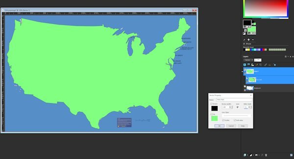
Totally enjoyed this workshop. Gonna do a diamond membership for a few months and try to pick up some of the classes and information available for PSP. My next project already started is to do a preset shape of a USA map. I guess to do state borders internal to the closed vector path, you just select the lines (vs edit) with pen tool and put them in seperate. I'll find out if that is just a folly in my mind LOL.1 point
-
Carole, Thank you so much for your lessons on Vector. I like what I have learned so far and expect to review to get a better handle on what I have not "mastered" yet. Everyone else, Thank you for sharing your work. Thank you for helpful input. Thank you for encouragement by showing what can be done, and encouraging words to push ahead. This is great! And having something that I have learned that I can use in the future is really the best part.1 point


