Leaderboard
Popular Content
Showing content with the highest reputation on 06/28/2024 in all areas
-
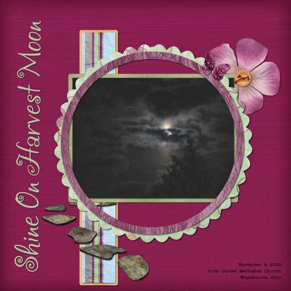
I actually like taking pictures of the moon when they are clouds or trees partially obscuring it. My absolute favorite picture I took was maybe 15 years ago. I was attending a camera club meeting at my church (we talked and learned about all things from usage of the camera to setting scenes for taking photos). When we came out it was a Harvest Moon in the sky with a cloud cover. I stood with my back against my vehicle to be as still as possible (didn't have my tripod which is highly recommended for night photos). I held my arms very close to my body and took several photos. One of them is absolutely amazing. I ended up having it printed as an 8x10 and put into a larger frame with matting. It was displayed in the church along with other photos from members of the camera club for awhile. It now hangs in my living room. I love the spooky feel of it! I also did this layout of the photo.6 points
-
4 points
-
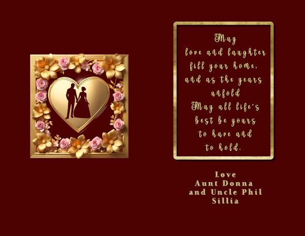
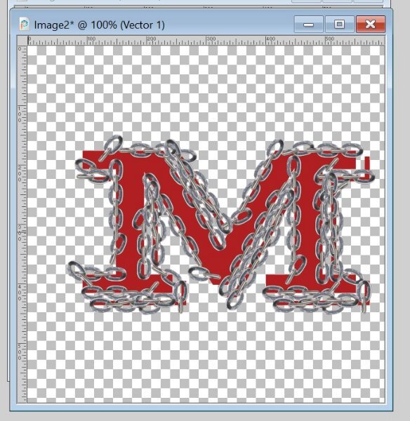
I spent yesterday revising my wedding card. Most of the graphics are from CF except the silhoutte which is from Canva. The side font is ruritania. The other fonts are FarewellAngelina and FancyPants(I don't remember where I got them) and starinline(purchased from Deeezy.com). The other font is DDRadford from CF. I made the letters M and J, but stupidly forgot to save the vector so I don't remember what it is, but it's from CF. I also made the gold frame on the inside. The wedding is today so I just managed to get it ready after an extremely hectic week. The card is an 8 1/2 by 11 printed borderless on card stock.4 points
-
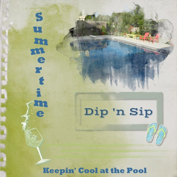
Before the month ends, I wanted to get something done for the Sketch Challenge. Only the pic is mine. Background paper is from ET Designs; mask is called "watery" from Katie Pertiet. I wanted to use the CassPaintSplash mask, but I had too much trouble adjusting it for the photo. Other elements and things from my stash or online clipart. We have dubbed out get-togethers at our friends' pool as Dip 'n Sip days.4 points
-
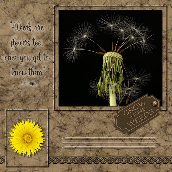
Here the sketch I did. Pretty much followed the sketch. The three photos are mine (one was extracted- yellow dandelion). The little tag was a vector shape I made in the first Vector Workshop. I made frame by promoting the background layer and gave them a bevel. the lines below the tag are the effect>cutout and i used a vector ellipse shape to have tapered ends. It's the first time I made something I could use "Selection from Vector Object". The background paper is a photo I did of dandelion seeds on a black background. I first did negative image, then used a blend mode, then I think I used HSL and reduced the opacity or something like that. the bottom tiling is a CASS punch (cass-Edge12), then a small inner bevel and small shadow which made it stand out more. Fonts used are Adorn Copperplate on the tag and Amanda Sunshine for the quote. Both from Creative Fabrica. My text tool was acting very strangely today. I couldnt move it or resize it, it would just jump back to where it was. Also I used cass-screwheads picture tube for the screw on the tag. I'm not sure about the quote. I couldnt find any color that showed up well against the busy background. I tried the paint behind technique but I did a dismal job at it so I used a layer style so the quote would at least be readable.4 points
-
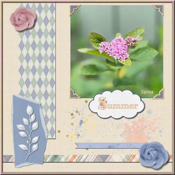
After finishing with the Vector Workshop I took a pause because we had such nice weather for a change. This was the first time this year we could sit outside in the evening, much welcome after all that terrible rain. But after a few days I wanted to see what the Argyle-2 script which I won is doing. I love it, it gives so many options qua colors that can be matched to a project. Of course I wanted to use it in a project and I took the Sketch and incorporated not only the argyle tiles but the photo corners freebie by Carole too. Those use the blogtrain color palette for this month and I have the freebie kits from Jessica Dunn and Marissa Lerin where all the elements are from. I don't know if it is clear in this reseized version but the background has a texture. The fonts are Crocus Monogram and Georgia and the photo is by me as usual.4 points
-
3 points
-
What you do, Ann, is what a friend of mine on a farm does. She is 85 and keeps saving feral (barn) cats, feeding them, then one by one taking them to be neutred/spayed to keep the population down. I help by doing some of the driving and buying food and treats. I would love to take one or two (since I lost my kitty last summer), but I have my hands (and budget) full with three dogs (2 older). Hats off to your big 🧡!3 points
-
Actually, I'm now feeding seven outside cats twice a day so any hunting they do is a supplement. We just trapped four of them: 3 boys were neutered and returned here. I have a "cat cabin" filled with straw on my front porch where I feed them, so they do have shelter even though the porch is also covered. The leftover female, Brandi, is still too young to spay so they're putting her in foster in hopes to domesticate her as she's quite friendly. I still have 3 more to trap including a surprise twin to Brandi that I'm calling Randi. It looks like i may have been feeding both all along and not realizing there were twins in the mix. Predators are mostly raccoons that do threaten newborn kittens. The rescue moves fast when they hear of a litter. No coyotes, thank goodness! I remember your neighbor's cat with the "sexy tail" from the last vector class! LOL3 points
-
3 points
-
3 points
-
3 points
-
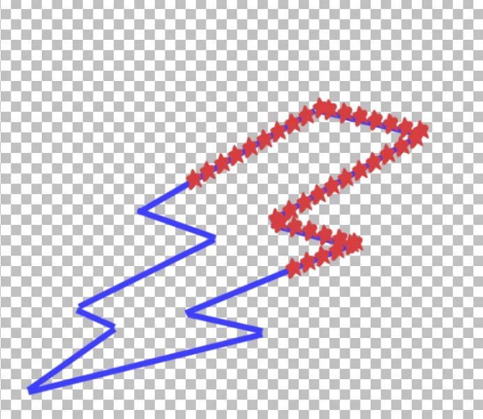
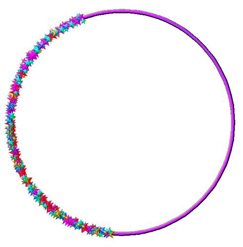
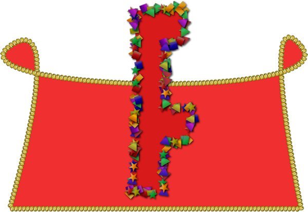
Lesson 7: A bit finicky working with those "star nodes" but I finally got it! I think after I participate in the Vector Workshop maybe a dozen more times, I might get good at this! In case it isn't obvious (ahem), that's a lightning bolt. I traced the shape from a clipart to make the vector/path. I have a very limited number of picture tubes so the bolt got stars.2 points
-
2 points
-
me too. Echo is a grey tabby and Zeppelin (older now and does really wander anymore) is a black fuzzy long hair dude. My black cat (Sumi) is in love with Echo, so you can imagine her surprise at him attacking the window screen (he's actually a chicken and make all these noises if a different cat comes into the 'hood). we usually head out the door to stop the meeting. They have a Chow named Jasper, barely ever hear him bark.2 points
-
Hi Daniel - Carole explained that the Lock keeps the transparency and lets the "paint" focus on the object alone. Be sure to undo the lock. It can make problems further along... hth2 points
-
2 points
-
Good ideas. Echo and his brother Zeppelin have been part of my backyard landscape since their owners moved in. While I don't like it (especially when they try and attack my cats through the window screen and Zeppelin sprayed my downstairs window - with white frames, that are now spotchy yellow!), that they hunt in my yard and use it as a giant litter box (I dont care if they "go" in the bug hotel....the bugs probably think it's a feast), I want this to also be a cat-safe yard as we have lots of coyotes around here. And the neighbours are great people. We usually just knock on the window or go outside and call his name and he knows it's time to go home. And I don't have weed...that's the main takeaway for me. You'd almost think I planned it this way. 😁 I love what you are doing, it's so awesome that you take action and care for these disadvantaged cats. It's sad to think they have to survive all the seasons, the predators and manage to feed themselves. I'm glad my girls are safely inside! the world outside for cats is scary.2 points
-
I agree, and some weeds are quite pretty. I also have a bug hotel (very exclusive!), well, it's just some logs from the dead parts of a tree we had to cut off (now the tree is spindly but doing fabulous). The Magpies keep eating the guests at the hotel! So, it's a stay-at-your-own-risk kind of hotel. I'm lucky my hubby pulls the weeds, I don't because the neighbours cat does his business in the garden 😪. My husband has a stronger nose, and his icky-factor sense is higher than mine.2 points
-
This is great. All those cool details you added. I especially like those 3 cutout lines near the bottom. So clever. (BTW, I've learned to live with some "weeds", easier than pulling them over and over. A garden that is too manicured doesn't attract enough insects. (That's my rationalization.)2 points
-
I'm glad you are starting to have fun with those #@*&# nodes! I love the fringe one!2 points
-
2 points
-
2 points
-
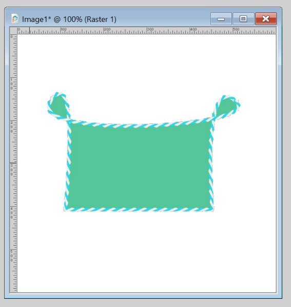
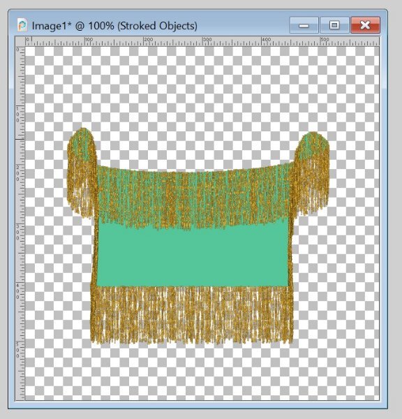
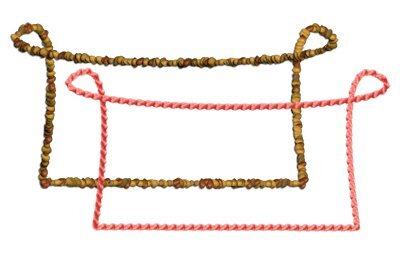
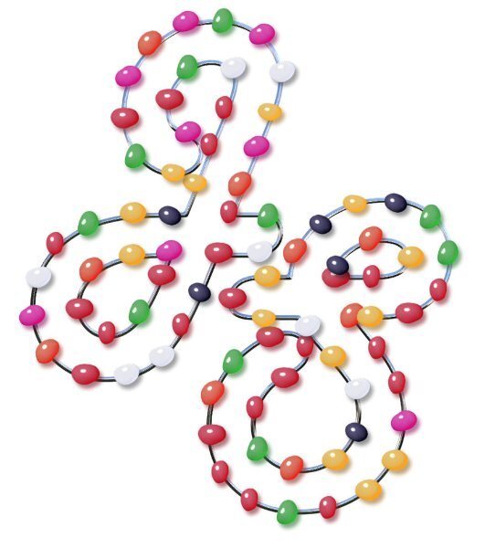
I have been otherwise occupied for a few days. Most of my deadlines come toward the end of the month which leaves me not much time (or energy) to work on much else. All clear now. These shapes (with Vector Tubes) are from Lesson 6. They worked well for me, could even call them fun this time. I don't expect to be a Vector Expert in this lifetime, but it feels good to just be able to manage those #@*&# nodes better. (The green shape with the weird fringe is just for fun b/c I had a fringe tube in there.)2 points
-
2 points
-
1 point
-
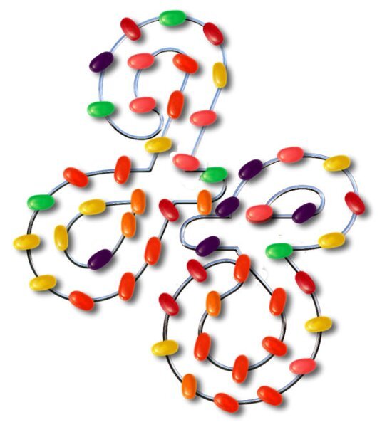
Donna I see you have or found the VectorSpiral script! I like that script very much because it gives a unique effect if you use it with text or picture tubes even if you only use a part of it!1 point
-
Julie very nice! Maybe you can ask Carole for a demonstration of the PaintSplashMask script in the next Q&A. I think if you have some problems with it, there probably will be others too that like to see it in use. Those demos help so much in understanding the way a script works.1 point
-
me too. I wonder if it locks the settings in no matter if you try and change them in the F11 Variance palette. oops i just saw Ann answered it for you. I was WAAAAAY off.1 point
-
on this topic, I'm involved with TNR which is Trap/Neuter/Release of stray community cats that can never live indoors. When teaching kittens (who are able to be domesticated when they're young) to use a litter box, it is recommended to first use organic potting soil, which is similar to being outdoors. I know most cats prefer to be clean and I wonder if your local cat would use a litter pan instead of the garden if it had garden soil in it? They tend to prefer the confined space, which is why they love kids' sandboxes, too. You could add sand to it, and that might even be better and keep the cat out of your garden. Just slowly nudge it away a little further every day and before you know it your garden will be cat-free!😽1 point
-
I like what you do with the layer styles. You have good control. I find I'm usually having to put it so low in the settings, wish there was more fine control on them.1 point
-
Julie, what a wonderful thing. It must have felt surreal for her.1 point
-
@Susan Ewart Yeah - I'm getting to like those layer styles. They come in handy sometimes! You did a great job as usual. I like those frames also. And the cutout strip at the bottom.1 point
-
So beautiful Corrie. I love those soft tinty colors. At long last summer has arrived for you. I think we had our two days of summer and now it's fall, with constant rain.1 point
-
1 point
-
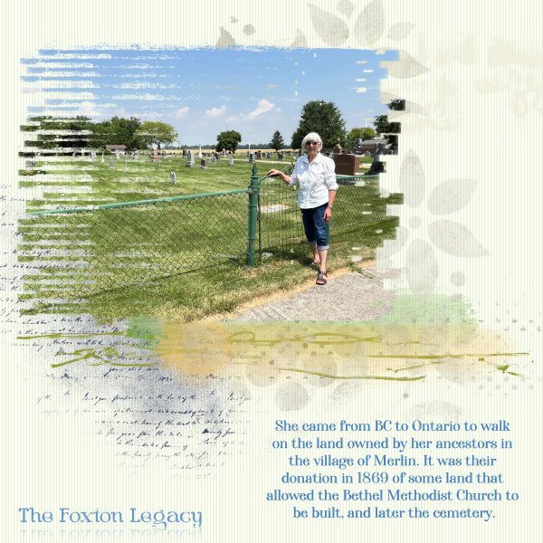
One of the things I did recently was take a woman from BC on a guided tour of my hometown so she could learn about the place where her ancestors lived many years ago (here in Ontario). It was a very hot & sunny day but we had a good time. We had exchanged many emails back & forth and met for the first time that day. She took lots of pix and I took many of her in the places that mattered. With one of those I made this layout for her.1 point
-
1 point
-
1 point
-
1 point
-
1 point
-
1 point
-
1 point
-
1 point
-
1 point
-
1 point
-
1 point
-
1 point
-
GOOD CATCH!! my eyes aren't as good as they used to be (nothing really is for this body). Yes, I so enjoy Cassel and this forum. Everyone is so helpful and so inspirational. I've gotten so many good ideas from different things you post as well as each one who posts in the forums. In fact, one of the background papers someone had in a layout led me to make several papers (and ribbons) like the one we are supposed to make for Lab 12 Mod 8 (my next Lab endeavor).1 point
-
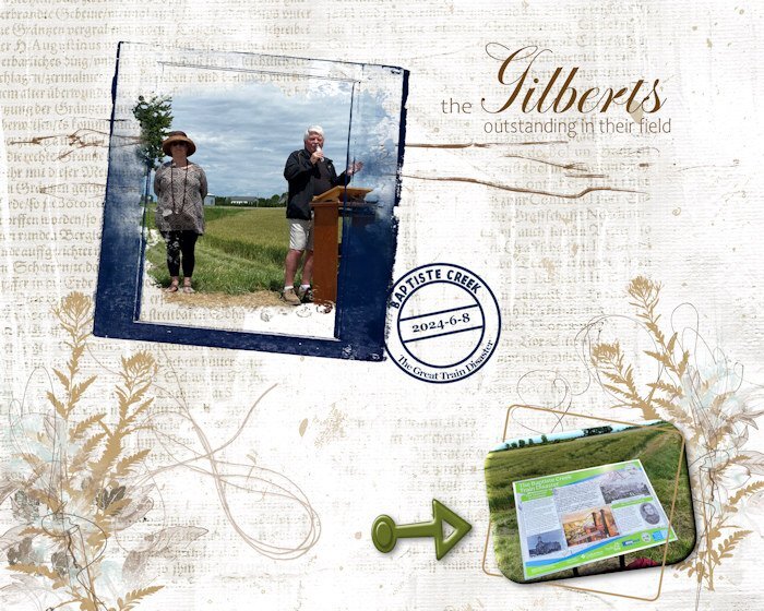
Since I used the date stamp (that I have finally figured out how to do with reverse text), I want to post the "souvenir" I made for the couple pictured here. They are local historians/writers who have spearheaded a project to install heritage (historical) plaques (large) in various rural areas and small communities (one is underway now for my home town). I am on the committee and involved with the unveilings that are taking place this summer, and in the future. This plaque, literally in a field (lower right photo), showcases a terrible train disaster that occurred close by in 1854 with a massive loss of life. It was the early days of railroads and there were many accidents, but none as disastrous as this one. The blue frame is from (I think) Natali Designs on Pickleberry Pop; most of the other elements are from ET (Erika) Designs or Katie Pertiet. I'm not good at keeping track while I'm doing the layout.1 point
-
1 point


