Leaderboard


Popular Content
Showing content with the highest reputation on 06/24/2024 in all areas
-
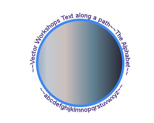
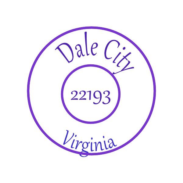
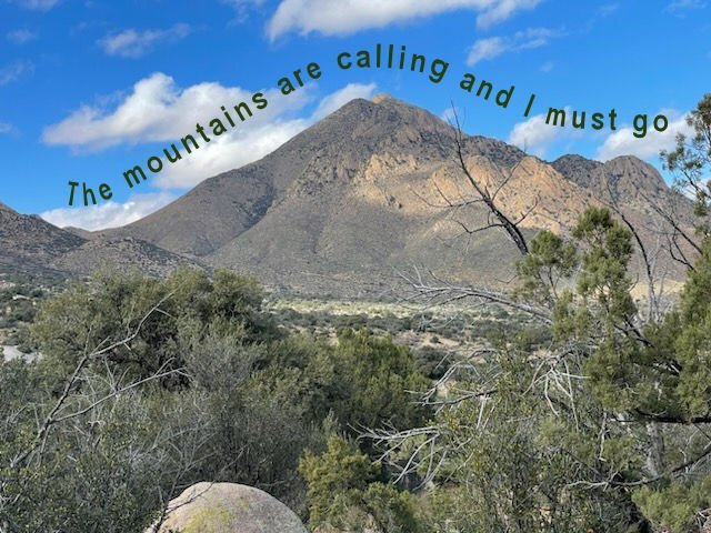
Somehow I ended up on the forum for last year's workshop. Interesting reading, for sure. Anyway, I took a few days off to deal with life, but I'm back. Text on a path inspired by a photo, and a (literal) postmark design.
 8 points
 -
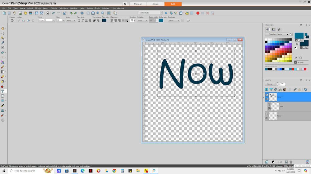
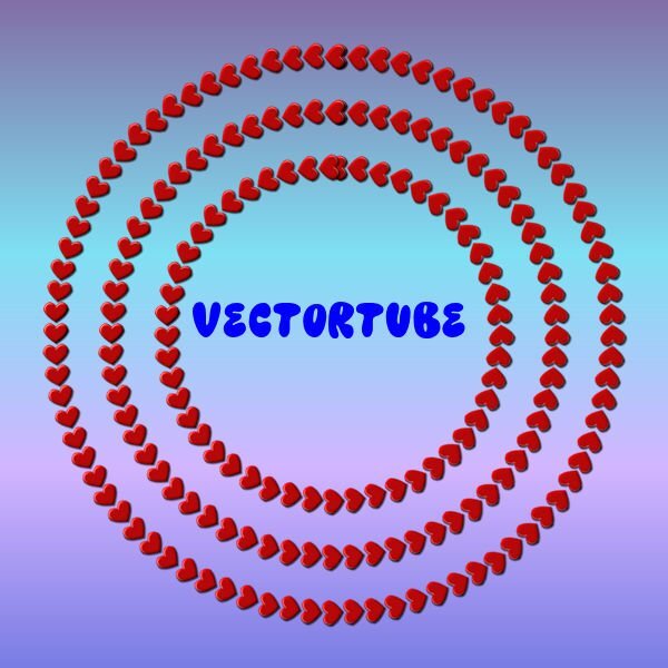
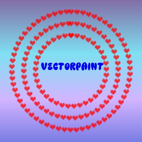
I'm still behind since we have been entertaining a very good friend this past week. Here is my vector tube. I also experimented with vector paint and really liked the results.
8 points
-
Used the VectorTube script to light up my house.
7 points
-
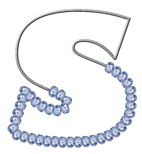
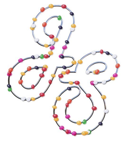
Thanks for your messages, Carole, it certainly helps. I raced ahead yesterday and created an image using my initials. I even put them on a metal wire, and then, today, we had this one to do so it worked well. Yesterdays attempt with jellybeans and today's attempt using Carole's brass bead and colourising it. Jeni
7 points
-
Day 7. One of the challenges with this one was grabbing hold of the correct node to move after cutting. I learned not to move the node too far before you determine it's the correct one. I had to start over a couple of times because I couldn't get it back in place to line up with the full shape. Carole - Thank you for the reminder about Vectors in Action. I recall that all of the Vector masterclasses were great. I'll definitely go back to watch them again. After every workshop I think about the Mickey Mouse song: Now it's time to say goodbye to all our company. See you real soon!
7 points
-
Hi , you all made great work in this workshop, it was fun to view all the lessons again here is my day 7 and the old one6 points
-
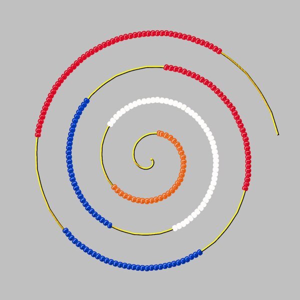
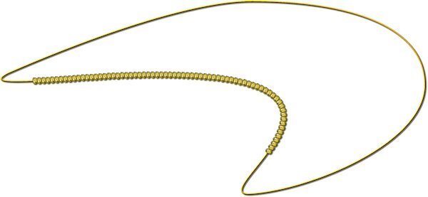
For the last lesson I made this. I first used the Vector Spiral script, it is a free one and is in a Featured Resources blogpost quite some time ago. I use it once in a while, sometimes with text or other picture tubes. After making the spiral which already is a path, I made the cutouts and then ran the Vector Tube script with a beads tube in the national colors of the Netherlands. I know I did something similar last year but it was among the things I lost when I had some computer problems earlier this year.
6 points
-
And lesson 7,
5 points
-
@Cassel I guess I just assumed that the text always appeared in the layer below - but I checked several of my pspimage layouts and it doesn't. So either I use the pen tool or click on Properties>convert text to curves in order to get a path to use with the Vector tube script. This is the one I made using the Properties>convert text to curves
5 points
-
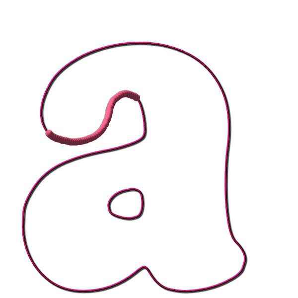
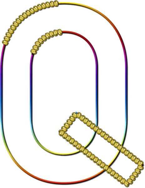
Lesson 7 Went pretty good, especially when I think it's a hard lesson, it turned out to be straight forward. The tricky part is grabbing the right node after the cut. Like Gerry said, it's hard to reposition the node you didnt want to be moving. I ended up pushing it back (if I picked the wrong one) very slightly then I could see the other node I really wanted to be grabbing. when I say see, I mean I had it zoomed in very close and when you move one node underneath it, the other node shows up. Only 4 cuts of all the cuts I made was the correct node I wanted to grab to move away and delete. I used undo a lot and learned to nudge the node into itself and not to the side as it would get too distorted. I really love this technique. On the Q I wanted to see if the lower cross bar was possible to isolate and it was. It's really interesting to see fonts with nodes, I forget about that, I could also be manipulating those fonts too...didnt we learn that in a master class or the Text Workshop? Thank you Carole. Even with some stumbling blocks, I felt way better going through this workshop for the second time. I'll get my question together (about the rocket) this week. Thanks again for a great workshop.
4 points
-
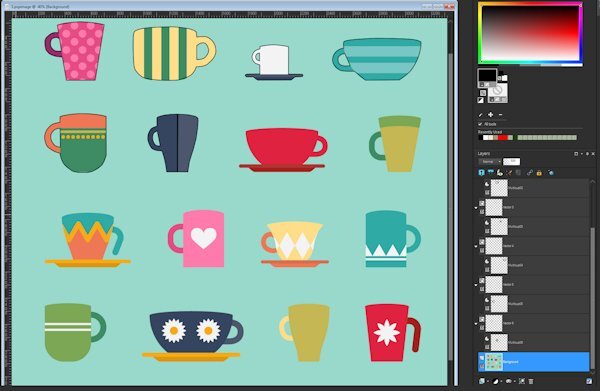
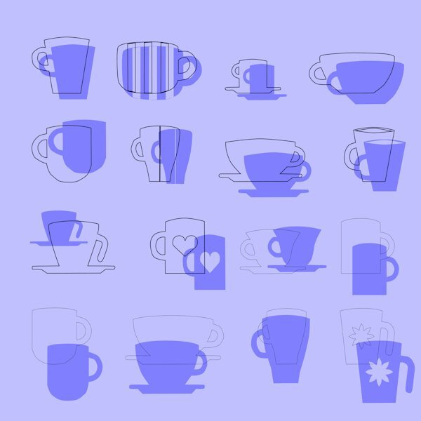
Carole, on the "invisible" question, I don't believe so...it disappeared when I CUT it from the base image and showed up for final repositioning after pasting. It just (many times) did NOT paste the cutout (transparent) into the original vector. The "undo" to the Reverse Path command with a new Reverse Path inserted in the process worked. I'm sure I have been doing something wrong but the only thing I can think is using the "Select None" after creating a selection to change multiple nodes to Symmetrical...I couldn't seem to get it back into edit mode any other way. Anyhow, I finished the 16 cups rendition AND some of them with additional cutouts. Also Lessons 6 and 7. I did NOT do the text part of that...I just went for a real complex "cut with knife" thing on a circle using a compass layer to divide it equally into 4 parts. Here are the results.
4 points
-
Lesson 6 part 2 I wanted to see what happens on letters like "i" and "j" to see if the script will do the dot on the I. It sure does, I guess because the character is both of those elements. This script is really fun and addictive. The second thing I wanted to know. How thick or thin can the stroke be? I tested 5 px and 20 px and makes no visual difference to me. The reason for this test is so I can duplicate the vector and have a layer that has a stroke and no fill. And the bottom Vector layer has a fill and a very small 1-5 px stroke. That gave me the opportunity to to be able to reduce the opacity of the vector layer with the fill, and be able to manipulate the stroke layer on it's own. One issue that came up with the font (is the pipe cleaner can't make such a bend as shown, so the stroke showed through). It was an easy fix as I had the stroked object layer to use, I just hid the Vector outline layer and it was gone. I really like this lesson.
4 points
-
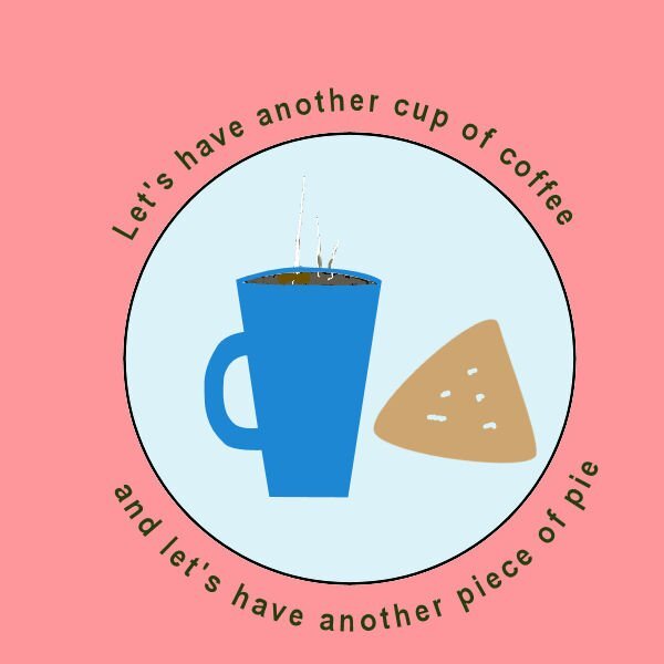
Lesson 5. I can't believe the trouble I've been having with the text tool and the path. Anyway, I managed to get the text to go along the path on the mountain and the circles paths for the cup of coffee and piece of pie. I know - the piece of pie doesn't look like much, but that's all I've got this afternoon for it. It is what it is!!!!!
3 points
-
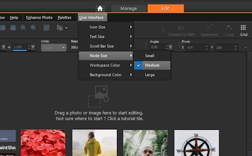
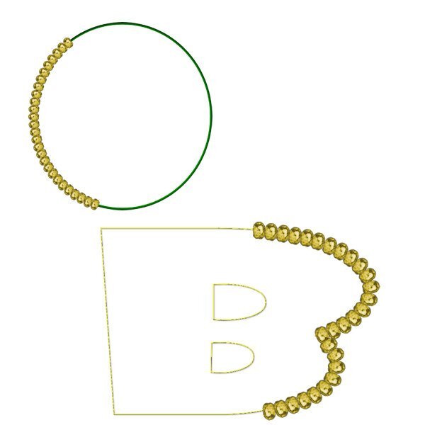
@Mary Solaas That life preserver was a perfect shape to do a cutout! For the text, I see that one is a Text object and the other is a Path object. What did you do between the two? @Daniel Hess When you say that you pasted a second time and it didn't do anything, could it have been "invisible" because it would land outside of a current vector? Just guessing here. @Donna Pearson I am always trying to help when someone is stuck. You are doing great now! @Trevor Andrew I am glad to see how you are now able to troubleshoot your own process! That is good as it will help in the future. @Bonnie BorntragerIf you need more hair, there is a set of free hair picture tubes you can get in this blog post. 🙂 But now that you know how to do all those projects, you shouldn't lose anymore! @Anne Lamp You can change the size of the nodes if you go to the User Interface menu on the right of the menus. Donna and Trevor already mentioned it so you might have already changed it. @middie I have a Picture Tubes Workshop on my to-do list, but I have others too so I am not sure it will come this year. But stay tuned! I see you were playing with the buttons script. I suspect (and it is not wrong) that you changed the Selection mode to Angular for the blue buttons. That is why all the buttons on the horizontal line are the same then the vertical line too, etc. Depending on the angle of the path, a specific button is selected and once the angle changes, the button changes. For the pink buttons, you probably had the Selection mode set to Random (which is the default). See how you can play with the settings and get very different results! @Randy I can see a lot more play in your future. Vectors might be intimidating at first, but like any other tool, once you understand the basics, the rest just falls in place. @Susan EwartDo you know that the VectorTube script is the very first script I used? I managed to "open it up" and wanted to know the steps to follow a path with a picture tube; I wanted to write a tutorial on how to do it manually. Well, I never found out because I could not understand what all that "gibberish" was, but it got be curious about scripts, and once I found Suz' scripting course, I was hooked! Have you figured out something about your greyscale flowers? For the Stroke width, one thing to note: in 2023, with SOME fonts, if you have two matching texts and one has 0 for stroke and another one has a thicker font, they might not line up. It seems to be a bug and it affects only SOME fonts, so if you ever notice that, you didn't do anything wrong, and you can then set a stroke of 0.1 in the same color as the fill and it will look "invisible". For the Pressure setting, it is used when you have a graphic tablet set to apply pressure (I never use that with mine) so that you get a different tube based on the amount of pressure. It is really weird and I have never made much sense of it, so I don't use it! @Corrie KinkelWow! That was and advanced project! You get bonus points for those cut paths! @Gerry LandrethI agree with you that it is not always easy to grab the correct node after cutting a path. Zooming in helps but they still look like one larger node. The best trick is to click a little off the center of that big node, in the direction where you expect the side node to be. USUALLY it works. @Donna Sillia Yes, VectorPaint has also a lot of potential. VectorStroke is another one in the series but it is a little less intuitive to use. I might play with it in the next Q&A session following Ann's question. @Jeni Simpson Personally, I would have wanted more jellybeans!!! If you want more, you can change the Placement mode to Continuous instead of Random. That will make the spacing more regular and then the Step value will determine the real spacing. Just another setting to play with. @Alicia GarbelmanGlad you managed to deal with life on time to join in the workshop. I love that photo!!!!! @Anja PelzerWhat a way to practice and combine lessons. Don't tell me that vectors intimidate you anymore. I would not believe you! You still have a few more days to continue your lessons if you are behind. The videos will stay up until next Sunday. Remember to fill out the survey to share your opinion on this workshop (a link will come in an email). I am particularly happy to see some new "faces" in this workshop!3 points
-
It really is fun to try out different tubes, I have a huge file with the different tube, just from playing. I'm glad Carole showed us in the video to just hide the one. One thing I learned is that I had my "create as a raster layer" check box checked so I was getting an empty "stroked object" layer and then the actual stroke object in the raster layer it created above. Too many layers! glad I saw that and unchecked it.3 points
-
I wanted to do text on a path in PSP but kept missing something 🙂 Anyway, I am quite enjoying that part and that is my focus of the vector workshop. I used text to path for the introduction to a video for the service from our church today. I like learning things. I like it much better when I can use what I learn. Thank you again, Carole. I so appreciate this.
3 points
-
Lesson 6. I'm going to have to work hard on this path business. It seems that I've forgotten a lot! With the Globe of the earth, I had to put another circle around the outside of the globe as the maps of north and south america are also open and thus a path. The leaf was interesting - made the leaf last year in the vector workshop and using it as a path this year, I fooled around with different picture tubes and finally settled on the stars. The letter - I had already worked with it several days converting text to a path and this time no problem. I used a string created earlier.
2 points
-
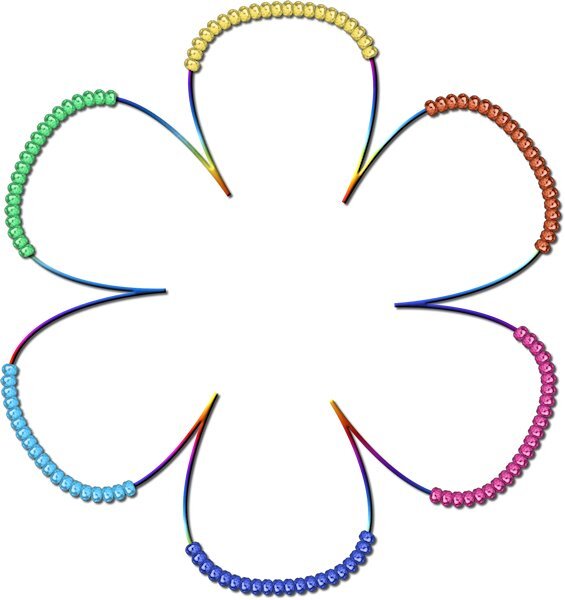
Well, my face is red. Pressure was it and when I opened PSP again it was back to the setting and normal again. but the most embarrassing thing.....There is I think 5 different flowers in this tube and somehow (the settings I was messing with) caused it to just have the one flower, which looked similar to the yellow one (which shows up so tiny). What I was trying to do was to make the tube that normally is random in placement, be not random, but come out one after another and I chose bad settings. This is for sure, user error. Thanks for seeing the pressure setting (I'm not even sure what that setting does).2 points
-
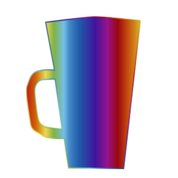
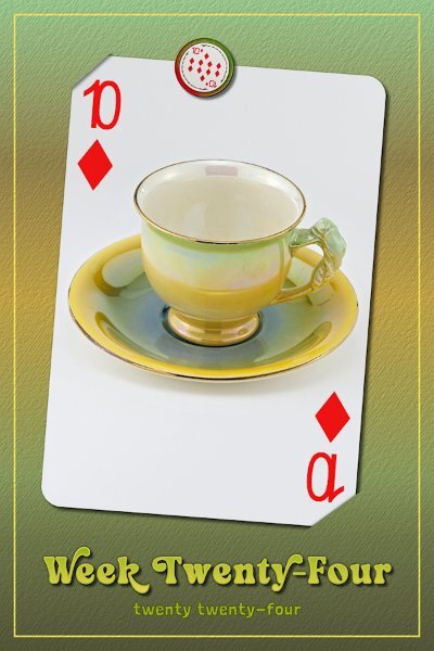
Week 24, I hope it's not a bore and it leaves you wanting more. (that's is for rhyming Sunday) Can you believe I even found a gradient that mimics the cup. I've always liked this cup, it's a keeper. I used the slipped in effect. I sure like it. Carole, how do you come up with this stuff? I hope you keep it up. And I also used a texture on it, and the frame outline and the 2024 text.
2 points
-
Awww, Jeni, that's so kind of you to say. The feeling is mutual, I'd be no where without all campus members. It really does take a community (to raise a PSP-er).2 points
-
You are all such creative people here, and your work motivates me to improve my vector skills. Thank you, Carole, and everyone. Next Vector Workshop, maybe? Jeni2 points
-
Thank you so much, now if i get time I will go back and try all if them. It makes all the difference when you know WHERE to look for something.2 points
-
This is awesome Corrie. I remember this lesson was challenging for me. I hope this year I'm better. I should look and see if I have the vector spiral script, it look really neat.2 points
-
I also changed mine, then changed them back again. when they are bigger (and way easier to see) you still have to click in the middle. I found I was missing the middle so I went back to the small ones (why are they this small anyway?) and zoom in.2 points
-
These are the screenshots of before and after using the text tool
2 points
-
Lesson 6 part 1 What a fun script this is. I learned I NEED way more picture tubes.
2 points
-
2 points
-
Hi Anne. I had difficultly with that too. Go to User Interface at the top of the screen above the tool bar. Click on that and you will get various options you can alter, including font size, text size, and node sizes. Mine is now set to large. Shame there's no Extra Large!! Hahaha2 points
-
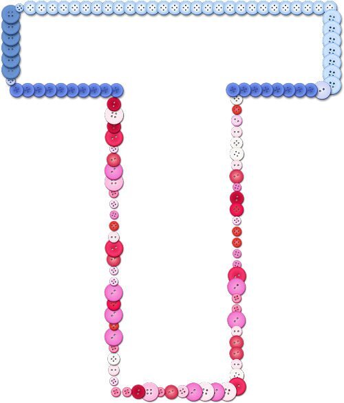
Lesson 7 assignment enclosed. Stil having trouble matching font & tube styles & sizes. This looks like I used one tube around one complete path but I did cut the path in half so I could work on the top and bottom of the letter separately (that actually was the easiest part). After numerous combinations, I decided to use one button tube for the top and another button tube for the bottom. When I was cutting & moving nodes, I didn't get the images to line up properly & had to use the pick tool to do so before merging the layers at the end. Some mistakes are easiert to hide than others........
2 points
-
I am way behind in this challenge for various reasons. One thing I can't figure out is how to increase the size of the size of the NODES so I can wee them better. I know Cassel said how to do it, but I can't figure out how to access the place to do that. It is probably one of those DUH things, but I just can't get my head around it. Without doing this I get frustrated every tome I try to do anything. My eyes aren't as good as they used to be and my screen is not very large.2 points
-
This workshop was alot of fun but some of it was hair pulling. 😆 Thank You
2 points
-
Lesson 5 gave me a lot of trouble suffering from Murphy’s law “If anything simply cannot go wrong, it will anyway”. Finally I realised I had not selected the correct layer, duplicating the path doubled the number of layers, reverse path on a text layer seriously messes things up. Carole mentioned duplicating the vector / layer before adding text, for me that worked as I could “reverse path” on one vector, named as lower text, now typing in correct order. Then tweak the offset making sure the correct layer is selected. A little more practice and still suffering with reverse paths, sometimes seems we have to be specific in the order we do things Still need practice to perfect the workflow.
2 points
-
I've finally finished the 6 Vector lessons. Thanks Cassel for the quick response to the Need Help post yesterday. It really helped. It is version 22.2.0.8 PSP Pro 2020 Ultimate I'm using. I'm so excited about what I can do with that learning! I just need to find the time now! And I'm now really looking forward to the next lesson!
2 points
-
@Cassel and everyone else as well. Going back to the 16 cups file, I have found that OFTEN, after doing the cutout, then pasting it into the vector, the cutout doesn't happen i.e. I do NOT get the transparent section in the cup handle. Then I start using the undo step by step until the NEXT undo is the Reverse Path command. If at that point I go into the cutout section and select Reverse Path AGAIN, then select all, cut, then paste into the vector, IT WORKS. I don't know what I've been doing that "already" reverses the path before I try to do it on the first attempt but somehow, when my initial reverse path is invoked, the path was already reversed (apparently...if doing it a second time makes it work). Anyhow...I'm now up to "Multicup07" preset shape in the cups file. I have also a couple of times tried to get fancy and paste a second cutout into one of the vectors but that hasn't been working. When I'm done with the 16 cups, I'll go back and tackle that and figure out how to make it work.
2 points
-
Susan so nice to see you got the hang of it! Once you know how to do such things it becomes easier each time you use it. So don't loose it, use it!1 point
-
Gerry, that flowertube looks great on your G! I have that one too and it is so versatile!1 point
-
I think that is a hard decision for an author, what format to print. A book has to show a spine when sitting on the shelf of a book store to have any chance of anyone looking at it. I've had books that had a spine and inside the coil binding, the cost to print that and the added weight for coil in shipping (customer and printer) would be quite high. BTW, the book I had didnt have that many pages and was over $60, likely because of the additional steps to have a lay-flat book and still show a spine to catch the customers attention.1 point
-
@Mary Solaas That life preserver was a perfect shape to do a cutout! For the text, I see that one is a Text object and the other is a Path object. What did you do between the two? @Cassel - I used the text tool as I normally do and typed my text. Normally, the text shows up in the layer beneath and is not blank. To get it to show up in the layer underneath I used the pen tool. I've never had to do that before. If I wanted to use the vector tube script on a letter, I just typed the letter and it was a path. So, I'm not sure what happened this time.1 point
-
Man, I'm confused. Except for the post by Alicia Garbelman above ^^ the rest of the page is from last year (2023) ???1 point
-
Thank you for the encouragement. Carole's flowers were a happy accident. After clicking through so many options, that one popped up.1 point
-
Anne - I have the same problem. From the menu bar, go to View and find Customize. From there, find the Options tab and you will be able to change the size of the nodes, icons, and scroll bars. It's easy to change back and forth depending on what you need to do.1 point
-
Wow Susan you really had fun playing with the vector tube script!1 point
-
When I just watched the Lesson 6 tutorial with the Vector Tube script I thought of Gill Sans Ultra Bold immediately. It's one of my favorite fonts. I am thinking of the small 'i' and wonder if the script will find the dot since it's not attached. I'll find out tomorrow when I do the lesson. Everyone has done really awesome stuff in Lesson 6, I'm excited to get to it.1 point
-
Thank you Carole. I will try that. I know that it's something I'm not doing right and that it's a simple fix like you've offered. Often my issue is "where" I am clicking as opposed to where I "should be" clicking. Clicking the mouse in the right spot is important I am learning.1 point
-
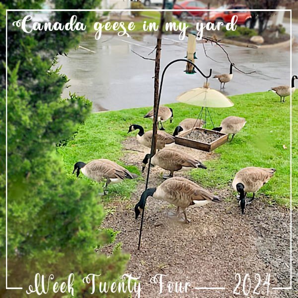
Although I curse out the mess underfoot that the Canada Geese leave under my dead cherry tree, now that they've migrated, I miss them. This was last week and now they're all gone for the summer.
1 point
-
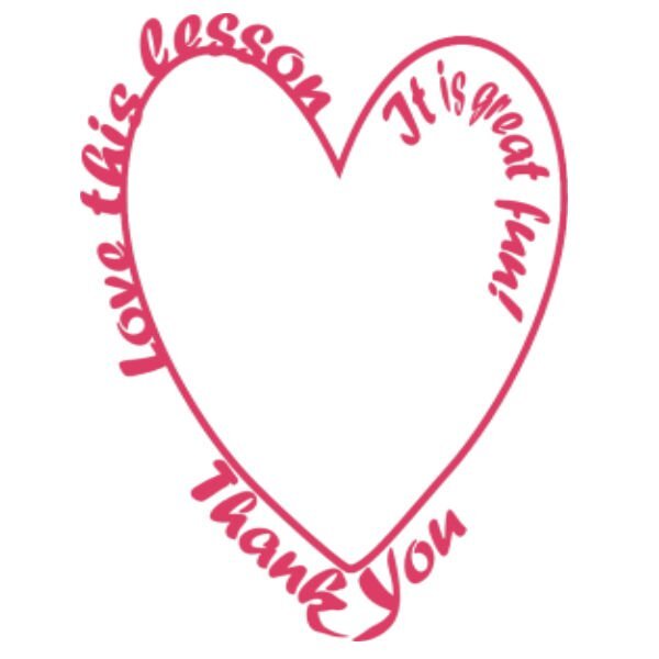
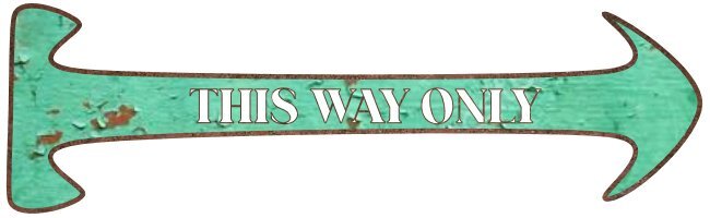
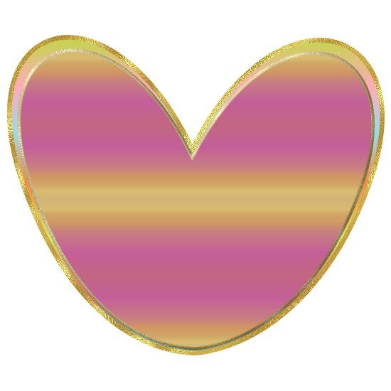
stylized arrow, and a heart
1 point
-
Second time round for me on this workshop..... vectors are soooo very hard to remember let alone use. I didn't use any special fill or lettering as I am still trying to concentrate on node manipulation so my imges are recognizable. Did try a bit of extra manipulation in getting the heart through the arrow but it looked flat so I grabbed a brush to add some irregular marks around the entrance point of the arrow hoping to create the effect of a bruise. Sometimes additional "play" takes the edge off those pesky nodes. I am no artist so I doubt that I will be drawing many vector images but I really want to master text on a path. As for other members comments on PSP9, I still have my old WXP with PSP9 & AS on it and it is my favourite combination by far. I kept it primarily for the seamless integration with animation shop and for its ability to use all of the older free plugins that hate 64 bit installation. I use PSP 16 & 18 but 22 is waiting for me to stop avoiding installing it. I don't mind them adding new features with each release but I just wish that they would leave the old features alone. Change for the sake of change is so annoying and don't get me started on the fine print online manuals. I still have and use the paper manual that came with PSP9, a copy of a "Paintshop Pro for Dummies" book, and , of couse, Cassels own great publication.
1 point
-
I have done this workshop before, as well as tutorials and master classes, but it's always good to review them. Thanks to these lessons, I don't struggle with the nodes as I used to. After choosing the arrow shape, I changed the node type of the arrow to symmetrical. I added the Text to a separate layer.
1 point
-
I'm here, too. I have done a number of tutorials over the years in PSP, but find with some things I have to look them up again to figure out how to do what I want to do. Hopefully I will retain more knowledge id I use it more often.1 point
-
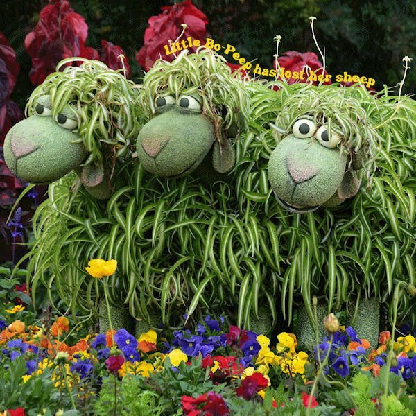
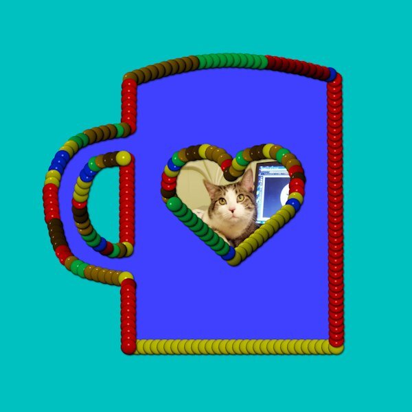
Her is Vectors Lesson 5 text on a circle. For this project I used a photo of our Leo who will be forever in our hearts.
1 point


.jpg.ff3ff437ad40c3e3815a58580fa32841.jpg)