Leaderboard


Popular Content
Showing content with the highest reputation on 06/22/2024 in all areas
-
Haven't had much time to play as a major house project started much earlier than I expected .... but I am following along. Love seeing what everyone has been doing! I am looking forward to July 4th ... a traditional day of BBQ around this family!
 11 points
 -
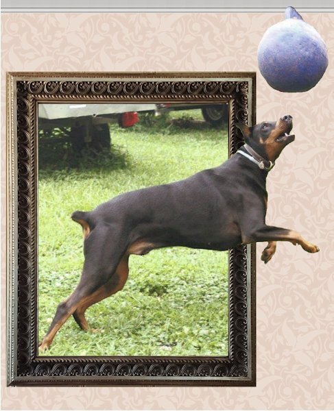
Lesson 4 "Failure". Haven't figured out where it went wrong but the "cutout" isn't truly "cutting out" for me. Maybe I missed one of those double node merges but I didn't see any to merge. At any rate I should be seeing transparency in the handle after using the Preset Shape I exported and it is filling just like the main cup. The dog is pestering me for his walk and he won't let me concentrate on anything else until that "ritual" has been observed. As of September last year, we had 3611 (and change) miles logged with my Garmin watch (since Nov 2016) and have done a couple or more hundred since September. He is almost 11 and we won't have him for too much longer...he is a large doberman...getting gray and he runs out of steam early after commencing our walks these days. Pretty much maxing out at 1.5 miles on good days.
9 points
-
OK...I have done Lesson 5. Here is my submission.
8 points
-
Kinda cool
8 points
-
LESSON 5 I found this tricky. I now see why Carole keeps emphasizing to convert to path. It is so easy for me to forget that step. I like how far I can go in PaintShop Pro. I usually use AAA LOGO Software to create text on circle. I like the fact that it has a lot of shapes that come with the product. It also has the ability to add things like an outer glow and inner glow. How can I go from my PaintShop Pro version to add the features I can in AAA Logo? I know that I could try to create a shape with the points but expect it would be tedious and would probably not be 100% symmetrical. I have a script that I created to duplicate and rotate and used that to create the points (but it is not vector). I added that behind my text on path and can get part way to where I can with AAA Logo software. For some reason, as I duplicate and rotate, the size of each eventually grows so that my last triangle is noticeably larger than my first one ... I don't know why this enlargement happens It is most noticeable at the top . Any suggestions on how to get it all the way to look like AAA Logo creates it would be appreciated. Anyway, in PSP, I think I may be able to replicate results. I have tried now a number of times with some success. NOTE: The one with the green glow is the AAA Logo one.
8 points
-
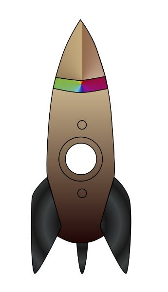
Lesson 4 Whew, this is an emotional rollercoaster lesson. As I told Daniel in an earlier post, I thought I was rock star, I finally got it. And today? failure after failure (the rocket). I could get the cut out, but could not get it to show when I filled it. I finally got it, but I don't know why I got it or why I didn't get it, which is important to know so I don't continue that way. I have lots of questions about the rocket I did. About how to go about it. The words arent in my head right now and it's lunch time...must be hungry and cant think (it cant possibly the entire week of only 3-5 hours sleep a night, naaaaa 😜) Carole, I'll try and formulate what I want to aske about making complex stuff like rocket with overlapping lines and other issues that came up. I'll wait until I get caught up first.
7 points
-
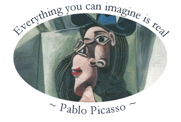
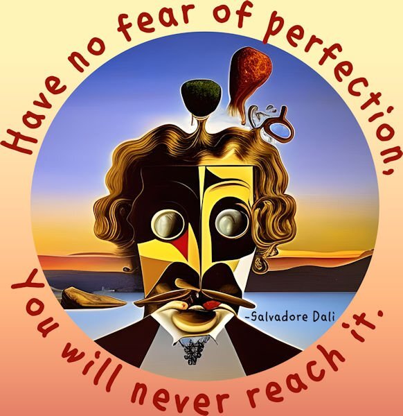
Thank you, Carole, I had been searching for offset, yet when you said where to find it, and that was where I had been searching, I actually found it to the right, after warp text and mitre limit. I tried this text in a circle again, using an ellipse, and a quote from Pablo Picasso. I'm no fan of his later work although have an illustration he did of a horse and the anatomy is accurate.
7 points
-
day 57 points
-
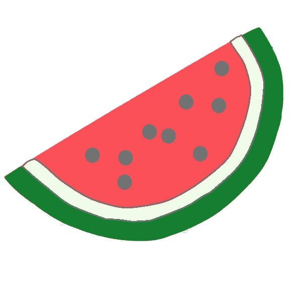
Lesson 3. Use pen tool to outline an object. I chose to do the watermelon slice from the group given of summer fun stuff. I made a preset shape with just the red slice. I then used it to create the slice I could use in a summer picnic layout.
7 points
-
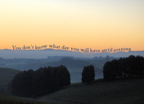
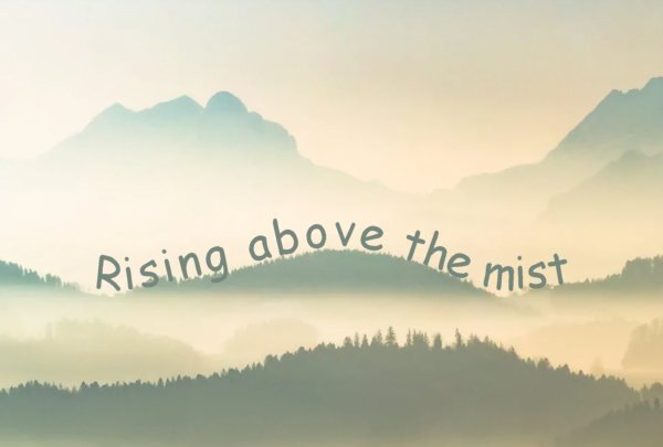
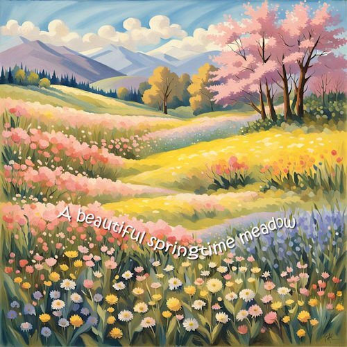
Day 5 part 2 I found a photograph I took in the early evening from a road up in the hills near where I live. I love this time of day, and have a few pix taken at a similar time. Quote is by Sophocles. Jeni
7 points
-
Thank you, Carole, I had spent quite a lot of time searching for the offset, and now, thanks to you, I have it.
7 points
-
Lesson 2. Make a label from more than one preset shape. I loved the snowman that was shown earlier. So - I decided on a whim to try and make Mickey Mouse. Well this is what I came up with. Since I had made labels before (but not grouping them with different names and as one pspimage) I just decided to show some of them.
7 points
-
Day 6. "It's Showtime" was me in avoidance mode. Playing with PSP is much more fun! The tubes are LED lights from Cassel. I did two runs at slightly different sizes. One tube layer is in front, and the other is in the back of the text. The spotlight is from Pixabay, and the light is from a group of brushes I had in my stash. I do have a couple of questions. Is there a way to have text that is not an outline? Rather than having a rope outline in the Sailing example, I would like to have the text as a single rope. My first thought was that it would need to be done manually, but I didn't like that thought. Is there another? Second, at some point, I saw Carole do a neat trick that turned a preset star shape into a flower using the node arms. Can you remind me how you did it? I would only get it to work one arm of the star at a time.
6 points
-
Lesson 3 - Leaf Thank you for explaining so clearly how to copy a shape. I will be using this feature a lot.
6 points
-
Oh, wow, I didn't know this. I also hadn't noticed that my anti-alias would stop working spontaneously from time to time. I do take special care with the settings for the Pick Tool which seem to change without warning. I've also realized it may depend on if I just used a script as they do change settings without warning.6 points
-
Second parts of lesson5 is enclosed. The image (which does look a lot like me) is from Pngtree where I have a premium subscription.
6 points
-
Lesson 6
5 points
-
Ann me neither and it happened a lot too. I have written this this "trick" in my list of really important issues. Like you I always check if the Pick Tool is set correctly because that one has a mind of its own 😉4 points
-
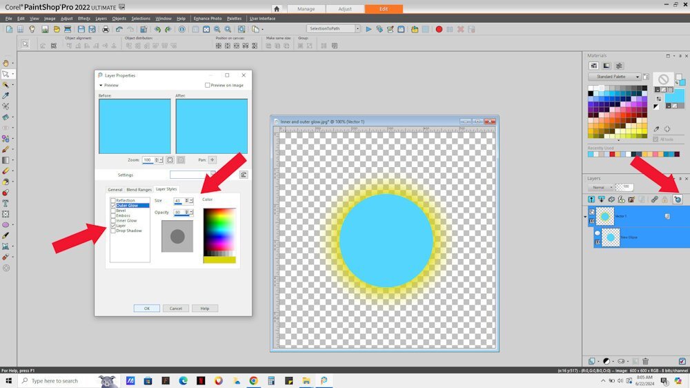
@Randy Inner and Outer Glow are available if you use Layer STyles on your layer. With this vector I used both inner and outer glow. There are other effects available with them
4 points
-
@Jeni Simpson I am glad for you that you had the time to follow the workshop this year! Where were the settings in the end? Were they collapse on the side? I am glad you have all the settings now to complete the projects and the results are worth it! @Emerald Jay The reversing of the path for a cutout might not make sense at first, but if you think about it, the inside of the shape can be FILLED, but thinking in the "reverse" of it, it would be EMPTY. So, associating the REVERSE behavior then makes more sense 🙂 Sometimes, you just have to find some ways to remember steps. Yoru sun and text on path look great. @Daniel Hess I don't understand why your PSP would freeze when exporting a preset shape, wherever the folder is. That is a strange behavior. However, I remember that if I point my PSP to different folders, especially after I added some, it tends to check them all in case of duplicates, and that takes a long time (really long time). Could that have been the issue? And since you removed a folder and it stopped, ... You are doing great so far! @Jnet Allard Nice cup with those diamonds. @MoniqueN. Of course there will be more workshops. Sometimes, life happens and PSP just waits. @Corrie Kinkel In Canada, weather is so often the topic of the day. You might have noticed it in the Campus newsletter too! 😉 You have learned (and remembered) so much in those years since you started. @Susan Ewart I don't know why the Anti-Alias gets unchecked either, but I notice it too. But if you have a path that is jaggied, do you know that you can recover the Anti-alias without having to redraw the lines? Activate the object in question and go to Selection > Modify > Recover Anti-Alias. @Bonnie Borntrager I love that little girl with the text around her. You did a good job! @Gerry Landreth Your projects for Lesson 5 are delightful! @middie I sense that you are having fun with those vectors now! I LOVE that vintage quote! @Donna Sillia Getting ready for the Holidays already? Why not! Fun mug! @Mary Solaas Mickey is a great character to practice! Tomorrow, we will go through a totally new way to use vectors and that will open up so many options for you. Stay tuned!4 points
-
With this 5th lesson the fun is starting, at least for me. I use text on a path regularly on all kinds of projects, so no problems here. For this assignment I used a photo from a friend which I have for a long time, but never used it. I vividly remember the very first time I tried to make a postmark in the first Travel Challenge I participated in when I was a newbie to scrapbooking and the Campus. It took me for ages and I didn't understand what I was doing! Now I use postmarks very often for a date or a place and this time I played a bit with my postmark, made it in color with 2 little flowers left and right and a photo in the middle. As it is suppoost to be a postmark I used a distressed brush to give it some grunginess.
4 points
-
I'm not doing a whole lot with the lessons because we have a very, very welcome visitor whom we are entertaining. The pattern on the cup is my own, the drips and chocolate are from FF and the whipped cream is from the cass frosting script with the warp tool applied. Candy cane is from Canva.
4 points
-
The first image is from CF and the font is Chrishmkbold from my Hallmark Card program. The background is a gradient. The second picture was just sent to me by my grandson from Thailand where he is visiting and playing rugby. The font is from CF and called Asian Pacific.
3 points
-
Oh, yes, the pick tool is a mischievous little devil.3 points
-
LOVE this phot and the quote.3 points
-
What a stunning photo Corrie. Both of them3 points
-
This is lovely!3 points
-
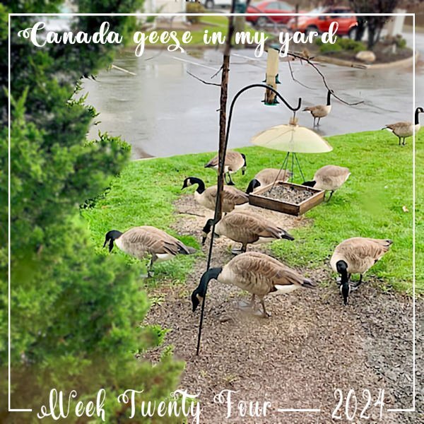
Although I curse out the mess underfoot that the Canada Geese leave under my dead cherry tree, now that they've migrated, I miss them. This was last week and now they're all gone for the summer.
3 points
-
Lesson 5 - The sun element came from an old scrapbook kit I made years ago called Keeping Cool. The saying is by Walt Whitman. This lesson was easy for me since I've used text on a path numerous times in the past. And in this case reverse path did make sense to me.
3 points
-
My lesson 4
3 points
-
I 'm ready with day 6 and the old lesson2 points
-
I made something as a kind of label with a flower tube around the shape. Used my own initials filled with a gradient and the C has a sequins tube that I made for another project; the K has a flower tube made of an extracted flower that I did some time ago. The font for both is Beauty Smile.
2 points
-
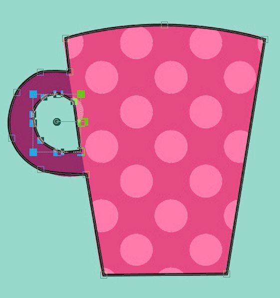
I"m not sure if this is anything, but when i was pasting I was trying to paste on the canvas in the hole it came out of, but when I did it again and pasted on the body of the main object (the cup) it worked. Now, this may just be a coincidence. Why can I do it one time, then not the next, makes me scratch my head at what step I miss.2 points
-
Daniel what a beautiful dobie. So sad and heartbreaking to see our pets age. I've had my share of issue's with the cut tool. Just yesterday I realized when you do the right click this, right click that, I was doing it on the layer in the layers palette. that did not work. Then when I thought I truly understood it yesterday, today was maddening (I will be posting the results) and I couldnt cut anything. So, I feel your pain. Very cool stats on your walking, I love that sort of stuff.2 points
-
Oh wow, I did not know that. thank you, I will go back and fix it. Speaking of fixing it, on the camera I see I went over with line, is there a way to get rid of that mistake? Oh wait, would I just go back to the vector, in edit mode, mode the node back?2 points
-
I told that we have those geese as well and that they are becoming a pest because many of them don't migrate any longer and are staying permanently now. This morning I read in the newspaper that there had been an accident with a truck on the highway in my region. The truck wanted to swerve to avoid a family of geese that were crossing that very busy highway and the truck felled on its side along the road! The road was closed for several hours to clean up because a lot of the cargo and some oil had been spilled.2 points
-
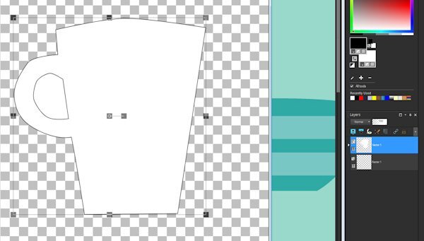
I honestly don't know what I'm doing wrong at this point. I've deleted everything and gone back the drawing board and followed along step by step with Lesson 4, pausing the video with each step. It "cuts" the cutout vector and I can paste it into the "cup" vector and reposition it but the cutout is filled when I check it. The only thing different is that I'm working on the original canvas of many cups and started with the upper left one. The vectors are in the layers palette and show up on the canvas and when I switch to fill AND stroke its all there except the cutout is NOT cut out. GRRRR !!! To the best of my knowledge I'm set up exactly as Caroline was in the video for the pen tool. The image below is what I have right after I paste the cutout into the main cup vector and reposition it. The "test" fails (so far) every time.
2 points
-
Getting better.... only took 3 tries to get these assignments done. the first is enclosed.... sending second one separately as I am not sure if the two together will create issues. This one doesn't fare well in a small size but it is gorgeous as a wallpaper. Couldn't resist adding the frame.
2 points
-
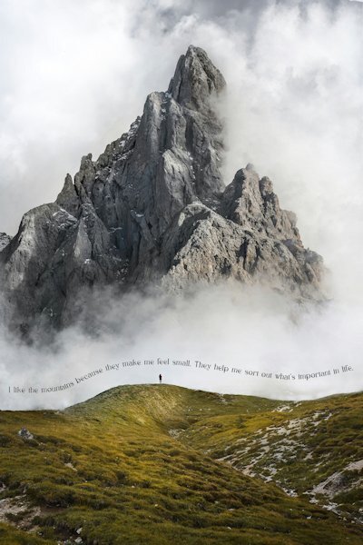
Day 5: Mountain photo: Massimiliano Morosinotto (Unsplash) with a quote from novelist Mark Obmascik. Rainbow Roses: Denise Chan (Unsplash) with a quote from American poet Lucy Larcom (March 5, 1824 – April 17, 1893). The quote in the mountain photo is: "I like the mountains because they make me feel small. They help me sort out what's important in life."
2 points
-
Don't bang your head against a wall as it achieves nothing. Eat choclate or shortbraed instead - calories are calming..... vey calming..... as I munch away during this lesson.2 points
-
Vector lesson 5
2 points
-
Lesson 3 I thought everything was going great. Somehow my anti alias got unchecked. I wondered why things were so jaggy despite not being that zoomed in. Ah, the newbie in me rearing it's mistake-ridden head again. I will post what I did so far because I'm out of time now. I did the camera parts as different objects that I WAS going save as a preset shape. I liked the camera (from the summer collection download) so I will do it again, I can sure use the extra practice since I see some mistakes I want to fix. I also showed the outline on the camera so you could see the parts. I need to go bang my head against the wall and repeat: Anti Alias ALWAYS checked. If I had a blackboard I'd write lines too! 😩
2 points
-
Well you must have that from the Dutch because over here the weather is always and everywhere the topic of a conversation!2 points
-
OK. Doing "ONE" object/cup and changing the stroke width to 10 (from 5) actually worked. I still do not know what I was doing wrong when using the whole cup file. I'll take the "win" and might go back and try the big file again. Originally was going to see if could make a shape file with multiple preset shapes as per lesson two from a few of these.1 point
-
I am lost in lesson 5. I work in x8 and I cannot find how to get the text in the right place on the bottom of my circle. I cannot find a 'more options' button to alter the offset. Does anyone know where this might be in x8? Jeni1 point
-
I love this! You think spelling something wrong in a layout...try hand lettering a quote and seeing a typo at the end...especially if you got all the spacing correct and the lines straight. There is no undo only a do-over.1 point
-
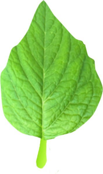
I redid my leaves using the pen tool and the nodes. I filled the first one with the photo of one of my leaves. I made wonky veins with the pen tool, added a gradient and filled with the fine leather texture. The stems were isolated--one filled with a gradient green and one filled with a brown gradient. This time was easier than the last time.
1 point
-
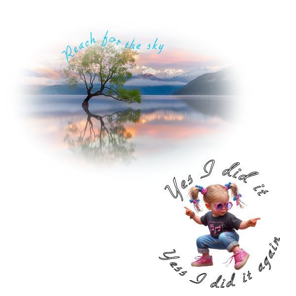
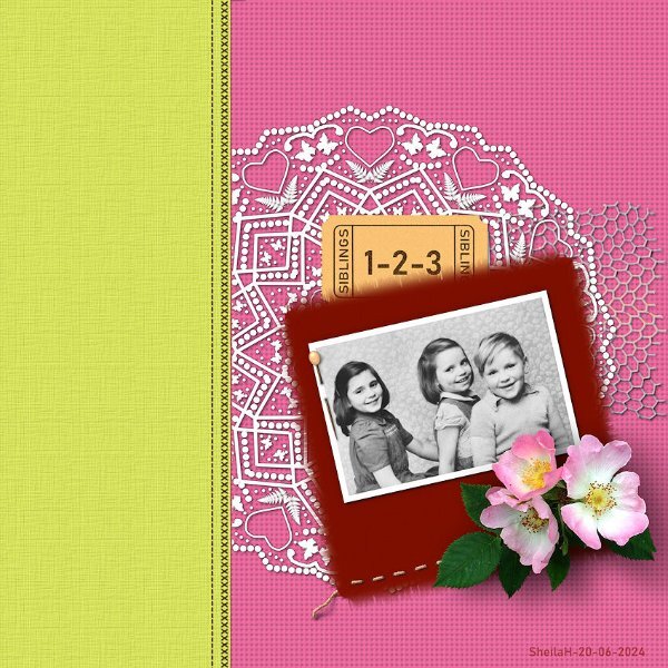
Had a go at this but nothing like the idea I had in mind. However, mine is side to side and quite vibrant which is out of my comfort zone. I used Carole's Admission & Laser Doily Scripts and a font called Bahnschrift SemiBold. The dog rose is from one of my photo's I extracted many moons ago. Other images are PSP tubes but unknown creators. I used some texture on the backgrounds to simulate fabric and tried to make some stitching effect. TFL.
1 point
-
Take care, Michelle, get well quickly1 point
-
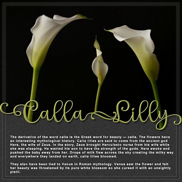
Yup, I spelled it wrong. ARGH! I didn't notice until I was looking up information about Calla Lilies. Weirdly, I found some Canadian sites that use two Ls. I'm pretending it's the Canadian spelling or maybe I accidently bought Left handed lilies? They are spelled with two Ls, right? I didn't quite get the layout horizontally in equal halves either. It was fun to make though. The font is Lophinky from CF, which has LOTS of glyphs by the way, and Arial. Photo's are mine, I used 3 photos and a blend mode to set to Lighten. I didn't know the flower is actually the pointy thing in the middle (pistil?) and what I thought was the flower is actually a leaf. They are quite beautiful.
1 point