Leaderboard
Popular Content
Showing content with the highest reputation on 06/04/2024 in all areas
-
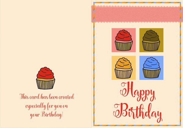
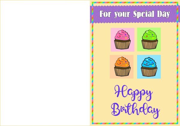
here is my day 7 card, photo my own, lace is a picturetube from Cassel9 points
-
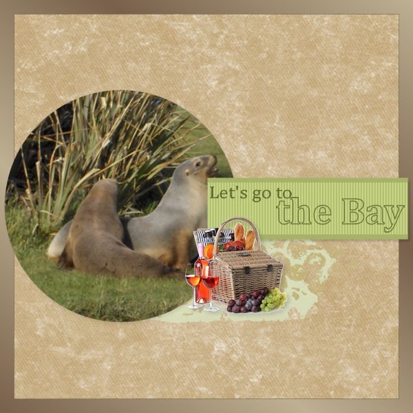
Beautiful page! Love the title! When I was home in Dec and Jan 2024. I bought the girls a cookery book from a charity shop. It was like new, it hadn't even been opened for one pound 50p. Inside there was a recipe for lemon blossom flower tartlets. Of course their mam didn't have any flower cutter, so I ordered a set of 5 online for them. As you can see , they turned out great and tasted delicious. Whilst making them, the lemon tree song popped into my head out of the blue. I found and played the video over and over while we were baking them. The girls soon learnt the chorus by heart. That song was reminscent of my youth too! The other squares are carbob slices. In Wales not to far from where I lived as a child there was an orangery on the Margam estate. It is still there, open to the public. Filled with many mature citrus trees.7 points
-
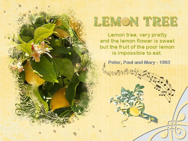
As soon as I read what the theme for this month is, I thought of a photo I took on my trip about a lemon tree. To me that is something that I never see at home, at least not as a big tree. Here it are little plants meant to go in a big container and they have to be brought indoors over the winter. In the older days when there were big estates it were plants for an orangery. The only set back for me is that now I have this earworm from the song Lemon Tree. It is a song from my youth by Peter, Paul and Mary; it is one of my favorites from that time and I will recognize it immediately if I hear the start of the music. I used the kit Sunshine Lemons from Marissa Lerin for the papers, scatter and all the elements for the cluster I made. The mask is by Jessica Dunn and the music notes came from pngwing. Fonts are Bremlin for the title and Arial rounded for the lyrics. The corner punch is one of a series of punches that I have found once on a search for interesting elements, but I have no clue where I found it in the end.6 points
-
5 points
-
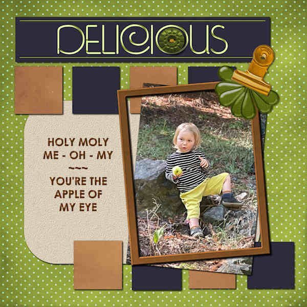
my daughter has some strawberries planted , here is my layout with some photos font is Impact Label3 points
-
Hi all, today I'm bringing the 4th card " Gold Kiss". The Valentine's Day theme is still fresh for me: "Golden Wedding Anniversary". But it's been almost 2 years already...The credits are long, you can read them in the Card Workshop Gallery.2 points
-
2 points
-
2 points
-
2 points
-
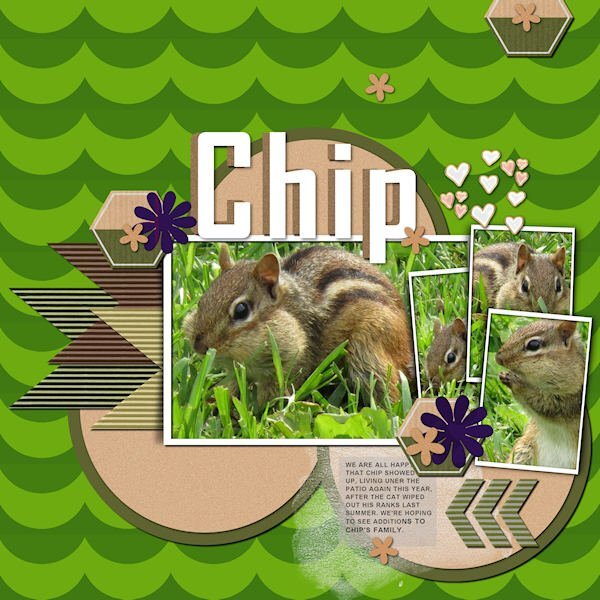
I was happy to find a chipmunk took up residence under my patio and my cat, Eve, is also fascinated. He keeps her entertained since she can't go outside, herself. I snagged some templates from the mailer this morning from Digitalscrapbook.com. This one is from Rachel Martin. The title font is Agency, and the text is Arial. Meet Chip!1 point
-
1 point
-
Those tartlets look delicious and isn't fun to back with the grandchildren! Mine are teenagers now and the eldest (14) is becoming more and more interested in clothes and make-up. Nowadays when I'm visiting and instead of bringing some presents, we are going shopping and they can choose something they really like. Of course I give them a budget. The youngest (12) likes to bake and we made banana bread together, where I was in charge of measuring all the ingredients. She said that was the quickest way for me to become more knowledgeable with the imperial system of cups and tablespoons etc. She is such a smart ass😉1 point
-
I finally had to renew my pc, and the new one had W11 (version 23H2). I tried with beating hart to install my faithfull X-3 on, and lo and behold, it worked! I did need to install the 5 patches for it to work properly, but the thumb nails still need to be installed, but I forgot, where I stored them. So I 'll search the blogs for the download. But I do have the old PSP X-3!.1 point
-
And I remember it being sung by Trini Lopez! I think it was covered by a bunch of artists.1 point
-
1 point
-
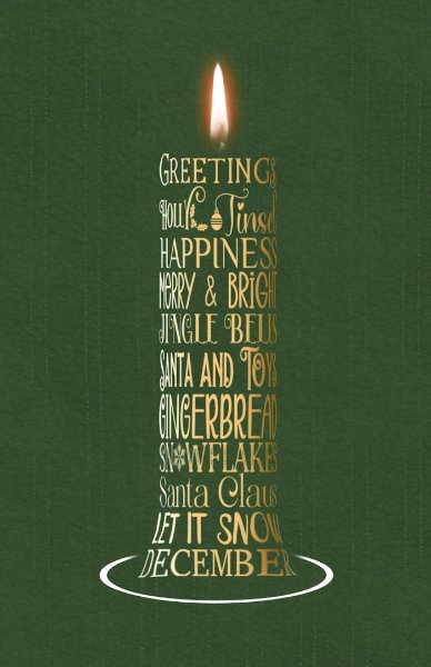
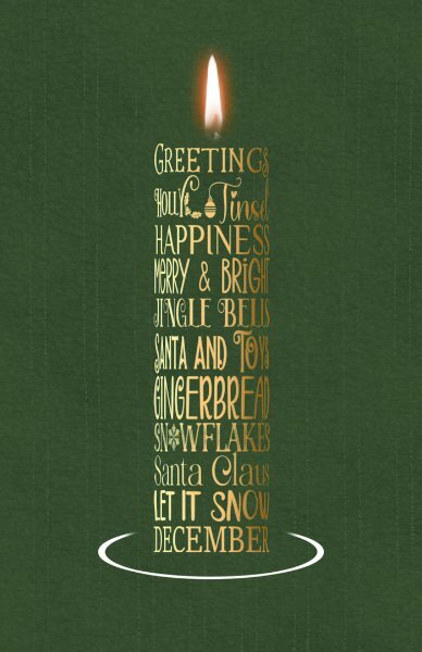
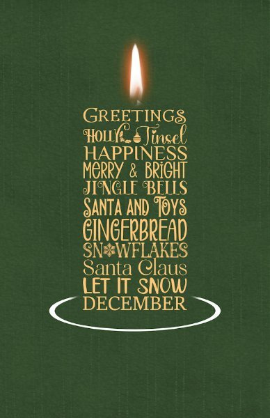
I'm not quite sure what you mean. You want the base of the candle to fan out. Can you give me an example. I can make, say the last two words words taper out like a Christmas tree. To create a base, while still maintaining the cylinder shape.1 point
-
You're amazing! I'm going to challenge you even more and ask you to make the bottom of it curve more toward the white oval. I know I'm a pain in the butt. 😄1 point
-
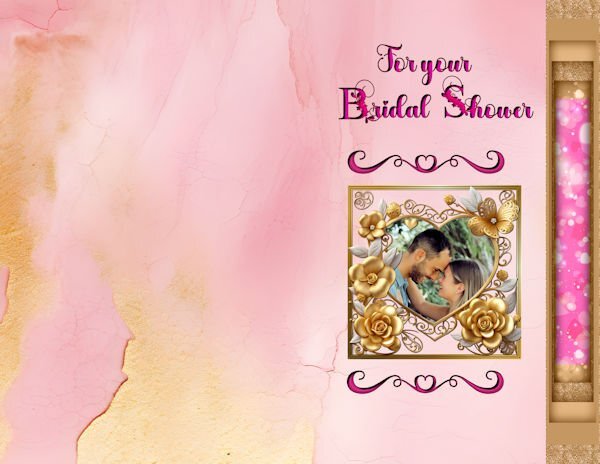
I have been working on a card for my niece's bridal shower this month.My backgrounds are from CF. and the side panel is from the cass offsetcutout. The main font is Valentines, but the first letter is Flowerina both from CF. The hearts are from a Script Bundle downloaded from CF. The heart part of the frame is from CF, and I made the outer frame.1 point
-
To satisfy my own curiosity, I will do another one, using my suggestions. At least when I do need to create another one closer to Xmas, I will know what steps to take, to create something I will be happy to place on a card. I was also thinking of using a word art candle on a birthday card, it could be a funny one even. As we get older, one candle is sufficient. 😉1 point
-
I certainly did! Thinking about it, what I should have done before I started the word art, was to create the word art almost as wide as it is high, in order to create the tube effect. As this one now appears to be much taller, which it isn't, because I have narrowed it to get the rounded effect giving the illusion that it is. Another thing to take into consideration, is to not to have such wide gaps between words on the same line. I will know for next time.1 point
-
1 point
-
1 point
-
I love this! Here's a challenge for you ~ Can you take the word art and make it curved like an actual rounded candle? I have full faith in you!1 point
-
1 point
-
1 point
-
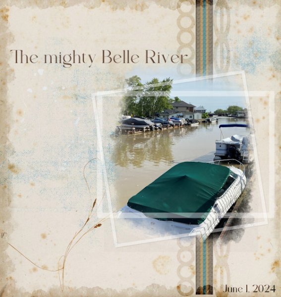
I live in a town named for the river that runs through it. It's an old French community right on Lake St. Clair in Ontario (part of the Great Lakes system). In the photo, the lake is just in the distance. One must cross the bridge to get in and out of town going West-East. Something not noticeable when you do it every day!1 point
-
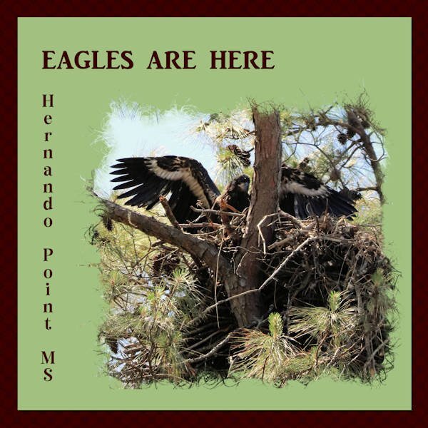
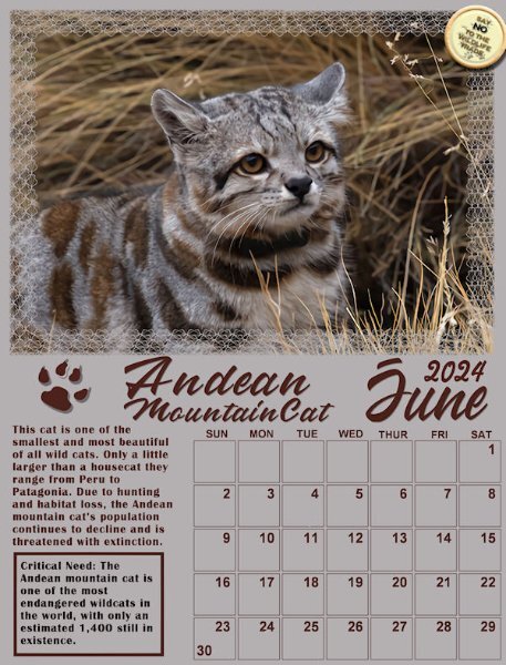
Every time I read or hear about the endangered species, I want to weep.1 point
-
Gorgeous! That flame looks so real. The simplicity of this is beautful.1 point
-
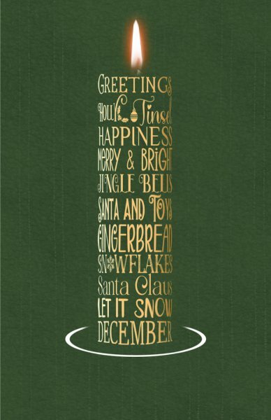
I'm up to date with my cards, also some of my Xmas cards for 2024. I'm back on the Xmas cards and general festive creations which I can add to cards. Here is a Xmas wordart candle, I started last night. The flame is from CF, a selection of fonts and a base I made using a vector shape, and the pen tool. It will easy enough to change colours to adapt to any card.1 point
-
1 point
-
I the process of writing my book, currently, I needed to find the source of all the kits and the fonts I used in layouts made years ago. When I used the Open as Layer-Rename script, it would include the name of the file I used (whether it was a paper, a ribbon, a flower, etc.). This has saved me a lot of headaches in figuring out what kit was used. I also always keep a vector version of all the text, so when I reopen the layered file, if I have used a specific font that is not installed on my computer, I would get a popup telling me what is missing. And if the font is installed, I just have to double-click on the vector layer as if I wanted to edit the text, and it was immediately selected in the Text toolbar.1 point
-
Carole has a script that will the name of each layer into the image information. I use it to keep a record of the various kits I use on my layouts. I do have to add the name of the fonts used after the script runs though since it only reads the name of the layers. Although, the script doesn't always run as it should in both 2021 and 2023. I still have X8 and the script runs perfectly in that version. So once I've saved the pspimage file, I open it in X8 to run the script then save the jpg (sometimes in X8, sometimes in 2023).1 point
-
1 point
-
One of my cats is obsessed with watching the toilet flush. A previous cat I had could flush the toilet.1 point
-
1 point
-
Wow Mary, you are on a roll. Send me some of your Mojo, please!1 point
-
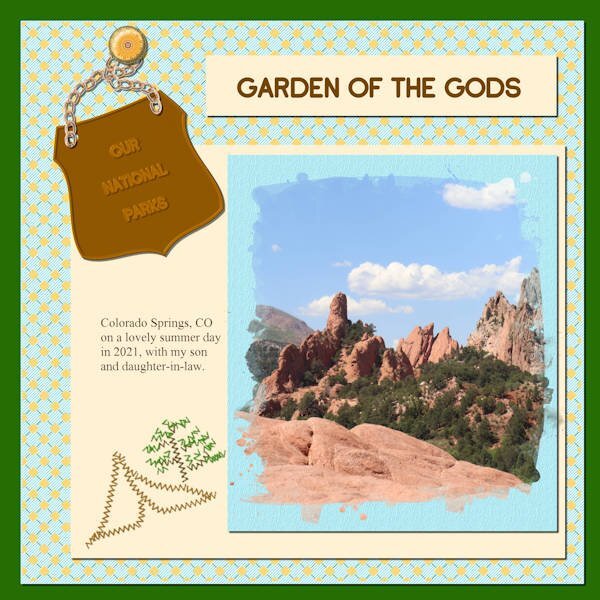
Well, I did go back and finish the 1st attempt. The multiple diamonds background I added the halftone effect; the brad is mine and the chain is a picture tube; the font is from Marissa Lerrin and I placed a background behind it as a frame and it is textured with bark texture; the Title font is Adventure Island SansBold and the journal font is Mongolian Baiti. I assume that both fonts came from Creative Fabrica since that is where almost all my extra fonts come from.1 point
-
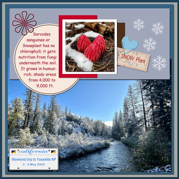
For the Bingo I went with the 5th vertical row: Snowflake, Paperclip, License plate, Ticket, Glitter gel. I already had created a California license plate for my photo album and only had to change the text on it. A have several paperclips done before and of course the ticket was done with my own script (I had never thought that I would use that so much). Snowflake and glitter gel were done with tutorials, but for the glitter gel I used a preset shape instead of drawing it by hand; I'm terrible at drawing! As a starting point for the layout I used the template Lab 14-02.1 point
-
I had forgotten about Lady 22's templates. Glad it was mentioned again. Great stuff there.1 point
-
1 point
-
🤗 Thank you Jeni. I am a big FONT fan😍, I have in 19 years 4000 fonts collected. But I'm still always on the lookout for new fonts in different styles. Of course, I also have to remove some that I have duplicated or never used.😊Your font i used for a birthday card for a family member now.1 point
-
Thank you, Michelle. It looks like I have now completed all of mine. Phew!1 point
-
1 point
-
@Dee Morris and @Jeni Simpson I'm determined to complete the workshop this time. The thread remains open so there is no time limit. Don't hesitate to share what you finish.1 point
-
1 point
-
Mary lovely layout and a good use of that photo circle script. I love that script and have used it for 2 of my intro pages for my photobook.1 point
-
Hi, today I was able to finish the third card in peace. @ Carole: Email is on the way. The "doctor-doctor" Scrap is already older and unfortunately without Tou's and names, only "CD". The heart with EKG is from Pixabay- OpenClipart-Vectors1 point
-
I so agree with you, Dee. If I don't manage to get everything done, I can still complete the cards anyway.1 point
-
1 point
-
I went with the second horizontal row. File tab, Arrow paper, Halftone brush, Fuffy cloud, paperclip. I created a different paperclip, 2 circles with a line joining the two circles at the top. I had already created a halftone brush, which was in my brushes folder. Same goes for the File tab, and fluffy cloud, I had templates for them all. I had to create the arrow paper though. I didn't really know what to do with the cloud, so I created a sprayed effect using a grey coloured watercolur brush. The cloud is actually a rain cloud. Carole's lace font, and canvas patch I had in my stash.1 point

