Leaderboard
Resized.thumb.jpg.d25811db03a63358cedab1e79f527635.jpg)

Popular Content
Showing content with the highest reputation on 05/27/2024 in all areas
-
Thanks for the Lessons I learned a lot more to make more.
 13 points
 -
And here is my take on number 7
11 points
-
Here is my CardWorkshop- Card5. The bear and the paper are from Creative Fabrica and the ribbon is from Marisa Lerin.
11 points
-
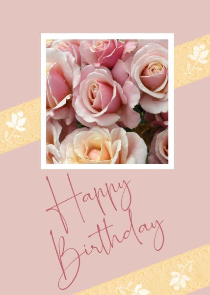
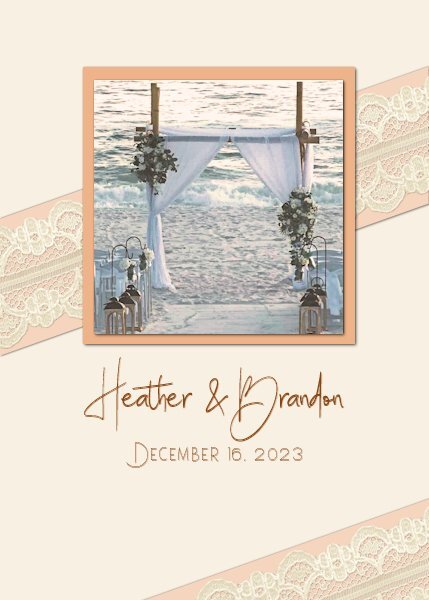
Card 7, at last. I wanted this card to be softer and more feminine than others I have completed. I chose a photograph I took many years ago of a rose bush, although just the roses, I wanted a bouquet-ish look. The ribbon comes from Melo Vrijhof of Digital Scrapbook. This was colourised to match the lemon coloured rose at the bottom of the photograph, using Adjust > Hue and Saturation > Hue Map, something I had never noticed before, thank you, Carole. The font I used is one of my favourites, Romantically Free for personal by maisfontes. I angled it to fit in line with the ribbon without having to reduce to too small a size, and, I think, it works on the angle. Jeni
10 points
-
9 points
-
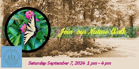
For Card 5 I chose a couple of my own pictures to create an invitation to a Nature Walk. The ribbon was created from the same photo as the butterfly, changing the opacity.
9 points
-
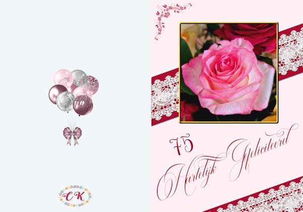
And here is card 7 and already the last one. It is said before but I have enjoyed doing this workshop for the 2nd time and a refresher is always a good thing. Inevitably there are things that I have forgotten! I have loved seeing all the different cards made from the same templates and the inspiration they provide. Carole thank you for hosting this class again. This card is made for a friend who will turn 75 next month. I did a background as well because I want to print it as a double card. The photo I took some time ago from a bouquet I got. The lace comes from my stash, I think it was a freebie by Carole and I placed it on some sort of a ribbon for better visibility. The corner is a brushset of 4 floral corners that I found somewhere a very long time ago.
9 points
-
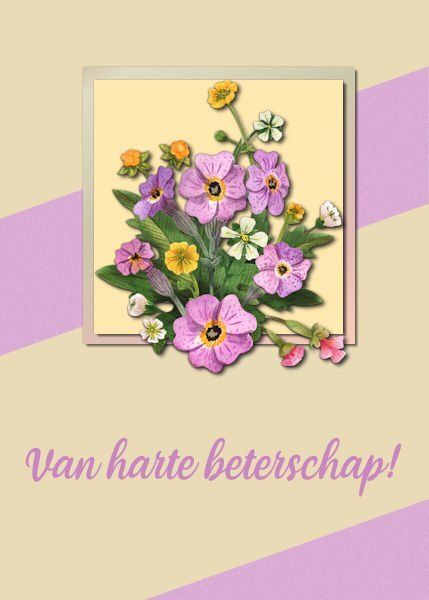
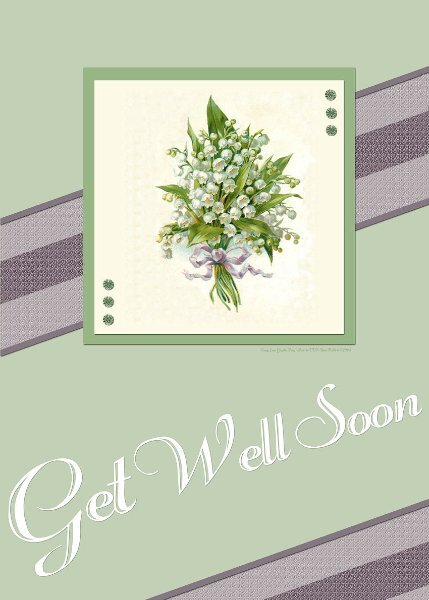
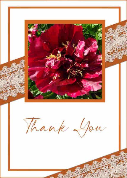
A get well soon card. Flowers are formCreative Fabrica, font I don't remember. The paper and the stripes are meant to be printed, the rest is thick paper 🙂
8 points
-
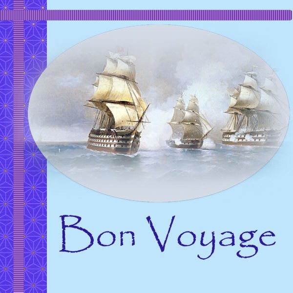
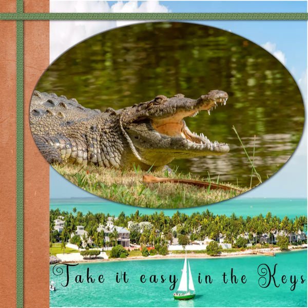
Card 6 at last. I found this beautiful tube of ships at sea and thought of all my ancestors who travelled to New Zealand from various ports around the world, so thought to wish them all Bon Voyage on their 2-3 month journeys. I used a font I have always loved, Papyrus. It has been around forever, and I love the beauty of this font. I added a light drop shadow to the ellipse of the image because it was a soft tube. Jeni
8 points
-
Number 7. Last one. Great challenge and wonderful results by everybody. Well done to you all and thank you Carole for exceding fabulous vids and ideas to stimulate the creative juices. Just a simple one to finish. I used a lovely image from Graphic Fairy and 41.TTF font from CF. TFL.
8 points
-
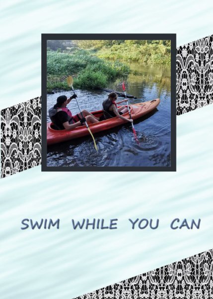
L7. Card7. Shot --kayaking,
7 points
-
Chantalia Designs has a gorgeous vintage collection today. Her site is always free. https://l.facebook.com/l.php?u=https%3A%2F%2Fchantahliadesign.com%2F%3Fs%3DVintage%20Magnolias%26post_type%3Dproduct%26fbclid%3DIwZXh0bgNhZW0CMTAAAR1hK0OUNStC2ntLzs2SGEIM34-386gqoG19G0lJgIS5VSUJ-Q2PnJ8Uqzg_aem_AZ3Exa0uT_lwYA94uH59NW0GgYKh4heAZuvZjxDarYG6b9ppfwnHjrXKfiEHKuB0U6366_eh_1WAvCXrAUQNWCQt&h=AT3uUORnnhicTQ8jwBmSay1lAJPTWNXAjCHc0nUn7jTzG4CAU2WUcmJjNISQDoWVyJcu0-cD5IYqaO0MgXzk52vMudX-xFXc8muSZ1sq-_NP_jERNScliCReGkBsW2D8PCBQ&__tn__=-UK-R&c[0]=AT04vSuDxnR1FxSFR6TdV42WfdbpCe88yy_mAPmJsYgH9WfXK3bGVzxZaVTd46Zt897k4wJC-3Jq2rDXrUsBNItwCmHpQp4axOSo40HnWfC4RUzSvz0PZWSX28yE6L7xBWOBqqJnwxLx7ztYi6oY1ppCH31zz6k-ywtlKYs_YnWthBj_5jCmML9yzF_oKs6O7 points
-
Corrected L.6, Card6.
7 points
-
Finally got to #4 - this took some time; I had a rough time getting the punches to work correctly. VERY interesting.
7 points
-
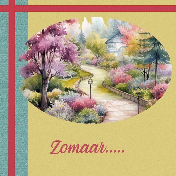
Once again, the Mountain Laurel is having a bountiful year. Template 221 by Lady 22.4 points
-
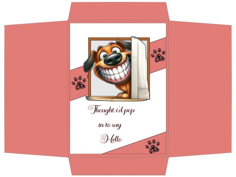
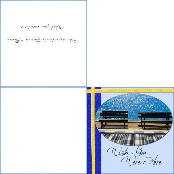
I created the card with my peony photo as a 5"x7" 1500x2100 and decided to set the envelope up to suit UK A4 standard size so I can use it for future. A4 210x297mm = 8.3"x11.7"". In pixels (8.3x300dpi) 2490 x3510. I hope I have understood this. The envelope (not shown) was a little clunky where I had applied the Pic tool Perspective scale on the flaps so I might redo that. I also liked the idea of printing a design on the envelope or maybe a pretend stamp. The font on card is The Billion. Loved the lace. So pretty.
4 points
-
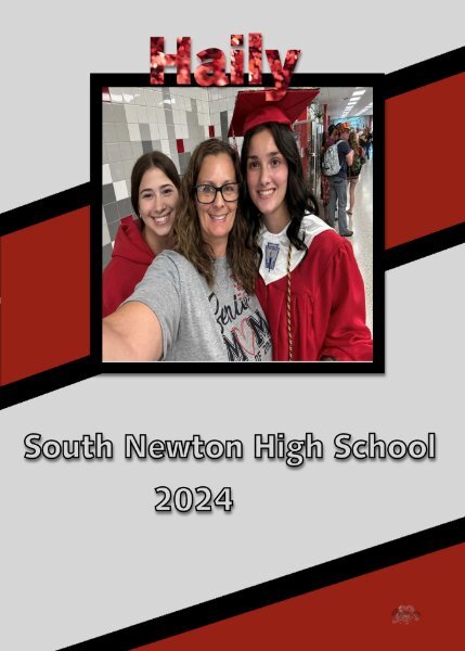
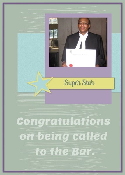
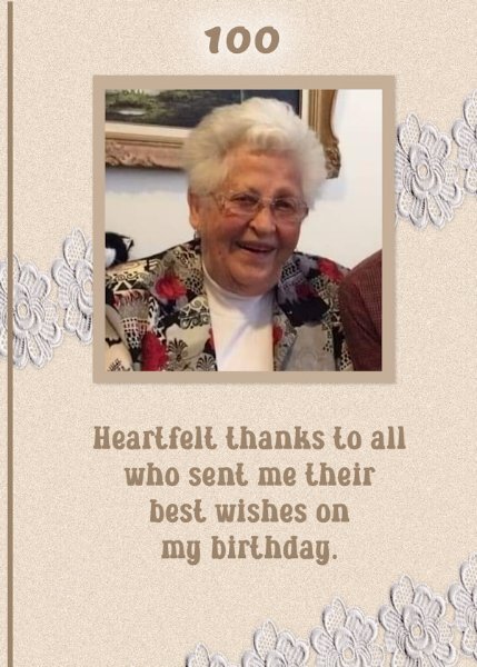
Lessons 6 (extra template) & 7 The grad pic is actually a former college student of mine who went on to law school and invited me to his call to the bar. The 100th birthday pic is a former teacher of mine who celebrated that milestone a couple of years ago and is still with us. She did get many greetings and cards for that occasion.
4 points
-
Card 6. The image is from Freepik. The ribbon was created using a script. Font is called Handmade (from Creative Fabrica). The green border has a simple line added to it as a pattern.
4 points
-
So here we go with number 6. I didn't like the main image overlying the side bar so changed the layout a little. First my card front . and then the four fold
4 points
-
This could have been the cover of an invitation or thank-you card for my niece's wedding (the mother of the 10-foot-tall teenager). The script font is Billie Ashley, and the sans serif font is Satreva. Both are from Creative Fabrica. Thanks to Carole for another fun and interesting workshop.
4 points
-
We should open a card shop! 🙂 Lovely cards, some I would really buy if the were actual cards🤩4 points
-
I like your watermark effect for you the designer. I might nick that idea, especially for the folded cards.4 points
-
Sweet girls! 🙂4 points
-
It has been a busy week! I decided to go with an inspirational poster type card. Lesson 1 The photo is mine. Footprints and brad are from Digital Scrapbooking.4 points
-
Hello, here is my CardWorkshop-Card6 done with 2 photos from L'internaute and the ribbon designed by me.
3 points
-
Actually, I did use Text on a path, but my path was wonky. I remade it using a path that more closely followed the line on the banner.
3 points
-
We're almost a kind of family here, growing up with your Magic, first as baby now toddler, lovely girl..........and yes the card is also lovely 😄3 points
-
If this card would be in a shop, I would buy it 🙂3 points
-
Oh wow! Love the colours and the background fits fine with this card, on my lesson 3 card it didn't work out.3 points
-
Day 6 Watercolur picture is from Creative fabrica Veni is the font I liked the "out of bound"(?) effect of the ellips.
3 points
-
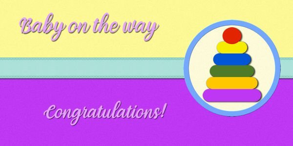
Day 5 The stack toy is from Creative fabrica Font veni
3 points
-
Day 4 Picture is from Creative fabrica Font Victorian parlor By accident the ellips was more blurred then I wanted, but it came out just fine 🙂
3 points
-
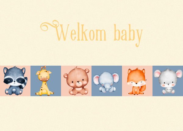
Day 3 Font is Victorian parlor The animals are from Creative fabrica
3 points
-
I'm more outside these days, not much at the computer, but here are some of my projects............Day 1 If I would use them as actual cards, I would use my cutting machine's print& cut function, Font is Fiolex girls, this font I also used for the birth announcement card for my grandaughter 2 years ago.
3 points
-
Lesson 3 Images are from the web.3 points
-
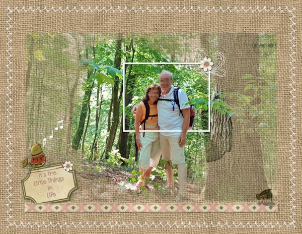
Following Mary Solaas's steps, I went back to the Labs tutorials. If I had kept the sequence where I left off, I would have used Lab11-Module11, but to fit my needs, I followed the techniques from Lab13-Module 2 (Corner Cut Shape & Double Arrow pattern). This is the first layout I created with an 8.5x11 size or, in this case, 11x8.5. I am still not sure which direction I'll take... I mentioned before that Lyn Grieveson, a designer from The Lilypad, started using 8x10 size (portrait orientation)... Carole has a post with good information about Different Sizes for Scrapbook Projects. Anyway, here is my layout and credits: Background paper - KAagard_Great Outdoors Pattern2 from the "Great Outdoors" kit by KAagard. Mask - Palvinka_HelloSpring_photomasks_2 from the "Hello Spring" kit by Palvinka... I like the Photomasks she designs... I used a Mask on top of the photo, which lowered the opacity a lot. Elements from the "Nature Walk" kit by DiHiller. Carole: Straight Pin & Pinned Paper techniques /// Datestamp#8 Script /// Decorative Stitches (cass-stitch-turkey) Font: High Notes
3 points
-
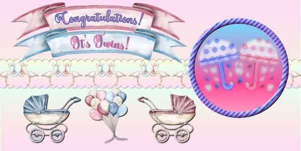
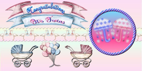
Day 5 - I'm running behind this week. All the images are from Creative Fabrica except for the umbrellas which I made a long time ago and which I made into watercolors using casswatercolor script. Font is called Better Spring Font from CF. The circle design was made from Day 2 stripes lesson. The umbrellas were actually made for a very good friend who had just had twin grandaughter and grandson.
2 points
-
Love the colours! 🙂2 points
-
Card 6. Just catching up with yesterday's template. It's a bank holiday weekend in UK so juggling hobbies and weather! I may have a graduation card to do soon but didn't want to tempt fate by doing it too early. Instead I just made a holiday card. The Classic Materials Palette option that Carole suggested has worked for me and I find easier to tweak the colours than the swatches set up I had before. Thank you.
2 points
-
Day 2 I love vintage cards 🙂 Font is Victorian parlor
2 points
-
Lesson 7 Another favorite quote.2 points
-
Lesson 6 Another favorite quote. Photo from the web.2 points
-
Lesson 5 This is one of my favorite quotes. Photo is from the web. I saw these ladies play around 2015. They were in their 80's then.2 points
-
Lesson 4 Photo is mine.2 points
-
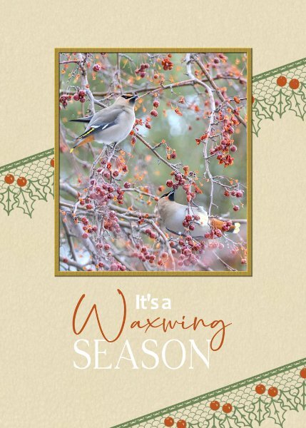
Even though I participated in the first greeting card challenge in 2022, it's always nice to have a refresher. Congratulations to all the participants, who submiited their pages, each every one is a masterpiece, to be proud of. The standard of creativity submitted is exemplary, even from the newbies. Not only that we are an inspiration to each other. Day 7. I kept it very simple. I used a lace brush. Colourised the berries red. I decided not to use a shadow on it. Using it as a stamp. I often use, well not often but always use a bird photo when I create cards for my birding friends. Same goes for my friends that have a passion as I do for insects. The surprise on the inside page for those that receicved invitations to festivals.
2 points
-
I'm behind......work, a wedding and a fantastic concert consumed my time. I'll try to catch up soon.2 points
-
My card 5. I’m trying to catch up so I’ve kept this one really simple. The vector image is from Freepik. The font is Cookie and the strip is a PSP Pattern.
2 points
-
Nothing wrong with goofy! LOL2 points
-
Thanks Sue. Another group I used to belong to a long time ago now had a tut on how to make a lace strip using this lovely font and that oval was just begging me to put something frilly on it. A single layer was a bit skimpy so I duplicated and mirrored it to fluff it up a bit.2 points
-
I am still not caught up, here is Card 5. I will keep going until I finish them all. I'm enjoying the learning, thank you, Carole. The font is Brewsky, a fun font that I wanted to try. I have used Brewsky along with Helvetica.
2 points