Leaderboard
Popular Content
Showing content with the highest reputation on 05/15/2024 in all areas
-
My friend and teammate, Lily. This photo is from 2006. Lily is an amazing person with an amazing story. She came to the US alone when she was 18. Enrolled at the University of Maryland, met her husband and became a pharamacist. She is fast as greased lightning and can shoot a basketball like no one else...remember we were playing senior basketball...age 50+.7 points
-
My bball team again. This template is from Photobacks. They sell templates to photographers.6 points
-
I really like this template so I tried another: Pat and Frank's page above was from 2012. This one is from 2022. This is my current basketball team. Beth, the girl standing beside me, was pretty deep into dementia when this photo was taken. She is no longer able to play. In this layout, you are able to see only part of this huge sand sculpture. It was indoors at the convention center where we played basketball and pickleball. Most of the sports played in the Senior Games were represented.6 points
-
Nothing fancy...using Carole's Multi-Frame Collage: My friend and basketball teammate, Pat and her husband, Frank in 2012. We often played a tournament in St. George, Utah and Pat had built a home there. One year I was invited to stay in her home. We went hiking after the basketball tournament and that's when these photos were taken. Sadly, Frank has passed away. However, Pat is doing well. I think she sold the house.6 points
-
5 points
-
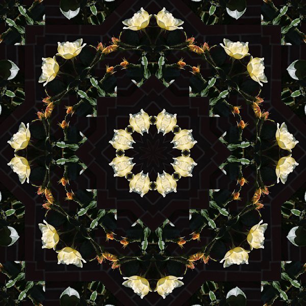
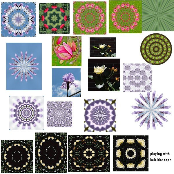
This is what I have been playing with off and on the last few day. It is amazing what can be created from a regular pick with the kaleidoscope. The center picks are some of the originals and most of the K. were created starting with them. I do have all of them saved full size, so some of them may show up here and there.5 points
-
I promised my granddaughter that I would make here a layout when I had overcome the jetlag and this is what I made for her. She loves plants, especially cacti and succulents, and she has quite a collection of them as mini plants. Besides that, green is her favorite color. I used the mask from Jessica Dunn for the May mask challenge on digital scrapbook and the papers (with blendmodes) and elements from cpjess Meadow bundle which I recently bought and some plant tubes. In the mean time I have transferred and ordered all my recent photos, so now I can start making a couple of layouts as intro pages for the photo album I'm going to make. Slowly I'm getting back into scrapping, it always takes some time to readjust to my normal routine at home.5 points
-
4 points
-
Perhaps I have given you some ideas for your own layouts. I know I will look at a layout and think ah, I like that, why didn't I think of it.4 points
-
Not at all Julie! I feel the main goal on here is to influence, motivate, stir up ideas, that we may not have thought of through each other. Feel free to copy, it can be a starting point, until your own style kicks in, which then makes it your own. I'd say that Carole's punches would look fantasitc in your delicate layouts.4 points
-
@Anne Lamp I love playing with the kaleidoscope tool. I've saved many of them as presets. @Julie Magerka You should definitely try using the punches in your projects. We all get inspiration from each other. There's even a term for it that I can't think of right now so I'll say scrap-napping. 😄2 points
-
2 points
-
2 points
-
2 points
-
2 points
-
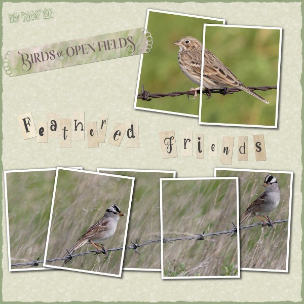
I downloaded Carole's multi framed collage template. I have never used a multi framed template, although I have seen several of them. As I have said previously, I was hooked on this technique after watching the photo split frame technique in the creative scrap. Since them I have created my own, using up to as many as 8 frames per image. I blended two photos of the White crowned sparrow. Created the Alpha, (can't remember what the tutorial is called) burnt edge, which isn't really burnt as I used green. The background paper is an edited favourite of many the linoleum pattern. I don't see many using Carole's corner and paper punches. I love them and use them a lot. I used one of them on the strip. They are ever so versitle, quick and easy to use to add that extra touch to any layout.2 points
-
Another food that defines my childhood and adulthood is bar-b-que. Layout from 2020 Storytime Challenge.2 points
-
2 points
-
This was created for the storytime workshop. It is still my favorite cake.2 points
-
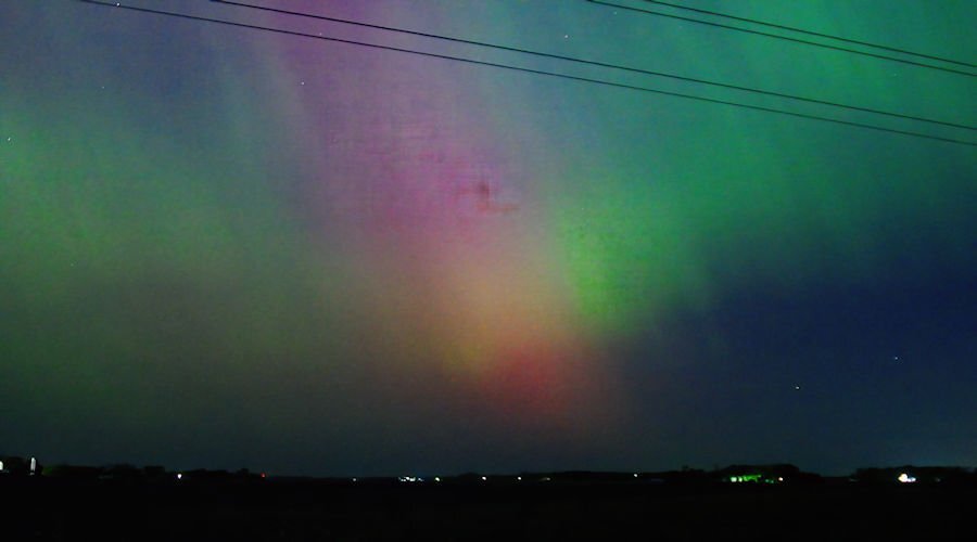
I live an hour west of Minneapolis and had good luck finding the Northern Lights about 5 miles out of the town I live in. Looking the sky over, disappointingly, all we saw were white streaks from the horizon to straight over our heads. No color at all, just white streaks. I set up my dslr camera on a tripod and took a few photos anyway, and to my surprise when I looked at the LCD screen on the back of the camera the colors were there. Of course I took many photos over the 2 hours we watched. (midnight to 2:00.a.m.) This was the first time I have seen the Northern Lights and hope to again to perfect the pics I take next time. I will admit I did some photo editing as the photos were very grainy. I will try different settings on my camera next time.1 point
-
You can make a layout without any photo! Those are still fun layouts to enjoy!1 point
-
Well I can better answer this question before I forget to do so. Again I have no pictures of layouts about this topic, but I can write a short story. I have told before that I grew up in the postwar years in Rotterdam. That period was, certainly in the first years of my life, still a period of sparseness and hard working families. I luckily wasn't very picky about food, but disliked (or I should say hated) rice. Every time that came on the table I flatly refused to eat it and that always provoked a speech from my parents about the hunger they endured in the last year of the war where they had to eat tulip bulbs to stay alive! It has taken me more than 50 years to overcome my dislike of rice, nowadays I will eat it but it never will be a favorite of mine! The best memories about food I have of my dad baking pancakes or apple pie. He had learned backing from his older sister and liked to bake, which my mam didn't. My mam was born in the wrong era, had she lived now she probably would have made a nice career for herself and it wouldn't be that of a housewife! I think she was unhappy in that role, however she loved my dad.1 point
-
Thank you Ann! The trick is to water very sparsely, the most common fault in watering a cactus is: you give them to much water. When in a pot or container you should let the soil dry out completely before giving them a drop. To this rule are some exemptions for certain species but that is normally on the label when you buy them. It is so funny to see her with her plants because my son, her uncle is also a great fan of cacti and he started with them when he was the same age as she is now. At 50 he still grows cacti but I'm not sure his wife loves those too.1 point
-
I lIke the use of the bunting from the masterclass recently. Fits the bill. ha ha!1 point
-
1 point
-
Thank you Cristina. It was fun to make, relaxing I'd say. just having fun after a busy week.1 point
-
1 point
-
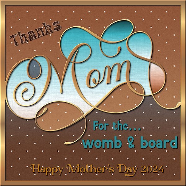
I finally got some PSP time in. Busy week and finally some down time. And just in time for the Q&A. I was driving home from grocery shopping this morning and a local Lube shop always has a funny quote on their sign and this was the one I saw today. I had to keep repeating it over and over because I couldn't pull over on that road to write it down... and my pen was in my shopping bags way in the back. 4 fonts used: Mandala Vintage (for the womb and board) Mansdefia (Mom) Magestica (Thanks) Marcgravia (Happy Mother's Day 2024) Papers are by Gina Jones (Digital Scrapbook) Kumbaya papers See you at the Q&A! All the cool kids go there....I hear.1 point
-
1 point
-
I too was picky as a kid. I wouldn't eat my mother's famous carrot cake with cream cheese frosting b/c of the carrots and cheese! I missed out on a lot of good slices for many years! That's what your reminiscence made me think of.1 point
-
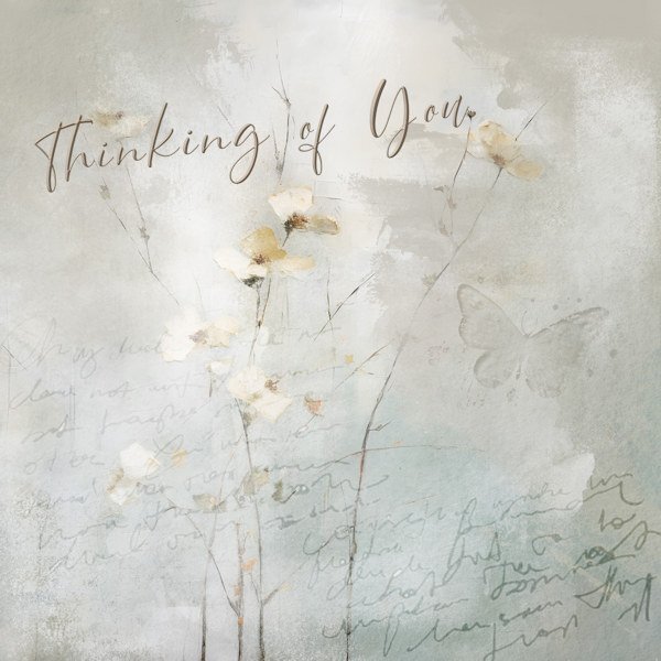
When I first started to learn PSP a few years ago it was to improve old photos for my history articles. Then, with Carole and this group, I got hooked on learning more and just playing as a different kind of creative outlet, something removed from words which I deal with all the time in research. This type of layout takes minutes to create and serves a purpose when I just want a more personal kind of message to send to someone. This time it was made for a friend whose husband of 54 years died. I sent a "proper" card (in the mail), but followed up with this. I just like that I can do that.1 point
-
Chantahlia Designs, template 334. Plumbago is a tropical flower and my favorite. Remember, each time I see a "new" flower, it is my favorite. These photos were taken in Ft. Myers, FL in 2006.1 point
-
1 point
-
1 point
-
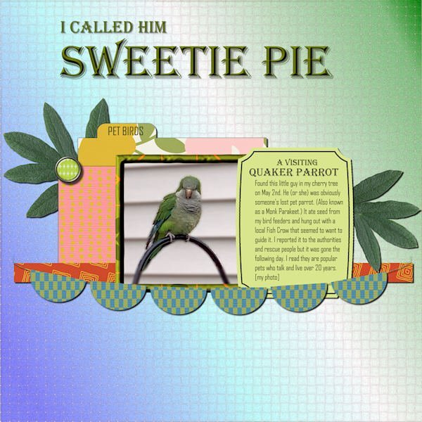
Here's what I've been distracted by recently. I was a bit astounded to find a parrot at my bird feeders! All the supplies came from Marisa Lerin, mostly from her Template 530 and Bolivia Mini-Kit. The title font is Algerian, and the text font is Agency. I'd like to introduce you to the Quaker Parrot "Sweetie Pie".1 point
-
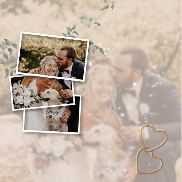
I think you have a done a lovely job. I like the split frame effect. If I may, I'm going to make an alternative suggestion using a frame or the split frame technique and I have also posted an example even though it's not the split frame effect, it is still a frame, and I feel it will work equally as well. Duplicate the photo, hide one. Create the frame/frames. Using the magic wand select outside the frame, contract by a few pixels, then invert. Now you can edit the photo not in the frame or frames, reduce the opacity, blur, add a texture, its up to you. I would then place the hearts up in the left corner, with a few words. I added an out of bounds effect, for that I used the hiden photo. You could have the bouquet just out of the frame.1 point
-
1 point
-
I started creating this as just one page, and it ended up being a double page. Most of the time, the final layout is completely different from the one I began—different papers, colors... That's why it takes so long for me, but I am happy that at least I'm doing something. Credits: Template by Scrapping with Liz (SwL_LotsofBlocksTemplate5). -- To suit my needs, I usually rotate the template, change the size of the photos, etc. Background paper: #ps_janet-scott_43698_paper-texture-template-068_cu plus a Photo Effects>Sepia Toning ---- I also added a lined paper I created for the Build-A-Kit Workshop, plus a photo of the internet with a Black Pencil filter. From Cassel: Tutorials>Fasteners>Back Brad -- Photo Prongs -- Cross Stitch cass-DateStamp#4 script, which I purchased on the 22nd just for this layout. The arrows are created with a font suggested in the Lab7-Module 08 (KGArrows).1 point
-
1 point

Resized.thumb.jpg.d25811db03a63358cedab1e79f527635.jpg)


