Leaderboard


Resized.thumb.jpg.d25811db03a63358cedab1e79f527635.jpg)
Popular Content
Showing content with the highest reputation on 04/29/2024 in all areas
-
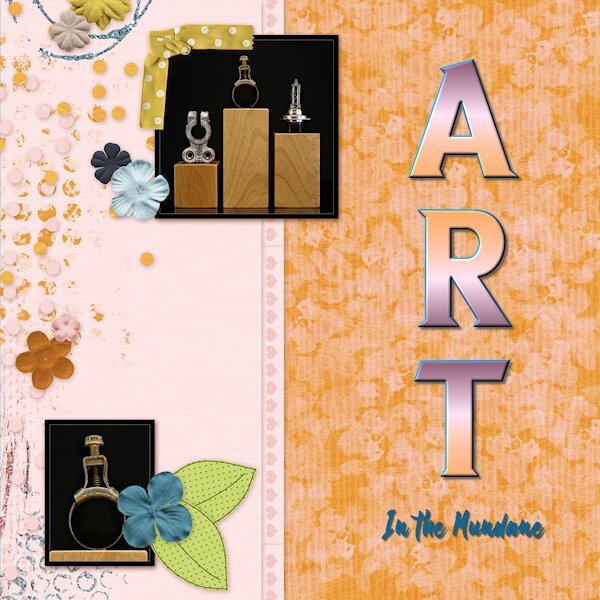
here's a close up of the screws (on plexy) just to show you that I really do have a "few screws loose". I call it 'Art in the Everyday' or "Art in the Mundane'.
 6 points
 -
Day 5, plugging along slowly. These photos arent really meant to be shown small, detail is lost in the lack of size. And why on earth am I photographing screws. Hubby torn apart all the hard drives I brought home from work (they have holes screwed into them so they cant be used again) so I could use the insides for photo projects. I walked into the room and saw the screws had attached the very strong magnets inside hard drives and thought, that looks like industrial art. The wood plinths (two are laying on their side) are reject left overs from wood stands I used to make for glass bead makers (lampwork) (some with knots, some without). They remind me of the big plinths you'd have in an art gallery show, but in miniature. Font is Nathalia (title) and Neuton (Extra Bold) both from CF I think. I changed the color of part of the QP using a layer mask (actually two masks; one for the band, one for the above and below part). I need to learn how to duplicate and invert a mask, I tried but it didn't work.
6 points
-
Day 6, More of the mundane things I found around the house to put on the little baby plinths. Maybe I'll dig out some beads to show what they were really for. Fonts are Sea Gardens and Shintaku from CF.
5 points
-
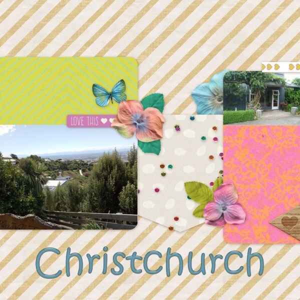
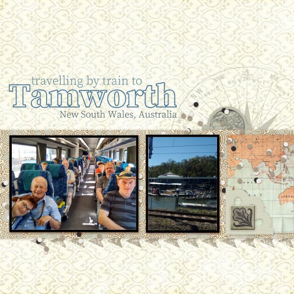
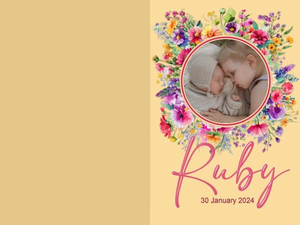
I lived for about 19 years in Christchurch and travel up there at New Year to housesit for friends. The photo on the left is taken from the Port Hills looking towards the Southern Alps, The photo on the right is a cottage we stay in other times we travel to Christchurch. In January, 2018 and 2020, I travelled with a group of friends to Tamworth in New South Wales, Australia for 12 days of the Tamworth Country Music Festival. We travel to Tamworth by train from Sydney, a journey of 6 to 8 hours, depending on how hot the day is. The train travels much slower in hot weather due to tracks possibly buckling in the heat. Ruby came into the family in January this year, sister to 3-year-old Poppy. Poppy happily moved out of her bedroom to make way for her baby sister, she was so looking forward to the new baby. Jeni
5 points
-
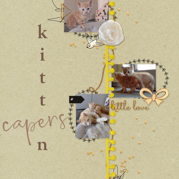
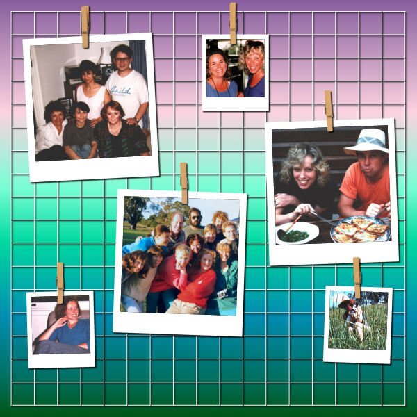
Kittens are such a delight, these kittens belonged to friends. Photographs of roses. I do love the scent of roses. I'm unsure how to re-colour some elements, so I just did the piece I could easily change. Photos of friends taken back in the 80's.
4 points
-
Extra 6. I used Arial for both the title and the journaling.
3 points
-
My Lesson 6 - font is Myanmar Text and Santa Claus. I turned the entire layout sideways and re-arranged a lot of the elements. I enjoy fiddling with stuff like that. The tall center row of hearts is a cass-heart brush tip used with the eraser tool and an added background layer of burnt orange.
3 points
-
On to lesson 6. Title font is Ravie.
3 points
-
Lesson 5 non-scrap - card. I made an Anniversary card. The silhouette I had made for one of the labs. The font is Pretty Smile. I used the layer styles to bevel the font, the silhouette, and the heart.
3 points
-
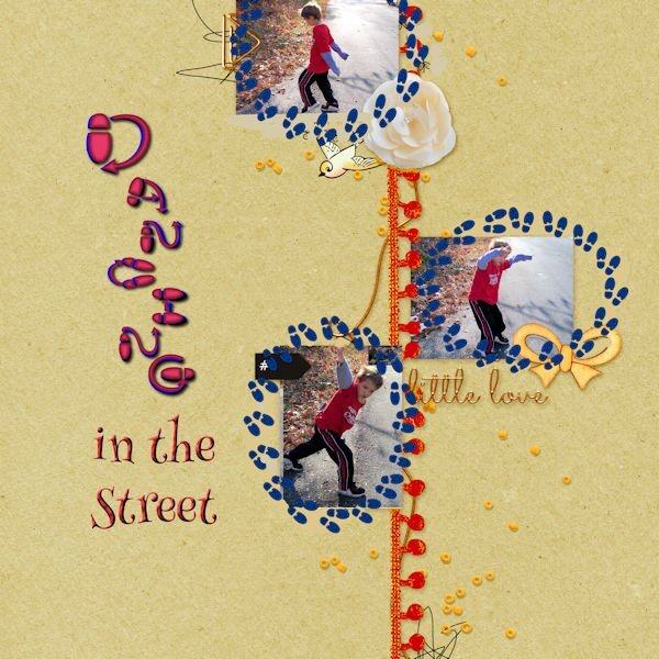
Day 6 The photos are mine taken several years ago in Virginia. The footsteps are from Canva, made into a tube with VectorTube applied. The fonts are DanceStep which is free on Dafont and Henny Penny.
3 points
-
I seem to have Dogwoods on the mind lately. 🙂3 points
-
I also like this QP. I have a script to create this effect. I forget to use it. 😞3 points
-
Day 7 I spent a lot of my time deciding which pictures I should use and revising the template to match my colors. I think that is why I don't like quickpages unless they are layered. The photo are my own taken while visiting Las Vegas and the Valley of Fire. Las Vegas has the Ethel M candy factory which has a beautiful cactus garden, not to mentions the best chocolates. Ethel M is the upscale brand of chocolates from the Mars family, Ethel being the mother. The font is a colored font from Creative Fabrica and does not work in Paintshop. They had a bonus file of pngs which I used for the title. The font does work in Photoshop, even my old one.
2 points
-
And the non-scrap for lesson 6. I changed the background with Adjust>Color and Adjust>HueSaturationLightness to contrast with the blues, whites, and greys of the pictures.
2 points
-
Interesting stuff, I didn't know. I just dealt with baled hay and straw for stalls (for the momma's and babies not for the racehorses...they'd eat the straw, they had to be on shavings).2 points
-
All haylage and silage bales have to be wrapped, due to the higher moisture content to keep the air out otherwise the feed can be contaminated with botulism, which is a bacteria that likes the higher moisture, which can kill live stock and horses. Haylage is dryer than silage, ideal for horses. We did both, round and square bales and silage pits, which would be compressed down with heavy equipment, and covered. Unwrapped bales would be straight forward hay. Just thought I'd tell you.2 points
-
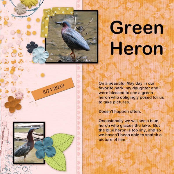
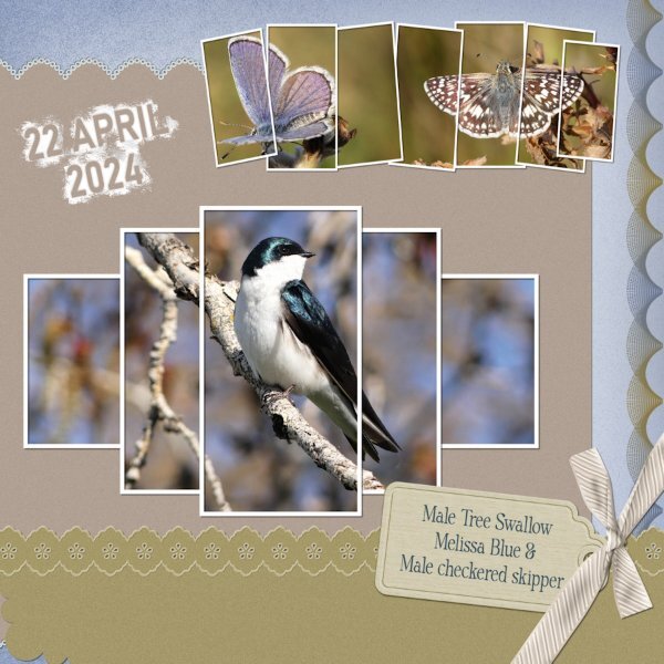
I started out with the best intentions of sticking to the sketch, by creating something using the grid. That soon went out the window, when I decided to use multiple frames instead of the set blocks in the sketch. Some of you will have the frame with the Swallow in as I created a template and made it available to download, back in 2021 I believe. The other frame I created today. The tag is mine, the bow is one of Carole's scripts, along with the decorated bottom paper. The design on the right is created using the brush and brush variance tools, which can be found along with many others in the brush variance masterclass. Birds and creatures of all kinds are now making an appearance, for me this a positive sign that Spring is for me literally around the corner.
2 points
-
Lesson 7: I really like this QP. My layout from the last workshop using this QP is one of my favorites.2 points
-
I like the color contrast, Mary. I am having trouble trying to read your text in this reduced version. Could you post it separately? Thanks!1 point
-
I have done that quite a few times. It really makes a difference.1 point
-
Oh no Michele. I hope you get a fast resolution.1 point
-
All horses like to pick through straw, straw bedding should always be wheat straw and no other, especially not Barley. Since silage and haylage took off, it has been the preffered roughage for horses, as unless hay is properly made, it's dust/spores can cause breathing problems such as COPD. The same goes for dusty straw bedding. It is also more nutritious than hay.1 point
-
Thanks for looking that up for me! I will be checking it out.1 point
-
I don't think any of us ever complete a page as we previously envisage. I whole heartedly agree with you that it is certainly great fun. Also a wonderful surprise to see the end result. There is a tutorial, I had to look it up for you, so you can check it out. Split photo effect. Lab 10-8.1 point
-
Yup, I know that feeling. Starting out with good intentions and a plan, but seeing them go out the window as the layout develops. What I envision is usually not precisely what I get. But it's fun anyway. Love everything about this one. Those frames are wonderful.1 point
-
@Susan Ewart For Filter Forge, have you tried simply adding the path to the standalone version, inside the File Location for plugins? I am not 100% sure if it will or if it is, somewhat, a different "version" between the plugin and the standalone. @Ann Seeber To me, "creature" is anything alive, big or small, so that bird is a creature (might not be the correct word though). Even with pages you are not 100% in love with, you are able to tweak them using PSP. Great skills! @Jeni Simpson are those white packages some harvested crops? It is funny that they are square. Here, they are round. @Mary Solaas Yes, Layer Styles can be useful. I just find them clunky to use, although they can give great results. @Bonnie Ballentine I love seeing flower pictures especially when they are "fresh". We just got rid of our snow, and the most "spring-like" elements we have are buds on the trees. I have not seen any flower budding yet. And kitties!!! I love kitties! @Donna Sillia You are really creative with that butterflies title! For the footsteps, if you set the picture tube Selection Mode to Angular, the footsteps would follow the circle. @Anja Pelzer Great pictures for the cactus. Do you do anything specific to make it flower at the same time every year? Keep this up. If you have not finished, don't worry as you will have another week to continue or catch up.1 point
-
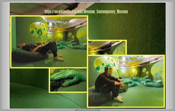
You know everything already. I've sent not corrected pic. Sorry...This time the picture is better. Sorry once more, friends.
1 point
-
Jacek's visit in Wrocław's C.Museum with his friend. Shots taken by this girl. It's a first part of the story where are shots first of all. No words rather.
1 point
-
Before: After: Done very quickly. I'm sure I could do better with a little more effort. I also removed an age spot from my forehead. 🙂1 point
-
I'm having a problem with PSP so I can't make anything. 😢 I'm waiting to hear from support.0 points


.jpg.dd085516c77d877e2bb4b6192fbfe99c.jpg)