Leaderboard
Popular Content
Showing content with the highest reputation on 04/04/2024 in all areas
-
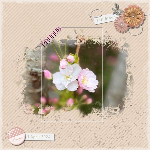
Lately on a dry spell I came along a front garden in a street I normally pass by and saw a magnificent rather big Prunus in full bloom. The only problem was that I had to take my photo from the pavement and in that position it was impossible to get a good shot of the tree without getting the front window and door of that house on the photo too. Nowadays you have to be a bit careful when you do that, because most people don't like you doing so and I didn't want the house in the photo anyway. Therefore I took some close-ups and used one of them here. I like the work of Jessica Dunn and subscribed to her newsletter recently. She hosts a mask challenge on digitalscrapbook.com for this month and has a freebie mask and as a welcome gift I got the mini kit dandelion wishes part 2. And I used both the mask and the kit for this layout to make a background from 2 papers with a blendmode. Made a cluster with some elements, changed some colors to go better with my color scheme and made a text frame because the frame in the kit was way to overpowering for this photo. The font is Belinda, a freebie from CF. Just a whole layout using freebies!!!7 points
-
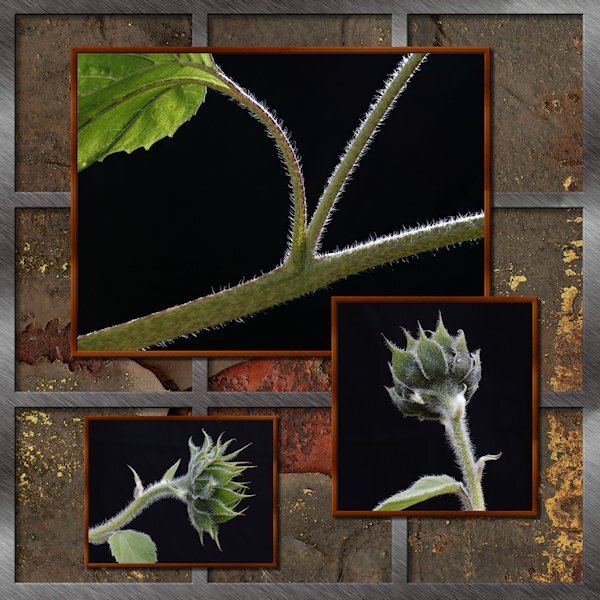
I hope this counts...more like pre-flowers than "flowers". I posted this one because my grid squares are not square (look at the far right column) and I'm hoping the Masterclass will teach me how to make everything square and even. These were the first sunflowers I've ever grown (2023). They were supposed to be 6' tall, perfect fit where I put them (against the garage wall). They ended up being mutants and grew to over 10 feet tall, having to bend around the eves troughs to reach for the sky. Some got too top heavy that they leaned over and that's when I got this shot. My lighting designer/expert was Mother Nature.6 points
-
5 points
-
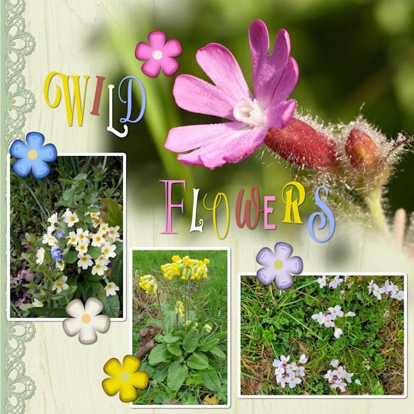
UK WIld Flowers. I have many favourites. The Campion which flourishes in hedgerows all over the country, can flower almost all year round in some areas. Wales and Cornwall, especially so. I used one of Carole's lace picture tubes, edge magic script on the flower elements, which I created myself, adding the flowers names on a curve, as the flowers are vectors. As for the tile, I went wild using many different fonts, and colours from the photos. Due to compression, some of the flowers names in the flowers may not be legible. Forget me nots, Primroses, Cowslips, Shepherds smock. The main photo is a macro shot of the Campion flower.5 points
-
I love wildflowers. If I owned my own home I would have them in my garden. I think making word art for the title was perfect...wild flowers and wild text!3 points
-
3 points
-
2 points
-
That is such a beautiful layout, Corrie. I get the newsletter from Marisa, but I didn't know Jessica had her own. Where can I sign up for hers?2 points
-
2 points
-
Yes I noticed your unusual color scheme 🙃, but why not if the flowers dictate it. Indeed I know all the flowers you used and I think I will have some of them in photos of my own.2 points
-
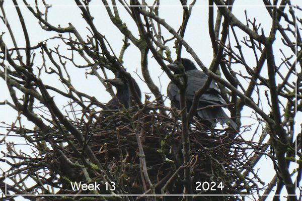
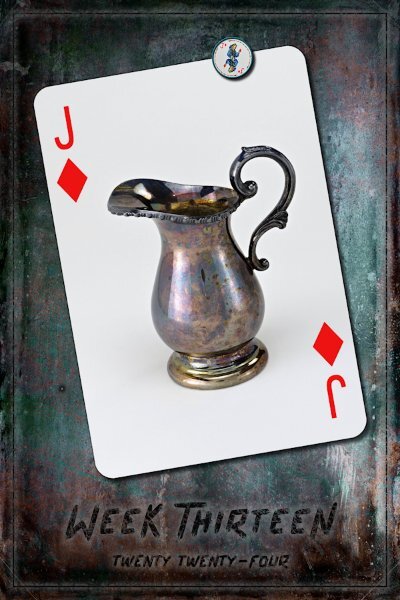
P52 Week 13 Fun with blend modes! I used: Vintage Paper Textures - Apothecary -86766159 (Creative Fabrica...I think) and chose 3 papers with a blend mode on two of them. I am enclosing the results as that show the blend mode. All at 100% opacity. I made the 12x12 after the 600x900. For the 600x900 version I pasted the papers in and then squished them down, since I welcomed any distortion in this case. I have shown the two 600x900 and the 3600x3600 side by side so you can see how the distortion affects the smaller image. The font is Arissa Typeface (CF again). I took all the strokes/outlines from the vectors and turned them gray, rasterized and then gaussian blur. the fill in each of the Vectors done in black, rasterized then used a mask (Layers>new mask layer) on the rasterized version of both text layers and the frame layer, to add grungy scratches in the black. (side note: I channeled Sue T, remembering she once wrote that she likes to use a mask instead of the eraser tool - I FINALLY figured out how to do it!). Therefore, I need the make sure the outlines were on a separate layer (grouped actually) so they wouldn't be effected and I needed to have some definition to the frame and text. Are we 1/4 of the way through? Time is going too fast.2 points
-
2 points
-
Flowers it is. Fonts. Butterline, Bell, Cornish Pastry, Selectric Advocate2 points
-
2 points
-
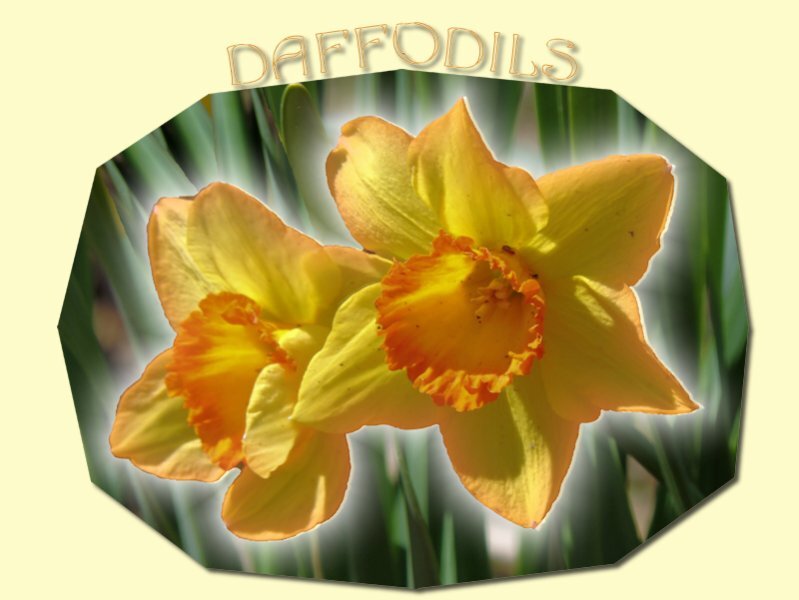
In April, our monthly theme is FLOWERS. With the arrival of Spring (at least in the Northern Hemisphere), we are looking forward to those colorful additions to our landscape and our gardens. Let's find various names of flowers, flower parts, or flower projects starting with each letter of the alphabet. And if you happen to have a quick photo to share, we will just get a very colorful thread. Let's go!1 point
-
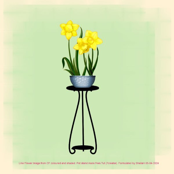
Hope you all had a fab Easter. My PC slowly died over the last couple of weeks but now have a new fast one. I am still suffering from the effects of Vertigo and have to ride it out as there are no meds for allieviating my symptoms. However, I do think it is gradually going but very slowly. Anyhow, unknown to me I did not know of this months challenge and only saw it tonight. As I have finished colouring and shading a line image of Daffodils today too it will fit the bill here. I also had made a plant stand image last year so put the two together. I find that playing with my PSP helps with concentration at the moment and I did feel lost without it. TFL.1 point
-
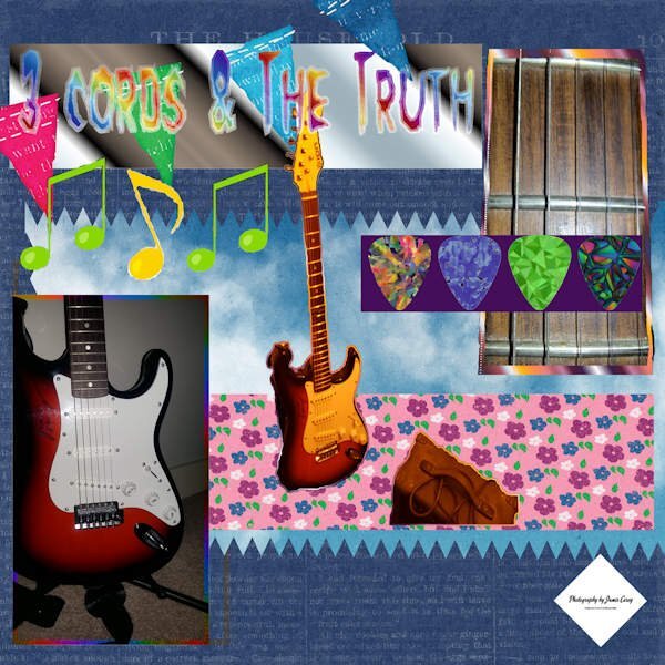
There is a double meaning behind the title "3 cords and the truth." It is a quote from (Professor of Rock a YouTuber who tells the stories behind Music from the 80's) He uses it as his closing line when his videos are over. The second meaning of the line is my truth (I'm better at playing with pictures of my guitar then I am at playing the guitar LOL anyone willing to give lessons?)1 point
-
1 point
-
1 point
-
I think we are boycotting "U's" this week, that's the memo I got. hahaha, sorry, my job kicked my butt to curb last night so I was a little bleary-eyed when I posted. I will write the alphabet out today and post by the computer so thinking wont be required of me. 😔1 point
-
Thank you so much Michele. The flowers I grew for the first time (ever) were my muses last summer. I'm going to try again this year. it's a steep learning curve for me (black thumb). The instructions tell you once the seeds sprout to thin them out. I'm like no way! What if I thin out the one that would actually grow, and isn't that seedling manslaughter? I'm no plant killer...oh wait, I will chop off their little heads to photograph them. 😱1 point
-
I already subscribe to curio pantry. I just didn't realize it was her. Thanks so much. Your sunflower l/o is incredible!1 point
-
1 point
-
Try her website. I just signed up too. I love her stuff https://www.curiopantry.com/1 point
-
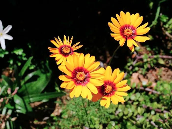
For me it is very colourful! lol I'm pretty certain you will be familiar with these native wild flowers. It's still very drab here, there are signs of grass starting to green. I enjoyed looking back over the recent years for photos I have taken when home, for this layout.1 point
-
A very colorful layout, but it does justice to the colors of the flowers!1 point
-
You did a great job with this card and put a lot of effort in! I already used to link my layers and now I group/ungroup as well. I often rename my layers but I think color coding isn't my thing.1 point
-
One more thing...I just learned I could Group all my Vectors ...I saw it in a tutorial on the Campus and tried it. Makes life so much easier. I used a number groups, sometimes for short period while I did something to the whole group, then ungrouped. I linked a lot and also color coded. Just what we have talked about in prev post (another forum post though, I think).1 point
-
1 point
-
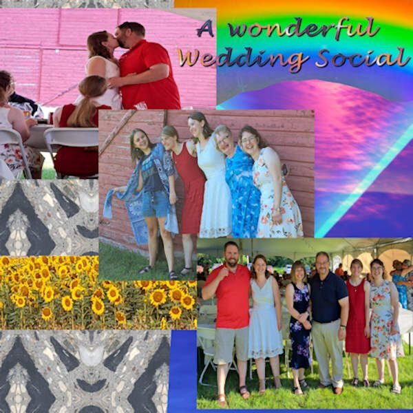
Bootcamp Project 3 “Friends” Good afternoon everyone here is my Bootcamp Project 3 "Friends" Project. Hope you enjoy it! 😉 There are a lot of elements to this image. 1) For the background I used a photo of a patch of stone edging that I took using an app called “Mirror Labs” to create the geometric patterns. 2) The rectangular image was a photo of a sunset with a color filter applied 3) The photos were all taken at my friends Bryan and Lori’s daughter’s wedding reception 4) The sunflowers are a selection from a photo I took at a local Sunflower farm 5) The rainbow is selected from a photo of a CD with the sunlight creating the rainbow effect 6) The text is Lucida Handwriting font with a gradient fill and drop shadow As you can tell I like to use my photos for the elements whenever possible. I enjoy experimenting with a variety of photographic styles and photo effects apps. 📷1 point








Resized.thumb.jpg.d25811db03a63358cedab1e79f527635.jpg)

