Leaderboard


Popular Content
Showing content with the highest reputation on 02/19/2024 in all areas
-
Many thanks for lesson 4. I love the watercolour brushes that you gave us a link to, they are so much fun to use.
 12 points
 -
Day 7 and I have managed to learn so much. All I have to do now is remember everything. Cassel, I do not know how you have managed to retain all this information. When my little grandson found it too hard to learn something, he would say to me - too hard to do. Now I know what he meant.
11 points
-
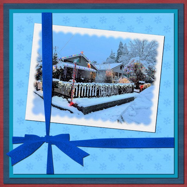
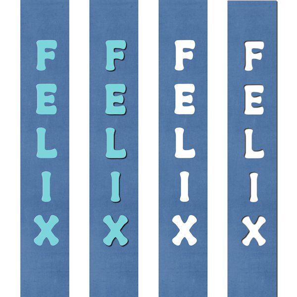
Day 7. The picture is my cousin's house in Northern California. She loves holiday decorating and snow. The papers, Winter Day, are by Janet Kemp at Digital Scrapbook. The ribbon was created using Cassel's "Attached Ribbon" script. Instead of polka dots, I used snowflakes.
11 points
-
Day 6 with the Mask Workshop. I have be able to learn so much. The new way to doing backgrounds is great and fun to do.
10 points
-
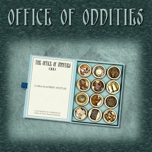
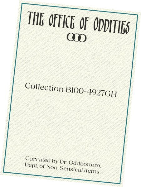
Day 6 I used the mask technique (selection/modify/feather) from lesson 5. I added a black layer under my lino layer and then reduced the opacity of the lino layer to get it darker. I used the Pencilsketch2 script and used a mask to bring back the items (oddities?) in the containers. I also extracted those containers to be able to put a shadow on them and also the the box so I could shadow it too. The background of the pencilsketch part is from Riley B Graphics (Creative Fabrica). Fonts are Giorna Velusca (for the title) and Gilnger (for the rest) both from Creative Fabrica. the layout title has a bevel added as well. Day 7 will come later in the week. the Office of Oddities is a riff on the Instagram posts from Office of Collecting; fun and eclectic stuff to see there.
10 points
-
Lesson 7 Font used Rockwell Condensed Thank you for the workshop. I thoroughly enjoyed it, Carole.
8 points
-
now I finished day 7, I used the mask I made in the last Maskworkshop. I made a pattern with 4 different colors - angel45, the background with gaussian blur. the brad and silhouettes are from Zookits made by CSSD and ljd at Gingerscraps8 points
-
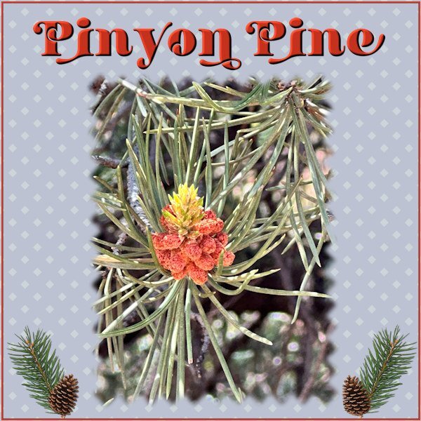
Day 7 and already the last day of this workshop 😭. I have enjoyed looking at all the work done by everyone, such a variety and all from the same lessons! For the mask I didn't use scallops but the "pinky shears" and therefore no dots but little squares. The mask has a rather heavy blur because my photo is blurred also and I didn't liked the hard edges on the mask for this particular photo. The font is Bastro and just an embellishment that went with the photo. Sometime ago I got the branche and pinecone on digitalscrapbook.com. The last thing I did was making a very small frame around the page.
8 points
-
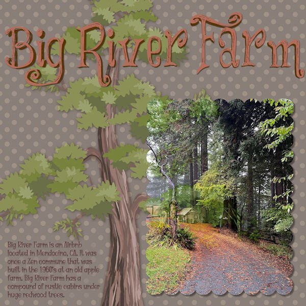
Finally got to finish Lesson 7. Here is daughter, Deb's, Big River Farm that she has turned into an Airbnb. It seems folks want to get away to a rustic environment! Who knew? It does have all the mod cons so there's that. It has about 5 cabins on the property, but the largest one is the rental. The title font is "Things We Said." The text font is "Witch Mystery." (Because the title font is a bit quirky, I tried to follow up with the text font in the same vein.) The redwood tree illustration is from pngtree.
7 points
-
DAY 6 Bird : free png (pngwing) Nature element : Commons (digitalscrapbook) Elisabeth Minkus Font : Alegra7 points
-
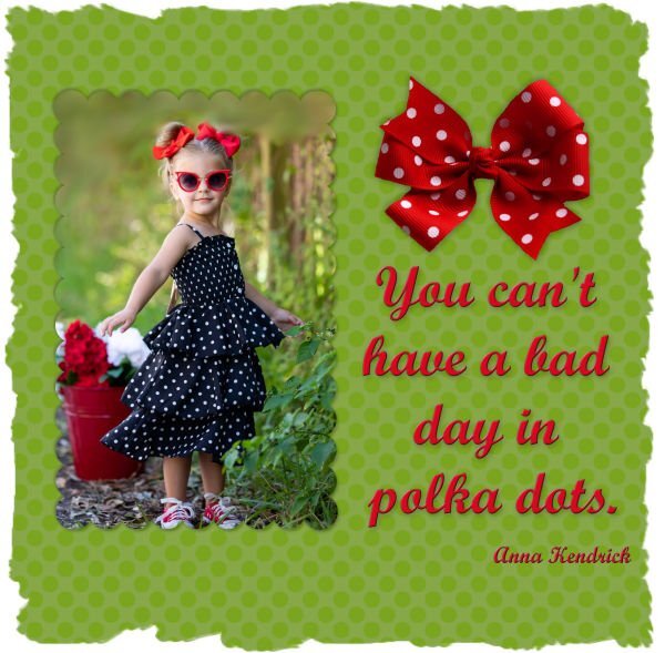
Day 7 - There is just something fun about polka dots..... No problems with this one. I used a soft light blend mode twice on the dots for the paper. The bow is from Pngitem.com & the font is Script MT. As for that day 3 assignment that gave me so much trouble, it was, as suggested, a mistake on my part. I did click on greyscale rather than negative image and that was my undoing. I did redo the image but, to be honest, the blood splattered paper that I wanted to use did not compliment the rest of the elements. The error ridden image one that I posted earlier is, in fact, the better result. So much for happy accidents or, in my mistake, stupid blunders. Thank you to Casell for all the great mask lessons. Now if you have any beginners brush lessons.......... Many thanks. Sharon
7 points
-
Carole - the 2nd image had revised shadows. It seems I made a bad design choice. Below is an image of how I got to that place. The left one is what I started with followed by the routine shadowing. The third is a cutout of the title with the fourth showing the shadowing. This is the one that I used. Had I put that on top of a solid color or a subtle pattern, the eye would have seen it for what it was. However, putting it on top of a bold and colorful pattern confused the eye. Using the original title, the eye would no longer be confused. From a little detail comes an important lesson, which is why I enjoy these workshops.
5 points
-
Day 6 here is the inside cover if you can read the blurry one above
5 points
-
Day 5 in the bag! I was able to use the Pencilsketch2 script for this (yay). then i made a mask to bring through the colors of the glitter and make up (used for crafts not my face). then I did some more selection and promoting so i could add some shadows to the box the glitter was in and to the little container rims. Then I thought the splotches looked funny on the background paper so I decided to try some different sorts of shadowing. I think more extractions (just with magic wand) was needed to do shadows in the recessed way. One layout will show the little splotches floating and the other recessed. the script background that was created was perfect for this layout and I added gaussian blur several times. The background paper is Riley B Graphics (Creative Fabrica). the Font is Goodnight (italic version) with a blend mode of overlay - I think. Here is the "floating" island version.
4 points
-
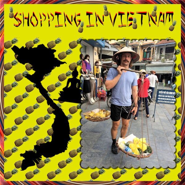
Instead of dots, I used the tube that I made of a pineapple. This mask gave me fits, mainly because I was using wrong settings. The photo was sent to me by my grandson when he was in Vietnam to play rugby. The font is a free font called Peel. I made it a layered font by duplicating it, changing the color of one font and moving it into a lower position. The border is the kaleidoscope.
4 points
-
DAY 7 Font: AR CARTER, Brad : by Magnolia (Digitalscrapbook, blog train Oct.21) Cat on photo is PLUCHE, our friends' cat that I take care of when they are on vacation3 points
-
Bonnie that is a great idea, so I second this!3 points
-
A brush workshop would be great! Could you include Suz Shook's script for making custom brushes from pngs and for custom brushes from dingbat fonts? The mask workshop has been a blast! Thank you, Carole!3 points
-
A Brush Workshop sounds good. This Masks workshop, although I did it before, I have got a greater understanding this time around. Thank you Carole for all you put in to it.3 points
-
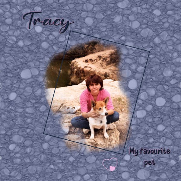
Outstanding linoleum, Carolyn. When I did mine, I liked it so much I started saving just the linos as papers in my stash and went on to create it in various colors. Is Tracy the person or the pup?3 points
-
Thank you, Corrie! My granddaughter, Jackie, took me out to dinner on Friday evening and daughter, Laurey, took me out for dinner again on Saturday. I'm over-dinner-ed! 😊3 points
-
Day 5 Monoline fonts : Simplefire and Grape Escape3 points
-
day 6 , using a mask by Jessica Dunn and another mask by Rachel Martin font is Arnold Story, I made 2 Linoleumpapers and filled a selectionsborder with the darker one3 points
-
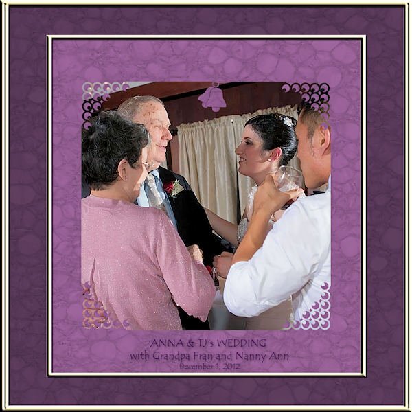
LESSON 6 - ANNA & TJs wedding reception. (I will also post this in our wedding forum this month.) Hard to believe it's been almost 12 years! I played with brushes and ended up using corner punches and the wedding bell is also a punch. (in the mask) The text font is Tempus Sans. The frame is called Transparent01 in the PSP frame collection.
3 points
-
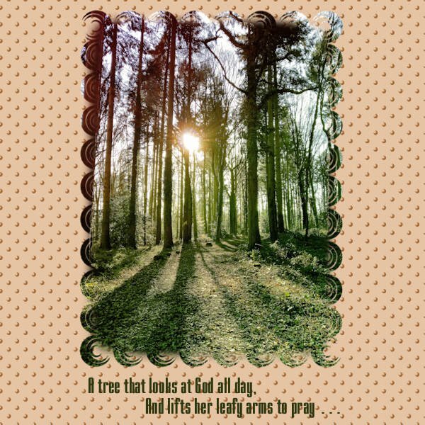
Lesson 7. For my local woodland photo I ran a Corel freebie script called Gradient_8, which made the light flare stronger and brightened the colours overall. For the mask I used a brush tip called Shape7. The circular design was not solid like a dot so I filled the centre of the mask with a rectangular selection flood filled black. I needed to move my mask but made a silly mistake and didn't duplicate the Mask Group before Merging the Group so was able to move it but lost the layers for future editing. Duh! For the dotty background effect I used the same circular brush tip Shape7, Text: I chose a condensed font to replicate the tallness of the trees, called Mekanik. The words are from another verse of the poem, Trees, by Joyce Kilmer. Ann, I have just read that the poet died at the age of 31 in WW1. What a waste but what a legacy of words.
3 points
-
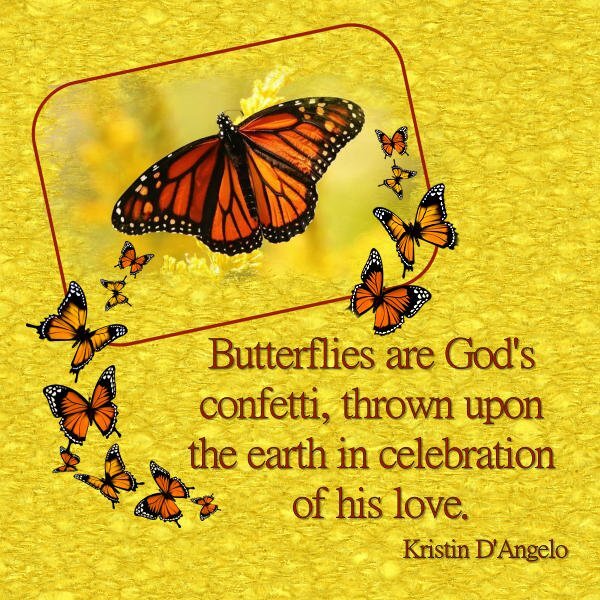
Day 5 - I loved that linoleum effect though I had to make it a bit more subtle as I was using the same color as the photo background and mask. Added a small frame to make things pop out a bit. I don't remember where I got the butterfly photo, probably from a naturalist site, but the kaleidoscope of butterflies (yes, that is what a group of butterflies in flight is called) is from Pngitem.com and the font is MingLiu from Fontsgeek.
3 points
-
Once I got into this, I couldn't stop. I placed the linoleum paper under the green paper that was used to create the linoleum. The linoleum paper only has a repeat of 2 or 3. I changed the blend mode to lighten.3 points
-
Oh man, what was in the pipeline? Might it have been a workshop we'd all die for....like Vectors 2! I must agree, I need big time brush help. That's a few more master classes for me to re-watch. Is there a saying, "Too many workshops to create, not enough time to host them!" I might need a 48 hour day, but you surely need a clone of yourself for all the workshops you want to create and teach.2 points
-
Happy birthday, Ann! Wishing you all the best. Hope your day has been filled with family, friends, fun...and some ice cream!2 points
-
Day 5 ...And here is the recessed version.
2 points
-
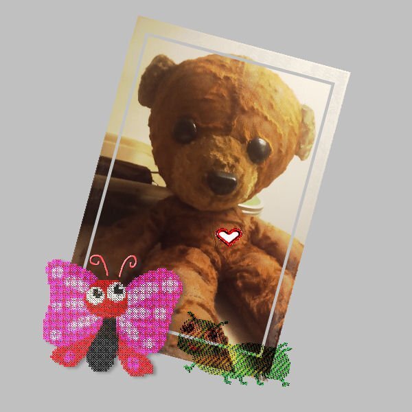
OMG! so cute! How do you say no to a face like that?2 points
-
Carole - I was overthinking the shadows. I used a cut-out for the title and exaggerated the shadow. Below is a revised version with normal shadowing.
2 points
-
This photo was taken on the golf course after the clinic. Two of our number remained in Florida for a couple more days to visit friends and play golf.2 points
-
Day 7...once again, 2 layouts. These are the 10 who attended the clinic together. There were also 30 ladies from Massachusetts. We played card/board games when we were not on the court and it didn't take long for the Massachusetts ladies to join us. We had so much fun...we are planning another clinic with both groups. I had all sorts of elements in this layout and decided not to use them. Does this surprise you, Doska?2 points
-
I love all the different projects around here, here I used brushes for the mask, kit Beautiful One by Conny Prince,2 points
-
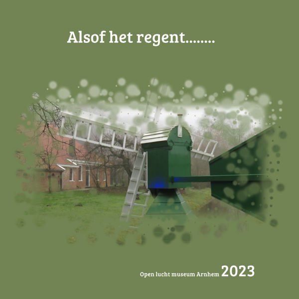
Lesson 5 My, my, what a project tis is/was! And not because of the lesson, but I couldn't find a brush that I thought was ok for this photo. I ended up with this, nothing special, but ok for this lesson. Spent all afternoon on it 😞 Text translation: As if it rains......... font Bree serif Photo is my own taken at a museum.
2 points
-
2 points
-
Thank you for Lesson 3. It was fun playing with the kaleidoscope effect.
2 points
-
The font for the title at the bottom is Broadway and yes, it is my birthday today.
2 points
-
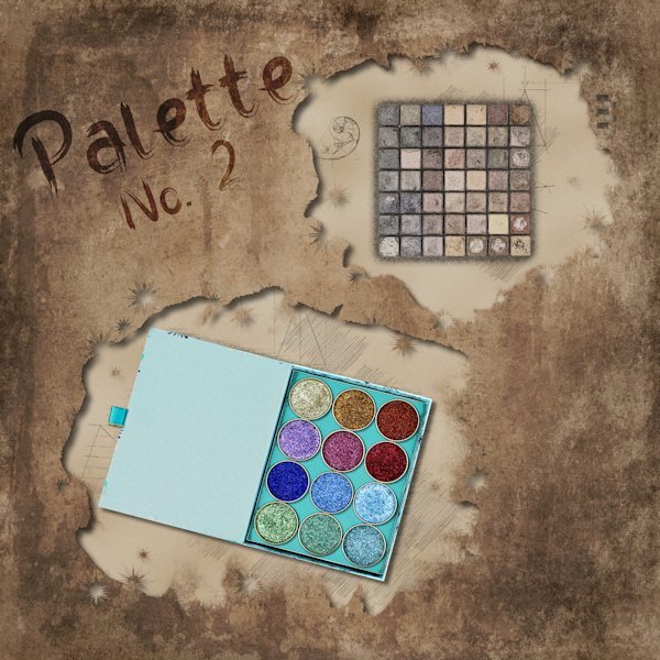
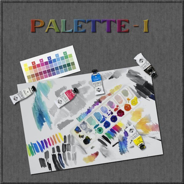
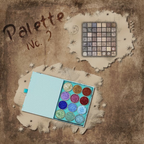
Day 4 I tried the PencilSketch2 script but there was too many hues that are dark so it didn't work well. In fact I had planned on using an image of the paint palette on it's own with the tubes of paint in front of it. It didnt work. so I went on to trying to the use the brush with a "hide all" mask and well, it's looked something you'd throw out with the trash. I had this other image of me playing with 20 yr old gouache WC paint using only CMY K and White for my color group I belong to. I had the idea of having a desaturated image and using the mask to bring back color in the palette and certain areas. I dont know why, but that was a head scratcher using the two layers of the same image (one desaturated and one fully hue-full). I got there in the end and this is just the technique I have been wanting to learn. I need to practice it way more. I extracted the tubes from the other image I was going to use and put them on this image as separate elements. The little square color swatches is from my color group, something we are doing until the real color cards get made and mailed to us. The font is Evidance, by Creative Fabrica I think. With an inner bevel added and a gradient fill and lowered opacity (with the shadow layer below it turned in into a dark tone, as the shadow was not 100% black, otherwise it would have been a dark shade). Tomorrow I will only be 3 days behind. Yippee!
2 points
-
Day 6 I really struggled with this lesson. I find this paper so busy. I didn't think black would work well but I like it OK. I did lower the opacity..2 points
-
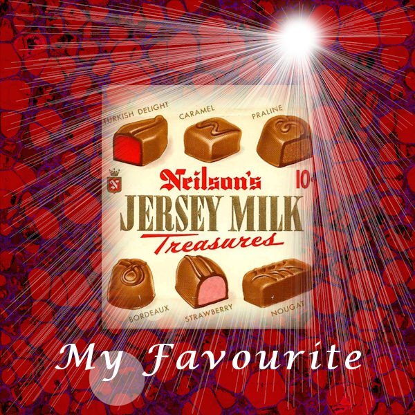
Day 6 Years ago, I used to enjoy this bar. My favourite part was the Turkish Delight. I have never found any as good since they stopped making this bar. For the Linoleum effect, I tried originally a blue. When I tried red, it just seems to blur into itself. SO I used the color changer tool and used different shades of red. Then I duplicated the layer and used the burn blend mode.
2 points
-
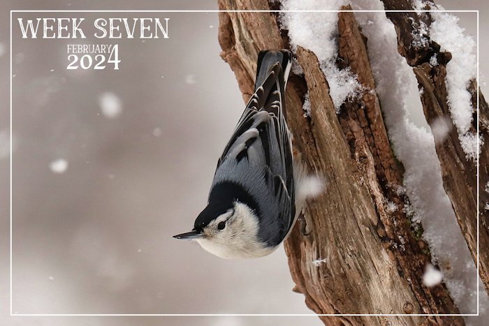
This past week we have had snow, and blowing snow. Once again the landscape is blanketed in the white stuff. A delightful White-breasted Nuthatch. Nuthatches are short tailed birds which walk up and down and a round tree trunks and limbs. The ones I have here, and enjoying the suet, sunflower seeds, and peanuts.
2 points
-
Day 3 and 4 🙂 "Zo gaat de molen" is the title of a Dutch song for children, my granddaughter loves to sing it with me, well I sing, she does the movements (she is 2 years now since thursday🥳) The kaleidoscope I totally forgot it was in PSP, was nice to use it again. Sometimes it's nice to have a "calm" pages, with not too much things added. Day 4 is a shipyard form the old days from the Netherlands. It closed in 1947 and rebuilt in the museum in 1948. Font is Bree serif and I used a brush form the link Carole had in her lesson.
2 points
-
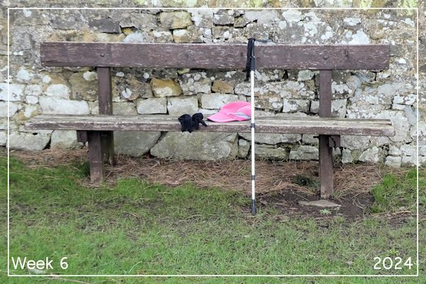
Week 6 A quiet week. The photo is of four things I need when out walking – my gloves, my baseball cap (great for the sun and the rain), my walking pole and a bench. I know where all the benches are on my local walks!
2 points
-
Very simple but very beautiful!1 point
-
Day 3 Plugging along at a snails pace. Had fun with this one. I wanted one object in color but still with the Pencilsketch2 effects. I believe I used hard light blend mode with an extracted version of the pipe wrench (is that what it is?). The two little box wrenches(?) in the corners were originally photographed (along with a third ugly one that I didnt include in the layout) with the main group of tools. So I extracted them, inner bevel added. I used the Letter press script again with Gill Sans Ultra Bold font (formerly from MSWindows). This time I added the spaces you get when you add a space (I think) when entering the text. And this is a one row box you have the option of making. I did desaturate it to make it look like metal and I had to resize it because it was wooden and the box bottom shows through. The Letterpress script is quite customizable with the each element on a separate layer (when you choose adding the box for it it all goes into layers and I recomend using this because you can choose to use or not use the box and you can also group it all for easy resizing all at once for for copying and pasting into a layout as a group. It's much easier than handling each element separately. And like everyone else, I went down the rabbit hole for a good hour playing with the kaleidoscope effect. One to Day 4 now.
1 point
-
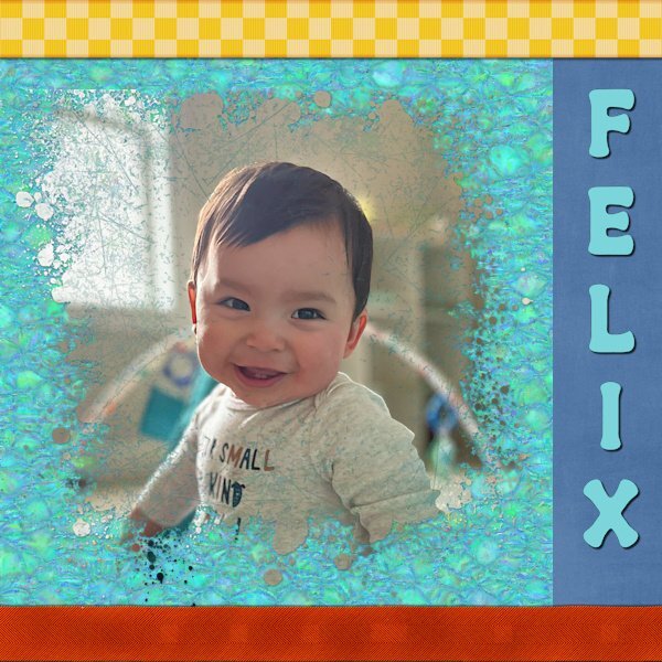
Day 6. Felix is my youngest great-nephew. The top ribbon is from Marisa Lerin at Digital Scrapbook. The bottom one was created using the Ribbon Factory script from Cassel. The mask was created with the help of the Paint Slash script, also from Cassel. The font is Retro Real Wavy from Creative Fabrica.
1 point
-
The kaleidoscope really suits this image and design I think.1 point
-
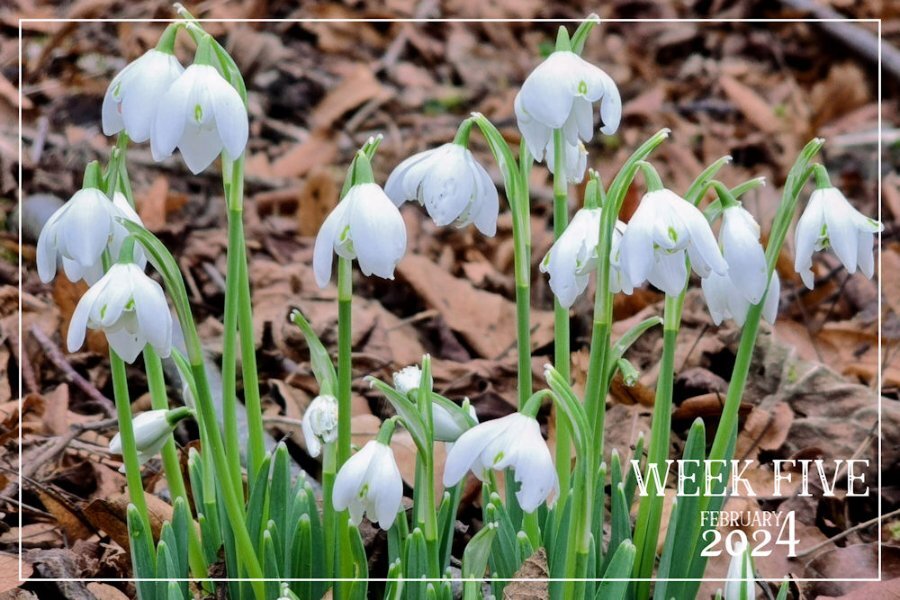
Welsh Snowbrops. Image taken on the 29th January. The Daffs are slower to bloom, but the native milk white Snowdrops are daintily blooming across the Welsh countryside.
1 point


Resized.thumb.jpg.d25811db03a63358cedab1e79f527635.jpg)