Leaderboard
Popular Content
Showing content with the highest reputation on 02/09/2024 in all areas
-
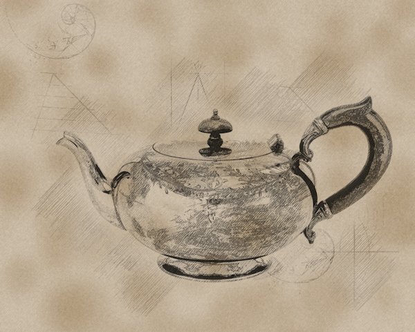
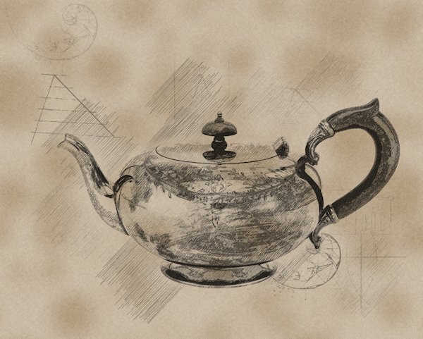
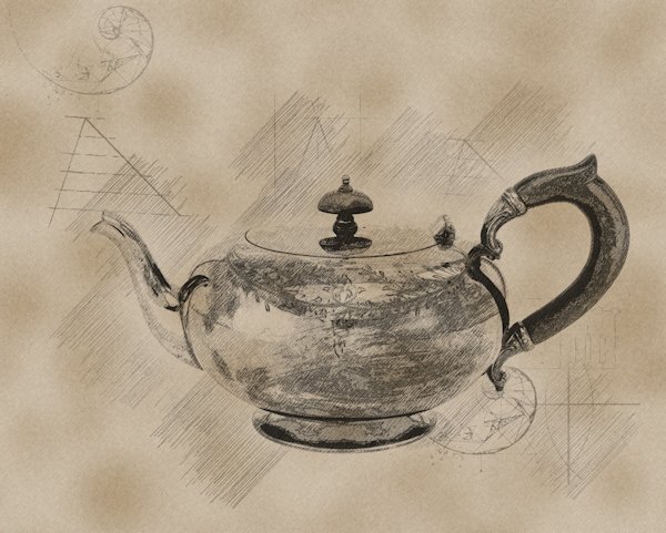
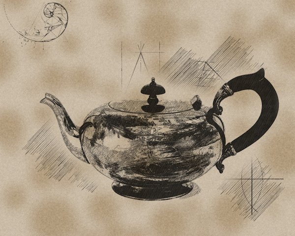
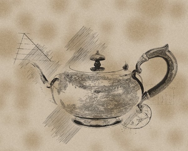
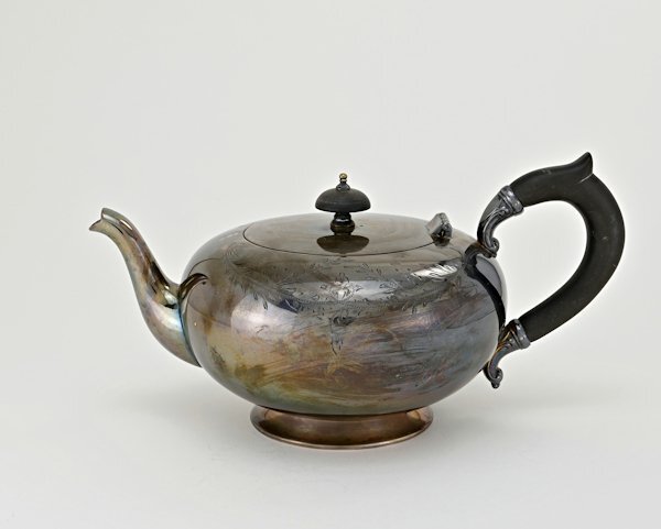
Here is made a mask from the layer (which I've never done before) with the darker (photo1-script1) one as the mask and use white to reveal the edges that was lost on and black to conceal the darker parts. On the second one I had the lighter (photo2/script2) on top. I'm getting confused at what I did now. when I look at the mask group, there is white on the group top layer the actual mask has black on it. It's all a learning experience. I did try and manipulate the layers the script makes but it seemed to lose detail and the composite way and mask way, gave me better results. I must try and understand the how the "Mask" from image works because it's pretty cool. All in all, this is really nice script. I did not change the background because I wanted to keep everything the same to compare. There is so much potential in this script and for further tweaking. I'm going to play with it some more.8 points
-
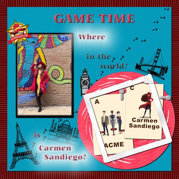
Lab 12 Mod 2. Requirements: Flash cards; I made several and decided that this would be about the Carmen Sandiego game I used to play on my Windows 98 computer many moons ago. The gal in the photo is her older sister who likes to play games and she is Carmen Sandiego in that mystery game played by grownups in Memphis, TN. My granddaughter and I used to try to discover where Carmen was by following the clues. Was it Paris?, India?, London? Or maybe in the USA in San Francisco? Another requirement was photo clips – I did make 4 so that you can use them in any orientation for holding down photos or whatever – here are 2. And the last requirement was a distressed frame – I did follow directions for this one and it covers the 2 game cards. The red circle I made some time ago when I was just playing around. The place stamps are from Nice Png. I made the question mark and employed the Cass-CustomDirectionalTube script. In one of the recent tutorials, the “layer Styles” tool was discussed. I employed it on the text and how I like it. I believe I like that bevel a whole lot! And of course the Emboss is really great too – And I used the Outer Glow on the bottom text and the “Where”! What fun this was! The background paper is a bulls eye paper I made last year or the year before when we were discussing making bullseye papers and I changed the colors on it with one of the tools but I can’t remember what it was now. The font is Carmina Blk BT (Can you guess why I chose that one?) The blue paper is texturized with a texture I got from Pixel Scrapper – Marissa Lerin. Of course I used the Clip-To-It script from Cassel – it is on my top list of tools – for the photograph. I did use the template that was given with the lab module, but it was customized by me!7 points
-
6 points
-
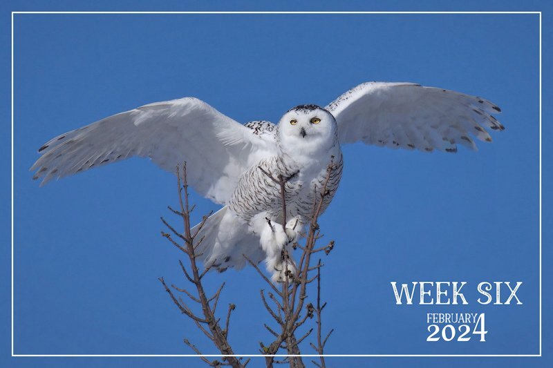
A mature female Snowy Owl dropped in yesterday, whilst I was out back in the trees filling the bird feeders. It's quite unusual to see them perched in trees. They are either on telegraph poles, fence posts or on the ground. I must say that I'm overwhelming impressed with all the creativity being posted. Such diversity. Well done to you all.5 points
-
4 points
-
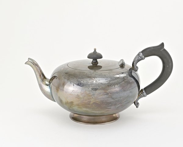
I managed to salvage some of the day (now late night) to try the PencilSketch2 script. Since I tried a few things I'll have to post a few times. here's the two photo's. It's the same photo, and I originally edited it darker, then went back after the first run of the script because it was too dark. Also here is photo 2. the next post will show how the script ran on it's own with these two images. Photo 1 is the dark one, Photo 2 is the lighter one. these are just the edits before the script.4 points
-
4 points
-
Sue what a wonderful shot of this owl! I have said it before; I envy the surroundings you live in. I know it has a harsh climate but it rewards you with its beauty and we are lucky that we can enjoy it through your photos.2 points
-
2 points
-
What a gorgeous photo of that magnificent bird and perfectly presented without adding a bunch of things to distract from the bird.2 points
-
Wow, this is INCREDIBLE! This is the perfect shot with the perfect background. Awesome, just awesome! I also agree about the creativity of the posts here.2 points
-
2 points
-
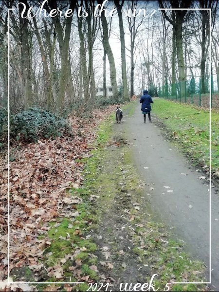
I asked the same question the whole time I was home, whether I was in Cornwall, West Wales ( Haverfordwest) or South Wales (Rhondda). Cornwall was the worst, with continous wind, fog and what the Cornish call mizzle ( drizzle). Mind you it didn't deter us from going out and about, even the to beach.2 points
-
2 points
-
Wow, this arrived 3 times via email. I thought you had the hiccups, Bonnie! LOL2 points
-
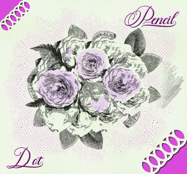
Wow, Bonnie! This has to be the best D.I.Y. result. I love the dotted background for the title. Very creative! Is that a font or an alpha?2 points
-
Easter, 2023. My niece and my nephew's soon to be fiancee. We usually have a craft for special occasions. Template 4 by Lady 22.2 points
-
I felt privilaged and humbled when this beautiful female graced the trees out back. She even allowed me to take a few shots, before flying off. I certainly do appreciate how lucky I am. Give me the harsh climate over the Welsh weather any day of the week. The UK weather is the only thing I don't miss about home.1 point
-
Susan. I like what you did with the script, the results differ but together it works great. I will have to play some more with it, if and when I have a bit of free time. At the moment all different kinds of things are going on that need my attention too.1 point
-
1 point
-
It was purly by chance I had the camera with me whilst filling the feeders, when she desended at the top of a tree not to far away.1 point
-
Thank you! It has always been my philosphy to be inimalistic with my pages, in order not to distract from the subject in hand in any shape or form. This page wasn't any different.1 point
-
Susan,the pencil script makes your teapot look even more interesting to me than the original photo of the silver teapot.1 point
-
1 point
-
1 point
-
Well, in that case, I'd keep going and create an entire alpha in that style. It is stunning!1 point
-
1 point
-
1 point
-
I have been playing with the Pencil Sketch 2 script which I won last Sunday and this is one of the images I created. I used this month's Lab to make the dots and an edge punch just for fun. The font is Fadilla. When using the pencil sketch I find that it gives the best result with images that have very defined edges with colors that are not too light. Here I decided to give some of the flowers a little bit of color.1 point
-
1 point
-
Nothing so far, my day off, and I wasted it on trying something that didn't work out. 😪 Hopefully tonight I will get to try it out.0 points


Resized.thumb.jpg.d25811db03a63358cedab1e79f527635.jpg)
