Leaderboard
Popular Content
Showing content with the highest reputation on 02/04/2024 in all areas
-
5 points
-
Thank you ever so much ladies for your kinds words welcoming me back into the fold. It is very much appreciated. It was an incredidible time being home, especially being around the little girls. Ages 3 and 5. By the time I left they were already rolling the letter r, as we do in Welsh, and other letters. Also picking up many of my mannerisms. As for the memories, well they have left an indelible mark in my mind. Here we go again Susan. Haven't you ever heard the saying upside down and inside out. hahaha! I use it in reference to being topsy tervy. Being in disorder, until I get back into my ususal routines. Perhaps it's another British saying.5 points
-
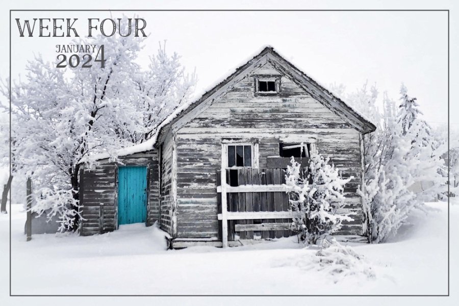
I have just logged in, and read some comments. I can't take credit for the colour of the door. The door is actually that colour. Rather cool I thought!4 points
-
4 points
-
Wow! I love this photo! I know topsy tervy well, but not upside down and inside out. I'm going to use it! Well, I'm feeling a little foolish, I just checked it out. One of my favorite singers when I was a teenager was Diana Ross (I saw her in concert in Vancouver, BC). I am known for not knowing words to songs and wouldn't you know it, here's one of the verses: Upside down Boy, you turn me Inside out And round and round Upside down Boy, you turn me Inside out And round and round My face is a little red right now; it was one of my fav. songs, that I haven't thought about in years. Sooooo, I stand corrected, I do know that term after all.4 points
-
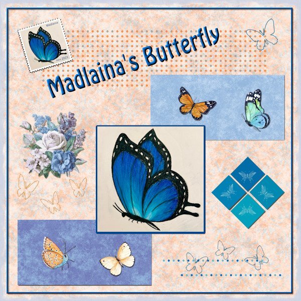
I stayed rather close to the DIY-kit and used all the elements as they were, but reshuffled them. In the big square is a photo of a drawing my eldest granddaughter did. She loves drawing and is taking courses to make a portfolio to get into a highschool that will have extra courses in arts. All the papers are from this month's Blog Train and by Jan Clark and Nellie Bell. I made 2 extra squares and they have brush prints on them; the other butterflies are from my collection and the butterfly outlines are preset shapes. The flowers are by Jessica Dunn, my own postage stamp, recolored dots and the font is Hobo. I think I have it all, nice to be back to scrapping, however I'm not saying goodbye to scripting either.3 points
-
Thank you, I must confess. I love the snow. It's magical. It simplifies an image, whilst enhancing fences, trees, branches, buildings and the like.3 points
-
Amazing find! Looking forward to what you might do to your own shots. I really like B&W with selective color.3 points
-
3 points
-
Of course, I had forgotten all about that song, and the lyrics. Me too, one of my favourite singers and song back in the day. I'm pleased that I triggered some fond memories for you.3 points
-
2 points
-
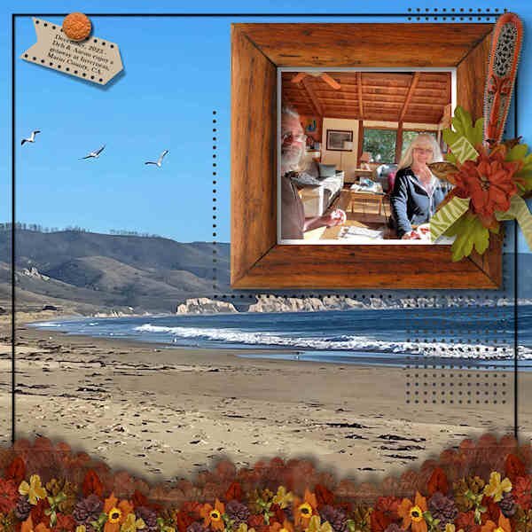
My entry for the DIY Challenge. Using a photo of Deb and Aaron in their Airbnb on vacation in Inverness, Marin County, CA, and her photo of the beach as background. The clusters at the bottom are the same size as the larger rectangles in the template + an addition. The tag top left is a combo of the two small square elements in the template. I added more dotted areas; I like the effect. The frame and all other decor came from the ID-Circle of Life mega kit. The font used on the tag is Baskerville Old Face.2 points
-
2 points
-
This challenge has had great success in the past so we can continue to have it on a regular basis, don’t you think? Just like those “some assembly required” kits that you can buy for a shelf, a chair, or a picnic table, I am including a 3600×3600 pixels canvas with some shapes. You HAVE to use the shapes in the size and proportions they are. You can move them, rotate them, flip them, and rearrange the layering if you want but you cannot resize them. You need to use ALL the pieces but you can add more if you want. So it is like all the pieces to build a DIY shelf: you cannot change the size of the pieces but you can use them creatively. Obviously, you will want to recolor them or replace them with papers, photos, etc. We just need to be able to recognize the initial shapes. Here is a preview of the shapes involved. Because of the size of the shapes, there can be overlaps. Will it be for papers or photos or both? That is up to you! And this time, I am including little dots. How will you use them? Click here to download the layered template. Post your projects in the gallery.1 point
-
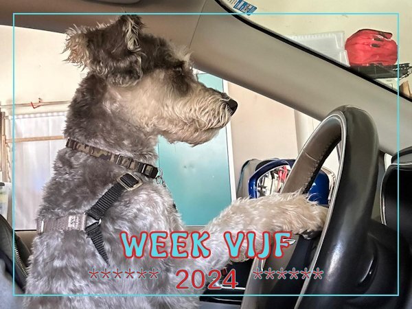
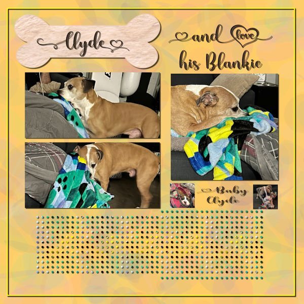
Last week, I was in Fredericksburg, VA visiting my daughter. Her dog, Clyde, is quite a character and a lot of fun. I made a pattern from his blanket and used it to fill the middle dots. I just used a color from the blanket for the other dots. The font is Madelyn Heart from Creative Fabrica. The bone is a preset shape with a texture from Creative Fabrica. The photos are mine and my daughter's. I used the open as a layer and clip to it scripts for the pictures. I loved how he would drag his blanket from the floor to the couch so that he could lay on it.1 point
-
I can't take credit for the colour of the door Michele. Saying that you have given me an idea for possibly colourizing doors and or other parts of a building that I have, and in the future shoot. It's extremely rare for me to edit any of my photos in that way.1 point
-
Sue, is that door actually that color or did you add the color to the photo? I love it!1 point
-
1 point
-
I had a good laugh when I opened this post. What a cutie. And more attentive at the wheel than some humans!1 point
-
This week there was nothing interesting happening and although making photos of housekeeping are ok 🤔 I want to show a photo that my daughter send to me. We had to laugh seeing one of the dogs as a driver and she remarked that she is training an assistance driver to come and get me at the airport if needed! This is such a cute dog and a bit naughty too. When I'm visiting them he is my friend and looks after me as long as I'm willing to play with him when the rest of the family is at work or at school.1 point
-
I went over to your page to look. Lots of great layouts to see. Thanks.1 point
-
1 point
-
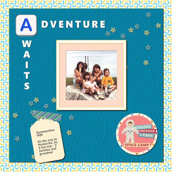
Lab 12 Mod 1. Requirements: Scallops 2: saved it as a pspimage for the pattern and then made the background paper from it. Colored Tape: it’s holding down the tape I created sometime ago; Hand drawn frame: Well I did make it but did not distress it; I made it as if it was a regular photo frame and even shadowed it on the inside as if it was thick and made a mat for the photo. I made the little circle paper in the bottom right corner and placed the spaceman sticker and the 3 journal stickers on the side and made the Space Camp sticker at the bottom. I used “Polar Cordinates” Distortion Effects on my star ribbon to outline the paper. The spaceman and the 3 journal stickers are from Pixel Scrapper – Sheila Reid. The Alphabet is one of a set I made in a Lab. The font used in the title is Segoe UI Black. The star scatter is also from Sheila Reid.1 point
-
1 point
-
I created this layout in 2018 as a part of the Mask Workshop. Of course, I just posted many wedding layouts in January.1 point
-
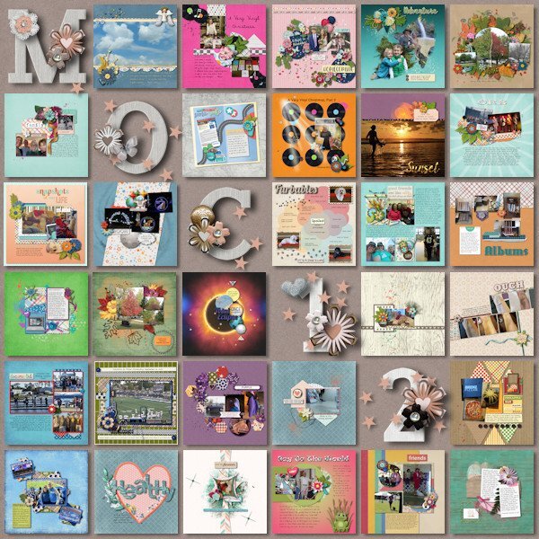
I spent the month of January participating in the Month of Challenges at The Lily Pad. 31 challenges in 31 days. Even with 4 days away from the computer I was able to get them all done. One of the designers graciously provides a free template to showcase all of the layouts. I finished that today using a kit by Bella Gypsy. Also, all layouts must have only product currently on sale at the store or retired products by the current designers. Some challenges were a real challenge! Some challenges were easy because of things I've learned here at Scrapbook Campus (hello Mask Workshop). And some were full of ideas to use in future layouts.1 point
-
1 point









Resized.thumb.jpg.d25811db03a63358cedab1e79f527635.jpg)
