Leaderboard
Popular Content
Showing content with the highest reputation on 01/06/2024 in all areas
-
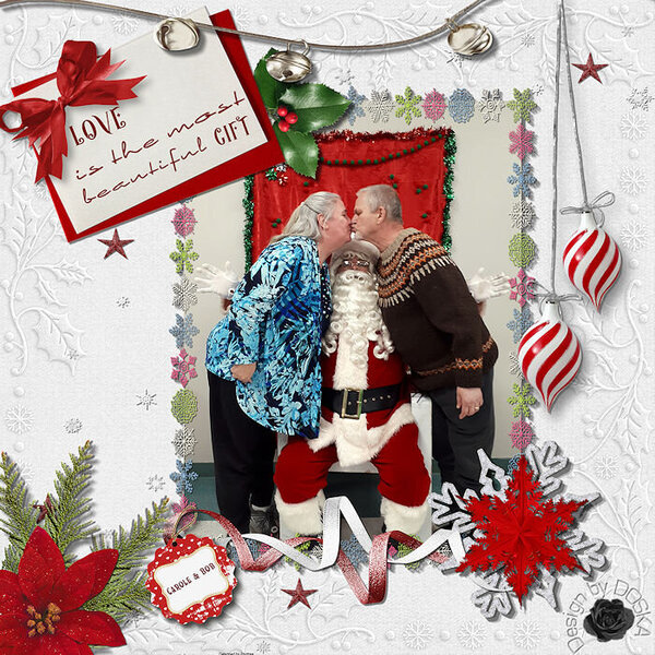
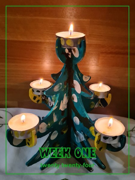
Wow Scrappers, have you been busy these 6 days in the new year with such beautiful ideas. I bring you, with Carole's permission, my January 1st creation (also in my scrap gallery) I had so much fun putting it together. The photo is just lovely, which I initially only sent to her privately, but she likes it when I put it here. Credits: Photo: © Carole An very old "white christmas" kit from Molemina Photoframe from "HOHOHO" kit from DS Anette Marie Background: MLDesign Texture 07 "Xmas" Fonts: Happy Holidays & Elegance7 points
-
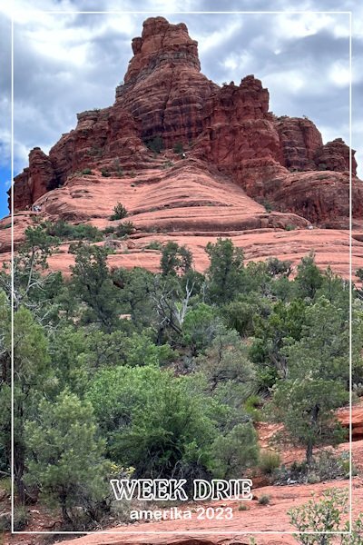
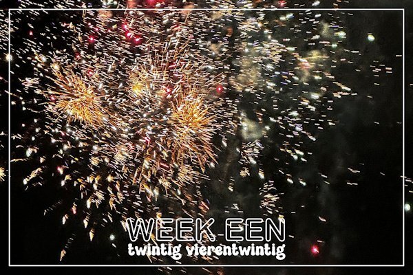
I have been playing around with the new script cass-CountingCards1-Weeks. I made 2 cards for week one but I can't see myself taking a photo every week and make a card. Carole maybe this could be a new challenge! So I thought when would I count in weeks: on a holiday when I make a lot of photos and each week could have a lot of photos. That would make a nice intropage for the different holiday weeks in a photo album. Therefore I tried that option with a photo from last year. Nice!!!5 points
-
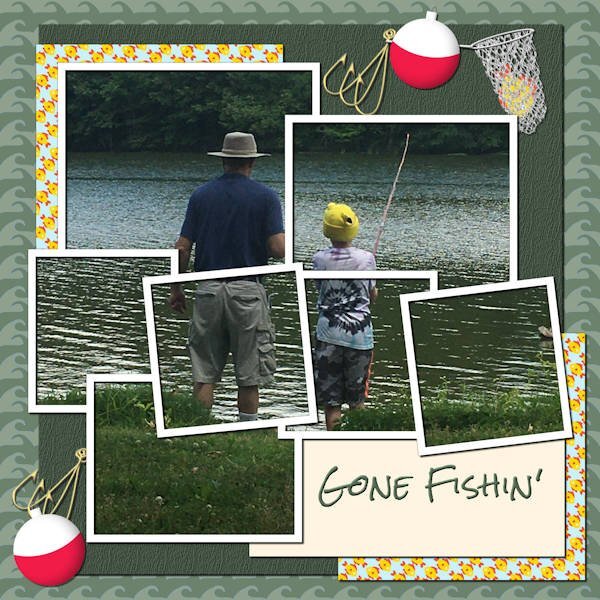
Well, back to the labs. Lab 11 Mod 7. My 2nd attempt at this. I did the fishhook, the bobbin, and the wave pattern. I choose to do the wave pattern in the colors found in the river or lake in which my son and grandson are fishing. I've used this pic several times; it is one of my favorites. The fishing net I designed using cass's fishing net tube and adding a vector ellipse and rectangle with inner bevels. The fish in the net is from the vector workshop - loved that fish and have made it a shape, a tube, a pattern, (reversed the fish for another pattern which you might see in the 2 paper backgrounds). Used my bark texture on the dark green paper. The title is Rock Salt which was a freebie in this lab module. The template I used is in the lab module and modified.4 points
-
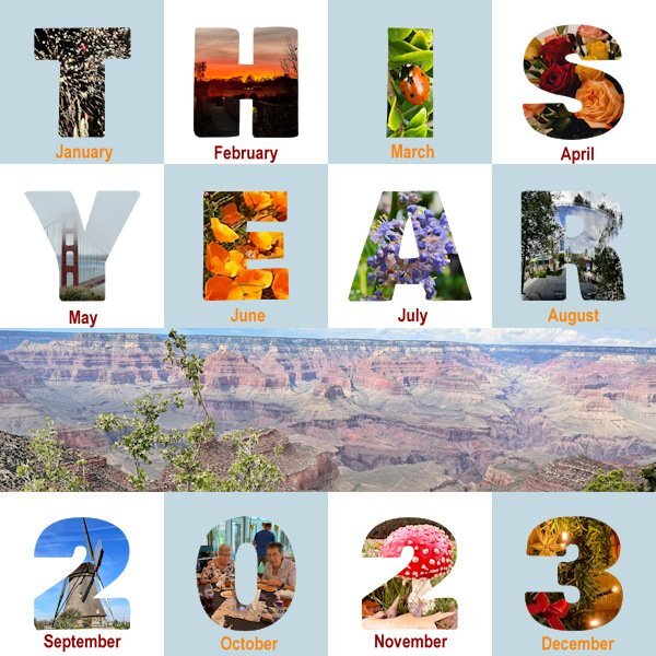
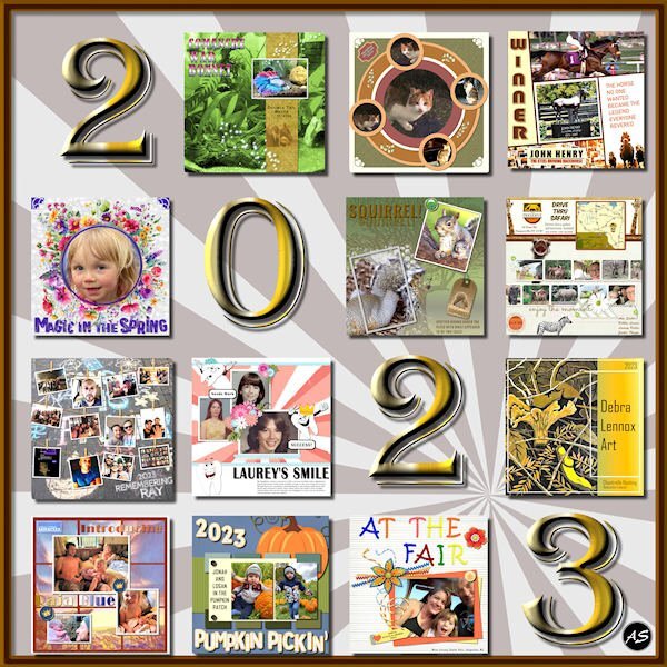
I went back to a former Year in Review layout and edited it for 2023. I picked out my favorite projects from each month of the year but, because the illustrations are confined to a square format, I didn't include our calendar project from November. The date is a font: Algerian with a gold metallic gradient and an inner bevel.4 points
-
I've started organizing my fonts into categories using NexusFont and Character Map UWP. In preparation for the Template Workshop, I have also been making masks using cass raster to mask. Most of the shapes are from preset shapes and preset shapes that I created using the ss Making preset shapes scrip.4 points
-
I felt ill on Dec 27 and tested positive for Covid on the 28th. It has now been 10 days and I'm finally clear. I had mostly upper sinus involvement with a little coughing. No fever just felt sleepy all the time. Looking forward to the Q & A and the new template workshop. Hope everyone else feels better, too.3 points
-
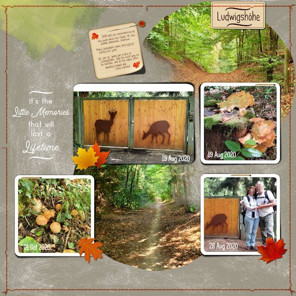
Here is a layout I started in 2021 for the Color Challenge, and although I posted it as finished back then, I left it in the unfinished folder for later tweaks. The color that was supposed to be part of the layout was already in the photos, so I changed the background paper to a solid gray color and added an overlay. I started with Lynn Grieveson's (The Lilypad) Template - #lgrieveson_messy_captured_4. I created the Wordart for the first version, and for this reviewed version, I added some elements following Carole's tutorials: Post-It Note, Straight Pin, Pinned Paper The lifted photo effect was created using cass-LiftedPhoto Script.3 points
-
Most of the elements are from Creative Fabrica. I used their preview of their Pink Nutcracker Christmas Clipart as inspiration. The font is Bahgila from the CF Absolute Font Bundle from last year. The bundle is still available for $1. I love this bundle because all of the fonts have additional glyphs.3 points
-
Christmas Eve service...Kit from Digital Scrapbooking, Commons, "Ready for Christmas" by Saskia Veldhoen. Paper, solid, 03. Frame 18-10a. I extracted the tree from a photo. Gifts from Creative Fabrica. Tree graphic, 18-10a.3 points
-
I did this last year only taking at least 1 photo every day then doing weekly layouts. I'm undecided as to whether I am continuing in 2024, but have been taking photos every day in case I do decide to continue on. I call my version "Week In Review" and all 7 photos are on one page so at the end of the year I have 52 layouts.2 points
-
I'm in and I'm going to use cass-Custom Playing Card Script as there is 52 cards in a deck and in a year!2 points
-
2 points
-
After today's Newsletter I checked the Store and saw the template freebie YearInReview-2023. I have started with the last lessons of the scripting course but couldn't resist the chance to use it. Well it's a diversion from studying the last lesson, which is a big one and I certainly can't concentrate the whole evening on it. 😉 From all the photos I took in 2023, I selected one from each month. Plus a bigger one from the Grand Canyon which was my highlight of the year, apart from seeing my family again. Furthermore nothing fancy, soft colors for the squares, because the photos are colorful enough and I didn't change the font for the months, only colored it. Now to bed and tomorrow back to the study!2 points
-
As most of you know, I love gnomes. These cuties are from CF (I have a subscription so I have a lot of their stuff). The font is Bestop Glistening, also from the Absolute Font Bundle. For any newbies to the Campus, I often create frames like this. I increase the canvas size, magic select around the bottom layer, add a new layer and fill the selection (in this case I used the same gold sequin pattern that I used for the text). Then I apply an inner bevel. It's a quick, easy way to dress up a layout.2 points
-
2 points
-
2 points
-
Thank you, Corrie. We did get through all the Christmas celebrating so I feel lucky. I am fully vaxxed so that helped to make it a mild case.1 point
-
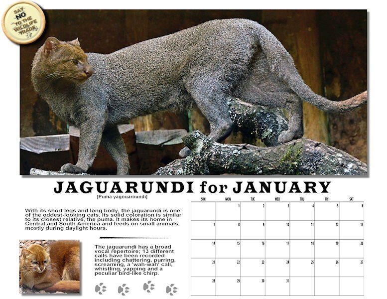
Well as I together with Suzy am the reason we are having this thread (thank you Carole) I'm in. I will use the script cass-CountingCards1 that has a card with the week number on it. That will give a coherent layout for the whole year and I will change the colors depending on my photo. This is just a card not a full scrapbook page and it will be easy to make. Which in my opinion makes it not too difficult to keep up with. When I have my first card done I show it here later today or tomorrow.1 point
-
Doska, this is so very beautiful. Thank you (and Carole) for sharing it.1 point
-
Mary, This is just perfection! I cannot believe you made that net! Or the fish hooks. Really, it is just exquisite. Corrie, I wonder if anybody would like to join us? Isn’t that script amazing? And so versatile. PLUS it’s good for 2024, but also 2021 and 2029 - anything because the second line can say anything you want. Does anybody want to do a P52 - photo a week with Corrie and me? As she said, if anything big comes along, it can just have its own page(s) stuck right in there with the singlets.1 point
-
1 point
-
Suzy is hoping to do such a challenge, so maybe you can be photo-buddies. I have seen challenges where participants had to take a photo based on a specific prompt, while others were open. In the Maniacs FB group, there is one challenge/theme every week. If you want to use that as inspiration, you can join. And instead of having an overall theme (vacations, flowers, etc.), it could just be "a year in my life" or something of the sort. No fancy theme, but daily life.1 point
-
1 point
-
Ann, Bonnie, Michele, and Corrie, those are beautiful layouts. I love everything about them. Donna, those mask shapes are very creative... they'll look interesting and unique in a layout. I downloaded the 2023 Year in Review after seeing it here! I am so behind that I have only recently continued working on my 2021 Year in Review!1 point
-
1 point
-
S = Sets Yup! I'm a rebel and did 2 in a row. Only because Reps and Sets go together like peanut butter and jam! and because I just finished my workout full of reps and sets.1 point
-
I have Norton too, he's not very ultimate even though he says he is....cause when I look out the windows, they are still dirty.1 point
-
I use Font Base. There is a free version and a paid version. I chose paid, 1x a year payment. that gives me access to the glyphs in a nice big format and I click on the glyph and it copies to the clipboard, it's easy for me to use. It's the first font viewer I chose (after reading reviews) and I was very new to having one. I'd like to see what other ones are like too. and I never want to go through the character map in Windows again because it's so small and it doesn't pop out and enlarge when I hover over it, and even when it did it was still too small to see.1 point
-
I like NexusFont because as long as the fonts are in the uninstalled folder, I don't have to install them in the Windows font folder. I try to keep my installed fonts at a minimum. Creative Fabrica is not helping my font addiction.😄1 point
-
Organizing fonts is very tedious work. Installed fonts are no problem, but finding where I saved the uninstalled fonts was difficult since I have them in so many files. Then I put them into 2 programs. NexusFont and Character Map UWP. I like UWP since it shows all the additonal characters and is large enough for my poor eyes to see without strain. I have several programs to wash my windows, including a Dell program that came with the computer and Norton Utilities Ultimate.1 point
-
There should be an AI or a script that you point to the existing folder and it looks at your fonts and assigns tags, then makes a list of the tags and all you have to do is use the list to find what you want. I get this sound just like a font program, with mine I have to do the assigning. some seem to have tags but maybe less than 1%. I'm being lazy and that would be a better use for AI's.1 point
-
Can you come and organize my fonts too? Can you come and organize my fonts too? Also, the windows could use some washing...🤣1 point
-
1 point
-
I love seeing these stats. It would be cool to see these stats year to year.1 point





Resized.thumb.jpg.d25811db03a63358cedab1e79f527635.jpg)
