Leaderboard
Popular Content
Showing content with the highest reputation on 11/24/2023 in all areas
-
7 points
-
7 points
-
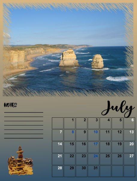
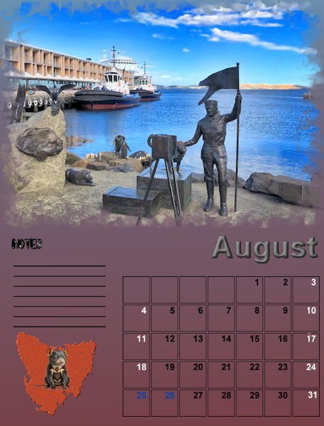
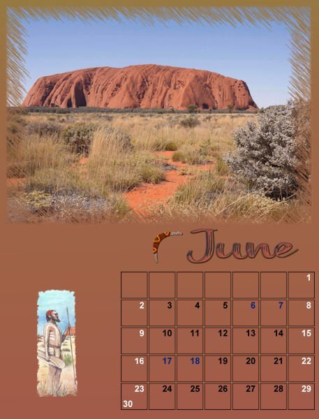
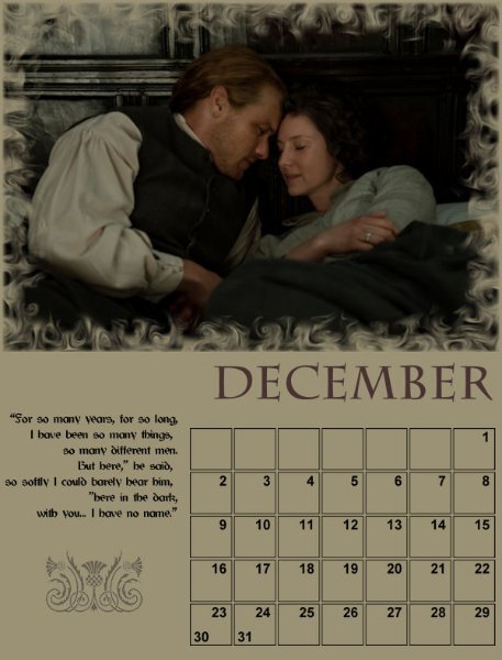
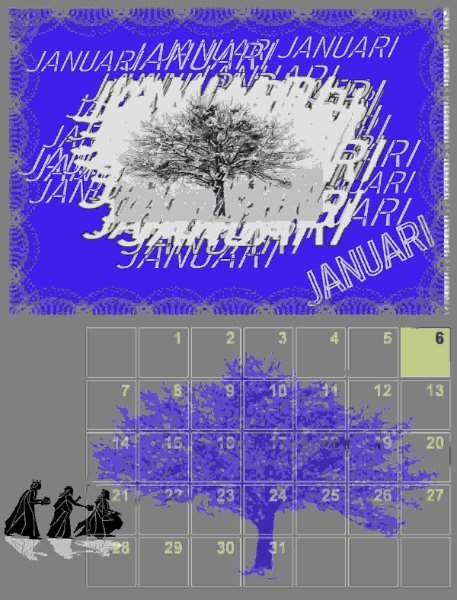
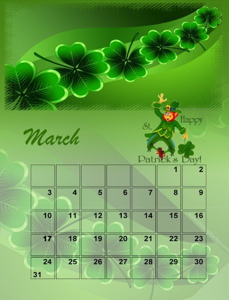
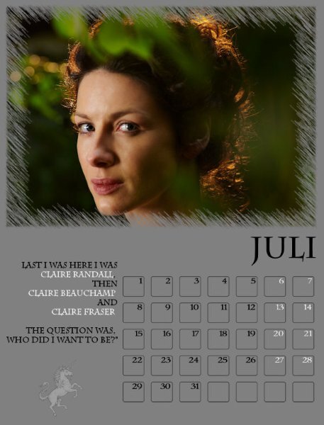
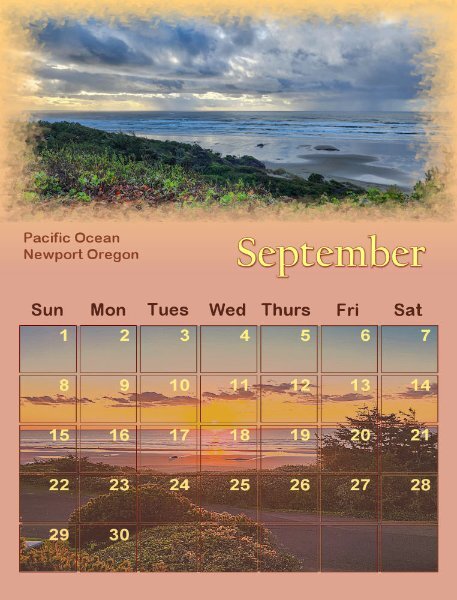
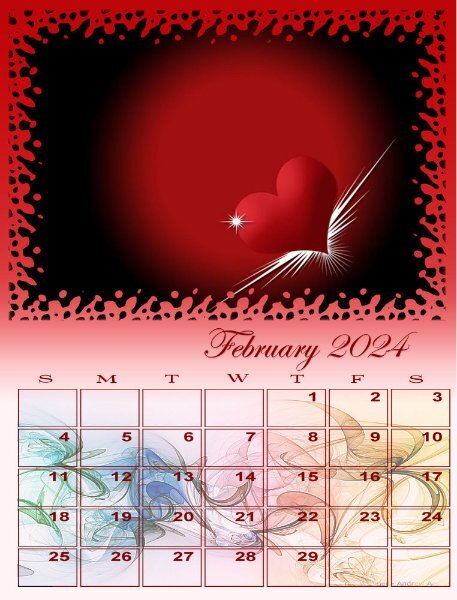
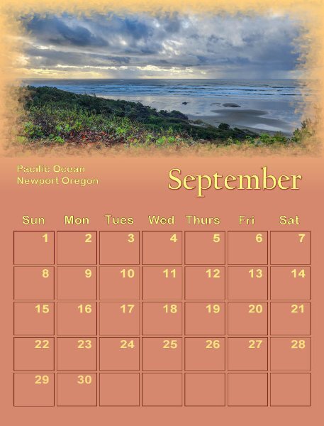
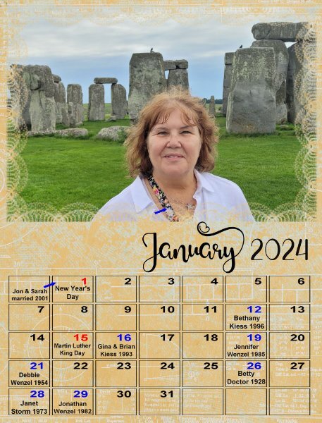
I need advice! For the first time (this is my 3rd calendar class) I need to get it printed as a Christmas gift. I always see calendars that open up from the center and can be pinned to the wall. And they are bound in the center. I have two now, one is stitched and the other has wire coil. This class has produced 13 pages @ 8 inches x 10.5 inches. So what do I do now and where is a good place to get it printed. It's for my granddaughter, Jackie, who lives nearby. I only have one more page to finish, for December. Here are July thru November finished.6 points
-
6 points
-
5 points
-
4 points
-
4 points
-
Did anyone get the Corel's new Discovery Centre email? Carole has a great tutorial in it called, "Make a custom calendar in Paintshop Pro". It's very good.4 points
-
Just a small X-mas star with a decoration. As most of you know I'm taking the Scripting Course and in this week's lesson we had to use a preset shape and rotate it. Then write a (simple) script using what we had learned in that lesson. For fun I used a star preset shape and when finished with the lesson I thought well that looks like a nice X-mas star. The result from the lesson was quite small because we had to use a 200x200 image. This evening I played a bit with that script and redid it on a 400x400 image. After running the script I placed a decoration on it and I have something to use on cards or whatever related to X-mas. I love it when I can make something with the knowledge I'm getting in this course.4 points
-
Someone suggested that I should write a book on digital scrapbooking using PSP since there is already so much content in the Campus that I can collect and publish. Well, that is easier said than done as it needs to be well organized. I searched on Amazon and there has not been any recent book on digital scrapbooking in recent years, and even less using PSP. So, here is my thought. I want to know, from all the scrapbookers in here, what topics you feel a book should cover. Let's make a list of CHAPTERS you can envision in a book or topics you wish you had when you started (or still are looking for). I have a few ideas in mind, but I would like YOUR ideas. I will list the CHAPTERS/TOPICS in this post as you suggest them so it will be easier to see what has been already suggested. At this point, the chapters/topics won't be organized. Here is a list-in-progress. Why digital scrapbooking? Pros and cons. The Text tool - used for titles and journaling Layers - linking, and grouping Shadows Content and information - dates, names, locations Supplies to use - getting pre-made kits Fixing photos - some basics Genealogy - one way to share Photo processing - some interesting styles to replicate or use 365 or 52 - a different type of documenting everyday life Building a page - start with the focus and add the details Sharing your scrapbook - printing, posting, emailing, etc. Using PSD supplies - a lot more can be used! Variety in scrapbooking - from simple and basic to complex and crafty TOU - what it is and why Clusters Size and formats Printing or not printing Special effects (only available for digital) What to scrapbook or why3 points
-
3 points
-
Had fun with this one. I updated the one I made years ago for the same theme. (I've been doing that a lot lately to save time.) The font is Little Brushy Regular.3 points
-
3 points
-
3 points
-
3 points
-
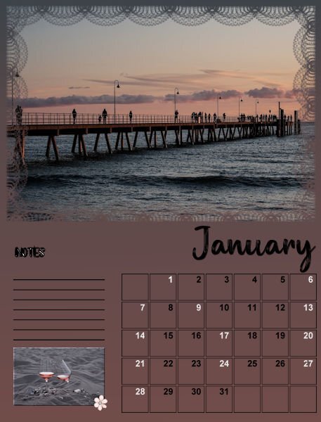
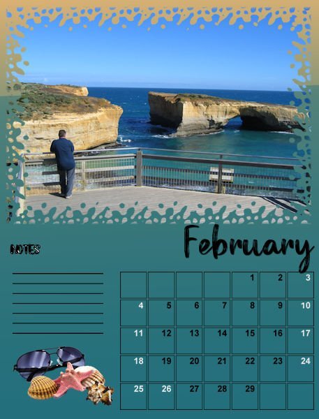
I now in your side of the world the colder winter weather is beginning, but down under, we are coming in to the warmer weather so I decided to show some of our lovely lifestyle. One is walking along the Glenelg Jetty on a warm evening and another showing some of the beautiful scenery along the Great Ocean Road.3 points
-
3 points
-
2 points
-
2 points
-
Ann, my go to for printing my layouts is Persnickety Prints. I do print 12x12 size but they have a multitude of sizes that can be printed (as photo prints). I just looked and although they don't have 8x10.5, they do have 8x10 and 8x12 for $3.99 per print. They also have 8.5x11 for $1.99 per print. The quality of their prints is exceptional and if you don't like it, support will work with you until you are satisfied. If I was doing a calendar for a gift, I would use Persnickety and get the 8.5x11 prints and see if they would put a white border all around it. Then I would bind it possibly with ribbon like Sue suggested. Persnickety's customer support is awesome and works with their customers to make sure everything is what they wanted. Shipping is usually very fast, I've gotten orders within 4 to 5 days (Utah to Ohio). If I was doing a calendar for me, I'd just print it on my printer.2 points
-
I print everything off myself. Using good quality paper, it's worth paying the extra. I use HP Photo premium (matt) paper for the calendars, as I'm able to print on both sides. Avery products for cards etc. For the calendars I round the corners, or other punches to subtly remove the sharp edges. Everything , is always well received. Several years ago I looked into buying the wire binding kit, but for the price it wasn't worth the expense. I punch two holes, and use ribbons to use to hang the calendars. I will also punch holes in cards, to thread ribbon, of course it will depend on the card. Choosing ribbon colours to match the calendars, or whether it's for a man or woman. Once again, it's the little details that count, which get noticed the most, and remarked upon. Bit like an error will stand out like a sore thumb. I agree, although it's nice to use your own photos in the calendars to personalise a calendar using the online printing services, which are basically premade, are excessively expensive. I certainly couldn't warrant using them, for the number of calendars, and cards I produce and print. Also, for me it would take away some of the personalising of the item. It's all my work, from start to finish.2 points
-
2 points
-
A section at the end for where to find supplies listed by category Like: Fonts - then a list of some current free and non free places Kits - list places you can get kits or elements etc Other supplies: eg. like textures, brushes, scripts Tutorial sites - yours, Corel Also: section on "making your own supplies" (papers, flowers, elements - just some basic ones ) Also, somewhere in there explaining what CU and PU and Scrap-for-hire mean...I didnt understand that for some time.2 points
-
Wow. So much awesome ideas. I have loads of old family photos of my parents and no clue who anyone is (other than my parents and grandparents). They are all gone now. Wish I was into that sooner so I could have asked more questions. I guess that's why I never actually scrapped physically, because I come from a photo arts background (and handmade books/paper) so I was more interested in the art aspect of layouts...as I am now. The only family members i've digitally scrapped is my cats. Yikes eh!2 points
-
I definitely agree that a chapter on supplies that are already there for people to use would be nice. Most digital scrapbookers that I know like to buy a pre-made kit then scrap their layout when they first start out. Heck I've been digital scrapping since 2008 and still prefer to buy kits. I prefer my scrapbooking time actually being spent on scrapbooking not creating although I have enjoyed learning more about creating my own stuff. As for templates, make sure to include the fact that PSD templates can be used in PSP. Even though PSD templates might have native PSD features in them, they can still be used in PSP. A PSP user will just get the basic template to use (I do it all the time). One of the designers I have bought from has glitter styles as an add-on to her kits. Since PSP can't use styles, I always ignored them. Until I found out that the png files of the glitters could be used by saving them in the patterns folder. Not to mention all the commercial use paper textures from Pixel Scrapper that can be used by saving them in the textures folder. I do agree with Susan about using Bootcamp as a starting point. But make sure to expand into more crafty or complex pages. Show what can be done with PSP because quite a few PSD or PSE users think PSP users cannot do everything they can! Most of the scrapbookers that I know started out with very basic pages but as they continued on they found they enjoyed the crafty (and what some call busy) pages. I've seen (and done) some crafty pages that do have the story on the page as well. Just because a page is crafty doesn't mean it can't tell a story. Since you don't want to go in to detail about the tools, if you mention something but don't want to go into a lot of detail put a disclaimer that more info can be found at.... whether it be one of your books or a blog post or tutorial here at campus. A sneaky way to advertise 😉2 points
-
2 points
-
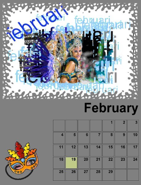
The top half is (in my humble opinion) very busy, because of the script/freebie from the store. Maybe if you erase a bit of the (light-)blue on the lady, it might become a bit less busy? Hope you don't mind me saying this 😎2 points
-
2 points
-
Here are some random thoughts from me. There should be several chapters on photographs. one for disguising bad photos, but the others could be something like cropping, and getting rid of photobombing things…we were just at the Andy Griffith of Mayberry Museum in Mt Airy, NC, and the 1966 Mayberry patrol car was leaving the parking lot. I snapped some quick photos because it was leaving. The houses in the background were old, but there was one modern SUV in the photo I want to get rid of. Something lIke that. Jannette is right - the one thing about what is going to be important in 30 years. It’s the people. And pretty much only the people. Their names. The date (as close as possible) the location. A caption at least of what you’re looking at, but more text the better. (More text, fewer clusters.). My kids like the text the best in their baby books. It is descriptive text on their lives from my perspective…how much they cried, what outfit of mine they spit up on that day. what they ate, the color of their poop, presents they had gotten, that they pulled the dog’s tail or cried when they saw a certain person….minutia, really, but they love reading about it! Still! a caution…..where there are so many junky elements with giant flowers bigger than the heads of the people in the photos…. Where so much junk is there itks hard to figure out where there even are any important pictures. there could also be a chapter on genealogy. Easy Sharing is one of the most important reasons to do genealogy digitally. The other thing is not having enough actual photos of an old great uncle, for example - but the person might know he had a yellow Lab dog and the address of his house and his occupation. Without a whole lot more, they could put together a page with a little story. (I am STILL selling copies of a genealogy book I wrote in 2008. personally for me, figuring out how I’m going to print and bind BEFORE doing even one LO was a Godsend.) A chapter on embracing the decade.. maybe they have a photo with 1960s color Cross processing?, I think that's the term. They have a choice to make. Fix it or embrace it? And you can show them how to use period text and the sepia colors for old photos, then how the colors change per decade or generation. Because that would be really groovy. Er, da bomb. I mean hip, baby! Be sure to touch upon the idea of scrap every day of the week, or 365 or 52 week, or whatever, to show their actual lives and what they do and how they do it. Show pics of their bathroom sinks, kitchens, including wall paper and maybe even the inside of their refrigerator, maybe you could two pages that have 365 prompts in tiny font of everyday life? Riding in the car…facing front, backwards, car seat?, big booster seat?, whatever. Wouldn’t it be fun for me to have that from my youth? Well, I have 1000s of ideas, I’m just not sure this is what you mean.2 points
-
2 points
-
2 points
-
2 points
-
2 points
-
2 points
-
2 points
-
@Susan Ewart I still have to have an "honest to goodness" camera. Even though my cell phone takes marvelous pictures, the real deal for me is the camera. I have a Canon - it's heavier than my old point and shoot camera, but it takes marvelous pictures. I'm not the photographer you are (or Sue Thomas or Ann Seeber), as I use the auto focus features - but those are marvelous features on my Canon as it has various settings to choose from. My mom and my Aunt each had one of those cameras that folded up like a "brick". But my first camera was a Brownie box camera and it did for me until I bought my first camera. I don't have it any more as I gave it to someone who collects "antiques". @Rene Marker Have you ever ordered a photo album from them?1 point
-
Ann, it's me again. Please forgive me, as I'm not purposely picking holes in your work. In the month of July, and the word July and June. The letter J has what appears to be a diacritical mark above it. (acute accent). Perhaps that is how the font is meant to be, unless you chose the wrong fancy J. Either way, and I'm not you, I would remove that mark, as the font itself is ideal for the theme of your calendar.1 point
-
That is an interesting idea. I might just ask you all when the time comes!1 point
-
I know a lot of the information is available on the internet but you have to search all over the place to find it. And, that can be frustrating! Especially since most of it is focused on PS and PSE. I think a book would be great for a start then possibly build the website to go with the book. I've only learned what I know by trial and error and frequenting various forums over the years. I already was familiar with PSP when I started since I had already been using it for over 10 years for scanning and correcting photos. I was familiar with layers since the first thing I ever did with PSP in a class on ZDNet was make signatures for forums! But I was a complete novice when it came to digital scrapbooking although I had done paper scrapbooking so knew what scrapbooking was. I needed to learn more about the process. I just thought of something else that isn't PSP specific but how about having testimonials from scrapbookers that use the program giving their tips for how they do things. (For example, when I shadow my layouts I start with the bottom layer and work my way up the layer palette. This way I always know which layers have shadows when I don't use shadows on a separate layer.)1 point
-
With all those fantastic ideas, I might need to write an encyclopedia! ... or maybe build a website ?? 😉1 point
-
1 point
-
and it should be! The more people that find the campus and the store and Corel will only benefit us all and hopefully you really will, because you put tireless effort into all the great resources you've given to us. You should be well compensated for that. I'm a book lover, I'll be buying no matter what.1 point
-
Thank you Jannette, I'm pretty sure I don't have any virus on my pc. My husband is very cautious and runs a scan every week and we have a good antivirus program installed too. I have this little problem, I think since starting with PSP2023. I can avoid it by checking carefully where I save my work, but when I'm in a hurry and just save without looking then I have this annoying issue.1 point
-
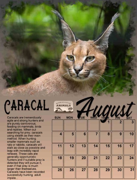
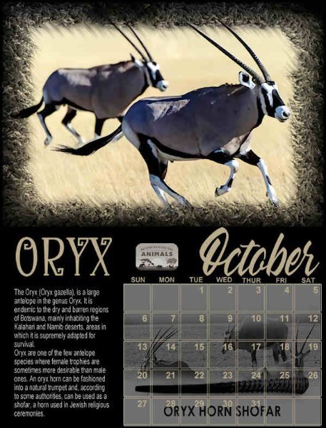
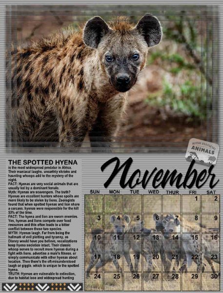
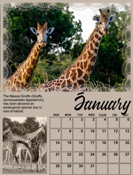
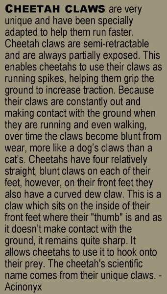
I was able to read the Badger and Caracal text. How interesting about the Badger, they must have a way to digest and filter out the poisons. Unreal. Ann, I'm so blown away by this Calendar. I'll head to FB today and see if you have posted them there so I can read the rest. The information is very interesting.1 point
-
Well said Rene. I did not know that about the Styles. I have downloaded some in the past thinking I could use them. I'll have to find them and see if they have png files.1 point
-
1 point
-
Hi, I finally had a response from Corel support. Here is the info: "This is a known issue and I have sent all the information regarding the issue to our Development Team to investigate further. The Team does not provide us with any ETA required for the fix or workaround, thus we cannot provide any ETA at the moment. We hope it won’t take long. Once additional information or a fix is provided, we will contact you immediately."1 point
-
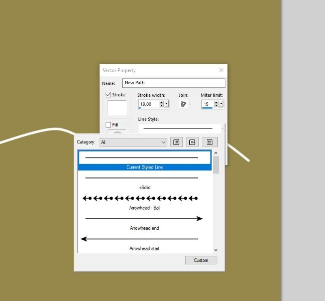
Looking at your screen shot, you need to change from fill to stroke in your material palette. Double click on the NEW PATH layer, it will open a dialog box. Ensure you have the stroke selected, and not the fill. Click on the line style arrow to select the line style you want. There you can change many settings. Disregard the mitre limit.1 point
-
If you "open" the Vector layer, you should see the OBJECT in the Layers palette. If you double-click on the OBJECT, you should get a dialog window with the Line style and there, you can change it. The OBJECT has to be active for the change to be shown.1 point
-
Bonnie I'm so glad that you could find the time to resize your calendar pages so we could enjoy them. They are lovely and will print well, should you decide to do so. I hope your care duties will stay manageable and leave you some time for yourself!1 point


