Leaderboard
Popular Content
Showing content with the highest reputation on 11/09/2023 in all areas
-
8 points
-
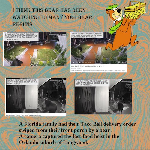
I just saw this video of a bear stealing this Taco Bell delivery and I just had to share this little page here. The pics were screenshots from the video. I have no idea if it was O K to do this, but what the heck, it cant be any worse than the way things are shared all over facebook etc. I made no attempt to add shadows or anything, I just had to do this for the Fast Food theme. Apparently we humans are not the only ones that enjoy a little fast food home delivery.6 points
-
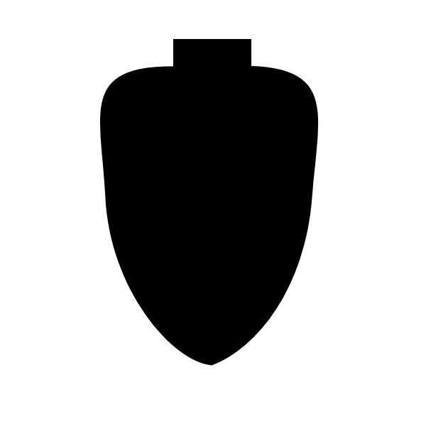
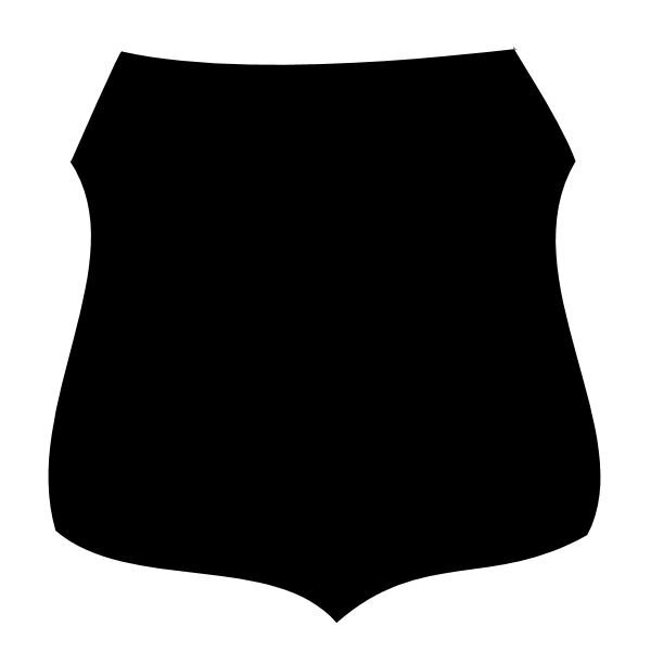
I've been working on making preset shapes. I needed an arrowhead and a shield for some things I've been thinking of. They required me (at least I thought so) to use two vector shapes to complete each project. I couldn't for the life of me remember how Cassel told us to export a couple of shapes as one complete shape. So I looked at the workshop and in Lesson 2 she describes how you have to highlight all the layers and then GROUP them. Well, that worked and so now I have a shield and an arrowhead.4 points
-
4 points
-
Hello all, this time there are no flowers and bows, just oil cans and coal☺️. I wanted to do a technical scrap. As a child I lived on a railway line in the Black Forest, so I have a soft spot for the railway. The challenge was the text. For me, T couldn't be selected when I had selected 2 layers to change the font color. It could also be due to my graphics card, which was quite busy when I had to use the video and graphics program. The double shadow was also a bit difficult. Suddenly there were 2-3 shadows behind the object. I quickly deleted it and reloaded it and then checked the box for drop shadow with extra layer, then moving the shadow or blurring it worked. The papers are all from Creative fabrica. The photo was taken by a former work colleague Frank St., who photograph Trains worldwide. I have his permission. The deco is from Kisspng and pngtree. Font: Model Railway (CF) Doska3 points
-
When I think of Fast Food, my mind automatically goes to Hamburgers and Fries. Although we don't care for McDonald's, I do love a good burger! Our favorite burger place is Huey's! I created my own papers and used elements from Pixel Scrapper. The heart was from Rebecca's Kit: Enamel Heart, and the button was from Avivia Elements Button 2. The word strips came from Food Day Pizza Word Strips.3 points
-
I am also in! Every year, I make a calendar to give to my mother-in-law, as she likes and expects. She likes something cute and something she can laugh about... So, that's what I have in mind when choosing images at Pixabay/Unsplash/Pexels... It's getting difficult to find something new in this category. 🙂2 points
-
Corrie, great use of the Scripting lessons! Those stamps look really amazing.2 points
-
2 points
-
1 point
-
I guess this is one of those "try anything" steps like reboot the computer, delete the cookies (or eat them), delete the cache, update the browser (or try with a different one). We never really know which one will work but always worth a try. Glad it worked!1 point
-
1 point
-
Last week was pretty funny in town where everyone seemed to be calling out "Paul". What do you think of this? Have you ever seen something else, in your area, where everyone seems to be connecting in an unusual manner? Let's chitchat.1 point
-
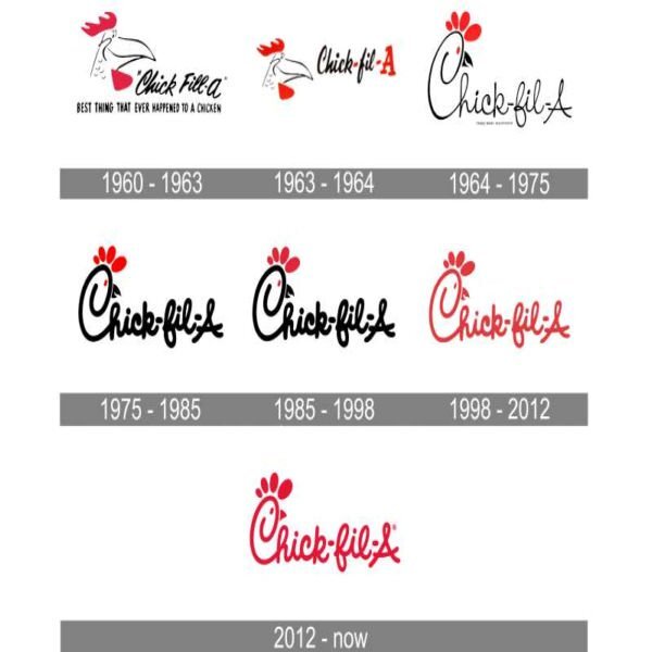
C = Chick-fil-A Who doesn’t care about your holiday ham or your pumpkin pie—this Christmas, the chicken chain just wants you to 'eat mor chikin'. How do we know? Because Chick-fil-A just launched a brand-new line of holiday merch to add to your wishlists. And, take it from some food writers who have seen just about everything when it comes to branded merchandise—this stuff is actually cute. From chicken sandwich socks to plush chicken pillows, this holiday collection has some of our favorite items we’ve seen from the company, and there’s no question it’s going to sell out fast. This season, we’re getting a line of holiday-inspired goodies that go way beyond clothing. Yes, there’s a festive knit sweater that would be the talk of any holiday party, a red-and-green pom beanie we’d proudly sport in the grocery store, and even a cozy wearable blanket that we’d wear, well, constantly. P.S. Look closely, those snowflakes are actually waffle fries. But, there’s also an adorable cow ornament, a 1000-piece chicken sandwich puzzle, and even a snuggly Chick-fil-A sleeping bag. Whether you're shopping for yourself or another Chick-fil-A fan, there are plenty of chicken-themed gifts to choose from.1 point
-
Take care of yourself and your husband, Doska. Prayers are with both of you.1 point
-
We'll all be here in whatever way you need us. We are a very close community and are always willing to help when we can. Take your time. PSP won't go anywhere, but if PSP can be your relief, let it be.1 point
-
1 point
-
Thank you and I can't say if it will be to difficult for you or not. I find it is a bit similar to learning a completely new language and a steep learning curve, but soon I was able to recognize some parts that are always in a script. I haven't been learning/studying something really new for a very long time (besides all the wonderful things we learn here in the campus) and I had a hard time getting in a sort of flow that works for me. But having said that, I find it highly interesting and very nice to get my old braincells into action again. When t all comes together into such a script that I undoubtably will use many times. I have used postage stamps on many projects and always made them by hand, not difficult but my script will come in handy and save me time, therefore I wanted all the options in my script to make the best use of it.1 point
-
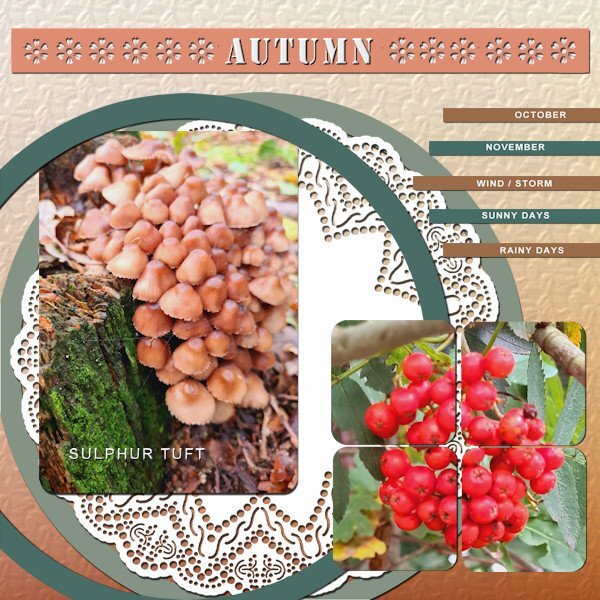
I'm still in the Autumn mood, due to the weather we got this last couple of weeks. I used everything and added an extra square tile so I could use 1 photo in 4 tiles. The color palettte is from the October blogtrain on digitalscrapbook.com. The background has the texture spruce, the doilie is one of a set by Carole which I have for a long time and the fonts are Stencil and Arial. I made a cutout with a brush that is in the the brushes folder.1 point
-
1 point
-
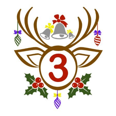
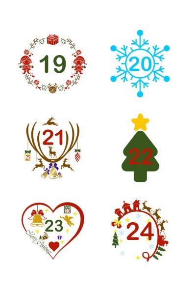
We are quickly approaching the Winter Solstice, which entails the festive season. This year's advent calendars for my little girls are already en route. Seeing as Michele has posted a lovely Xmas page, and mentions having fun colouring. I thought I'd post some of the dates that are printed onto multi purpose removable labels. (11/2 x 11/2 inches) which are easy for the girls to peel off. I have a nice large collection of Xmas monogram fonts which I use, and grows with each year. I use the same font for the numbers( Ariel). Colouring is time consuming, but I really do enjoy the tediousness of it.1 point
-
You always do such a cracking job, on whatever you put your mouse or stylus to.1 point
-
Daily Look for today. I decided to go with a poster feel. The bell and the ornament on the top are from CF. I've had Santa with his sleigh for so long that I don't remember where it came from. The snowflakes are a picture tube I made several years ago and the font is Kirvy (I know; you'd expect it to be curvy!). I had fun changing the color of the overlapping portions of the elements.1 point
-
1 point
-
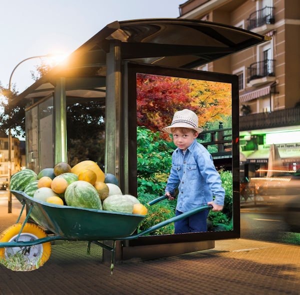
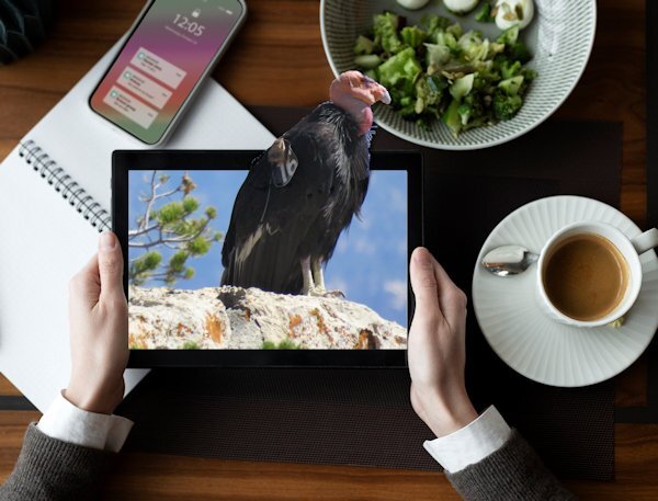
I have found a mockup that I liked and have used the photo of a California Condor (from the internet). I have seen those birds on my visit to the Grand Canyon, but it was impossible to get somewhere near them to take a photo. There were photographers with a mighty telelens that couldn't take a good photo of them either. I have given the bird a shadow because in the image is a shadow too with light coming from the left. When I have time I might search for another mockup for another photo, but I wanted to give this a try.1 point
-
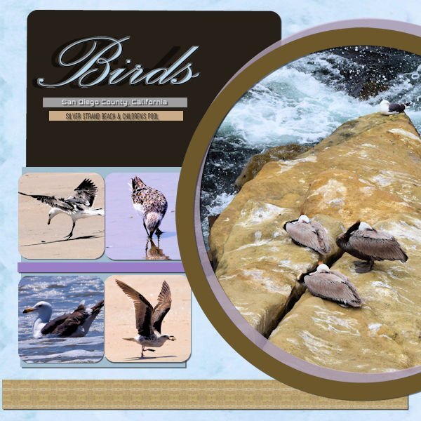
This is the cleaned-up version of my design. I fixed the kerning on my font by setting my kern value to -25. Then I swapped two of the square pictures and adjusted my circle layers so they did not over-power any of my squares. Finally, I fixed all of my shadows. My background paper used the pattern effect on my picture of the three birds. I used the same effect to create the brown band across the bottom of the design. The thinner bands and the large rectangle were created using the colors in the circle picture. Thank you to everyone who offered me advice and suggestions.1 point
-
I have not figured it out yet. I will wait until I have all the photos on hand to decide. I have many options: keeping it completely white so the focus is only on the photos having a random watercolor pattern to frame the frame (which might not be white either) using a faded/black and white version of the photos themselves (which might not always work if they don't cover the whole page create a small pattern from the colors in the photo So, right now, it is still a work in progress and nothing is finalized, however, the OOB approach is getting more and more interesting now. I'll keep you all posted!1 point
-
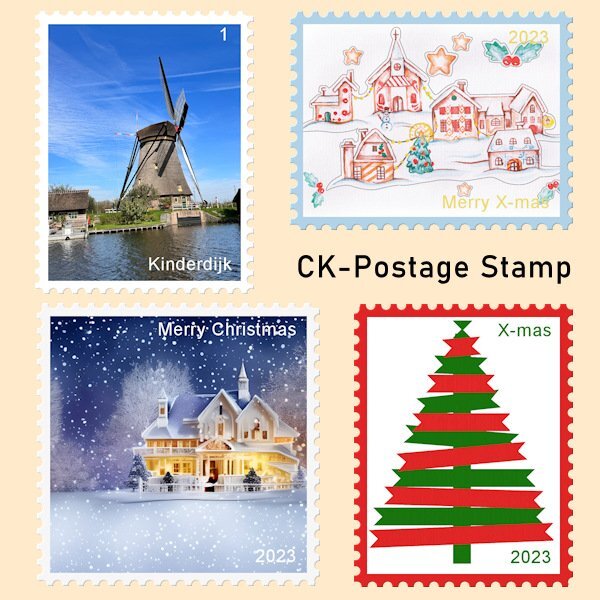
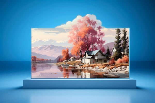
Seeing all the above OOB's I will have to go and search for some mockups that I like and that will go with my photos. In the mean time I like to show what I have been up to with the scripting course. I have posted there my result but that is only visible for the members of the course, so I will post it here too. I have been making my first "real" script, not something for practice only. I made a postage stamp script that can use landscape, portrait or square format with a border for which you can choose the color. You can choose to have no text or with a simple text for which you can again select the color. When testing I used some X-mas related images, so I can use them this year. I have used the "ribbon tree", that Sue T has generously shared with us last year, for one of the postage stamps. Thanks again Sue! The Kinderdijk postage stamp was the one I used to code the script so I could adapt it for the other formats, colors and text.1 point
-
1 point
-
Actually, for me choosing a photo is easy, choosing a background to place the photo in is far more difficult. I rarely, if ever use outside resources, other than some elements.1 point
-
That is true. I had another project to show (but that will be for Part 2) which is even more important when you consider the perspective for the photo and the "base".1 point
-
1 point
-
Yes, the most difficult part of this technique is to find/take 2 suitable photos1 point
-
1 point
-
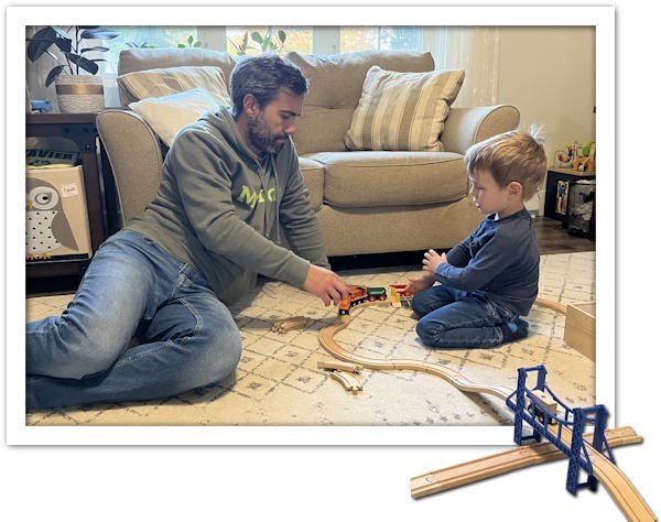
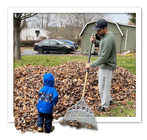
As I have mentioned before, I plan on making a storybook with photos of my son-in-law and grandson as a "home-made" gift exchange this Christmas. I am still collecting photos to have enough for a story, and I have not yet, decided on how to display the photos (as is? with instant effect? extracted?) so I thought of trying another method, which is the OOB, as we saw in the class yesterday.1 point
-
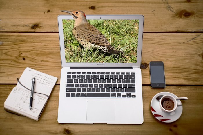
I had some time earlier to have a quick play with the Just Out Of It. It took me longer to find a suitable background, eventually I found one on Unsplash. Than to create the page. I liked the natural rustic wooden table, to go with the photo I used. Northern Flicker Woodpecker. I quite liked the slight tilt of her head, and element of surprise on her face, which I thought appropriate considering the situation she found herself in. 🙂1 point
-
Good morning all, here is my module 5, which was really a challenge until I finally placed the rings satisfactorily 😉 but the new techniques were fun. We have a Dutch fabric market in the city twice a year which is very popular. Even if you're not a seamstress, you'll be happy to go there for photos, as it's a very colorful market. Credits: PSBT-Jan16-Minikit © DS Jessica Dunn Alphas: DS Marisa Lerin Photo & Tag: Doska Font: Arial1 point
-
1 point


