Leaderboard


Popular Content
Showing content with the highest reputation on 08/12/2023 in all areas
-
I ran into a hazy photo on the internet so I had to try out the Haze Removal Tool.
 5 points
 -
Vector Workshop Redux, Lesson 2 - a bunch of labels. (Yay, I did them! This is where I was stuck in July)
4 points
-
So I had to try out that special border in another way. It seems that you can use anything that will go from border to border and have no gaps. So I tried with a banner that I had created in one of the labs and it works. All of the elements and papers are mine as well as the pictures (which I've used many times). The font is Nandola (probably from CF).
4 points
-
Dorothy Donn's posting of her lab 6 layouts inspired me to try to make that flower (?) element in the middle. I couldn't quite get it to work, but the multicolored element is my attempt at it. I also tried doing another 4-petal flower multiplied and these are my results.
4 points
-
Mine works too and i found the extra pack when PS opened it had a pop up for brushes you could buy (where I had to register too) and at the bottom was the free pack. this could be a fun tool to play with. but I sure need A LOT of tutorials or practice. controlling that brush is like riding a bucking bronco.
3 points
-
I've started a reprise of the Vectors Workshop and finished Lesson 1 last night. I think I'll post them here as no one else is in the original showroom any more. Here's my heart and arrow.
3 points
-
Lab 6 Module 8 Lesson 3 – Cross Stitch Some days are just purple days!
3 points
-
this is lovely and I'm about to post after not seeing this forum. you will laugh. We have the same title. I forgot to click follow and wondered why no one was posting in the What are you Working On forum.2 points
-
When I was watching an ON1 (Raw Editor) tutorial they actually showed how to recover hazy photos, it's not a big secret, but having a one stop button sure makes the workflow faster. And Particle Shop, it's so cool and another thing I need to add to the long list of learning.2 points
-
Starting over with the Vector Workshop now that my PSP2023 Ultimate has been tamed! Here is Lesson One: Heart and Arrow.
2 points
-
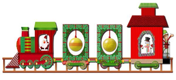
Finished my Santa Train
2 points
-
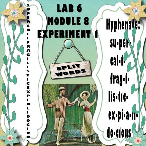
Lab 6 Module8 Experiment 1 1- Title work - Split words. "use a longer word"! At my age this word popped into my mind and I cannot stop singing at the top of my voice while I put this together.
2 points
-
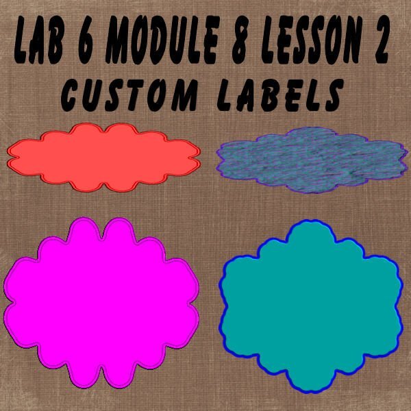
Lab 7 Module 8 Lesson 2 – Custom Labels
2 points
-
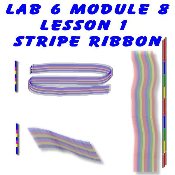
Lab 6 module 8 Lesson 1 – Striped Ribbon
2 points
-
Lab 6 Modulem7 Experiment 5- Fun Font Find -Waterepark Font
2 points
-
Lab 6 Module 7 Experience 4- Sketch idea
2 points
-
Lab 6 Module 7 Experience 3- Color/Pattern/Texture: Sepia
2 points
-
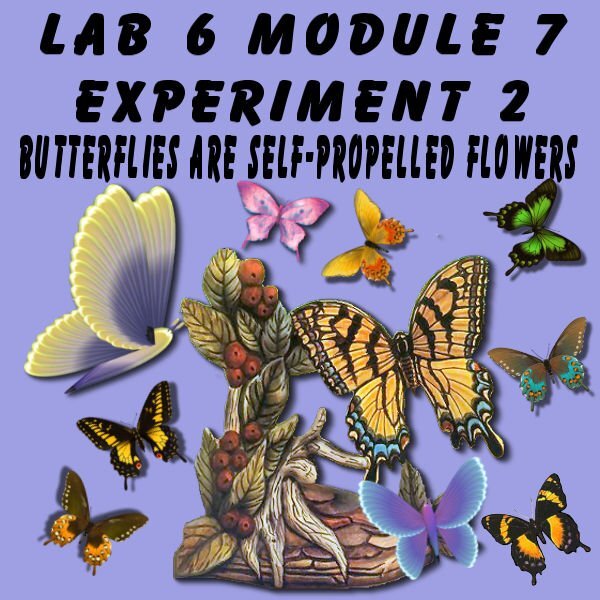
Lab 6 Module 7 Experiment 2 - Element: Butterflies All PSP Butterflies and an image I made years ago.
2 points
-
Lab 6 Module 7 Experience 1 - Title work: Multiple direction A Template I like.
2 points
-
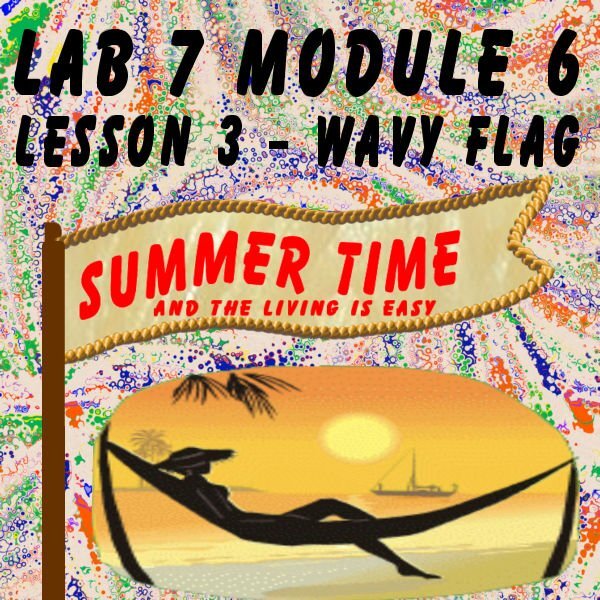
Lab 6 Module 7 Lesson 3 – Wavy Flag One of my favorite things to do but this year is way too hot to do it.
2 points
-
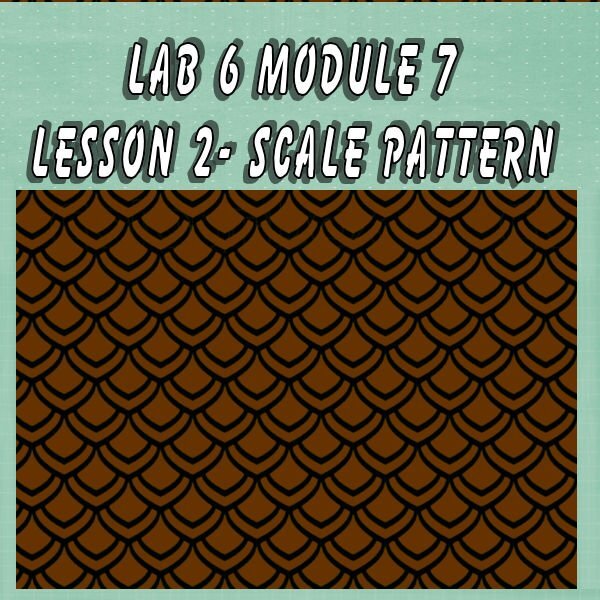
lab 6 module 7 lesson - Lesson 2 – Scale Pattern When I was little, I found a turtle in my sandbox at our beach house. This is how I remember this shell color so well. Sweet Jessica my little friend.
2 points
-
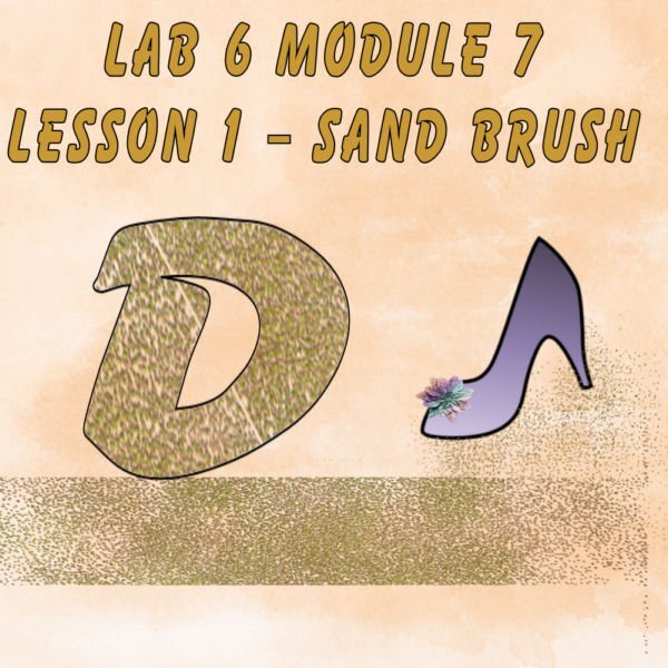
Lab 6 Module 7 Lesson 1 -Sand Brush Please note- Cassell's lovely vector shape slipped it's way into the lesson.
2 points
-
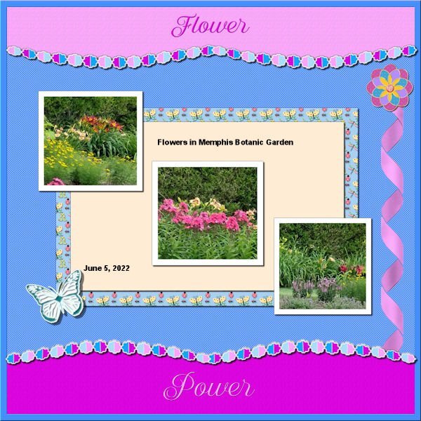
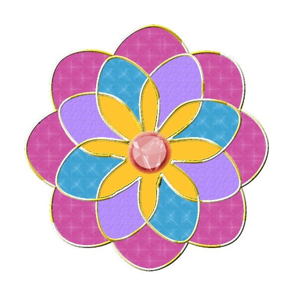
Back to the Labs. Lab 11 Mod 3. Make a banner, 4-petal flower, Sun element. All 3. Doubled up the 4-petal flower to make one with 8 petals. I needed practice to make that delightful border, 2 words, paper above (and below if you want otherwise you can have a different pattern/color below), and middle to display what the layout is about. Although I had written the instructions to make that, I found that I had to add some instructions for how to select with the magic wand. More practice needed, so I may use this again. All elements and papers are mine; the picture is one I took at the Botanic Gardens and the tag is one from the brochure. The font is Better Caramel.
2 points
-
I started scrapbooking when I was old enough to be trusted with glue. HaHaHa I would walk to my Grandparents house and help my Grandaddy with his many scrapbooks. He was quite disabled, so I would hop into his bed & he would read the recent news to me. We would cut and paste those newspapers for hours. Always laughing at the funny things we could make out of the left over paper. I think that is what he truly enjoyed most. As did I. He started to develop Alzheimer's (which I certainly didn't understand at my age). Only noticing little by little, his enjoyment with them faded, as his memory. As he declined, I would sit with him, opening the pages for him, and at times, finding a smile, a giggle or even tears. THAT is the perfect meaning of the word scrapbook to me. Scrapbooks truly play a crucial role in our lives. I can still thumb through mine and feel the love that was shared in creating them. May many more find the desire in making one, and through it, its lifetime of memories. Scrapbooking took a back seat in my life unfortunately. Creating memories for others is where I find my happiness. Perhaps that stems from those moments with my Grandaddy. I LOVE to give. Putting a smile in someone's heart via my hands, is divine. I am most grateful to be welcomed here. I look forward to the moments of sharing, and through it, new friends and new smiles. ▫▫▫ Previous PSP'r, now learning Photoshop ▫▫▫ "Don't eat the glue", Jenifer1 point
-
Well, THANK YOU for this! I saw the cost of the brushes (admittedly the most expensive were at the top) and never went all the way down to the bottom! AND I got 10 Free brushes on top of the 11 it came with! And this is with PSP 2022 Pro Here is my new hybrid - a double furry daffodil. Made with a mouse in case you can't tell because Susan is right - controlling it is next to impossible.
1 point
-
hip hip. It does work now again. I don't know what was wrong. PSP closed when I tried to get it to work but now I could give a photo an effect.1 point
-
Hello and thank you, Cassel! Bonnie! Corrie! Jannette! What a lovely & warm welcome! ❥ Jannette, what a beautiful memory. My Mother used to keep hers in a cedar chest. I loved when she opened it, to smell that beautiful cedar, as much as being able to peek upon her most cherished memories. Thanks again for the sweet welcome, gals!1 point
-
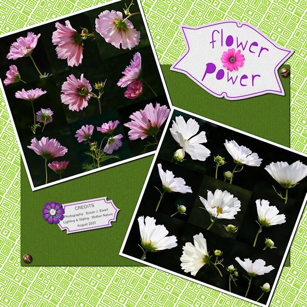
I was talking to Elvis the other (YIKES! Right?) and telling him all about The Scrapbook Campus, PSP and the Forums. And you know what he said to me...."A little less conversation, a little more Action". Kidding aside, here is my latest lab. I dont like the purple color in the tags and might go back and redo it at some point and add some brown or stick with green, in the layout. Lab 7-1 Concentric Rectangles Filled Text Photo Mosaic Even if I'm not happy with my layout design I loved this lab. It's quick and easy to do. I had to use the shift key and make straight(ish) rectangles because drawing with a mouse creates a very achy hand and it's just plain hard. I was a skeptic, but once you use the tile to flood fill your page it looks pretty darned good. Everything is mine except: Fonts: Annie Use your Telescope (google I'm sure), Raftera (Creative Fabrica) Screwheads: Creation Cassel (cass-screwheads freebie) Pink Flower, White Flower: corel picture tube I even made two Vector tags (made previously, but after the workshop) and the Vector flower. Contrary to popular belief, and because I said I did this; no flower heads were cut off in the making of these photos. They are in their natural element (if being in a Pot is "natural"). I hired a lighting designer for this shoot, she came highly recommended by the neighbourhood crows...her name: Mother Nature. The Fine Print: This post has been "Elivs" approved (I think I've had too much sun)
1 point
-
I love your backyard too. I just wish it was MY backyard. So lucky you are.1 point
-
It's a bit spooky Suzy, all those presents from Corel. I tried to use the Particle shop but it refused, working and the paint shop closed, unbelievable isn't it. After that, I tried to open Painter a present from Corel too. I had to fill out a form to register Painter. I had done that already but anyway, it opened. So I could try a bit but failed hopelessly. All together with all the trouble with TFT A lost afternoon. ?1 point
-
Very cool. I did try it one a photo (not hazy but looked cool). I do have a shot that I was looking towards the sun and the lens hood let some stray light by...(not to worry, I gave that lens hood a good talking to) so I will try it on that. I also reshot the photo after checking the preview. It will allow us to use more of our photos we thought we'd have to throw out.1 point
-
Thank you. I'm going to copy this and start formulating a plan......code for: one day I'll get it done. Kidding. I cant keep going like this, the thought of wading through 1000's of fonts to find the right one for my project makes me stick to Arial and Gill Sans Ultra Bold for everything.?1 point
-
And the winners are: Monsterrat whole family Bowlby Yard Sale Cafe Rojo intimate Butlers + Butler Stencil and insolent Cassel, I think it’s like cleaning out your closet when you need new shoes. You buy the shoes first so you know how hard / deep you need to clean. ???1 point
-
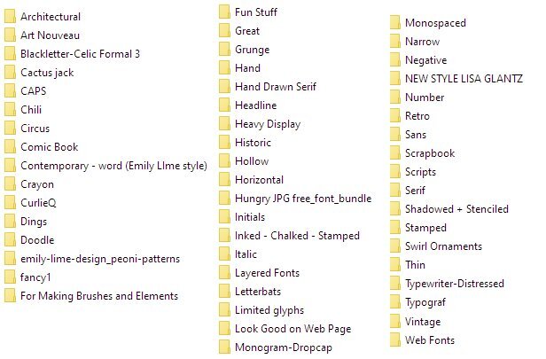
Here is a list of mine, but this is after years and years and years! Cactus Jack was from 1996. It has Western Fonts. Retro is divided into 1930s, 40s, 50s, 60 and 70s. (meaning a separate Vintage on the list is a mistake) Script is a world unto its own. When the novelty script fonts and girl-ish novelty fonts first came on the market, the big boys like Bitstream, Linotype and Monotype didn't quite know what to do, so they added a bunch, but they didn't sell. Adobe was starting to go great guns and making inroads that way, too. Adobe was able to sell the more girly fonts, why couldn't they? (The answer is that Adobe hired more women and had more fonts designed by women) So the big houses would have these contests, and I might have been the only person who entered because I won a whole bunch of them, week after week. :)). The commercial advertising houses didn't like them, but people like me did. But people like me were not going to spend $25.00 a font -- well, maybe I did, but not enough to keep a type house in business! So companies with desktop publishing software like Microsoft, Word Perfect, PSP etc, bought them in bulk to offer as "free if you buy this program". At the same time, fonts were being offered at Best Buy and Office Depot on CD Rom, 1000 for $19.95. All the CD Rom people had to do was scan the font and put it through the software. Skip any kerning pairs or alternates and give it a similar name. Voila! You now could own your very own Gill Sans. Fast forward to today, and that's why most places don't allow you to make alphas from their fonts.
1 point
-
Jenifer a warm welcome from me too! It's great to be a member of our big international Campus and you will certainly "meet" a lot of people and make new friends!1 point
-
View>Customize>Commands>View> scroll down and find "Snap to Object" and Grid, Guide Object Snap Properities I just clicked and hold and move it up to View which will drop down and then I placed it where the other grid stuff was. trouble is I then had two different properties. When I didnt use my saved workspace I see that the missing stuff was in place. If you use the Repeat Comand then it's under View>Customize>Commands>Edit> scroll to repeat (it's near the top) and click/hold and move to where you like it. I have mine next to the lock transparency icon at the top of the Layers palette. The bound scripts I found either under View>Customize>Scripts> it shows the bound ones, grab them and put them where you like. another place I found them was View>Customize>Commands>Bound Scripts> way at the bottom. I'm not sure which is the right place to get them from, it worked whatever I did. (This is presumming you had bound scripts - if you didnt then you have to bind them and this paragraph can be ignored (except you read it, to find out you didnt need to read it). Since you use the JPG/PNG optimizer you know where that is. I'm hoping when I do my re-install on the new 'puter that all this will straighten out. I am sure I did something wrong on my original install. since something happened and I had to uninstall and then reinstall.1 point
-
I totally agree. I've never thought of extending anything beyond the border. I love the look of it, @Mary Solaas1 point
-
Hi, Jenifer and welcome to the Campus. Fun place, it is. Lots of opportunity to learn and share. Your home sound lovely. Look around and jump in when you are ready.1 point
-
Welcome @Jenifer Lyn I am sure you are going to have fun in here. We have a great bunch of participants. Some are more present than others, but everyone is welcoming and friendly. You can browse around the Campus for ideas, tutorials, inspiration, and support. The forum is open to all so you can as questions, play games, and give a thumbs up. You can visit our gallery too and add comments. And finally, you keep an eye on your inbox as we have lots of activities to keep you busy and learning.1 point
-
When running the initial exe setup file, I remember that it created a series of folders, for setting up, and those folders included all those "extras" that are promoted. I have NO CLUE why those fonts got installed in my PSP2023. I didn't even know they were in that folder, so I know I didn't install them manually. However, there is a POSSIBILITY that the link I was given at the end of the beta testing period could have been different than everyone else's. Who knows? From reading this thread, it looks like so many users have different experiences, which makes me think that a lot of it has to do with one's computer configuration.1 point
-
Such a beautiful layout, Mary! The border makes the page stand out even more... I never tried this technique.1 point
-
I found my fonts...in a random folder not called Set Up. I think I might be the culprit...I usually am. Wish I was more techy. But at least I found them. I'll have the fonts too. I too have the zip folder and unzipped it but probably forgot to install them. Duh!1 point
-
Thanks, Rene! I LOVE Cafe Rojo and Yard Sale, so thanks for the list! I just realized why I always stop deleting fonts when I'm still in the A's -- I keep worrying about PERMANENTLY deleting them. I am pretty sure that I have an extra copy of most if not all. In fact, the original copy from when I installed them. The difference is that some programs -- programs from Microsoft, Corel -- will directly install the fonts - not put them in a special folder. This means when I delete them, they really are gone. I think I might make a copy of the ones in my system fonts folder, just in case. maybe put it on a thumb drive. The only reason it would even come up is that somebody on here will have the *cutest* LO and name the font they used and I don't have it!!! If I start deleting without backup I will always assume that cute font was one of those I deleted! LOL!1 point
-
You may want the Clone tool on the left menu strip.1 point
-
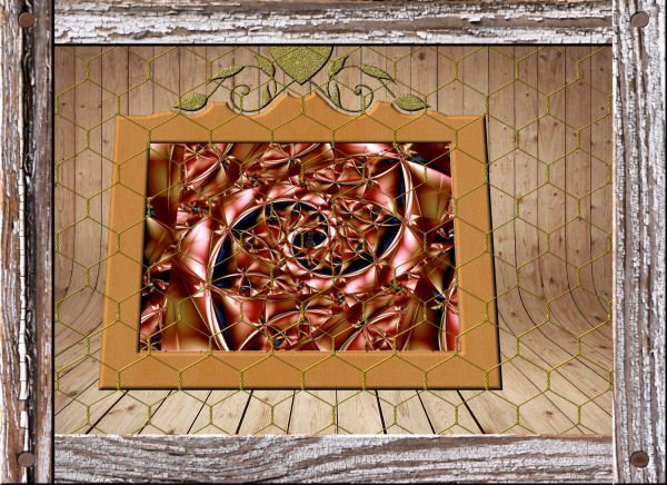
Have fun:) My fractal, a free paper found in net, free Carele's chicken frame.
1 point
-
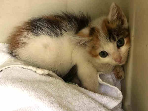
I installed the '23 patch but have yet to really test it out. '23 was giving me big problems with vectors so I look forward to re-trying that workshop. Meanwhile, a nice crew from a local cat rescue org. is helping with capturing my "friendly feral's" kittens and Mama also, to be TNR'd and returned. The kittens are shipped off to waiting foster homes to be socialized and adopted out. Here's one of the babies, just nabbed last night. ♥️
1 point
-
One photo for this page. Font: Choco & Chips.
1 point
-
I've been working on the creative scrap tutorials and I love how this one came out. The first one was adding noise with monochrome checked which was cool. But then I did it with monochrome unchecked and what a nice surprise!1 point
-
I used Cassel's WordSlats script for this one. I started with a black background and ran it three different times for each row of text. Copied one on top of the other and moved it to where I wanted the second line of text to be. Using the magic wand selection brush inside the new words, I switched to the original layer and hit delete. Once I hid the second layer, both lines were on one layer. Lather, rinse, repeat for the third row of text. Finally, all three were on one black layer with the words cut out. I used the magic wand again to choose the black and copied/pasted into selection the picture of the woman on the rock. The font is Hobo Std which is what Carole used on her free samples.1 point
-
Thought I would go for an old photo album look for this theme. The photo corners are by Sheila Reid from PixelScrappers. The main font is Tomatoes (free from Fontspace), but I used Lazy Ride (free from FPTFY) for the numbers. I've had the background for so many years that I can't recall where it came from. Given more time, I could have created my own paper with everything I've learned in the Campus. Also don't know where the party pic came from. I've been doing a much better job recording the origin information in the last several years, but the old ones are from who knows where.1 point


Resized.thumb.jpg.d25811db03a63358cedab1e79f527635.jpg)