Leaderboard


Popular Content
Showing content with the highest reputation on 06/27/2023 in all areas
-
Quick Page Day8 Quick Page from Digital Scrapbook (Marisa Lerin - Tunisia Quick Page 01). Photo is mine, very old...actually comes from a negative that is too old to reprint now. I scanned a smaller print (the one hanging up is 17x22 and would not fit the tiny old scanner I have) version I have and it lost all detail in the shadows. I chose this photo after I was looking for a Quick Page and saw right away, the color was perfect for that photo. This the quickest Quick Page I've done to date. Fonts: Resnick and Reneo (Creative Fabrica). Thank you Carol, for a wonderful workshop. I have enjoyed all the variety of layouts everyone produced. The active forum was fun and I looked forward to checking in to see the new pages and reading the comments.
 9 points
 -
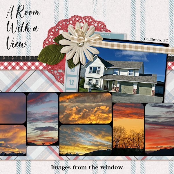
QP Extra Lesson 7 I didnt change anything on the page. Photos of crazy sunsets taken from the windows (front or back) of my house in Chilliwack (British Columbia). Being in the Fraser Valley, surrounded by mountains it was a treat to have days that there was a sunset. Normally we'd have grey sky days. Where I live now, there is less rain and sunsets almost everynight. Fonts: Magista Brush and Maxim from Creative Fabrica.
9 points
-
Here is my QP-Day 8. I looked at the QP Kits at Digital Scrapbooking and selected one called Love Birds from Gina Jones. Added other graphics from Creative Fabrica and my stash. The Font is Fadilla and I applied an Inner Bevel and drop shadows. This was such a fun-filled workshop and I always learn something new.
9 points
-
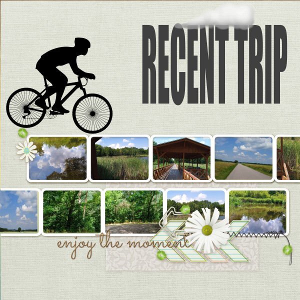
QP-07-Recent Trip. Pictures are correct and fine taken.
8 points
-
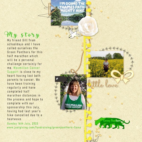
Got there eventually and decided to keep to the same colourful theme of street art. I have replicated some of their artwork and used the 'Art Group' Picture Tube for extra decoration. It has been a fun workshop and has been good for practicing PSP with basic templates as well as good for the creativity. Thank you Carole and thank everyone in the forum for their ideas and comments. Now back to training for my hike!
8 points
-
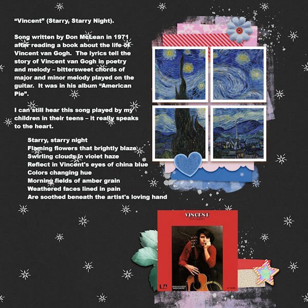
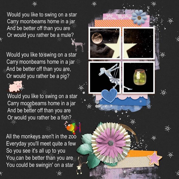
Day 6. The quick page extra always puzzled me as to what to do with it. Guess I'm in a melancoly (can't spell it) phase, but Starry Starry Night just popped in my head when looking at it. So here goes.
7 points
-
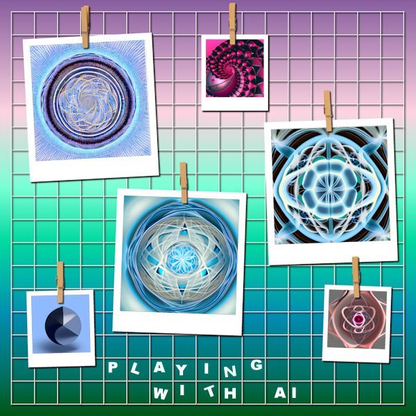
And this is the extra - I've been having fun as you can see. May post the stuff I did with these AI patterns in PSP later - just having fun!!!
6 points
-
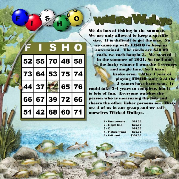
We love to fish and so we started FISHO, I used Cassel Bingo Balls script and cass-Overlapped. Font Gill Sans Ultra Bold and Bodoni MT Black.
6 points
-
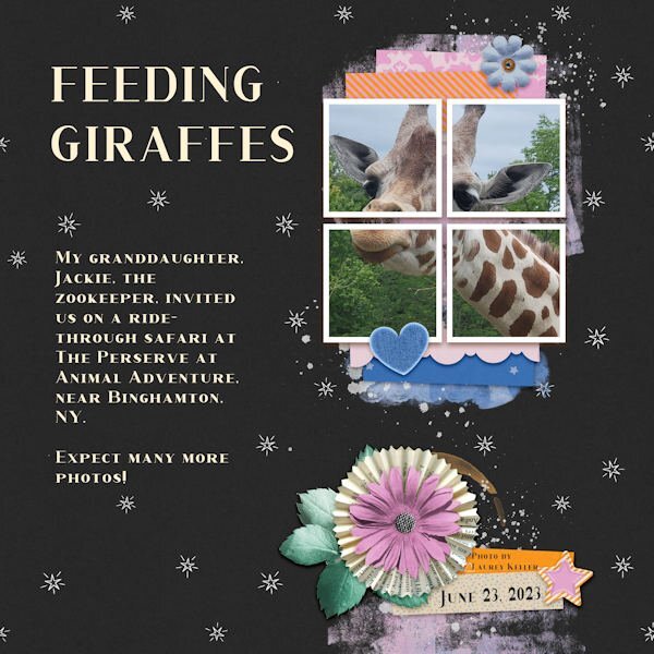
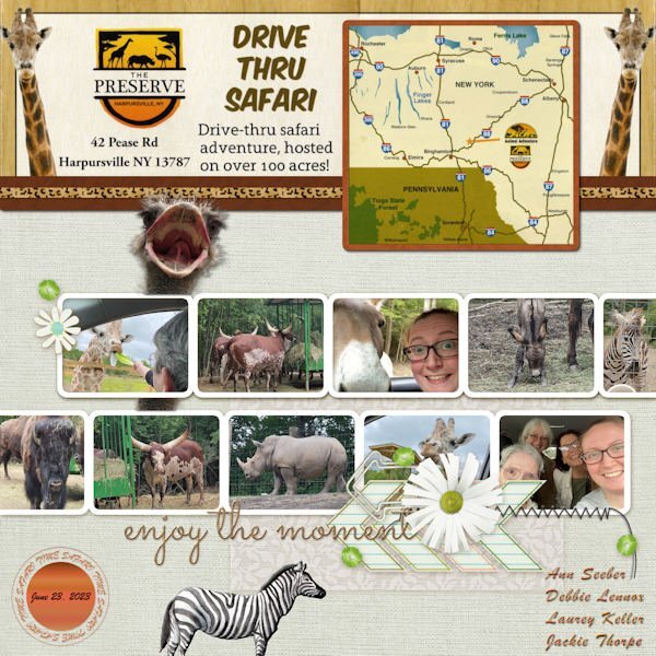
QP-6 EXTRA - FEEDING GIRAFFES. My visiting daughter, Debbie and her sister, Laurey, plus Laurey's daugher, Jackie, the zookeeper, went on a drive-through safari on Friday. It was at Animal Adventures, The Preserve, near Binghamton, NY. The font is Corlita Serif. The photo was taken by Laurey on her Galaxy mobile. (It takes superior photos!)
6 points
-
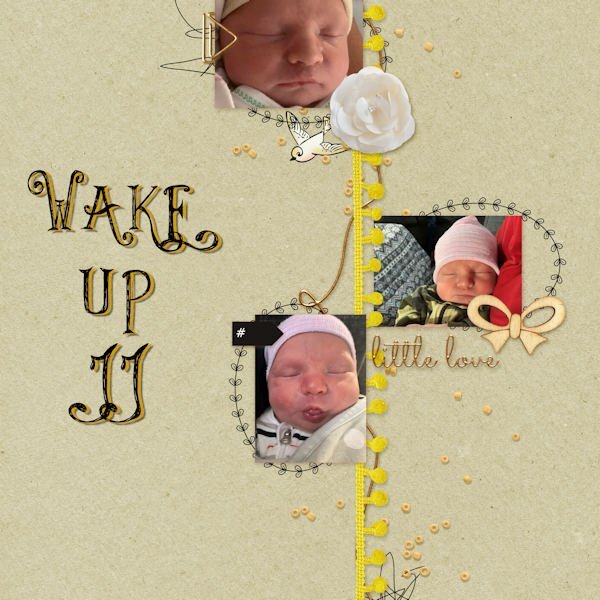
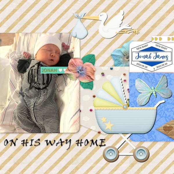
On to QP-6 - More Jonah James. The font is called Things We Said. Appropriate, I thought...
6 points
-
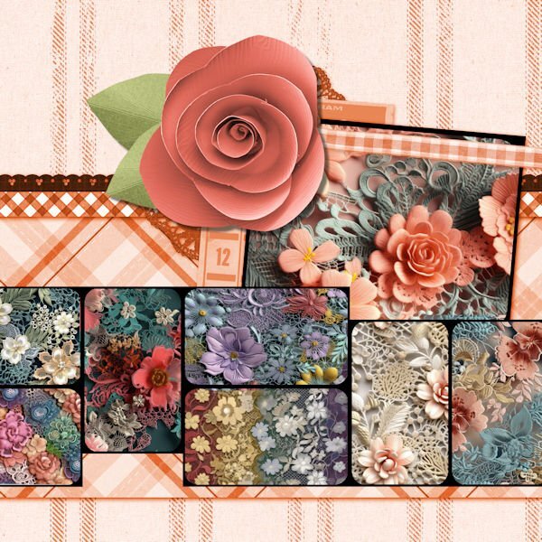
Day 7 extra: the flower pictures are called floral lace seamless patterns from deeezy.com. I tried to match the color of the center flower, but the leaves on the original template were orange. Since I could not change the leaves to green, I added a flower from songbird blog train in my kits.
5 points
-
Susan put a song in my head with her layout. All of the clipart is from Pixabay.
4 points
-
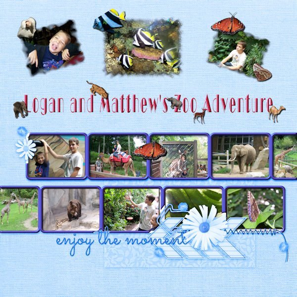
I had to go way back to find 10 pictures. My grandsons in the photos are now 21 and 28, but we had a really great time at the Cleveland Zoo. The font is Broadway display. The additional animals are tubes except for the baboon which was also taken that day. The butterflies are tubes from my own butterfly photos.
4 points
-
Mijn laatste.
3 points
-
QP-7 - Our drive-thru safari. This layout was good for all the animals that were around and almost inside our car! The font is Brush Script and the ostrich head came from PNGALL. I scanned a flyer from The Preserve for the details and map on top. I will also post this in Facebook and in the comments post the little, very funny video that Jackie did from the front seat to the back and you'll see what I mean about the animals almost "in" the car. ?
3 points
-
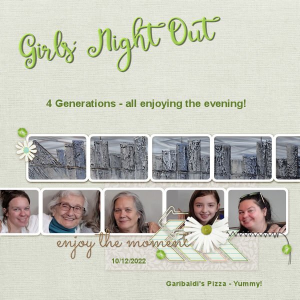
And now here is QP 7. Hard to fit those heads in the spaces. I had to take out part of the flower and clip in order to fit in Emma's head. All were taken from the same photograph. We were in Garibaldi's and the picture behind which covers all of the top layer is one that fascinates me at Garibaldi's - it was behind us in the group picture - it is a metallic take on the Memphis scene taken from across the Mississippi in Arkansas.
3 points
-
Here is the promised layout of the unboxing of my album with the photos from my recent trip. It is just a simple page with a background of old letters but a bit reduced in opacity. The book arrived last Saturday and I took some photos when it was laying on our dinner table. The font is School and College outline, fitting for this album, hence some American embellishments. The sticker at the bottom is by Carole, a freebie long ago. Now I first have to clean my workspace, even a digital one becomes messy, at least mine if I'm working on a Workshop and doing other things besides that as well. I have to organize all the photos from my trip and name all the flowers in the photos too. I think the rest of this week will go into that! So don't expect much activity from me; at least this week's challenge about a layout with a story is not a favorite of mine! That is another one I'll skip.?
3 points
-
Getting started on catching up. I've been traveling around with family since Thursday so I'm WAY behind! This is QP- 5 - featuring new gg Jonah James on the day he came home from the hospital. The font is Viner Hand for the title. The label on the right was from Carole before she released her new script.
3 points
-
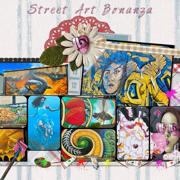
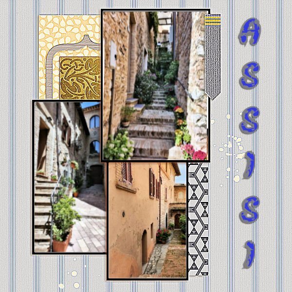
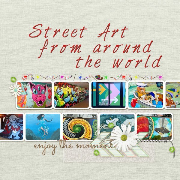
Caught up on the days and this is my Lesson7 which comprises photos of street art a friend took in New Zealand and some of mine from the UK. Font is Harabara Hand. Picture tube is called Art Group.
3 points
-
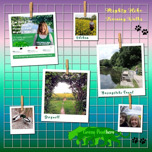
My second template for Lesson 6 follows the same theme of my imminent sponsored hike. I may be able to change it a little and use it as a thank you note for all our sponsors.
3 points
-
QP-8 I found this QP at pixelscrapper and had to use it, but odd, it was difficult to find a photo that I liked to use. This one was the best so far ?
3 points
-
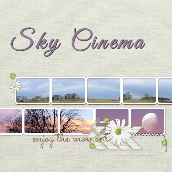
Just three photos of mine for Day 7 - Sky Cinema.
3 points
-
Up to the first template of Lesson6 and have chosen a recent activity to advertise. It's a sponsored charity walk.. I would rather have had a different badge to 'little love' but kept it in situ because it has such good balance on the page. I like what Anja has done with replacing it on her design though. I merged my portrait photo with a scenery shot from one of our walks and have included a little logo that I have designed for our 'Green Panthers' team for the hike. Of course designed using PSP. I adjusted the Brightness of the background. A problem I had was when I resized the image to make the smaller jpg, it wiped out the body text. In the end I 'merged visible' and then resized. It seemed to work.
3 points
-
here is day 6,,3 points
-
I wanted to have a go at this. I decided to go with the flow and use purple! Images all from online and only papers I made with some torn edges. Font is Bombshell Pro. I'm not that big a Coco Chanel fan, but I do adore some of the fragrances and have a few in my collection. I just couldn't think of another subject for the layout.
3 points
-
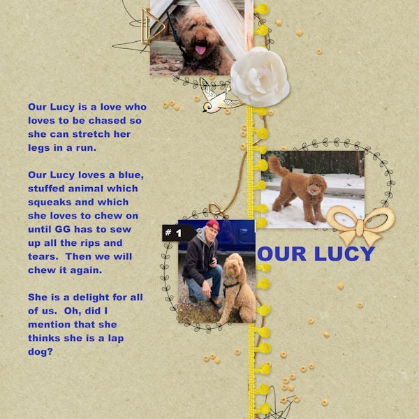
What a happy looking Lucy. If ever a dog could laugh allowed, she would be it. I love Van Gogh's work, esp Starry Night. I couldnt bring up the song in my head so I looked it up. It's really nice.2 points
-
This is beautiful. It makes me want to try getting something printed.2 points
-
And another Pixelscrapper QP, now with another photo ?
2 points
-
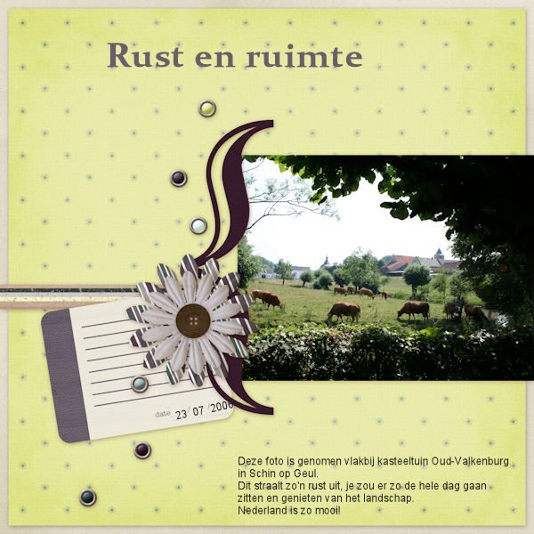
Also from Pixelscrapper. ? Text says: " This photo was taken near castle garden Oud-Valkenburg in Schin op Geul. This exudes such tranquility, you could go there all day sit and enjoy the scenery. The Netherlands are so beautiful!"
2 points
-
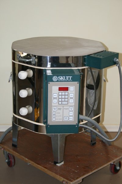
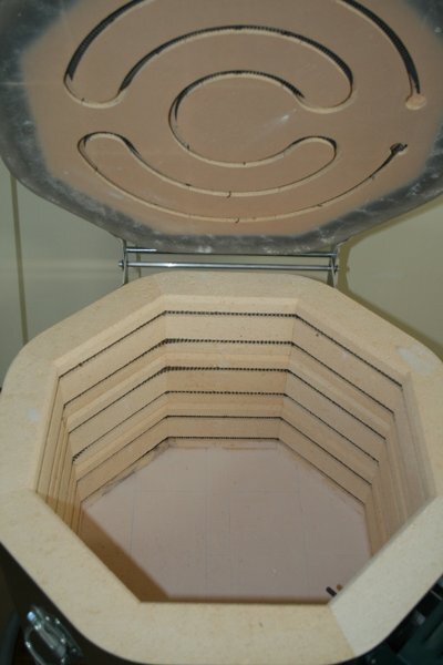
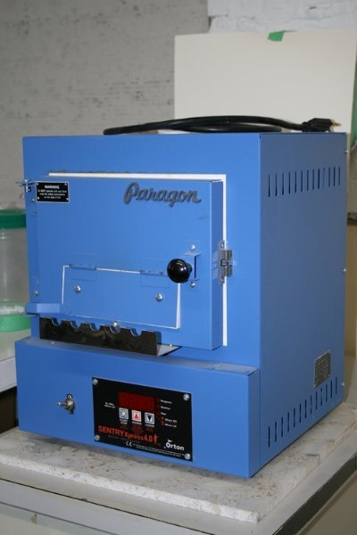
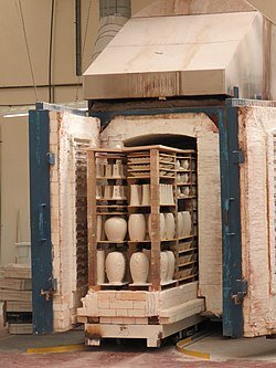
Ann answered this below. Most people would know it when making pottery/ceramics. But there is different types of kilns. Mine was for glass, fusing pieces (melting or partially melting) together. Because of the themal shock that can happen with glass (think when you take a hot glass out of the dishwasher and put cold water in it and it thermally shocks and breaks), kiln ramp up in temperature by certain amount of degrees per hour, usually stays at the top temp for a period, then needs to ramp down in temperature quite slowly so it doesnt cool too fast(releieving internal stress - also called healing. the bigger the pieces the longer the time it takes. Here are my two kilns. One I used for glass fusing and the little blue one was a table top one used for glass beadmaking (called Lampwork, using not a kiln to melt glass, but a oxygen/propane torch). There are many kinds and shapes of kilns. Glass blowers have huge ones like in Ann's photo and they will them ovens.
2 points
-
A kiln is a thermally insulated chamber, a type of oven, that produces temperatures sufficient to complete some process, such as hardening, drying, or chemical changes. Kilns have been used for millennia to turn objects made from clay into pottery, tiles and bricks. Wikipedia
2 points
-
and now the last day, showing you my mom through the early years, font is Rafting Script2 points
-
Quick Page Lesson 7 This is 20 years ago! How did that happen? It only feels like yesterday I was getting up at 3am in the days before a show to re-load the kiln. This is the years I set down my camera and got a point and shoot digital camera. Ugh, it was awful. so much lag time between depressing the shutter button and it actually taking a picture...this wasnt a cheap camera either. fonts: Madelyn calligraphy, Showcard Gothic, Magic Hopes (Creative Fabrica) Photos: mine
2 points
-
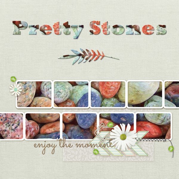
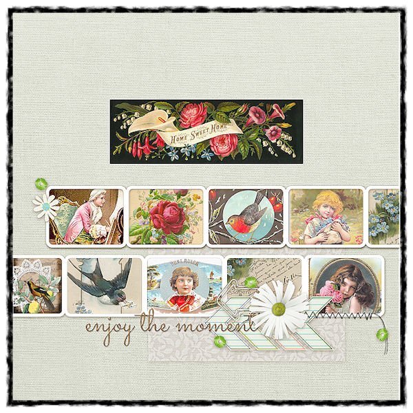
Here is my QP-Day 7 I picked some pretty stones from Pixabay to fill all the frames at once. Font is Rockwell Extra Bold and the decorative leaf below is from Salmon Queen. Added Inner Bevel and drop shadow to both. Thank you Carole and everyone here for a fun-filled workshop. You have all inspired me with your beautiful pages. I will continue to work on the extra and Non-Scrap pages.
2 points
-
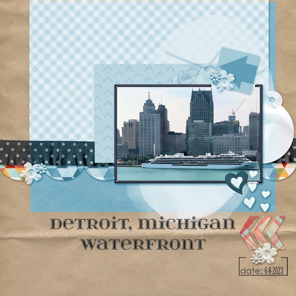
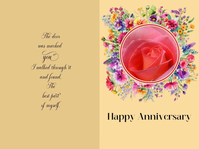
For our 55th anniversary, we traveled to Windsor, Ontario. I took this photo of Detroit from our hotel room window. I changed the hue to better match the photo and changed the white frame to also match. The frame was beveled. Since there was still a little white showing, I added a heart that I created using a cass script offset cutout. The font is itsadzokeS02, an olf font.
2 points
-
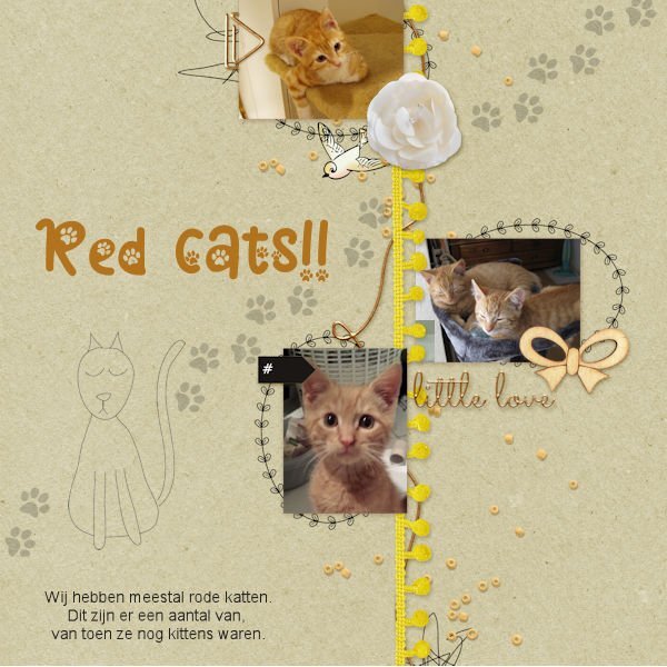
QP6 Font is Cat paw (duh ??) and the cat footprints are from Marisa lerin.
2 points
-
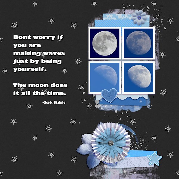
Quick Page Extra Lesson 6 I'm starting Lesson 6 with the extra. I love the layout of this quick page (I mean the QP as itself). For such a small area for the photos you eye is really drawn to that spot. I dont deny it, this is a challenge for my shooting style where it's hard to get photos that fit into a square. It's a good challenge for me. I dont have a great lens for moons, they are tiny in my images so i have plenty of space for getting that square layout. I took some creative liberties with the backgrounds going from the darkest blue of the full moon to the lightest blue in the less than full moon the lightest one is. Three of the moons were actually shot in the day...I call them Day Moons. The full moon was shot at night. I had to extract it and put it on another moons background (with permission of the "other" moon of course). i like using the selection to put the quotes in. I changed the colors using the Hue Map, it took several times going back to it. Photos: mine Fonts: Gill Sans Ultra Bold and Gill Sans Ultra Bold Condensed (windows)
2 points
-
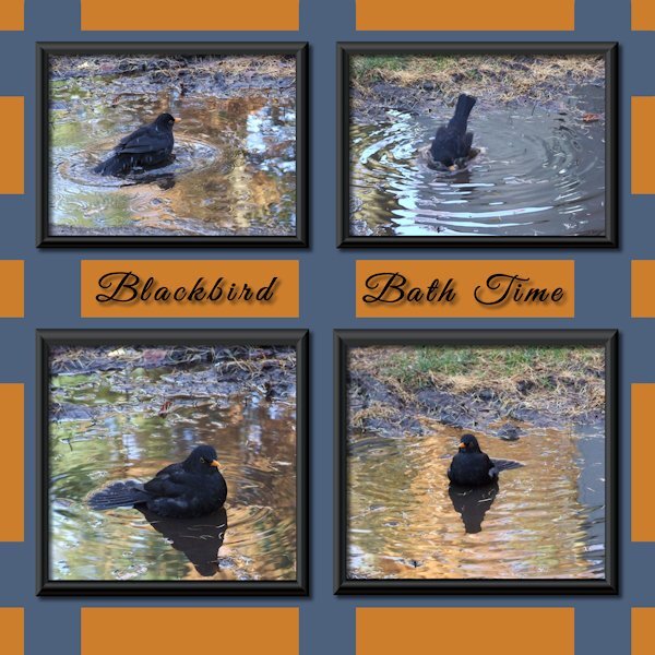
When I set out on this challenge it was with photos of robins and a totally different colour scheme but then I found my blackbird photos...
2 points
-
We probably did play some arrangement of it. In addition to our solo work, we did a lot of organ/piano duos and piano duets. As soon as we sat down, our differences (and there were many!), disappeared.1 point
-
4 Generations, how wonderful and lovely is that....1 point
-
That's about how the ostrich at the safari looked!1 point
-
Susan, I'll try to post another AI I made with CF Spark and what I did with them in PSP. So much fun - playing with them in PSP is a lot of fun. I still have one I made when I first found cF Spark but have not played with in PSP. Not sure what I want to do with it. Any way these are the latest ones and what I did with them in PSP. - too large - will have to post my PSP patterns in the next post.
1 point
-
With so many hobbies you just need a lot of space, sounds familiar??1 point
-
Such a great idea isnt it. The homeowner I talked to said one person showed up with a bag full of books to put in. She also said she has extra books in the house to replenish with. The "librarians" are really quite inventive with their library structures.1 point
-
Nothing to mention this time. it's vintage images.
1 point
-
Thanks for sharing that. Great to see how delighted she was with all the details.1 point
-
Quick Page Non- Scrap Lesson 5 I wish I'd thought of Mary's idea. Love the change of color you used, Mary. I couldnt think of what do for this and was thinking I'll just pass on it. But once I started looking at pictures, the ideas start to come together. I reduced the Clarity to make it a bit softer and dreamy. I think I should have made it even softer, but I am a chicken. it's a challenge for me to make things soft instead of crisp. It's a good lesson for me. I forgot to credit the quote on the card I just realized. It's a comma after the word "found" but it looks like a period so it seems like bad grammar. I think I will take it out. Quote: Mary Anne Radmacher Fonts: Alevandar (for the quote), Meiland Geogeous (both from Creative Fabrica) Photo: mine
1 point
-
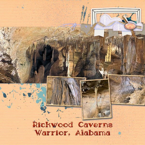
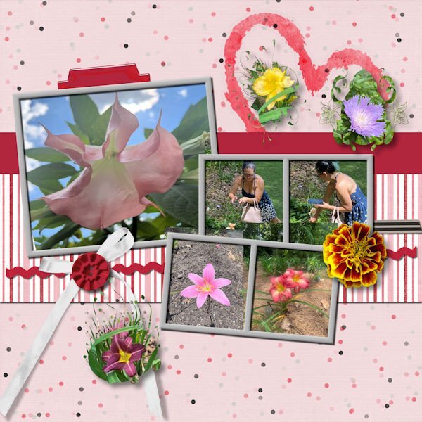
Day 4 is an homage to my daughter who has seriously started taking pictures for me, including photos for just texture. The first one has pictures of the cave at Rickwood cave in Alabama. She remembered how I love caves. I made a texture from one of the photos and used it to fill in the picture frames. I also changed the color to be more compatible with the pictures. The second one is of Beth taking the photos at the Botanical Gardens near Birmingham, Alabama and some of the flower pictures that she took. I added the marigold flower from one of my own photos. I used masks that I made for some of her other flower photos and added them.
1 point
-
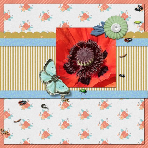
Like your idea Susan with the bird prints so I have made a version with my photo on the QP Extra image. I used 'Bugs' Picture Tube and dotted them about.
1 point
-
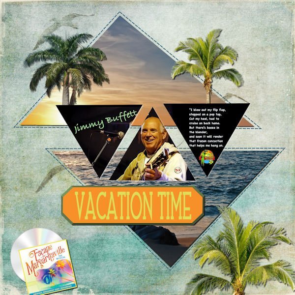
I love song challenges. My fantasy vacation to the Florida Keys to one of Jimmy Buffet's Margaritaville Resorts (he has some all over the world). His iconic "Margaritaville" song always makes me stop and sing along. I got a lot from NicePng, the layout is the template from Lab 13-06. The background is from my stash of beach kits.
1 point