Leaderboard
Popular Content
Showing content with the highest reputation on 06/26/2023 in all areas
-
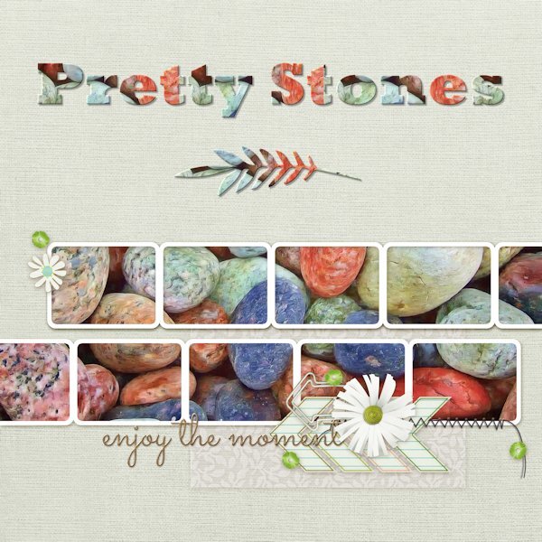
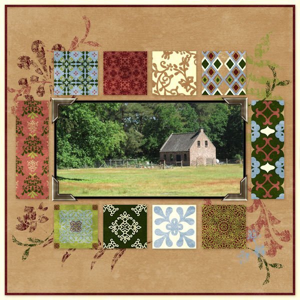
Here is my QP-Day 7 I picked some pretty stones from Pixabay to fill all the frames at once. Font is Rockwell Extra Bold and the decorative leaf below is from Salmon Queen. Added Inner Bevel and drop shadow to both. Thank you Carole and everyone here for a fun-filled workshop. You have all inspired me with your beautiful pages. I will continue to work on the extra and Non-Scrap pages.13 points
-
13 points
-
Quick Page Lesson 7 This is 20 years ago! How did that happen? It only feels like yesterday I was getting up at 3am in the days before a show to re-load the kiln. This is the years I set down my camera and got a point and shoot digital camera. Ugh, it was awful. so much lag time between depressing the shutter button and it actually taking a picture...this wasnt a cheap camera either. fonts: Madelyn calligraphy, Showcard Gothic, Magic Hopes (Creative Fabrica) Photos: mine11 points
-
and now the last day, showing you my mom through the early years, font is Rafting Script10 points
-
10 points
-
10 points
-
9 points
-
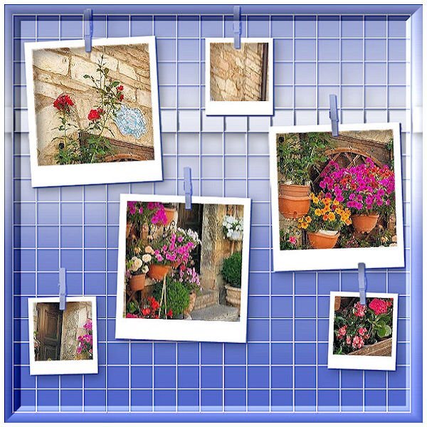
I think this is my last edited foto of this course. Friends of mine are in Italy on a summer holiday. Sent me such beautiful pictures so I asked them to use them in this course. As an answer, they sent me their whole batch. I've used just one photo and copied it 4 times and snip snip.? So just a street in ITALY.9 points
-
8 points
-
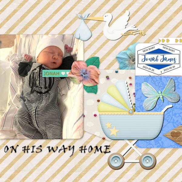
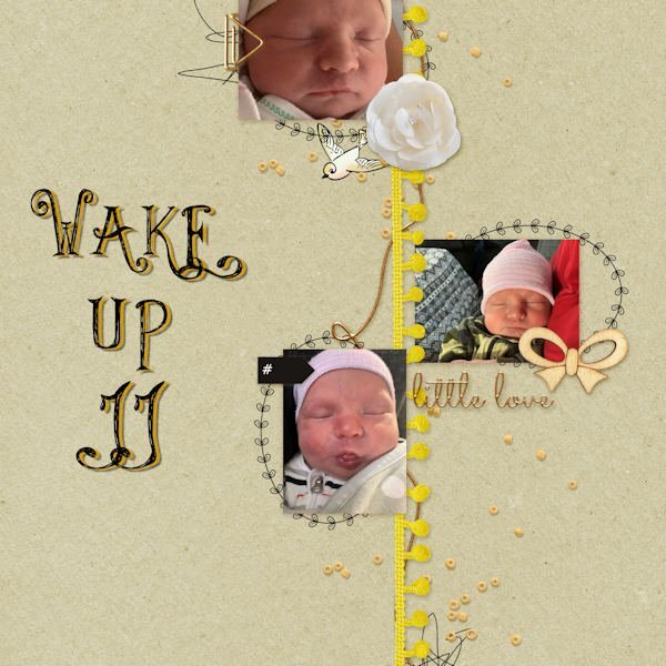
Getting started on catching up. I've been traveling around with family since Thursday so I'm WAY behind! This is QP- 5 - featuring new gg Jonah James on the day he came home from the hospital. The font is Viner Hand for the title. The label on the right was from Carole before she released her new script.7 points
-
7 points
-
7 points
-
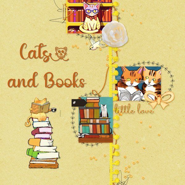
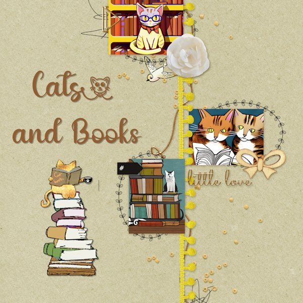
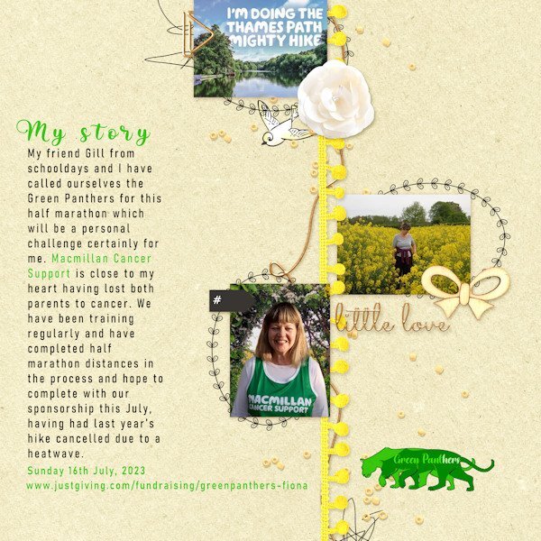
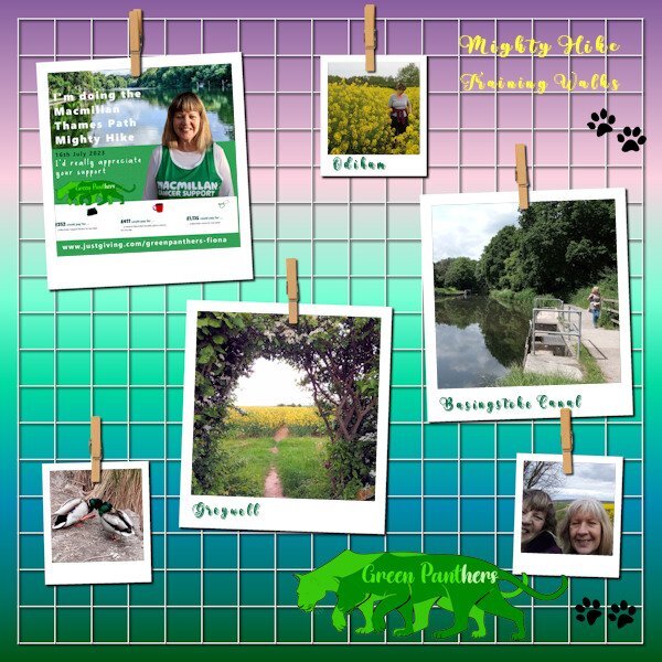
Up to the first template of Lesson6 and have chosen a recent activity to advertise. It's a sponsored charity walk.. I would rather have had a different badge to 'little love' but kept it in situ because it has such good balance on the page. I like what Anja has done with replacing it on her design though. I merged my portrait photo with a scenery shot from one of our walks and have included a little logo that I have designed for our 'Green Panthers' team for the hike. Of course designed using PSP. I adjusted the Brightness of the background. A problem I had was when I resized the image to make the smaller jpg, it wiped out the body text. In the end I 'merged visible' and then resized. It seemed to work.7 points
-
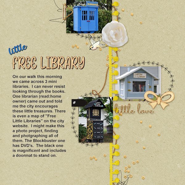
Quick Page Lesson 6 I had no idea what to do for this one as the photo space is very small and doesnt lend to detailed photos. On our walk today we came across 3 little free libraries. I have known about two of them, but I needed 1 more for the layout. And bingo! There was the blockbuster one (it has DVDs in it). I would like the do separate layouts in the future that shows them. the black one is exceptional. And we got to have a chat with the library owner of that one. Photos: mine, from today fonts: Rose Birth Flowers and Spring Garden Script (both from Creative Fabrica)7 points
-
6 points
-
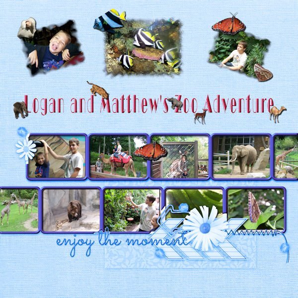
I had to go way back to find 10 pictures. My grandsons in the photos are now 21 and 28, but we had a really great time at the Cleveland Zoo. The font is Broadway display. The additional animals are tubes except for the baboon which was also taken that day. The butterflies are tubes from my own butterfly photos.6 points
-
6 points
-
6 points
-
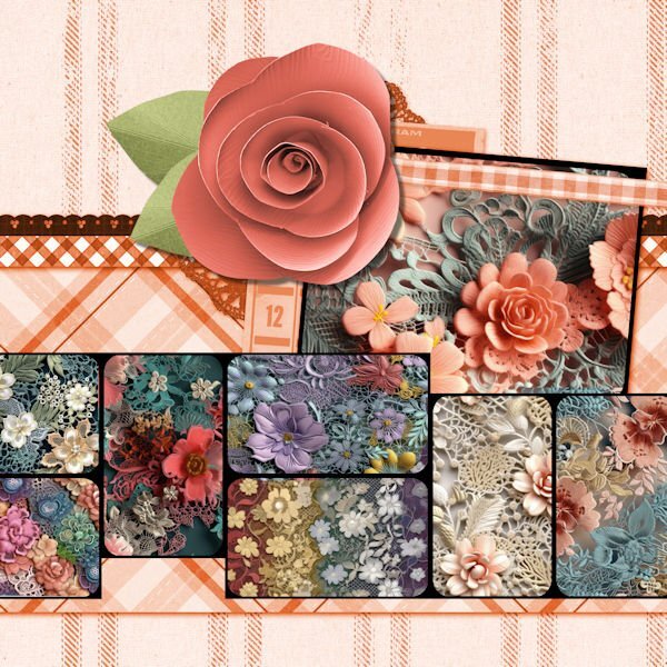
I wanted to have a go at this. I decided to go with the flow and use purple! Images all from online and only papers I made with some torn edges. Font is Bombshell Pro. I'm not that big a Coco Chanel fan, but I do adore some of the fragrances and have a few in my collection. I just couldn't think of another subject for the layout.6 points
-
6 points
-
6 points
-
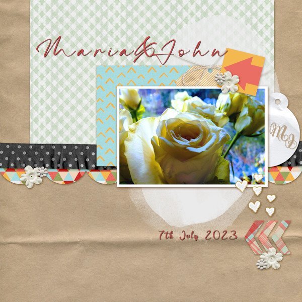
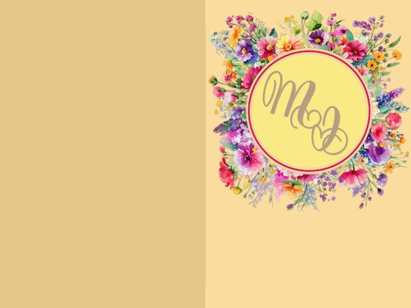
Still on Lesson 5 with some catching up to do on the next two days. I am thinking of using the extra pages templates from Day5 for a wedding card for my neighbours who are about to be married. Fonts: M&J monogram = Yash Monogram, Maria & John = The Billion, Date = Evelyne. Rose photo my own with Brightness and contrast adjustments. The original 'DATE' text I removed using the clone tool from the background. In reality I suppose the text should have been creased like the paper behind it. Can I use artistic licence here boss?6 points
-
5 points
-
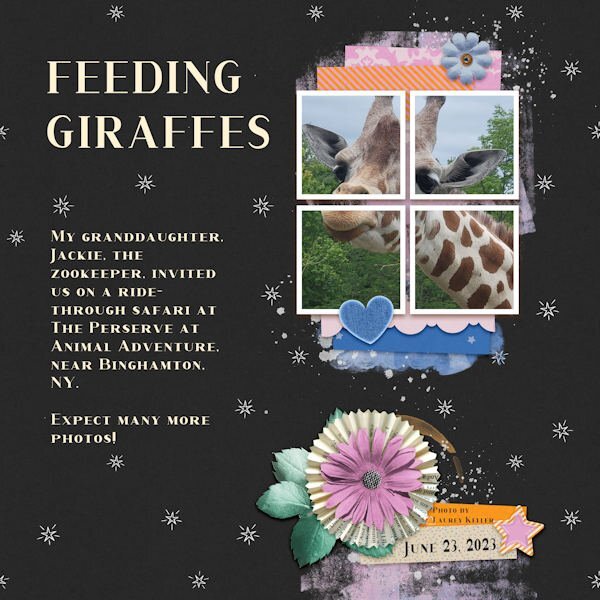
QP-6 EXTRA - FEEDING GIRAFFES. My visiting daughter, Debbie and her sister, Laurey, plus Laurey's daugher, Jackie, the zookeeper, went on a drive-through safari on Friday. It was at Animal Adventures, The Preserve, near Binghamton, NY. The font is Corlita Serif. The photo was taken by Laurey on her Galaxy mobile. (It takes superior photos!)4 points
-
4 points
-
Here is the promised layout of the unboxing of my album with the photos from my recent trip. It is just a simple page with a background of old letters but a bit reduced in opacity. The book arrived last Saturday and I took some photos when it was laying on our dinner table. The font is School and College outline, fitting for this album, hence some American embellishments. The sticker at the bottom is by Carole, a freebie long ago. Now I first have to clean my workspace, even a digital one becomes messy, at least mine if I'm working on a Workshop and doing other things besides that as well. I have to organize all the photos from my trip and name all the flowers in the photos too. I think the rest of this week will go into that! So don't expect much activity from me; at least this week's challenge about a layout with a story is not a favorite of mine! That is another one I'll skip.?3 points
-
Here is my QP-Day 8. I looked at the QP Kits at Digital Scrapbooking and selected one called Love Birds from Gina Jones. Added other graphics from Creative Fabrica and my stash. The Font is Fadilla and I applied an Inner Bevel and drop shadows. This was such a fun-filled workshop and I always learn something new.3 points
-
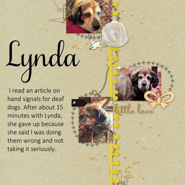
I had to tap Lynda to get her attention and maintain eye contact. In her last year, her eyesight was also failing. When she was a pup, she could hear a chip dropping from the other end of the house and be there to scarf it up before it hit the ground. In her elder years, it would drop; I would wake her up, lead her to the kitchen, and point. I was always rewarded for my effort with a big sloppy kiss.3 points
-
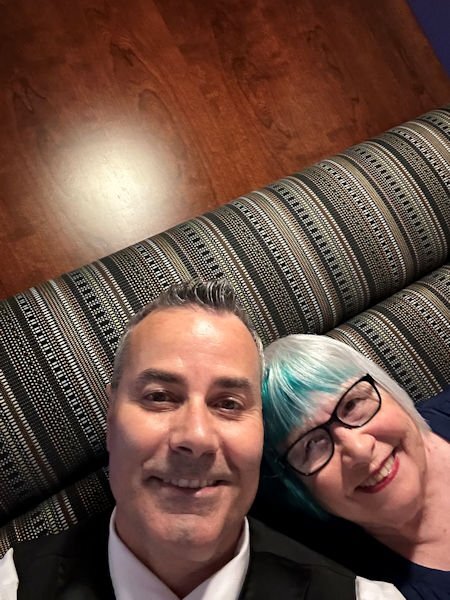
Julie, we are about 2 1/2 hours from Windsor and love to visit. We went to Nero's for our 55th dinner and Vito's the day before. Food is Canada is wonderful. They ban a lot of additives like corn syrup which I think makes the food taste better. I also love shopping at Devonshire Mall where I have been buying my make up for years at Caryl Baker. The photo is a selfie of me and Pete, taken by Pete who has been our server at Nero's for over 30 years3 points
-
I was in the mood to do something with QP Non Scrap 4, but it took me time to make a choice for the pics. I used the Brush Script MT-Font - I found again thanks to Carole who "enlightened" me last day, LOL. Fotos are all mine. For 2023 I used the log digits made by Carole, just adjusted the color. For those of you who are interested, you can find it there at the end of this page and request them: https://scrapbookcampus.com/2019/07/theme-camping/3 points
-
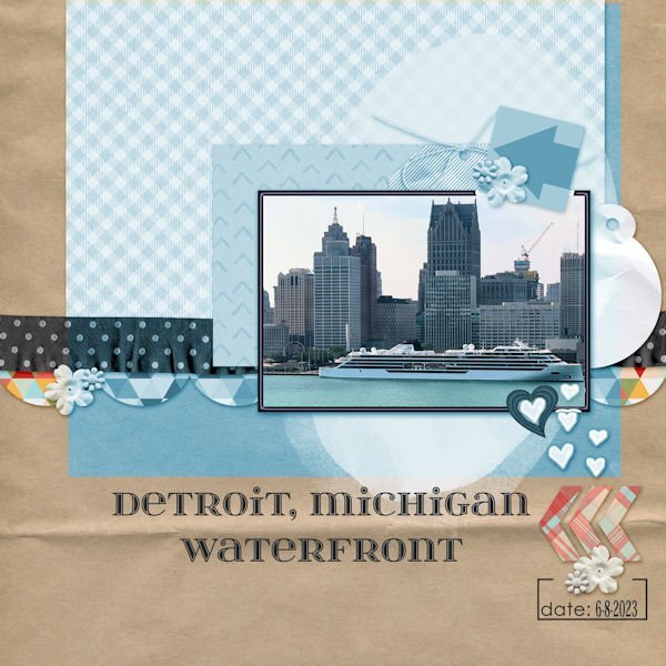
For our 55th anniversary, we traveled to Windsor, Ontario. I took this photo of Detroit from our hotel room window. I changed the hue to better match the photo and changed the white frame to also match. The frame was beveled. Since there was still a little white showing, I added a heart that I created using a cass script offset cutout. The font is itsadzokeS02, an olf font.3 points
-
3 points
-
3 points
-
I used the QP-7 extra layout. I thought it might take me hours to find and download multiple photos on a theme, so I cut corners by using only two. Both are from Pixabay. Having a nice manageable project to work on each day is such an enjoyable task. I will miss not having one tomorrow! The dreaded blank canvas will be in front of me once more.3 points
-
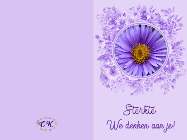
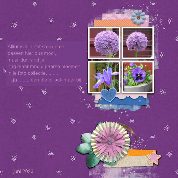
This is a card for a friend who has to have a complicated operation next week. It is not her first and she always says she hates all those very colorful or "funny" well wishing cards. So I made her a purple one by changing the colors of the card into something more monotone based on the purple of the flower. I hope this is more to her taste! It says that we are thinking of her.3 points
-
3 points
-
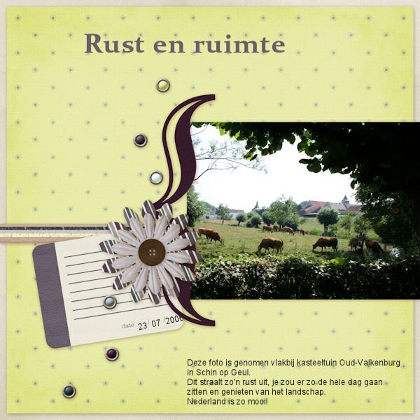
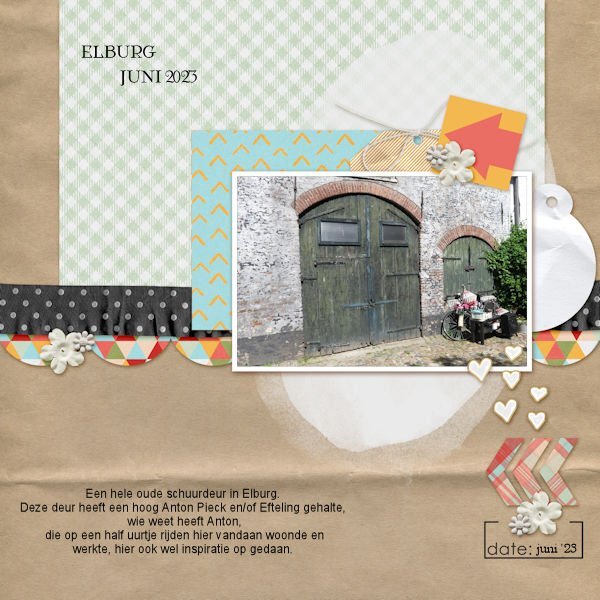
Nu was ik in 15 minuten klaar inclusief het zoeken naar een passende foto. Net als Corrie Kinkel heb ik 1 foto gebruikt. Maar de foto was te smal, dus dupliceerde ik het en draaide hem om, lijnde het uit. En VOILA. niemand ziet het. Ik heb een screenshot gemaakt van mijn mobiel omdat ik de foto leuk vind.3 points
-
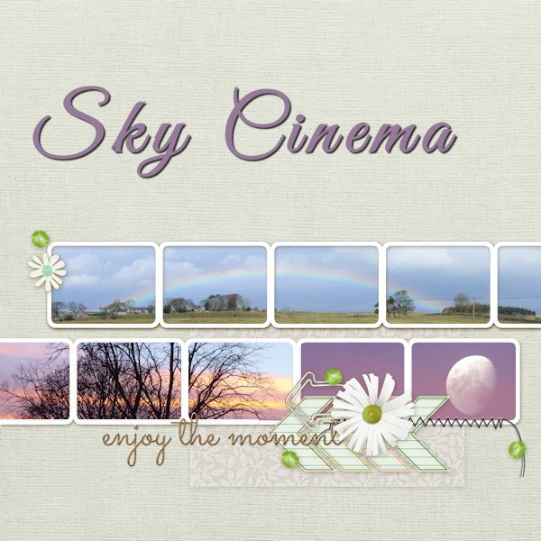
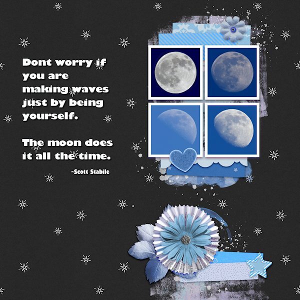
Quick Page Extra Lesson 6 I'm starting Lesson 6 with the extra. I love the layout of this quick page (I mean the QP as itself). For such a small area for the photos you eye is really drawn to that spot. I dont deny it, this is a challenge for my shooting style where it's hard to get photos that fit into a square. It's a good challenge for me. I dont have a great lens for moons, they are tiny in my images so i have plenty of space for getting that square layout. I took some creative liberties with the backgrounds going from the darkest blue of the full moon to the lightest blue in the less than full moon the lightest one is. Three of the moons were actually shot in the day...I call them Day Moons. The full moon was shot at night. I had to extract it and put it on another moons background (with permission of the "other" moon of course). i like using the selection to put the quotes in. I changed the colors using the Hue Map, it took several times going back to it. Photos: mine Fonts: Gill Sans Ultra Bold and Gill Sans Ultra Bold Condensed (windows)3 points
-
3 points
-
3 points
-
Hi, I used selection tool to extract some elements from QP and the title from another photo. vines- picture tube by cassel font - date - chirp3 points
-
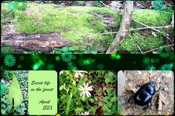
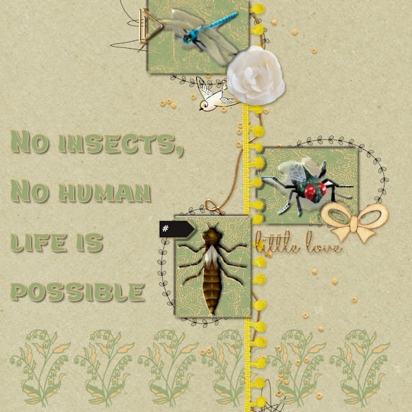
My first attempt failed this afternoon, So I deleted it. No suitable photos. The photos faded away after scaling. This afternoon after a long break I got a new idea, insects enough in my stock. But again they needed a background. I made all the same for the balance in coloring. The three open spaces got a double shade of me after being selected to give them depth. I do have time enough and can work as long as it needs till I'm satisfied, so no problem. The name of the text font is Marly Tail. The flower edge is a 'true type' too named Azalea Ornaments. No shades behind as they are background images.3 points
-
I sold all my glass studio tools and supplies when we moved to where we are now (almost 10 yrs go we moved), and last year I sold all my silversmithing tools and supplies to buy a new camera. It's like the pre-pre-downsizing. I chose photography and PSP to be my hobby going into that phase. Glass/jewelery took up a lot of space. Now I laugh because I have a photo room that is too small, and another studio in the basement for paper supplies, for paper art, photo props (huge amount taken up with this0 or whatever. More purging to go, I want a nice streamlined studio.....that is about size of an aircraft hanger! (that might not be enough?) .2 points
-
WOW! That's a really unique QP. It takes a strong picture to not be overpowered by the layout. And you've accomplished that. On another note, that QP displays a number of strong patterns - and I've been playing with patterns (strong ones) the last day or two - an interesting way to display them.2 points
-
Such a great idea isnt it. The homeowner I talked to said one person showed up with a bag full of books to put in. She also said she has extra books in the house to replenish with. The "librarians" are really quite inventive with their library structures.2 points
-
I live near Windsor, and one of the best things about it is the skyline view of Detroit. Both cities were once quite beautiful and bustling and then declined badly. They are coming back, bit by bit.2 points
-
2 points
-
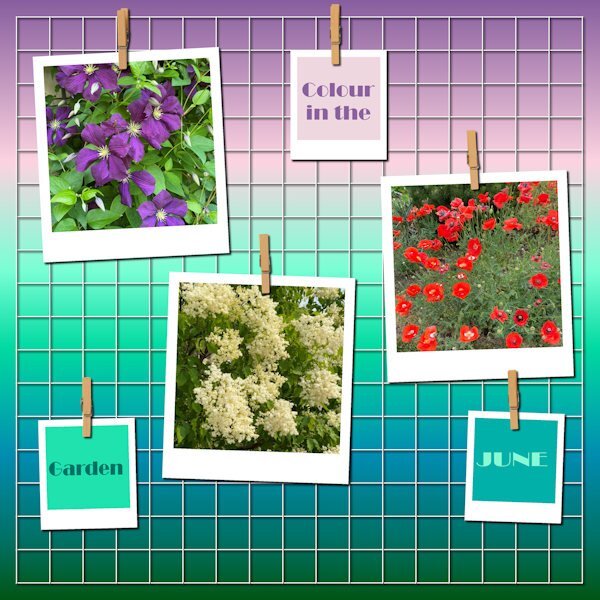
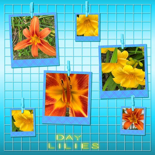
Yesterday I spent some time photographing my day lilies, one of my favorite flowers. I changed the background color and added one of my plaids to the frames. The font is Beon to which I applied the cass neon script. For the text, I used individual letters, but got too impatient with lining them up to fit the squares.2 points
-
2 points
-
2 points


