Leaderboard
Popular Content
Showing content with the highest reputation on 06/24/2023 in all areas
-
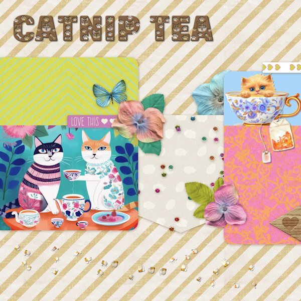
Here is my QP Workshop- Day5 It took me a while to come up with a theme for day 5. How about a Tea party, I thought for Cats. So all I had to do was to find the graphics and font to start with. After some digging, I found them at Creative Fabrica. The font is Paw Cad (that is the way CF spells it). I used Inner Bevel and drop shadow on the font and drop shadows on kitten in cup and teabag.Then I used Carole's custom confetti script with 2 of the teabags and sprinkled those on the bottom of the page.11 points
-
10 points
-
9 points
-
Deze keer lag de vertraging niet aan mij. De foto werd binnen de benodigde tijd in de sjabloon geplaatst, maar mijn teksttool kwam niet opdagen. En toen het er was kon ik nog steeds niet van kleur en maat veranderen enz. Dat vorige week vaker. Na een paar keer openen en sluiten is het me gelukt. De naam van het lettertype is Lucida handschrift.9 points
-
9 points
-
9 points
-
8 points
-
8 points
-
8 points
-
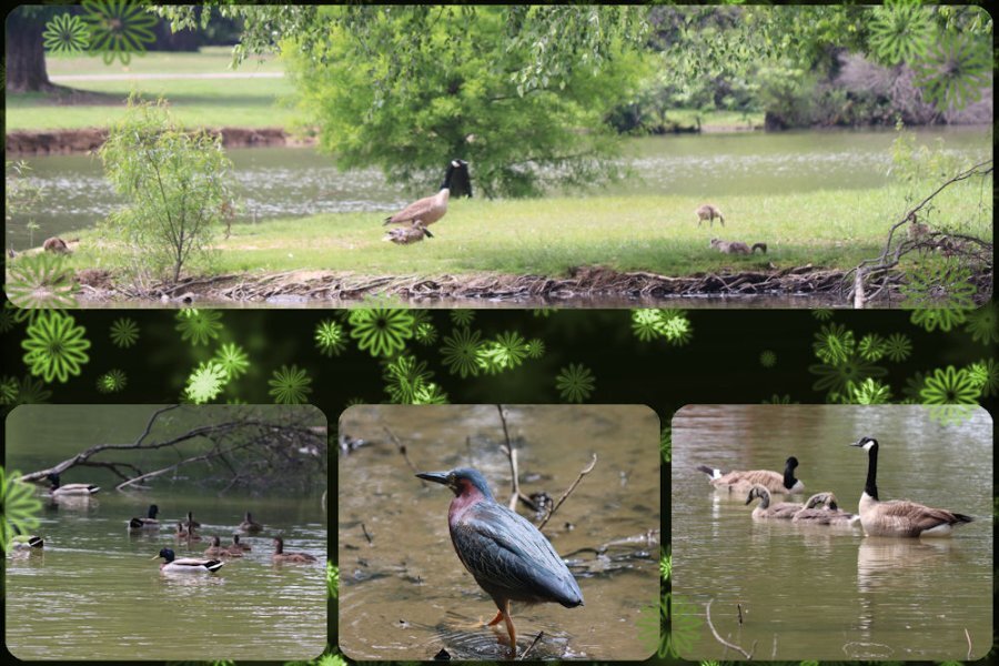
And now for that green extra on day 4. I changed the color of the original elements with Hue Saturation Lightness with the Colorize option. That was fun. These are pictures I took one day when my daughter and I visited our favorite park. The geese and the ducks are with us always, but occasionally we find one of the heron family there. This day we were lucky and saw a green heron (yes, I know he doesn't look green, but we looked him up when we got home.)8 points
-
7 points
-
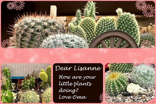
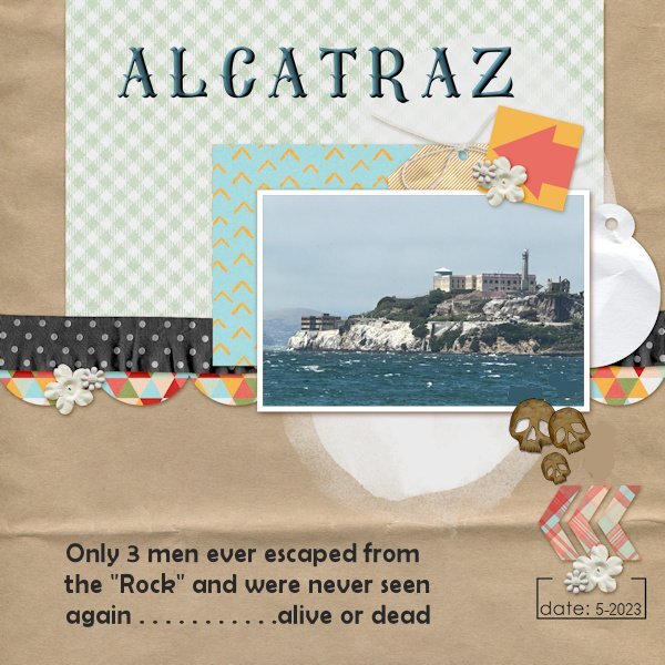
For Non-Scrap 4 from yesterday I used some photos I took because my youngest granddaughter asked me to do. She loves and takes care of all sorts of plants and animals! I changed the colors of the template because the colors of the photos didn't get well with the vibrant greens of the template. I turned this into a card which I'll send to her. QP 5 Extra has again a photo from my trip and when I was in San Francisco I saw Alcatraz in the Bay. Even from a distance it looks so formidable and threatening! I made a small alteration of the template, b there were little hearts which I replaced with some skulls; this is no place for hearts!7 points
-
7 points
-
So, today, we visited my daughter and I gave her the green room I had been working on. In the travel (3.5 hours), obviously, everything tumbled down as nothing was actually glued, so it took a while to put everything back together. I told her to stay out of the kitchen while I reset everything, and here is her reaction when she discovered it.6 points
-
6 points
-
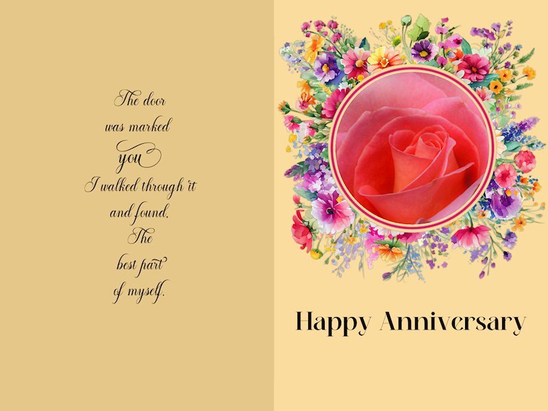
Quick Page Non- Scrap Lesson 5 I wish I'd thought of Mary's idea. Love the change of color you used, Mary. I couldnt think of what do for this and was thinking I'll just pass on it. But once I started looking at pictures, the ideas start to come together. I reduced the Clarity to make it a bit softer and dreamy. I think I should have made it even softer, but I am a chicken. it's a challenge for me to make things soft instead of crisp. It's a good lesson for me. I forgot to credit the quote on the card I just realized. It's a comma after the word "found" but it looks like a period so it seems like bad grammar. I think I will take it out. Quote: Mary Anne Radmacher Fonts: Alevandar (for the quote), Meiland Geogeous (both from Creative Fabrica) Photo: mine6 points
-
6 points
-
6 points
-
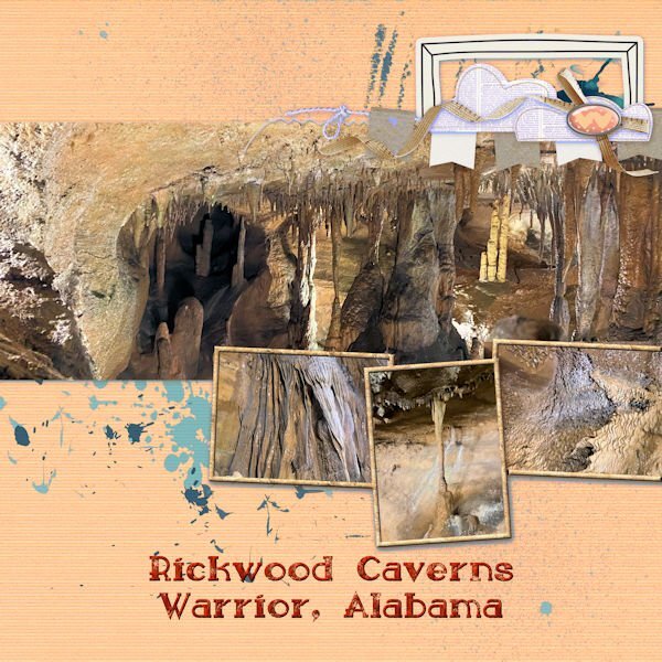
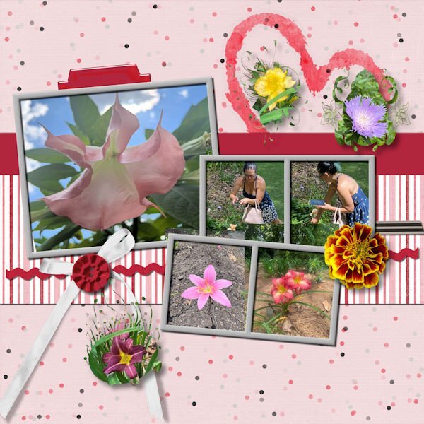
Day 4 is an homage to my daughter who has seriously started taking pictures for me, including photos for just texture. The first one has pictures of the cave at Rickwood cave in Alabama. She remembered how I love caves. I made a texture from one of the photos and used it to fill in the picture frames. I also changed the color to be more compatible with the pictures. The second one is of Beth taking the photos at the Botanical Gardens near Birmingham, Alabama and some of the flower pictures that she took. I added the marigold flower from one of my own photos. I used masks that I made for some of her other flower photos and added them.6 points
-
5 points
-
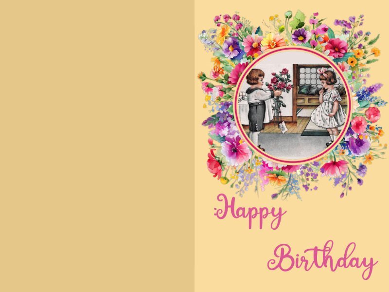
So, this time I didn't change the color of the card. I downloaded a vintage card from PS by Jessica Dunn and used smart carver on it so that both children would fit in the frame. Then (because the top and bottom of the picture were blank inside the mask, I filled a layer with the color of the wall and put it behind the picture. Lots of fun. Susan - I love your anniversary card for your hubby. My husband died 35 years ago and I still think that the best part of me died with him! But that's oK because that means that the best part of me is already in heaven!5 points
-
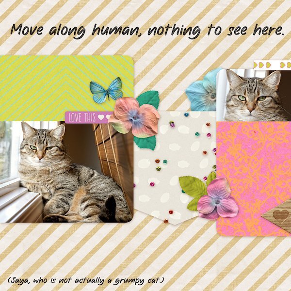
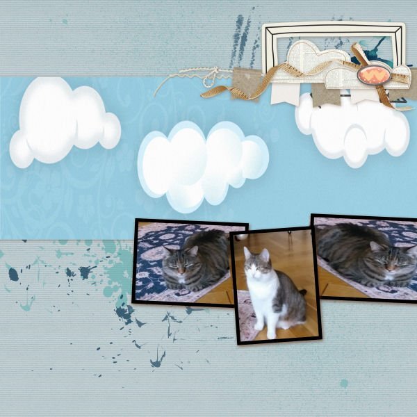
Quick Page Lesson 5 I used the page as is. Added text. Saya is an energetic playful and snuggly girl. But she always looks cranky in pictures. I had put the blinds down to see the computer screen and she kept trying to go behind them so I pulle out over the ledge and she has been using it as her sunning/sleeping spot. Maybe in the winter I'll be able to pull the blinds up again. Font: The Wild Chaos Stamped (Creative Fabrica) Photos: mine, taken a week ago.5 points
-
5 points
-
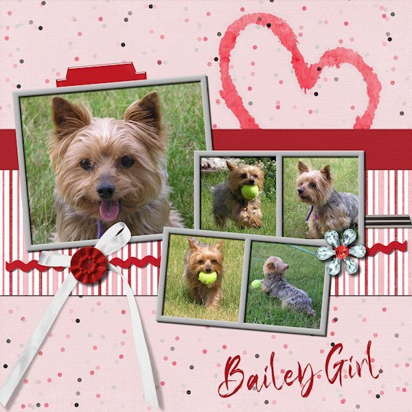
QP Extra 4 This time after choosing too many photos because I couldnt decide on something that reflectected a love theme. I found My brothers dog Bailey. This dog is little, but she's big on the inside. She will play fetch for as long the humans can stand it. We looked after her one weekend and had lots of play time. I didnt do anything to the photo's just plunked them in and erased the necessary parts and added a title...it truly can be quick. Font: Klasted (Creative Fabrica).5 points
-
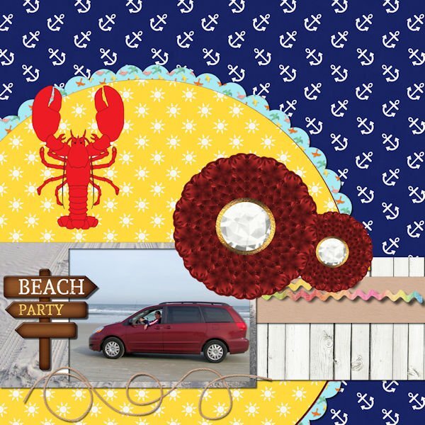
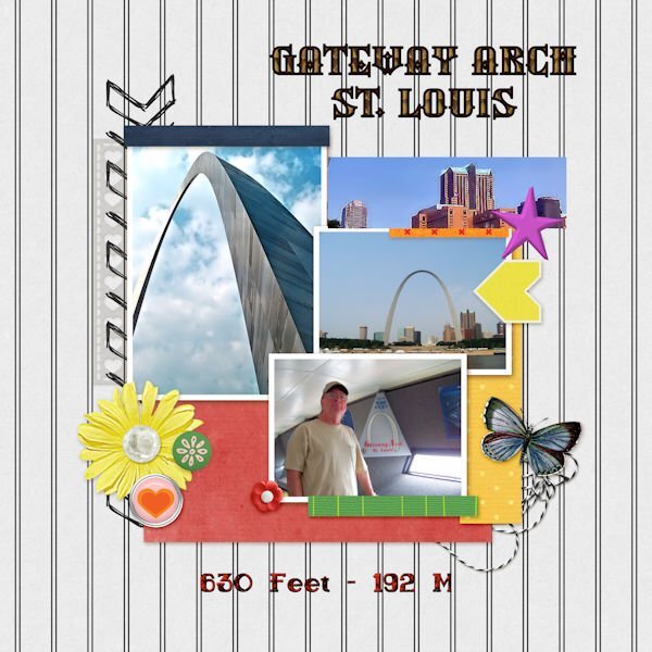
I am just getting to page three, partly due to beautiful weather and partly due to taking so long to decide on pictures. Beach Party is a picture of our van on the beach in St. Augustine. I changed the flower to two of my own from my build a kit. I changed the background under the van to sand from one of my own photos. The lobster is a Summitsoft clip art. The St. Louis Arch pictures are my own photos. I changed the little houses to a picture of buildings in St. Louis. The top font is an olf called Silverblade and the lower font is sailor bold 1 grunge, a Windows font.5 points
-
I've made some progress and reached it in 40 minutes. The delay was in the sizing, it was in % instead of px. So it takes such a long time before I found what it was other wise I had been finished in 5 minutes. But the pics were png images so they needed a background. Underneath the wedding rings is a homemade TEXTURE. I'm very proud I have made 5 textures now. So altogether it takes a bit less than 1 hour.5 points
-
5 points
-
4 points
-
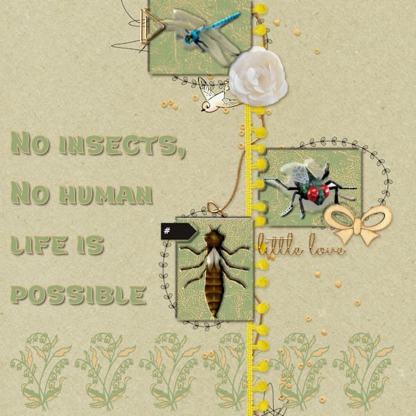
My first attempt failed this afternoon, So I deleted it. No suitable photos. The photos faded away after scaling. This afternoon after a long break I got a new idea, insects enough in my stock. But again they needed a background. I made all the same for the balance in coloring. The three open spaces got a double shade of me after being selected to give them depth. I do have time enough and can work as long as it needs till I'm satisfied, so no problem. The name of the text font is Marly Tail. The flower edge is a 'true type' too named Azalea Ornaments. No shades behind as they are background images.4 points
-
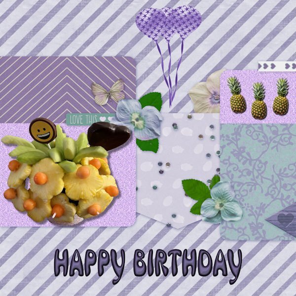
Someday, I will have to remind myself that not every empty space needs to be filled. The edible arrangement photo was taken after I received it from my lovely daughter, Beth. Pineapples are from an AI program, and the balloons are from my build a kit. I changed the hue because I love purple. The font is an olf called Mrs Beasley. The glitter paper background is from one that I made some time ago.4 points
-
4 points
-
4 points
-
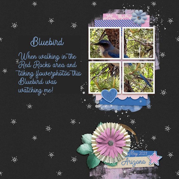
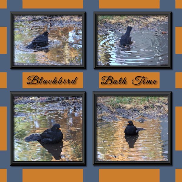
In general I do not like to use very small photos and therefore I placed only 1 photo in the frames. The color blue in the template invited me so to speak to use this photo of a bluebird, a beautiful bird that we don't have in the Netherlands. At first he/she was sitting on the ground between some grasses and I only spotted some blue and when I went to have a better look he flew up and settled in a tree to look what I was up to. I could come rather near and got a couple of photos of him or her. I don't know if there is a difference between the male and female birds. If someone knows, please tell me.3 points
-
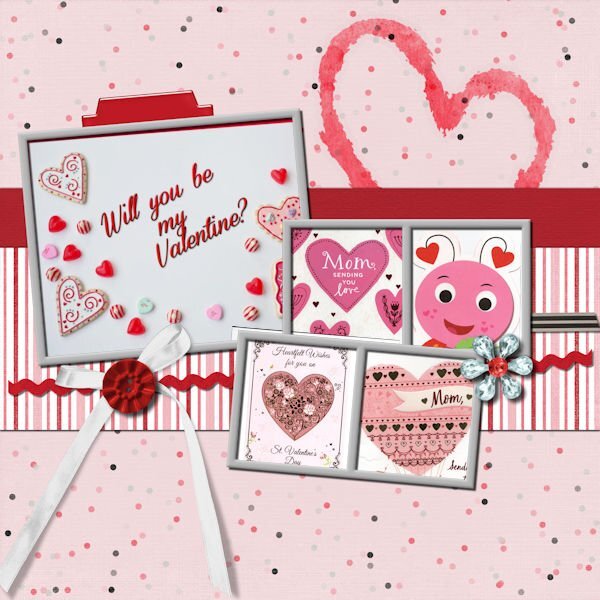
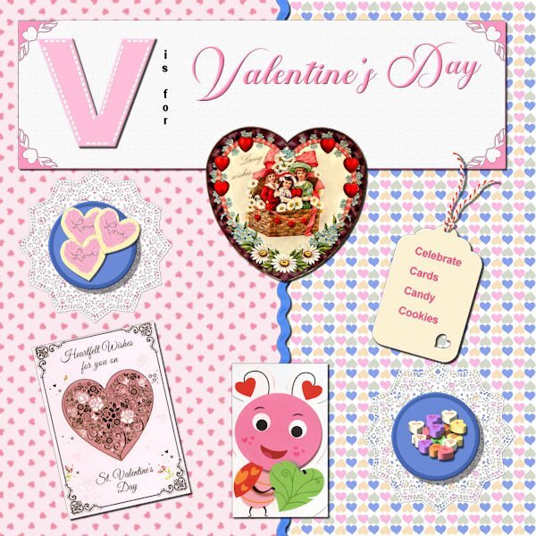
Bonnie - love your ice cream pics and layouts! Makes me drool for ICE CREAM! I decided to go with V is for Valentine's Day. (There are too many places I like to go to for vacation - mountains, sometimes the beach, family members in the north, the south, the east, the west; route 66, route I-90 (from the east coast to the west coast) - would take a whole album to do those vacations! So here we are with Valentine's Day. Cassel's heart punches on the corners of the title paper; I made the cookies and bought Cassel's script for tube icing since I wanted icing that was not just flat - used the sprinkles I made in one of the labs for the word Love on the cookies; used the picture tube for the heart candies; used the plate in the basic course, made the doily in one of the labs; made the papers; Cass-zig zag ribbon in white which I (of course) colorized; the valentines: the old victorian one was from PS - Janet Kemp; the others are scanned images of cards I have received; made the tag in one of the labs, as is the string attached to the tag. And of course, Valentine's Day is celebrated with cards, candies, cookies, cake and whatever sweet you can give your "sweet".3 points
-
Hi, I used selection tool to extract some elements from QP and the title from another photo. vines- picture tube by cassel font - date - chirp2 points
-
2 points
-
I was not intending to make this one but I was practicing making TEXTURES. So I was looking into my stuff for a suitable application, and I bumped into this one. Someone had placed it here and I downloaded it. It was very terrible working. When I selected one section all were selected. Advanced this came out of all my creative possibilities. YOU DON'T HAVE TO LIKE IT ? As I don't have a FB account I can't download from that source.2 points
-
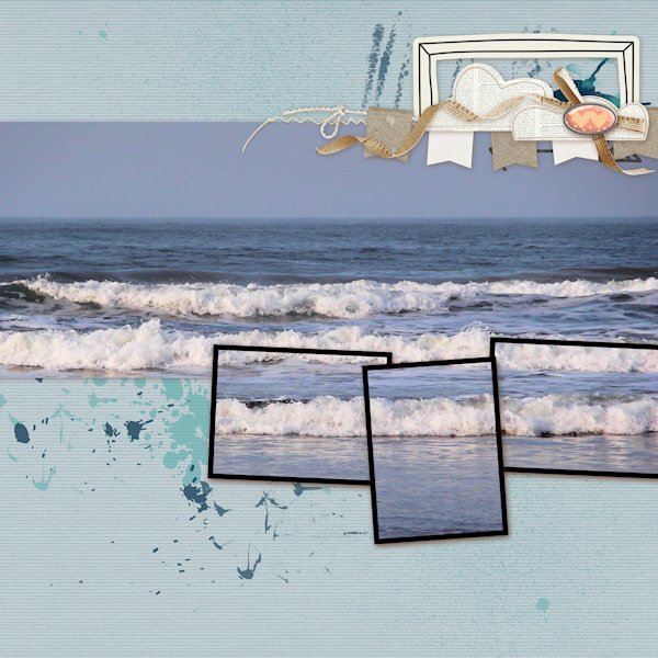
I had to be away from my computer yesterday so am catching up today - it was a joy to look through the posts I'd missed to see all the amazing layouts. My day 4 project has no tweaks! It also only uses 1 photo. I discovered that my photo showed into all the frames and fit just fine so I ran with. The photo is one of many I took of the sea when I lived at Saltburn on the NE coat of England.2 points
-
2 points
-
2 points
-
wow what an interesting insect, great use of the sketch here is mine, I used the warp tool to make the two papers uneven font is Underwater World2 points
-
1 point
-
Thank you Mary. It's sad to hear you lost your husband well before his time. I would feel the same and I'm at that point in life (58) that thoughts of losing my husband is terrifying. You have a positive outlook on it, i like how you worded it and it's a nice to feel comforted by those words.1 point
-
1 point
-
It looks like a sugar cookie, one of my favorites. Good job.1 point
-
Jannette, as a solution for your background texture problem, I think I'd make separate layers for each section. Then I could fill a selected area with whatever and it would be confined to that layer. Allover, this looks very interesting.1 point
-
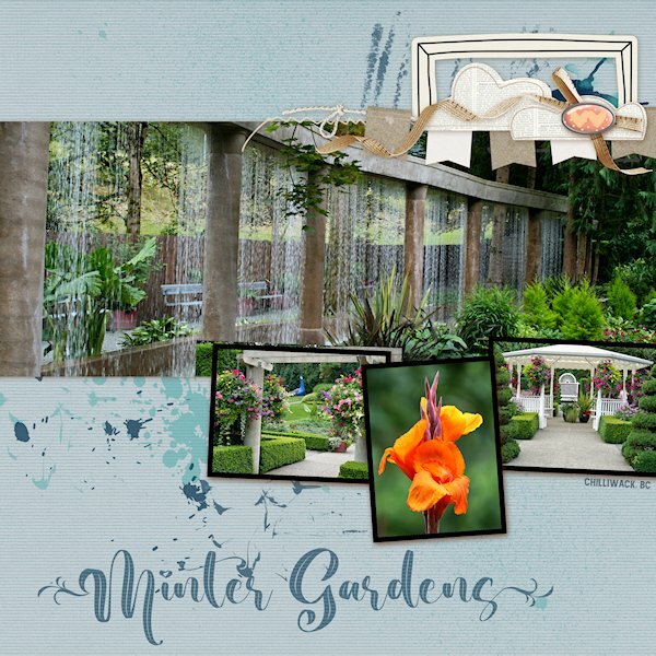
QP Lesson 4 I'm still doing a deep dive into old photo files. This was (and is no more ?) a garden close to where I lived in BC. It was a beautiful place to walk around even without a camera. It was very peaceful there. I did not change anything on this layout and only added text. Fonts: Beauty Nature and Amnestia Normal (creative fabrica) PS Beauty Nature has some nice glyphs, it's described as a "leaf" font. I used a glyph on the first and very last letters. It's from Creative Fabrica I believe.1 point
-
1 point
-
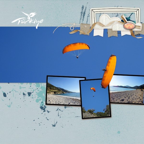
I've just managed to create one page so far for Lesson 4. This year we had a short but lovely holiday in Turkey. On the beach all day, the power gliders would be landing having taken off from the huge mountain behind us. The angle of the power glider image that I have placed on top of the frames is the actual angle he/she was flying...crazy guys. The Turkey tourism logo was a white on black background and using the 'Screen' blend mode in the layers palette it turned to a white logo with no background. Perfect!1 point
-
1 point

