Leaderboard
Popular Content
Showing content with the highest reputation on 06/22/2023 in all areas
-
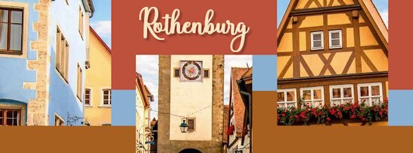
Here is my FB Header for Day 3: I used a photo of Rothenburg, Germany showing one of the town's entry towers. Then I changed the colors of the template. Font is Baby Valentina from Creative Fabrica. I am not sure if I did this right by using just one photo across the whole template, but it was a lot of fun to practice with.11 points
-
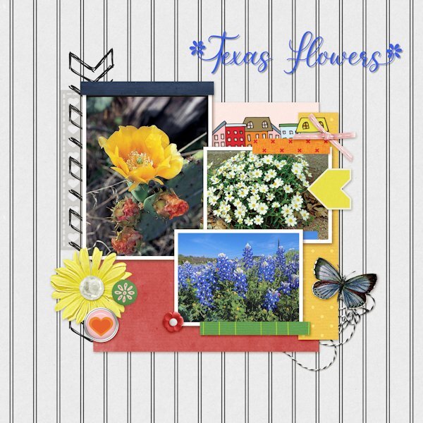
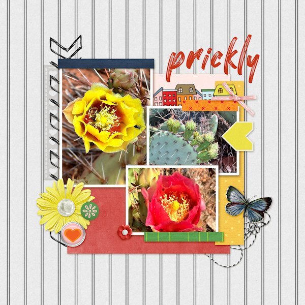
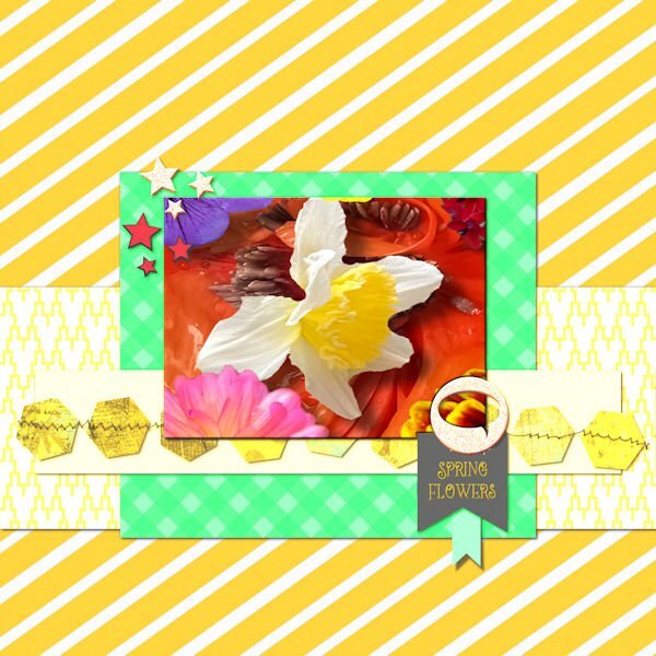
Here is my QP- Day- 3 project. It took me only 15 minutes finding, selecting, and pasting the flower images in the QP template. The flowers shown are: Prickly Pear Cactus, Blackfoot Daisies and Blue Bonnets. I used the eraser brush on overlapping parts. The font is Spring Flowers from Creative Fabrica and that took me a bit longer. I used the font’s glyphs for the letters T and F.11 points
-
10 points
-
10 points
-
9 points
-
9 points
-
Day 2 and 3, again both again from my recent trip. I have so many photos that didn't make it in my album, so lots to use in the coming months. I must admit that after being away and not doing much scrapping I'm a bit rusty and have to think about how to do things..... I must be getting older! The fonts are Wiskey Cool and Better Brush.9 points
-
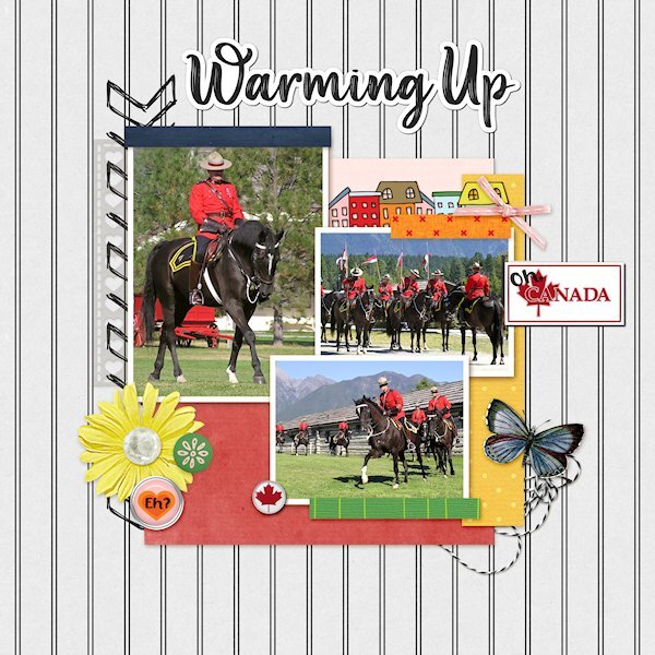
QP Lesson 3 More from the RCMP Musical Ride. These are some warming up shots and one just before they get lined up to parade in to the arena. I used extra elements from KMRD-The great White North (brad 1 and CANADA with Maple Leaf) Fonts: Afifla (words 'Oh' & 'Eh?') and Aesthetic Violet for the the title, both from Creative Fabrica.8 points
-
8 points
-
7 points
-
7 points
-
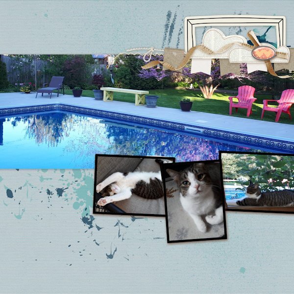
QP - 4 Choosing pix is the longest part for me, but this time I had some on hand, taken by friends whose house, yard & cat this is. Kitty, unfortunately, doesn't get to go out there but she lazes away in the screened porch & watches birds. I added nothing extra b/c I'm enjoying having this be "quick" stuff.6 points
-
6 points
-
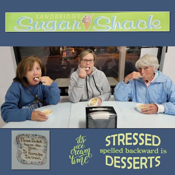
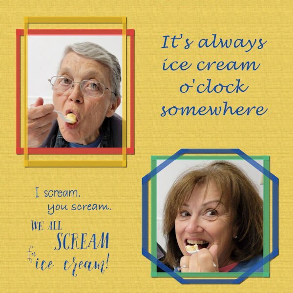
Four of us had a Girl's Weekend recently. I have already posted layouts of the pickleball tournament and a beach walk. On our last evening there, we went to a local ice cream parlor, Sugar Shack. I got a bit carried away and created 3 layouts from the Sugar Shack. I love the please don't tap on the glass sign on one of the ice cream freezers there.6 points
-
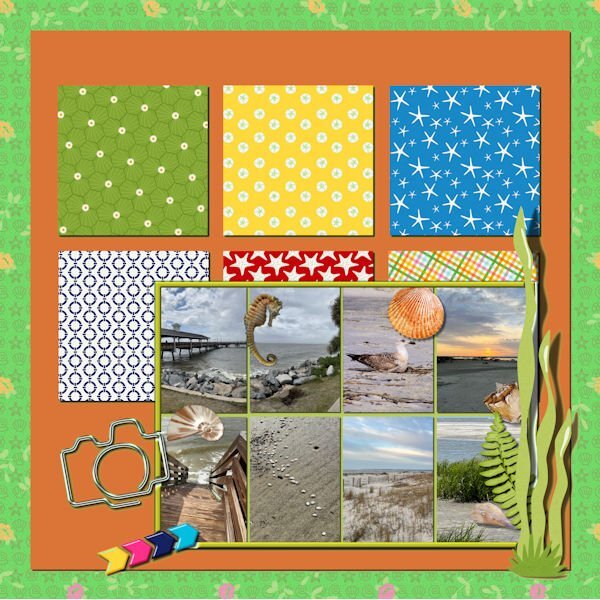
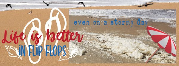
had fun filling this page, I used some picturetubes on the sand and picture I colorized the text in the colors from the photos6 points
-
6 points
-
6 points
-
5 points
-
5 points
-
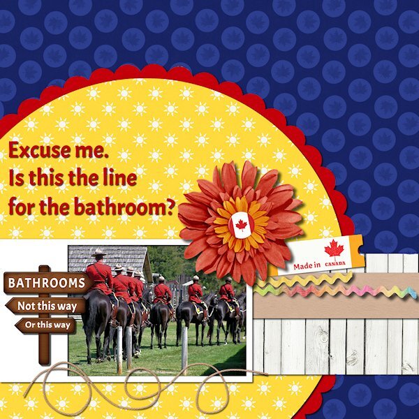
QP Extra Lesson 3 I managed to get one made today. Came across some old photos circa 2005 (pre-DSLR days) from Ft. Steele Heritage Town in the Kootenays (British Columbia). I used the brush tool to put circles over the anchors as it didnt fit. I added a maple leaf to the circle for some texture. Changed the sign (I used the clone tool) and added a few Canadiana items. I had fogotten about these photos and laughed when I saw this one. Looks like they are all lined up for the bathroom. Font is Acme, I think it's a google one that came with my font viewer. Onto the other lesson 3 QP.5 points
-
5 points
-
5 points
-
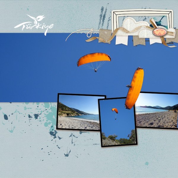
I've just managed to create one page so far for Lesson 4. This year we had a short but lovely holiday in Turkey. On the beach all day, the power gliders would be landing having taken off from the huge mountain behind us. The angle of the power glider image that I have placed on top of the frames is the actual angle he/she was flying...crazy guys. The Turkey tourism logo was a white on black background and using the 'Screen' blend mode in the layers palette it turned to a white logo with no background. Perfect!4 points
-
4 points
-
4 points
-
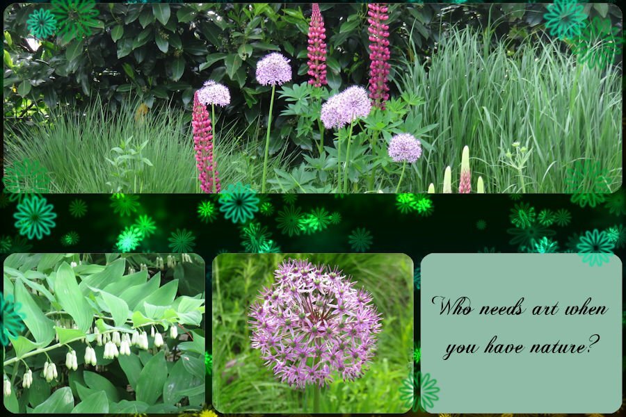
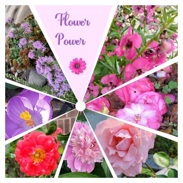
Bottom left pic - Solomon's Seal, one of my favourites. Great pic choices.3 points
-
3 points
-
3 points
-
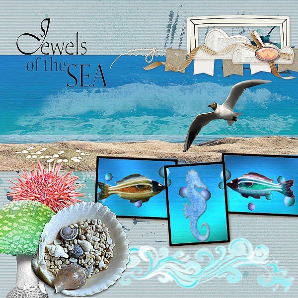
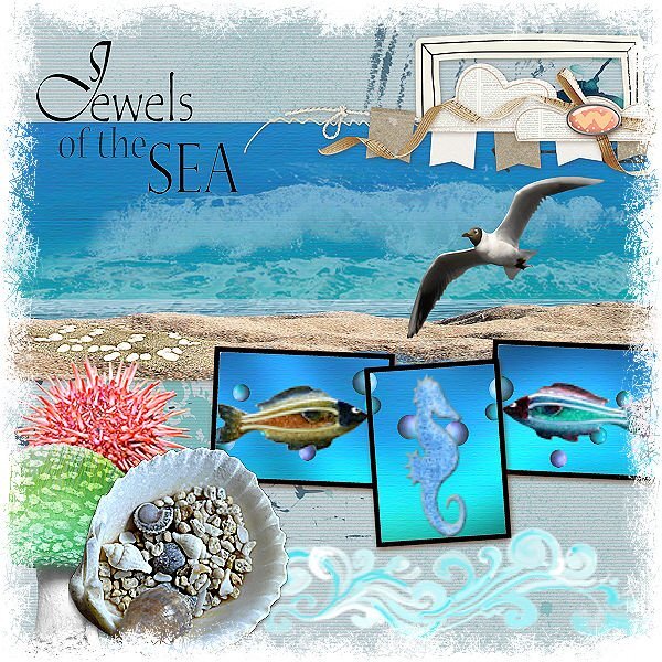
I couldn't find suitable photos for this commission. so I had a look at my stock scrap kits. I have first resized the original as I'm used to working on smaller boards. I played with some scripts (got the most from here) number 1 is the original, and number 2 is photo edges, number 3 is the dot method.2 points
-
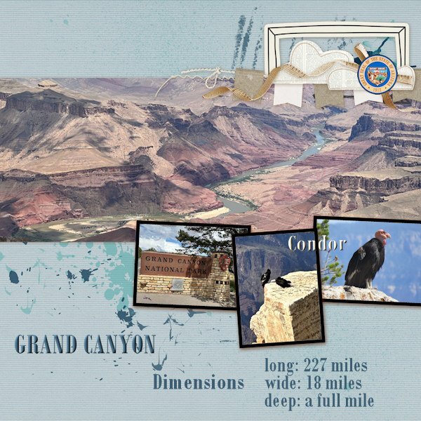
The only thing I changed was the button in the righthand corner, I used the great seal of Arizona instead. The close-up photo of the condor is from the internet but the photo of the 2 condors is mine, they were perched on a cliff and you can imaging that it was impossible to go near them. We were lucky to have seen them at all and the other visitors including us were pointing at them and going WOW!!! There are not that many condors, the park is in the proces of relocating them to their original homelands. Added the text, font is Bodoni MT2 points
-
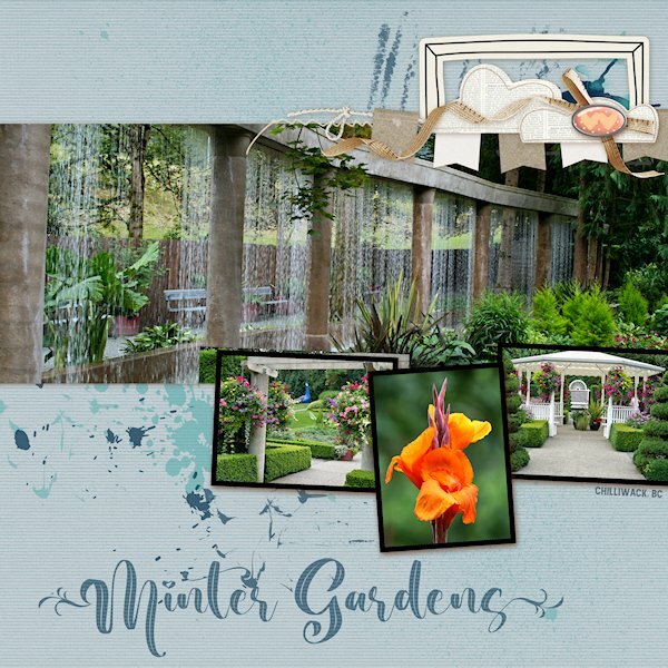
QP Lesson 4 I'm still doing a deep dive into old photo files. This was (and is no more ?) a garden close to where I lived in BC. It was a beautiful place to walk around even without a camera. It was very peaceful there. I did not change anything on this layout and only added text. Fonts: Beauty Nature and Amnestia Normal (creative fabrica) PS Beauty Nature has some nice glyphs, it's described as a "leaf" font. I used a glyph on the first and very last letters. It's from Creative Fabrica I believe.2 points
-
2 points
-
2 points
-
2 points
-
2 points
-
2 points
-
2 points
-
2 points
-
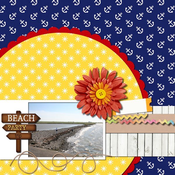
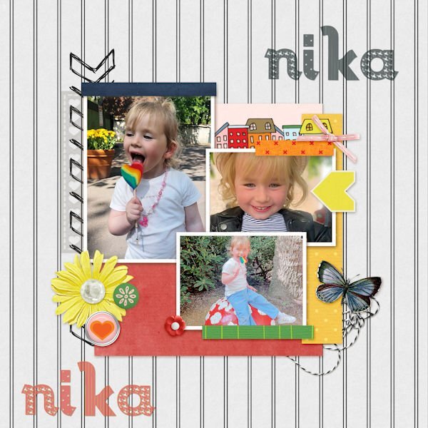
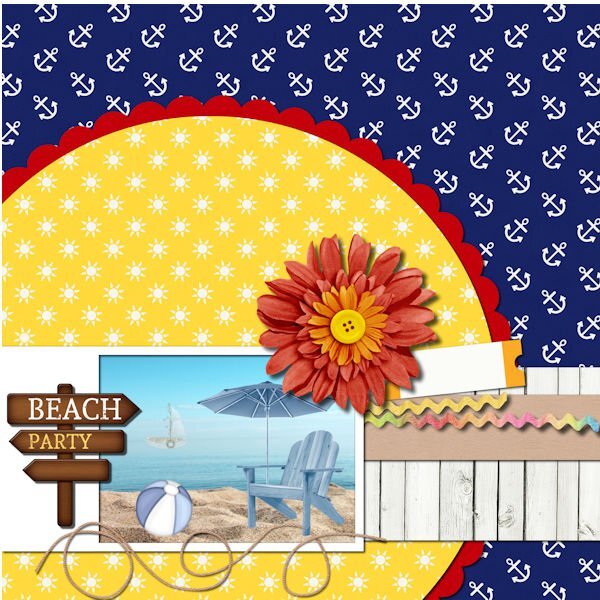
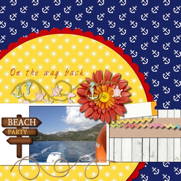
This lesson was absolutely not done in just 5 minutes. Looking for three photos and making them fit was a lot of scaling and cutting necessary. ? The first photo is from my granddaughter Nika, the happiest child in the world as long as her mom is around. Iv made a shadow of her name and used the shade on the top, as there is a lot of space extra. The second photo was just a photo of a sand beach and sea. So dull in my opinion. So I placed a little boat in the sea and some beach attributes in the sand. The chair is empty as the person is gone to the party.2 points
-
2 points
-
2 points
-
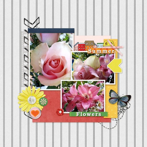
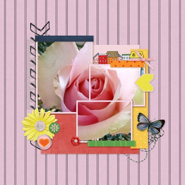
For my Lesson 3 I made two versions as I discovered by accident that I liked the one rose image covered by the three frames. Following Susan's idea previously to change colours, I used the Colour Changer fill tool on the background to match one of the pink colours in the rose. (I notice it has coloured the frames as well!)2 points
-
2 points
-
2 points
-
2 points
-
I think it was Ann Seeber who used the AI background remover in PSP. I tried it with the same pic I used for QP-2 layout. It wasn't perfect, but it's much BETTER than anything I can do using the Edit Selection which always gives me grief and leaves me frustrated. This time, I can live with the results. Background image of "colonade" from Unsplash.2 points
-
2 points
-
2 points
-
They are so cute! Yes, I need to remember...this is supposed to be quick. But it's oh so fun to change stuff...cause we can(more likely we cant help ourselves). Have tools, must change "stuff". ?1 point
-
1 point


Resized.thumb.jpg.d25811db03a63358cedab1e79f527635.jpg)
