Leaderboard
Popular Content
Showing content with the highest reputation on 06/14/2023 in all areas
-
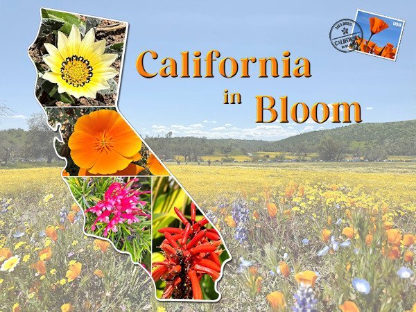
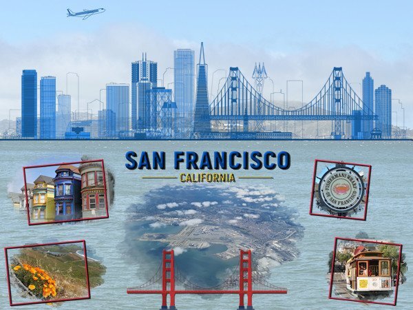
The next one. I was working on another layout but I didn't like what I came up with and made this one instead. I didn't see the full extend of that glorious bloom, only the last of it when I arrived but I have taken so many flower photos that there will be a selection in my book. The background consists of 2 photos taken by my son in law when the family went to admire that bloom. I merged them together with a mask. The template of the State is by Marissa Lerin and I filled it with my own flowers. Carole's stamps template came again to good use as well as datestamp 12 script that I bought in the last birthday sale. Font is Perfectly Vintages that I use throughout this project .8 points
-
7 points
-
6 points
-
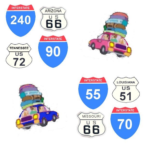
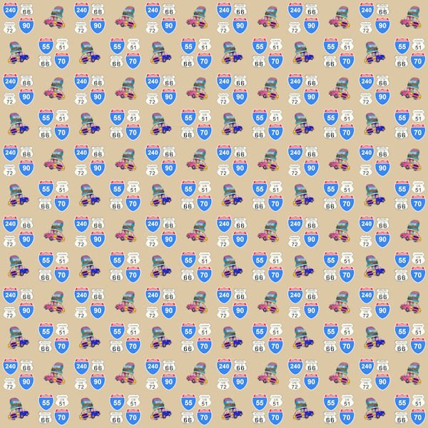
Lovely things you are working on. That paint frame is intriguing. I made 2 from transparent ribbons and downloaded the freebie from Cassel but haven't used them yet. I'm just OCDing about patterns for papers. In working my way through the alphabet challenge from 2022 I can't make up my mind about V - vacatiion? or Valentine Day? So I made a pattern of cars and road signs for a paper for vacation (since I really like road trips). I'll show you the pattern and one of the papers I made from it. I haven't yet played with that cut out circle. I'll also include the 2 transparent ribbon frames in a later post.6 points
-
5 points
-
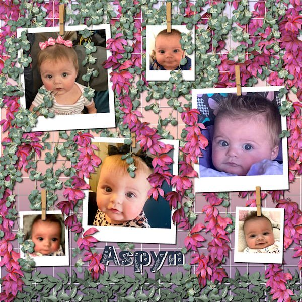
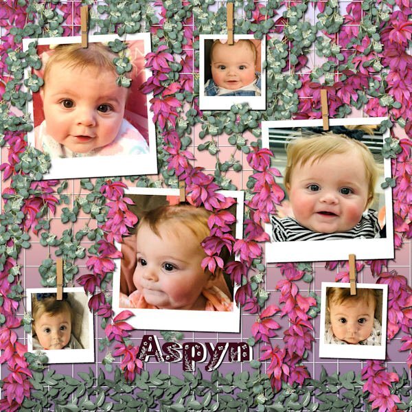
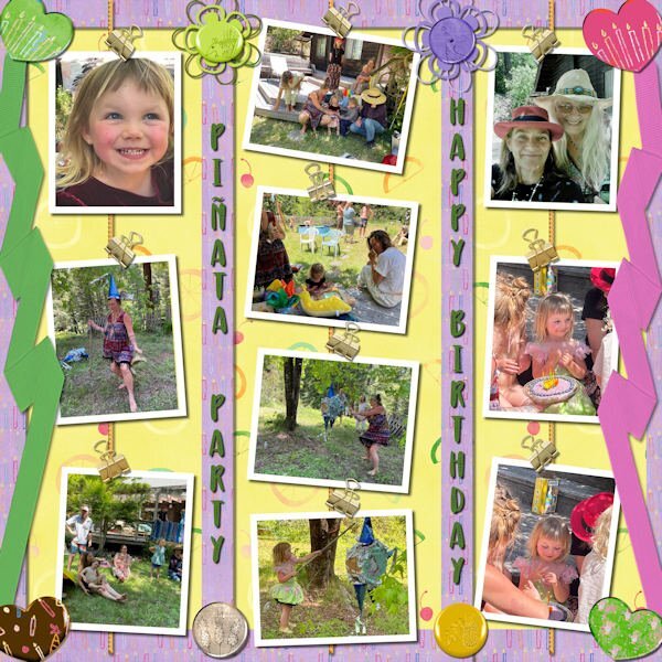
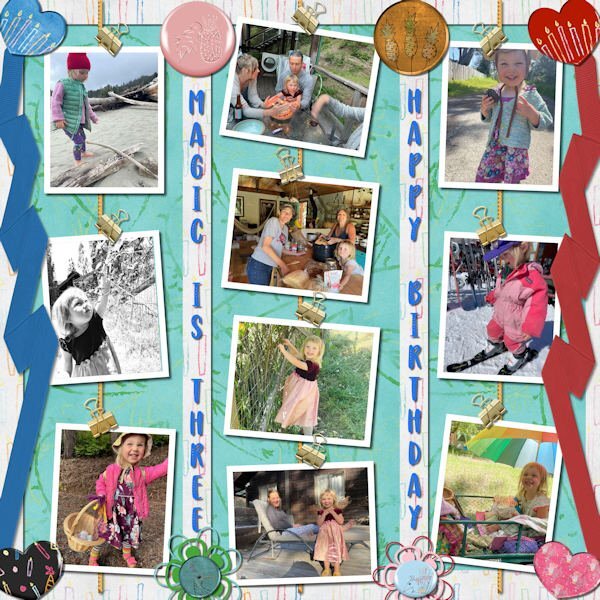
Still playing with Carole's hanging photos, this time with the grid background. I ended up with multiple layers of hanging picture tube vines. This is still Aspyn Dionne, from my last layouts. I finally used all the photos that her mother, Kristan, posted. This turned into a double page, or actually, two coordinated pages. This layout only used 6 photos each and I had 12 photos.4 points
-
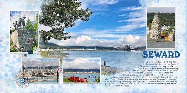
Hi, I thought I would put in what I am working on. I like to make photo books and I am in the process of doing one for our Alaskan cruise from 2018. Yes I am way behind. I usually use Shutterfly to print, so I use there standards sizes. I also do double page layouts. For this one, I started out with a plain blue background, then added some overlays, and blended them, and also added some spots with a brush, then faded them out. I scrap lifted the format from an Indigo template 34, using a mask I purchased from the Indigo template 47. I got most of the elements from Design bundles - Nautical Water colour clipart collection, and Pixel Scrapper Beach elements Blog train from August 2013. My title is the font Calistroke, & the journal is DB Sweet Everyday. I did my frames by doing selection borders, which I learned from a Carole class. (Thank you.) I have learned so much from these classes.3 points
-
3 points
-
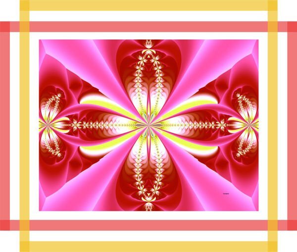
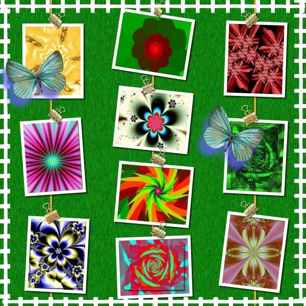
You'll observe fractals everywhere in nature, basically it's a series of patterns repeating itself over and over, at different scales.2 points
-
Yes, in the Files section at the top. I put one up there recently.1 point
-
SO if you can’t decide, maybe your V page should be “vacillation”? ???. Meanwhile, on this patterned paper, I like that you took the time to have one car with luggage facing right and one facing left with slightly different colors. It’s a little detail I appreciate.1 point
-
1 point
-
Kasany - how do you do your fractals? They look like some of the stuff done with the Kaleidescope effect in PSP and some of the other tools, but only kind of. Corrie - I have a pspimage of a national highway sign which are the other ones in that pattern. How can I get it to you? Does Facebook accept pspimages?1 point
-
Exactly, and may I add for example in science and technology too. @ kasany I would like to know, do you create your fractals with another software?1 point
-
It's not exactly the right place here, but may I add my answer concerning the Font ID-subject. Just for the case it would be still interesting...1 point
-
@ Corrie "California in Bloom" what a cool and creative idea to present it like this!!!1 point
-
Of course. I gave the links to my daughter, but she opted for a different style (she is picky!) LOL1 point
-
1 point
-
Only a very creative type like you would see that possibility! Great idea.1 point
-
Thanks for the kind words, Suzy. The two fonts on top are: Bahnschrift Semi and Banana Pancakes with an Inner Bevel. The bottom is Corlita Sans and I applied a cutout. They are all in my Nexus Font handler so I don't know where they came from.1 point
-
1 point
-
I think it would simply be a matter of layering straight lines in different colors and adjusting the opacity. It might be a bit tedious to do but it is not hard. Maybe a tutorial?1 point
-
1 point
-
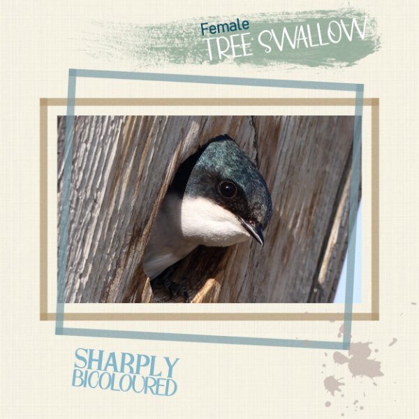
Thanks Michele. 6 of the 10 tree swallow nest boxes are occupied this year.The parents occupying this box are busy trying to keep up with the constant demand of feeding young. I suspect they gave 4 nestling. I'll find out when they fledge. I have photos of youngest popping their heads out of holes. I appreciate the shadow comment.1 point
-
1 point
-
1 point
-
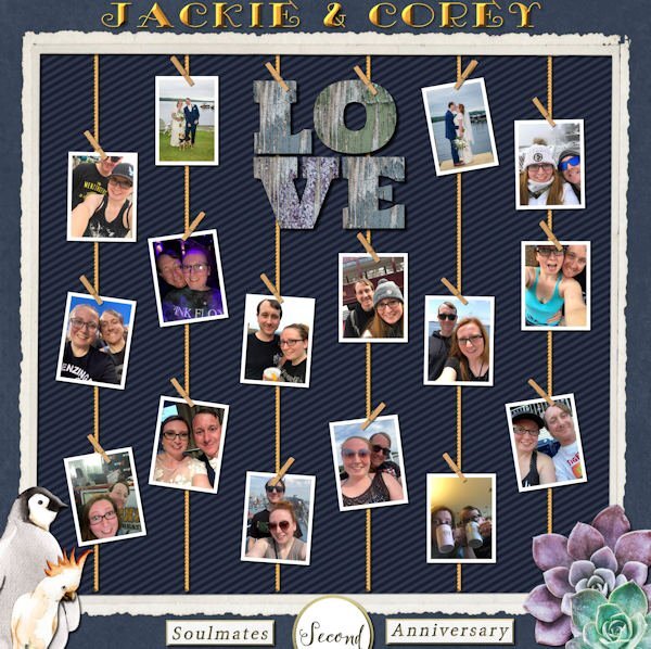
Granddaughter Jackie and hubby Corey are celebrating their Second Anniversary. I had 16 photos to place and thank goodness for Carole's Hanging Photos 2 Script! The succulents are for Corey and the animals are for zookeeper Jackie, found in the Animal Kingdom kit; the LOVE word art and snippets are from Melo Vrijhoff on Pixelscrappers. The title font is Simple Pen Solid and the frame is labeled BMU-Eve from Scrap Girls and the striped background paper is from a wedding kit by Sahin Designs.1 point
-
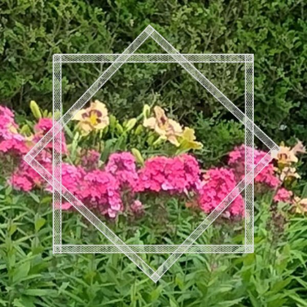
This morning in the latest email, Carole has another new script called Paint frames 1. I'm always looking for new ways to showcase photos and these frames are awesome. I've created the rectangle frame with corner boxes before, but not with the a higher opacity that overlapping or another coat of paint would give. Anyway I gave it a go. Although the script would have been quicker, these frames were easy to create. I added some noise1 point
-
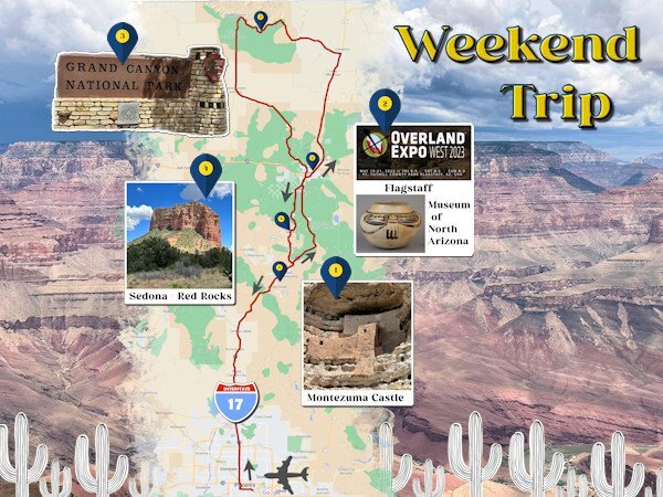
This is my next intro page and it is about the weekend trip we took to Arizona because my son in law wanted to go to the Overland Expo! He went there for one and a half days and had the time of his life. My oldest granddaughter went with her dad for the first 1/2 day while the rest of us (my daughter, youngest granddaughter and I) visited the Museum of North Arizona that has an amazing art collection of the Hopi's, Navaho's, Apaches and other tribes. En route from the airport in Phoenix to Flagstaff we also visited Montezuma Castle, a big pueblo build inside a cave. The second day, son in law again to the Expo and the rest to the Grand Canyon, which is hardly to describe, spectacular!!!! The third day on our way back to Phoenix we visited Sedona and the Red Rocks, which were also very, very beautiful. Near Phoenix the highway is through the desert, another new experience for me. It were 3 days packed with so many new adventures and of course many photos to remember it all. This page took me a lot of time to do with all the tiny details. The font is Perfectly Vintage and photos are mine except the flyer of the Expo which I found on Google.1 point
-
1 point
-
1 point
-
Hi, I'm back from my journey to visit my daughter & co and have been reading all the comments in the different sections of the Campus for over an hour now, you all have been busy! I had a massive jetlag and although I attended the masterclass this Sunday I definitively have to rewatch it, nothing registered with me. I have had a great time and am starting to make a photobook as I did before. I'm going to make a scrapbook page as introduction to the different topics of the book. After each intro page comes the "normal" pages with all my photos and stories. I don't do all the pages as a scrapbook page, that would take me months to do and family and friends over here are waiting to see my book with all the photos! I'll show the different intro pages as I finish them in this section of the Campus; they are still in random order because for some I need to do an internet search. This time they are rectangles because my book will be a rectangle and this way they cover a whole page, which I regret not doing last year.1 point
-
1 point
-
1 point
-
I'm adding this layout here because it's June and I'm late for the May Scraplift Challenge. The background paper is made with effects>texture effects>texture>bricks. I scuffed it up with an overlay I made from the image in the middle. The middle dandelion fluff, is one of my photo's, which i did negative image and some other unspeakable things to. Only unspeakable because I cant remember, guessing I desaturated and lowered opacity and other stuff. I used barbed wire instead of stitching, it seemed to fit better. Photo's are mine. I spray water on the seed heads and brought them in the studio to photograph. The concept needs more experimentation (perhaps with gycerine instead). Fonts: Black Range (pluviophile) & Alisabela Brushley (quote) both from Creative Fabrica. I tried putting water spots on the layout but couldnt make it look random enough so just left it off for now. Carole: should this go in the miscellanous area of the gallery or in the Scraplift part, even though I'm late with it.1 point
-
1 point
-
I am the lucky one who won the wool2 tubes from Cassel and I tried something with it. The background paper is by Marisa Lerin Own pictures. Our daughter's dog regularly comes on holiday for a week while she is on the move for work.1 point
-
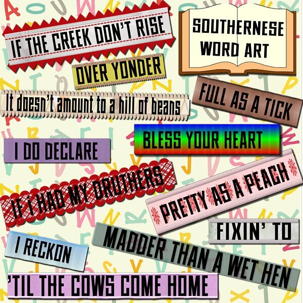
I was surprised to learn I won the Phrase Strips script! I had to play with it which took a bit of time as I made the adjustments to the script itself (as per instructions included) and needed some help from Carole. My deadlines for two projects are now behind me (other stuff) and I can get back to PSP time. I like the "idea" of this layout, but I'm not entirely pleased with the harsh white background. I had to leave it like that b/c I'm not much good at extracting an image and getting a transparent background (the sketch of Mrs. Roosevelt). If I changed or softened the background, then the borders of the sketch were too visible. It's a skill I have to acquire.... Otherwise, I'm happy with the phrase strips and how to use them. Thanks Carole!1 point


