Leaderboard
Popular Content
Showing content with the highest reputation on 05/27/2023 in all areas
-
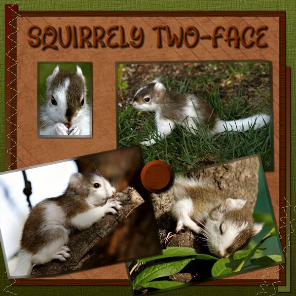
This baby squirrel visited us only on one day. We've had a number of momma squirrels leave their kids with us to baby sit for a few hours. These babies are oblivious to harm and the dangers in it's surroundings. Even coming right up to my feet. The magpies had a keen interest in taking it home to meet their hatchlings. I spend 3 hours watching it and chasing off the magpies and male squirrels (who are just mean and nasty to the little ones) and the neighbours cats. His/hers mom only came twice to check on it. Not really Mother-of-the-Year material. They run around for a bit and then just where ever they are, they stop and sleep. I can go right up to it while is sleeps, sometime it would wake up look at me and go back to sleep. They would sleep 3 or 4 times. It's amazing they make it through this time. The picture of it sleeping is only about 2.5 feet off the ground. I used one paper from Gina Jones-A night in October Solid paper 02 (Digital Scrapbook) Font is Flower Love (Creative Fabrica) Photos: mine This was a tough one to design, took me some time to find something I was okay with.8 points
-
7 points
-
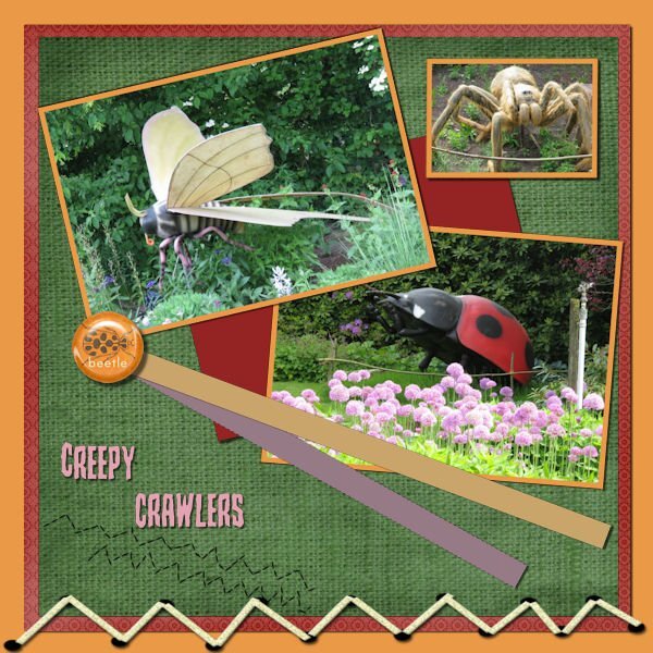
I have never done a DIY ,but it was fun!?? It's a bit busy for my liking, but it isn't "ugly" either ? The font is Creepy crawlers (?) And Marisa Lerin was my elements source ? During the bootcamp we learned (again) how to put edges around the photo's, that worked fine. (I completly forgot how to do that, I just added mats when I needed a border. ?6 points
-
4 points
-
Project 5 <<< Thank you Carole >>> I knew that I needed to put something together for this upcoming event in June but I have difficulty making decisions on so many things. Well, with the push from Carole, I went in different directions than I would have. I did (and redid and redid) and have something completely different from what I would have done. AND I LIKE IT! Thank you for this bootcamp and for other things I have been involved in with your teaching. <<< ADDING SHADOWS TO EVERYTHING? >>> I was a bit skeptical with this one about adding shadows but after doing it, I was really pleased with the effect. I am hoping that it will still look good when placed on the facebook site. <<< CONTINUING USE OF BLOCKS >>> I was trying to determine how best to highlight the date and time. I decided to use the colour blocks beside each other rather than spaced out as in video. But I liked the spaced out ones too. So I have both. When I put the text with the font chosen over the blocks, it was a close enough fit after some moving with the Pick tool. I made a mistake for text "PM". I reversed the black and white but actually like the way that turned out. So I kept it. <<< BACKGROUND PAPER >>> I did not even know that I needed this but when I got it, I knew it was just right. It, to me, conveyed the idea of celebration. When I purchased it earlier this week (May 2023), it was free. I do not know how long that will be the case. Bokeh Paper - Creative Fabrica - https://www.creativefabrica.com/product/bokeh-sparkle-light-effects-118/ - I stretched the image to get the starburst where I wanted it and to have the full page covered <<< BLANK LAYER - BUTTONIZE >>> I used the 3D Effects Buttonize to get the colours on the right and left of the background height - 20 Width - 909 Opacity - 100 Edge - Transparent Color - #2e99ee - I stretched this to get the effect that I wanted just the right amount on right and left sides, rather than trying to adjust values within the Buttonize to see if that would give me it. <<< THE BUTTON >>> I used the button that I place on announcements for the event and thought, especially after adding the sunburst, that it fit just right. <<< SUBSTITUTE FOR SOME PAPERS >>> I could not get papers that I liked for some backgrounds of picture so just selected areas and flood filled them <<< CELEBRATION TITLE FONT >>> Film Letters - Creative Fabrica https://www.creativefabrica.com/product/film-letters/ - I could not get what I wanted for the TITLE using the method in the video so I just used the font with a background added <<< DATE and TIME FONT >>> Baby Blocks - Creative Fabrica https://www.creativefabrica.com/product/baby-blocks/ NOTE - I could not get the colon to work correctly so left a blank, then used Arial Black Font to create the colon and moved it into place. <<< ALL OTHER TEXT FONT >>> Font - Arial Black <<< PICTURE FRAME >>> The frame is from one of the kits mentioned with Project 5 <<< FRAME GOLD EFFECT >>> To get the gold effect on the frame, I used a script that I created related to a tutorial in Beginners Workshop that I was enrolled in but the site is no longer active. https://bw-forums.com which points to bw-forums.net which no longer is Beginners Workshop and has caused problem for anyone trying to access it. I was disappointed to see it go as I was only part way through the training. <<< PICTURE >>> This was taken from the Church's Facebook Page https://www.facebook.com/Bill.Parks62 <<< SHADOW ON PICTURE >>> Because I placed the picture completely behind the frame, when I added shadows, there is no visible shadow for the picture. <<< NOTE TO SELF (or anyone else) ABOUT SELECTIONS >>> A number of times, I found that I seemed to be stuck. Upon further investigation, I found that I had some selected place and had forgotten to deselect. So, whenever I get stuck now, I deselect and then I can proceed. Yes, even when I don't think I have anything selected. It would be easier if I could remember to deselect, once I am done with the selected area, but at least I am not "stuck" if I just remember to deselect when things stop working. <<< Problem encountered >>> I have "Guides" and "Snap to Guides" selected and have placed guides in my work, but it does not seem to work for me, it does not "snap". I have to be exact in placement. I am, no doubt, doing something wrong but I am not sure what. <<< CAN I DO THIS? SNAP ONE OBJECT TO GOT DIRECTLY BESIDE ANOTHER? >>> When I placed the blocks beside each other, I did my best to have them fit side by side but I know it was not perfect. I think of the video software that I use often, Corel Pinnacle Studio Ultimate, in that if I have two video clips and there is a space between them, I can "close the gap" in the software and it moves it directly beside the other clip. I would like to be able to do that with PaintShop Pro with two items placed directly beside each other.4 points
-
4 points
-
3 points
-
3 points
-
I totally agree with you both. I played around for a few hours and it didnt come together until the very end. Those strips and the short stitiching were a challenge and I was putting them all over and at the very end I put them where I did. I had wanted the head shot picture to have those co0l faded edges that Sue does, but do you think I can even remember how to do it. I tried a few things, looked for a tutorial but didnt find it. PSP was acting weird too, wouldnt go to layers when I clicked on them. I would do selection>modify>select selection borders on a photo that was under another photo on the corner and it would select edges around the photo and the edges of the photo above it, but only the part that was overlapping. Finally I just filled it to see what it would look like and the odd "extra" border wasnt there. It was very late at night so now I think maybe I just imagined it. ? That's why I like these challenges, because they can be hard, but I keep going until I am saftisfied with it.2 points
-
Project 5 Again, I used the kits provided (except the one kit that is a 7z file that I cant open) and changed the papers/elments a bit, mostly darkened them. The frame was actually a polaroil frame that I used the custom selection to select the inner portion to delete to make the frame. I added a bevel. The bolt or silver item in the "O" of the title came from one of the kits in the bootcamp as there wasnt anything suitable for the "O". I followed the same shadow as in the tutorial. Is it too big? Given what item it is and that it's one a thicker frame it would be pretty far from the background paper. I was riffing off of the Penguins of Madagascar cartoon and "Kowalski" name in military shows. I did look up the Royal Canadian Air Force and found that there was 408 (Goose) Squadron formed June 24, 1941 that flew many missions in the war. It's patch/insignia (whatever it's called) has a flying goose. I didnt know the etiquette around using military likeness without permission so I turned to hollywood and used the penquins instead. And I loved that show, especially Kowalski the very capable Frist Lt. who had deep pockets filled of all kinds of things he'd pull out when needed by Skipper (his Captain)...who knew peguins had pockets in the first place. ? I tried to tilt the photo enough to look tilted but not look like the geese would be sliding off the photo. Just the way the ice is, it still looks like that's happening. Fonts are: Off War, Olivetti Typewriter Wide, Old Typewriter (all Creative Fabrica) Kit used: PSBT Nov 202 Songbird So Thankful Photo: mine Thank you for another wonderful Bootcamp. I have realy enjoy everyone's layouts. So nice to come home from work and head to computer to be inspired.2 points
-
As we have not had a BINGO in a while, so I thought we could revisit this activity as it gives a lot of flexibility in what you want to use in your next project. I am providing you with a card with 24 elements that can be included in a layout. You can make a bingo by using any element in a straight line that would make a bingo, whether it is a horizontal line, a vertical line, or a diagonal line. That means that you have to include 5 (or only 4 if you use the FREE in the center) elements in your layout. Of course, you can have more than one bingo if you want to create more than one layout. Once you post your layout, tell us what 4-5 elements from the Bingo card you are using (it is just easier for everyone to check on you! ? ) So, here is your card, for May 2023. If you are a DIAMOND member and want to create those elements, you are more than welcome. All the elements listed have a tutorial inside the membership. If you don't have access to those tutorials, or if you don't want to do anything from scratch, you can also use ready-made elements. There is no rule for or against that. The only rule: have fun and be creative!1 point
-
1 point
-
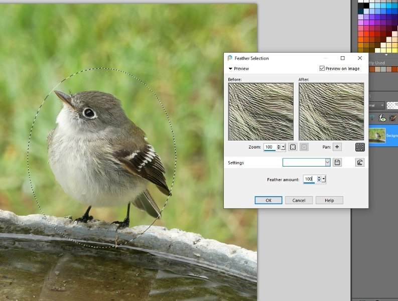
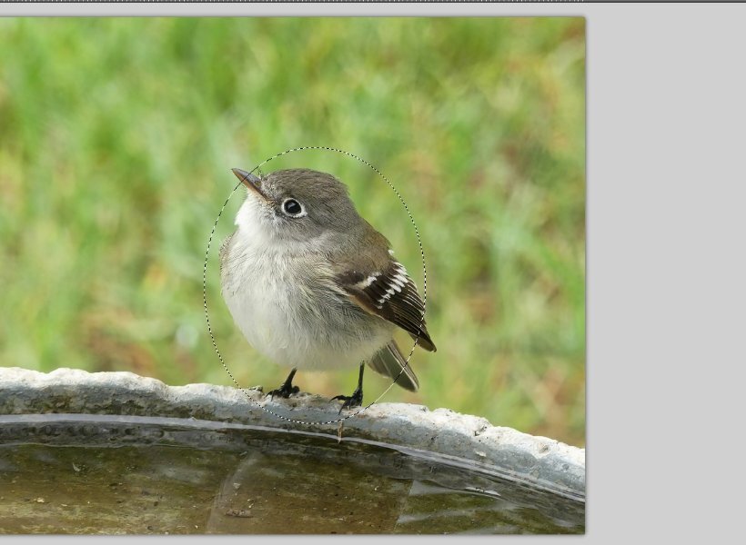
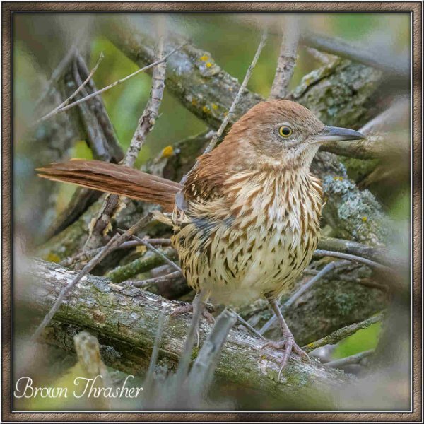
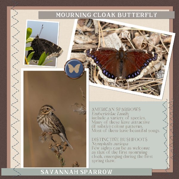
Here you go, I've done some screen shots for you to follow. Now this is fool proof!!! LOL hahaha! only joking! Of course there are several ways to copy, you can either promote to a new (which is what I did) layer, paste as a new image/layer, or copy /paste directly into a project, paste as a new selection and more. It's raining here, and it's wonderful, the first proper rain since last year. I have the windows open listening to the rain. The little bird is a Least Flycatcher, I have lots of them here. they are ever so entertaining, they look around for insects to catch on the wing. This one few off a second after the shot, to catch an insect in mid air. They choose great vantage spots.1 point
-
1 point
-
1 point
-
1 point
-
Yes, that is the name of one of the tutorials HERE. You can search all those elements in the list of tutorials.1 point
-
S is for St. Nicholas. Finally getting back to my alphabet challenge from 2022. The font for St. Nicholas is Ballpark. Santa Claus is from Creative Fabrica and his coat was colorized red because my daughter said it looked like a motorcycle jacket. The holly leave and berries are mine from a previous lab as a paint brush (so I colored the berries separately), the poinsetta is a picture tube. The silver glitter paper is from Donna Sills stash that she shared with us earlier this year which I colorized as silver - the red one I colorized wouldn't work here. The font for Santa Claus is Brandish. I think the St. Nicholas statue picture was from Wikipedia. The frame around it I developed with selections, etc.1 point
-
1 point
-
1 point
-
I'll start with the strips, although they can be a pain to use. If I'm stumped by them, I nearly always resort to using them to add text, they make excellent elements for all kinds of journaling. With regard to the faded edges that I do, I'm not fully understanding what you are referring to. So, I've posted what I think you may be referring to. If so, a lot of different techniques depending what I want to achieve are used. What I will say is, they are all created using the mask tool. I could give you step by step instructions for a specific project I have done, but then again there will be a lot of factors to take into account, to get the desired effect. I think, it may be a project for Carole, for a masterclass.1 point
-
1 point
-
1 point
-
My problem was the long, thin strips. I finally added text to them and buried them at the bottom of my layout in the same color as the background.1 point
-
I agree. ? I made all the photo's etc. to the size needed, hid them and added the photo's one by one and then the elements. Especially the short stitching, where to put it??1 point
-
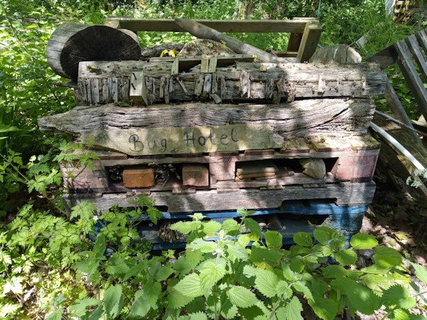
Wow this is awesome. I think I know what to do. I had a Mountain Ash that is rotting, in fact a branch just fell off and part of the truck has mushrooms think we will take off the dying bits and I'll make a little pile of them for the bugs. The birds used to make nests in the trunk but it got too unstable for them too. I can let it go back to nature, it's in a part of the yard that nothing grows and no lawn mowing happens there. Thank you for taking this photo for me.1 point
-
Oh Ann, so glad there are others who feel the same as me about lawns. Interestingly where I have been walking in the unmown grass I have created a natural path. Probably all the dandelion seeds blew to my neighbours though, which won't please them!1 point
-
1 point
-
WATERFALLS - Gradient background - green shiny paper - cork texture - cass-curved-photo script - BMU_Eve_Butterfly2-cutout - brad=PSBT_Songbird_Element (1) - US Park Service quote found on Facebook - font= Century Gothic. I did a lot of "out-of-bounds" to create the tucked-in effect with the photos. The shadows were tricky!1 point
-
1 point
-
I fully support this effort to reclaim the wild plants for the pollinators. Tidy lawns now make me shudder.... ?1 point
-
Carole - I didn't make the connection with the Scraplift Challenge. It's amazing to see the continuity between generations. Mother finally adjusted to the cats, and they rewarded her acquiescence with abounding love. The fonts for this project are Cute Cat and Stay at Home, both from Creative Fabrica.1 point
-
1 point
-
The font is Veni and arial. Kit comes from Marisa Lerin 1000 papers kit. The tea elements were in my stash.(Pixelscrapper, Marisal- England)) The font wasn't suitable to replace one character of, as was showed in the video. I couldn't figure out to use or notuse a shadow on the teapot,cake as it looks like a stamp ?♂️ Photo was taken at the showgardens in Appeltern last sunday. ? It was nice to participate again, some things I forgot, so was a good reminder. ?1 point
-
1 point
-
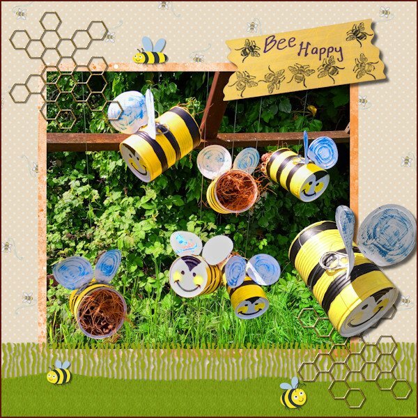
I have finally completed my project 'Bee Happy' so this is what I have been working on in May. I made the hanging bees for the purpose of decorative bug hotels for my garden. In PSP I used the Fringe Effect technique from Lab13 Module 5 for the grass layer & a reverse shadow then added a texture with the grass picture tube. I used various papers and images from the Digital Scrapbook site and studied 6 ways to add borders from the Campus Blog.1 point
-
layered template : Cassel Digitalscrapbook, blogtrain, Papers of Elizabeth Minkus, from minikit Oct2018 That Smile. Tag of Sharon Dewi, from minikit SpreadYourWings Font, Lucida Handwriting Photos are mine1 point
-
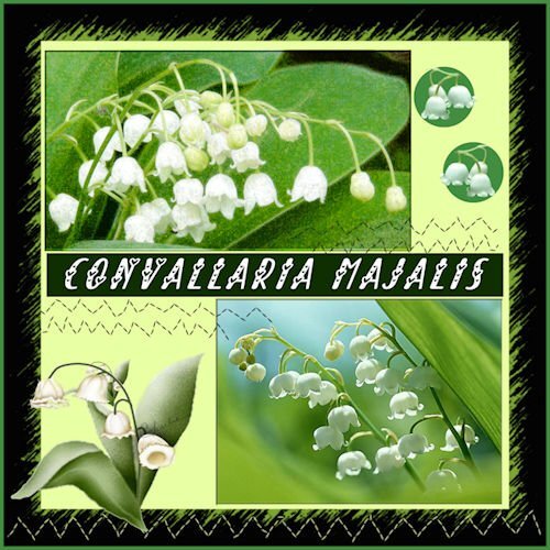
My contribution to the May Challenge. Although not a real challenge to me. I'm used to working with templates. I have Lily of the Valley in my garden but these photos are from the internet. And it is a real may flower here. I guess the are called in France Muguets. Muguet is a woman's name as well I 'v learned just today. I've called them the original name, Convallaria Majalis. There can be made medicine as well. but I do not know what physical ailments it's good for. I had to resize the photos a bit. The name of the font is 'Always Amora'. I love the font in projects like this.1 point
-
1 point
-
1 point
-
I think this serves for 2 challenges...DIY and April's Font Challenge...although a little late. The Blue-eyed Grass volunteered in my yard and I love it! There is also a white variety and I think we have a small cluster of it...the white is rare, they say. Blue-eyed grass is deer resistant and drought tolerant. It is a wildflower but they say you can buy it in nurseries. It should be planted in early Spring...I've missed that deadline for this year. Last year I tried to transplant it but critters dug it up. I hope to buy some plants next Spring.1 point








.jpg.ad8cbf684d54c6b3b2ddca30fdaa511e.jpg)
.jpg.6967a56d759a2c10b0502f4dca120524.jpg)
.jpg.e76bf60a33a74e9352d42108ffae3910.jpg)
.jpg.54d3b465633e16fb0dcf0b5b91b5dc71.jpg)
.jpg.7b3dc44050b714059054bd837415688e.jpg)







Resized.thumb.jpg.d25811db03a63358cedab1e79f527635.jpg)
