Leaderboard
Popular Content
Showing content with the highest reputation on 05/26/2023 in all areas
-
layered template : Cassel Digitalscrapbook, blogtrain, Papers of Elizabeth Minkus, from minikit Oct2018 That Smile. Tag of Sharon Dewi, from minikit SpreadYourWings Font, Lucida Handwriting Photos are mine5 points
-
4 points
-
Project 5 Again, I used the kits provided (except the one kit that is a 7z file that I cant open) and changed the papers/elments a bit, mostly darkened them. The frame was actually a polaroil frame that I used the custom selection to select the inner portion to delete to make the frame. I added a bevel. The bolt or silver item in the "O" of the title came from one of the kits in the bootcamp as there wasnt anything suitable for the "O". I followed the same shadow as in the tutorial. Is it too big? Given what item it is and that it's one a thicker frame it would be pretty far from the background paper. I was riffing off of the Penguins of Madagascar cartoon and "Kowalski" name in military shows. I did look up the Royal Canadian Air Force and found that there was 408 (Goose) Squadron formed June 24, 1941 that flew many missions in the war. It's patch/insignia (whatever it's called) has a flying goose. I didnt know the etiquette around using military likeness without permission so I turned to hollywood and used the penquins instead. And I loved that show, especially Kowalski the very capable Frist Lt. who had deep pockets filled of all kinds of things he'd pull out when needed by Skipper (his Captain)...who knew peguins had pockets in the first place. ? I tried to tilt the photo enough to look tilted but not look like the geese would be sliding off the photo. Just the way the ice is, it still looks like that's happening. Fonts are: Off War, Olivetti Typewriter Wide, Old Typewriter (all Creative Fabrica) Kit used: PSBT Nov 202 Songbird So Thankful Photo: mine Thank you for another wonderful Bootcamp. I have realy enjoy everyone's layouts. So nice to come home from work and head to computer to be inspired.4 points
-
WATERFALLS - Gradient background - green shiny paper - cork texture - cass-curved-photo script - BMU_Eve_Butterfly2-cutout - brad=PSBT_Songbird_Element (1) - US Park Service quote found on Facebook - font= Century Gothic. I did a lot of "out-of-bounds" to create the tucked-in effect with the photos. The shadows were tricky!4 points
-
Carole - I didn't make the connection with the Scraplift Challenge. It's amazing to see the continuity between generations. Mother finally adjusted to the cats, and they rewarded her acquiescence with abounding love. The fonts for this project are Cute Cat and Stay at Home, both from Creative Fabrica.4 points
-
3 points
-
3 points
-
Project 5 <<< Thank you Carole >>> I knew that I needed to put something together for this upcoming event in June but I have difficulty making decisions on so many things. Well, with the push from Carole, I went in different directions than I would have. I did (and redid and redid) and have something completely different from what I would have done. AND I LIKE IT! Thank you for this bootcamp and for other things I have been involved in with your teaching. <<< ADDING SHADOWS TO EVERYTHING? >>> I was a bit skeptical with this one about adding shadows but after doing it, I was really pleased with the effect. I am hoping that it will still look good when placed on the facebook site. <<< CONTINUING USE OF BLOCKS >>> I was trying to determine how best to highlight the date and time. I decided to use the colour blocks beside each other rather than spaced out as in video. But I liked the spaced out ones too. So I have both. When I put the text with the font chosen over the blocks, it was a close enough fit after some moving with the Pick tool. I made a mistake for text "PM". I reversed the black and white but actually like the way that turned out. So I kept it. <<< BACKGROUND PAPER >>> I did not even know that I needed this but when I got it, I knew it was just right. It, to me, conveyed the idea of celebration. When I purchased it earlier this week (May 2023), it was free. I do not know how long that will be the case. Bokeh Paper - Creative Fabrica - https://www.creativefabrica.com/product/bokeh-sparkle-light-effects-118/ - I stretched the image to get the starburst where I wanted it and to have the full page covered <<< BLANK LAYER - BUTTONIZE >>> I used the 3D Effects Buttonize to get the colours on the right and left of the background height - 20 Width - 909 Opacity - 100 Edge - Transparent Color - #2e99ee - I stretched this to get the effect that I wanted just the right amount on right and left sides, rather than trying to adjust values within the Buttonize to see if that would give me it. <<< THE BUTTON >>> I used the button that I place on announcements for the event and thought, especially after adding the sunburst, that it fit just right. <<< SUBSTITUTE FOR SOME PAPERS >>> I could not get papers that I liked for some backgrounds of picture so just selected areas and flood filled them <<< CELEBRATION TITLE FONT >>> Film Letters - Creative Fabrica https://www.creativefabrica.com/product/film-letters/ - I could not get what I wanted for the TITLE using the method in the video so I just used the font with a background added <<< DATE and TIME FONT >>> Baby Blocks - Creative Fabrica https://www.creativefabrica.com/product/baby-blocks/ NOTE - I could not get the colon to work correctly so left a blank, then used Arial Black Font to create the colon and moved it into place. <<< ALL OTHER TEXT FONT >>> Font - Arial Black <<< PICTURE FRAME >>> The frame is from one of the kits mentioned with Project 5 <<< FRAME GOLD EFFECT >>> To get the gold effect on the frame, I used a script that I created related to a tutorial in Beginners Workshop that I was enrolled in but the site is no longer active. https://bw-forums.com which points to bw-forums.net which no longer is Beginners Workshop and has caused problem for anyone trying to access it. I was disappointed to see it go as I was only part way through the training. <<< PICTURE >>> This was taken from the Church's Facebook Page https://www.facebook.com/Bill.Parks62 <<< SHADOW ON PICTURE >>> Because I placed the picture completely behind the frame, when I added shadows, there is no visible shadow for the picture. <<< NOTE TO SELF (or anyone else) ABOUT SELECTIONS >>> A number of times, I found that I seemed to be stuck. Upon further investigation, I found that I had some selected place and had forgotten to deselect. So, whenever I get stuck now, I deselect and then I can proceed. Yes, even when I don't think I have anything selected. It would be easier if I could remember to deselect, once I am done with the selected area, but at least I am not "stuck" if I just remember to deselect when things stop working. <<< Problem encountered >>> I have "Guides" and "Snap to Guides" selected and have placed guides in my work, but it does not seem to work for me, it does not "snap". I have to be exact in placement. I am, no doubt, doing something wrong but I am not sure what. <<< CAN I DO THIS? SNAP ONE OBJECT TO GOT DIRECTLY BESIDE ANOTHER? >>> When I placed the blocks beside each other, I did my best to have them fit side by side but I know it was not perfect. I think of the video software that I use often, Corel Pinnacle Studio Ultimate, in that if I have two video clips and there is a space between them, I can "close the gap" in the software and it moves it directly beside the other clip. I would like to be able to do that with PaintShop Pro with two items placed directly beside each other.2 points
-
Oh Ann, so glad there are others who feel the same as me about lawns. Interestingly where I have been walking in the unmown grass I have created a natural path. Probably all the dandelion seeds blew to my neighbours though, which won't please them!2 points
-
2 points
-
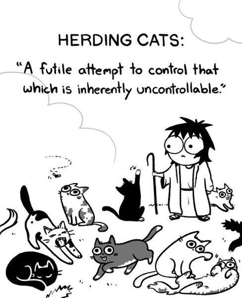
Doesn't everyone hear their cats talk? Mine are constantly reminding me that their ancestors were revered as gods and I should act accordingly.2 points
-
2 points
-
2 points
-
2 points
-
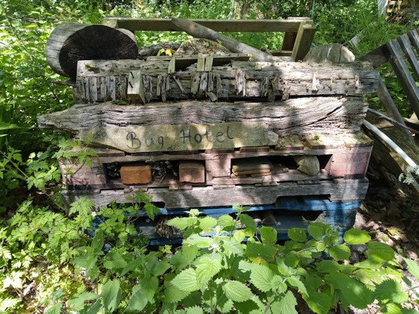
Hi, Bug hotels as they call them come in all shapes and sizes and I think started out by people leaving old bits of wood and leaves in a corner of a garden so the bugs could have shelter. I've seen huge ones made of layered pallets (not PSP palette layers!) in-between which would be all sorts of organic matter. Our councils in UK place them in parks or wild areas, some made of decorative carved wood or use bird boxes with the fronts replaced with things like bamboo, straw etc. Kids like them and it's a way of introducing them to the importance of natural areas and gardening. Susan, you will now need to make your own bug hotel to go with your bird baths. Michelle, I try not to use insecticides or such like chemicals and make compost for the garden from vegetable scraps and also get a bit of exercise digging the heap over. We have a smallish lawn that this month I have let grow wild as encouraged by the environmentalists to help wild life thrive mainly for pollination purposes, so called 'No Mow May'. It doesn't look tidy but it's not a problem. Now you've given me a couple of subjects 'vegetable garden' and 'No Mow May' for other scrapbook projects. Hopefully I won't take so much time doing those ones!2 points
-
2 points
-
2 points
-
2 points
-
Although I could make a case for the spelling, I'll 'fess up. I rely way too much on spell check, which does not work inside PSP. And to think I was a spelling bee finalist in grade school. My teachers would be appalled!1 point
-
Not following that suggestion, Sue, as the green paper is almost full size behind the photos and the "cork" layer. It would cover up the photos completely. I'm sure there are easier ways to achieve my result. I'll have to try it again, sometime.1 point
-
Rene, you are absolutely right! I was trying to think like that, but all I could think of was Gerry was hearing his cats talk to him….the male version of the proverbial “Cat Lady”. I decided he *must* have meant herding, but I believe you are right.1 point
-
Hearding works for the sentiment he is expressing with this layout.... the cats are laughing because of what they are hearing ("train these cats") and he can't hear because of their laughing. Definitely a play on words. Love the layout Gerry!1 point
-
This challenge is one of my favourite challenges, the scavenger hunt is my number one. Some of you didn't comply with the specifications of the challenge, which is what makes it a challenge. Ann, you did 4 out of bounds. I'm going to suggest a quicker way of doing it for this particular layout. Select the background paper, contract, invert, promote to a new layer, move that layer above the photos.1 point
-
I'm sure my neighbours cringe at my "lawn" it's mostly weeds. Weeds are green, it's look the same to me as when it's mowed. I wont allow pesticides on the lawn that animals go on, I have reluctantly allow ant extermination around the perimeter of the house as I do not like ants in my house, thankfully the "ant garden" where the mound is for the birds is out by far end of the garage in the back yard.1 point
-
Thank you for the explanation on Bug Hotels , it's really quite interesting. I inadvertently followed your no mow May objective too. I love dandelions and lately have been photographing them. I put a "no-mow" decree on the the backyard (to my husband) and it was gloriously yellow and the seed heads were stunning, until the wind blew them away, and I cut some to photograph (soon to be in a layout). I had also read that bees hibernate in the ground and they need the dandelions as the flowers aren't out early enough. I did not know this. My husband was saying he hasn't seen as many bees on the dandelions as there usually is. How sad is that. This year my tiny garden (I am a terrible a growing things)got a soil refresh and I was lifting up some small paver stones and there was an ant colony. I felt bad so I put the stones back and covered over with the really fine soil/dirt they seem to make . So, they still had their solid roof, then I used the cement pavers to mark the edges of the ant "garden" section and that's where the little brown birds go for their dust bath. They dont like the garden soil but they love whatever it is the ants make. Also the Magpies and Crows will use the ants to eat the mites off them (there's a word for it, but I forget right now).1 point
-
I fully support this effort to reclaim the wild plants for the pollinators. Tidy lawns now make me shudder.... ?1 point
-
Fiona, if I had a garden, it would be filled with wildflowers. Can't wait to see your new projects.1 point
-
1 point
-
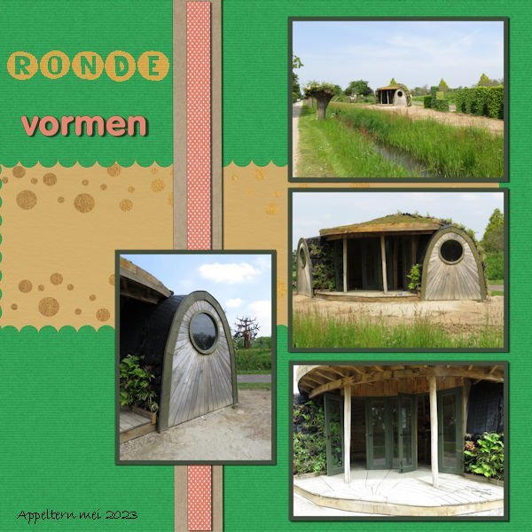
The font is Veni and arial. Kit comes from Marisa Lerin 1000 papers kit. The tea elements were in my stash.(Pixelscrapper, Marisal- England)) The font wasn't suitable to replace one character of, as was showed in the video. I couldn't figure out to use or notuse a shadow on the teapot,cake as it looks like a stamp ?♂️ Photo was taken at the showgardens in Appeltern last sunday. ? It was nice to participate again, some things I forgot, so was a good reminder. ?1 point
-
@Susan Ewart That is a LOT of birds! That must be quite noisy too as they are usually pretty loud birds. @Randy Glad you reposted the image! Did you take those pictures? Maybe you were taking pictures of the same geese as Susan! @Ann Seeber My eyes might be playing a trick on me but is there a shadow (or a bevel) on the left side of the word "Wings"? @MoniqueN. My brain is happy now! LOL Simple layouts have great advantages: they are faster to complete and can be just as effective in showing off the photos! As for the snap, yes, it should work vertically and horizontally. I am glad to see that you used a different shape for the "pinked" edges. As you can see, any shape can be used. That is actually the basis of my edge punches in the store: just different shapes. @Gerry Landreth That is such a cool font!! Looking at your layout, it reminds me of the one I used for the Scraplift challenge, where I have pictures of my grandmother, holding 3 generations in her arms. I was just lucky to have the older pic. @Sharla It is nice to see that although you have the same theme and topic for every page, each of them end up looking different. It would not be boring to browse through your list of books because of that!1 point
-
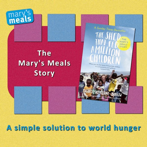
Day 7 Because of the round shape of the "shed" I used a mat with circles on it. And instead of squares to cut out, also circles this time to fit the round shapes of the "shed". The font is unround (The yellow ones) I didn't look nice to have them in different colours, will maybe do that in another project. Vormen (Shapes In English) is the VAGrounded font (Like it!) The shed looks a bit like a Teletubbie house ? I should of added a reverse shadow to the left of the big mat, I thought the map was completly (sp?) to the left of the project ? It's nice to repeat things from earlier bootcamps, I forgot for example to use the magic wand to create borders around the photo's, I always add a mat:). I saw beautiful projects in the gallery, I'm now taking the time to look at all of them in this thread in the forum and add my "likes".1 point
-
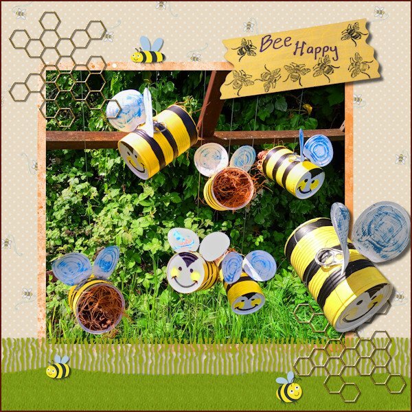
I have finally completed my project 'Bee Happy' so this is what I have been working on in May. I made the hanging bees for the purpose of decorative bug hotels for my garden. In PSP I used the Fringe Effect technique from Lab13 Module 5 for the grass layer & a reverse shadow then added a texture with the grass picture tube. I used various papers and images from the Digital Scrapbook site and studied 6 ways to add borders from the Campus Blog.1 point
-
1 point
-
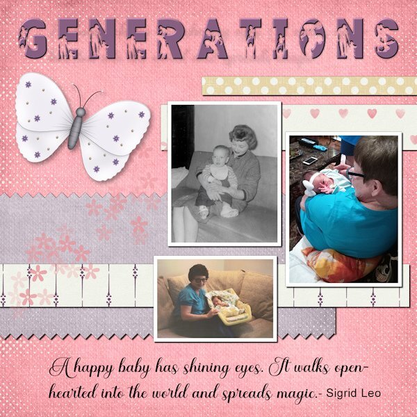
These are pictures of my mom with babies from three generations. She loves babies, and they all have returned the love as they got older. Now she is with me in home hospice. She can still muster a smile when I mention the name of the great-grandkids. The title font is FAMILY from Creative Fabrica. I added an inner bevel to help better define the silhouette. The script is Ernestone, also from Creative Fabrica. The papers and elements are from a kit, Inner Beauty, by Annie C. Digitals. P.S. The black and white picture is me. I wear my hair differently these days.1 point
-
1 point
-
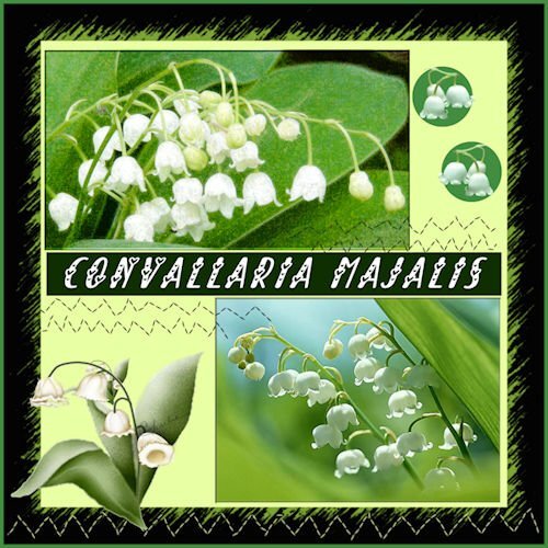
My contribution to the May Challenge. Although not a real challenge to me. I'm used to working with templates. I have Lily of the Valley in my garden but these photos are from the internet. And it is a real may flower here. I guess the are called in France Muguets. Muguet is a woman's name as well I 'v learned just today. I've called them the original name, Convallaria Majalis. There can be made medicine as well. but I do not know what physical ailments it's good for. I had to resize the photos a bit. The name of the font is 'Always Amora'. I love the font in projects like this.1 point
-
Thanks, I rarely use templates, I tend to create a layout to fit the photos, hence, this challenge made me think of an alternative whilst working within the limits.1 point
-
Definitely one way around the limitations! I read often that working within limits tends to generate more creativity. This is a great example!1 point
-
I think this serves for 2 challenges...DIY and April's Font Challenge...although a little late. The Blue-eyed Grass volunteered in my yard and I love it! There is also a white variety and I think we have a small cluster of it...the white is rare, they say. Blue-eyed grass is deer resistant and drought tolerant. It is a wildflower but they say you can buy it in nurseries. It should be planted in early Spring...I've missed that deadline for this year. Last year I tried to transplant it but critters dug it up. I hope to buy some plants next Spring.1 point
-
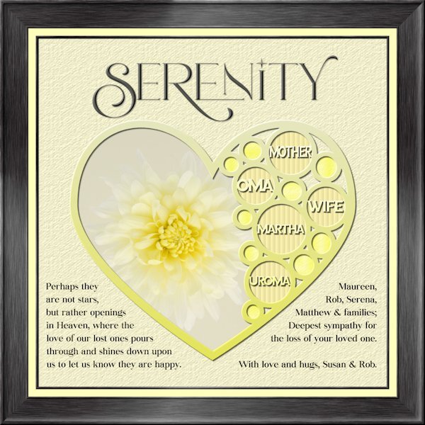
I havent made a tag yet. An unexpected passing away of my sister-in-law's mother on Sunday had me working on my condolence layout instead. Whew, that goodness I was able to go back to the Build A Kit workshop to the frame section and follow the instructions again. I used Lab 13-1 again for the shape, hearts looked weird inside hearts so i used circles. Frame is using Add borders from the master class Framing 101. My photo, and fonts are Romantic Serif (title), Sea Gardens (words in the template) and Audaciti (journaling). The title does have a bevel to help it stand out a bit, also has a very small shadow. reduced opacity on the title and journaling because black was too contrasty. I used the selection tool to fit my words in on the left side. the right side I just used a right aligment as it looked better that way. Nothing bad to report with PSP 2023. today it outshined me and any issue's I had was my dull brain at work and not paying attention.1 point













Resized.thumb.jpg.d25811db03a63358cedab1e79f527635.jpg)

