Leaderboard
Popular Content
Showing content with the highest reputation on 05/23/2023 in all areas
-
7 points
-
Day 5 We were at an show garden this weekend, the pictures I took there and will be used for this bootcamp. The text says: A lovely spot to get some rest, but the funny thing is, we never sit there but at a spot earlier on. I used parts from kits I had in my stash from pixelscrapper and the text "rust" (rest) I used "enamel" (effects--artistic effects--enamel5 points
-
I had very little time to do today's daily look pic. But I had this sweet little kitten from Creative Fabrica* that I fell in love with and never used. I added a mask from Lady22 on a background from AnnieC. The font is, coincidentally, Lazy Cuties also from CF. I added very low opacity drop shadows to everything simply to get rid of the "flat" look. *When we celebrated the campus's 10th anniversary, I won a one month subscription for CF. I've been hooked ever since and cannot foresee ever ending it.5 points
-
4 points
-
This was inspired by an article in The Washington Post about the healing benefits of the songs of birds. The article featured sound clips of the birds in the layout - meadowlark, bobolink, and woodpecker. The glitters were created using Carole's script Glitters-C. The papers and elements are from a kit, Celebrations, by Whispey D'Zines. The fonts are Spring and Ernestone, both from Creative Fabrica. I forgot to note that in the previous project, I used Carole's Smoothener script to eliminate the jagged pixels appearing in a selection's expansion. It did an amazing job.4 points
-
4 points
-
Project 3 Butterfly - since I did not have same butterfly as in video, I used the same Drop Shadow as other elements such as pictures. Heading Font - Bailenson from Creative Fabrica - https://www.creativefabrica.com/product/bailenson-font/ Digital Scrapbook -- all of the elements listed below were obtained from Digital Scrapbook Green background paper (I used the colour changer tool to change the polkadots to more green) ps_marisa-lerin_1622_polka-dot-8-green_cu.jpg Paper with coloured diamonds in circles (I reduced brightness for part I used behind the title) ps_janet-kemp_137036_memories-traditions-quilt-paper_cu.jpg Paper with diagonal slashes ps_janet-kemp_352811_galentines-day-pink-chevron-paper_cu.jpg Butterfly (I changed the colour to white using the colour changer tool) ps_jessica-dunn_353814_baby-dear-stamp-butterfly_cu.png Folded Paper Flower (I lightened the colour using Adjust/Brightness and Contrast/Brightness and Contrast and adjust just the brightness) ps_marisa-lerin_11181_paper-flower-20-pink_cu.png Sunburst (behind the upper left folder paper flower) ps_jessica-dunn_167072_sunshine-and-snow-mini-sunburst_cu.png ................................ Challenge with font When I add a second line, the spacing is too large. So I created a separate text layer for each line. The spacing between lines is probably not exact. My settings were Offset 13 (I was unable to change) Kerning 69 Miter limit 10 Leading 0 Tracking 0 Challenge with "New Layer" text instead of icon In the layers palette, at the bottom is where I can select "New Layer" and other options. Mine is in text but would prefer to have the icon. I think I tried this before without success, but cannot remember or find the steps to take. I think I even tried reinstalling PSP but still the same thing. This is PaintShop Pro 2022 Ultimate. In PaintShop Pro 2021 (not Ultimate), I have icons.3 points
-
3 points
-
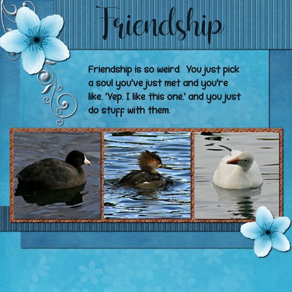
Project 3. I used the kit provided "Welcome Spring" from Digital Scrapbook and by DB Magnolia. And I used the orange glitters. Are you sitting down? Are you ready to hear this? I did not change the blue/white flower or the background paper. I did however change the glitters (darker) ?. I used the background paper twice, once for the background and once upside down for the mat behind the photos/glitters. I used the an extraction of the same background paper and added texture effect>texture> blinds, then added noise, then went back to try a different size blinds on a duplicate copy and accidently applied it again to the one with the texture already on it. it made it look more like stripes. Same for the bottom striped one, which I made darker. I used a scatter of little flower petals and changed the color to white (from pink) and reduced the opacity a lot. It might not show at this resolution. There was no metal element so I extracted a design (part of one) from a card in the kit and then changed the color and added an inner bevel, hoping it looks like metal. Fonts are: Shelly (title) and Robeek (quote). from Creative Fabrica or Google (as my font program came with google fonts as well). Quote: found on internet search "unlikely friends", but could not find who made the quote. it has "human" instead of "soul" that i added because, well, these arent humans. Photos: are mine from the the same photo shoot day, weird changing weather. The layout would have looked best if all the water was the same color as the one in the middle. I may swap out two photos from another photo day that has matching water.2 points
-
2 points
-
In the April Q&A I had asked Carole how to make a Stencil effect. My idea was to make different papers with it. But at my first try, I wasn't sure for which project I could use such papers. My eternal problem is what shall I make as a project. So I just did something, and tried things out for several days until I finally came to something. I didn't use the stencil technique here to make a paper but saved it as a png. The alphas are a freebie from Carole, as are the screws. Of the photo, of course that is Poncho, I first made a B/W version, duplicated it twice, on the first layer the blend mode: overlay, on the second layer: screen and on the third layer I applied: soft light. Font is from DaFont and is : PaintyPaint 1 and a watercolor bruch for the stripe.2 points
-
2 points
-
Learning scrapbooking is often done with practice, looking around for inspiration and trying to recreate projects we admire. This challenge will give you an opportunity to personalize a project while trying to "copy" another one. Of course, you will change the title, the text, and the photos, but you will want to try to replicate the arrangements and some of the effects you see. It is a challenge but in the end, you will learn more about scrapbooking and your PaintShop Pro. In honor of Mother's Day (at least in North America), here is a simple layout you will want to "scraplift". Although this layout was made in a rectangular format, you can easily use the basics in a square format. The translation for this says "Germain Handfield-Chauvette held, in her arms, three generations". And if you want more information on "scraplifting", check out this article.1 point
-
PROJECT 4 Fonts used Which - Impact Path? - Cursive Serif - https://www.dafont.com/cursive-serif.font All elements came from the suggested pack. I did modify one paper I used Color Foil Then I used Typography Carole, Thank you for the information on the Music resources.1 point
-
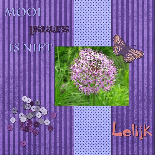
Yes! Funny, I just edited my original post and now I see your question ? Ugly is lelijk in Dutch, so that's why I chose that font in the right corner.1 point
-
Susan - I love that "just playing around" you did with the papers and I love that element.1 point
-
The weather was going from sunny to really dark overcast that day. It was November and the day started out sunny, that's why I went to the park, but it turned quite dark very quickly. The water went from having blue sky to reflect on it to a grey sky. There is trees around the pond so there is also lots of shadow from them too.1 point
-
Project 2 I get the opportunity to sing at a couple of Special Care Homes in my province. So I thought I would show my guitar. I don't take pictures of the residents singing along with me as there is usually a warning somewhere about taking pictures. The background papers were from suggested packs for project 1 and 2. I did change the colours on a couple of them. The Treble Clef was from Digital Scrapbooking. I cannot recall where I got the musical notes.1 point
-
This is so beautiful, Michele! Everything fits so well together, and I love the color, the illustration, everything.1 point
-
1 point
-
I think this serves for 2 challenges...DIY and April's Font Challenge...although a little late. The Blue-eyed Grass volunteered in my yard and I love it! There is also a white variety and I think we have a small cluster of it...the white is rare, they say. Blue-eyed grass is deer resistant and drought tolerant. It is a wildflower but they say you can buy it in nurseries. It should be planted in early Spring...I've missed that deadline for this year. Last year I tried to transplant it but critters dug it up. I hope to buy some plants next Spring.1 point
-
Stunning! I love everthing about this. It looks like a photo from the 1800's. Really incredible, complex work. Thank you for the instructions. Very interesting to have different blend modes on the different layers.1 point
-
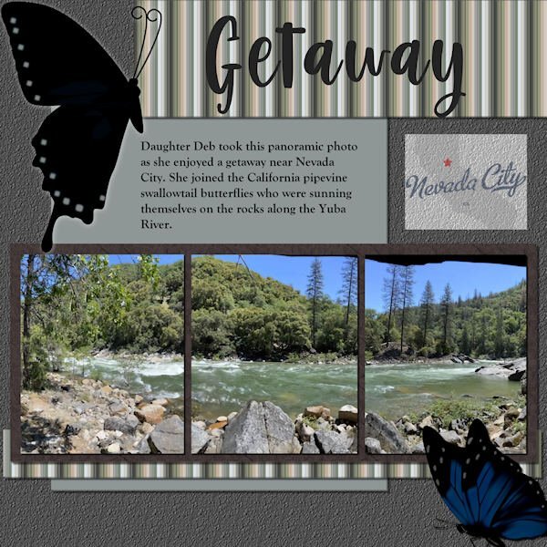
Scrap Bootcamp: Lesson 5 - Yuba River Getaway - Daughter Deb took this panoramic photo as she enjoyed a getaway when she joined the California pipevine swallowtail butterflies who were sunning themselves on the rocks along the Yuba River outside Nevada City. The title font is Berlin Kitchen, the journaling font is Goudy Old Style. Background color fill with asphalt texture, photo mat wood tile01 pattern with hardwood texture. Butterflies are from internet searches for pipevine swallowtails. EDIT: Forgot to mention the stripe pattern; used the directions for making a plaid but stopped before adding a second, rotated layer. The colors are from the portion of the photo that shows on the far left.1 point
-
Thanks so much, Mary. I've never thought of making a palette of my pic and then playing with the effects to make a paper. What a great idea! Thanks. And I agree with Susan. Just because you're not working on a layout doesn't mean you aren't creating.1 point
-
Wow those Explore live cams have nice screenshot resolution. Do you get to watch them moving and choose your own screenshot. I will have to check that out.1 point
-
1 point
-
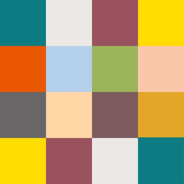
Yes, I always love what you do with the Fabulous Divas, Michele. I'm still playing. Made an image of my Chattanooga Pallet - putting the colors in squares. Then I made a copy of the jpg and played with Kaleidoscope and at the last, played with a copy of it and twirled it, kaleidoscoped it and twirled it again and then kaleidoscoped it again. These are the results. I can't seem to get to making layouts and I need to finish my 2022 Alphabet challenge - S, T, U, V, W, X, Y, Z. Still a lot to do before I can make a photo album of it. And, then, there is the rest of the double page workshop that I didn't finish. My, my - my To-Do List is overflowing! LOL.1 point
-
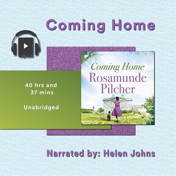
Project 2 - Book number 2. The papers are my creation, the book image from the book cover, headphones a bit of vector art I copied and adjusted. The 'home' in the title is Cornwall for the heroine who is catapulted away during WW2 A very long gentle story. I listened to it whilst doing jigsaws in the winter. It took me weeks to finish it...1 point
-
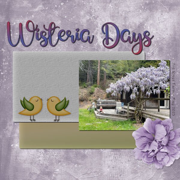
Using the photo I displayed earlier, I toned it up and it's now the star of Wisteria Days. Title Font - Glamlips w/custom gradient, Background paper-Marisa Lerin (colorized), Photo by Debbie Lennox of her granddaughter Magic in Mendocino, CA. Detail font - Harrington, Flower - AFT-Love Life, Bird art - found in my birds folder.1 point
-
Here is yesterday's daily look for my gaming group. The fashion illustration is by Megan Hess, a wonderful artist. I used some elements from AnnieC's contribution to the SYHO (Scrappin' Your ❤️ Out) Lavender Fields Blog Train. One of her flowers worked great as a picture tube ~ created a vector and used the vector tube script to make the frame. The font is Palegina free from Creative Fabrica's 12 Days of Christmas-Beauty-Handwritten-Font-Bundle last year; the bundle is still available as the Beauty Handwritten Font Bundle of 43 fonts for $7. I added a white drop shadow using offsets of -10 and another dark one using offsets of 10.1 point
-
1 point
-
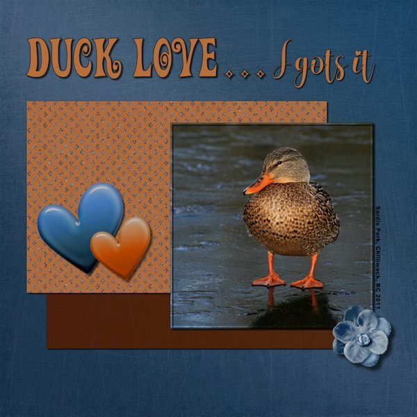
Project 2: Duck Love...I gots it! Another photo from the same photo date and again I used the kits available in the lesson. I'm trying to challenge myself to only use what is in the kit/bundle, but allowing for color changes (absolutely everything was changed). Next bootcamp I will try not do color changes but will get to choose any kit, and only use items from that kit. That's my story, and I can't guarantee I'll stick to it because I probably wont even remember I said this. ?. I used a variety of ways to change the color in the papers/elements to match my vision and often using several on the same paper element. Even making a selection, feathering, and then changing the color of the selection. Good practice for me. Papers and Elements: Rachel Martin Designs; Felicity (Digital Scrapbook) Fonts: Adam Melda, Action Is (Creative Fabrica) and Arial Black (windows). Photo: mine1 point
-
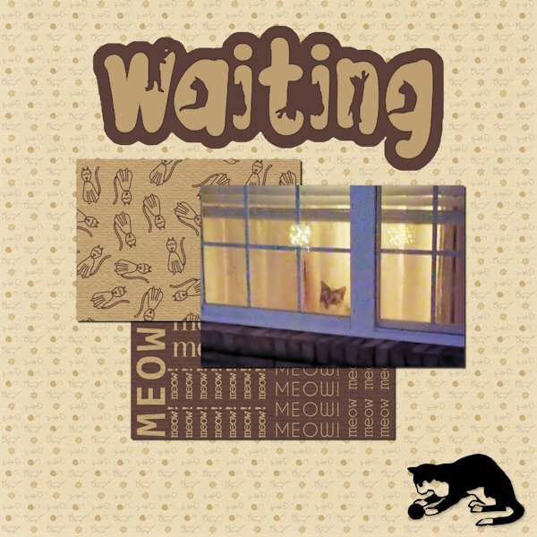
The papers are from Marisa Lerin. The font is The Cat from Creative Fabrica, and the silhouette is from Jessica Dunn at Digital Scrapbook. The little guy in the window is Rudy. He watches when I leave and pops his head up when he hears me pull into the driveway. A side story ... In Lynda's younger days, she would get very excited when I came home. Even though she was deaf in her last few years, she would still poke her head up in the window and meet me at the door. I had no idea how she did it. I finally realized Rudy would wake her to tell her I was home. He was a devoted companion and protector.1 point
-
1 point
-
1 point
-
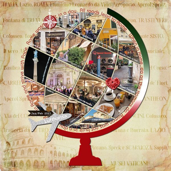
Here is the layout. I had to start from zero, as I got the message "Unable to open file" as I was almost finishing it in PSP 2023... I think it has to do with the text tool, but not sure...So I recreated it in PSP 2019 just to be sure. Credits: (1) Template: SwL_AroundtheWorldTemplate2 (2) Heart ps_janet-scott_33385_be-mine-brown-crochet-heart_cu.png (3) Carole: Basic background paper following the Lab5-09 Text paper tutorial, and a paper from the internet... Also used the Custom Coin script.1 point






Resized.thumb.jpg.d25811db03a63358cedab1e79f527635.jpg)


