Leaderboard
Popular Content
Showing content with the highest reputation on 05/16/2023 in all areas
-
10 points
-
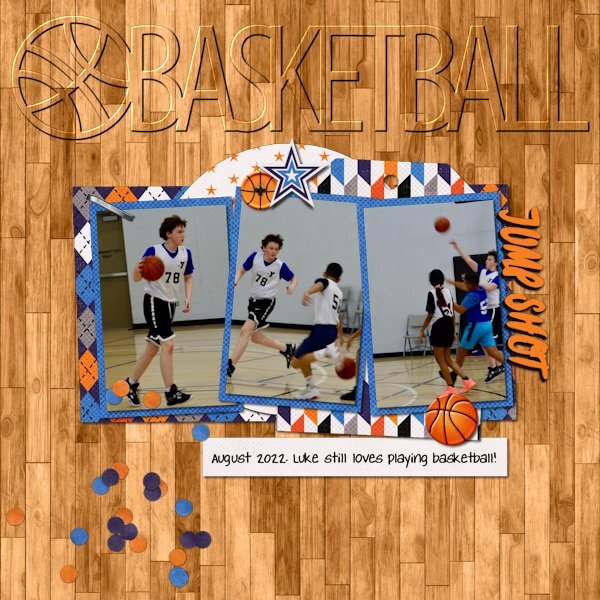
Love your layout! Amazingly, that is one set of SWL templates that I don't have (and I have a lot... over 42MB of her templates). I do have the cutout version of the globe though. Liz has had some wonderful shape templates over the years including the now retired cutout sets for all 50 states, DC and USA. She also had previously done over 10 years ago some state templates that had photo spots inside the shape of the state. She never completed the series and retired them before she moved to The Lily Pad in 2016. I have been using some of her cutouts as titles on pages and experimenting with different ways to highlight them. These were my latest (basketball done in March and the other in April).6 points
-
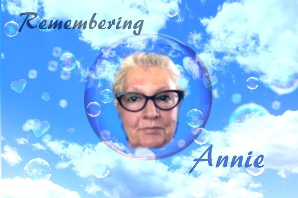
Hi @ all and thumbs up for all your creative layouts!!!! I come around here because I have especially today Annie Tobin - missed and well loved - in my thoughts! May 16th of the last year Carole announced with gread sadness that "Annie passed away probably in May" Cristina shared her last words in January for many of us who wished speedy recovery after her eye surgery "...you are amazing troopers and I accept your well wishes in good grace. It sure has been a trial and all I can do is wait … obviously I need to have lessons in patience which has never been one of my virtues, lol!" I had so many ideas to create a layout and finally I add this one even if it is not my best result. Annie used to say "Thanks for takin a peek my friends. ;D".....5 points
-
I know what Michele and Susan mean about the effects of grief and the way something out of the blue hits you when you weren't even thinking about it. The price of love. I find writing private thoughts down helps. I don't know why. On a happier note I am taking ages to create my current design so don't have anything to share yet but am enjoying your contributions. My design focuses on some bug hotels in the shape of bees, for the garden I have made from tin cans. I am using the 'Fringe Effect' from The Lab 13, Module 5.5 points
-
Thank you, Susan. I totally get the randomness of grief; I was just discussing it with someone the other day. ❤️4 points
-
3 points
-
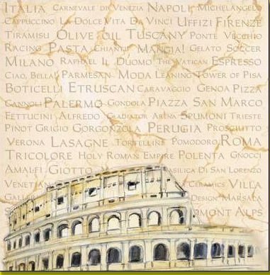
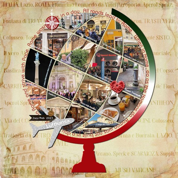
Thank you so much, Suzy! ❤️ Yeah, because of the photo's shapes, it took longer than usual, but exactly these shapes caught my attention to the layout... I created the gradient based on the colors of the Italy flag. But I had to create a few before I had one that I liked...It was good practice on how to create a gradient. ?3 points
-
Thank you so much for your kind and uplifting comment, Ann! ❤️ ... We are all inspired by each other work and expertise... I have learned so many things from Carole and the members through the years...That's why this group is so great.3 points
-
Here is the layout. I had to start from zero, as I got the message "Unable to open file" as I was almost finishing it in PSP 2023... I think it has to do with the text tool, but not sure...So I recreated it in PSP 2019 just to be sure. Credits: (1) Template: SwL_AroundtheWorldTemplate2 (2) Heart ps_janet-scott_33385_be-mine-brown-crochet-heart_cu.png (3) Carole: Basic background paper following the Lab5-09 Text paper tutorial, and a paper from the internet... Also used the Custom Coin script.3 points
-
Hai, Jannette here. I knock on this door to inform you about my absence. Sinds begin in January I had pc trouble. It seemed my Windows password was out of date, indeed it was one from the start of Windows. Another era, another requirement in those days. I have changed a lot of passwords from Microsoft etc. but the windows must have slipped my mind. It was horrible, I couldn't place anything. I saw some of what you made but not even a mark from my side was possible. And even mail from Cassel came in but I couldn't respond to the clicks. Since I fixed that passwords slowly get back to normal Internet traffic. Not everything was down, and my Campus password was recently renewed. So I did not understand at all. I hope now I have them all renewed. I also got warnings that this site possibly is not a safe one. I had to give permission to enter with an extra warning. I discovered too late that there is here a place to introduce myself. so I do now. I'm Jannette Nieuwboer. The last name is translated: Newfarmer. Nieuw is nearby pronounced as the English 'new', and Boer: the b and r are the same as the English but the OE: is pronounced as the "U" in the word 'TOO', I do not hope this puzzle is too difficult. I'm in my 74th year. I live alone, my husband is suffering from Louis's Body Dimension and lives in a care home. I visit him every day so do not have as much time for PSP as I want. In the past iv done a lot of PSP. I work in the 2020 edition as I'm fond of plugins. For now, I will keep this edition. I have a metabolic disorder myself. I get some meds for it but also have to keep a diet. And have to cook everything myself, even baking bread. I eat 85 - 90 % vegan. (I eat eggs, yogurts, and butter. To get my daily portion of protein I eat a lot of lentils and chickpeas too. I v learned to cook them tasty for example chickpeas muffins. lentil pancakes, and lentil pizzas, and from both burgers. See you on campus.2 points
-
2 points
-
2 points
-
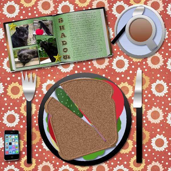
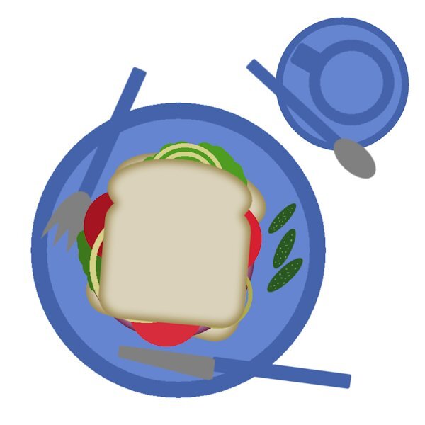
I call this "Dinner and a Movie". I watched a movie (tutorial) and made dinner (or in this case breakfast) at the same time. Yummy! I made duplicates of the onions to help as pep to my oncoming workout and instead of big pickles which I ate the last of last night, I chose those little ones (by resizing smaller). I think they are called gherkins? they are so yummy. I like them on the side. You might see my top slice is smaller. You know how it is when you get the end of the bread and you have a nice full size piece and the only other choices are the end piece or a smaller size one next to the end piece. I wouldnt normally have a knife and fork with my sandwhich, but today I will live on the wild side and try to use them to eat my sandwhich. All kidding aside, this is always a fun exercise. I totally forgot about dragging from the layers pallet one layout to another. it only took me 8 times through the bootcamp to remember, well, er...that is IF i actually remember this time. ?2 points
-
I probably did. That park is very small and well over 800 canada geese come to it every morning and fly off every evening. I used to try and go watch both times as I was rehabing my back surgery and had the time. There is all kinds of waterfowl and ducks too. You can walk amongst the geese, they dont even get up as you walk 6 inches from them (when they are out of the pond). It's a well used park by people. the ducks will actually run after (not chase) the little kids because they think they will get fed. You can get very close to the birds when they are on land.2 points
-
This is a beautiful layout, your mom would have been thrilled and proud to receive it. it never gets easier does it. Random moments of sadness for not having my mom or dad to talk to; to make things better when I'm sad or sick and just for being there. I dont like being an orphan.2 points
-
2 points
-
1 point
-
This looks great Anne. Indeed you are in the right place. If I cant find the forum from the campus I just go back to the lesson and it has the link ("the forum") at the bottom, it says something like this, " Then, go to the forum, and show us... has. Believe me, we have all had to a lot of help from Cassel, when we got started. It was so new to me I didnt know or understand what anything was, keeping going knowing I had Cassel to be there when I got stuck was/is an amazing experience. And it's the first time I didnt get frustrated and quit PSP. I look forward to seeing your layouts.1 point
-
I wished I could sit by you and watch you OMG oh my goodness thats the best one Ive ever seen or My Favorite of all so far. Love your entry1 point
-
What a pretty table cloth. Love how it's faded or textured slightly. really pretty. You nailed the coffee color!1 point
-
Awesome Ann! Your tablescapes are always a delight to see. This is very realistic. I love seeing the possibilities. You have the bread baked (the technique) to perfection.1 point
-
Thank you so much, Rene! I also have this Globe Cutout. ? --- Besides that, I have the Adventure Waits Cutout and Life is an Adventure kit. -- I got to know her years ago because of the Monthly Template freebies. --- There are many designers at Lilypad that I like very much. Those two layouts are beautiful, and I like both titles very much! --- You gave me a great idea to use the cutouts as titles... Never thought of doing this, but will do it whenever possible. That's why I say we learn a lot here.1 point
-
It's funny you mention Instant Effects. I'm on my 8th time and keep forgetting it's there. Since you mentioned it I just added it and chose Hide as well. I am considering the scripting course too. I'm hoping it's not too hard to understand.1 point
-
I have taken the bootcamp before but a refresher is nice. As far as colour, I prefer the light gray. For background, I use black. palettes/toolbars Palettes I keep (but auto hide) Instant Effects - I have set up a number that I use off and on ... actually, I have had this up always but decided that Auto Hide is okay for now and if I need to, I can always keep up all the time. Toolbars I keep Effects Toolbar _ I like what Foil and a couple of others can do I keep Scrip Toolbar - I have saved a number of scripts and now taking the Script course I have not decided which photos I will be using yet.1 point
-
I really like her templates and put the globe on the wishlist. Birthday coming so I'll treat myself. thanks to you for recommending her and The Lily Pad to me. There is some really great designers there.1 point
-
Happy you found it! ---- I have had this Scrapping with Liz Around-the-World templates for quite some time. ---- Have fun!1 point
-
Thanks, Cristina! I found the template on The Lily Pad. Now I gotta go PLAY ?1 point
-
Thank you, Mary! ❤️ And, yes, the enamel corner really gave the photo an interesting and nice effect. ----------------------------------------------------------------------------------------------------------------- I noticed that I had the Title layer turned off while working on the project and never turned it back on again... So anyway, I tweaked the layout a bit after I posted it here.1 point
-
Here is my set up. Workspace is dark gray and Background space is medium grey. I use the UNtabbed window. I closed the organizer and the help centre and I also have PSP open to the Edit screen upon start up. For the life of me, even with the blog post on how to do a screenshot. I can not do it. I set it up and then what. I click on start. It minimized but there is no screen shot at all. Well, actually it screen shot my windows desktop, dont know how it did that. I set it up to save in a file, which it did... but it was of my desktop and not PSP. So I used the windows snipping tool. It's fast and easy. though I wish I knew what I was doing wrong.1 point
-
Welcome to the Bootcamp, @Ann Seeber, @Susan Ewart, @Anne Lamp, @cindy harris. @Susan Ewart That is a great shot. Do you use a zoom lens? @Ann Seeber Those wisteria are fantastic. If you tweak the photo a little, you can brighten those colors even more! Who else is planning to participate in this Bootcamp? Just come and say hi!1 point
-
1 point
-
Wow! Just wow! That is really great! ALLL those pictures in alll those little not-squares! I am so sorry you had to redo the effort because to my mind it was Herculean! The gradient metal on the meridian is such a nice detail, too.1 point
-
WOW! this is AWESOME! It looks like a lot of work and to have lost it must have being so defeating. That background is superb. We are all lucky you rallied and remade the layout for us to enjoy.1 point
-
So, Suzy, you are the one we must thank for this great script! ?1 point
-
I like the layout very much, Ann... And it looks even more beautiful with this script! I also got it but have yet to use it... Soon1 point
-
1 point
-
Finally finishing up the April Double-Page Challenge #6. Here is Shadow, one of the star black leopards at The Wildcat Sanctuary in Sandstone, MN. She's quite a gal! I used the Vector Tube script on the title and the font is Ravie. The journaling font is Kleymissky. The background is my own Shiny Paper and the stars are from my Rustic Kit. The paperclip is from Marisa Lerin and I used the Open Book script with a gradient cover.1 point
-
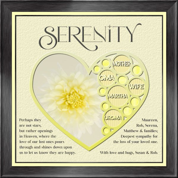
I havent made a tag yet. An unexpected passing away of my sister-in-law's mother on Sunday had me working on my condolence layout instead. Whew, that goodness I was able to go back to the Build A Kit workshop to the frame section and follow the instructions again. I used Lab 13-1 again for the shape, hearts looked weird inside hearts so i used circles. Frame is using Add borders from the master class Framing 101. My photo, and fonts are Romantic Serif (title), Sea Gardens (words in the template) and Audaciti (journaling). The title does have a bevel to help it stand out a bit, also has a very small shadow. reduced opacity on the title and journaling because black was too contrasty. I used the selection tool to fit my words in on the left side. the right side I just used a right aligment as it looked better that way. Nothing bad to report with PSP 2023. today it outshined me and any issue's I had was my dull brain at work and not paying attention.1 point
-
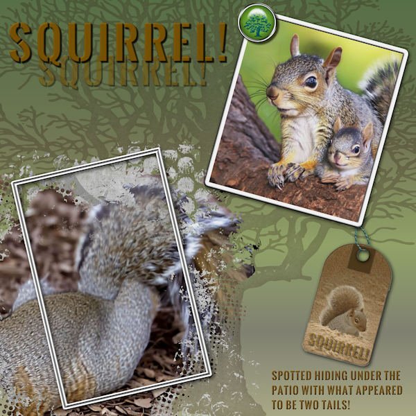
Out my patio door I saw what looked like the back end of a gray squirrel with two tails. She appeared to be burrowing under my concrete patio. I opened the slider and tossed out a few peanuts in the shell. She popped out with her baby! So sweet! ? The title font is Oswald Stencil. The tree is a stamp.1 point
-
1 point
-
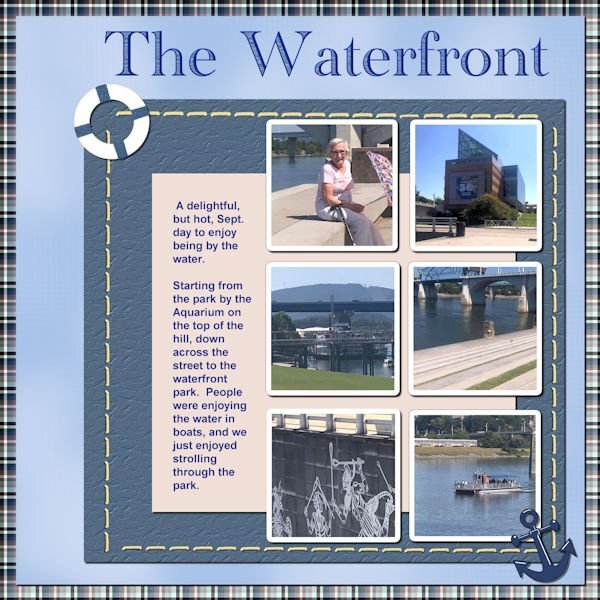
So, here is my next Chattanooga Trip layout. The font is Academy Engraved LET and I filled the open areas with a pattern taken from the water of one of the pictures. The anchor element came from NicePng and the lifesaver element came from pixel scrapper - Jessica Dunn (One of my favorite designers).1 point
-
Last night I created this birthday ecard. After discovering the May tut/tech challenge this morning, I decided to use it to advertise a fictitious event. There are so many different tag designs which can be used in so many ways to help showcase photos. The one with the threaded ribbon I copied from a magazine. I created my own version of a ticket design, which I saw somewhere or other. I jot down on paper designs that I see on the telly, or in a magazine, or online ads creating then as when needed. The pinned tag design will be familiar to you. I frequently use many other techniques in my pages, putting emphasis on small realistic details.1 point
-
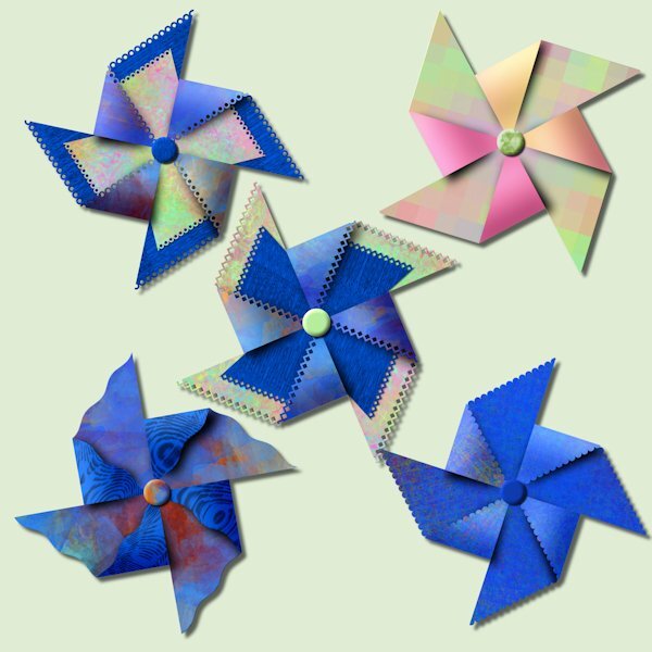
I cant find the post about our purchases from the recent sale so I'm posting here. I had a pinwheel party tonight. There is limitless combinations you can try, it was fun. I used papers from just watching A Beautiful Mess masterclass. And one has gradient on the folded forward part (pink&orange) that I had made previously. It's really quite something to watch it come together.1 point














.jpg.3dc12dba605c6049008b3d00c6f37db2.jpg)
