Leaderboard
Popular Content
Showing content with the highest reputation on 04/28/2023 in all areas
-
6 points
-
6 points
-
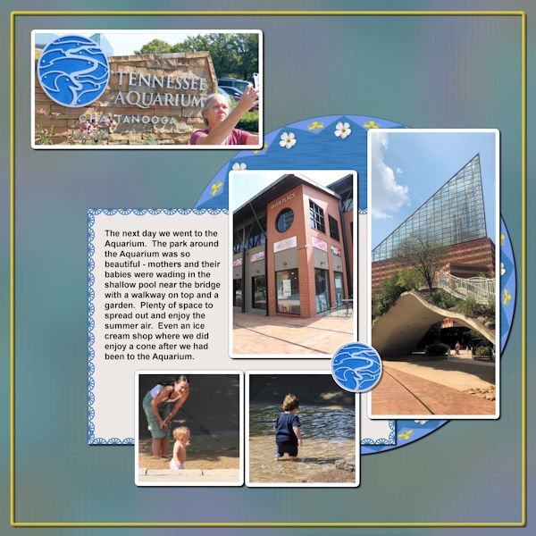
Back on Chattanooga. This is about the park surrounding the Aquarium. Anna and I enjoyed this day - it was full. The picture Anna is taking of the Aquarium sign is what I chose to be a title for this layout. I put a Cass stitch around the journaling paper; I made a brad from the Aquarium sign. The background is the same one I used for the 2 Aquarium layouts I did (which were the first layouts of this trip that I did).5 points
-
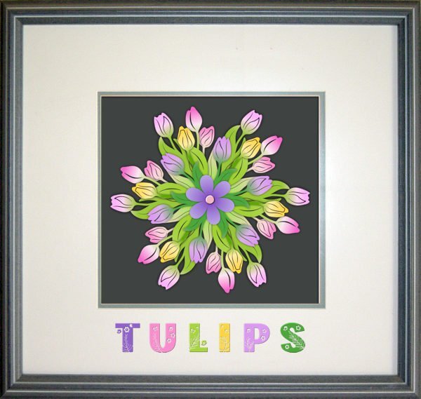
By mistake I had downloaded a 3D flower mandela with 6 layers, colored and in png format. I had now clue what to do with it but decided to "assemble" the flower to give it a try before deleting it. The normal shadows didn't give a good result so I tried shadows without an offset and a blur and opacity from 100% on the backlayer to 40% on the toplayer and the little heart has a slight bevel to let it stand out a bit better. I choose a frame from the frames inside PSP and used the Flora Garden font with different colors. At least I had fun making it!4 points
-
3 points
-
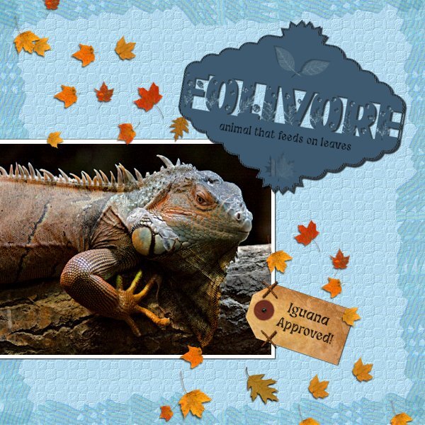
I combined the April Front Challenge with Lab 6-8 Stripe Ribbon Custom Label Cross Stitch I didnt like my Stripe Ribbon so I put all 4 together, merged and made a couple layers and used it as a border with a blend mode. The Custom Label; I saved the two parts before putting together and ended up using that version with the Flora Gardent font for the challenge in between. I hummed and hawwed with the edging, if I should omit it from the text or continue it. I tried just the top and bottom of the 'E' but it looked unfinished, going around the th outter edge looked weird, so I just closed it all up. the shadow needs work on the offset so it makes it hard to see. I believe the pictue tube leaves are Carole's. The tag is KMRD-My Fathers Study Tag 01. The Cross Stitch I used as two stitches to hold the tag on. The photo is mine I found while cataloguing shoot dates. I had passed it off as a bad photo, but thought I'd see how much I could do. Adjustment layers were used and I made selections and used the Adjust option on the top of the tool bar for selections (3 different ones in total). Does anyone know if you can make separate adjustments layers for selections, would I need to group them so the adjustment doesnt affect the whole photo? I used a texture layer on the backgound to simulate reptile skin. second font is Funky Grim (CF). This was fun to do and a surprise at what I did with the photo. Cant wait to get better at the photo editing/adjustment layer part of it. Again, I must add, my monitors are very bad so i really have no idea what anything I do looks like.3 points
-
3 points
-
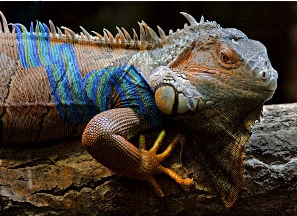
Here's a funny thing I noticed. No, I'm not into tatooing iguanas. I was moving my Stripe Ribbon around and passed over the photo and it looked like the iguana had a tattoo. I think this was a blend mode of "color", not the one I used in the layout. Now I can see what people are doing when they color animals or other objects, they are likely using blend modes.2 points
-
2 points
-
2 points
-
2 points
-
I love all of Cassel's punch brushes, but I just got the new Edge Punches - B - PSP Brushes. I couldn't wait to try them out and I didn't have a project, but I certainly had some fun just playing around!1 point
-
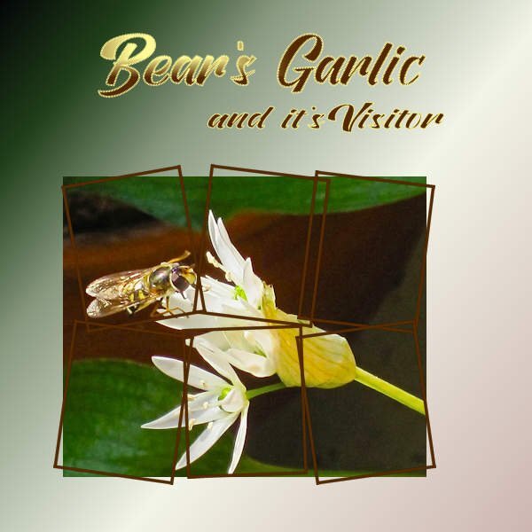
Whenever you create a project, it is likely that you will want to use some text. In this case, you might be looking for some interesting fonts to showcase titles or dates. This month, you will get the opportunity to download a free font that is a little different than usual. You can get this free font at Creative Fabrica. Do you have a nice spring photo or story to share to showcase this fun font?1 point
-
1 point
-
1 point
-
Yes, Blend modes are great for coloring surfaces where you want to keep the texture as is.1 point
-
I still resize before using the JPG optimizer. I've been using it so long that I prefer it over using the save as even though it basically does the same thing. I just know what settings that work best for what I'm doing whether it is a 3600x3600 page or the 600x600 pixel size. And, it is one click to get to the settings in the optimizer. If I want to see the same thing in the save as, I have to click on options (so a 2nd click) then click OK then save (I don't like the slider).1 point
-
Thank you, it surprised me too? I will certainly download some 3D files again.1 point
-
Marie-Claire and Michele, those layouts are so beautiful!! Love both fonts too! ?1 point
-
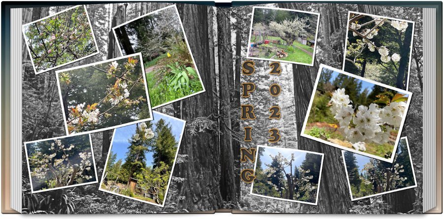
I finally came up with a sixth layout but it's not the style of that assignment. I used the scattered photos script, the open book script and the title style from last month's title workshop #1. Not real happy with the title but it'll do. The photos are from my daughter in California of her flowering trees in the midst of the redwoods so I went to Pixabay and found a shot of the Redwood National Forest as a background which I treated to a Multiply over a white background and that removed all the color. I liked the effect as the flowering tree photos were more visible. The title font is Cooper Black with Vector Tube effect with rope.1 point
-
Being the resident fontaholic, I would be remiss if I didn't participate in this challenge. I took the pic I made for my gaming group today and adapted it to this challenge. The Honeycomb font and clip art are from CF. The font on my original is Abongia which was in the Absolute Font Collection bundle from CF, too. I believe it might still be available for the next day or so.1 point
-
1 point
-
1 point
-
1 point
-
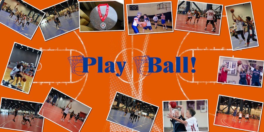
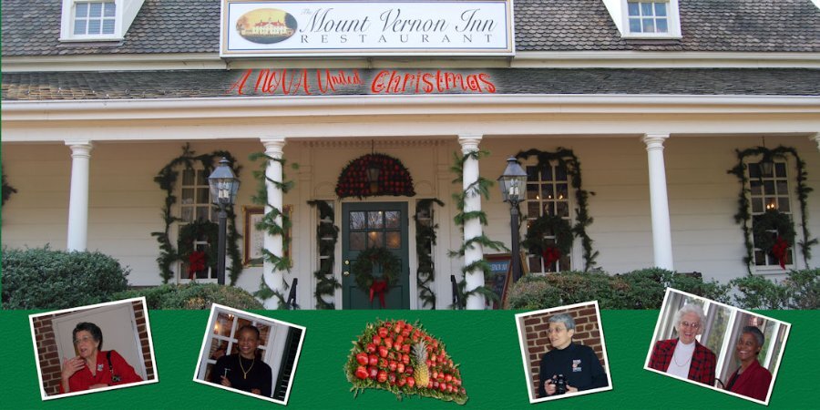
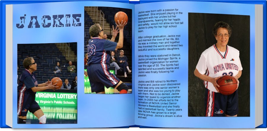
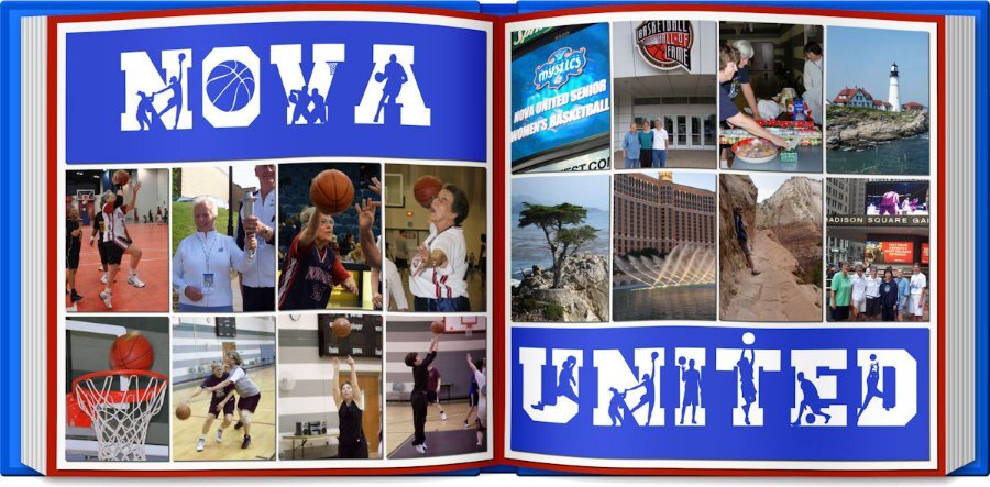
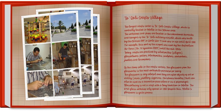
I'm not finished but here is what I have created so far. I decided to use my basketball group as my theme. It has been harder than anticipated as good photos are hard to find. NOVA United celebrates its 20th anniversary this September. This page features some play and places we have played and other projects we participated in. Does not come close to represent everything. I decided to use the open book script...just because.1 point
-
1 point
-
Paper is from digitalscrapbooking from Janet Kemp The mask I made with Cassel's script cass-MaskMaker Font: Flora Garden and Misha Gergoval1 point
-
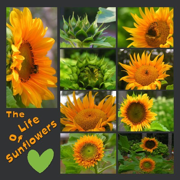
Day 1 I have managed to get some work done this week (between the computer and an external drive) in spite of my full disc. I plan on continuing to work on some more of the lessons this week! I have thoroughly enjoyed all of the fabulous creative work that has been posted during the workshop. My pages were Sunflowers from 2022, they are dwarf Sunflowers that I grew in containers on a tabletop. I live in a woodland setting with spots of sunshine, but I have always loved Sunflowers. I have read that you can't grow them under trees, but I think this proves them wrong! If you don't have much space to garden, I would highly recommend giving dwarf Sunflowers a try it is very rewarding!1 point
-
1 point
-
1 point
-
1 point
-
And here is day 6 and the last of this workshop! The left side of the double page has photos of a few of the lakes to show something more than the mountains which I love so much. On the right side are some details of the country as a whole. The background is as in the lesson but when I had the left single page background I mirrored it to the other page to avoid a noticeable seam. The embellishments I already had done some time ago and could use here again. Between the photos I used the picture tube water. Fonts are: Lucinda calligraphy and Joaquin Regular which I used throughout this Workshop.1 point
-
1 point
-
1 point

Resized.thumb.jpg.d25811db03a63358cedab1e79f527635.jpg)


