Leaderboard
Popular Content
Showing content with the highest reputation on 04/01/2023 in all areas
-
8 points
-
5 points
-
5 points
-
5 points
-
5 points
-
4 points
-
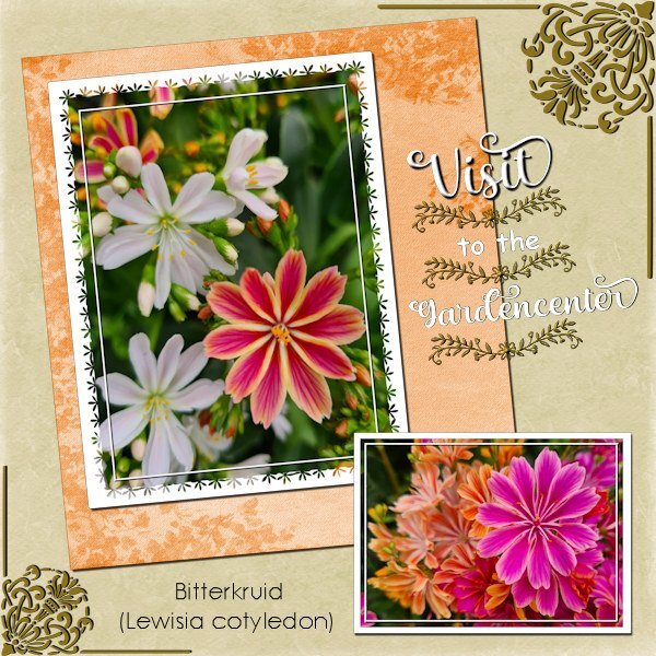
A couple of days ago we went to a gardencenter because we needed some compost and this lovely flowers caught my eye and of course I couldn't resist taking a picture of them. And I needed a change from the Build a Kit Workshop before I will wrap that up! The fonts I used are: Christmas seasonal (why it is called like that is beyond me), Floral dividers (a dingbat) and Century gothic. Background papers come from my stash. I made a simple mask for the biggest of the 2 photos inspired by some of the ones Sue Thomas has done some time ago. This is just a starting point for me in making more and different masks myself.3 points
-
Day #7 Very fun lesson! Fall/Autumn is my favorite time of year. I will definitely Use this Title in the future for a scrapbook page. I have saved the titles in PSP format so that I can still use them, and tweak them if needed. So many possibilities! (so little time) One more day to practice and learn new techniques from this workshop....2 points
-
2 points
-
2 points
-
Julie thank you, our gardencenters are open year round and they sell houseplants as well and all kind of pots and accessories. Most have a small café and we go there often, a specially on gloomy days or weeks for a coffee and a stroll through the glasshouse. Spring isn't great here either, I want a bit of sunshine and am fed up with the rain, wind and cold. The only plus point is that's good for the groundwater levels which were very low after 2 uncommonly dry and hot summers we have had.1 point
-
a semless overlay I made for one of my mini )) i use 2 different hearts shapes and image kaleidoscope you can use it if you want, but only on PU (thanks )1 point
-
1 point
-
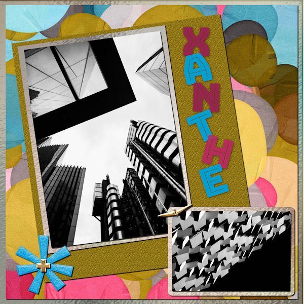
I did the March Sketch Challenge. I used a kit called ps-rachel-martin_xanthe for any papers and elements. The photos are random from Mike Hindle on Unsplash. The font is Bungee Inline and I used the technique taught by Carole in the Text Workshop-Lesson 5 but this time I used a "fatter" font and added texture. I took the title from the name of the kit.1 point
-
I used a kit called ps-rachel martin xanthe for any papers and elements. The photos are random from Mike Hindle on Unsplash. The font is Bungee Inline and I used the technique taught by Carole in the Text Workshop-Lesson 5 but this time I used a "fatter" font and added texture. I took the title from the name of the kit.1 point
-
Thanks Michelle. I did what you pointed out, and it's a bit better. Can't be bothered to reduce & save again to post it a second time. But I'm really glad you pointed out this technique to me.1 point
-
i didn't do anything special Ann. I see above your post that Michele has already posted the explanation. That's how I did it. The magic wand with contiguous unchecked, invert selection, then selection borders. then filled with the color black and then a shadow1 point
-
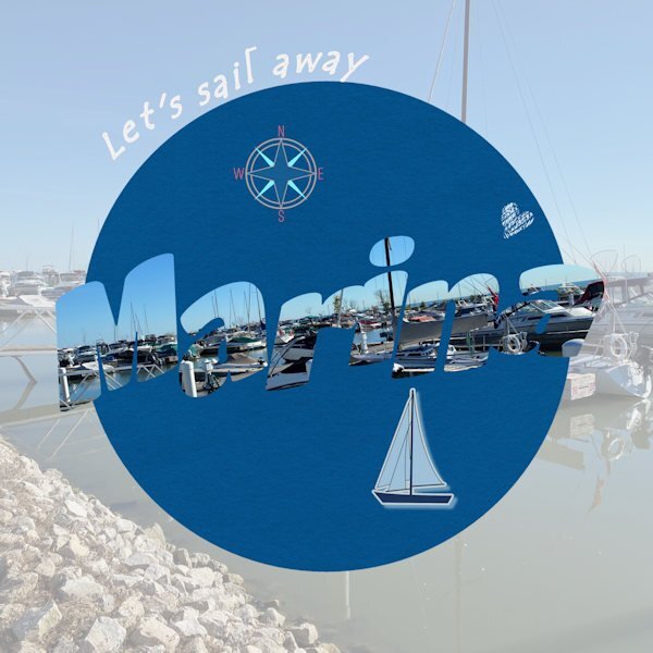
Day 7. Done. The text says "marina" in case it's not easily readable. I find it's often a bit challenging to read the letters when they are cut out as pictures. The photo is mine of the lovely marina we have in our small town on Lake St. Clair (not a Great Lake officially, but part of the system). I really enjoyed this series of lessons and prompts. I used techniques I wasn't familiar with and got a bit improved in some of those. Thanks Carole. Having your templates was a great help as well. I don't do scrapbooking, but I do enjoy just creating layouts for birthdays or other things. Mainly, PSP helps me work with old photos to make them better quality for my history and genealogy projects.1 point
-
1 point
-
1 point
-
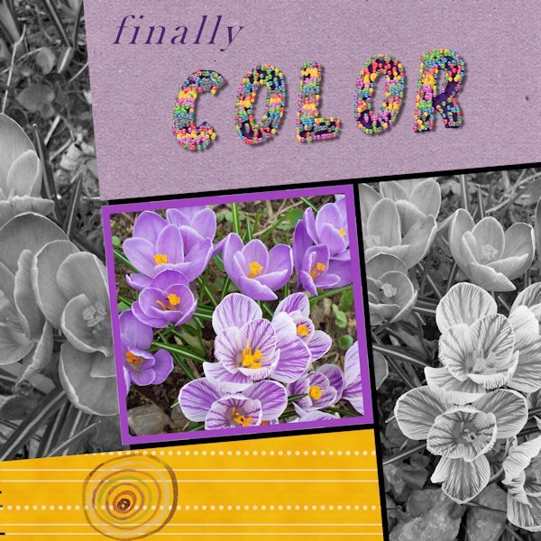
Trying to get caught up. Here is Day 6. There are many things that didn't work out well, but sometimes that has to be good enough. Photo is from my garden a few years ago. The cheerful and welcome little crocus. The title is done with a small colored ball and the vector tube script. It filled each letter entirely....oh well. I wanted colour, and I got colour! (I used American spelling on the layout.)1 point
-
Day 5 : it's not really a scrapbook page, but I didn't like everything I tried, so I tried something else ? Template : Carole Cassel Instead of papers, I used on the bottom layer the effects - texture effects - soft plastic on the second a blend mode The font is Poplar Std1 point
-
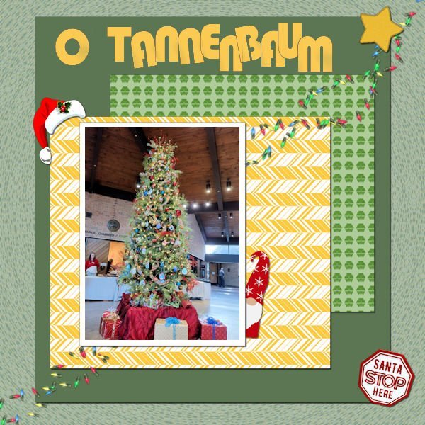
Still working on it. This is workshop 5. The text is Bauhaus 93; the Christmas hat and the star are from Cassel; I'm not sure, but I think the gnome is from Creative Fabrica. I extracted the "Santa Stop Here" sign from another picture of the tree. The scene is from the Germantown (TN) Civic Center Christmas Santa Party for the kids. Yes, Santa was there and I even have a picture of me with Santa!1 point
-
1 point
-
1 point
-
I looked over some tutorials inside the Diamond section, "Meli-Melo Paper" caught my attention and after the video I wanted to try it. It's really easy. I played a lot with the blend mode and opacity, results so cool!! I just used one picture to do my selections. Here the link for those who would be interested: https://scrapbookcampus.com/element-creation-index/meli-melo-paper/1 point


