Leaderboard
Popular Content
Showing content with the highest reputation on 03/30/2023 in all areas
-
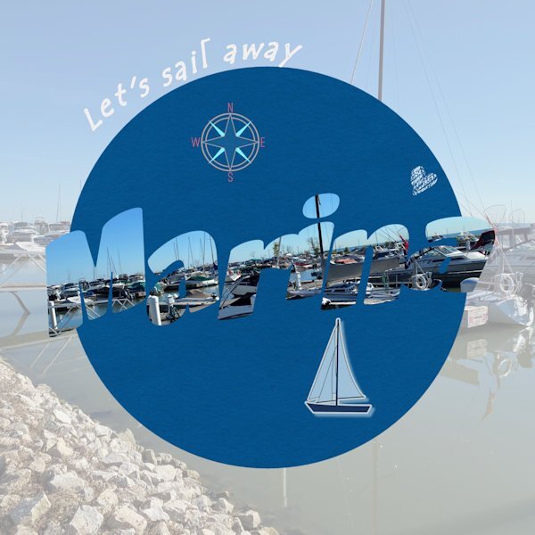
Day 7. Done. The text says "marina" in case it's not easily readable. I find it's often a bit challenging to read the letters when they are cut out as pictures. The photo is mine of the lovely marina we have in our small town on Lake St. Clair (not a Great Lake officially, but part of the system). I really enjoyed this series of lessons and prompts. I used techniques I wasn't familiar with and got a bit improved in some of those. Thanks Carole. Having your templates was a great help as well. I don't do scrapbooking, but I do enjoy just creating layouts for birthdays or other things. Mainly, PSP helps me work with old photos to make them better quality for my history and genealogy projects.9 points
-
5 points
-
I think if you put a border around the letters, they would be more legible. There are several methods you can use, but one of the easier ones is to use the magic wand with contiguous unchecked, invert selection, then select selection borders.3 points
-
3 points
-
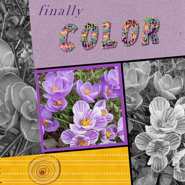
Trying to get caught up. Here is Day 6. There are many things that didn't work out well, but sometimes that has to be good enough. Photo is from my garden a few years ago. The cheerful and welcome little crocus. The title is done with a small colored ball and the vector tube script. It filled each letter entirely....oh well. I wanted colour, and I got colour! (I used American spelling on the layout.)3 points
-
i didn't do anything special Ann. I see above your post that Michele has already posted the explanation. That's how I did it. The magic wand with contiguous unchecked, invert selection, then selection borders. then filled with the color black and then a shadow2 points
-
2 points
-
Do you have any interest in miniatures? Miniature scenes, trains, etc.? If you are interested, there is a TV show currently available on CBC Gem about miniature buildings. I would never be able to reach that level of detail, but I still love to watch them work! When the nice weather will be back, I will get to work some more on the gnome house, and keep you updated. Let's chat!1 point
-
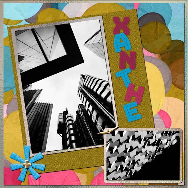
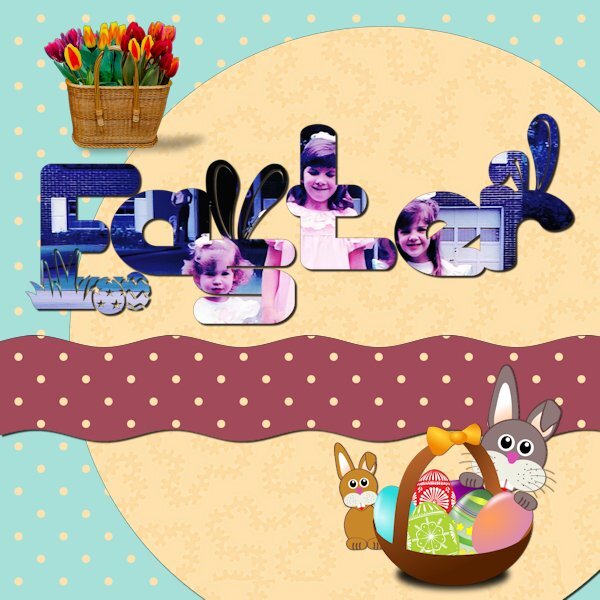
I used a kit called ps-rachel martin xanthe for any papers and elements. The photos are random from Mike Hindle on Unsplash. The font is Bungee Inline and I used the technique taught by Carole in the Text Workshop-Lesson 5 but this time I used a "fatter" font and added texture. I took the title from the name of the kit.1 point
-
Thanks Michelle. I did what you pointed out, and it's a bit better. Can't be bothered to reduce & save again to post it a second time. But I'm really glad you pointed out this technique to me.1 point
-
1 point
-
All the best intentions go flying out of the window when flu visits. It started just about the same time as the Text workshop was ready to go. I thought I might get a bit behind but I have never felt so unwell for many years so was unable to participate as planned. However, not wanting sympathy as eventually I will get better but just wanted to say I have enjoyed seeing every bodies work, some lovely results. Stay safe and well everyone.1 point
-
1 point
-
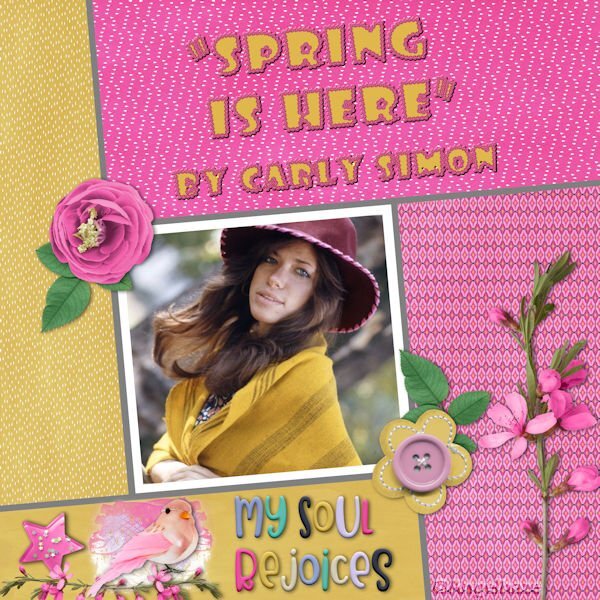
Day 6. Template : Cassel Papers : Marisa Lerin (digitalscrapbook) Font : Simplefire (= monoline font)1 point
-
1 point
-
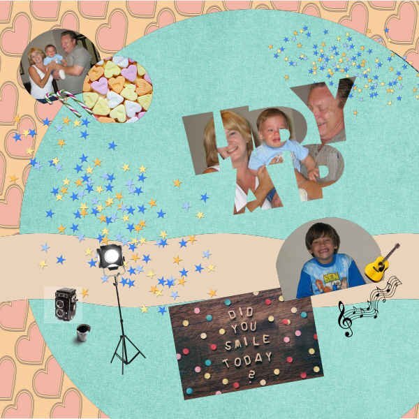
Finally completed Day 7. The photos are of my youngest grandson, who by the way, is now a teenager. Found this one, for some reason, hard. It is still not my best attempt but after two attempts, have given it a go. I am definitely not good at scrapbooking. Needless to say, I have learned a lot thanks to Carole. I have absolutely enjoyed all 7 Days.1 point
-
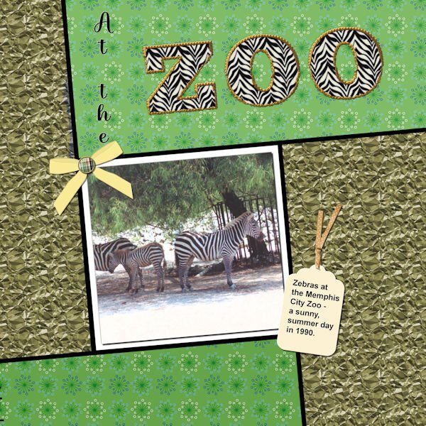
Well, I did complete workshop 6 and will go on to 7 today also. Not too happy with my last couple of layouts - however, the different ways to use text have been interesting. With this one I used a pattern in the letters instead of a color - it was interesting resizing the layout - the zebra pattern didn't want to resize; so I had to close the jpg and then call it forward again - and this time the zebra pattern also resized. The ribbon on the tag is from PS - Gina Jones; the rest of the elements are my own. I think the font I used for the Zoo was something Big Chunk.1 point
-
1 point
-
Day 5 : it's not really a scrapbook page, but I didn't like everything I tried, so I tried something else ? Template : Carole Cassel Instead of papers, I used on the bottom layer the effects - texture effects - soft plastic on the second a blend mode The font is Poplar Std1 point
-
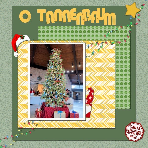
Still working on it. This is workshop 5. The text is Bauhaus 93; the Christmas hat and the star are from Cassel; I'm not sure, but I think the gnome is from Creative Fabrica. I extracted the "Santa Stop Here" sign from another picture of the tree. The scene is from the Germantown (TN) Civic Center Christmas Santa Party for the kids. Yes, Santa was there and I even have a picture of me with Santa!1 point


