Leaderboard


Popular Content
Showing content with the highest reputation on 03/01/2023 in all areas
-
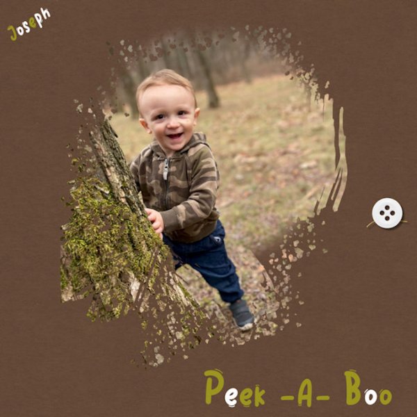
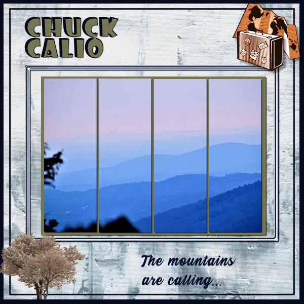
Still working on the masks workshop. This is one of the extra's. Sometimes a mask and the photo are beautiful as they are and just adding the photo completes the lay out (and of course a little bit of text)
 2 points
 -
See if you can adjust other settings for your pen/tablet for Hover, touch, double-touch, etc. And also if your pen has a button. For me, the pen has one and clicking on it while dragging the pen on the tablet allows me to scroll on a web page or drag something. Different devices have different settings, so maybe there is something that you have not explored yet??2 points
-
From the album: Cassel
This layout was done as part of the ADSR2010 (a twist on the Amazing Race)2 points -
There is an article (if you want it printed) on the blog: https://scrapbookcampus.com/2015/12/creating-a-layered-template-from-a-flat-image/2 points
-
Here is my completed entry for the Scraplift Challenge. Title font is Showcard Gothic; journaling is Stay Outside. The background paper is ps_melo-vrijhof_winter-day. The embellishments are all Picture Tubes. I added a mat behind the photos and filled it with a woodgrain pattern and colorized to match the title.
2 points
-
1 point
-
Another extra.? Font is Charlemagne and Augusta
1 point
-
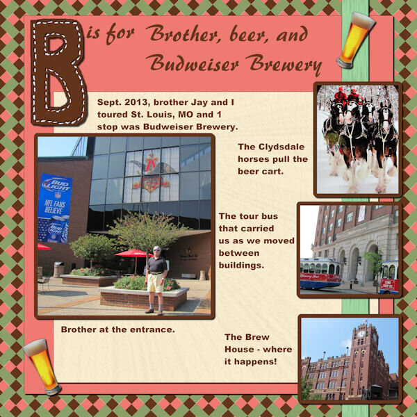
B = Beer (yeah, that was an easy one!)1 point
-
I scrapped the only photos I have from anything related to St. Patrick's Day back in 2012. Also, even though the grandparents of my Dad's mother came from County Kerry Ireland, St. Patrick's Day was not something that was celebrated by Dad and his siblings when growing up. My 2012 layout made with a kit that has long been retired. I'm not sure if the designer is even still designing!
1 point
-
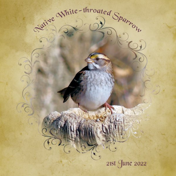
It took me a few seconds to analyze that image as I initially "saw" the tiger fighting with another creature!! Wonderful photo.1 point
-
I have a hard time with the things where using the scroll button of the mouse, with the pen I find that difficult. I also often move things with the pen without wanting to, such as a toolbar for example. That's a problem for me in particular, that it's easier to tap things with the pen that I don't really want to tap. Applying the right click of the mouse, to the pen is also a tricky adjustment for me.. I guess I just need to persevere and be patient1 point
-
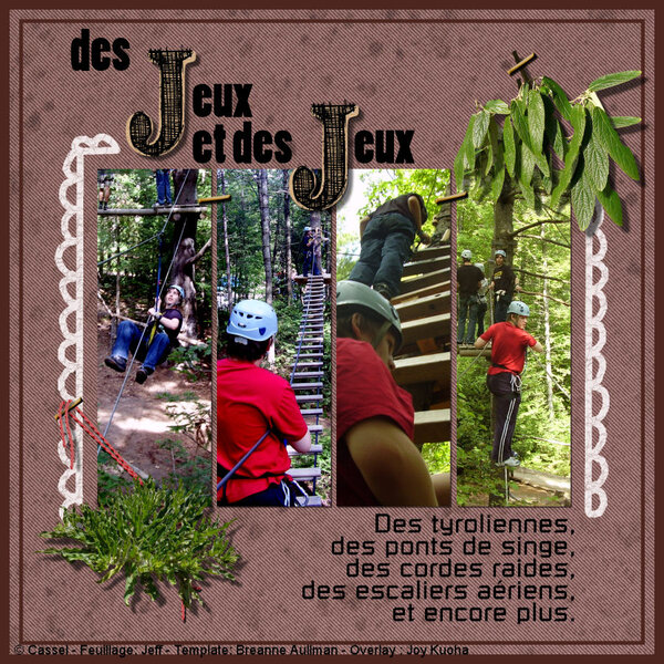
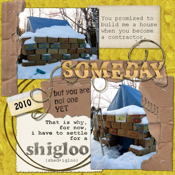
From the album: Cassel
This page is from pictures taken during a "tree trekking" activity. The template used is from a series from Breanne Aullman called A mother is... (I am still looking for the whole set as it is very very old)1 point -
Destined to be a Scraplift! ?1 point
-
Your Beautiful inside and OUT!1 point
-
 So Wonderful I got to be at all 3 of my Childrens graduations from high school I was so Proud of them.1 point
 -
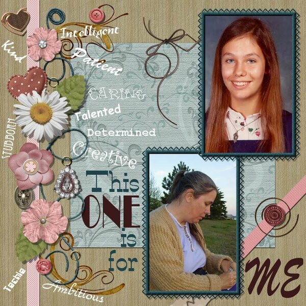
Yes, it is me, in high school and about 10 years ago.1 point
-
Awww its you I thought it was your daughter when I seen this but Its You. You rock your the Best!1 point
-
A new version of lesson 6 ?
1 point
-
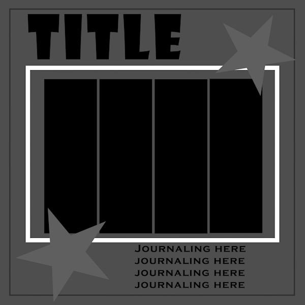
Learning scrapbooking is often done with practice, looking around for inspiration and trying to recreate projects we admire. This challenge will give you an opportunity to personalize a project while trying to "copy" another one. Of course, you will change the title, the text, and the photos, but you will want to try to replicate the arrangements and some of the effects you see. It is a challenge but in the end, you will learn more about scrapbooking and your PaintShop Pro. Here is a simple layout you will want to "scraplift". And if you want more information on "scraplifting", check out this article.1 point
-
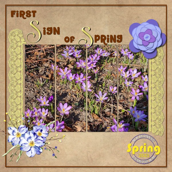
Just today I took some photos of the crocusses that are blooming in a little open space along a footpath near my house and it gave me the idea for this scraplift. The background is from my stash and I used part of a crochet frame. The top flower is made by using the ribbon flower script and the flower bouquet is from CF and I have it for a long time in my stash. The datestamp is a freebe by Carole which I recolored. Fonts are Chirp the CF-freebie from today and Arienne for the letters S. A welcome diversion before I'm starting on the plaid papers for the Build a Kit Workshop.
1 point
-
I used Ann's template...thank you, Ann! The background was an accident but I like it and decided to keep it. I had used a different color and added a texture. Then I decided I didn't like that color so I floodfilled with the green. The texture was underneath and the green didn't fill everything. One of my pickleball players brought cut flowers and gave them to those who wanted them. My daffodils are not blooming yet...budded but not blooming, so I was happy to receive these.
1 point
-
When you say "font for the corners" do you mean dingbats? I'd sure like to know how you do that! Is it selecting the symbol, copying it and then pasting it onto the frame you've made?1 point
-
Scraplifting is one of my favorite challenges. I always start with copying the example and enlarging it to 3600. Then I reduce the colors to grayscale. From there I build a template, keeping the original as my base layer, and filling in shades from black to white for each component, be it full sized paper or embellishment. I make all photo areas black. At the end, I increased the colors to 8bit so there will be a full palette available. Here is my finished template in a reduced version for posting here. I will put the full sized version on our Facebook and the .pspimage in the Files area there for those who want a head start. Feel free to download it and start creating! I will be back with my own new creation in a while. Edit: I did discover that the black areas for photos didn't work in the Raster-to-Mask script until I used Negative Image on them again and they turned white. Then the script was ok.
1 point
-
And now Project 6. My linoleum started out green, but I used Hue Saturation Lightness and changed the color. Title font is Aryaduta (CF). I extracted the chess pieces (only the white ones - I used Brightness and Contrast for the black pieces (duplicate copies of the white ones). Fun with the curled ribbon made with a script from Cassel. This mask is the one I talked about in the previous post - I made it with the watercolor brushes and some interesting twiggy brushes around the edges. I inner bevelled and drop shadowed the title. The white swirlly things on the paper in back of the masked picture were made with a brush I had made earlier playing around with the fancy squiggles and things that come with some of the fonts. I had forgotten how you made linoleum. I think I will play around with that again when I finally finish this workshop. One more project to go.
1 point
-
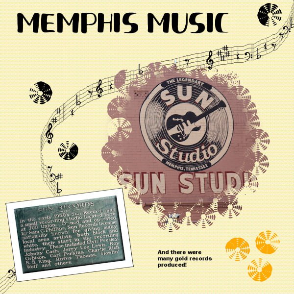
Project 5. Still behind. Using several layers for the background and the top layer was a pattern from a previous project and the blend mode. There is a brush that looks like a record (kind of) so I used that for around the original circle mask. I also used it for the records as elements. The font was Fresh Hansler Duo (CF) for the title. I used some different settings than I usually use for the Sun Records placque - inner bevel, and I used chisel on the paper behind it. This has been a challenging workshop and I do intend to finish it. I played around with creating a mask from those watercolor brushes from an earlier project and I'm also going to post a layout using the one I developed that uses some odd but interesting brushes around the edges. I think I learned more about blend modes this time as well as refreshing my understanding of how to make a mask. Anyway, it has been most interesting.
1 point
-
Day 6 Diamond Extra. I tweaked the blue frame by the little circle. Made it bigger and used it as a frame, as the inner frame seemed distracting. It was hard to find a background I liked. I tried many versions of the lino paper but could find one I liked. Used a gradient that seemed like the sky... and now having typed that I could have found a photo with the actual sky. Font is Adobe Devanagari and the water droplets on the sign are from Digital Scrapbook - Jessica Dunn Coastal Spring Water Droplets. You can see in the smaller photo that I was shooting through the window. You can see a reflection, sometimes there is no getting away from it. Angle of incidence equals the angle of reflection... sometimes you just cant get out of the angle. I hate physics.
1 point
-
Day 5 I was stuck when learning this, but then it all came to me after a bunch of tries, and I just love it. I can't wait to continue to use this. ? I used a scattered hearts brush around the photo
1 point
-
There are so many posts for the masking workshop, I just can't keep up with them all! But I'm delighted to see so many creative layouts and projects. So many talented folks in this group who are willing to share. I just love it! I still need to work on Day 6, but no time today.1 point
-
I ended up using the mask to "extract" the bird. The double, transparent frame is a PSP frame. The chains are a Picture Tube. I made the rings from circular selections, filled with a gold gradient. The bird photo is by Kim Gragert. Kestrels are pretty, colorful little falcons but I've never seen one in person.
1 point
-
Day 4 Masks Workshop - thanks Carole, I didn't even notice the straight line on that day 3 picture. Here's Day 4 with some extra effects.
1 point
-
Day 5. I'm burning the mid night oil, after a most enjoyable day hiking in the river hills, in mild weather for the time of year. I used 2 overlays for the background paper. Created a mask using a swirl brush and the vector paint script. All I had to do was apply that mask to the photo. (layers, new mask layer, from image)
1 point
-
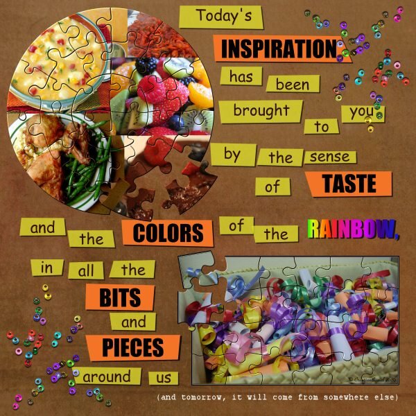
From the album: Cassel
Just a fun layout using the journaling strips script.1 point -

From the album: Cassel
One of the very few times I let the kids play with paint, was OUTSIDE. They ended up so dirty that we needed the pool to wash them.1 point -

From the album: Cassel
Would be fun to do all those things!1 point -
From the album: Cassel
A fun example of colored focus in a photo and out-of-bound.1 point -
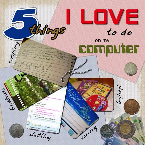
From the album: Cassel
All elements of my own. Did you know that PSP does not like to manipulate images of currencies??1 point -
1 point


Resized.thumb.jpg.d25811db03a63358cedab1e79f527635.jpg)