Leaderboard
Popular Content
Showing content with the highest reputation on 02/22/2023 in all areas
-
8 points
-
7 points
-
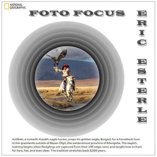
Playing with Carole's Offset Cutout template, I turned every layer to negative and came up with this. I subscribe to Nat Geo and they announced their yearly photo winners. This guy didn't make first place, but his work is the one I liked the best. I may keep this as a template myself to do more. Could be similar to Michele's Fab Divas series. The font is Wide Latin treated to a cutout effect. The journaling is from the magazine as is the logo. I turned the Raster 1 Shadow layer at the bottom into a mask for the photo.6 points
-
5 points
-
5 points
-
4 points
-
Day 5 Paper : Marisa Lerin , Digitalscrapbook Font : Fly Watercolor flower is a freebie, I don't know where this comes from anymore.4 points
-
Day 4 Filmstrip Cassel Cluster : freebie connieprince.com Paper : Saskia Veldhoen on Digitalscrapbook, Commons Font : Sun Island4 points
-
3 points
-
3 points
-
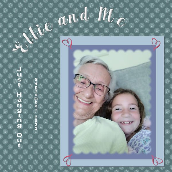
This is my project 7. finally finished the workshop. whew!!! Had fun playing. The background is the combo polka dot - learned that in one of the previous labs I was doing. I put a "squiggle" from one of the fonts that I imported as a brush. (What fun!) And I used that squiggle brush in the four corners of the papers behind the mask. Ellie is the great granddaughter of my cousin that I visit every year in Illinois. She is a barrel of fun. The font is Arlington Script (the only font factory I go to is Creative Fabrica). I chiseled and inner bevelled the title. The journaling is in Arial (2 different sizes). The original polka dot was a deep pink with a white heart squiggle, so the polka dot part of the paper is in the luminance blend mode as the background paper is a deep blue green. Fun, fun, fun!3 points
-
We have the cuckoo in the UK too. I miss their very distinctive call. Also cuckoo spit, which has nothing to do with the cuckoo bird, but liquid excreted by nymph of the spittlebug2 points
-
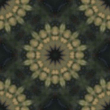
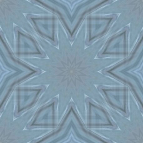
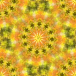
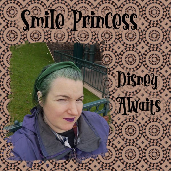
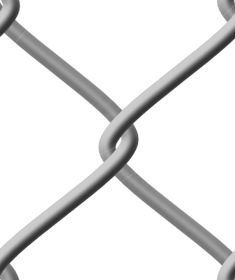
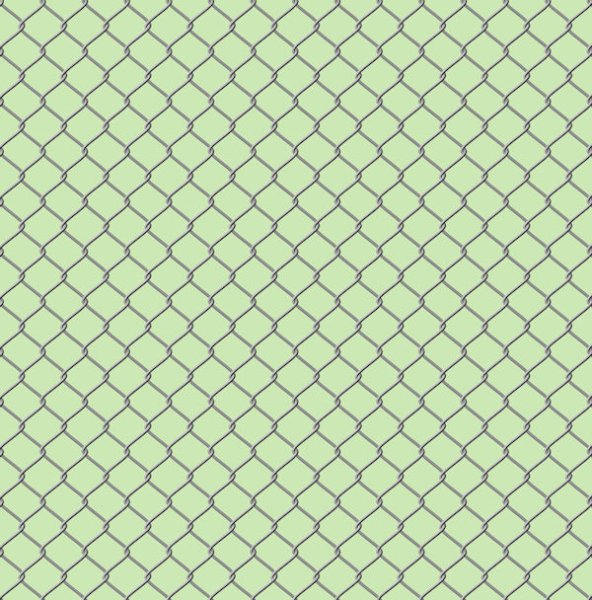
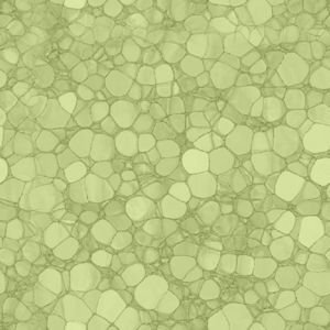
An example of a seamless tile I did some time ago for a layout. Instead of that page I show the tile and a page filled with it. I have made a lot of hem with the kaleidoskop, or of plaids but as they are intended for a particular layout I stopped saving those and simply make new ones that suits the new project. I found that I never reuse those, so I save only the more generic ones.1 point
-
Interesting to read about those birds. Over here we have the "Koekoek" or Cuckoo that lays its eggs in other birds nests.1 point
-
1 point
-
1 point
-
No long weekend for me. If the holiday is a Monday we do some of the work on Friday but still have to work on the holiday Monday. But Normally I have Thursday and now Fridays off. So, I get a 4 day weekend whenever there isnt a long weekend. Which is a lot more weekends than long weekends in the year. I did tons of mask fun with PSP this past weekend, like I'm sure a lot of others did too. The big cram session to get all the lessons completed.1 point
-
1 point
-
1 point
-
I'm finally getting a bit more confident playing with the settings, just found out why my floodfilled backgroundpaper had holes in it where the mask was. Floodfilling all layers wasn't such a great idea ? Uncheked, floodfilled again and it was right ?1 point
-
I had so much fun doing this one. The dancers are from CF's Dance-Marathon-Watercolor-Animals-Set. I'm really getting my money's worth from my subscription lately! The font is Party Dance which, I think, was in my system fonts. I tried to add a texture to the background layer to match what was on the paint splotches.1 point
-
1 point
-
That is my pick tool these days. I used perspective ONCE and now it goes to it every time, even when I'm using the pick tool set to scale multiple times in a few minutes.0 points


