Leaderboard
Popular Content
Showing content with the highest reputation on 02/02/2023 in all areas
-
5 points
-
Should I put a shadow with the netting? I opted not to because it just really made the whole bit darker and I didn't care for that look. But maybe there are settings that might work that I don't know about. (Currently using PSP 2022) This is my first time using a pocket template and I'd appreciate any comments on what I could do to make the layout better. I care for dogs (and cats) in my job and this is my showcase of January's clients (though I just realized I left out three so I will have to do it all over again anyway). I was thinking about doing a page or two like this every month and at the end of the year have them made into a book at Shutterfly at the end of the year to give as thank you gifts to my clients. Anyway, I'd appreciate your comments. And thanks to Carole for her masterclass on Pocket Scrapbooking. It helped a lot.3 points
-
Oh... it was supposed to be in the newsletter. First prize - Kasany - PSP2023 Second prize - Thomas - 2 months of DIAMOND membership Third prize - Tonimarie - $25 in the store Thank you to all the participants. The winners were already contacted. I apologize for forgetting to add the results to the newsletter.3 points
-
Well here is my promised Easteregg as a stencil. I'm going to use it on a card, but I have time enough to do so later. I'm not completely finished with customizing and exploring my new PSP 2023, but I wanted to finished this one first. The little eggs inside the big one come mostly from my stash and some came from Carole as freebies and some I just colored. I think the bunny was a freebie by CF some time ago3 points
-
2 points
-
2 points
-
Okay - Ive been playing too - not yet with that stencil beautiful stuff you are posting, but somewhere someone used a background paper that I think came from CF. I had made abstract paper in one of the previous labs I've been working on and I thought - well let's see if I can put glitters on it too. So I did one with gold glitters and one with silver glitters and then did one with an expanded glitter of silver that I put in my winter folder. So here goes.2 points
-
I just read that the Diamond members are getting new masks, so I'm pretty exicted!!!! Carole thank you so much for making the Workshop attractive for all of us!2 points
-
2 points
-
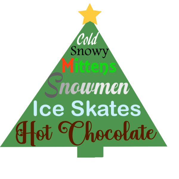
I can't seem to get my mojo going. Lagged behind because Lab 10 Mod 12 wants to do a word art in the form of a tree (since it is December's mod, a Christmas tree); the holly and berries are no big deal since I've been practicing with the pen tool and practicing using the tablet and pen, but that word art form just escapes me. I think the words are OK, but I don't like it with what I have in the background of the words and I didn't save the pspimage like I should have. So now I will have to start over. Although I'm ashamed of it, I will show you what I did. You might have suggestions.1 point
-
Corrie-I love your Easter egg stencil. It looks like it was quite a bit of work. I still have not made up my mind on getting 2023 yet. Good luck with your set up.1 point
-
Ann-I agree with you "Laughing Chettah" If it was a human I think it would have been the reaction to a leg slapping laugh after a really funny joke.1 point
-
Ha ha! I was going to label it Laughing Cheetah, but Sleepy works, too!1 point
-
1 point
-
1 point
-
1 point
-
Michele, you constantly produce superb pages. I'm a huge fan of Carole's punches too! I agree I would love to see a new set of edge punches. I also use then to create decorative borders/ corners on labels, and tags.1 point
-
I just LOVE Cassel's Punches; I used her Edge Punches to make the black border around the dancing people. Such an easy way to "dress up" your page. I would love to see a new set of Edge Punches (hint-hint). The font is Grenadier NF from 1001Fonts.1 point
-
I tried the 2nd part of LAB 13-1 tonight. Finding the right font is key, I didnt get enough overlap on some letters to make it look as nice as Carole's example. I put the same texture on all of it because it looked like it was painted on a cement wall. It probably wont show in the smaller size. Font is called Listing Packs (weird, I know), probably from Creative Fabrica. My font program came with access to Google fonts so now they are all mixed in and I dont know who came from where. This is just me trying the exercise, I think I would do it differently next time adding some pattern to the letters. My head got muddled up when I was remembering which letter was behind of in front of the other. It was fun to do though, and any vector practice is good for me. Realized I didnt put shadows in, here it is with shadows.1 point
-
It would depend on the format they come in. I have a a couple of tutorials on using masks: How to use masks? Using transparent masks But we will go in further details during the Workshop.1 point
-
Carole: Is there any way we can get some instruction on using pre-made masks? I have several but don't know how to use them. Thanks!1 point
-
I will participate too, I liked the previous classes about masks, so here I am again ?1 point
-
1 point
-
here is my project 4, a visit in a museum in Berlin , credits are all in gallery1 point


.jpg.655797a277cde850629806162db74b66.jpg)


