Leaderboard
Popular Content
Showing content with the highest reputation on 01/09/2023 in all areas
-
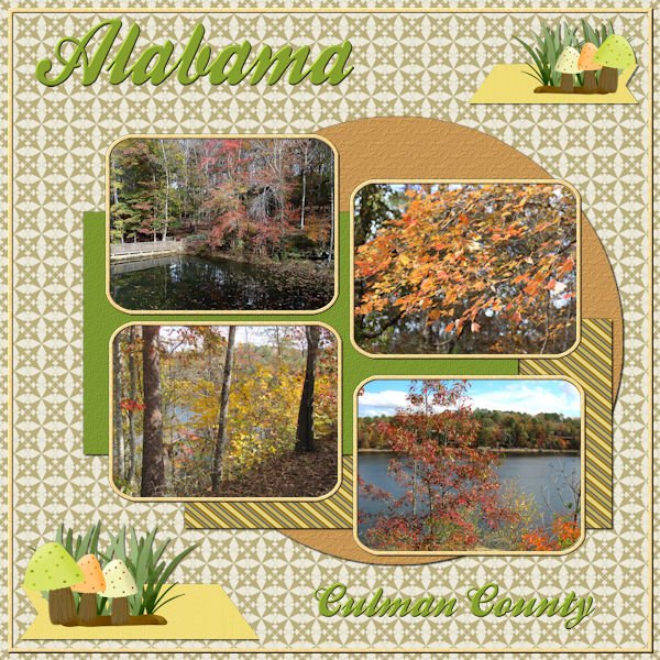
Lab 10 Mod 10. Requirements: Cross pattern - made several papers and the background is one; Grosgrain Ribbon - made several and the short ribbon in the cluster is one of them; Mushroom - this was interesting - made several and grouped them here with a piece of grass from Creative Fabrica. Rest of the stuff is from my stash. The font is Ballpark. The pictures were taken by me and Laurie on a trip there in 2020.6 points
-
5 points
-
I am participating in a month long challenge at The Lily Pad and today was the first challenge that was a "Technique" challenge. It required blending a photo into a background using layers of paint, gesso, or watercolor (all items had to be from the store on the website). They wanted more than one mask layer and to use blending if possible. I used 7 mask layers (6 paint, 1 gesso). I'm thankful for the Mask workshop earlier this year and this challenge helped to reinforce what I learned.3 points
-
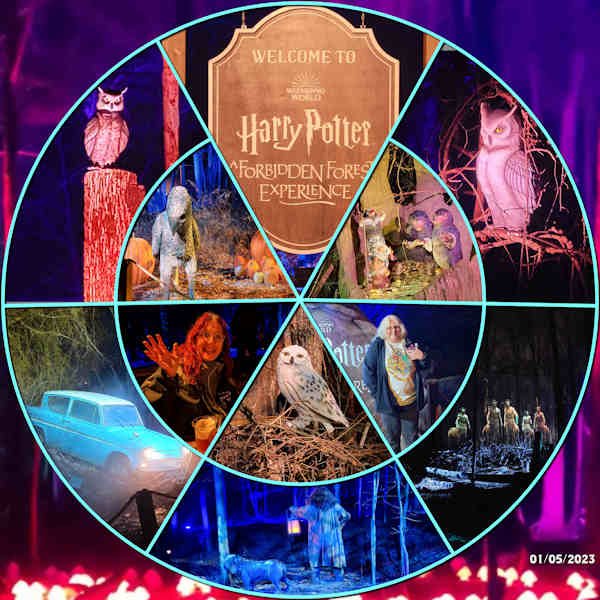
Since I already did a Year in Review, I took the new template and used it for a layout of my daughter, Laurey and her friend, Kim, when they visited the Harry Potter Forbidden Forest Experience in nearby Westchester County, NY, this past week. I used part of one of the photos as a background. The whole thing is very simple, but the photos speak for themselves!3 points
-
2 points
-
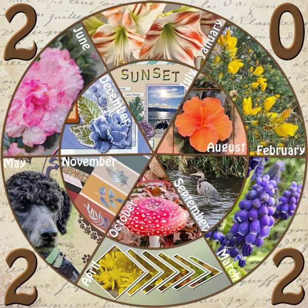
I guess I should also show what I do, when I am not recording videos! In summary: January: my husbnd showing off his new kitchen attire (he loves to cook and bake) February: an accident a few hundred meters from our house torn down an electric pole. Power failure for a few hours March: a little visit to the ER. Nothing serious although concerning for me April: yes, still getting some snow May: a little present sent by someone I have helped with her PSP. Lovely notebook! June: a visit in Ottawa, where I met 3 "colleagues" from Corel July: cookies for Xavier's 2nd birthday (no I didn't make the cookies) August: at my age, first encounter with... lice! September: upgrading the kitchen to add a backsplash but we also have to move one counter by about an inch! October: leaf raking with the grandson November: visit to Montreal and a tour of Illumi December: a little peek-a-boo cat made for Xavier's quiet book.2 points
-
I found the "Year in Review" freebie template in the store while looking for something else. I used it pretty much as is, just a background with some text and some coloring. For each month I choose a project from that month that I did for that month. Because there isn't space for the whole layouts I took a detail from each.2 points
-
Cass gave us a bargello sample pattern that perfectly matched the girls I used for this! Thanks, Carole. (The font is Argaka Fashion from Fontspace.)2 points
-
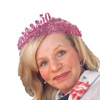
My daughter asked me to make an itinerary for when her best friend visits her in Savannah, GA. I decided to make a card with the itinerary inside. So far, I have made the back and front of the letter size card. It will be printed on card paper. Heidi loves pink and loves glitter. The glitter is from Creative Fabrica, the plane and tag on the luggage are from Digital Scrapbook, the newspaper mockup is from Deal Jumbo, the suitcase is from lsj designs, the tiara a free brush from Brusheezy, the old maps are of old Savannah downloaded from the Library of Congress, and the the airport map is from Google. I plan on using a color version of Heidi for the inside which hasn't been started yet. Beth, fortunately, gave plenty of time. My husband did the proofreading and saved me some embarrassment.2 points
-
Yeah. That is why I made some tutorials to guide you all. Review them here. Maybe it will help make it a little simpler?1 point
-
I think you did a great job. Often, if you make fewer waves, or narrower, it makes it look "simpler".1 point
-
1 point
-
OK, here are a couple of pointers: - I think that you could add (or add more) shadows on the photos and the blue paper. - I love the goalie in the middle. With a cast shadow, it would make it stand out (pun intended) Will you get it printed for him? If so, make a version with his name instead of a reference to "my grandson". It might be a nice frame to hang in his room!1 point
-
There are some example screenshots in the main post about the challenge but they are all from PS. They do try to link to tutorials for other software and the one they linked to for PSP was from the Corel How-To Guide on Using Photo Masks. And, that one doesn't really go into what the actual technique challenge is about. I ended up looking at the Mask Masterclass handout to see if that would help but actually found better help in the Mask Workshop (Lesson 3) and a blog post about Using transparent masks from April 2, 2015.1 point
-
Great idea with the template Ann. Rene, that is exactly what I want to do. Lots of blending with paints, gesso and watercolor. Did they also have tutorials on how to do that? I will work more on masks in the new year as I really want to learn that really blended background and getting the edges of layers brushed out etc. Alas, January is for cleaning out/culling all the clutter in my house...and hopefully my computer. changes in hours at work and losing more paper runs on the press (newspaper industry) should leave me with more time. I will try and use it well. I bought the yearly membership so I didnt have to worry about the loss of income. And because I got a gift of money to my Paypal account! they say when one door closes (my hours) another door opens (a wonderful gift of creativity with another year of instruction). I am really looking forward to the February workshop. It is daunting, but I know I will come out with a completed kit at the end.1 point
-
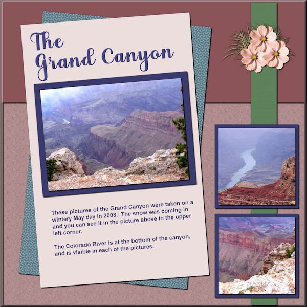
Here is my take on the Sketch. The pictures of the Grand Canyon were taken by me on a trip we took in 2008. Winter hung on a long time that year and though it was in the later part of May, snow was coming in as we drove through the South Rim road. I really wanted to take pictures of the Colorado River at the bottom of the canyon and it really showed up as we drove further down the road and stopped off at one of the areas where you could get close to the edge. The colors used were from the palette obtained with the 2nd Palette Script. I also used the ClipToIt script. I made a pspimage template of the sketch. All the elements and papers are mine. The title font is Aryaduta.1 point
-
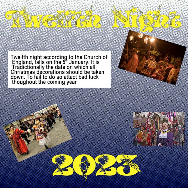
Hi, It's 12th night, the night when all Christmas decoration should be taken down and in victorian times was celebrated by a family meal. Well yes my daughter came over and had a cup of coffee while helping us take down our decorations. Is anyone else who takes down their decorations etc today? It's considered bad luck to leave your Christmas decorations after today. The background to this was a gradient with Effects> Artistic Effects>Halftones with the settings of square 22; Screen Angles 1. = 120; 2. = 103; 3. = 133; with the Use Overlay box ticked and the Blend Mode set to Luminance. the Opacity of 55 and the Colour Scheme at RGB. The photos are taken from the internet; the title text was a font called "NEWYEAR" with the journal text is just ARIAL.1 point
-
The elements, font and graphics were all from Creative Fabrica. Another day of learning. That was a fun one.1 point
-
1 point
-
1 point


