

middie
-
Posts
25 -
Joined
-
Last visited
-
Days Won
1
Content Type
Profiles
Gallery
Forums
Posts posted by middie
-
-
14 hours ago, Jeni Simpson said:
I agree, Middie, I played with many different options with the size of tube to shapes to add the tube to. The font you have used for your creations is fabulous, and works so well in this instance.
I have always loved doing Richie Dumlao's tutorials using the ampersand. It is such a beautiful shape. I also loved the x shape, Gill Sans Ultra Bold. I tried several different fonts and shapes, there is so much to enjoy with this day 6 vector tutorial.Enjoyment yes, but lots of tedium in finding letters and tubes & tube settings that gel together perfectly. I probably need basic lessons in using picture tubes. The more you learn the more you need to learn... it never ends.....
-
 2
2
-
 2
2
-
-
Lesson 6 assignment is attached. Love that script..... you can play with all sorts of variations before committing to one. I got a bit lost in all the tube settings so went back to the basics. However, I am noticing that I am getting a small "dot" if you will at the same bottom right of the capital M no matter what setttings I am using. Is this just an artifact of that particular tube? I had tried with a flower tube but got some gaps in the sharper inside corners of the M despite the tube being set at continuous so I guess that the size of the angular space has to do with the flower tube fitting in that space. But I still can't figure out that dot on the sample below..

-
5
-
6
-
-
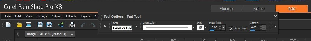
21 hours ago, Jeni Simpson said:
I am lost in lesson 5. I work in x8 and I cannot find how to get the text in the right place on the bottom of my circle. I cannot find a 'more options' button to alter the offset. Does anyone know where this might be in x8?
JeniHi Jeni. I had the same problem with PSPX8. I eventually found it, not in a popup box, but a bit further along in the text toolbar at the top. You won't see it until you click on one of those teeny faint arrows to expand the toolbar. It should appear to the right of the mitre limit area and just to the immediate right of the warp text. Screenshot of my PSPX8 text toolbar is enclosed.
-
2
-
 1
1
-
-
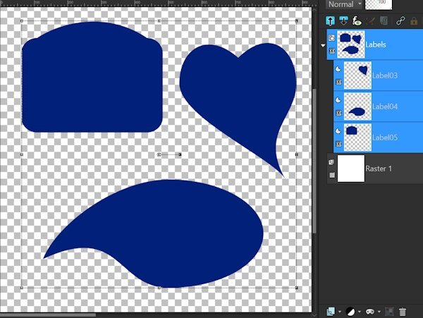
Second parts of lesson5 is enclosed. The image (which does look a lot like me) is from Pngtree where I have a premium subscription.
-
1
-
 7
7
-
5
-
-
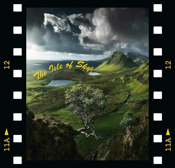
Getting better.... only took 3 tries to get these assignments done. the first is enclosed.... sending second one separately as I am not sure if the two together will create issues. This one doesn't fare well in a small size but it is gorgeous as a wallpaper. Couldn't resist adding the frame.
-
8
-
-
32 minutes ago, Susan Ewart said:
Lesson 3
I thought everything was going great. Somehow my anti alias got unchecked. I wondered why things were so jaggy despite not being that zoomed in. Ah, the newbie in me rearing it's mistake-ridden head again. I will post what I did so far because I'm out of time now. I did the camera parts as different objects that I WAS going save as a preset shape. I liked the camera (from the summer collection download) so I will do it again, I can sure use the extra practice since I see some mistakes I want to fix. I also showed the outline on the camera so you could see the parts. I need to go bang my head against the wall and repeat: Anti Alias ALWAYS checked. If I had a blackboard I'd write lines too! 😩

Don't bang your head against a wall as it achieves nothing. Eat choclate or shortbraed instead - calories are calming..... vey calming..... as I munch away during this lesson.
-
2
-
4
-
-
13 hours ago, Cassel said:
@Jeni Simpson Glad that you are learning. Vectors will be less intimidating with practice.
@Michele Take care of yourself. The lessons will wait!
@Cristina Those multiple checks will become second nature. How are you getting an outline through both sides of the mug? If you make a cutout, it should not show a line through the handle.
@Trevor Andrew Yes, it requires practice to switch like that quickly. Over time, you will do it automatically, without getting frustrated. And yes, the forum only takes jpg images 🙂
@Jnet Allard That is a good start! you are really doing good.
@Ann Seeber You are catching up well!
@Gerry Landreth Great practice. I like that leave that you outlined from a photo!
@Cindy Sheets You will get there. It will get easier and easier with practice.
@Louyse Toupin Great work. Was it getting easier?
@Bonnie Borntrager You are getting the hang of it!
@Donna Sillia Yes!! It looks great for that re-try!
@Jen Brown There are all kinds of "wonky hearts" and many of them are available as fonts. Why not as preset shapes?
@Alicia Garbelman It is great that you are persevering!
@Corrie Kinkel Great work. Those little holes on the eggs are fine the way they are! As you say, you can always tweak them if needed.
@Anja Pelzer That is a really cool composition!
@middie Your shape did survive the kiln here! 🙂 Do you know that there is a way to "simulate" some of the layer styles? Using the Sculpture effect (yeah, not the most obvious).
@Emerald Jay That is good. Do you still have to read the steps one by one to do the cutout?
Keep it up. You are all doing great. I hope you are getting more comfortable with the vectors and the nodes now.
I tried that "sculpture" effect a couple of times but it never seems to give me what I want. It is great for some things (especially grungy stuff) but not for delicate brocade or lace effects. So, when in doubt, buy or borrow from people who are far better than I am at this stuff.
-
3
-
-
19 hours ago, Cassel said:
@Mary Solaas Good work. Yes, the Layer Styles are the way to go if you want to add glow or shadows to a vector. I am not covering it in the lessons as people already have enough with the nodes!
@Jeni Simpson I hope you are feeling more comfortable after all those labels!
@Emerald Jay Great assignments. Simple but you did what was asked. You worked hard on that maple leaf! And you now have a great preset shape to reuse endlessly!
@Cristina Yes, I agree that if you don't click on the right place, you "lose" it and have to click again. It is annoying but with practice, it becomes just part of working with them. That flower is great!
@Anja Pelzer Great work on both assignments! Is it getting easier?
@Ron Yarborough Yes, vectors are often feared by many PSP users. Hopefully, you will also feel more confident once you go through the lessons. Looking forward to seeing your assignments too.
@Trevor Andrew Yes there is a lot of switching node type. I am not sure why one cannot start with a cusp. Maybe there is a reason, but I just don't know it. As for a shortcut, Ctrl-S is supposed to be for Save as... not changing to Cusp. I don't think there is any shortcut for those nodes.
@Donna Sillia I would rather you don't use that script to create vectors as the workshop is to help you edit them. Once you are comfortable editing the nodes, then you can take shortcuts to start the initial path and edit it later.
@Alicia Garbelman Yes, using food items is a good way to play with those nodes and paths. Those leaves are great!
@Jnet Allard Welcome back. You started very well with this lesson. Keep it up!
@Susan Ewart Yes, sometimes, the arms are very short. That is one situation where changing them to symmetric might make both ends the length of the longest one, which then allows you to grab them correctly. You are moving along quite well!
@Julie MagerkaDon't dispair. The "holes" in the middle will come in a different lesson as a cutout. It requires extra steps otherwise, every path wants to be filled the same way. Keep that image, and you will see, tomorrow.
@Louyse Toupin Great labels. Maybe you can use them in a project soon.
@Corrie Kinkel Great flowers! See, with practice, you will get to aim on the right place on the nodes and get going smoothly.
@Gerry Landreth Too bad the cats are so demanding!!! 🙂
@middie That is a great question about managing all those preset shapes. See, when you export the preset shapes, they are likely saved in the folder in My Documents > Corel PaintShop Pro > [version number] > Preset shapes. Simply go to that folder and delete the ones you don't want to keep. They should be .pspshape files. As for Photoshop, if you have access to it, it is fine. Each program has its strengths and each one has features the other doesn't have (Photoshop does not have scripts or picture tubes!)
We have over 150 people who signed up for this workshop. If you are registered and following the tutorials, don't be shy. We have all been beginners, and we know how it is. Show us your assignments, and over time, we will cheer your progress too!
For Cassel - Thank you for that deletion information. PSP can get bloated if you are not careful and I always like to bury my mistakes as I get better. I agree about the scripts & picture tubes for PSP. I must have about 95% of the ones in your shop. I guess that PS actions are the closest to PSP scripts but I find the PS actions to be "clunky" and the PSP scripts to have more finesse. I do love the PS layer styles though, especially any that have to do with brocade or lace. I start my projects in PSP, import to PS for the styles, then import back to PSP to complete the project. It took me a while to learn how to manage that without creating a disaster. My photography club has been trying to get me into Lightroom but that is were I draw the line. I can create rolling fog, rain with lightening flashes, softly falling snow, and blowing leaves in PSP9 & AS which is more than they can do.
-
4
-
-
Lesson4 - nothing fancy. Just tried to get the nodes & layers right. looks like something I did in my first pottery class (it didn't survive the kiln).
-
1
-
5
-
-
3 hours ago, Gerry Landreth said:
Day 2 - I started over a couple of times today, but overall, it was easier.
Carole: Unfortunately, the cats are not supervisory material. Ever since River watched a documentary on ancient Egypt, she has constantly reminded me that her ancestors were worshiped and that she needs to be fanned.
It's true what they say..... dogs have masters and cats have servants.
-
1
-
6
-
1
-
-
5 hours ago, Julie Magerka said:
Oh no Jnet! Losing all your passwords will make so much work for you, and on top of a move! I am sorry for you.
Been there... had to do that. Once I found out how to call up a list of all the passwords and their sites in my computer's memory, I print out the list every month (as I change my passwords often as recommended). That way, I have the currrent ones as well as the previous ones. I never want to have to go through that pain of loosing them all again. I hope that you get your passwords and accounts sorted out.
-
6
-
-
5 hours ago, Julie Magerka said:
It seems to me that PSP is better suited to working with rasters. If I decide I am going to be a Vector Artist (fat chance), I would need a different program. But I like that I can do a little bit of vector work at least within PSP. And that's good enough for me!
I think that working with vectors in any program is going to be tough. I am going to do a couple of Photoshop lessons later this year and see if it is any easier there. My preference is always PSP but I was tempted to use Photoshop for some specifical applications (like all the lovely styles that you find in scrapbooking bundles and in some of the online shops). I will probably switch back & forth once I master both. At least PSP is less expensive, there are way more free online tuitorials & Cassel is always helpful. With Photoshop, you sort of are thrown to the wolves.
-
5
-
-
On 6/18/2024 at 6:13 PM, Julie Magerka said:
They don't just multiply, they seem to change from one node type to another or be unavailable to work with. They are diabolical!
I believe that the adjective that you are looking for is "mephistophelian" derived from an evil spirit to whom Faust sold his soul.
-
4
-
 1
1
-
-
Lesson 3 went more smoothly as long as I zoomed in to add nodes, otherwise they end up all over the place. I do have a question. At the end of the classes, how do we delete all our admittedly poor first attempts at saving the shapes so that they do not clutter up our shapes library? I am sure that I will get better at these over time & I doubt that I will want to reuse my pathetic initial assignments. Can I just delete the pspimage file in my documents or do I have to also delecte them somehow from the shapes library?
-
3
-
8
-
-
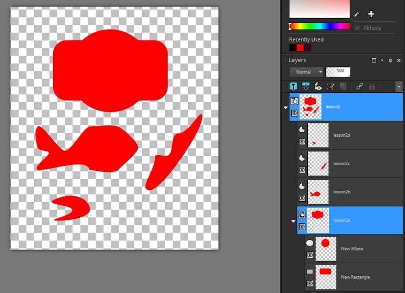
Sorry but I finshed lesson 2 & forgot to post it. Been distracted by that massive heat dome over our area & the fact that our electricity has been out so no airconditioning all day today. I didn't get fancy with this one, just tried to get the nodes & grouping right.
-
1
-
-
26 minutes ago, Anja Pelzer said:
if you watch the video from day 2, Carole shows it, Psp has the settings of video 1, you can set the horizontal and vertical radius to zero and the rectangle will become normal, hope that helps
It worked!! Thank you so much. I had not altered the radii figures on the top before. I guess it does that automatically from the last time used. Now I have another post-it note on my computer warning me to check for that. My computer screen will soon be covered in them. When I get struck with something I usually open my freezer and take out a box of shortbread to eat (shortbread is so very comforting) but I had eaten up all of my stash so I had to bake some more today. I try the lesson again after I have had some tea and warn shortbread. Thank you for such a quick and efective response.
-
4
-
1
-
3
-
-
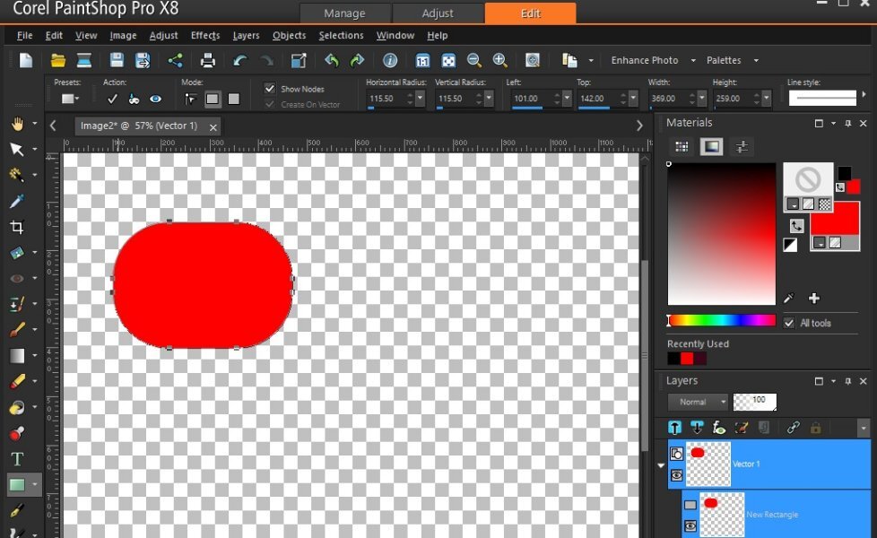
Help please!!! I have done something stupid but I don't know what. My rectangle shape has gone wonky in PSPX8. When I click on the preset at left and choose rectangle & try to draw one, I get one with rounded corners. The little mode box at the top says that it is a rectangle but all I get are rounded images. I used the preset choice at the top to get to the corel rectangle to use that but all I get is a black outline & no fill despite the materials palette being set to transparency & a red fill. I tried closing & reopening PSP but the same thing happens. I tried using PSP9 on my old computer and the rectangle shape works fine there, However, the one in PSPX8 on my new computer does not and it was working fine yesterday so something I did between now & then has caused the problem. I have put a screenshot of my PSPX8 workspace below but I am not certain that it is large enough for you to see all the settings. Any ideas? Thanks.
-
2
-
-
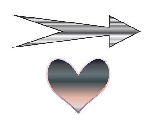
3 hours ago, Daniel Hess said:
Not great getting it actually symmetrical editing cusps...that will take some practice.
That arrow reminds me of one of the "angry birds" from the computer game. It just needs some eyes.
-
4
-
2
-
-
5 hours ago, Trevor Andrew said:
Now I have a better understanding, not very intuitive, I mean why select the pen tool.
I draw a shape on a vector layer, the next step I would imagine is modifying the shape, i would have thought the nodes would be available and not having to activate those.
So a new day and I managed to draw the shapes without referring to the video.
Bit of trial and error but I got there, found grid lines helped to keep things uniform
Just tried attaching a png but only Jpeg allowed which is larger than the png, 15kb to 65kb.
(post updated typo)
I did the same as I always save as a png for everything. I needed to put a post-it note on my computer to remind me to save a jpg for these lessons.
-
3
-
-
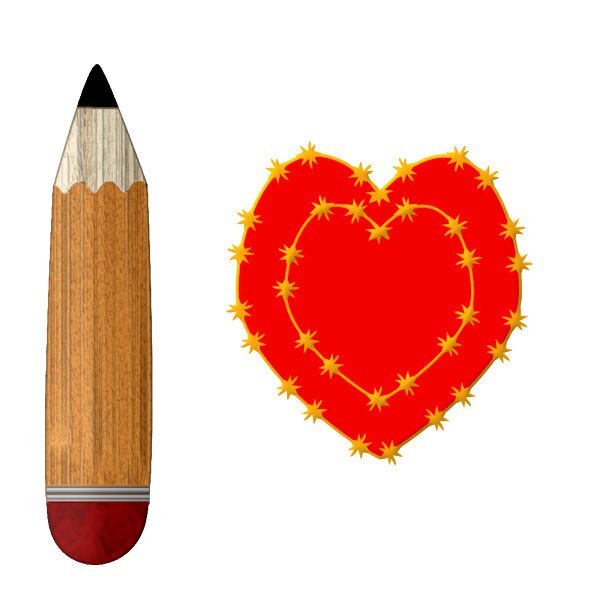
13 hours ago, Donna Sillia said:
I started to make an arrow, but then began to play with the nodes and ended up with a pencil. I converted the pencil to a raster and filled it in with different textures. The heart was harder than I remembered, but I finally got it to look like a heart using a lot of guide lines. I used a lined stroke, duplicated the stroke and made it smaller to fit inside the bigger heart.
That pencil is adorable!!!
-
4
-
1
-
-
15 hours ago, Randy said:
Well, I had to try something different.
(1 - Heart4) (I wasn't sure if this would work with a layer that was not raster which is what I have used it for in the past.) I ran a script I created to take copies of the layer, decrease the size of the copied layer. Repeat. Then merged the layers.
Then I flood filled with red in some areas.
(2 - Heart3) I then took a copy of Heart4 and applied the Colored Foil. I did not show this.
I then took a copy of this layer and used the blend mode to get Heart3.
(3 - Heart2) Then I used Heart3 layer with blend mode against Heart4 and ended up with Heart2.
(Conclusion) I liked the variations that I was able to produce.
I like it when it gets to be fun.
Show off!!! Wish I could do that.
-
2
-
2
-
-
Maybe we should use #@%^& instead of the word "nodes"?????
-
1
-
9
-
-
1 hour ago, Julie Magerka said:
This time around (my second at Vectors), my heart actually resembles a heart! The first go-around it resembled a molar! The arrow went OK too. Maybe not either is perfect, but I'm OK with how much smoother I was able to manipulate the (#@%^&) nodes. For some reason, Carole's explanations this time seem more detailed and I can follow without feeling that I have a blazing headache! 🙂 But let's see how it goes....
-
Second time round for me on this workshop..... vectors are soooo very hard to remember let alone use. I didn't use any special fill or lettering as I am still trying to concentrate on node manipulation so my imges are recognizable. Did try a bit of extra manipulation in getting the heart through the arrow but it looked flat so I grabbed a brush to add some irregular marks around the entrance point of the arrow hoping to create the effect of a bruise. Sometimes additional "play" takes the edge off those pesky nodes. I am no artist so I doubt that I will be drawing many vector images but I really want to master text on a path. As for other members comments on PSP9, I still have my old WXP with PSP9 & AS on it and it is my favourite combination by far. I kept it primarily for the seamless integration with animation shop and for its ability to use all of the older free plugins that hate 64 bit installation. I use PSP 16 & 18 but 22 is waiting for me to stop avoiding installing it. I don't mind them adding new features with each release but I just wish that they would leave the old features alone. Change for the sake of change is so annoying and don't get me started on the fine print online manuals. I still have and use the paper manual that came with PSP9, a copy of a "Paintshop Pro for Dummies" book, and , of couse, Cassels own great publication.
-
4
-
1
-
9
-


Vector Workshop 2024
in Showroom
Posted
Lesson 7 assignment enclosed. Stil having trouble matching font & tube styles & sizes. This looks like I used one tube around one complete path but I did cut the path in half so I could work on the top and bottom of the letter separately (that actually was the easiest part). After numerous combinations, I decided to use one button tube for the top and another button tube for the bottom. When I was cutting & moving nodes, I didn't get the images to line up properly & had to use the pick tool to do so before merging the layers at the end. Some mistakes are easiert to hide than others........