Leaderboard


Popular Content
Showing content with the highest reputation on 04/01/2025 in all areas
-
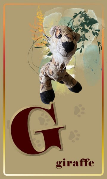
I know what you're going to say: this doesn't look like a giraffe! And when I see it up close like this, I'm not sure either. But it's a much-loved (and slobbered on) dog toy that we call the giraffe. None of my dogs over the years have destroyed their toys. Licked 'em, carried 'em, worried 'em, but not chewed to pieces. (The toy does have a long neck!)
 6 points
 -
I have to agree with many of the comments, it is wonderful seeing you back posting, like many of us, you have your own distinctive style, which is inspiring. I did take the photo, as I showcase only my own photos. I observe, photograph, document and then showcase them.5 points
-
Hello Sue, your Northern Shrike Bird is beautiful did you take the photo? interesting info about the bird also, quite often the names given to these birds do not match the beauty of them especially when they sing so beautifully. Hello Ann Seeber , likewise, interesting info you found out about the Pied Butcherbird... i never knew that about them. However they bring such joy here when they are in our yard . Best wishes to you both Dawn.5 points
-
This uses the same technique for the Glow but adds a few more steps to the other parts of the photo, including Gaussian Blur and Curves Adjustment Layer, among other adjustments. The photo is also from Affinity Revolution.
4 points
-
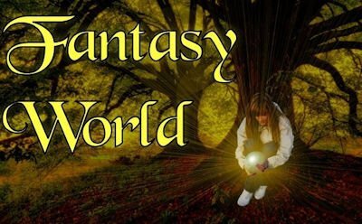
Lately, I have worked with PSP only to create stuff for the Build-A-Kit Workshop. Most of the time, I watch and practice tutorials for Affinity and PSE. I came upon one tutorial from Affinity Revolution that I liked very much because of its simplicity: adding Shine/Glow to an object. There is a Masterclass—2017 Fantasy World—where Carole adds this glow feature, among other great techniques she teaches, and I have always liked it very much. The Affinity technique requires adding a black layer, changing the Blend Mode, and painting with white. These are the two photos offered to practice along, and the same pictures with the effect I added. Not everything in Affinity is perfect, but I do like this app.
4 points
-
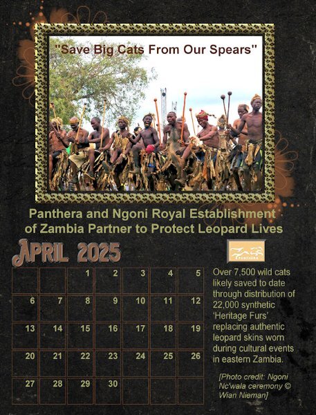
Happy April. Here is my new April Wild Cat Calendar for 2025. All elements are from Panthera.com. The template is from Carole's Calendar Workshop in October 2024. The April 2025 font is Aviation Cocktail with a chisel effect as it is hard to add shadows with such a dark background. I isolated the photo frame using a selection/select borders and promoted it and then filled it with the PSP leopard pattern from my materials palette and treating it to an outer and inner bevel.
4 points
-
Hello Cristina, your kind comment is very much appreciated. hope you are keeping well? i have not been posting since last July but i am trying to get back to it again. best wishes Dawn.3 points
-
Nature is brutal, but I like not to think of that. You make it very palatable with your photos and layouts.3 points
-
In Canada we have the Northern Shrike and the Loggerhead Shrike. (Although not related to your bird) Like your pied butcherbird, they too have earned the nickname butcher-bird. The male Shrikes will also impale dead prey, in order to attract a mate. This I have witnessed on several occassions. Nesting in well hidden dense or thorny trees. They most certainly have the most beautiful distinctive song. The way I see it, humans don't always give much thought when it comes to naming creatures.
3 points
-
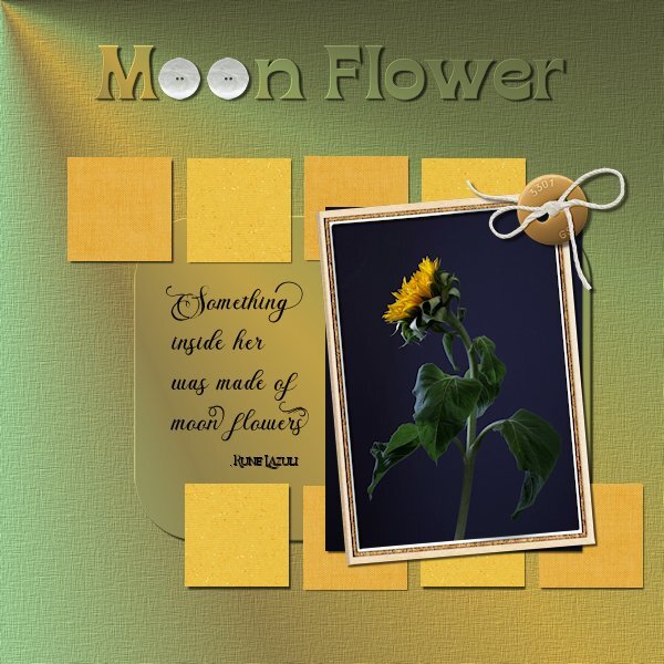
Project 5 This time I pulled a photo from my files, I think I shot these in October. I had another photo in mind but this one beckon me to use it. I made my own background paper with a gradient (looking like a beam of light on the flower) and for the rounded rectangle which I selected then promoted and added a small bevel. The squares I followed the tutorial and used scrapbook papers. Fonts: Briantone, Bricktown and Borensa (title, one of my faves) buttons: Melo Vrijhof button 04 and Billie Irene travel button 4 (DigitalScrapbook) frame: Marisa L gl21 frame 3 (DigitalScrapbook) Little squares: Janet Scott Dark yellow Fabric and DigiDewi Princess Paper Sparkle yellow dk (DigitalScrapbook) Photo: mine
3 points
-
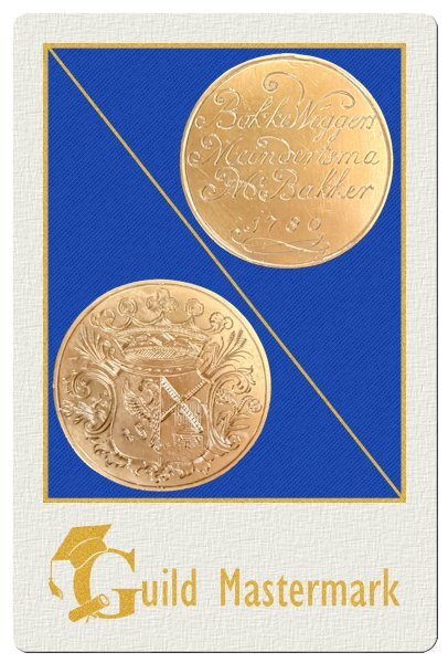
The letter G had me puzzled for a while and the word "grater" didn't came to mind. But then my eye fell on this copper guild mastermark that is in a small holder in our "office" - just a room but we call it our office 😉 It has a diameter of only 4.4 cm and was issued in 1780 to a relative of mine on my mom's side of the family. In those days there were guilds for the trades, like fishmongers, butchers, bakers, masons etc. You started as an apprentice for a master of the guild and after a couple of years when you were ready, you had to deliver a piece of work, your masterpiece that showed the guild that you had learned all there was to learn. If the guild approved you got the master title and a guild mastermark to prove it, which allowed you to start - in this case - your own bakery. On one side of the guild mastermark is the name of my ancestor and the word "Mr Bakker" (Bakker meaning baker) and on the other side is a windmill and stalks of wheat.
3 points
-
This is the Fantasy world Masterclass I mentioned.
2 points
-
All is well, Dawn, and I hope the same for you. I have noticed you've been MIA for a while, but I know that sometimes life gets in the way. I do hope to see you and your lovely work more often. 🙂 Best wishes 💟2 points
-
@Jacques Yes, you can use the arrow keys for a specific number of pixels: arrow alone = 1 pixel, Arrow + Shift = 50 pixels, Arrow + Ctrl = 10 pixels, Arrow + Ctrl + Shift = 100 pixels. @Susan Ewart That paper is quite interesting. I thought you had added a light effect to an otherwise "ordinary" paper! Great work everyone!!2 points
-
I was happy with the gradient (Thank you PSP!) and didnt want to cover it with a paper so i just made the round rectangle selection and promoted the untextured layer so the gradient would carry through. I liked the result. I was thinking, how will I make it standout so I added a little bevel (thicker paper?). I'm glad to have finished the workshop, unlike the other workshops I did not finish. I'm am hoping the wedding stuff is all finished by the end of the month so can resume the workshops and projects I have started and ones yet to be started. You must be close to your holiday. I hope you come back with amazing photos like the ones you have being treating us to from your last holiday.2 points
-
Hi Dawn! It's so good to see you back here again! 💟 Your work is impeccable and as beautiful as before. It's always a joy to see it. Come and visit us more often! 🙂2 points
-
Great story of the history of this special piece.2 points
-
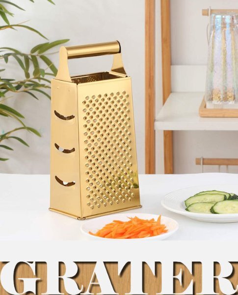
Rene, I tried that script for my G entry. Here's G = Grater. I use it all the time. I prefer it to the fancier rotary versions. I guess it could also qualify as Gold Grater! 😉
2 points
-
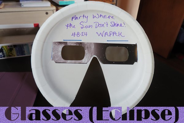
G is for "Glasses (Eclipse)". My cousin, her husband and 2 granddaughters came to my house to see the eclipse a year ago. Since she was a former elementary teacher, she did some research about watching the eclipse with kids. Her granddaughters were 5th grade and 7th grade at the time. One thing she found was using paper plates to hold the glasses. She brought the items needed with her and that morning we all made our own holders. I was very glad she thought of this as I couldn't keep the eclipse glasses in place over my regular glasses. I had no problems with this. It was a fun day and I still have them displayed on my bulletin board in my office. That bulletin board has been hanging in that spot since the late 60's and still has stuff my high school years on it! (Never thought of using it for the letter "B")
2 points
-
That is what I wanted to mentioned but you already did. I have used that one many times if I needed such an effect because it works behind a window as well.1 point
-
Thank you for this tip. Lately I too worked most of my time the for the Build a Kit, but in between looked at some Affinity Revolution tutorials. I like the way how she (Ally) explains everything; it reminds me a bit of how Carole teaches and perhaps that is why it feels familiar. This tutorial I haven't seen, but when I have time I certainly will!1 point
-
So cute and a lovely story about your dog. I was never one for having or playing with stuffed animals, not even a teddy!1 point
-
That's so awesome. Your dogs treat their toys better than I treated mine.1 point
-
I haven't tried that. I should add that to the Q and A and how to make metal swirls like you used in the bootcamp tutorial.1 point
-
Lovely color combination with that gradient coming from the top left and you made it to the end! Well done you🌻1 point
-
I asked AI Copilot about the bird and here's its answer: "The pied butcherbird gets its name from both its distinctive appearance and its feeding habits. The term "pied" refers to its striking black-and-white plumage, while "butcherbird" comes from its rather grim hunting behavior. It earns this title because it impales its prey—like insects, small mammals, or other birds—on thorns or sharp branches to store or eat later. This habit is reminiscent of a butcher hanging up meat, hence the name. Interestingly, despite their fierce name, pied butcherbirds are known for their beautiful, flute-like songs, making them one of the most melodious songbirds in the world. Quite the mix of talents, right?"1 point
-
@Cassel The banner is 'cd_daffodils_element_44.png'. I got it for free from the 'Chantalia Designs' website I wish if is possible to move objects via the keyboard keys per pixel (instead of 10 or 50). Did you know if it is possible to specify these moves? If yes how?1 point
-
Thank you to Julie Magerka ,Corrie Kinkle ,Michele, Sue Thomas, Ann Seeber and Susan Ewart for giving me hearts on my Butcherbird post. Appreciated very much. Julie i do not know how it got its name however i always look forward to hearing their beautiful song when they come into our yard it brightens my day. Best wishes to you all from Dawn1 point
-
I really like your layout as well. But, oh my, that bird's name is something else. I'm reluctant to think why that's the name. 😐1 point
-
Project 5 This rabbit was sitting in the churchyard opposite where my first photo of this bootcamp was taken. He was totally peaceful and so in the moment… The kit is the same one I used for the first project - the Jessica Dunne To Behold kit, font is DM Sans Medium, the photo is mine, the quote is from Eckhart Tolle.
1 point
-
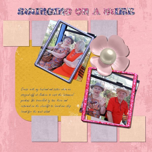
Day 11 - frames. The tip I did like was, for example, using glitter and pulling it into the pattern section so you could use the floodfill tool which I did with my frames, and the text "Swinging on a Wire". I also duplicated the pink frame to make it look like the petal had flipped behind and over it. So, here is my final project. I've had fun refreshing my skills with PSP. Always good to come back to it after a long break.
1 point
-
Day 11 I felt the need to correct my page after Ann questioning the frame. I looked back at the tutorial and realised the frame should have been on top of the photo, so have now corrected this. We have had a crazy few days and trying to get this finished meant mistakes happening. Apologies for the confusion.
1 point
-
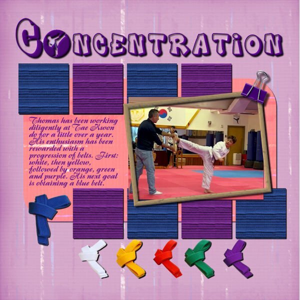
My grandson, Thomas, is one of my favorite subjects. We are so proud of his achievements. My lilac and orange papers are from my current Build a kit, originally a paper from Adobe Express with a blend mode. The frame is from FF; the belts and clip are from Adobe express. The squares are a material from the belts that I made into a seamless pattern using Carole's script. I extracted the photo from a video sent to me by my daughter in law. My son is the one holding the board. The layered font is from CF and called Dynamix Street. The "o" is an AI generated on Adobe Express.
1 point
-
Project 4 Here is Ver. 2. the one I do like.
1 point
-
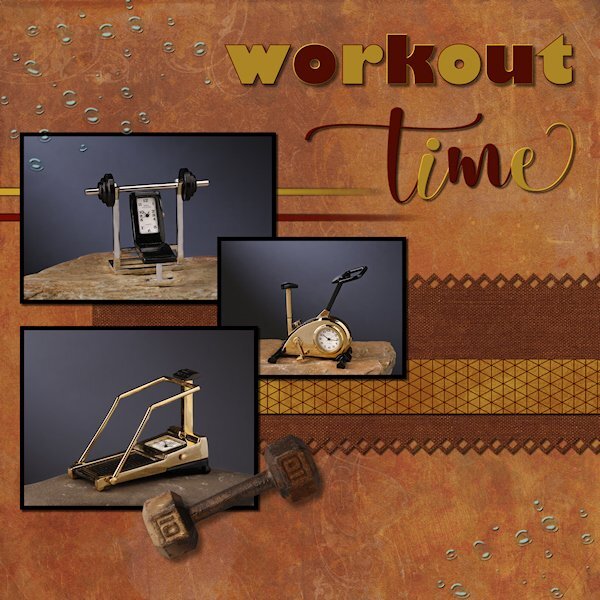
Project 4 One of the emails asked what tips/techniques did we learn that we liked. I will have to say it's SHIFT-D (duplicate), to duplicate the layout. I never really thought about how much I use tip, turns out I use it a lot. And this layout is a case in point. I will post the version 1, early in the layout it wasn't working for me, so I duplicated to test switching the background paper with the rectangle pinking shear paper. These "clocks" I've had, I thought for about 25, but hubby informed me we've being together 38 yrs, so they are now about 35 yrs old, which means i've been working out longer than 35 yrs. No wonder I'm tired. I did not shadow the lines I made because I wasnt sure if I should since they fad out. Does anyone have any advice on that? the photos dont show the time I had getting a light beam to shine on the background the way I liked, when I cropped it was all gone. bummer. The fonts used; Gill Sans Ultra Bold and Adellia Heart the dumbbell is an extraction from my Alphabet Photo Challenge letter D. and is my photo of a dumbbell in my arsenals of free weights. the water drops and both the dark background(Ver 2) and light background (Ver 1) are Jessica Dunn (copperspice and plum hill kits) The smaller selected rectangles are Gina Jones (zig zags on V2) and Marisa Lerin (V1) The two lines under the top photo are fading lines as learned in the Q&A November 10, 2024 (first way of doing it out of 4 ways) Here is version 1, the one that wasnt working for me.
1 point
-
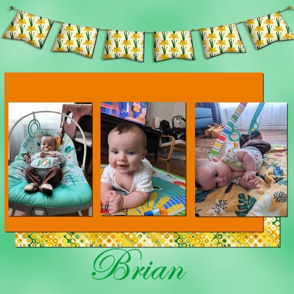
This is my third project. This is my 3-month-old grandson, Brian. In the photo on the right, he had just rolled over for one of his first times.
1 point
-
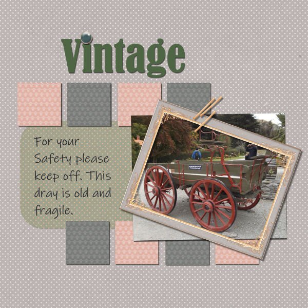
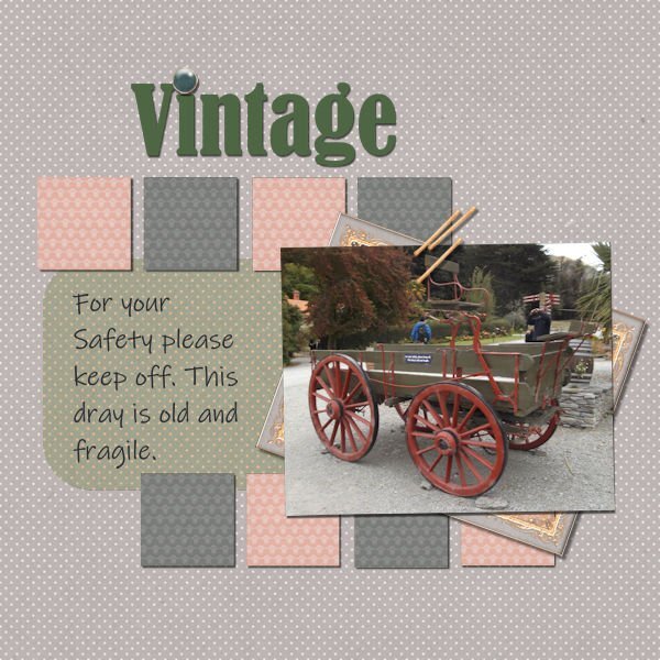
Day 11 I didn't know how I was going to create this layout using Jessica's kit entirely, but I found a way. No, I did not replace a whole letter; I instead replaced the tittle [the dot] of the letter 'i'! I was fascinated by the message on the side of the 'old and fragile' dray and used that to replace journalling. I selected a small square on my layout and copied the entire 3600x3600 paper into that selection, and it worked well; the design wasn't so prominent in the small squares. I loved using Jessica Dunn's Classy kit, colourising when the colours didn't work, and finding ways to play with this stylish kit was such a joy. Thanks, Carole, for the lessons, and thanks to the team here for your beautiful layouts and for giving me such an incentive to have fun with the challenge of using one kit for the entire set and the same two fonts throughout, The beautiful old Bernard MT Condensed for the headings and a modern Ink Free for the remainder. Anyone wanting to take a look at the Walter Peak High Country Farm can check it out here
1 point
-
Nice brushes! Have a nice trip to Scotland and come back with a lot of new photos for your projects.1 point
-
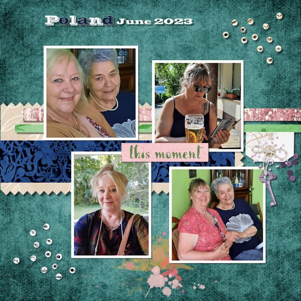
Day 9 Project 4 - this was a trip to Poland that my sister and I took to meet up with my dad's family. We are here with his sister, Aunt Helena.
1 point
-
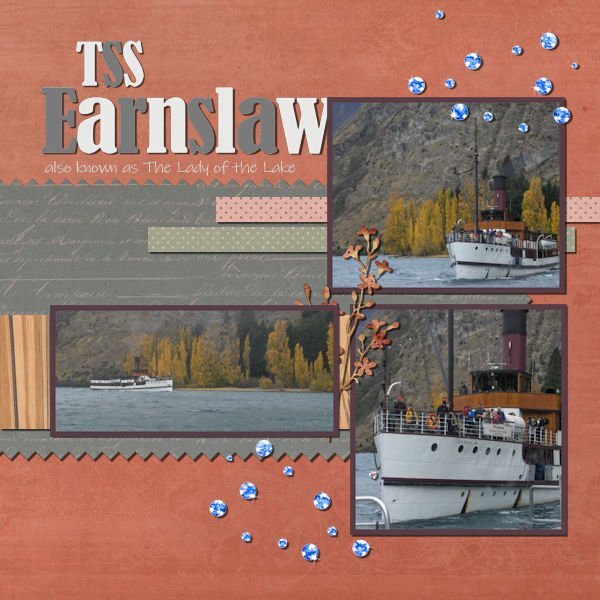
Day 9 This time, the steamer, TSS Earnslaw, steaming her way to the wharf at Walter Peak High Country Farm. I used Jessica Dunn's Classy papers and elements, again, colourising the scatters to resemble water droplets...well, I can pretend they are, anyway I am actually enjoying the challenge of using one kit throughout.
1 point
-
Sorry for not having done all my "homework" for this "Scrap Bootcamp". I received several photos of my 3rd grandson and since my first "hobby" is to make a "painting" of him, I did not have time to complete the homework for this scrap bootcamp but I looked at you all and really appreciated what you did. See you next time..1 point
-
A nostalgia moment for me; first with my family, then with school friends and even with my daughters when they were small. It was supremely corny but I did finally venture onto the rollercoaster with my friends! I felt so brave!! The poster is from the Facebook group Peter Gray's Magazine Covers and Posters which I follow. The title font is Century Schoolbook and the papers and accessories are from rae-BT-summer vacation. The information about the park was generated by MS Copilot AI. I probably should report my PSP2023 acted up with the journaling font that I had in a bounding box; as soon as I duplicated and rasterized it, it flew off to the right in a straight horizontal line. 😕 This was just with the raster version! I finally ended up converting the vector text to curves as a single shape to stabilize it.
1 point
-
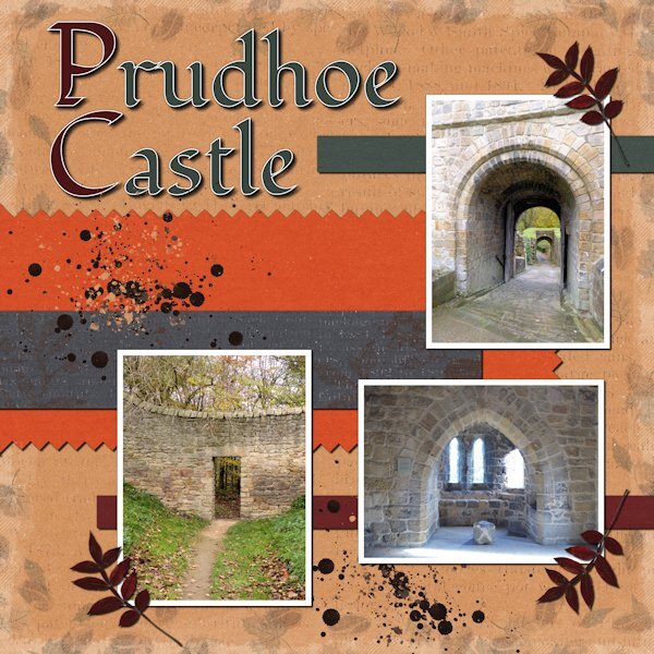
Project 4: Prudhoe Castle – the remains of a medieval castle on the banks of the River Tyne (Northumberland, UK). The photos are mine, the papers and elements are from a Jessica Dunn kit called Autumn Comforts, the font is Fondamento.
1 point
-
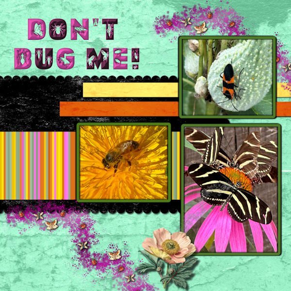
Bugs - Photos are mine. Background and papers are from a grunge brush recolored to yellow, orange, pink and black. Scatters are also from a brush, and the little insects and the big flower are from CF. The CF font is called Lovely Insects with a layer style applied.
1 point
-
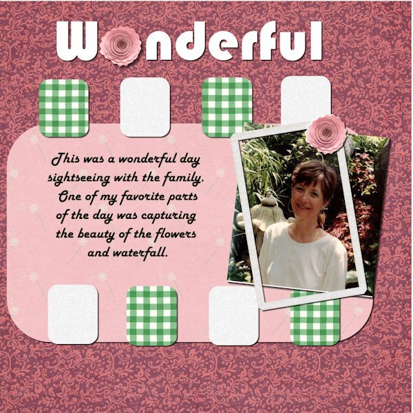
Hi, here is my Project #5. Thank you for all the lessons in this Boot Camp. All the pictures that have been submitted are inspiring to see what y'all are doing.
1 point