Leaderboard
Popular Content
Showing content with the highest reputation on 10/26/2024 in all areas
-
9 points
-
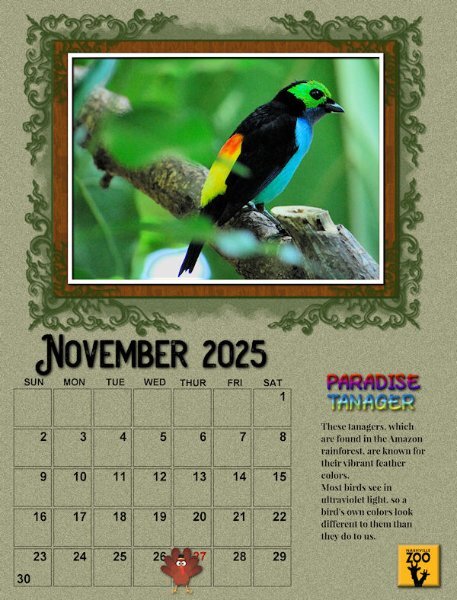
I consider this November page as totally finished, instead of preliminary as are the rest of mine. This time I added a title and journaling. The title is filled with a rainbow metallic gradient. The fonts are Play On and Playfair Display. Again I used a few promoted layers moved up to be outside the group in order to create the frame and mat effects. This is really a fun workshop!8 points
-
7 points
-
7 points
-
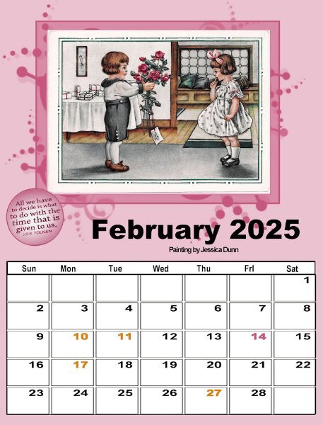
In the 4th lesson we learned to colorize dates that are important on the calendar. Since I was putting a white background on my dates so that I could still keep it white to write on while I had a different background paper, I had to use a different technique for colorizing the dates. In February, we have Valentine's day (pink) and I have 3 birthday dates (gold); I had to use a different technique. I isolated the 14 date with the magic wand (set to RGB) and flood filled the selection with pink; then I isolated the 4 birthday dates with the magic wand and flood filled them with the gold. I'm not sure if I will use this February page or use the original with no dates highlighted, but it was fun.6 points
-
5 points
-
5 points
-
5 points
-
Really beautiful Julian. Your colors are perfect. Love the frame darker like that.4 points
-
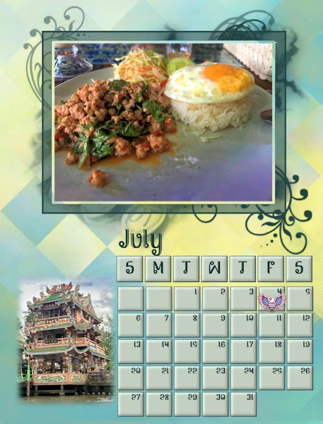
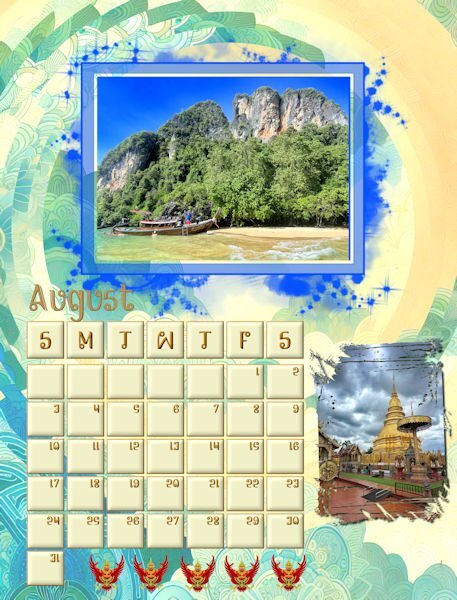
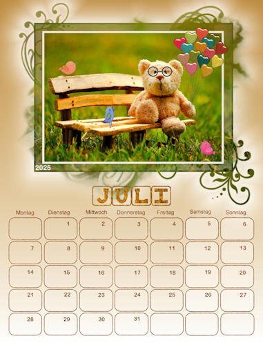
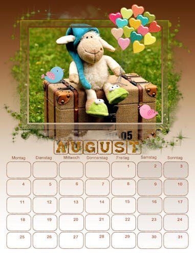
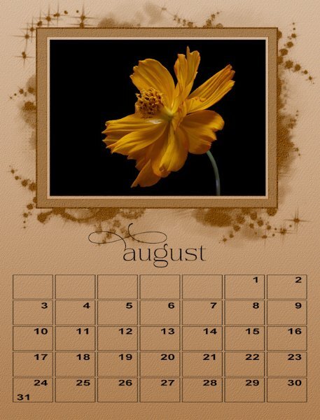
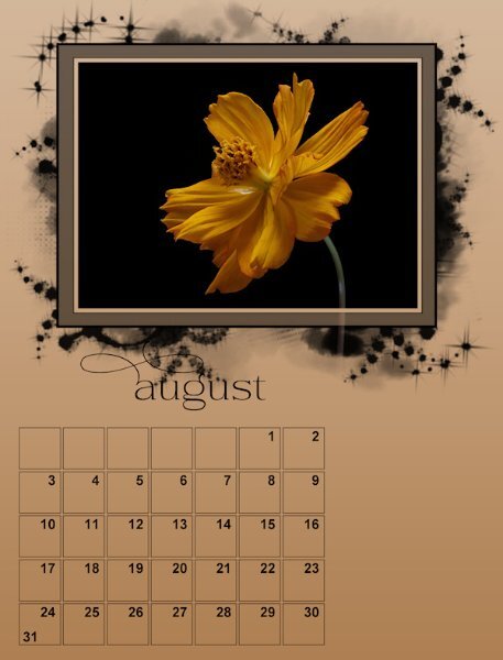
July and August The backgrounds are both from AI modified with FF distortion filters. I know that my backgrounds are fussy, but from what I see in David's pictures, Thailand patterns are vibrant and filled with patterns and colors. All the pictures are from David. One thing that I noticed when saving as jpgs is that the resolution was 100 px. I checked the other templates, and they varied from 100 to 200. Carole, should we be changing the resolution to 300 if we are planning to have our calendar printed?3 points
-
It's hard to veer out of a style. It's uncomfortable. I think having a style is good; really good. I follow a photographer and he talks about that too, and he's known for "his" style which is how he worked for 40 yrs in the industry (high end ad campaigns). he advocates, learn a technique and experiment with it like crazy, until you are known for it. For example, if you were making your layouts for resale, you'd get a following and they'd be buying because of your signature style. (ie. I buy June Hunters Crow prints because of her style). Just because we are doing this for our own pleasure doesnt mean we cant do it in a professional way, right. Of course I also advocate trying thing outside your style because discovery and learning comes from that. And styles also change over the years. I love your style. I love a lot of people's styles and many different art forms, it sparks the imagination to something totally different.3 points
-
I tried a bevel and cutout and would keep it if I sent it digitally, but for printed I always would worry about the shadows as they really darken when printing. It's funny to me that I try what others are doing because it looks fabulous on their layout. then I do it on my layout and it looks like a dogs breakfast...and I have CATS! hahaha. Kidding aside, I didnt interpret any of the post as critical. I like to hear from everyone on what they like and dont like because I can then try something I would never have thought to try and see if I like it or not, or it sends me on another path of discovery. Everyone's thoughts are valid and important to my learning and opening my narrow eyes.3 points
-
I am of the same thought as you Corrie. I have tried several techiniques using the mask, replicating many of what I have seen being done on here with the masks. In all honesty and it is my own personal opinion and preference not to create frames, or even elaborate to much on the masks. Again , as far as I'm concerned masks are meant to be subtle adornemts to any layout, if that is the right word to use. In this case, the calendar for me, the focus is then taken from the photo and placed upon the decorative/beveled etc masks. Calendars are meant to identify dates and events, adding (my own) photos are a great way to add a peronalized touch. Calendars are also like magazines, they are flat, withouts shadows, bevels etc. Hence it is my view to keep the focus on the photos, and the date boxes, whilst decorative and pleasing to the eye. Please don't anyone interpret what I have said as being critial.3 points
-
Corrie, I have used both. It's just what fits the feeling of the photo and masking. Plus, I'm flexible when experimenting like this. 😉3 points
-
Ann very nice and lovely to see the name of the bird and some explanation of it. Your calendar will be beautiful! I'm still in doubt if I want to have a solid frame around my photos or keep it translucent.3 points
-
I announced my plans to add journaling on my post for September which will include common names if I can.3 points
-
Hi Suz - I had to resort to promoted selections and even had to park those up out of the group. These mask groups are really different but I'm getting the hang of it now.3 points
-
It's nice to see the lake you talk about. I grew up on or around lakes, I love the solitude of them in the very early morning.3 points
-
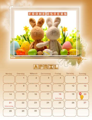
@Art Kuiper I keep using and re-using some of those features like the Lock Transparency, and the Character Map for many projects. Those are good tools in your toolbox. @Susan Ewart The minimalism of your photos make simple background very suitable. Those photos are the real stars! @Cristina Two of your images are not showing. I am not sure why (January and February). Out of curiosity, are all those images from the same author or the same theme? @Sharla I am glad those extra months are useful to you too (starting on Monday). @Julian Adams Beautiful effect on your April page. A subtle bevel is great and not distracting. @Ann Seeber It is so interesting that you have the names for those animals. You might want to add those details on the pages! @Donna Sillia What event is on June 15th? Remember that with the last lessons, it is very possible that you will want to revise and edit your first pages. That is alright. It is actually expected so if you end up with a very different page, enjoy the experience and the process. Keep those pages coming!3 points
-
Thank you two so much. Part of my inspiration was liking the less saturated colors you are using Susan, and the lighter colors you are using Sharla.. One thing I have been doing is to put the boxes and numerals from the dates on different layers so I can use different 3D effects. Does anyone else do that?3 points
-
3 points
-
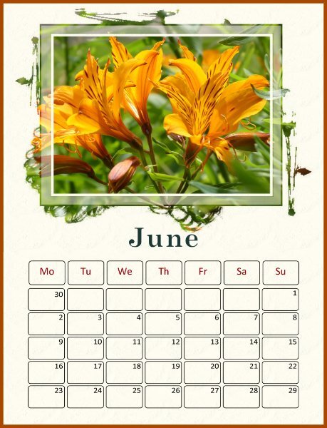
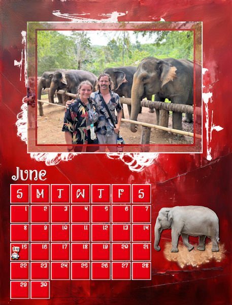
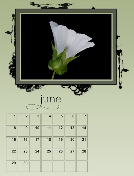
My finished June. I have been working on my calendars to make sure that they are consistent and adding major holidays. I decided not to use birthdays and anniversaries. I am not sure of the colors for June, although I love red, so this month may be changing. The elephant is an Asian elephant from Canva. My original elephant was African. David gave me a lesson on the differences.3 points
-
3 points
-
I just take one of your posts to tell you that your photos are great and very creative. I l see you do not use a capital to start the month name and that is an idea that I'm going to try because I had a bit of a problem with my months. Being still pressed for time this week I will certainly need at least the next week or so to get everything ready for printing.3 points
-
Sharla normally I like masks but then I can choose their size. Like you many of my photos didn't fit well into the masks, but slowly I'm getting there. Trial and error is a good description of this proces 😉2 points
-
It’s been great doing this workshop with you all because we do have different styles and approaches and they are great to see and learn from. I love the differences. I never use masks in layouts so this calendar workshop has been a challenge for me. More than half of the photos I thought I’d use simply didn’t work with the masks and some of the ones I have used looked awful at their original size hence I’ve enlarged many of them so that some detail emerges. It’s been interesting having to do this because it’s not what I’d usually do. I'll persevere to the end but I am still a reluctant mask user!2 points
-
2 points
-
There are so many creative styles people have developed here. I learned a lot from seeing what I like in other people's ideas. I sort of developed a style of doing this last year. I was pretty happy with a lot of the calendars I came up with then. This year the first few calendars were trying to remember the techniques that I used to use. Then I started trying to push the envelope on those. I'm not really sure what my style is yet, but I think you can tell that I'm leaning in a certain direction that works for me. I do want to push the envelope though doing things like I mentioned above strong in an airbrush to modify a gradient and the color underneath the mask. This is really so much fun and teaches you so much about the nuts and bolts of Paint Shop. I have been using paint shop back to version 8 to edit my photographs and the digital fractal artwork that I created. I logged many many hours just working on a single layer. It's taken me all these years to learn how to use layers.2 points
-
I used an airbrush on this. I wasn't happy with the way the gradient was blended into the lighter pink so I just touched it up with an airbrush to make it look more smooth. Then I decided to do a little bit of random variations in the color during the transition. Then I got the idea of adding yellow under the mask to accentuate the yellow coloured month. I don't know much about how to use masks so I created a masks y selecting all and then using the selection tool removed the rectangular picture frame so I would not get yellow paint on it. The possibilities are just endless!2 points
-
Not using a capital letter to start the month is a nice idea, paricularly if a glyph or a swash is added to replace that capital letter like Susan did.2 points
-
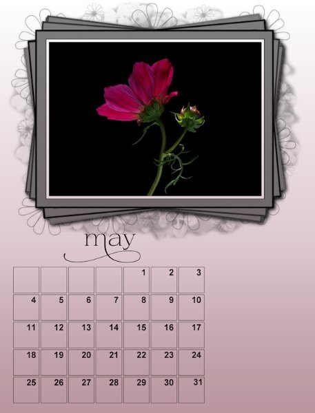
I LOVE everything about this. What perfect color and the date boxes. I had thought about deleting the un-used boxes and now seeing how great it looks I will do that. I'm happy to see another flower photographer, it's super inspiring to see all the members who shoot flowers.2 points
-
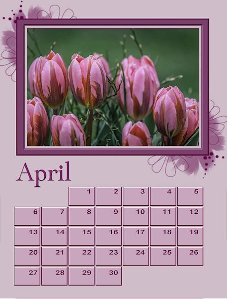
That is a great photo of tulips. I like everything about your layout - it looks great.2 points
-
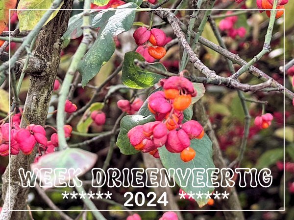
Through my village runs a railway track which is screened from the footpath that runs along the track by a fence and a thick row of bushes. It are all kind of bushes that provide almost yearlong interest. At the moment the Euonymus is still in flower; we call it "Kardinaalsmuts" which translate as Cardinal's bonnet and in English it is Spindle tree. I came across it a couple of days ago when I was running an errand and took a shortcut to get home a bit quicker, but I always have my phone with me.2 points
-
2 points
-
2 points
-
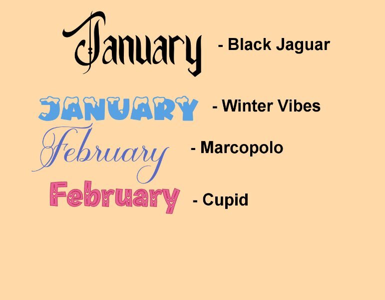
I'm keeping with the white background for the dates since they may be used for writing in after it's printed. Also keeping with the Arial Black for the font. But love what everyone is doing with their calendars as far as font, background, etc. which are in the tutorials. So, I decided to play around with background, fonts and whatever else the tutorials tell us to do. This is one of the background papers I made (looking forward to the upcoming workshop). This is some of the fonts I played with (but not the glyphs since I seem to have chosen ones without extra glyphs. On the paper, I played with blend modes on both papers and on the smaller one I used the layer style of outer glow.2 points
-
Wow! Thank you so much Julian. You have made my day. I had a log absence from photography and now it's become my passion again. This is a really nice font from Creative Fabrica called Daisy & Violette https://www.creativefabrica.com/product/daisy-violette-stylish-modern-serif/ It has lots of glyphs and is the style I like. One thing I found is when i was using it, the glyphs went outside the bounding box and were cut off. I realized after a while (a good long while!) that the BOLD was on and I had turned off bold by accident and there the whole glyph was. So when you are changing from the Arial Bold font, toggle off the bold on the tool bar above. At first I thought it was my font program.2 points
-
Thank you Michele, it's reassuring to get another point of view. Some of them, like this I liked, but others I kept being distracted by it. I need to stop making things identical. I am bad for that.2 points
-
2 points
-
WOW! Incredible shot and what detail! I havent seen one of them since I left the Westcoast, they are so cool.1 point
-
1 point
-
I was having trouble with PSP 2022 so I uninstalled. Even thought I have 64 GB free on the drive I was installing it to, I got an error message that there wasn't enough space. Grrr. I opened a support ticket. Hopefully I'll hear back soon.1 point
-
Cristina, these are so sweet. I love how you did the Months like the date blocks and your colors are perfect for all the months. I couldnt see the first two months though 😥, it's just a little box that I clicked and got nothing.1 point
-
1 point
-
1 point
-
Carole, repeating myself, I love these calendar artsy mask templates. After seeing some designers' work, I have been playing with this style for some time. I like the idea of a tutorial or class. 🙂1 point
-
Here I have two versions. One I'm playing with the date box - I just stretched it to see if I wanted it bigger (I do). I will watch the YouTube video Sue T mentioned and think about trying a different style. and I played with the frame/mask which I added a texture to and then a different texture to the background. since I'm wishy-washy on what I want to do, I'm going to try different things and live with them for a bit and hope a good idea comes out of it by the end. You'll notice my photos seem darkish, it was intentional, I seemed to be into the darker moody stuff when I photographed them over several months. They dont look great at this resolution though.1 point
-
1 point
-
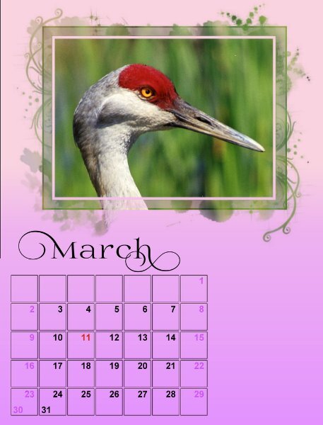
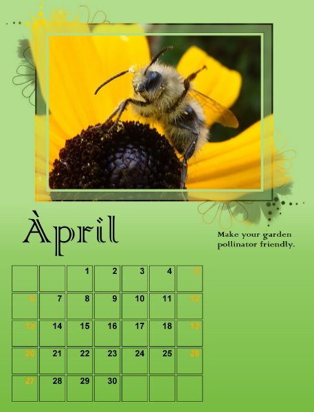
Thanks, Cassel for your note about the Artsy masks. They certainly make the area around the image more interesting. Also I learned a lot from your Day 3 video. The information on using the Character Map will be useful in other programs too. Day 4 you introduced the Transparency Lock, so great. I am waiting expectantly for what will come next. I am learning so much. Merci. Here are my March and April projects with elements from all 4 days.1 point
-
A riding is an electoral district, also called a constituency. I presume the Canadians adopted this word from the British, more specifically from the English.1 point


