Leaderboard
Popular Content
Showing content with the highest reputation on 10/25/2024 in all areas
-
10 points
-
10 points
-
10 points
-
9 points
-
9 points
-
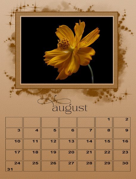
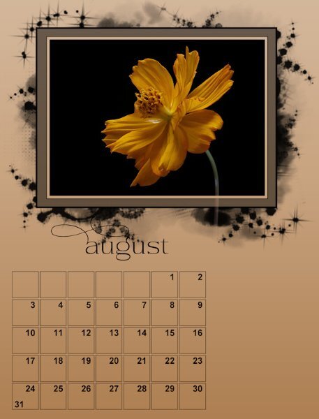
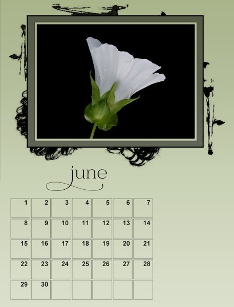
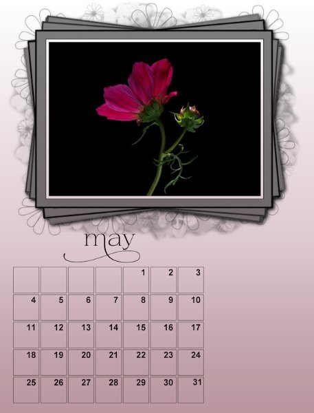
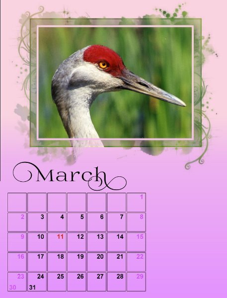
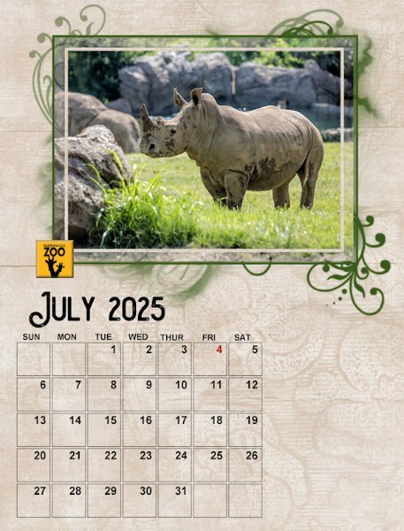
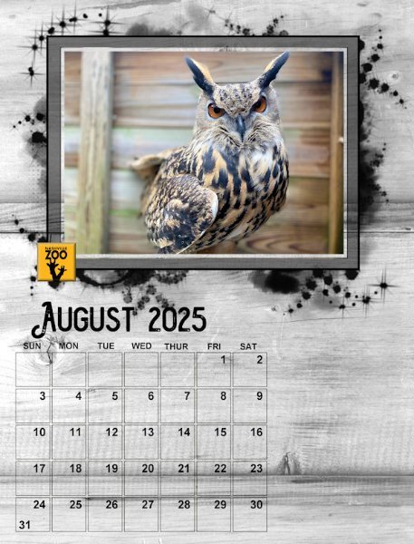
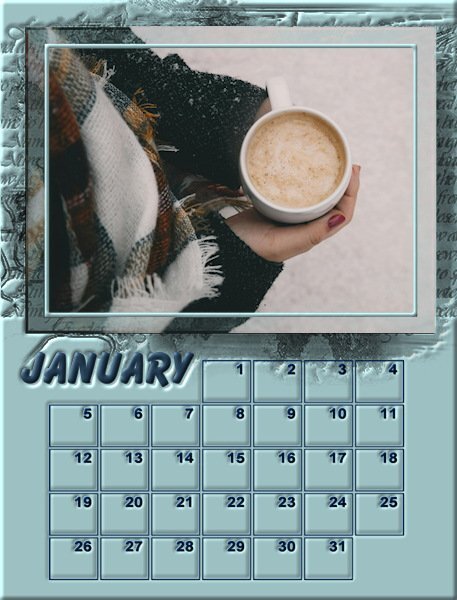
Here I have two versions. One I'm playing with the date box - I just stretched it to see if I wanted it bigger (I do). I will watch the YouTube video Sue T mentioned and think about trying a different style. and I played with the frame/mask which I added a texture to and then a different texture to the background. since I'm wishy-washy on what I want to do, I'm going to try different things and live with them for a bit and hope a good idea comes out of it by the end. You'll notice my photos seem darkish, it was intentional, I seemed to be into the darker moody stuff when I photographed them over several months. They dont look great at this resolution though.9 points
-
I'm also posting unfinished stuff because PSP is being quite cantankerous tonight. I am living with a few things in the mask to see if I want to leave it or delete the part in question - the stem running through the frame. I've cut it off completely from going out of the frame part of the mask, in one month, and cut off only in the frame part of another one month.9 points
-
9 points
-
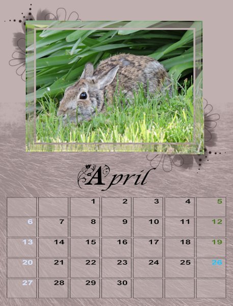
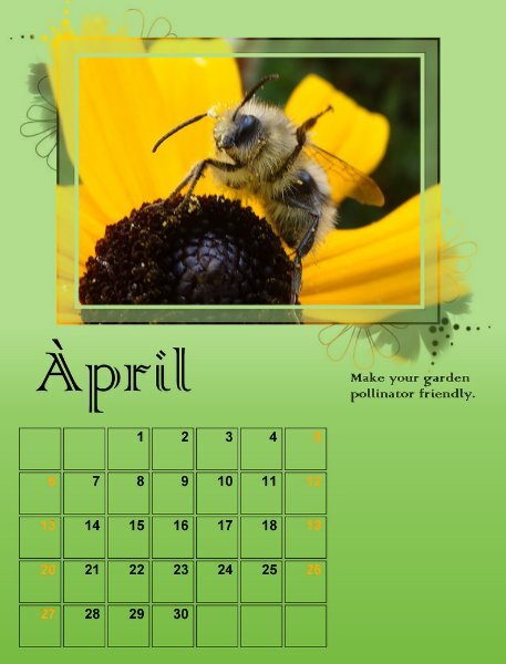
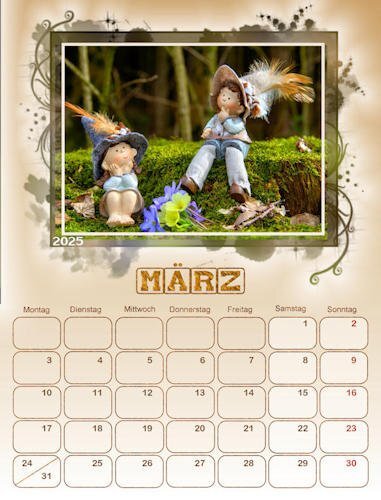
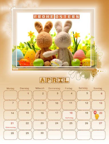
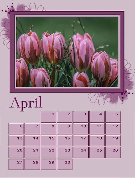
Thanks, Cassel for your note about the Artsy masks. They certainly make the area around the image more interesting. Also I learned a lot from your Day 3 video. The information on using the Character Map will be useful in other programs too. Day 4 you introduced the Transparency Lock, so great. I am waiting expectantly for what will come next. I am learning so much. Merci. Here are my March and April projects with elements from all 4 days.9 points
-
8 points
-
8 points
-
8 points
-
I think this one looks wonderful with the stem showing. As much as we want to have a common thread throughout the year, I don't think you have to keep each month identical.7 points
-
7 points
-
Wow everybody has been so creative! Here are my preliminary pages 01 and 02, I managed to get something done. My theme is mushrooms/fungi and therefore I used cass-CustomCalendar script to make little mushrooms with the datenumbers in them. For the backgrounds I used background/foreground gradients but there will be some sort of texture on them, but I still have to figure out what I will use. My date mushrooms also got a matching gradient otherwise it was too monotone for my liking. The font for the months is Prida01. I have that font for a while now and the video tutorial reminded me of it! I'm not sure if I will change the dates for weekends and special dates; I'll have to experiment if that is going to work with those small mushrooms. I see I still have a black line on Januari and a point on the right top of februari; I'll change that, I thought I had done but it is still showing.7 points
-
6 points
-
Wow, there's no shortage of creative stuff posted! There are so many different styles, tips, ideas, and inspiration.6 points
-
Carole, repeating myself, I love these calendar artsy mask templates. After seeing some designers' work, I have been playing with this style for some time. I like the idea of a tutorial or class. 🙂6 points
-
@Julian Adams I would suggest to go less with the bevel so the mask effect can show more (more obvious on the January page). For February, did you put the image only in the "center" of the mask? If you have a square image and a rectangular space, you can either crop it rectangularly, or do like you did and "fill in" the sides. If you want to resize the mask, you CAN do it, using the Pick tool, but make sure you will brush in black, the areas that will become uncovered on the sides. For the bevel, I tend to keep the Ambiance at 0 so the lightness stays as close to the original as possible. @Ann SeeberSince the mask creates a partially transparent section, that is why the layer below will show through. Maybe you can tweak it by brushing, with a solid color, where you don't want the pattern to show (or where you would want to add color). To adjust the Kerning, you highlight the character and reduce the Kerning value to narrow the space or increase it to spread them apart. It can be also very useful when you use dingbats, like stitching fonts. Adding color to the outside of the photo area is not something I expected, but all you, users, are so creative!!! @Sharla The white background might sound boring for some, but on your pages, it makes your photos stand out! @Sue Thomas Maybe someday, you could share "not-so-photogenic" models, just for a good laugh maybe? @Mary Solaas The days of the week abbreviated look so much more balanced! These pages are the perfect opportunity to work with gradients! @Art Kuiper Those masks are called "artsy". There are some designers who create great masks of that style. Maybe I should make a tutorial (or a class) on that type of mask. @Donna Sillia I guess you answered Julian's question about modifying the format of the mask! @Corrie Kinkel It is so great to read how you see "errors", and can fix them yourself with PSP. And experimentation also yields fantastic results. @Anne LampIf you follow what others have done, you can add a color that matches the photo on the layer called PHOTO HERE, and it will add some colors around your photos, through the masks.6 points
-
6 points
-
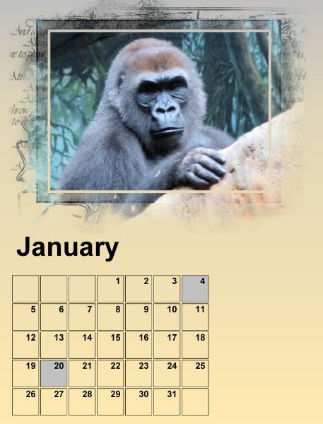
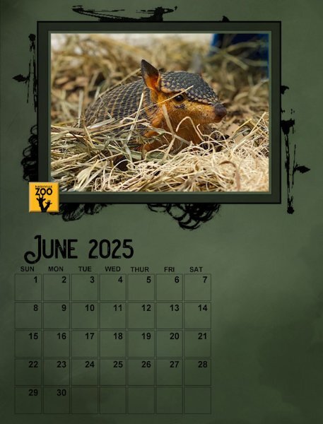
Well I have Day 1 calendar pages done. I used the day 2 Background instructions to liven the pages up. I also highlighted some dates as those are family birthdays that need to be remembered. These first two photos are from my library but were not shot in the wild. Hence the sad face on the gorilla. I struggled a bit this the mask until I realized from all the other submissions that they were designed to show through outside the frame. I like the effect.6 points
-
5 points
-
5 points
-
5 points
-
I love your work and the low saturated, but high contrast colors you use. May I ask what font this is?5 points
-
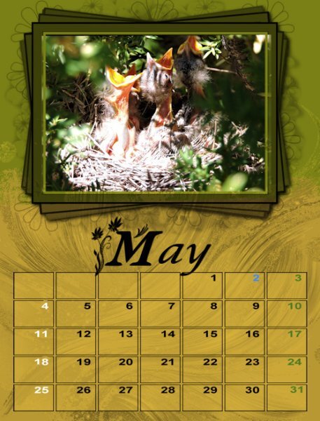
May I had to resize the mask since the photo was not a landscape. I merged the group and horizontally centered the image. The background was created in Adobe Express and modified with FF. Changing cass calendar font colors once the file has been merged is not possible. I think that I have saved some of the original files so I will be experimenting this afternoon. The mask for the cement statues is my own. Both photos are from David.5 points
-
5 points
-
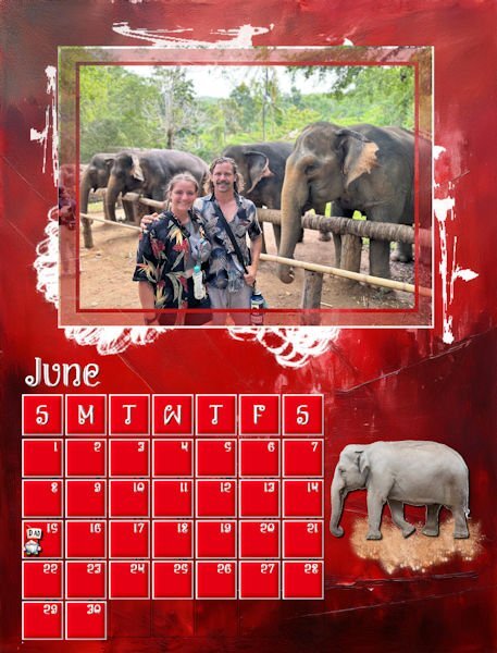
My finished June. I have been working on my calendars to make sure that they are consistent and adding major holidays. I decided not to use birthdays and anniversaries. I am not sure of the colors for June, although I love red, so this month may be changing. The elephant is an Asian elephant from Canva. My original elephant was African. David gave me a lesson on the differences.4 points
-
I'm keeping with the white background for the dates since they may be used for writing in after it's printed. Also keeping with the Arial Black for the font. But love what everyone is doing with their calendars as far as font, background, etc. which are in the tutorials. So, I decided to play around with background, fonts and whatever else the tutorials tell us to do. This is one of the background papers I made (looking forward to the upcoming workshop). This is some of the fonts I played with (but not the glyphs since I seem to have chosen ones without extra glyphs. On the paper, I played with blend modes on both papers and on the smaller one I used the layer style of outer glow.4 points
-
Wow! Thank you so much Julian. You have made my day. I had a log absence from photography and now it's become my passion again. This is a really nice font from Creative Fabrica called Daisy & Violette https://www.creativefabrica.com/product/daisy-violette-stylish-modern-serif/ It has lots of glyphs and is the style I like. One thing I found is when i was using it, the glyphs went outside the bounding box and were cut off. I realized after a while (a good long while!) that the BOLD was on and I had turned off bold by accident and there the whole glyph was. So when you are changing from the Arial Bold font, toggle off the bold on the tool bar above. At first I thought it was my font program.4 points
-
4 points
-
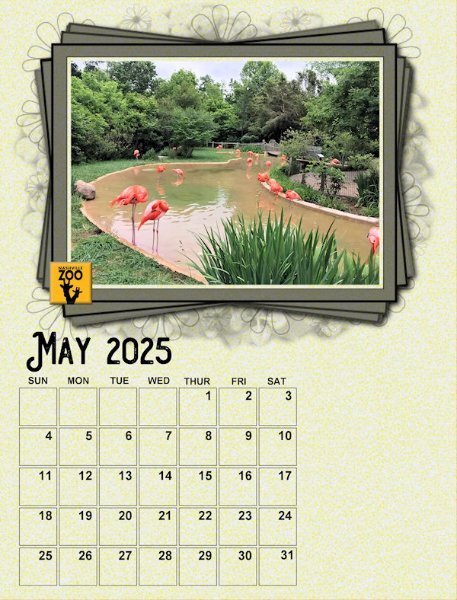
Julian, that is the original template design for May. She turned it 90 degrees.4 points
-
4 points
-
Julian, I only use this bevel on the squares. I have a lot of different bevels as presets for different items. Most of the presets are from Carole's tutorials, e.g. I have presets for different types of flowers, glitter, fonts, frames, etc.4 points
-
Thank you! I got the idea because in the photo of this script in the store is one item depicted as a leaf. Besides that I didn't want the normal boxes because the people that are going to get the calendar never write in those tiny boxes! However it is convenient that you can see with day of the week it is. It took me several tries to get it the way I like it.4 points
-
Thank you for your help Donna. I find sometimes when I use that the image gets much darker than I wanted to. Do you have any suggestions how to control the darkness of the image? @Cassel Do you have any suggestions Carole?4 points
-
4 points
-
Beautiful, Sharla! How did you get the green color on the mask? Oops, I figured it out, just add color to the PHOTO HERE layer. 🙃4 points
-
4 points
-
I haven't been posting my progress because I know we have to go back to prior days as we learn more. I'll post them when we're all done. I love what you've all been doing. This is a great group.4 points
-
That is a great photo of tulips. I like everything about your layout - it looks great.3 points
-
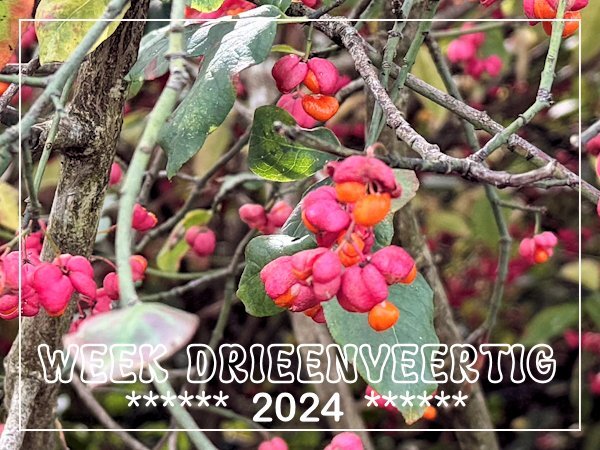
Through my village runs a railway track which is screened from the footpath that runs along the track by a fence and a thick row of bushes. It are all kind of bushes that provide almost yearlong interest. At the moment the Euonymus is still in flower; we call it "Kardinaalsmuts" which translate as Cardinal's bonnet and in English it is Spindle tree. I came across it a couple of days ago when I was running an errand and took a shortcut to get home a bit quicker, but I always have my phone with me.3 points
-
Love the addition of the outline. What a great idea. Photos are as usual, BEAUTIFUL!3 points
-
Sue, another beautiful and peaceful photo. Wonderful - we are fortunate that you share these images with us. Thank you.3 points
-
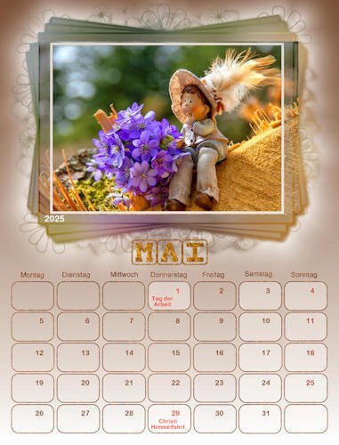
How do you get those frames on the main picture tilted like that and duplicated?3 points
-
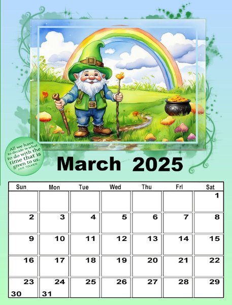
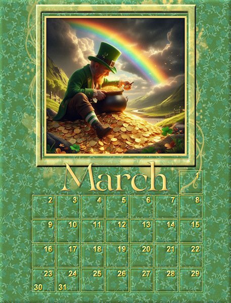
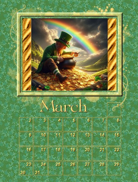
I asked Microsoft copilot AI to generate me an image of a leprechaun counting his gold at the end of the rainbow and this is what copilot gave me. @Cassel The image I had to work with was square but the window and the mask was a rectangle. Is there a way to edit the mask to make the opening in the middle be square without sacrificing any of the cool little squiggles that extend outside of the frame?3 points
-
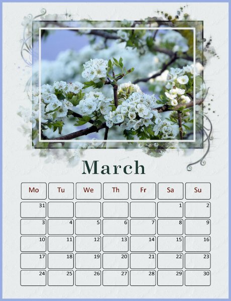
Well, I changed all the January :& February layouts (& the pspimages) so that the days of the week are abbreviated and centered. Works out well. The Arial Bold font that I am using doesn't show the small i very well. This is the March 2nd set page. I'm having trouble with the March 1st set since I am using St. Patrick's Day for the theme.3 points
-
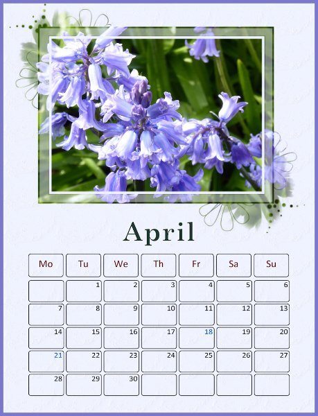
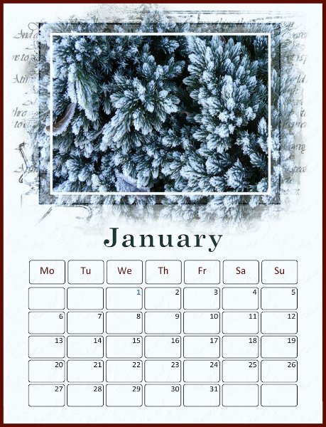
I’m using photos I’ve taken of flowers and plants. The dates have been created using Caroles Custom Calendar script – I’d already produced a calendar using these for 2025 so I saved a set as png files and am reusing them in this workshop. I have changed the colour of the days and will colour bank holiday dates blue. The month font is Century Schoolbook, Gautami for the dates. January: The photo is of frost on a small conifer in my garden taken in January of this year. The background layer is a colour from the photo with a very light watercolour texture applied.3 points
-
3 points
-
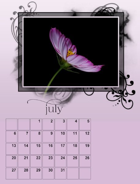
Gray is not a color I'd normally use but it looks perfect with the purple flowers3 points


