Leaderboard
Popular Content
Showing content with the highest reputation on 10/24/2024 in all areas
-
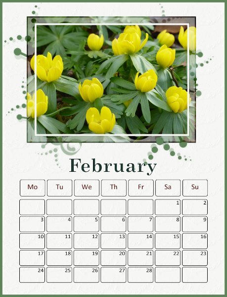
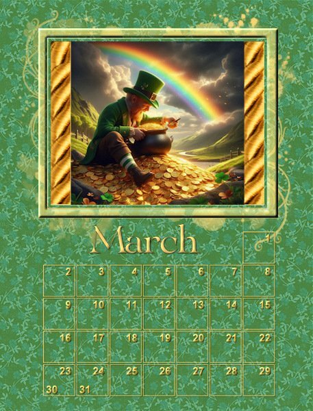
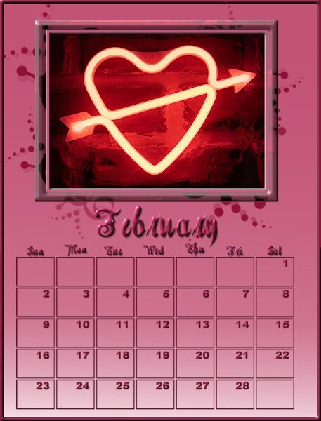
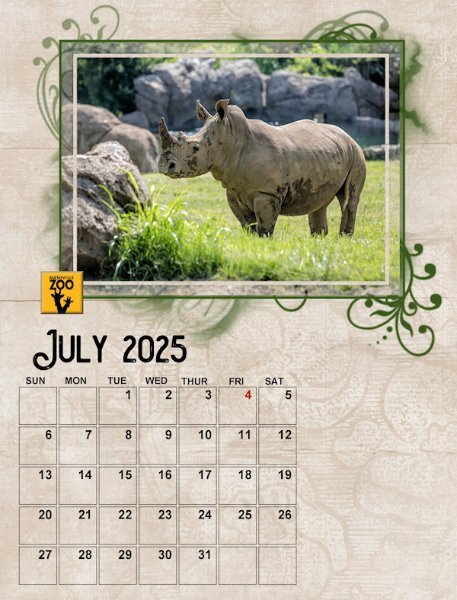
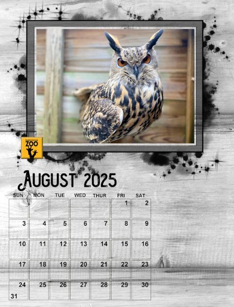
Well, I changed all the January :& February layouts (& the pspimages) so that the days of the week are abbreviated and centered. Works out well. The Arial Bold font that I am using doesn't show the small i very well. This is the March 2nd set page. I'm having trouble with the March 1st set since I am using St. Patrick's Day for the theme.7 points
-
7 points
-
7 points
-
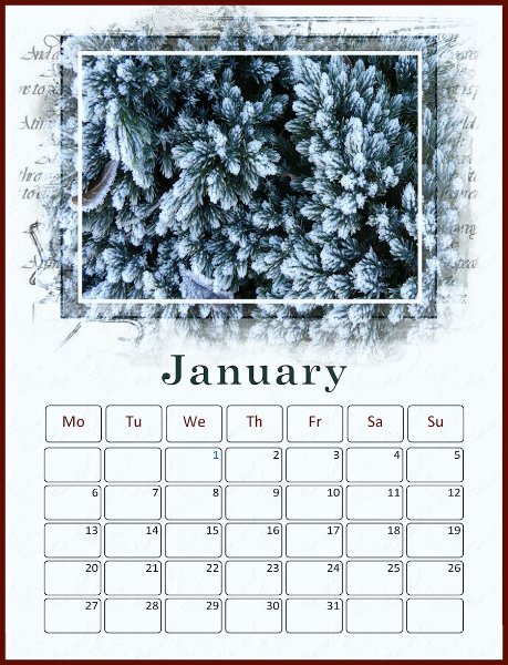
I’m using photos I’ve taken of flowers and plants. The dates have been created using Caroles Custom Calendar script – I’d already produced a calendar using these for 2025 so I saved a set as png files and am reusing them in this workshop. I have changed the colour of the days and will colour bank holiday dates blue. The month font is Century Schoolbook, Gautami for the dates. January: The photo is of frost on a small conifer in my garden taken in January of this year. The background layer is a colour from the photo with a very light watercolour texture applied.7 points
-
7 points
-
6 points
-
6 points
-
6 points
-
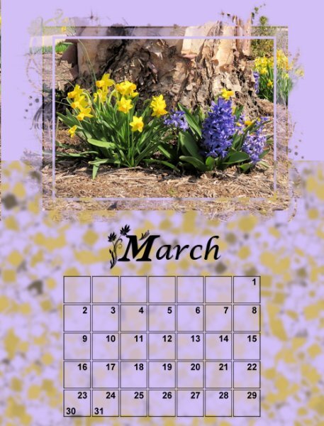
Here is my march after days 1 2 3 I went with font am-intex for the first letter and Lucida Calligraphy italic (that I plan to make more italic but forgot to do that before saving it) for the rest. I also see I need to extend by lavender background a bit, or I assume that is why the left side is not right.6 points
-
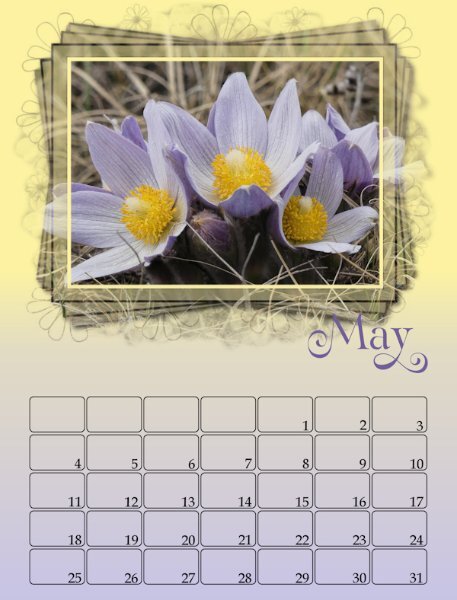
May I had to resize the mask since the photo was not a landscape. I merged the group and horizontally centered the image. The background was created in Adobe Express and modified with FF. Changing cass calendar font colors once the file has been merged is not possible. I think that I have saved some of the original files so I will be experimenting this afternoon. The mask for the cement statues is my own. Both photos are from David.5 points
-
5 points
-
I asked Microsoft copilot AI to generate me an image of a leprechaun counting his gold at the end of the rainbow and this is what copilot gave me. @Cassel The image I had to work with was square but the window and the mask was a rectangle. Is there a way to edit the mask to make the opening in the middle be square without sacrificing any of the cool little squiggles that extend outside of the frame?5 points
-
5 points
-
5 points
-
5 points
-
4 points
-
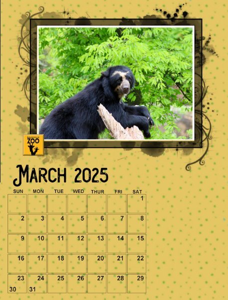
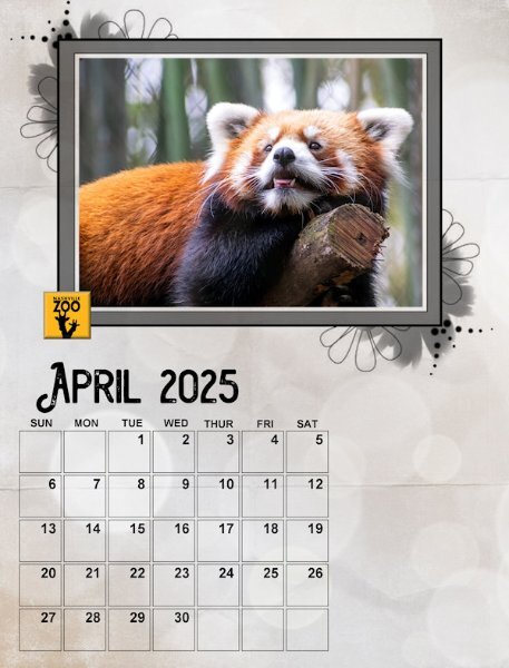
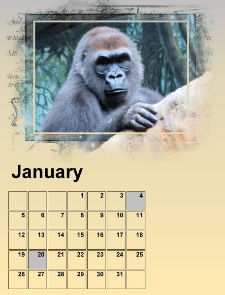
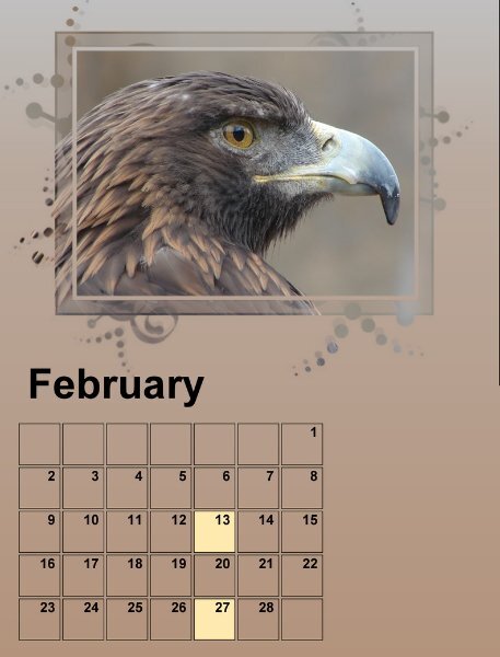
Well I have Day 1 calendar pages done. I used the day 2 Background instructions to liven the pages up. I also highlighted some dates as those are family birthdays that need to be remembered. These first two photos are from my library but were not shot in the wild. Hence the sad face on the gorilla. I struggled a bit this the mask until I realized from all the other submissions that they were designed to show through outside the frame. I like the effect.4 points
-
I haven't been posting my progress because I know we have to go back to prior days as we learn more. I'll post them when we're all done. I love what you've all been doing. This is a great group.4 points
-
4 points
-
4 points
-
4 points
-
4 points
-
4 points
-
4 points
-
4 points
-
4 points
-
Wow everybody has been so creative! Here are my preliminary pages 01 and 02, I managed to get something done. My theme is mushrooms/fungi and therefore I used cass-CustomCalendar script to make little mushrooms with the datenumbers in them. For the backgrounds I used background/foreground gradients but there will be some sort of texture on them, but I still have to figure out what I will use. My date mushrooms also got a matching gradient otherwise it was too monotone for my liking. The font for the months is Prida01. I have that font for a while now and the video tutorial reminded me of it! I'm not sure if I will change the dates for weekends and special dates; I'll have to experiment if that is going to work with those small mushrooms. I see I still have a black line on Januari and a point on the right top of februari; I'll change that, I thought I had done but it is still showing.3 points
-
3 points
-
It has to be a vector in order to make any adjustments. In order to adjust the kening, you need to highlight the letter/letters you want to move.3 points
-
I agree Carole, the models I find to shoot are the best, saying that the majority aren't always cooperative to pose for a photo shoot. Those that are make the time and effort all the more rewarding. Lol3 points
-
I'm not at the lap top, I believe it's called sparky dream. I like clean legible fonts, not to frilly so to speak. More importantly legible for anyone to read.3 points
-
What I tend to do is to duplicate the font, close the one and change the other to character shapes, making the adjustment manually. In my opinion the result is better.3 points
-
@Susan EwartMinimalism looks great to focus on those lovely flowers. @Sue Thomas You have the most photogenic models of all! @MoniqueN. I think that we will have many more projects posted as the workshop gets closer to the end since all the tutorials will have been demonstrated. Looking forward to yours. @Ann Seeber When using fancy glyphs on single characters, I noticed occasionally that it SEEMS to add a space, which can just be removed manually. Other times, I need to adjust the Kerning for that one character. I don't know if it is the case for yours, but something to check, just in case. I like those subtle papers you are using. @Mary Solaas Have you considered centering the days of the week instead of aligning them to the left? I am not 100% sure, but I wonder if it would make them a little more balanced? Maybe not. @Anne Lamp It is possible that the layers had been slightly shifted before saving them on my end, which might explain why some pages show a little line on the edge. At least, it is easy to fix by expanding the mask layer a tiny bit. @Corrie Kinkel Hopefully, you will still have enough time to complete your pages and get them printed in time for the holidays. @Donna Sillia On your February page, the decorative flower on the bottom corner has its light source coming from the right. Flip it horizontally and compare the shading. Although I plan on making written tutorials in the form of blog posts, you can check out the webinar that I hosted for Corel, a few years ago. Maybe I could revisit it as a Master Class? What do you think?3 points
-
So far I have already seen great pages by you all, I'm becoming a bit jealous because just as this workshop started my week planning went topsy turvy and there are a lot of things coming my way at the same time which need my undivided attention. I know it isn't a contest and I have ample time to finish my calendars,3 points
-
Art, go to the vector layer, and open it. Double click on the layer below, and the the bar showing in the screen shot will appear, you will then be able to edit that text.3 points
-
I'm OK now. It turns out that background colour is the same as the colour when a letter is selected. When I was did a background Fill with a different colour, the selected text in the month layer appeared. My bad.3 points
-
3 points
-
@Cassel I have a question about the templates. The mask group seems odd in that the PHOTO HERE layer must be retained as it contains the design which underlays the frame. First time I've ever seen that. In the past you've advised to hide it or delete it, but you can't with these. Also, the font Arial is displayed in POINTS rather than PIXELS on the templates. I get some odd size reactions when changing the font for the name of the month. Your videos show you using pixels, but they come out way too small on my PSP2023.3 points
-
3 points
-
Often the best way! I always think its fun to see what emerges when we're just creating.2 points
-
2 points
-
2 points
-
2 points
-
Those are very nice Donna! I was trying to remember how to get the little squares with the dates pop up like that. Used to know how to do it but I forgot. How do you do that?2 points
-
@Cassel I think you are right (as usual). Thank you. I've seen how various members have handled the days of the week and have decided to handle it by using the abbreviations since they are just 3 letters and will be easier to center over the blocks. Will take me a while to go back and redo the January's and February's and I have done one March so that one too. ONWARD!2 points
-
Not really. As I said, I first merged the frame/mask/photo group, then I added a background paper underneath it in the layers. I was astonished when the background paper pattern showed on top (or through) the frame/mask/photo group.2 points
-
Oh, I think i see what you mean. You put the image in the central part of the mask, leaving the grey sections partially transparent. That means that the background paper will show through that transparency. Is that possible?2 points
-
One thing to remember is that when you highlight the text, it will show a grey background. Unfortunately (that would be on me) it is the same grey as the background. One alternative is to Select All (Ctrl-A) as soon as you see the cursor appear. That will select the whole word and you can edit it. But if you change the background color, it might show the highlighted text easier.2 points
-
Ann with regard to the font being in points, all you need to do is to highlight the font and change to pixels if you prefer to work with pixels, as most of us do. All of mine are showing Bold pixels. I don't quite understand what you are meaning when you say you delete the Photo here layer. That layer can't and must not be deleted, it is needed.2 points
-
PHOTO HERE simply means to activate that layer to add your photo (which will be pasted just above it). That layer does not contain anything other than black so that you can see the effect of the mask above it. You can change it to any color if you want to see the impact. I could have chosen any other color than black. It is just for "visibility" purpose. I am not sure what you mean by not being able to hide/delete that layer. I know PSP2023 has been a bit picky in that. For the title size, which one are you looking at? Mine show in Pixels. It should be 200 pixels, but you can also adjust that based on the font you will use.2 points


