Leaderboard
Popular Content
Showing content with the highest reputation on 10/08/2024 in all areas
-
I wanted an autumn feel and few places are as beautiful as Central Park, NY during this season. These are stock photos that I wish I'd taken. Cass's polaroid script came in handy, even if I did edit them a little. The elements and backgrounds are from a bunch of different sources including PS blog trains, CF, and Boo Land Designs. Again, the Change to Target brush was a lifesaver. The font is AutumnEmbrace for both the title and the little leaves.5 points
-
I am so happy that it's October! I love this month and the colours it brings, and I could make layouts all day long. Trouble is, I don't take many pix so I have to rely on finding them somewhere. In this case, the photographer's name (at bottom of layout) is a local guy (Windsor, Ontario) who travels around and creates some great images. I lifted this one from his recent FB post. I've started delving into the Anna Aspnes goodies that I downloaded and most of the background is from her designs. There's some Katie Pertiet elements in there too. The camera brad was in my Autumn stash, and the transparent label is from dhariana and I forget what site that was from. So basically, I did nothing more than make frames for the image, then just shuffled a bunch of stuff around! But I enjoyed doing it! Blending and adjusting, and tweaking and moving, and more blending....4 points
-
Ok, sometimes it can be difficult to grasp a meaning in another language then my own!4 points
-
Adding my 2 cents... How often are there misunderstandings when talking to a person in front of us and using our own language? At home, at work, with friends and colleagues, and at family dinners... 😄 Talking and writing in a language other than one's first language only adds another layer of difficulty to comprehension. There are nuances that we can only fully comprehend in our first language. No wonder I add a lot of smileys to my posts here. 😉3 points
-
I'm in and looking forward to it. I've been a bit absent lately and this will be a nice change from the project I'm working on that keeps hitting walls (lots of challenges).3 points
-
And sometimes even in my own language somedays anything and everything is hard to grasp😔. I can't imagine thinking in one language and typing in another language.3 points
-
Julie you did a superb page and kept true to your delicate style! It seems that there are a lot of us that don't like it too glittery! I often have to rethink and retry different ways and layouts before I finally decide on the one that you all can see here! Sometimes it is a hate or love affair.3 points
-
You're right Sue. I might have felt the layout was forced and unnatural, but it is good to step outside our usual zones and try something different. It's a good reminder for other aspects of our lives too. Not just layout styles!3 points
-
On the left under each post is the word "Quote" - click on that and you'll have the format to type a response. No need to highlight anything unless it is vital to understanding your comment. HTH3 points
-
KP of 7 is forecasted for tonight too! Unfortunately, here, it is pourring rain. For those looking for references: https://www.swpc.noaa.gov/products/aurora-30-minute-forecast# I also use an app on my phone called Aurora. I just wished my phone could take those pics, but it does not. It is too old and does not have that powerful camera feature that newer phones have.2 points
-
I wish that this kind of hobby was recognized by health insurance! It has great mental health benefits!2 points
-
2 points
-
It might be the word "should". Brits use it differently than North Americans. For us, it has the connotation of something that OUGHT to be done. Just my tuppence.2 points
-
2 points
-
Susan, you have also been creating beautiful pages, elements, papers, etc. Don't be too harsh on yourself. 🙂💟 I have had the same feeling, and I just did not like what I had done. Now, I am more of the opinion that I should practice the techniques more, post what I have, and try harder next time if it is not a piece of art. 😉😄2 points
-
First of all, come and say HI once you register for this workshop. We want to know who else will be there, on our side to encourage us. Every page we will make will be different, based on each others' photos, stories, and preferences but we can all get inspired by everyone's projects. The workshop will start on October 21st. You might want to chitchat during the workshop, but you will want to wait until the end, once all the lessons are done since you will keep working through them all during the seven days. Now, let's get ready! (if you missed the registration link or if you found this thread before I announced it, HERE it is)1 point
-
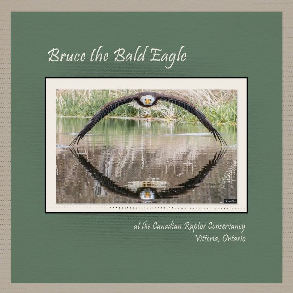
What a truly spectacular shot! You did the image justice, by keeping the layout at it's absolute minimal. I also love the fact that you took the colours from the image, making the layout an extention of the photo.1 point
-
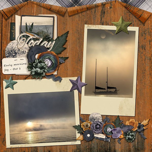
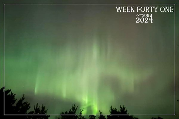
An occurance like this doesn't happen very often, well, certainly not with such intensity. The last time was in 1976 in Saskatchewan. A long awaited occurance happened last night. KP7 (a measure of geomagnetic activity index). Was it worth being outside taking pictures, until I couldn't feel my fingers any more? Yes! It most certainly was. We also had our first frost last night. The Aurora danced intensely overhead and south throughout the night, from 9pm til shortly after 5.30am this morning. Needless to say I didn't get to bed until shortly before 5am. With your permission I'd like to post an image per day until Friday. (Which is when my P52 week begins) Each one being different. Auroras occur when charged particles launched along the Earth's magnetic field collide with gases in the Earth's upper atmosphere. Those collisions produce tiny flashes that fill the sky with colourful light. What does KP7 mean, you may ask! Well, it means a strong storm, bright, dynamic and colourful aurorae, which is clearly visible in the southern sky. KP8, would be a severe storm, bright dynamic colourful, clearly visible again in the southern sky.1 point
-
From National Geographic magazine. Our shared hobby is good for us. (And pickleballers? You're in there too!) https://www.nationalgeographic.com/science/article/hobby-health-benefits-exercise-art-outdoors?rid=F706D92997827DA4EC860DF81A10247E&cmpid=org=ngp::mc=crm-email::src=ngp::cmp=editorial::add=Daily_NL_Tuesday_Health_202410081 point
-
I can wholeheartedly agree to this. It helps me in the periods when my husband is ill.1 point
-
You get used to it and when I'm using English I think in English most of the time. All things scrapbook related are in English for me and I find it sometimes difficult to explain in Dutch what I do to a friend. 😃1 point
-
1 point
-
Beautiful layout and photo, Julie. I love the idea of adding frames to the photo; it makes the colorful photo stand out more. When I create pages using mostly designer resources, I see it as a learning process. I pay attention to how they created the cluster, added a brush, a texture, or whatever. Maybe later, if I remember, I can try to replicate it using my own resources—at least the ones I can create myself!1 point
-
Thank you so much, Julie! 💟 I also love seeing old photos and would love to create pages with them, but I have very few family photos or my own. The ones I have were sent by a cousin some time ago, who found copies when a family member passed away. Somehow, they were lost when my mother was moving to different houses; I was far away, and my brothers were not interested in that at the time. But I still have photos of Mom and Dad in my memory even before they were married, also as teenagers. 🙂1 point
-
1 point
-
1 point
-
I will be there as well and it will be my 5th calendar workshop. When I'm finished with all the months I'll print the calendar and use it for some gifts. One of the recipients of the last 4 has already inquired if there will be a new one and if so what the theme is going to be! I have used up most of my flower photos in the earlier versions, so this year it will be all about mushrooms; I have quite a lot of photos about those.1 point
-
1 point
-
I have joined the ranks of the calendar people. Not because I plan to actually make/print a calendar, but to be involved and learn some new tips and tricks. Now I have to think of a theme?1 point
-
This is fun and has so many elements to admire. Love the kitty too.1 point
-
I do like calendars and look forward to something new for 2025. We had a workshop in November of 2023 when I created a 2024 series for the wildlife of Botswana. I've also been re-using those templates for my 2024 Wild Cat Calendar that I do every month. The first calendar I created here on the Campus featured the TV show, Downton Abbey for 2023, intended for my granddaughter Anna for Christmas that year and I recall one of my classmates here did one for the show Outlander. I'll be looking for a new theme for this calendar workshop.1 point
-
1 point
-
This challenge is packed with beautiful layouts. It's a joy to go through each one of them.1 point
-
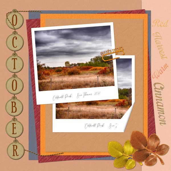
Sue, this layout is just another example of your amazing work. It has so many well-thought-out details and techniques. I love the paper clip with a text. Brilliant.1 point
-
1 point
-
To reply to someone's comment, highlight their comment (or part of it) and you will see a "bubble" appear at the end of the highlighted text, saying "Quote Selection". Click on that and it will automatically include that section in a response, while notifying the poster. And don't worry about others having finished the Bootcamp. This thread will stay open.1 point
-
Gonna try this one more time. Papers PBS-Escale amoureuse- Talie and Flolinette-PBS-EscaleAmoureuse. Rest is original and off the internet.1 point
-
Oh Julie, it is my opinion, that you have created a superb page, depicting your own delicate style. I also feel that you judge yourself far to harshly. Using glitter, took me outside of my comfort zone, which can be good thing. Allowing to experience something a little different. I look at your work, and I see a sensitive creator, producing perfection.1 point
-
I am posting this layout (without my own approval) to get it over with! I have started and stopped so many times with different attempts at using the 1-2-3 elements required and I just couldn't get it to work. So I figured - glitter? must be for a celebration, right? So I made a kid's birthday (photo from online) layout using some stuff from my stash. Bits and pieces from Billie Irene (the folded edges on the corally-coloured background paper); Rachel Jefferies for much of the birthday things (e.g. balloon sketches and striped paper at the far right); also some glitter bits from Marisa Lerin. The only piece I was involved with was the striped folded-corner paper in the background. The whole effort felt forced and unnatural to me, but I really wanted to produce something I could post and live with. If anything is missing or not according to instructions, please don't judge me too harshly. I have to let it go!1 point
-
Keeping you on your toes! 😉At least you may get to learn a new technique. Have fun, as that is what we are all about, whilst showcasing our photos in a creative way.1 point
-
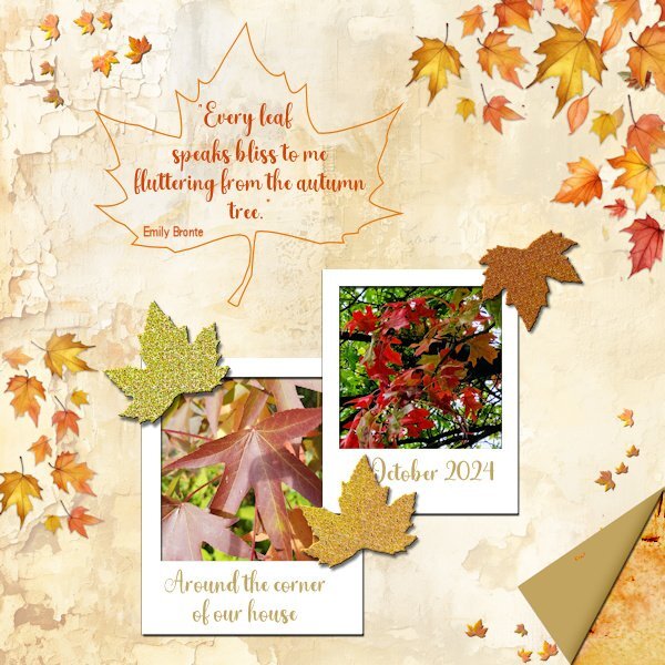
And here is mine and I am not so fond of glitters either! But I have managed to make 3. I used a background from the recent ACD freebie template because it goes nicely with what I had in mind. I already had polaroid frames and because of the background and my photos I made leaves confetti from a photo with cass-Custom Confetti script; the new script from this week would have come in handy, but that is on my wish list for now. I have used the same extracted leaf to make a frame around my text and used it again to make 3 glitter leaves. The folded corner is done with cass-Folded Corner script, after I had to ask Carole why my script wasn't working as expected. It happened to be one of the older scripts that doesn't work in the more recent versions of PSP. So if anyone has a problem with that, there is a new script, thank you Carole. Of course I know how to make a folded corner manually but I still have some problems with my eyesight and those very precise actions are still difficult for me at the moment. Besides that I have the script to use it!1 point
-
1 point
-
I didn't realize. Taking it down again. Will repost after I get it figured out.1 point
-
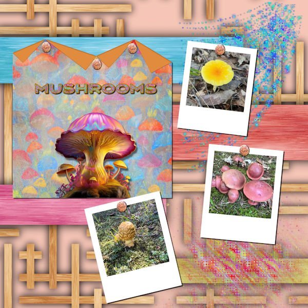
My daughter just sent me photos of some of the mushrooms that see saw on a walk in a Fredericksburg park. The background is called Wood Art from FF. the folded paper is one of mine with a mushroom background created in AI and blended. The big mushroom in the center is from Adobe Express AI. The title was also created in Adobe Express, imported into PSP where I converted it to a vector using the selection to path script so that I could add a glittered stroke with a layer style. I used a star sparkly brush to create the glitters. I used Carole's polaroid lab video to create the polaroid frames. The rusty nails are from Canva. I love glitter, and the stars brushes are great for creating scatters.1 point
-
I appreciate that Julie. If it's of any help to you, I always start by putting the photos onto a bank page. In this case the polaroid images. From there I create the papers. The size, shape, placement and number of the papers will be taken into account, of where the text, journal, title and so on will go. Elements are more often than not created and placed last. Quite often rule of thirds play a part in the initial layout. Direction of a bird, mammal insect in which it is facing, is also important. I suppose, it's my eye that determines the layout I go with. Maintaining a balanced minimalistic layout is what I aim for.1 point
-
1 point
-
I must say I'm most definately not a glittery person. I rarely use glitter in my layouts. Saying that I turned my paperclip I created some time ago into a gold glittery one. The leafy elements I turned into a soft glitter, along with the wording. It is glittery, as I used the glitter 2 tutorial from the creative scrap, but toned it down somewhat. All my own work. 1 folded corner on a polaroid photo. For the papers I applied textures and blend modes, after selecting colours from the photo.1 point
-
1 point
-
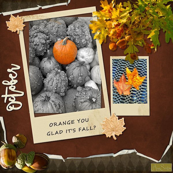
ORANGE YOU GLAD IT'S FALL? Folded paper, Polaroid frames and glitter leaves and word art from Merisa Lerin. Corel fall overlays are freebies this week. Font used is Segoe Script. I got most everything on Digitalscrapbooking.com as daily freebies today. The photos are by Chuck Calio on the Hudson Valley in Pictures Gallery.1 point
-
Assuming the elements are all the same shape and size, you could even flip, rotate, or even mirror them once the texture had been applied.1 point




Resized.thumb.jpg.d25811db03a63358cedab1e79f527635.jpg)


