Leaderboard
Popular Content
Showing content with the highest reputation on 09/09/2024 in all areas
-
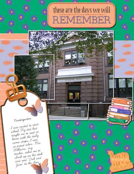
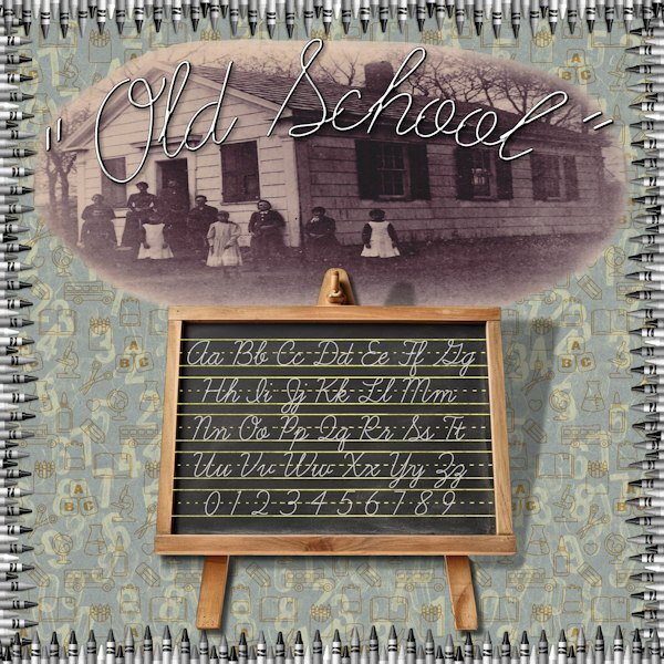
I love monoline fonts like this one. They look great with inner bevels. The elements are from my older stash so I can't give the proper credit.6 points
-
5 points
-
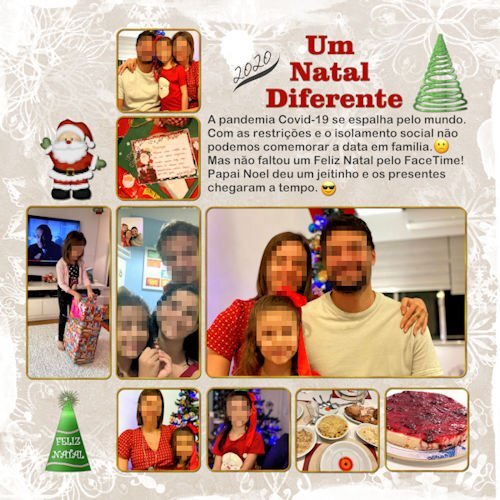
LAB 11-Module 12 tutorials: Glittered Tree -- Knitting -- Party Hat When practicing the Lab tutorials, I look up photos in my folders that have something in common with the tutorials, like Christmas, Summer, School, etc. Sometimes, it is not easy to find something suitable. Credits Cassel: Template from the Lab10-M02. I tweaked the dimensions of the photos. I like this template very much and have used it a few times before. Fireworks1 Picture Tube Diamond Chain-02 Picture Tube Others: Santa by Crazy Cat Creations-CCC_THT ele (18). I added the knitting effect to it Background paper by DiHiller_Happy Snow Season paper4 Fonts: Galeforce BTN -- Middle Class Script Swash -- Arial Rounded MT Bold -- Curlz MT ---------------------------------------------------------------------------------------------------------------------------------------------------- With this layout, I’ve finished all modules from Lab 11. Now, it’s only missing Labs 12, 13, 14 😁5 points
-
5 points
-
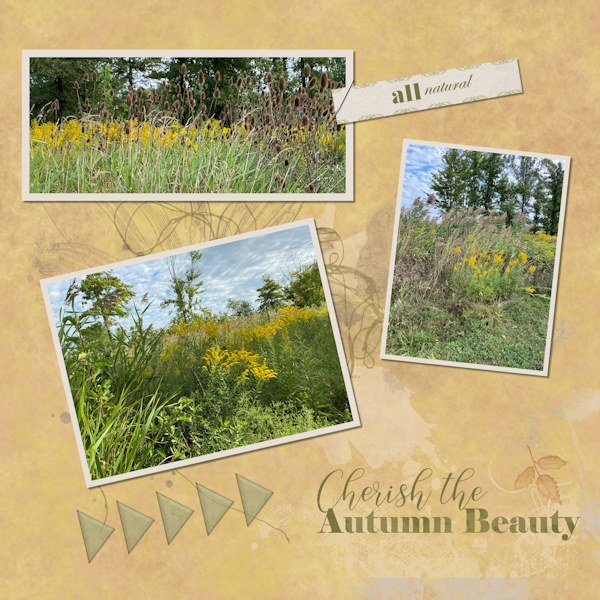
These pix are from a small natural area near where I live where I sometimes walk the dogs. We did today and I was impressed with the fall vibes there and actually had my phone with me (a rare occurrence on a walk). I should carry it with me more often, I suppose. I love autumn, and I wait patiently (?) all through our stifling, humid summers for the cooler, drier days which have made an appearance lately. Feels like coming alive again!4 points
-
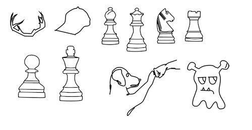
Among other things, been playing around with creating pre-set shapes (vectors) a little bit. The last one was one that I converted from some I found that were listed as vectors (I think psd format?...for photoshop?) but really weren't so had to work on it in PSP. I'm hoping I saved the chess pieces as pspimage because I did something wrong...the shapes in the preset shape drop down do not match up to the shape that gets drawn . When I do the shape, the names are correct in the vector objects so not sure where I went awry on that.3 points
-
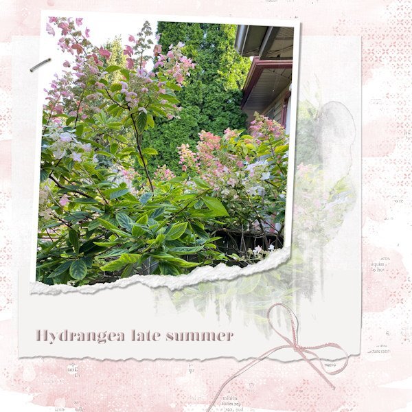
Lovely photo and it reminds me that I have to take some photos of my hydrangeas too before they are totally brown and dried, which can also give nice photos.3 points
-
Julie lovely and yes you should take your phone with you, you never know if there will be something interesting! I have my phone always with me and have taken a lot of photos this way, actually more so than when I go with the intention of taking photos.😉2 points
-
Daniel maybe I'm going to say something you already do, but when drawing a shape you have to hold the shift key on your keyboard. In this way the shapes stay as you want them.2 points
-
I so agree with you! And I don't want to give my info everywhere any longer. Sometimes it is also very difficult to unsubscribe from sites if I'm no longer interested.2 points
-
2 points
-
Finally got something together. I've had some pix I took of the hydrangea near my deck. I love observing how the colours shift from creamy white to light pink to dark pink. Mother Nature and her palette at work. I used the photo in a mask on the white layer, and then put the pic into a ripped frame. Got the idea from elsewhere and wanted to try it.2 points
-
I'll eat almost ANY cookie, pretty or not. But such lovely edibles must taste more delish.2 points
-
I ALWAYS think of things I should have done to a layout after I've put it away! And you're both 59? The next decade is approaching....!2 points
-
Brilliant layout Susan. No wonder your BFF enjoyed it. Making personalized greetings is so much more meaningful than a Hallmark card sometimes.2 points
-
I don't ever use "save as". Always the download link. Just a quirky thing I guess about which are really transparent and which are not. I think it's getting harder to find truly "free" images and clipart. Every site wants something back from me. My email, or sign up for free for a trial, or pay. Harr-rumph! I'm tired of giving my info everywhere!2 points
-
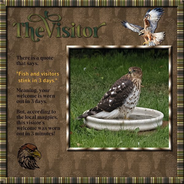
Lab 14-9 or Sketch 13, you decide. I started out doing something for the sketch challenge and ended up watching the tutorials for the most recent Lab (14-9). the items are: Striped Ribbon (2) Tight Diagonal The Striped Ribbon turned into the frame around the outer edge. I added a texture (blinds) and some noise and then duplicated and made a frame that I beveled. This is a quick and very easy to do tutorial. I kept my layers separate so I could decide on the background color (dark green looked better than white - it looks like black lines in the frame, but it's actually a dark green). The Tight Diagonal is really cool and easier than I expected. I did graphic of a hawk line drawing I found at Creative Fabrica. Then I used a blend mode and lowered the opacity as it was really busy and dark. Remember this tutorial when you do the Build A Kit next year, it will make for great papers. The hawk flying in and the hawk head are from Creative Fabrica and I changed the color of the feather on the head, used a blend mode, lowered the opacity and used the eraser tool to grunge it up a bit. Fonts are from Creative Fabrica; Gravity Wanders (Title and the journaling) and Gudea (yellow quote), Gudea might not be from CF. Background paper is Brook Gazarek (Digital Scrapbook). The birdbath I had took off the pedestal for a crow that had a bad leg a month ago. It turned out to be the favorite of the birds and squirrel this yr. This hawk flew in and stayed in the bath (it was hot out) for more than 20 minutes. The magpies gathered and watched very intently and then a lone little blue jay flew in to a branch 3 feet above the hawk and gave it a good talking too. All the birds were well behaved as this was big bird. When the Merlin flies in, the magpies endlessly taunt it and nip at the tail feathers. It's a much smaller bird. It was very exciting. I don't know what kind of hawk it is.2 points
-
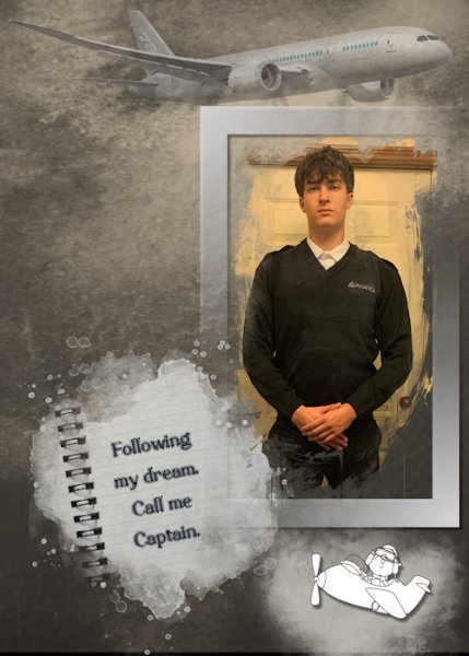
I was fortunate to receive a recent photo of my great-nephew who is about to start his Aviation School training (his long-term dream) at Sault College in Northern Ontario. As always, more challenging to make a "male" layout, but I can live with this version. He has worked so hard and done so much preparation for this venture.2 points
-
1 point
-
Thanks Cristina, but the idea came from elsewhere. It was a fun one to work on.1 point
-
1 point
-
1 point
-
Thanks, I will, I just thought it was supposed to look like that. LOL1 point
-
I've asked about this problem previously. I download a PNG, use Open as New Layer, and it comes in with a white (or dark) background. Today, I tried using OPEN, and it came in as a proper transparent background! Go figure! But that makes me happy!1 point
-
They are very good and I do manage to eat them. Sometimes I feel really bad for eating them...not!1 point
-
They are very good, Corrie. I also hate to destroy the beauty and creativity, but somehow, I manage.1 point
-
1 point
-
Thank you Corrie. the little 6x6 puzzle is really fabulous because each puzzle piece is on it's own layer and it asks if you want to group them (I did) so you can take the whole group into the layout as is. then I could choose which pieces to pull out. I wish I had moved the smaller ones to the background so it would look like pieces on a puzzle mat, I thought of that later. I did duplicate the layers of pieces I took out (then hid the layer) so I could rotate the pieces. If in the future I wanted to put them back I would just hide the rotated one and unhide the orig. The other two puzzles you choose, with the brush tool, which ones you want to separate. They are fun scripts to use. My friend really liked the layout...she did not like that we both are now 59! How did that happen?1 point
-
I love how you did some puzzle pieces separate. It really looks as if someone is busy putting the last pieces in place.1 point
-
I really love the August Moon layout. Outstanding! And the script you did for the muffins had my head going in circles, very impressive that you can make "a little script" any 'ol time you want.1 point
-
1 point
-
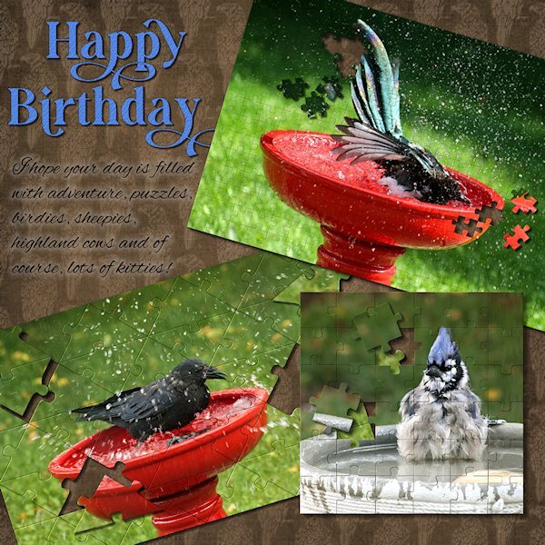
This was a quickie for one of my best friends (since we were 12 yrs old!). She recently moved to Scotland (7 hours ahead of me), and I left it until the last moment - life happens, right? She loves birds and puzzles and all the silly stuff I wrote about. I used 3 different puzzles and a HUGE THANK YOU to Carole for helping with an issue. They are really fun to play with. And good if you need to do a layout quickly (although no layout is ever quick for me). Fonts are Gravity Wanders (CF) and Alex Brush (from a freebie sight). And I re-used the tight diagonal paper from the Lab 14-9.1 point
-
My friend, Maryann, is a self taught cookie decorator. I think her work is amazing. I gave her the car cookie cutter, thinking she might use it for weddings. She created a completely different design and turned it into a pickleball car! She also made this cookie when a new pickleball venue opened here. She used the company colors and changed the wording, etc. Needless to say, they loved it! Heart cookie cutter by Brooke Gazarek at Digital Scrapbooking. Turner and rolling pin by Jessica Dunn, Baking Days at Digital Scrapbooking.1 point
-
I always use the download links and sometimes that goes totally fine and sometimes I encounter the above mentioned problems. I have no clue why that happens; it is annoying but like Ann said that background can be removed. If I want to have that particular png I will do so otherwise I'll search for something else instead.1 point
-
Just as a reminder, in case it can help some users, when downloading images from those PNG sites, it is important to use their download links and NOT right-click on the image to "save as...". It might not be the case, but I have often seen users do that, thinking it would download the PNG version, but that only downloads the jpg preview/thumbnail.1 point
-
No, but it seems to be most of the free ones I download. It's not a big deal, but it happens often enough. All I do is run a search again for another one with a transparent background, or just leave it out of the layout. The background removal takes me too long.1 point
-
1 point
-
I find the supplies offered as transparent PNGs don't always deliver the goods. I always test the checkered background with my eraser tool because many times I've found that they've been faked. Usually can be fixed easily, though.1 point
-
1 point
-
1 point
-
Template 6 by Lady 22. She has started sharing some of her templates at Digital Scrapbooking. She also shares on her own web site. Word art, paw prints and paw print heart from Creative Fabrica. This is Poppy as a kitten. She is now 12.1 point
-
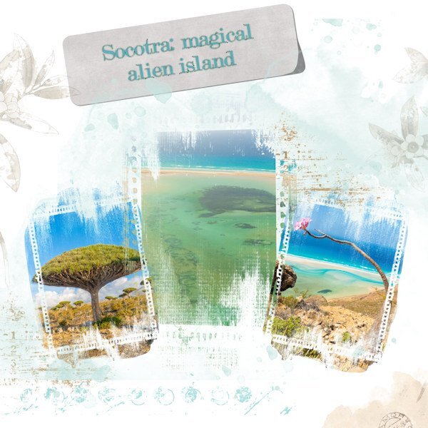
I have only sporadically worked with PSP over the last couple of weeks. And I was not satisfied with anything I attempted to do. Watching yesterday's Master Class made me feel more connected again. Then, in one of those moments that sometimes happens, I came across some info and pix of the "Galapagos Island" of the Indian Ocean with its rare botanical specimens found no where else. Of course, as is the case everywhere, this unique place is under threat due to many factors, including its location in a geopolitical hotspot. I had never heard of this island before. There must be some fortunate and intrepid travellers in the world who have gone there. I won't be going, but it's dazzling to see the many images available. The trees alone are worth looking at. Dragon's Blood and Desert Rose to name just two unusual ones (pictured in layout). And I know my shadow on the tag is a bit wonky. But I did what I could to make it appear a little lifted.1 point






Resized.thumb.jpg.d25811db03a63358cedab1e79f527635.jpg)
