Leaderboard
Popular Content
Showing content with the highest reputation on 09/05/2024 in all areas
-
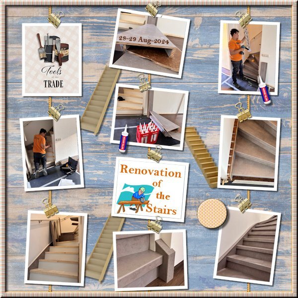
I had a lot of pictures from our recent stairs renovation and wanted to do something with them. I tried different templates and in the end decided on cass-Hanging Photos 2 template because it had the number of photos that I wanted. The background is made from 2 "wood" papers from 2 different kits by Jessica Dunn and blended together just as the journal card. The stairs and the carpenter sticker I found on kisspng; the glue bottle is from a DIY-kit by Chantahlia Design. I like the Lab 14-09 tutorials and made a tight diagonal with the € sign instead of the $ sign, not all fonts have that €! I think that are probably older fonts and the euro currency is only since 1999 in existence. Our new stairs didn't came cheap and therefore I wanted that € for this layout. But in the end it was way to overpowering and I made a flairbutton out of it. Last I made a striped ribbon, also Lab 14-09 with a very faint blinds texture and used it for a frame. It has become a whole list.....5 points
-
Thank you, Cristina. She's a little manipulor and I fall for it everytime!4 points
-
3 points
-
Oh, yeah, I forgot I've been in helicopters. A company I worked for on Long Island, NY had a subsidiary in CT. They also owned a couple of helicopters so when I had to go to CT, they flew me there. It was pretty cool.3 points
-
Wow, your Euro flairbutton looks very handsome! Nice use of the hanging photos layout. I use it a bit, myself.3 points
-
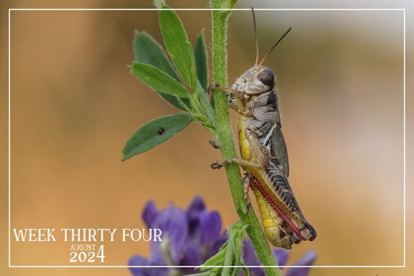
Sue I missed you here, but knew you would be outside probably riding. But these couple of photos are lovely and the grasshopper is fantastic, I can see all the details!3 points
-
2 points
-
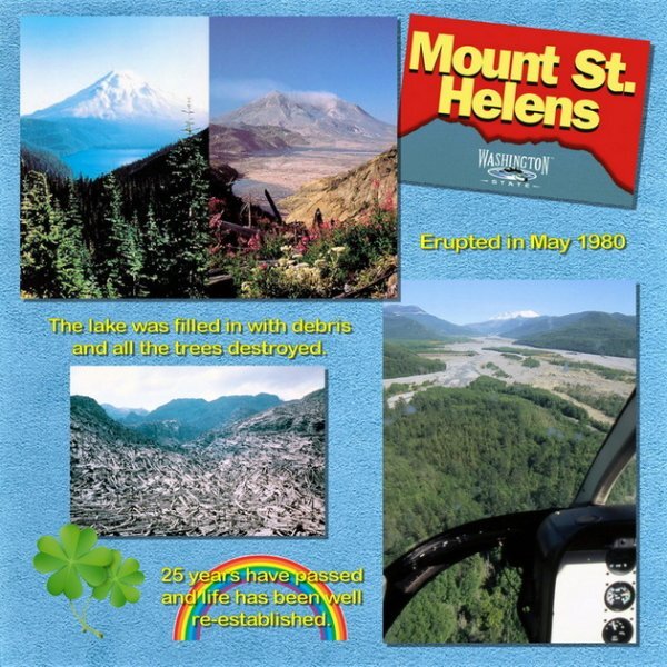
With all this talk about flights in helicopters, how about a sharing some of the photos you took during those flights, if any. Here is one of mine. Our most memorable flight was over Mt Saint Helens in 2005. This was 25 years after its major eruption. I found some images online to show what it looked like before and after. Then I added my photo from the helicopter flight over the valley. It was wonderful to see how much had been restored by Mother Nature. We even saw some deer wandering near the river. Life goes on.2 points
-
Does driving a motorcycle (Harley) for years qualify as risky? Some say so, but I was properly trained and always behaved as if I were invisible to other traffic, which most bikes are! Other drivers just don't see us. Cruising along the back roads and through beautiful scenery was enough adrenaline rush for me. I also wanted to skydive back when I was young, but I would feel OK with ziplining now. Bungee jumping? Not so much.2 points
-
Thanks and those stairs reminded me of that game too. I even considered placing more of them in that manner, but in the end decided against it because it became way to much. I think as it is so easy to make a striped paper and use it as a ribbon I will probably make more of those with the colors of the layout I'm working on. A bow or knot will also look nice.2 points
-
This also reminds me of a helicopter ride in Branson Mo. It was before we realized how bad my Hubby's phobia was. It was just a short ride to look at the dam. Hubby hung on to his seat with on hand and the back of the pilot's chair with the other. I swear he probably left permanent marks in them. I teased him when we landed saying that don't you know if the copter goes down those seat are going down too.2 points
-
2 points
-
2 points
-
Julie, this sounds familiar... 🙂 I like the layout and the grungy look very much.2 points
-
I haven't heard anything concrete about a new version, either. However, given PaintshopPro's popularity, I'd imagine that the developers would eventually release an update.2 points
-
2 points
-
I was pleased with the grasshopper shot, it's wonderful when they cooperate and pose for me. Even the fine hairs running down the Prothorax are clearly visible. I'm going to try and catch up, especially the challenges, as I like to participate in those.2 points
-
Back when those brushes were created, images were not as large as they are now. The only way you can TRY to enlarge your brushes is to re-create them, and enlarge them using the AIPowered resize. Hum... maybe a script? I'd have to look at that.2 points
-
Even the pigeons stayed up on the power lines. the hawk was look around and up at his audience. All birds except the blue jay were just chillin' . I thought it was weird. The merlin flew in the next day and the it had 6 magpies in tow and they kept darting at it and picking at it's tail feathers until it left, about 1 minute later. The merlin is quite small but a real power house hunter and if it's flying around the school field the my house backs onto, the magpies are on high alert (Merlins eat the magpies chicks).2 points
-
2 points
-
I am behind, as I've been away trail riding in the Grasslands. I've been back since Monday, but it has taken me a couple of days to get back into the swing of things. Macro shot of a tiny banded grasshopper. It has everything going for it, colour, textures, patterns, even gradients. There isn't anything that can surpass Morther Natures palette.2 points
-
How fortunate the timing of your last Scrapbook email. It arrived just a day before the episode with the Miramichi zip-line was aired here. We watched it last night and it sure looks like a beautiful location. Now I have another thing to put on my bucket list; to go zip-lining and visit more of New Brunswick. I was in New Brunswick as a teenager. I was an Air Cadet and learned to fly at Saint John Airport. Then for my solo cross-country flight I was sent to fly from Saint John to Moncton to Frederickton and back to Saint John. I saw a lot of trees from the air but I didn't really see much else. So a future trip to see it from the ground is in order.2 points
-
I love heights, but l[ving in the Netherlands which is flat there wasn't much of an opportunity to do anything that adventurous. But whenever visiting in Switzerland I loved to take the cable cars or chairlifts that are crossing a deep valley below. I have never come across the chance to do ziplining, but I think I will love it. A helicopter ride and hot air balloon are the most adventurous I did. Some steep mountain trails in my younger years as well and that is it!2 points
-
I have always wanted to do the zip line adventure. Any time we were somewhere I could do that I didn't because of my Hubby. He has a real problem withe heighths and would have been a nervous wreck by the time I got back down. On one of our jobs there were lights to be changed way up high. There was a old but safe wooden ladder we had to use (it shook a little). I would go up to change the lights and it was his job to hold the ladder and sweat for me. Other than some of the crazy things I did with my horse over the years, I have never done anything particularly adventurous.2 points
-
2 points
-
Hey, Michele! I've always wanted to skydive. Want to go skydiving together? I plan to go ziplining in March when I attend a pickleball clinic in Costa Rico. Looking forward to it. I use to race cars way long ago. It was a race called autocrossing. We used pylons to mark the course and we raced mostly in shopping center parking lots. Races were on Sunday when the centers were closed (blue laws). Totally legal with the shopping center's permission. We raced against the clock, one car at a time. I once held a national drag race record...drag strip, one car at a time, against the clock. I also raced at Summit Point, a road course, right and left turns, hairpin turns, etc. Again, one car at the time against the clock. I had the fastest time of the day once. I also went to I Fly...you may have seen my layouts about that adventure. I would love to go again.2 points
-
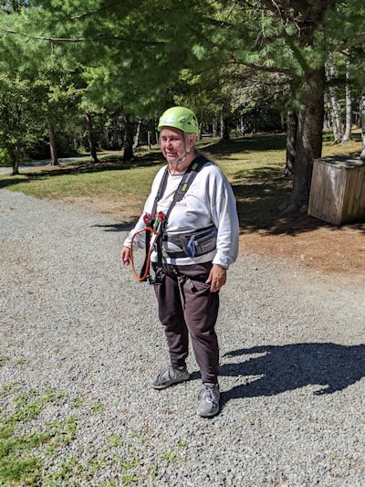
I am an adrenaline junkie who never had an opportunity to do any of those things. By the time I could afford those activities, I was a single mom and didn't think it would be responsible to do so. I probably wouldn't skydive at my age, which I always wanted to do. However, if given the chance, I would definitely go ziplining. Besides roller coasters (I love heights) and other rides, the most exciting thing I've done is white water rafting.2 points
-
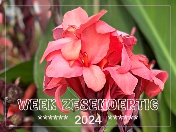
Where I live we have a small station with 2 platforms and of course there is a pedestrian crossing which everybody can use to cross the tracks. This year there are big containers with nice greenery and flowers in the square and as I have to use that crossing almost daily I enjoyed the flowers. The planting in the containers is changed as soon as it begins to wilt or dies down. Now there are Canna's in them with an underplanting of Pelargoniums. It was impossible to get a good photo without people in it and most people aren't happy when they think you are taking photos of them unasked. I didn't want those people in my photos anyway so no photo of the containers but a detail of the Canna in them.1 point
-
I think PSPs Background Eraser was the first tool I got really handy with in the early days...1 point
-
No, but it seems to be most of the free ones I download. It's not a big deal, but it happens often enough. All I do is run a search again for another one with a transparent background, or just leave it out of the layout. The background removal takes me too long.1 point
-
I have heard a lot of controversy with Photoshop, as they changed their Terms of Service, to use users' projects to train their AI. I don't know the ins and outs of PSP development, but MAYBE they are waiting for that issue to settle down before releasing anything new? I don't know. I just guess.1 point
-
I guess renovations are never cheaper; one thinks they will cost a lot, but they end up costing much more. Corrie, great work with the layout ( this script is great) and the flair button.1 point
-
Great work, Ann. I always learn something from your Wild Cat Calendar.1 point
-
Poppy is so beautiful, and by the look, she seems to be so sweet. You created a lovely layout, Bonnie. I like Lady 22's templates; they always have a mask.1 point
-
Didn't know there was such a thing! Likely only in USA? Would sure like to try them.1 point
-
1 point
-
X = X rated novelty candy and cakes. (Not that I regularly eat them but have on occasion at a party. LOL)1 point
-
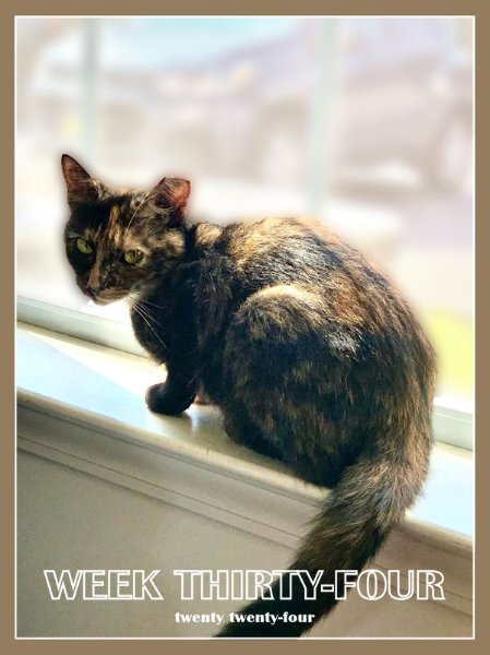
My Week 34 - Sept 1, 2024, TNR rescue cat Brandy, the tortoiseshell teen! It seems she won't stay in the house, so she has resumed outdoor meals. My 2 senior indoor cats are vastly relieved! 😅 UPDATE: She's back inside, quarantined to the bed/bath again. She ran because the seniors were bullying her. We have to work on that.1 point
-
I find the supplies offered as transparent PNGs don't always deliver the goods. I always test the checkered background with my eraser tool because many times I've found that they've been faked. Usually can be fixed easily, though.1 point
-
1 point
-
1 point
-
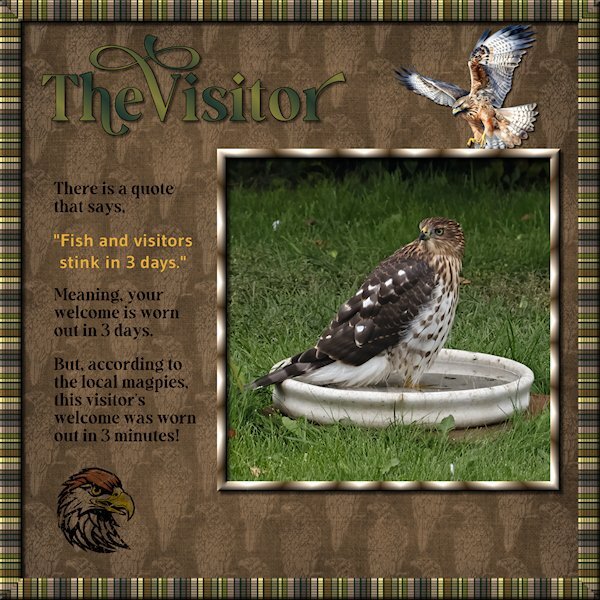
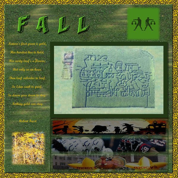
Lab 14-9 or Sketch 13, you decide. I started out doing something for the sketch challenge and ended up watching the tutorials for the most recent Lab (14-9). the items are: Striped Ribbon (2) Tight Diagonal The Striped Ribbon turned into the frame around the outer edge. I added a texture (blinds) and some noise and then duplicated and made a frame that I beveled. This is a quick and very easy to do tutorial. I kept my layers separate so I could decide on the background color (dark green looked better than white - it looks like black lines in the frame, but it's actually a dark green). The Tight Diagonal is really cool and easier than I expected. I did graphic of a hawk line drawing I found at Creative Fabrica. Then I used a blend mode and lowered the opacity as it was really busy and dark. Remember this tutorial when you do the Build A Kit next year, it will make for great papers. The hawk flying in and the hawk head are from Creative Fabrica and I changed the color of the feather on the head, used a blend mode, lowered the opacity and used the eraser tool to grunge it up a bit. Fonts are from Creative Fabrica; Gravity Wanders (Title and the journaling) and Gudea (yellow quote), Gudea might not be from CF. Background paper is Brook Gazarek (Digital Scrapbook). The birdbath I had took off the pedestal for a crow that had a bad leg a month ago. It turned out to be the favorite of the birds and squirrel this yr. This hawk flew in and stayed in the bath (it was hot out) for more than 20 minutes. The magpies gathered and watched very intently and then a lone little blue jay flew in to a branch 3 feet above the hawk and gave it a good talking too. All the birds were well behaved as this was big bird. When the Merlin flies in, the magpies endlessly taunt it and nip at the tail feathers. It's a much smaller bird. It was very exciting. I don't know what kind of hawk it is.1 point
-
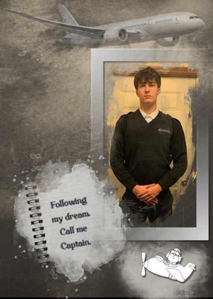
I was fortunate to receive a recent photo of my great-nephew who is about to start his Aviation School training (his long-term dream) at Sault College in Northern Ontario. As always, more challenging to make a "male" layout, but I can live with this version. He has worked so hard and done so much preparation for this venture.1 point
-
Template 6 by Lady 22. She has started sharing some of her templates at Digital Scrapbooking. She also shares on her own web site. Word art, paw prints and paw print heart from Creative Fabrica. This is Poppy as a kitten. She is now 12.1 point
-
Girls' Day Out...after playing 4 hours of pickleball we headed to Culpepper, VA to the Ole Country Store. We enjoyed incredible sandwiches and wonderful ice cream. Visits to the Ole Country Store usually include a stroll by the lake but as you can see, it was a rainy day. Looks kind of stormy doesn't it? The flowers on the big photo are in place of the squares. Wonderful funfilled day with the greatest friends.1 point
-
1 point
-
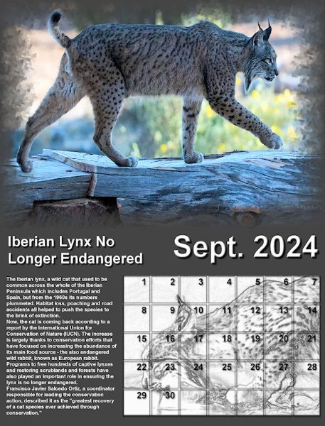
Here's my monthly Wild Cat Calendar for September featuring the Iberian Lynx. The text is small so I'm posting it here, also: "The Iberian lynx, a wild cat that used to be common across the whole of the Iberian Peninsula which includes Portugal and Spain, but from the 1960s its numbers plummeted. Habitat loss, poaching and road accidents all helped to push the species to the brink of extinction. "Now, the cat is coming back according to a report by the International Union for Conservation of Nature (IUCN). The increase is largely thanks to conservation efforts that have focused on increasing the abundance of its main food source - the also endangered wild rabbit, known as European rabbit. Programs to free hundreds of captive lynxes and restoring scrublands and forests have also played an important role in ensuring the lynx is no longer endangered. "Francisco Javier Salcedo Ortiz, a coordinator responsible for leading the conservation action, described it as the "greatest recovery of a cat species ever achieved through conservation." Arial font used throughout. Photo of lynx modified by Art Media Pencil behind calendar grid. Information from BBC News. I posted this full size (8.5x11) on Scrapbooking with PaintShop Pro on Facebook if you want to print it.1 point
-
1 point
-
I lived in Spencer Iowa for a couple of my late middle school years and spent alot of time at the town's library.1 point
-
It is great to see everyone working so hard on today's technique. @Sue Thomas You are right: one great way to learn about shadows is to look at them and analyze what they are. Observation is key in replicating any effect. I love how you added the lifted effect on the "sticker". That is another element that can easily be "lifted" on scrap pages. You are also correct about the idea to lighten the lifted corner a little (although it would not apply to all four corners). Unfortunately, that is not a detail that will be addressed. Maybe it will come in a second workshop on shadows! 🙂 @MoniqueN. The scribbles are both chalk, so it would not need a shadow. You see how it looks really natural on the bottom one, while the top one is unrealistic. Your question about the size of the shadow base on the geographical location is an interesting one. We know that the shadows are directly dependent on the light source so if the sun is low on the horizon, the shadows will be much longer. If the sun is high in the sky, it will be much shorter. If you live close to the Equator, the sun will be very high at noon, while it will be much lower if you are on the north pole. However, that only applies to shadows created by the sun. If you are indoors it won't make any difference. And if you are talking about shadows on a project, that won't have any visible effect. But here is a little technical article where an old experiment that shows some difference. @Rene MarkerYou are correct in using the reverse shadow only in some instances. I think that they are not essential every time, especially if the papers already have textures and obvious differences with the surrounding papers. The lifted shadows on the bottom photo look the most realistic. The top photo MIGHT have used more feathering before the blur. I think the same thing applies to the ribbon. It is a good idea to try on a ribbon as that is an element that can easily be "lifted" in a project. @Ann SeeberI think that for your lifted shadow, you started with too much of an offset. Then, I think you pushed the photo corner toward the top right instead of the top left (inward). Is that possible? @fiona cookThose shadows look good. I think the only issue is with the Warp brush. One trick you can try is to avoid putting the very center of the brush right on the tip of the corner. Try to keep that center away from the corner. I think it will push the corner a bit better (maybe there should be lessons about the Warp Brush in the future too!). Your shadows on the translucent ribbons are great. @Corrie Kinkel You are correct: once you have a starting point for the shadow, it is up to you to adjust it based on various conditions. And with practice, you might start to have your own prefered settings (and presets). Yes, the feathering is one way to go from the "regular" shadow on the flat section to the "lifted" shadow on the lifted section. @Cristina Great work on those lifted corners. I think the only slight issue is the corner of the photo. It looks like they are not "smoothly" curled up. I think that is just a Warp Brush issue, and that might need some additional lessons. @Donna SilliaThe shadow on the top photo is quite good, but if you look at the one on the bottom photo, your shadow was stretched in the wrong direction: it should have gone toward the bottom and you sent it to the top. If you want to try it again, you might see the obvious difference. I am surprised that the Flip it up script would send the shadow toward the top left??? @Susan EwartI think you did pretty well with those lifted shadows. Keep practicing so they become more "automatic". @Daniel HessThe shadows for the thumbtacks will be addressed in Lesson 7 so I won't comment on them. For the photo on the top, It looks like it is missing the shadow for the bottom left corner. For the other corners (and the other photo), they look quite good. @Anja Pelzer Your shadows look good, however, the one on the bottom left of the bottom photo seems to be misaligned. If you draw a line between the corner of the photo and the corner of the shadow, it would indicate a light source on the top, slightly to the right even. Do you see that? @Carolyn RyeYou did very well for those being your first tries! I think I would have pushed the top shadow from the bottom photo a little more toward the bottom. It MIGHT have been in the correct direction, but the blur just made it less clear. @Gerry LandrethThose are pretty good. I wonder if you feathered before adding the blur (maybe you did the same mistake I made!). @Linda J WalkerThe shadow on the top photo seems perfect. On the bottom one, I think you just pushed the shadows inward a tiny bit too much to fix the edges, but otherwise, they would have looked like the one on the top photo. For information about saving presets, you can read this article. Tomorrow, we will look at shadowing flowers. You will be able to use a few techniques learned until now!1 point


Resized.thumb.jpg.d25811db03a63358cedab1e79f527635.jpg)

