Leaderboard
Popular Content
Showing content with the highest reputation on 08/11/2024 in all areas
-
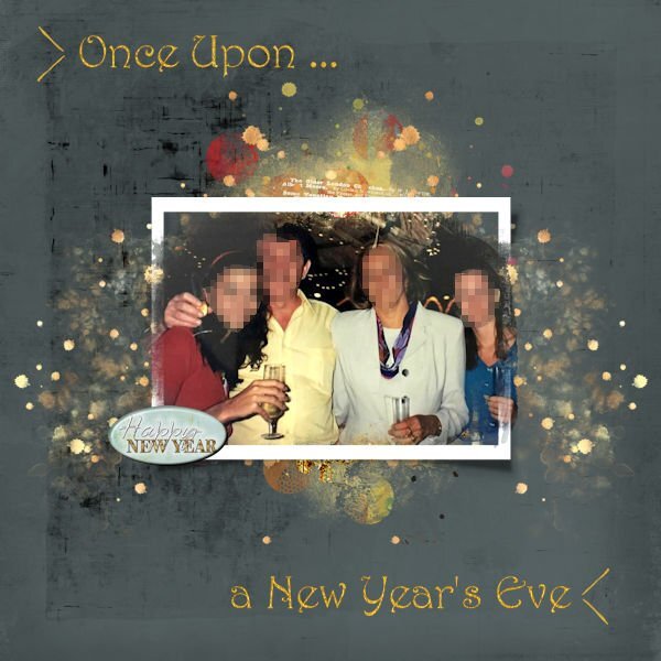
So, another layout is done. I am looking at some layouts and trying to use more Paints and Transfers. I changed the color of the background paper with ADJUST>Hue and Saturation>HSL Credits: FONT: Harrington --- BernhardTango BT Photo Mask: Palvinka_MoreThanWords_photomasks_3 Background paper: lgrieveson_sprout_5 cass-Flair Button: lgrieveson_new_beginnings_titles_1 Chevron: Creative Market_Watercolour basic-chevron-23 Paint-Transfer: Creative Fabrica_ivory-and-gold_0003_b --- lgrieveson_textual layered transfer_4_v27 points
-
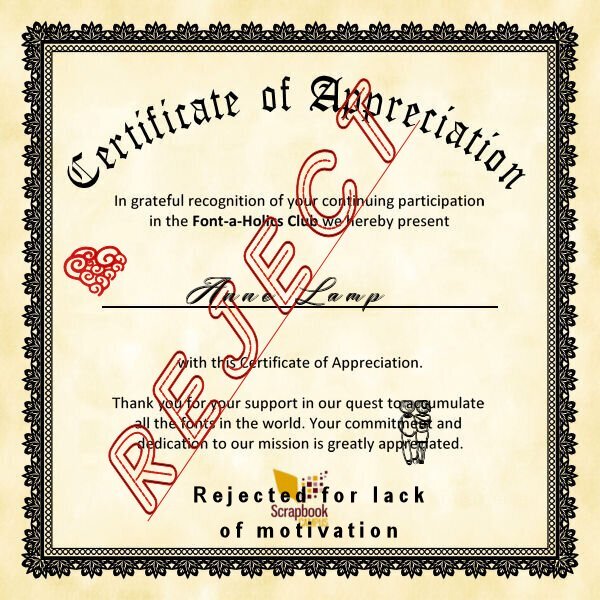
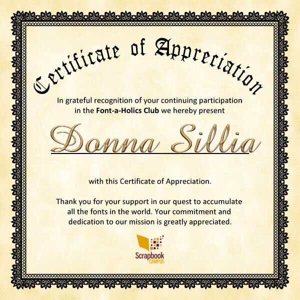
I suspect Donna had no idea what she would start with her comment "I really think that I need to go to rehab for a font addiction". Also Susan when she created the certificate. Unfortunately they wouldn't let me stay in the program because I have no desire to be "CURED" of mu addiction. LOL The heart and couple are from the dingbat font Valentine dingbats. The signature is Bigtime. The reject is Alphabet tracing. The rejected for is one of the Arials.7 points
-
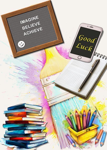
Just made this card for my granddaughter who is starting highschool tomorrow! A couple of weeks ago I made a blackboard without text and now put an appropriate text on it. The rest of the elements are a freebie from CF called back to school and I put good luck on the phone. I have sent it to her by iMessage because she has her own phone nowadays.5 points
-
Anne, your rejection was a mistake! The "lack of motivation" is one of the requisitions to belong to this group. The certificate reads, "Thank you for your support in our quest to ACCUMULATE ALL THE FONTS IN THE WORLD... Whoever did that definitely wants to sabotage the mission. 😅5 points
-
I wish i could take credit for this beautiful certificate, but I can not. The heavy gun was brought in, thanks to the the Creative talent of Michele. Yikes, I hope I dont see that big bad red word on mine!5 points
-
deeezy.com had several PSD text effects in its free section. I downloaded one call "Soft." You must change the text using Photoshop. I then saved it as a PSD and opened it in Paintshop. The effects were each on a separate layer and could be selected and filled with a color of your choice. I separated each letter using the elementstacker script. I will be experimenting with some of the other text effects that I downloaded. Unfortunately, you must have Photoshop to initially change the text.3 points
-
When I was young (grade 4, I think) we lived on a lake with not a lot of other homes (let alone full-time residents). We only got two channels on TV and Sunday night was the Wide World of Disney. Often there would be a show that was two hours so we had to wait a whole week to see the second part since it was only a 1 hour show. On one Sunday we watched "The Parent Trap" (with Haley Mills playing 2 rolls as twin sisters) part one. The next week my brother and I had our baths early so we could be all set to watch part two. That night we had a big storm and the power went out, so we missed the second part. It would be more than 20 yrs later that I saw the second 1/2. The Wide World of Disney was my favorite TV show. I remember one Disney short called "In the Bag" where a park ranger enlisted the help of the park bears to clean up the park...to this day me and several people my age can remember, "pick it up, put it in the sack, bump bump" (those aren't the correct words, but similar to that). At work anytime someone says "pick that up" my co-worker and I say, "put it in the sack, bump bump". the youngsters think we are loopy.3 points
-
Working with those paint transfers and splatters is so much fun. Yours really captures the NY eve spirit of fun and celebration.2 points
-
2 points
-
Susan, you are the Master of funny and great ideas! You make our days happier and put a smile on everyone's face. You deserve a special medal for this! 💟2 points
-
I could not let the opportunity slip away and show off. 😁 And Michele was so creative with the wording! 👏2 points
-
The paper and charm are gorgeous, Mary. had to laugh at PSP-aholic. I looked it up in the dictionary, and there was a picture of YOU! 😂2 points
-
1 point
-
OOPS! Sorry Michele. I did see you created it originally, but for some reason when I went back I got it in my head that it was Susan. Thanks Susan for letting me know about this.1 point
-
I love this. Julie is right, it's almost like fireworks. I like this technique and like Corrie, I wish I had more time to explore how to do this so it looks as nice as yours and Julie's do.1 point
-
Those paint transfers and splashes are so nice; another idea to follow! I don't have enough time to use everything I get inspired by 🥲1 point
-
1 point
-
You understood me right but when I tried to shadow the different parts on their own layer and had to erase some of those shadows it still looked not right, hence my question. Maybe if I can see how Carole does this in the Q&A it will make sense to me.1 point
-
In situations like that, if I'm understanding you right. I will create shadows on their own layer. Allowing me to shadow promoted selections independently. Even using different shadow settings. Of course you will then have to use the eraser tool to carefully delete unwanted shadowed areas.1 point
-
Unless I'm misunderstanding, try merging the different parts of the knot to one layer. I usually Merge Selected to New Layer then toggle off the visibility of the original layers. Then you can apply the shadow to the merged layer.1 point
-
1 point
-
Sorry to burst that bubble, but somehow the time gets filled with lotsa other stuff and there's not enough of it, just like when we're working. ☺️1 point
-
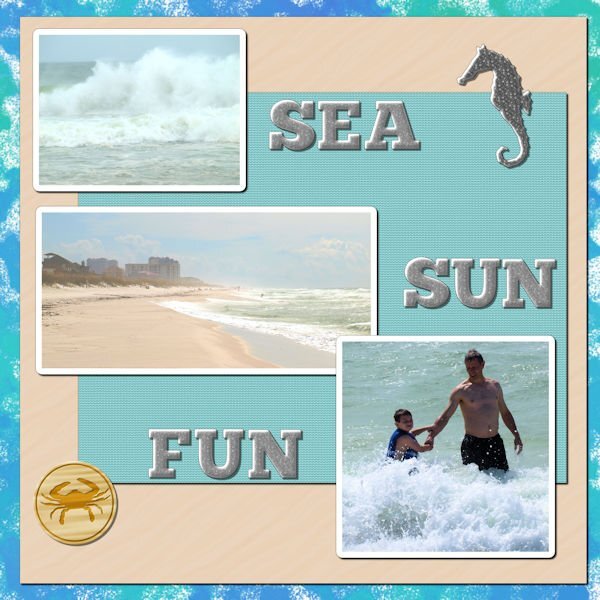
Oh, you Fontaholics. I am a PSPaholic. Can't quit can't quit can't quit can't quit.......... Lab 13 Mod 3. Papers from my beach kit. I didn't like the distressed look, so I didn't do that part of the decorated metal charm. At first I didn't want to do any alphas in it, but I finally relented and did a few letters - enough to do SEA, SUN, FUN -- and I made a heart charm as well as the seahorse. The background paper doesn't show up so well in this size, so (as I took an existing paper and made it black and white) I will show the paper here and the heart charm.1 point
-
1 point
-
1 point
-
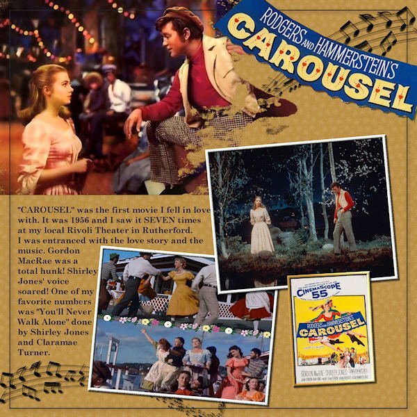
What a great cast of characters for the film! Good thinking Susan.1 point
-
AWESOME! It's better than I could have imagined! Great job and a big THANK YOU for all your work and your continued collecting of the Whole-y Font (PS...it's a religion, but I spelled it different so as to not step on any other religious toes) (PS2 'Whole-y' as in ALL the fonts in the world).1 point

