Leaderboard


Popular Content
Showing content with the highest reputation on 06/26/2024 in all areas
-
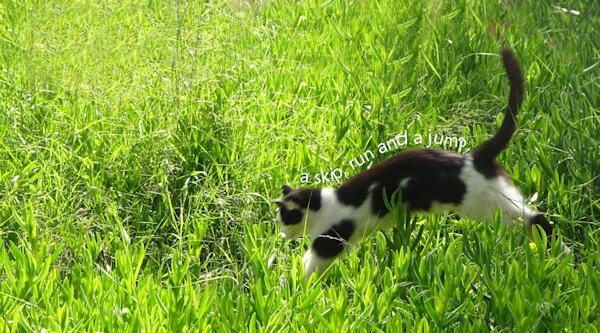
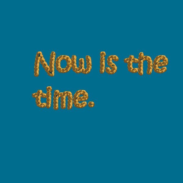
So sorry not to contribute before now as have had unexpected family commitments and only just managed to catch up. The first lessons I found quite tricky but got into it from lesson 5. Although the text on the path with the cat got bit distorted even if I changed the size of the text.
 6 points
 -
5 points
-
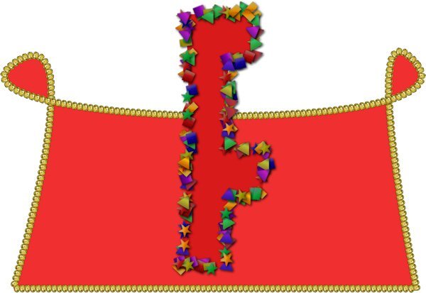
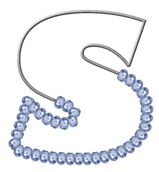
Lesson 6. Text used 'Mister Earl' but it is an unusual character 'F'. The Picture Tube is 'Confetti' which I made look thicker by reapplying the Vector Tube script.
5 points
-
Completed lesson 7 A little confused using vector lays duplicated each looked the same. Decided to rename the layers from the start which made things much better. Then rearranged the order in which was done first, slicing the path then applying tubes seemed to work ok for me. Anyway got the idea after a few attempts, practice, practice. Quiz, I got 8 / 10 Can I ask regarding #1 how many different icons are there to identify the different types of vector objects. What little icons and where are they? I am sure this must be simple but not sure what you are asking here, I thought about Cusp settings etc, I guess a senior moment.
5 points
-
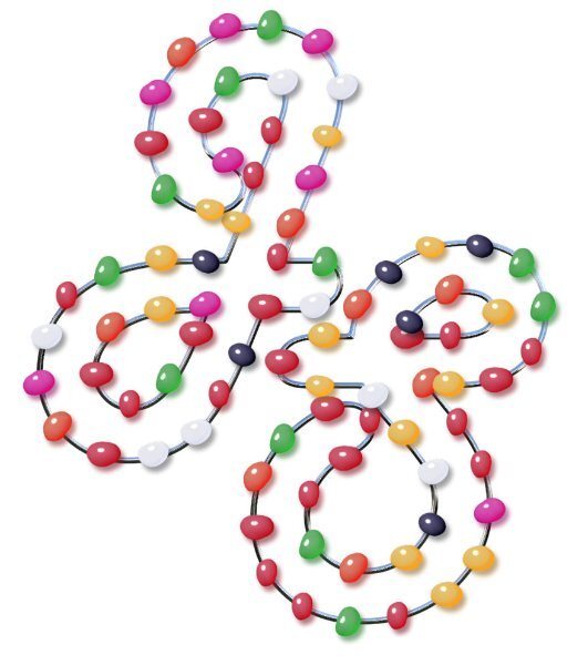
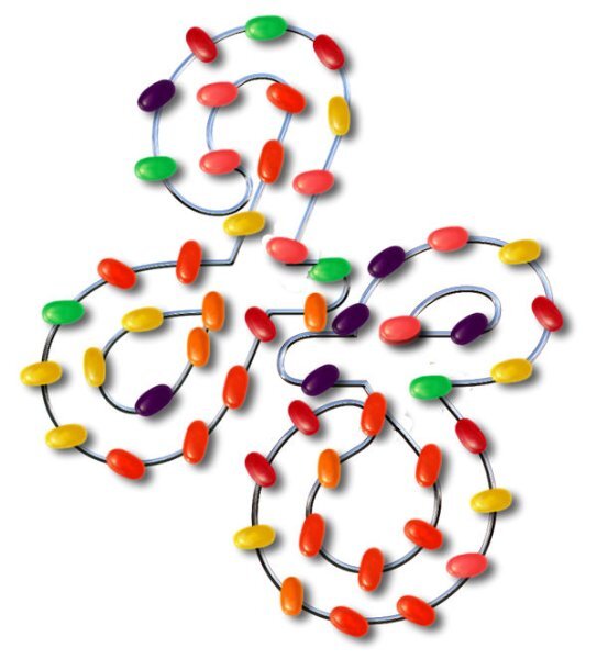
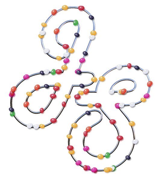
I had another play with Day 7's vectors. I knew I had used jellybeans yet my image didn't have the pretty colours I had used originally. I searched through all my picture tubes and realised the one I had originally used was Easter Jellybeans. Showing the Jellybeans first. The Easter Jellybeans
5 points
-
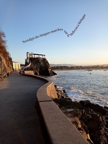
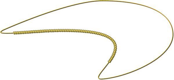
Jour 5 - premier travail et plus haut le deuxième my curve was made from the ramp
4 points
-
Lesson 7. I copied the vector layer, removed the stroke and added fill and texture but have made the mistake of adding this on top of the inner bevel! Not sure how I could have achieved this properly.
4 points
-
With the text on circle exercise, I got muddled up with where to double-click. To Reverse Path double click on the actual circle path (not the layer). To get the text to go under the circle, double click on the object text path Layer (not on the image) and select all.
4 points
-
Day 6
3 points
-
Good for you, the result is feedback on what you may need to study. Maybe do as Corrie suggested to Susan, do the tutorials again in a few weeks, that way you can go over what you may have forgotten between doing the workshop and the quiz.3 points
-
Thank You. I live in town and there are street lights etc. in fact there is one not thirty feet east of my porch where I took the picks from. Luckily the moon was pretty much due south of my house and there is a tree just west of that light that cuts down on the glare. I just got lucky with the direction and height of the moon that night, and a beautiful clear not hazy evening. Well actually about 1AM,3 points
-
I got 9 out of 10, so surprised at how much I remembered.3 points
-
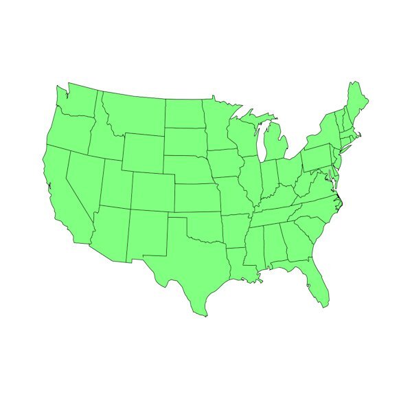
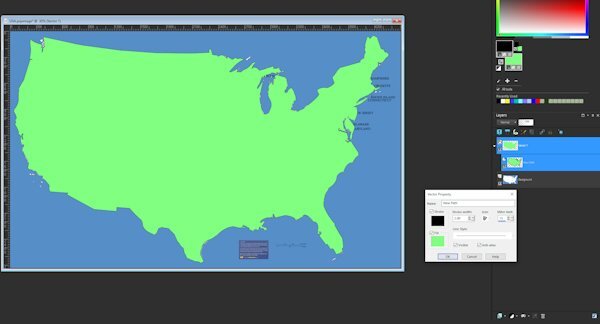
Added the states to my USA pre-set shape. I'm happy with it.
3 points
-
Lesson 7. I've had quite a time with this but this is what I came up with - both A and B.
2 points
-
Wow Anne, this is so cool.2 points
-
You don't know how true that statement is! 🙂2 points
-
Take care, Doska, your health is most important. I don't know when Carole will do this workshop again, and I am sure Vectors will be here maybe next year, they are such fun to do, even when not going right. Look after you first. Sending good health and love your way.2 points
-
@Corrie Kinkel Yes, I did hide the path of the circle. The green circle is part of the globe preset shape.2 points
-
To add to the fun I had 8 out of 10.2 points
-
Anne nice picture of the moon; you must live in an area without light contamination! I wish could take such a picture but the few times I was in such a place with a full moon, there were clouds!2 points
-
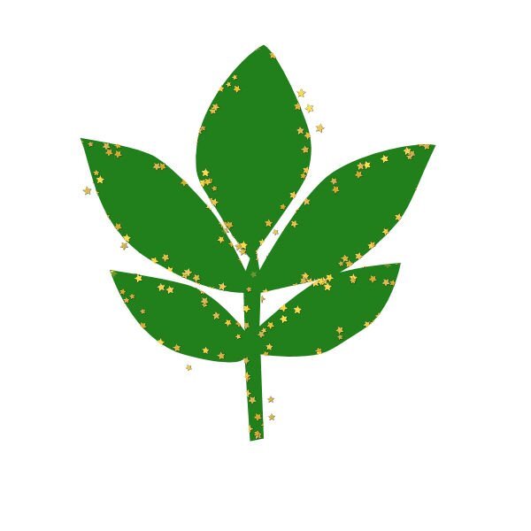
Lesson 6. I'm going to have to work hard on this path business. It seems that I've forgotten a lot! With the Globe of the earth, I had to put another circle around the outside of the globe as the maps of north and south america are also open and thus a path. The leaf was interesting - made the leaf last year in the vector workshop and using it as a path this year, I fooled around with different picture tubes and finally settled on the stars. The letter - I had already worked with it several days converting text to a path and this time no problem. I used a string created earlier.
2 points
-
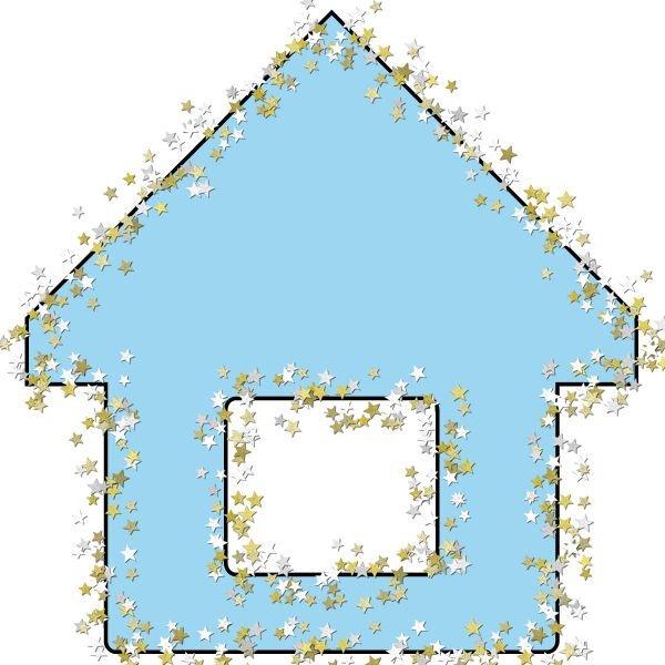
Used the VectorTube script to light up my house.
2 points
-
Works great for the rest of us!1 point
-
Beautiful. Everything so right about it.1 point
-
Rene, where I live we have bookstores a plenty as well as a good library with ebooks and of course they are displayed at shelves or on tables. Because of my eye condition I nowadays only use digital ones, just as the newspapers, but I like going to the bookstore in our shoppingcenter and have a look at the new arrivals! The feeling of a real paper copy is something I miss but I'm glad with the digital opportunities we now have.1 point
-
I got 9 out of 10, #7 wrong, I kept going back and forth and thought the one I chose was more important I laughed at the answers from #4 - the last answer. it was a fun quiz to do. I did much better from last year.1 point
-
Well, I took the quiz, and my score was 6/10. Oh, well, I'm working on it. 😉1 point
-
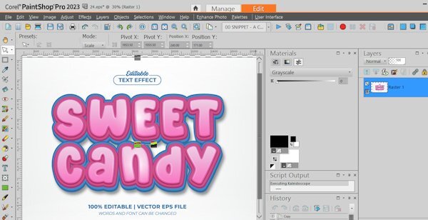
Possibly VECTOR related question. I downloaded an EPS file from Creative Fabrica. It says 100% EDITABLE | VECTOR EPS FILE. WORDS AND FONT CAN BE CHANGED. I was able to open in PaintShop Pro but it just appears as a single image .. cannot see how to edit text. Is there some way that I need to open an EPS file in PSP that allows me to apply the effect to the text?
1 point
-
Totally enjoyed this workshop. Gonna do a diamond membership for a few months and try to pick up some of the classes and information available for PSP. My next project already started is to do a preset shape of a USA map. I guess to do state borders internal to the closed vector path, you just select the lines (vs edit) with pen tool and put them in seperate. I'll find out if that is just a folly in my mind LOL.
1 point
-
Carole, Thank you so much for your lessons on Vector. I like what I have learned so far and expect to review to get a better handle on what I have not "mastered" yet. Everyone else, Thank you for sharing your work. Thank you for helpful input. Thank you for encouragement by showing what can be done, and encouraging words to push ahead. This is great! And having something that I have learned that I can use in the future is really the best part.1 point
-
Doska, I hope you are feeling better soon. We will all be here when you feeling up to returning. Take care of yourself first.1 point
-
Thank you. This sounds promising.1 point
-
Managed lesson 6 with no problems, certainly easier than switching the paths upside down.
1 point
-
And lesson 7,
1 point
-
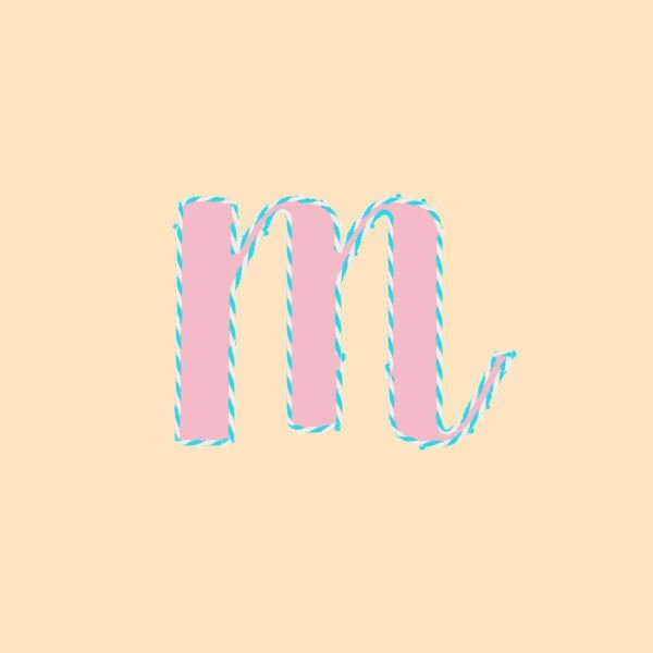
@Cassel I guess I just assumed that the text always appeared in the layer below - but I checked several of my pspimage layouts and it doesn't. So either I use the pen tool or click on Properties>convert text to curves in order to get a path to use with the Vector tube script. This is the one I made using the Properties>convert text to curves
1 point
-
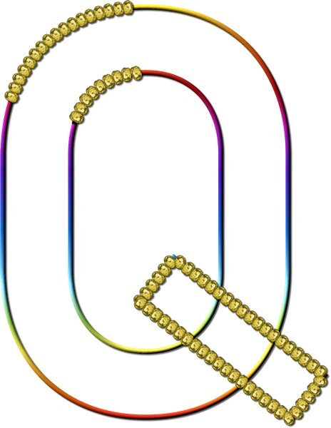
Lesson 7 Went pretty good, especially when I think it's a hard lesson, it turned out to be straight forward. The tricky part is grabbing the right node after the cut. Like Gerry said, it's hard to reposition the node you didnt want to be moving. I ended up pushing it back (if I picked the wrong one) very slightly then I could see the other node I really wanted to be grabbing. when I say see, I mean I had it zoomed in very close and when you move one node underneath it, the other node shows up. Only 4 cuts of all the cuts I made was the correct node I wanted to grab to move away and delete. I used undo a lot and learned to nudge the node into itself and not to the side as it would get too distorted. I really love this technique. On the Q I wanted to see if the lower cross bar was possible to isolate and it was. It's really interesting to see fonts with nodes, I forget about that, I could also be manipulating those fonts too...didnt we learn that in a master class or the Text Workshop? Thank you Carole. Even with some stumbling blocks, I felt way better going through this workshop for the second time. I'll get my question together (about the rocket) this week. Thanks again for a great workshop.
1 point
-
Thank you, Carole, I wasn't sure whether that could be done, and added the wire to hold them together. I appreciate all your comments to everyone, they help immensely. Jeni1 point
-
Thanks for your messages, Carole, it certainly helps. I raced ahead yesterday and created an image using my initials. I even put them on a metal wire, and then, today, we had this one to do so it worked well. Yesterdays attempt with jellybeans and today's attempt using Carole's brass bead and colourising it. Jeni
1 point
-
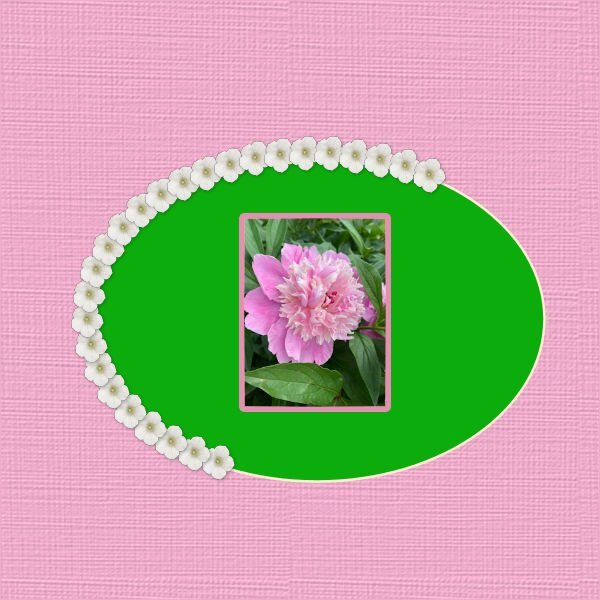
Lesson 5 #2 A fun exercise to do. I spend more time trying to learn how to work with layer masks (not sure that's the correct terminology), photographed on grey so I could add a textured back ground with blend modes (easy part), then needed to mask the blended texture layer to let the flower show through (hard part to wrap my mind around - which layer is the mask, is it black or white etc). the hardest part was wrapping my head around what on the top layer needed to be blocked, it kept thinking it was everything but the flower, but it turned out it was the flower I needed to block. Hopefully I will remember for next time. I added the little round label thinking you couldnt see it, but it seems to show up well and I have no idea why the top text on the flower is blurry, the original is not and even looking at the 600 version on my own computer it is not blurry. PSP is acting really slow today. Yesterday fast, today the opposite. And with the all temp files and cache cleared.
1 point
-
Lesson 5 first one
1 point
-
Lesson 6
1 point
-
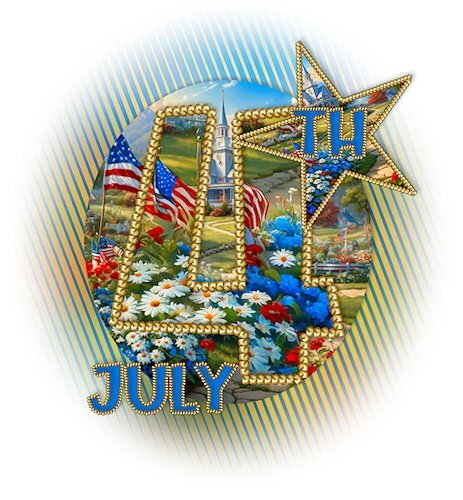
Haven't had much time to play as a major house project started much earlier than I expected .... but I am following along. Love seeing what everyone has been doing! I am looking forward to July 4th ... a traditional day of BBQ around this family!
1 point
-
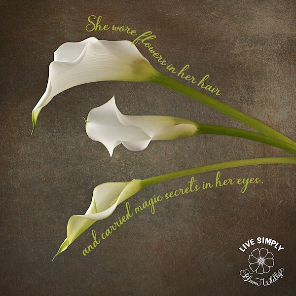
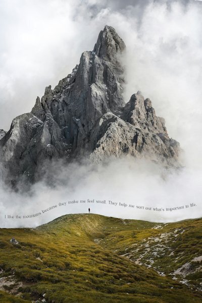
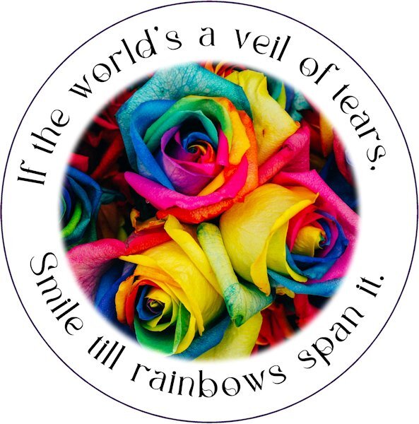
Day 5: Mountain photo: Massimiliano Morosinotto (Unsplash) with a quote from novelist Mark Obmascik. Rainbow Roses: Denise Chan (Unsplash) with a quote from American poet Lucy Larcom (March 5, 1824 – April 17, 1893). The quote in the mountain photo is: "I like the mountains because they make me feel small. They help me sort out what's important in life."
1 point
-
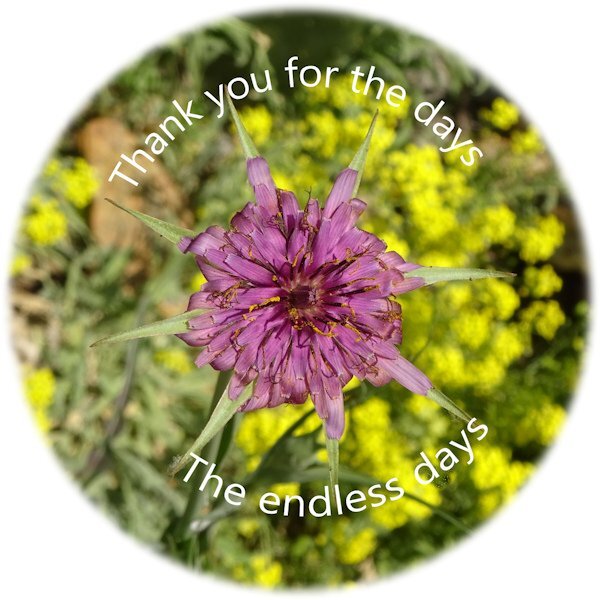
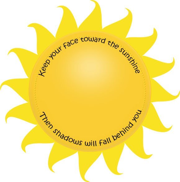
Lesson 5 - The sun element came from an old scrapbook kit I made years ago called Keeping Cool. The saying is by Walt Whitman. This lesson was easy for me since I've used text on a path numerous times in the past. And in this case reverse path did make sense to me.
1 point
-
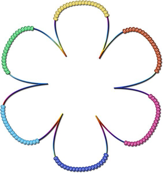
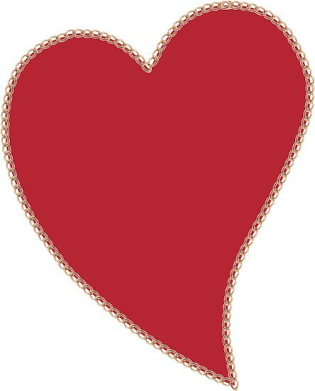
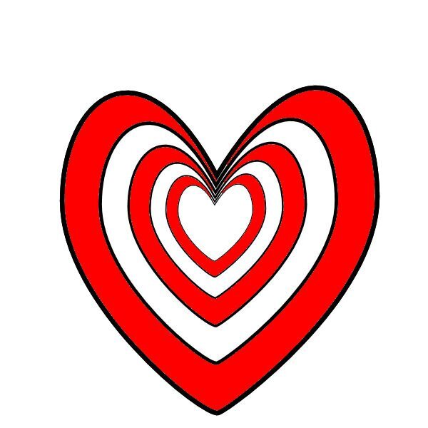
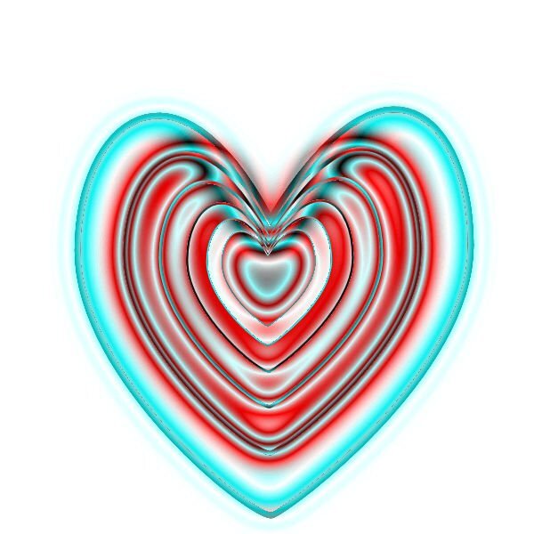
Well, I had to try something different. (1 - Heart4) (I wasn't sure if this would work with a layer that was not raster which is what I have used it for in the past.) I ran a script I created to take copies of the layer, decrease the size of the copied layer. Repeat. Then merged the layers. Then I flood filled with red in some areas. (2 - Heart3) I then took a copy of Heart4 and applied the Colored Foil. I did not show this. I then took a copy of this layer and used the blend mode to get Heart3. (3 - Heart2) Then I used Heart3 layer with blend mode against Heart4 and ended up with Heart2. (Conclusion) I liked the variations that I was able to produce. I like it when it gets to be fun.
1 point
-
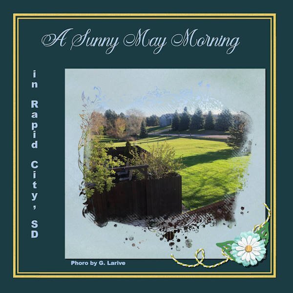
Really nice, Mary! Gosh, how you have evolved from a year ago! It must be all that work you do on the Labs. I think I see a small typo on the line that identifies the photographer. Does it say Photo or Phoro by G. Larive? I'm not sure because of the reduced size...1 point
-
I LOVE the birthday girl one. Your style is so awesome, the ethereal quality I love, but cant seem to replicate.1 point
-
Jessica Dunn has a challenge for June on Pixel Scrapper using one of her masks. I am using that mask on this layout. The flower is from Rachel Martin (Pixel Scrapper); the string is a Cassel string in Picture Tubes; the leaves are mine from one of the labs; the Title font is Arshinta Kirania Script; the place name script is Arial Black.
1 point
-
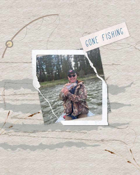
Here's the fisherman.
1 point
-
She's ba-ack!!!! It's wonderful to see your creations again, @AprilDawn. ❤️1 point