Leaderboard


Popular Content
Showing content with the highest reputation on 06/13/2024 in all areas
-
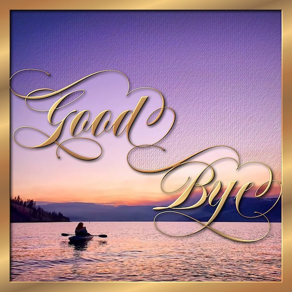
My physiotherapist is moving to the the interior of British Columbia (Kelowna, also part of the what we call the Okanagan area - home of the Ogopogo). I have lived in that area twice in my life enjoying mountains, lakes and lots of fruit (cherries, peaches, apples, grapes) and lots of wineries...even though I don't drink wine. This seems to be my go to e-card style of the moment. they are quick and easy to do...well, I say "quick", deciding on the font is the hardest part and takes forever playing around with it. You will notice the kerning on the word "Bye" is weird. I wanted the swash of B to blend in to part of the swash on the "e". I made masks for each, the upper and lower portions thinking I'd be using two different pictures (Lake shown is Lake Okanagan). I like the original photo, that I found on the internet so I put a copy into each mask but I wanted it to seem like it was two different elements. For the top portion I added two textures and some noise and used brightness/contrast to darken it a bit. That is also the area I added my sentiment on the copy I sent to her.
 8 points
 -
Thank you Michele always appreciate your kind words. i am going to try to make a card every day to get my brain active again. Corrie your Candle is beautiful. well done.. love it and will look great in a card. the card i am posting is a birthday email card. Flower is free from chantalia design...paisley lace sort of thing is created with a Ps brush that i use in PSP i downloaded it some time ago and the beads are done with cass. chain beads tube and the font is Brock Script. Best wishes to everyone.... Dawn. i could not remember where i got the free brush from so i went looking and found it...i found it on a site called antarasdiary.com it is set 28 when you click on download it takes you to brusheezy.com.
8 points
-
Something else I have been working on. I created a vector flame, used geometric effects to get the shape of the word happy to fit in the flame. The colours aren't the best, but when I come to create a card I will use colours and patterns to match. This is a trial run.
7 points
-
Decided to make this daily pic look like an old-fashioned scrapbook page. It's an updated version of the one I did in 2017 (in green). I like them both, but the display size that FB uses now is different than it was back then which is why I had to change it. The font is Nymph's Handwriting free from Nymphont.6 points
-
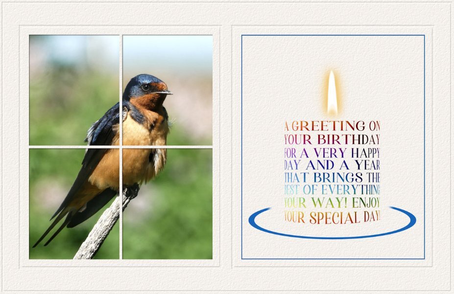
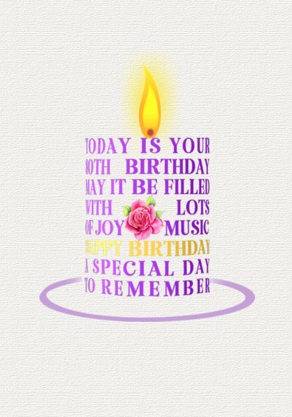
I can now post again. I hope that is the end of the issues, as Carole, I'm sure somteimes technology can be a nightmare. I created this for a friend, whose birthday was yesterday, using one of my bird photos, as she is also an avid bird and insect watcher, like myslef. (Barn Swallow) The colours used in the candle can all be found in the photo. I used one of my embosed cutout templates. It's a 5x7 ecard. Which my friend was able to print off. I'm currently unable to comment on posts in the campus. Corrie Kinkel I love everything about your candle! If anyone was going to try their hand in creating one, I knew it would be you. They certainly do have the potential to be used in a variety of ways. I only wish I had thought of it long ago. Thanks Michele Fineron, for the suggestive challenge, as without your vision I may not have had thought to take the candle to this level. By the way, everyone has been posting wonderful, inspiring pages!
5 points
-
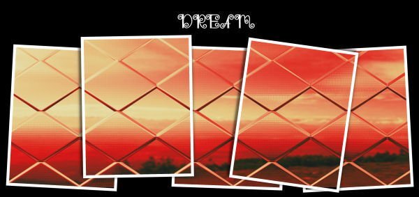
Dream with a photo taken by Jacek and a few FractalForge-s. I've got six free ones. I love them:). It's really good plugin, Carole's template.
5 points
-
Sue thank you and I'm going to play a bit more with the candle, I need a couple of cards for family and friends who have a special birthday coming up in the next months. I'm not 100% happy with my first attempt but I know now which adjustments I have to make and I have to think of appropriate Dutch words because we tend to have longer words, so the fonts and their spacing will be important too. Luckily I have been using the meshwarp before that makes it way easier. Thanks again to you for the initial idea and thanks to Michele for her suggestion. I wish I had thought of using wordart for a candle. I think many of my X-mas cards for this year are going to have a candle!4 points
-
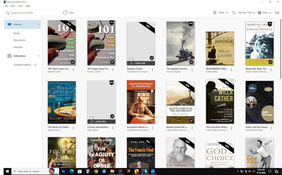
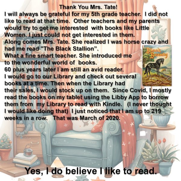
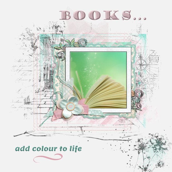
I haven't got a layout to show, but I'll enter the forum and tell my story too. I have always wanted books and loved reading. When I was in grade school and would get little Christmas gifts for my friends, I just assumed that they liked to read too. I would buy the cheapy ones from the dime store and read them before I wrapped them. (I still do when I buy books for relatives). In high school, my favorites were many - I think I remember the ones that I was most fond of: fairy stories (will always love them - Tolkein and Lewis agree that they are important), and romance stories: Jane Eyre, Scaramouch were my favorites. I saw the movie Scaramouch (loved Stewart Granger) and just had to find the book - Wow - greater than the movie. In high school when I was 16 I got a job and the first thing I wanted was to join the Catholic Book Club - great choice - got my first cook book (Meta Givens Encyclopedia of Cooking - my bible for cooking and baking), my first bible, the 1st book in a series on Canada - the White and the Gold, books on different aspects of the history of our country, the USA. Later in life, when I could afford it, I joined the Readers Digest Book of the month club which started me on another path. I have purchased books until I had a library (made a database on the collection since I seemed to be buying duplicates) of about 2,000 books and was running out of room and bookcases. I have since given away about 1,000 to friends, prayer groups, and the local library. My favorite authors are many, for spiritual books, novels, history, historical novels, biographies, autobiographies, nature. I can show you a sample of a screenshot I took of my Kindle books (yes, even though I like to hold a book in my hands (the smell, the touch)).
3 points
-
Yes, and I like the way it touches and blends with the gold frame!3 points
-
Absolutely stunning! That font is incredible and you did an amazing job on it.3 points
-
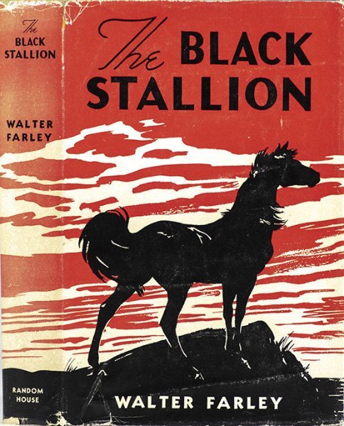
Oh, me, too, Anne. I also, was horse crazy, though Black Beauty upset me. I was a big fan of The Black Stallion series. I wish I still had the books. I can still recite the first line as I must have read it 20 times... "The tramp steamer Drake ploughed through the heavy seas..."
3 points
-
All of life seems to be a trade-off sometimes. 😃3 points
-
I have been an avid reader since grade school. The background is from Creative Fabrica that I downloaded who knows when. The Black Beauty book picture is one I copied from the internet.
3 points
-
One little tip I'll give is to use a guide when you are manipulating the duplicate vector, to get the extra thickness on the curves. So the pen nodes are aligned to create both sides symmetrical. Also lower the width of the duplicate vector. I'm still making adjustments when I create a candle. I've done several templates The more I do the better they get, as will yours. Not that I could find fault with yours, but you are like me. I have to be happy with what I create.3 points
-
hello everyone, this is a friendship card i have made. the floral paper and leaves are from a purchased kit a few years ago. the flower is free from chantalia design and the sentiment is a digi stamp from Power poppy....... best wishes...Dawn.
3 points
-
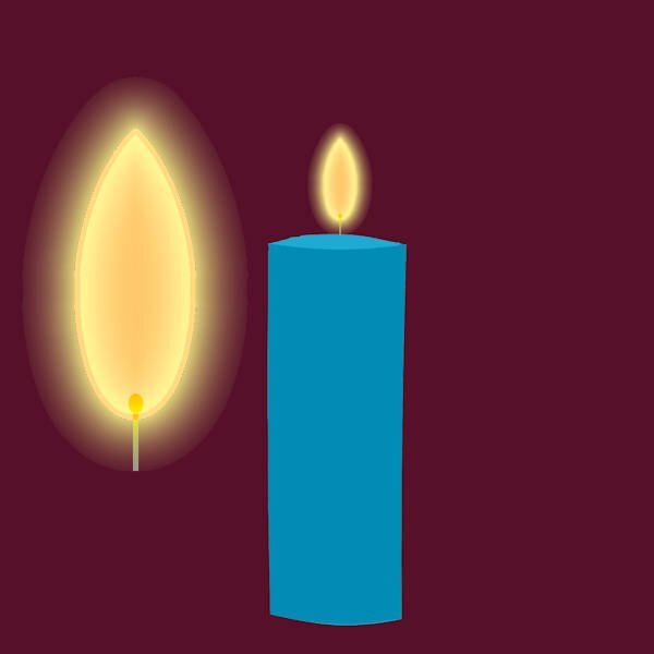
AThis is the flame and the candle.
3 points
-
She's ba-ack!!!! It's wonderful to see your creations again, @AprilDawn. ❤️2 points
-
I will rename the layers if I have a lot of them. I'll also add drop shadow info to them when there are different drop shadows for different layers, e.g. Red Flower 5/5/50/25. The reason I do this is because I will re-use some layouts like cards and when changing the text, I want to keep the same d/s. As @Corrie Kinkel said, we all have our own systems. I'll often find better ways to do something by reading how other people do them.2 points
-
This is what I do: I use no thumbnails at all but have large tooltips. I like that almost all layers are visible when I'm working. I'm also pretty compulsive about labeling the layers. I do have the script but sometimes, especially with a template, the supplied names are not helpful at all. Oh, and btw, @Cassel, I had a wild promoted layer last night but could'nt find the History button. I now found it but will have to wait for the next attack of the wild promos. 😉2 points
-
Bless Mrs. Tate! I had a teacher like that too in grade school, grades 5 & 6. She read to us every day after lunch. I can remember King Solomon's Mines as one of the books. I was so hooked!2 points
-
That is so pretty!2 points
-
Dawn a lovely card, if I would get such a card from a friend I would be over the moon!2 points
-
Two days ago when the Campus was up after that terrible gremlin attack, Sue very kindly gave instructions how to make a candle out of wordart! She has been perfecting her initial idea on this. Here is my try to make something too. To me it was clear it must be done with the warpmesh tool to get the rounding, but that you could use wordart to do so is a genius idea. I didn't want to copy her "card", so I tried a birthday card. I'm not totally happy with the colors I used and I have to try to make a better ellips on the bottom. I didn't have a realistic flame and I haven't a subsciption by CF. When I tried to just buy a flame they want me to take that really nice subscription for a year, which I at this point won't do. I just updated my filter forge and that was my budget for now. I'll see if I can find some flames there, but in the mean time I wanted to post this 1st try. I can see nice, unique cards made this way, Sue thank you so much for sharing this with us.
2 points
-
I thought about a layout and finally decided to try black & white (like text on a page, or like life without small joys). To me, books are my gateway - to learning, to pleasure, to emotions, to so many things. They have been a very large part of my life since childhood. I can't even fall asleep without reading at least a few pages. The background stamp is from Katie Pertiet, and the flower stamp is from ET Designs. The cluster frame is Jessica Dunn.
2 points
-
Thank you so much Mary, Julie and Corrie. That means a lot to me. You know what they say, "It takes a village..." Without all of you (my village), this and many more layouts wouldn't have happened. I've learned so much and keep learning new things from Carol and Campus villagers.1 point
-
You outdid yourself with this card! I like how the words connect with the swashes and I agree finding the right font for a project can take a lot of time and experimenting.1 point
-
You knocked this one out of the park! Beautiful!1 point
-
Ann good catch! I should have written June! I took the photo indeed yesterday. However the word NOTE was on that paper and came with the kit. Time flies....... Underneath the background paper is a soft green paper so I could play a bit with the blend mode, in this case luminous and an opacity of 90%. Of course I also needed it for the punches.1 point
-
Actually the Black Stallion series was my favorite too (there were quite a few of them). I know what you mean by Black Beauty being upsetting, but that was the one she showed me that got me started.1 point
-
Wow, Susan! This is absolutely stunning! I love everything about it🥰1 point
-
Thank you so much Michele. I feel like I'm walking on clouds!1 point
-
I do the same for small ones especially, or if I have a lot of layers that are similar then i"ll for sure name them, or group them and now I highlight the orig. vector (in yellow) in case I need to get to it, it's really easy to find.1 point
-
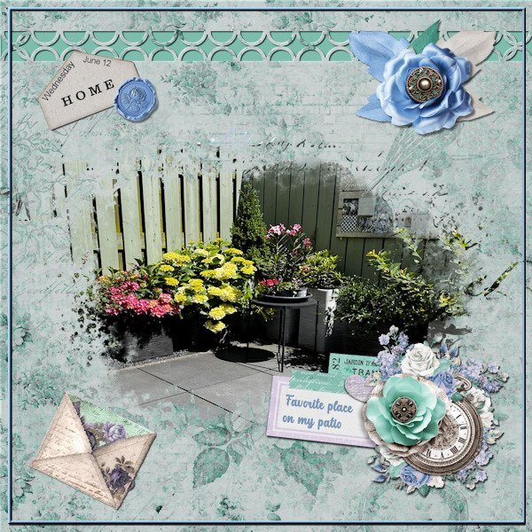
I had some time left over today and instead of just posting a photo with plants in containers on my small patio I made this layout. Not so long ago I had a bit of leftover money from a birthday gift and spend that on a kit by Jessica Dunn called Vintage flowers. Everything on this page comes from that kit, including the mask. The weather over here is still way to cold for the time of the year and way to wet as well, but today we had some sunny spells that allowed me to quickly take some photos. The corner in the photo has the most of the sun and is doing well despite all the bad weather, of course Hortensia's like water and they are getting plenty of it. Because everything is in containers/pots we normally have to water very regularly, but this year we didn't have to, at least until now. To the left in the photo is the spot were we have 3 garbage bins and those take a lot of our small space but we have fenced it of. There is a schedule when to put them outside along the kerb for emptying. To the right is the door to the parking spot and behind where I was standing for the photo is the wall of our shed with a door in the middle. The last side of the rectangle has the door to go inside and 2 large windows from the living that look out on the patio. It is nice to be able to sit outside, but after 7 years of living here I still sometimes miss the garden of our former house where we lived 43 years. We have a table and a couple of garden chairs and it nice to have an outdoor space where we can enjoy our morning coffee and if the sun is to hot we lower the sunscreen and have shade.
1 point
-
I would actually like to sit outside more but because of allergies, I don't very often. I do have a nice patio with a 2 seat cushioned bench, 2 cushioned chairs and a table that came as a set. I just got the cushions out this week for the first time since 2022. I physically wasn't able to do it last year. There is very little shade on the patio so it can get quite hot on an very sunny day. However, Peyton loves to go on the patio (it is fenced in) and she'll lay on the furniture in the sun. I have a set up that when I go away in nice weather, I leave her outside. She can be on the patio or go in the garage if she wants. I have a very small front porch but do have 2 chairs with a very small table between them. I used to have those plastic chairs on it but last summer I got 2 cushioned chairs at a garage sale when my cousins were selling my aunt's stuff (they moved her to an assisted living community). They are comfortable and look nice. There is a nice big bush in front of the porch so people can't really see me but I can see everything going on. The porch is in the shade so I do like to sit out there in the early evenings and read for awhile. Peyton goes on a tie-out so she can lay in the grass if she wants but can't run away.1 point
-
Increasing the thumbnail size just means not as many layers will show in the layers palette. And, I want to have as many visible there as possible. I just changed mine to 100 (way too big for my many layer layouts) and 75 (better than 100 but still not many layers showing). Even at 100, some of the smaller elements are too small to actually see what it is. Also, with my PSP settings/layout and screen size, I can see 7 layers when it is set at 50. A setting of 75 has 5 layers and a setting of 100 has 4 layers. However, changing the tooltip size is a better choice for me. A size of 200 seems to be good. Again, personal preference. I will sometimes rename layers but since I drag and drop my papers and elements directly on to the layer palette they get renamed to the file name that way. I've been doing this so long, (long before I even knew about a script to open as a layer) it is just an automatic for me. I'm an old dog that has a hard time learning new tricks 😉1 point
-
No, I didn't know that! I just bought a bigger monitor. lol1 point
-
It was my pleasure to share with you all, once I had played with it. You did an awesome job! I love it.1 point
-
Did you know that you can change the size of those thumbnails??1 point
-
Those thumbnails in the Layers Palette are pretty small so I still like to type in a quick name for some elements that are hard to see. When I use a lot of elements, it can get very difficult to figure which is which. I use abbreviations whenever I can to save time. e.g Flr 1, flr 2, etc.1 point
-
A really different type of frame. Very eye-catching.1 point
-
Thank You Susan .. appreciated very much. best wishes to yo Dawn.1 point
-
Stunning April!1 point
-
That is an interesting point. I don't usually teach it, for a couple of reasons: you can have a preview that is visible, which is usually enough for me to know whether this is a frame, or a photo, or a paper I often use the OpenasLayer script, which will rename based on the file you opened, so some layers will automatically be renamed However, it could be useful, especially for those using older versions that don't have thumbnails in the Layers palette.1 point
-
When I started out, I was very confused about my layers. Then I learned that you could NAME them! For me, it was a game changer. It's easier now to find what I want without the time consuming process of naming, but in the beginning it kept me from being totally lost.1 point
-
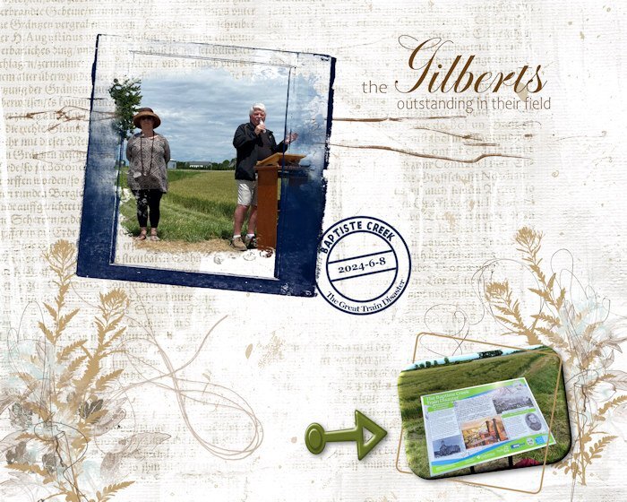
Since I used the date stamp (that I have finally figured out how to do with reverse text), I want to post the "souvenir" I made for the couple pictured here. They are local historians/writers who have spearheaded a project to install heritage (historical) plaques (large) in various rural areas and small communities (one is underway now for my home town). I am on the committee and involved with the unveilings that are taking place this summer, and in the future. This plaque, literally in a field (lower right photo), showcases a terrible train disaster that occurred close by in 1854 with a massive loss of life. It was the early days of railroads and there were many accidents, but none as disastrous as this one. The blue frame is from (I think) Natali Designs on Pickleberry Pop; most of the other elements are from ET (Erika) Designs or Katie Pertiet. I'm not good at keeping track while I'm doing the layout.
1 point